Branding / Logo / Website Design
Porano Pasta
Gerard Craft’s Porano Pasta sets a new tone for fast casual dining in St. Louis. Atomicdust’s branding, identity and design work for the long-awaited restaurant needed to follow suit.
Gerard Craft’s Porano Pasta sets a new tone for fast casual dining in St. Louis. Atomicdust’s branding, identity and design work for the long-awaited restaurant needed to follow suit.
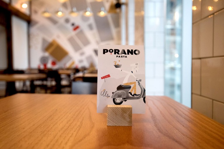
Porano Pasta gets its name from a small town in Italy. On a family trip to Porano, Gerard found a sense of warmth and community built around sharing simple, delicious food. This gave us the perfect building blocks for our designs.
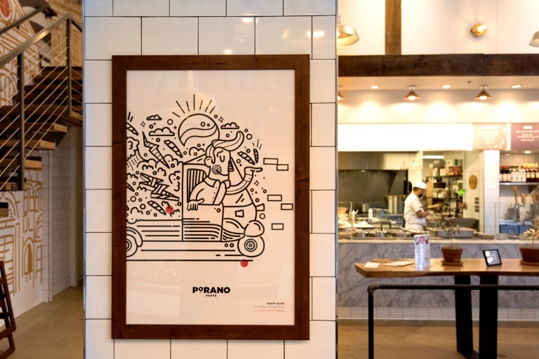
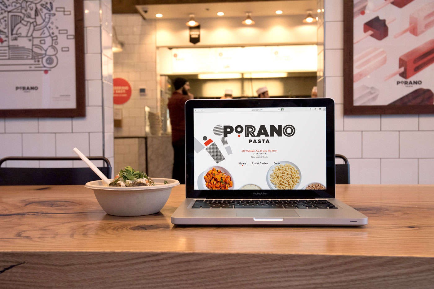
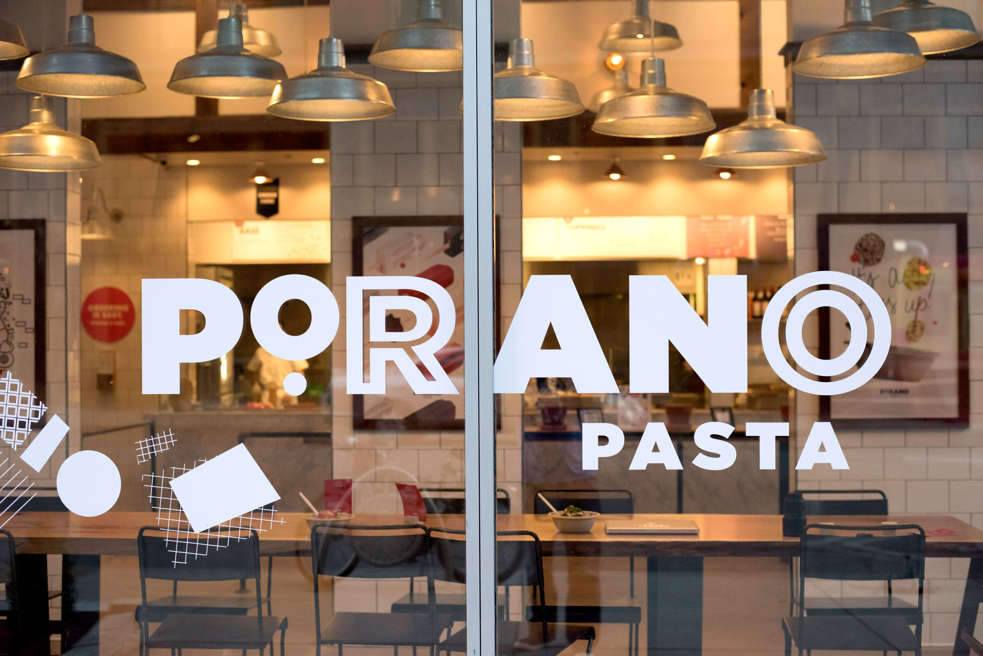
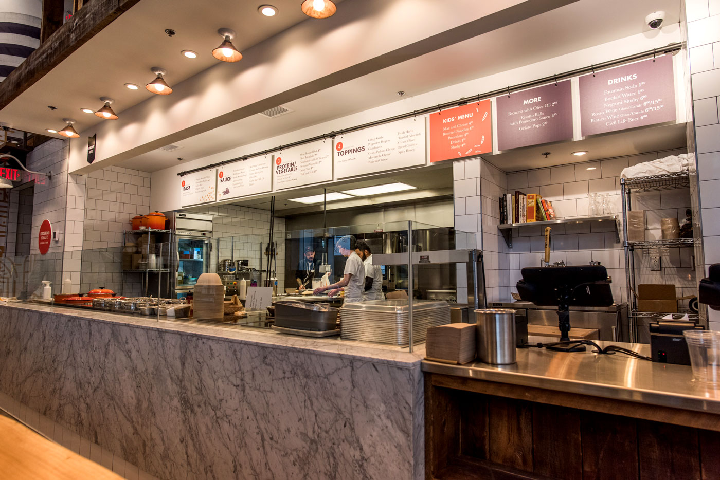
Consider the fonts used both for the logo and the in-store signage: While the letter styles vary throughout the space – such as the additional vertical strokes or red dot under the “o” – there’s a sense of structure and consistency to the branding.
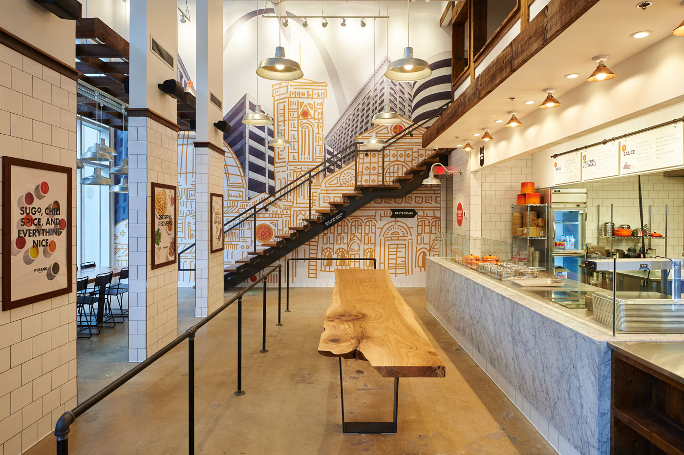
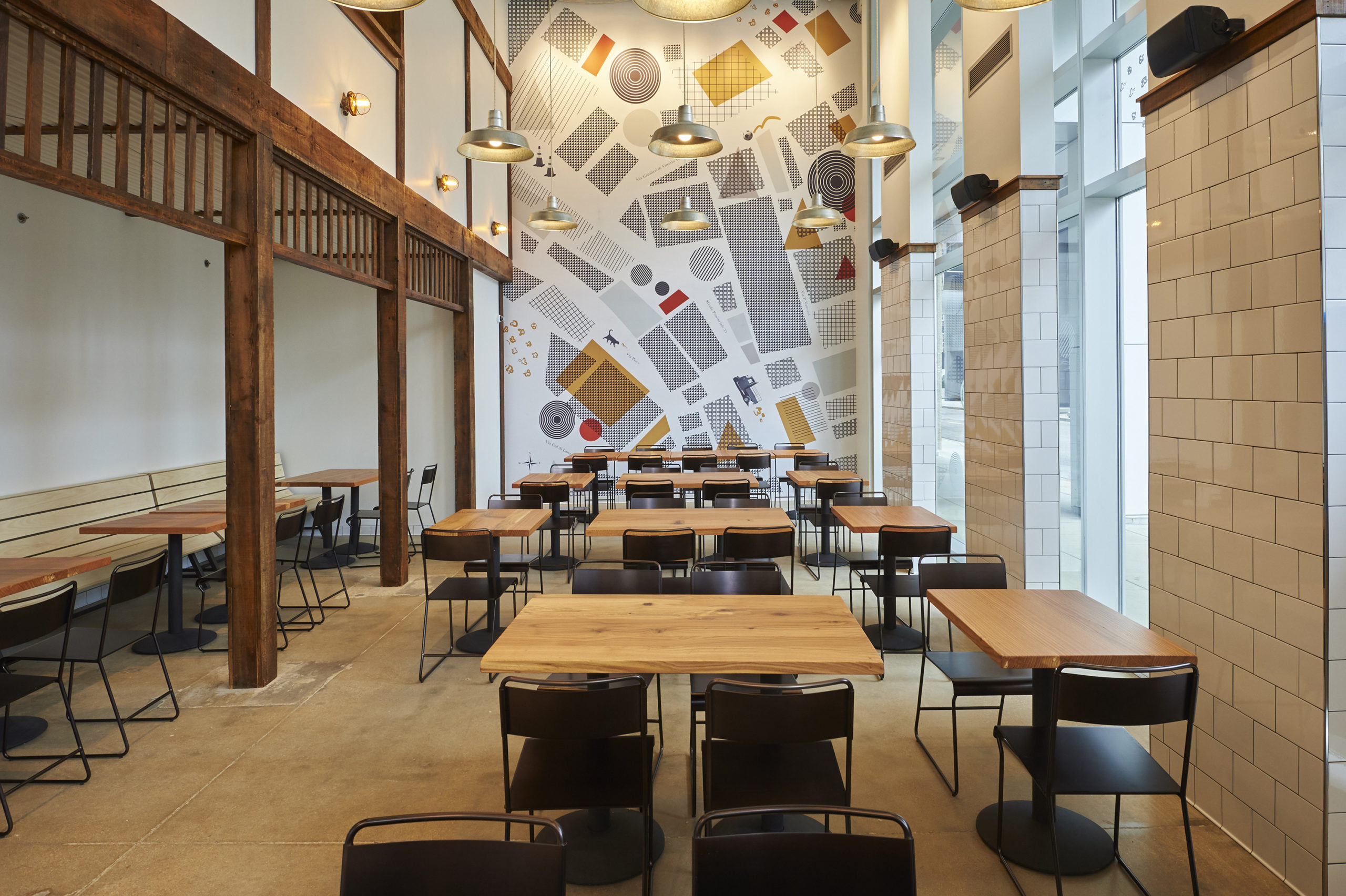
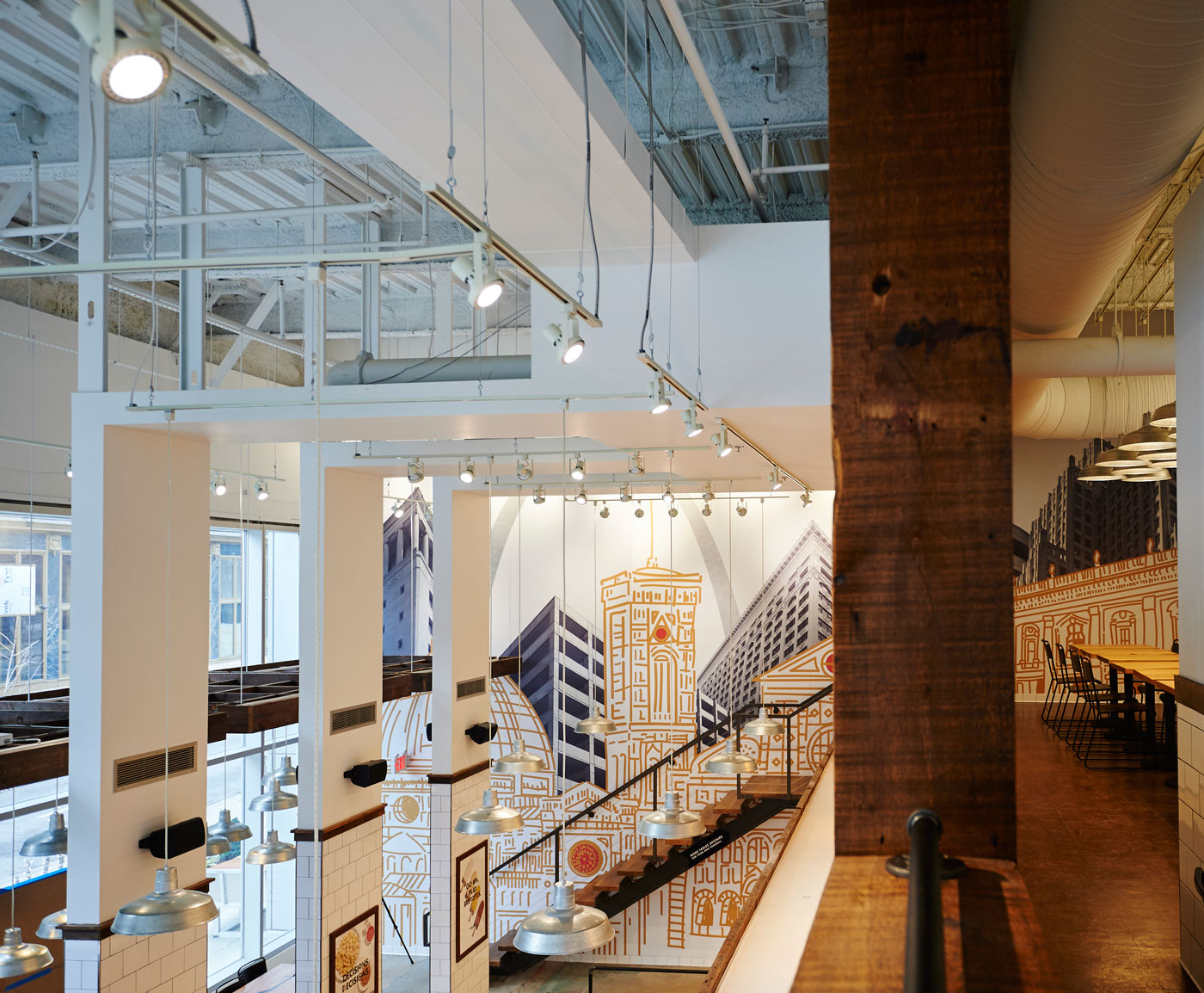
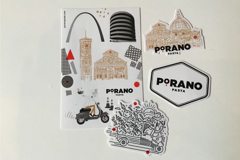
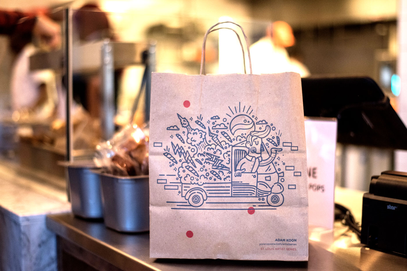
Similarly, the graphics in the space mix both modern and mid-century modern styles. Illustrations of Italian-influenced buildings were fused with images of our own contemporary city to create a striking mural in the main hall. On another wall, a map that reflects the real town of Porano becomes the center of attention.
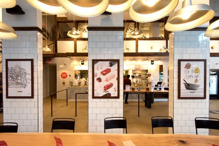
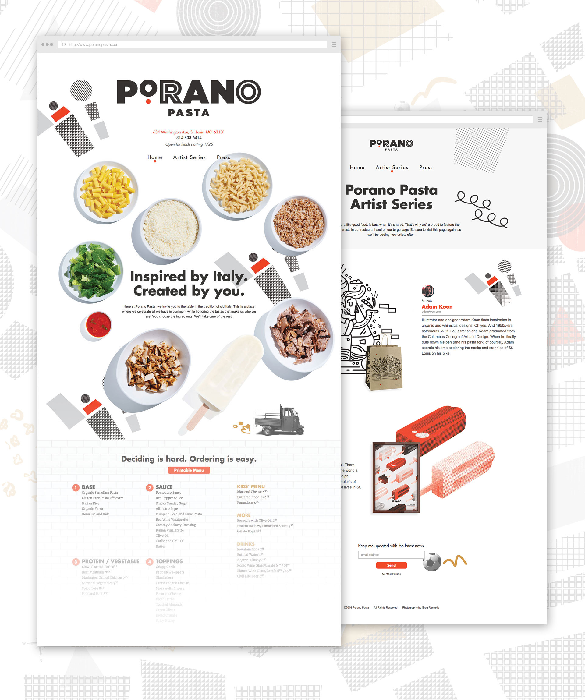
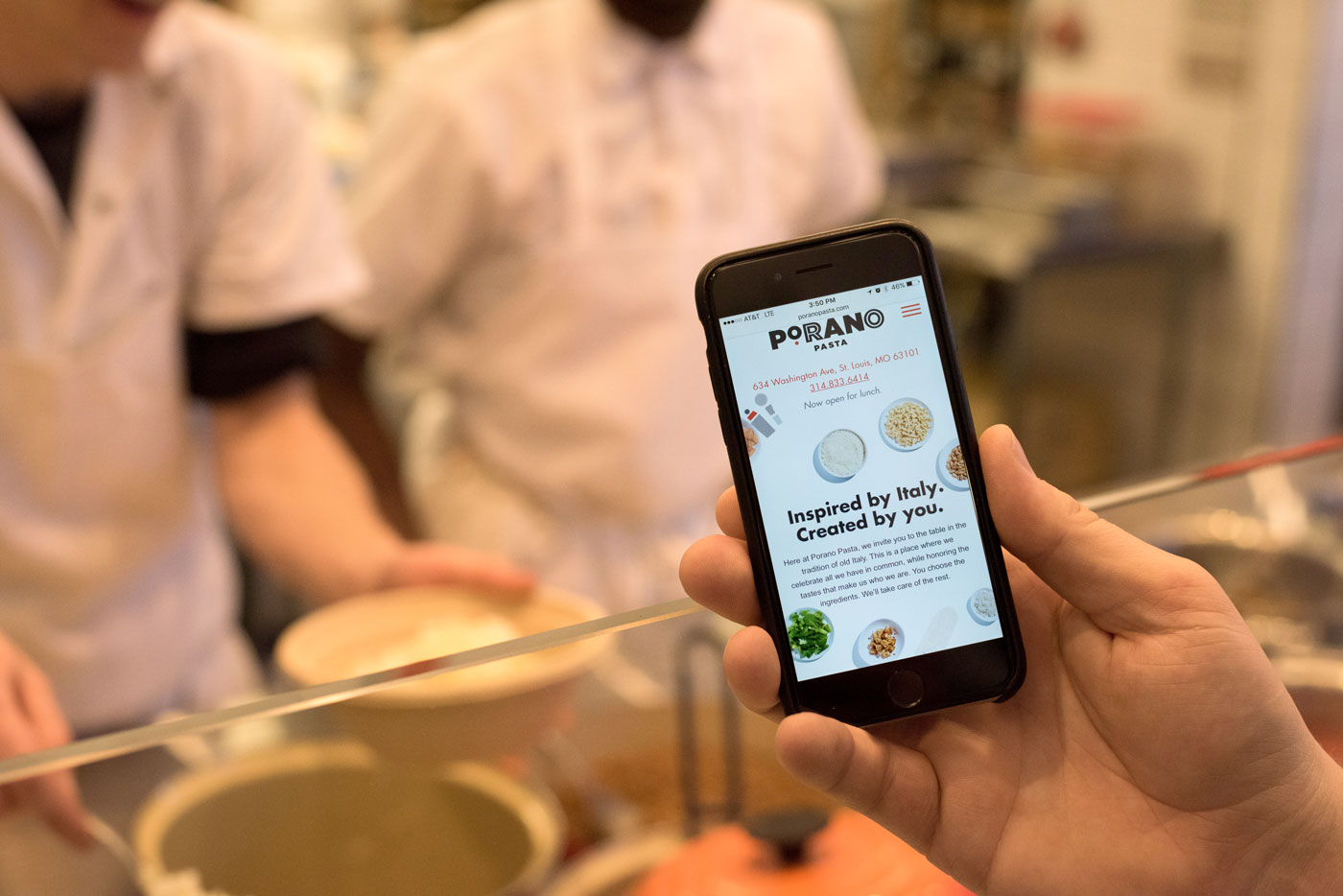
The website became an ideal introduction to Porano Pasta’s visual style, showcasing both graphic elements from the brand and photos of the food. The dishes animate in and out, capturing not only the spirit of the restaurant but also the sense of sheer variety of combinations available.
Porano Pasta opened in early 2016, and was named one of Eater’s Most Anticipated Restaurants of the Year. The restaurant has continued to receive high marks, both for its food (of course) and its design. It has been honored with PRINT Regional Design Awards, Graphic Design USA American Web Design Awards and was named Best in Show at the AIGA St. Louis Design Show. Special thanks to Greg Rannells for contributing some really great photography of the new brand.