Branding / Logo / Naming
Perch
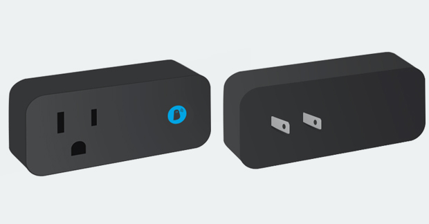
Perch, a product that prevents you from leaving your charger behind, gets a new name, new visual identity and a new brand for an entirely new product.
Perch, a product that prevents you from leaving your charger behind, gets a new name, new visual identity and a new brand for an entirely new product.
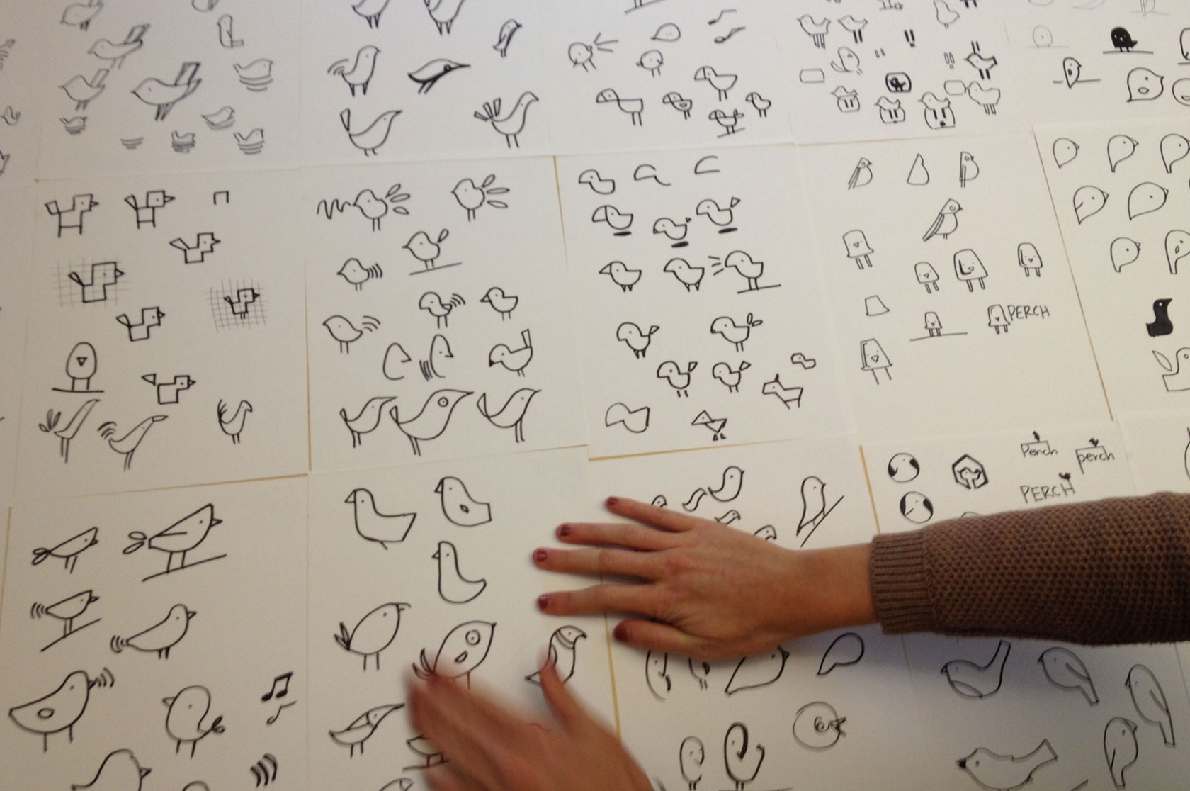
One of the first hurdles was creating an alarm sound that wasn’t, well, alarming. We collaborated with LPS Technology to develop a friendly and comfortable sound that didn’t bring fire alarms or storm sirens to mind. What resulted was a friendly chirp that helped guide Perch’s branding.
We gave Perch a new tagline – “Watching your wires” – to sum up the brand in a way that memorably played off the behavior of actual birds. For Perch’s logo, we created a simple singing bird to communicate the brand’s approachable and uncomplicated personality. What better way to quickly help people understand how easy it is to use Perch?
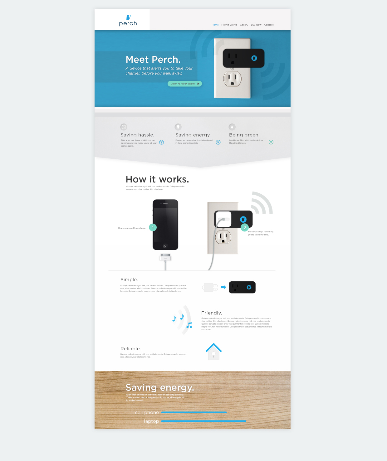
Part of unveiling a new tech product is developing a strong and flexible website. A site that’s prepared for the future. We worked with Perch in its infancy to develop its brand, but as LPS continues to develop new products and technologies, the site has to be able to develop along with them. We offered LPS a way to change and add new elements to the site without having to worry about disturbing the e-commerce functionality that makes it so valuable.
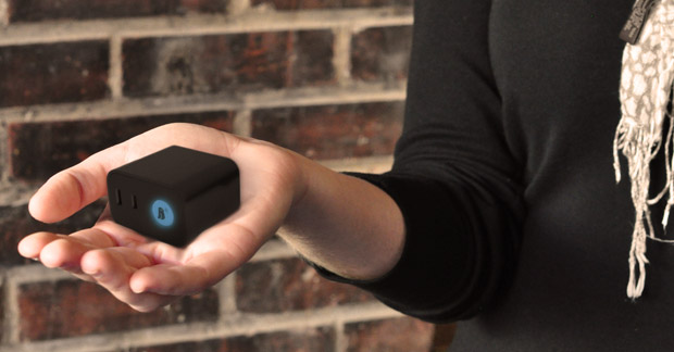
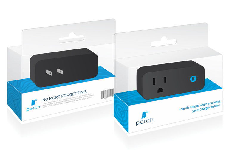
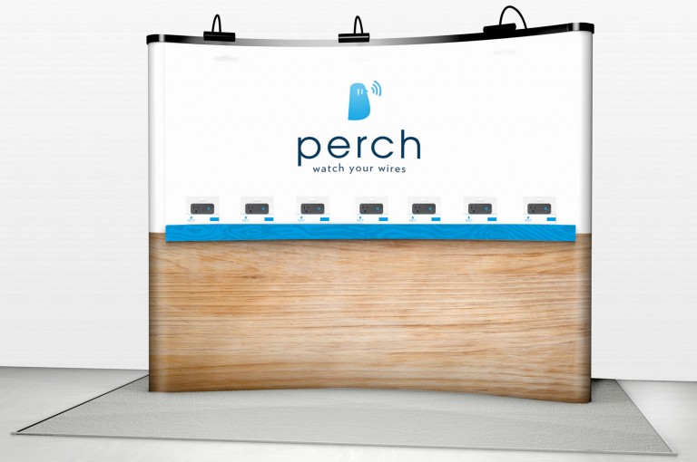
Perch was almost ready to meet the world, but it needed an identity on the shelf. Perch’s clean and simple packaging makes it visible from any angle, enabling consumers to see the new product’s size, shape and look. As they begin to get a sense for the product, clear and straightforward messaging reinforces the brand. A once-unknown product is now easily identifiable on the shelf and on the wall.
“Atomicdust took our new-to-the-industry product and gave it a life and a story beyond what we had been able to produce on our own.”
Nicole Tedesco, LPS Technologies