/

National Cart Co.


National Cart Co. frequently adds new products to its extensive lineup, but the company’s website was difficult to update and didn’t reflect the brand’s status as a leading player in the manufacturing industry.

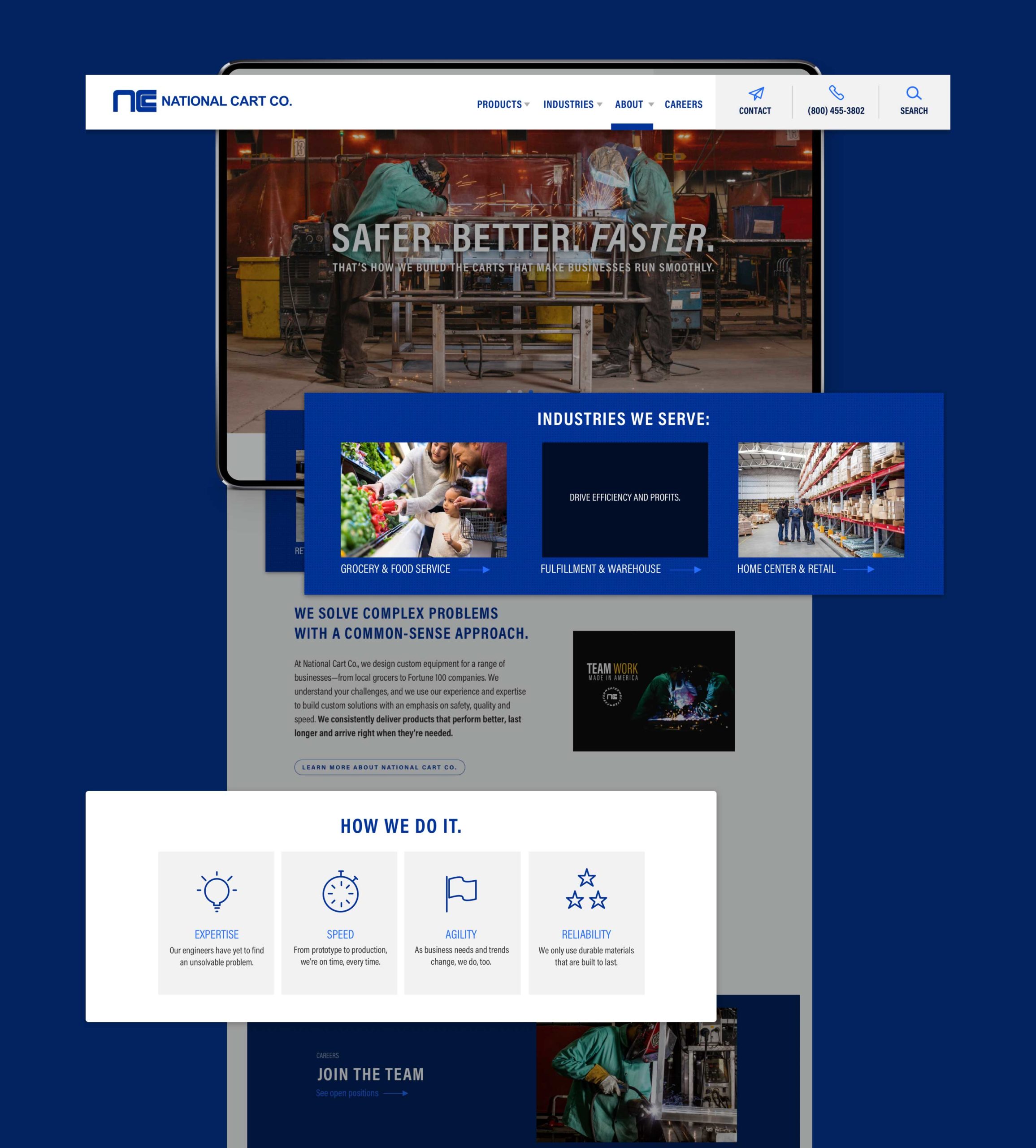
Image from National Cart Co.'s website design with a welder making a cart

Keeping commerce rolling.

National Cart Co. designs, manufactures and distributes material handling products and store fixtures for a range of businesses, from local grocers to national online retailers. Started in the founders’ garage in 1979, the business has evolved from cleaning and repairing shopping carts to producing custom and ready-made product racks, food service equipment, cart corrals, e-commerce picking carts and more.

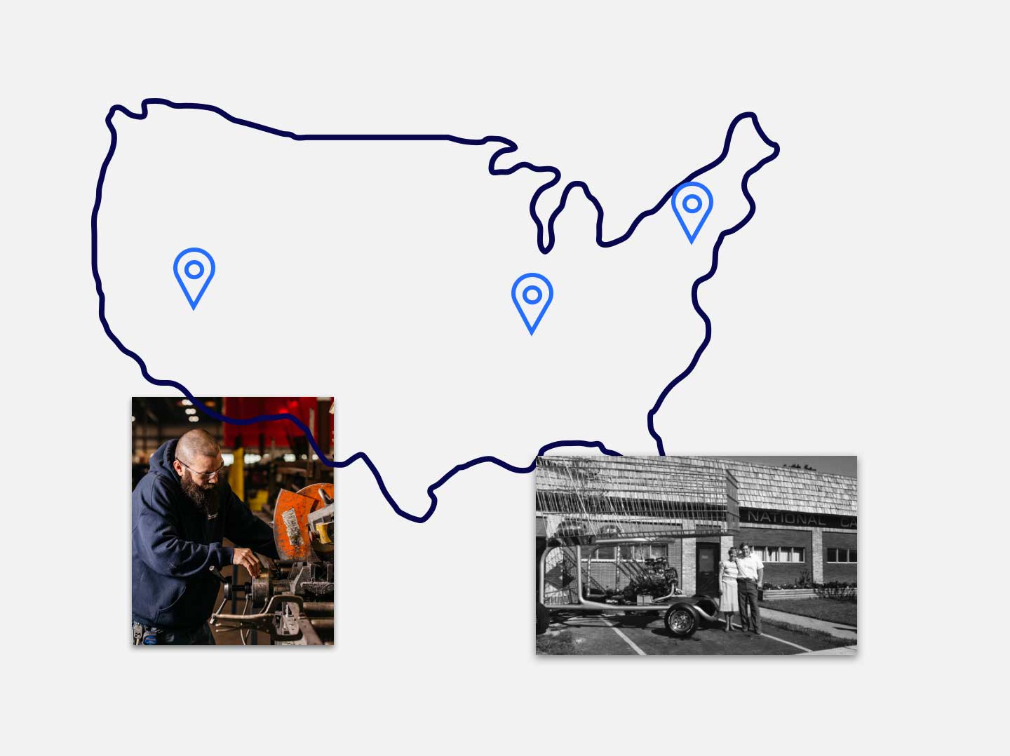
Map showing the locations of National Cart Co.

Clearing the way.

The old website was a tangle of products and pathways that often led visitors to dead ends. We streamlined the navigation and organized products by both type and industry, so those who know what they’re looking for can find it, and those who don’t—for example, an entrepreneur preparing to open a new store—can browse a variety of relevant options.


From a visitor’s perspective, the website design doesn’t seem very intricate. That’s thanks to the site hierarchy and tags used on the back end, allowing products to show in multiple places without the need for duplicate content. The new system lets the National Cart team easily add new products and connect them to related merchandise and blog posts, eliminating dead ends and ensuring visitors can keep exploring the site.
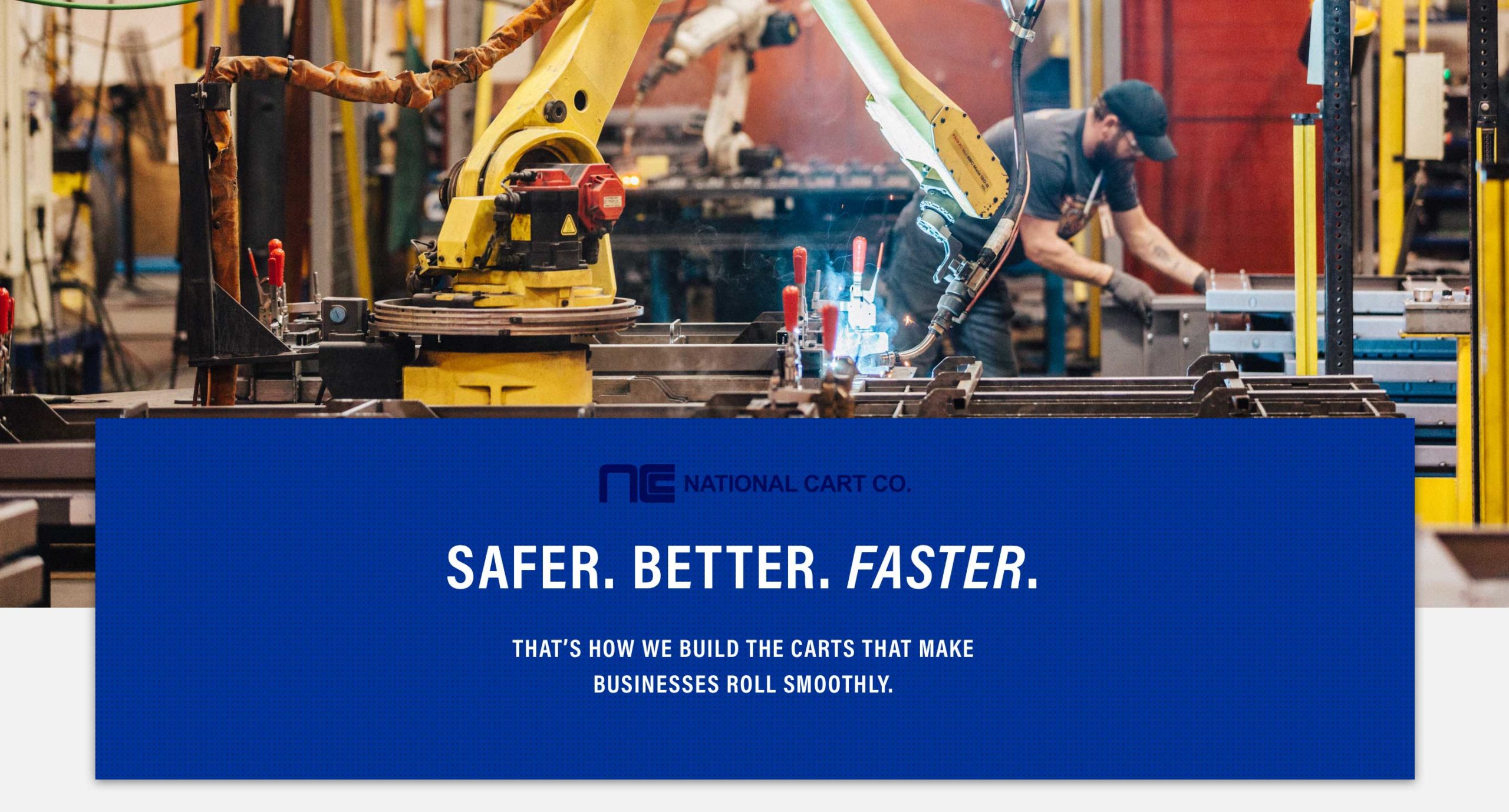
Elements of the National Cart Co. web design's homepage

Easy on the eyes.

We kept the site’s design consistent with the brand’s utilitarian nature. New iconography reinforces important product features, and accordion dropdowns keep information organized and pages uncluttered. We also shot custom photography at one of National Cart’s manufacturing facilities to refresh some of the website’s imagery.

Icons from the National Cart Co. website design to illustrate product features
National Cart Co. brand colors
A lead generation form on the National Cart website is auto-populated with product information

The right information.

Customers don’t make purchases directly through the site. Instead, we coded the call to action button on each product page to open a pop-up form that’s pre-populated with the product name. This helps National Cart’s sales team get a sense of the customer’s needs right off the bat.

On a roll.

National Cart’s team has already updated the site to feature new products and meet the needs of their customers. With an adaptable website that’s easy to use, the company can continue to fulfill its mission of helping businesses run smoothly.

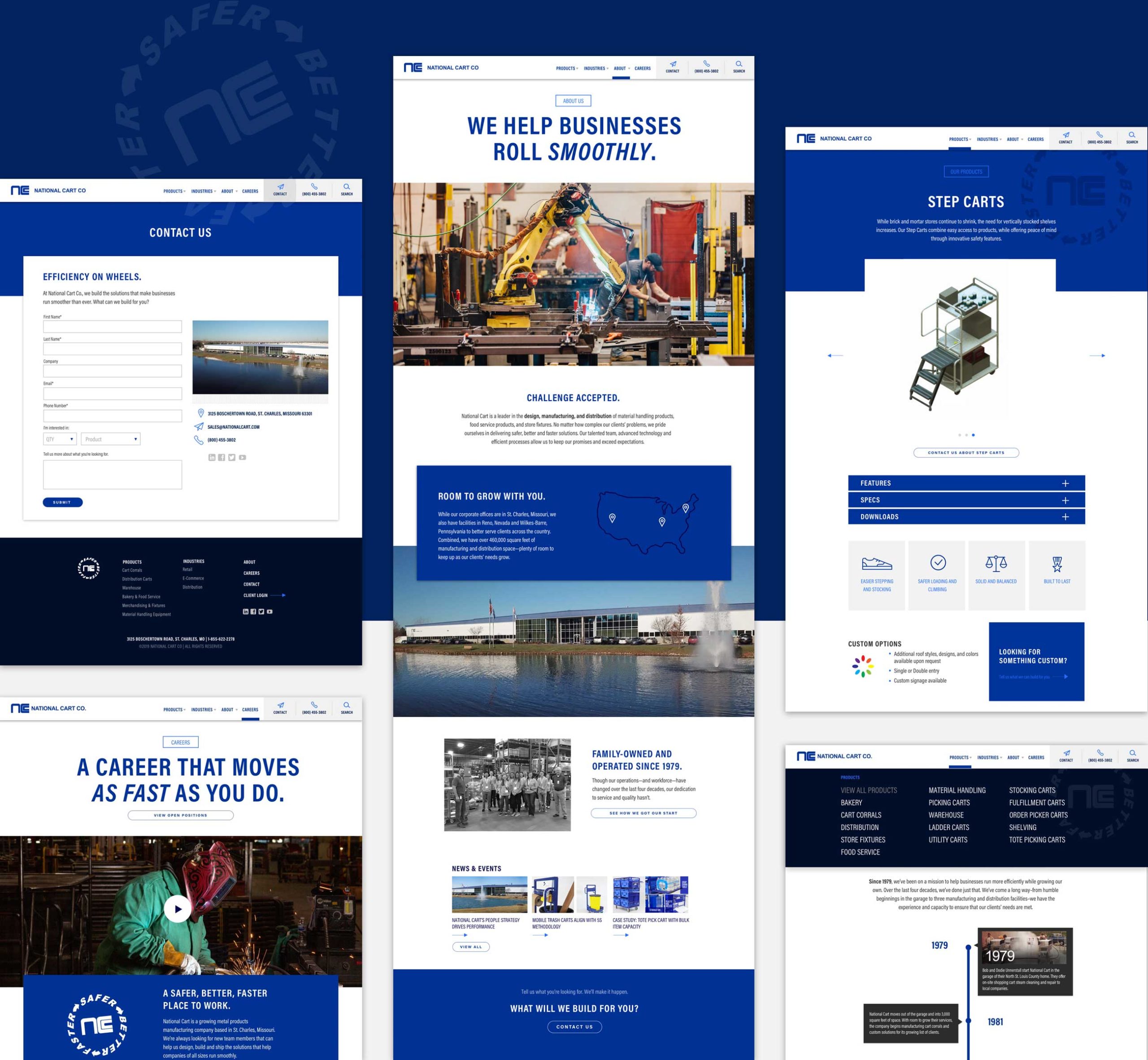
Page examples from National Cart Co.'s website design