Mercy


Mercy operates hospitals, clinics and outpatient facilities across four states, serving millions of patients each year. The organization was in the middle of a website redesign project when they hit a roadblock, so they asked Atomicdust to build a homepage that would improve the user experience and increase conversions.
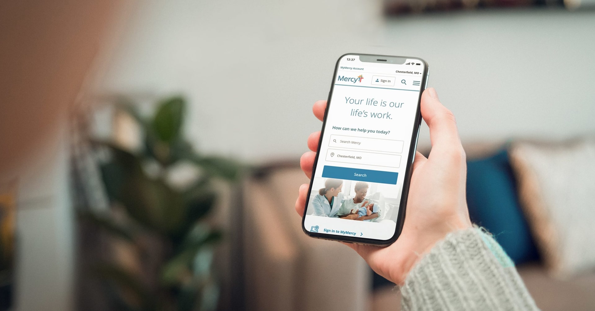
Mercy website design mobile responsiveness on a smartphone

Identifying a need.

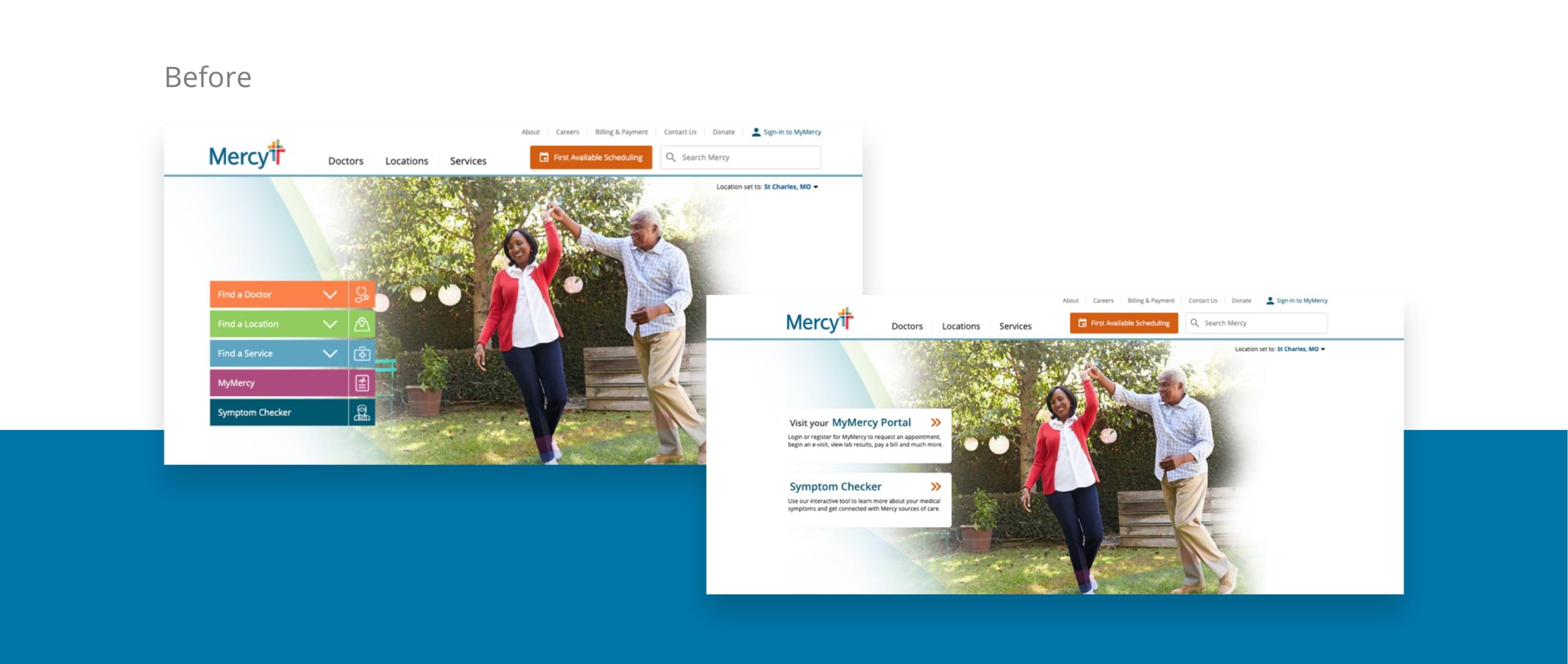
The healthcare system had grown, and its homepage along with it. Competing calls to action and an overwhelming amount of information confused users. They needed a simpler page to guide visitors down one of three paths: find a doctor, find a location and find a service. Aesthetically, the new homepage design also needed to fit seamlessly with Mercy’s evolved brand standards, already present on internal pages that their team had designed.

The old version of Mercy's website
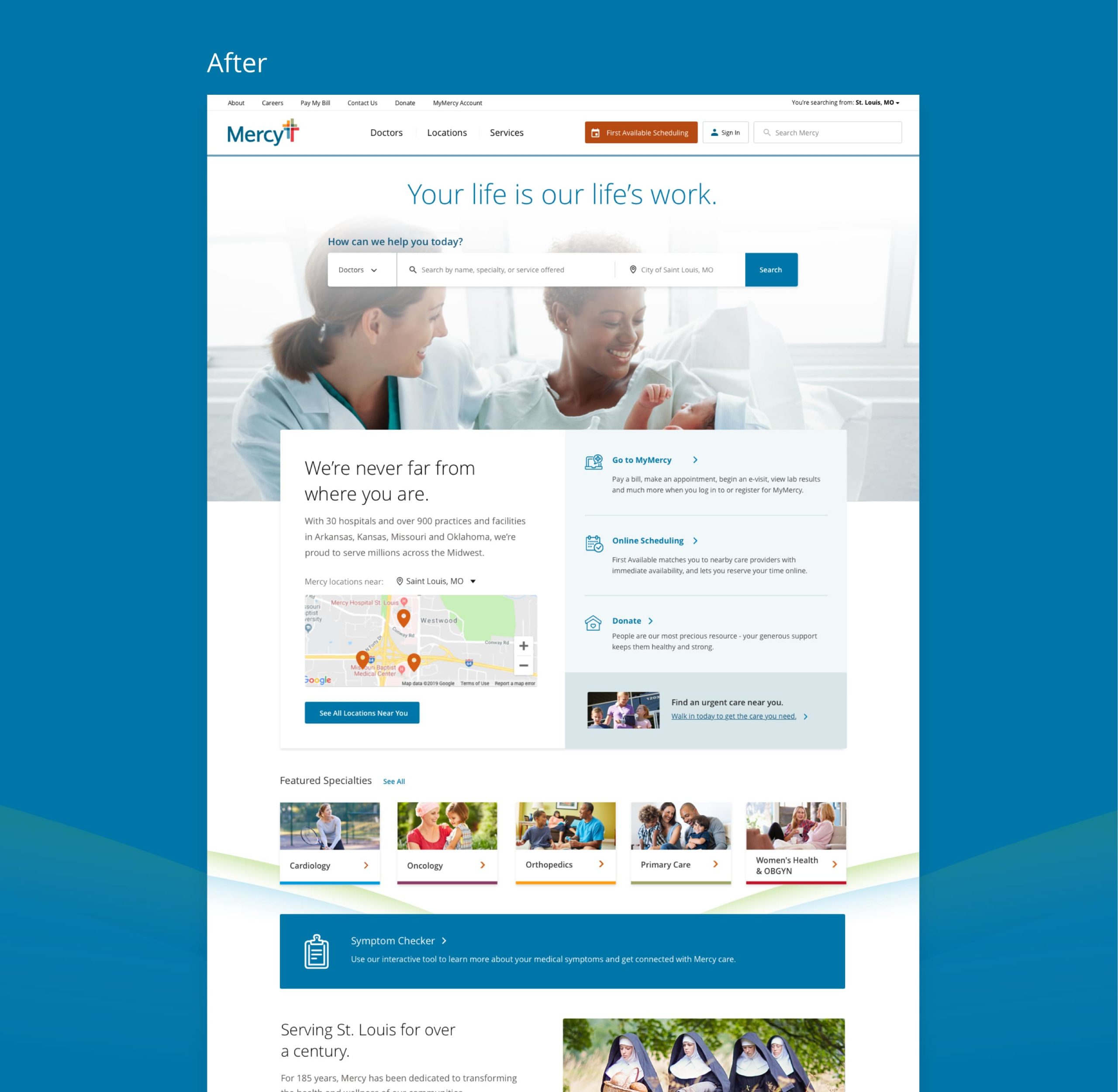
New website design and search function for Mercy

The search is on.

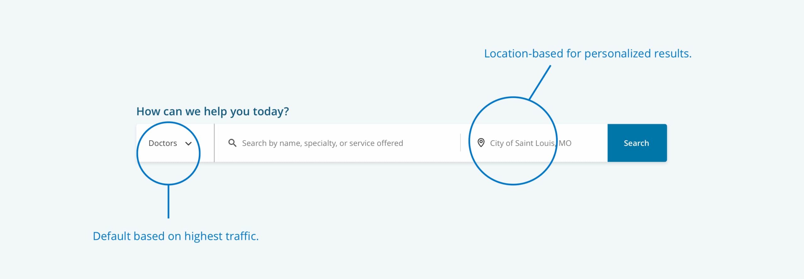
To improve the user experience, we needed to address the page’s search functionality. We eliminated the various call to action buttons and instead created a streamlined search bar. Users choose what they’re looking for from the drop-down menu (doctor, location or service) before entering their query. To make the process even easier and provide the most convenient search results, the user’s city or zip code is auto filled when they give permission to share their location. The outcome: more accurate search results in fewer steps.

The new search function on Mercy's homepage design

Putting the focus on the patient.

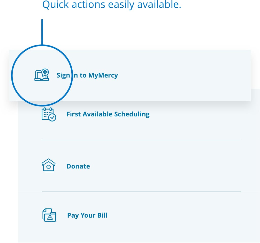
We took the most commonly used and requested feature—finding a provider—and put it up front. But for visitors who prefer to use the site differently, we made those features easy to use and find, too. Users can easily view nearby facilities and view commonly accessed specialties, along with any late-breaking news that might affect care. Everything on Mercy’s new homepage also follows the latest best practices for accessibility, ensuring all patients can benefit from the design and find the information they need.

Quick actions on Mercy's website
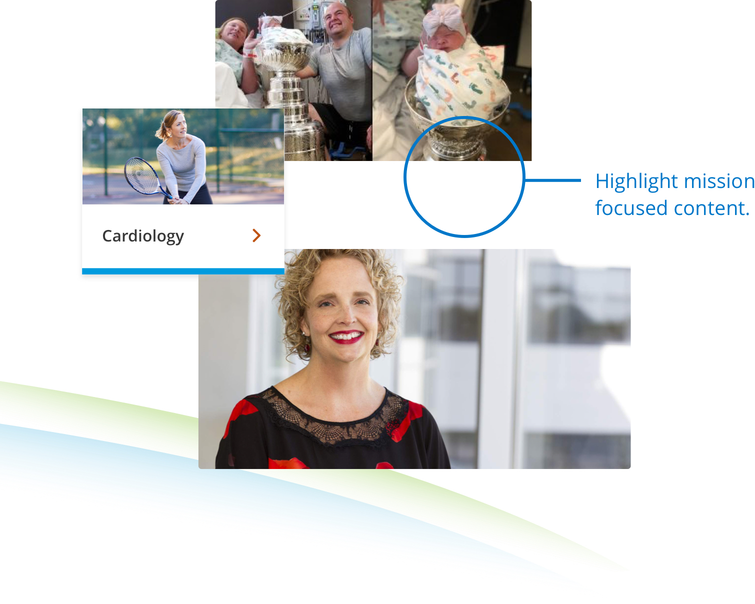
Links to specialties and content on Mercy's website design

Letting the mission shine.

The recently launched homepage, in concert with the rest of Mercy’s redesigned website, aligns the user experience with the organization’s mission: to transform the health and wellness of their communities. We are proud to have helped them bring this mission to more people by making the page more user-friendly, accessible and beautiful than ever.