Lawrence Group


Lawrence Group came to Atomicdust with a culture and approach that was different from their competitors in the architecture, design and development industries. They looked to us to help them express their values and personality with a new website design—one that would also help them increase their presence on the national stage.
Putting people first.

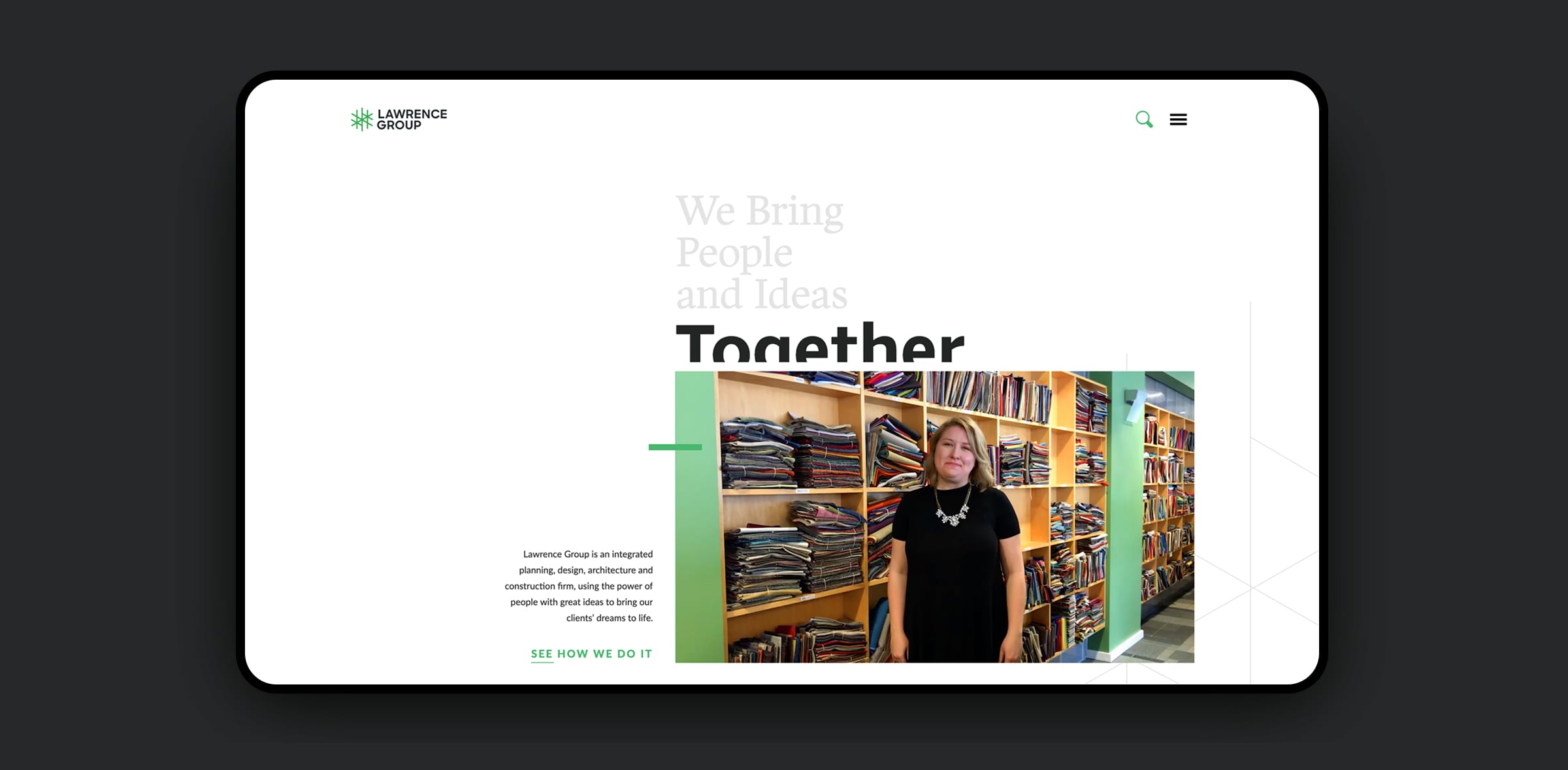
We captured striking, moving portraits to serve as the hero images on the homepage – these are the talented and passionate people who have created Lawrence Group’s renowned culture. The short video vignettes bring unexpected motion to the homepage and provide insight into the firm. The personal vulnerability establishes instant trust, an important factor for someone hiring a professional services company.

Lawrence Group Homepage

Staying on message.

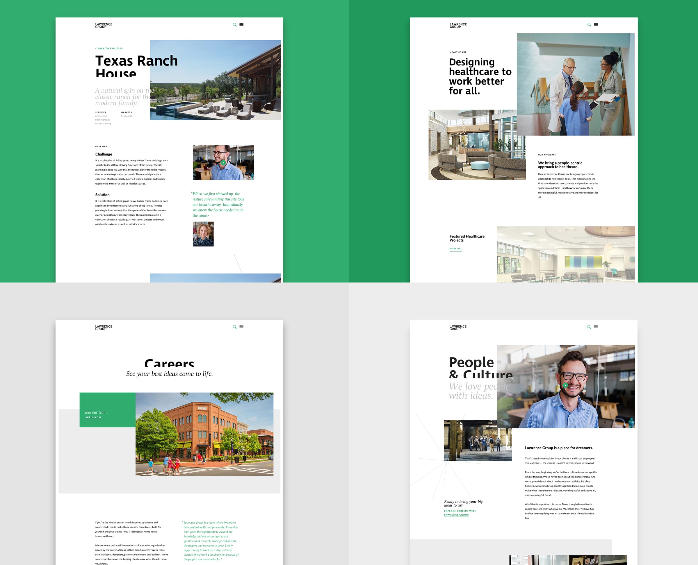
The website’s copy also highlights the firm’s personal, hands-on approach. Rather than focusing on technical details that may not differentiate each project, messaging illuminated Lawrence Group’s holistic approach in creating spaces around how people will actually use them. It’s a message that specs like square footage can’t capture.

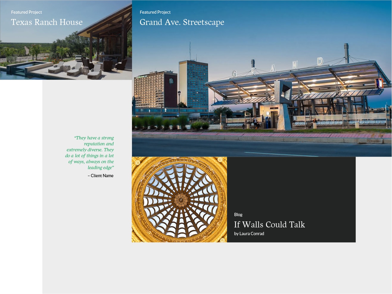
Lawrence Group Website Templates

Organized chaos.

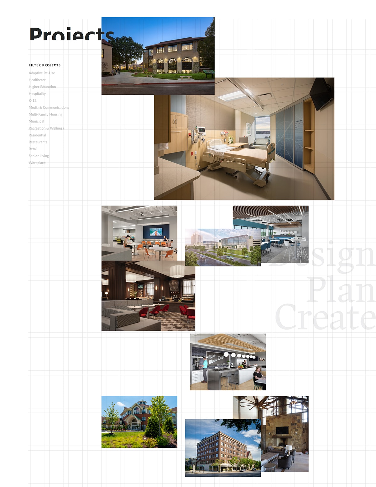
Architects love grids, but we found a way to step away from the convention. The resulting page adds life to the browsing experience, with projects scattered and overlapping but in an orderly, digestible way. From there, visitors can filter projects of interest – and dive into the details. Individual pages feature flexible content that can mix videos, client testimonials and photos.

Lawrence Group Grid Structure
Lawrence Group Projects Grid

Staying up to date.

Of course, we understood from the beginning that an architecture firm’s reputation often rests on its most recent projects. We made it easy for Lawrence Group’s internal teams to add projects and edit content. We also gave them the freedom to feature projects throughout the site and send prospects directly to individual pages.

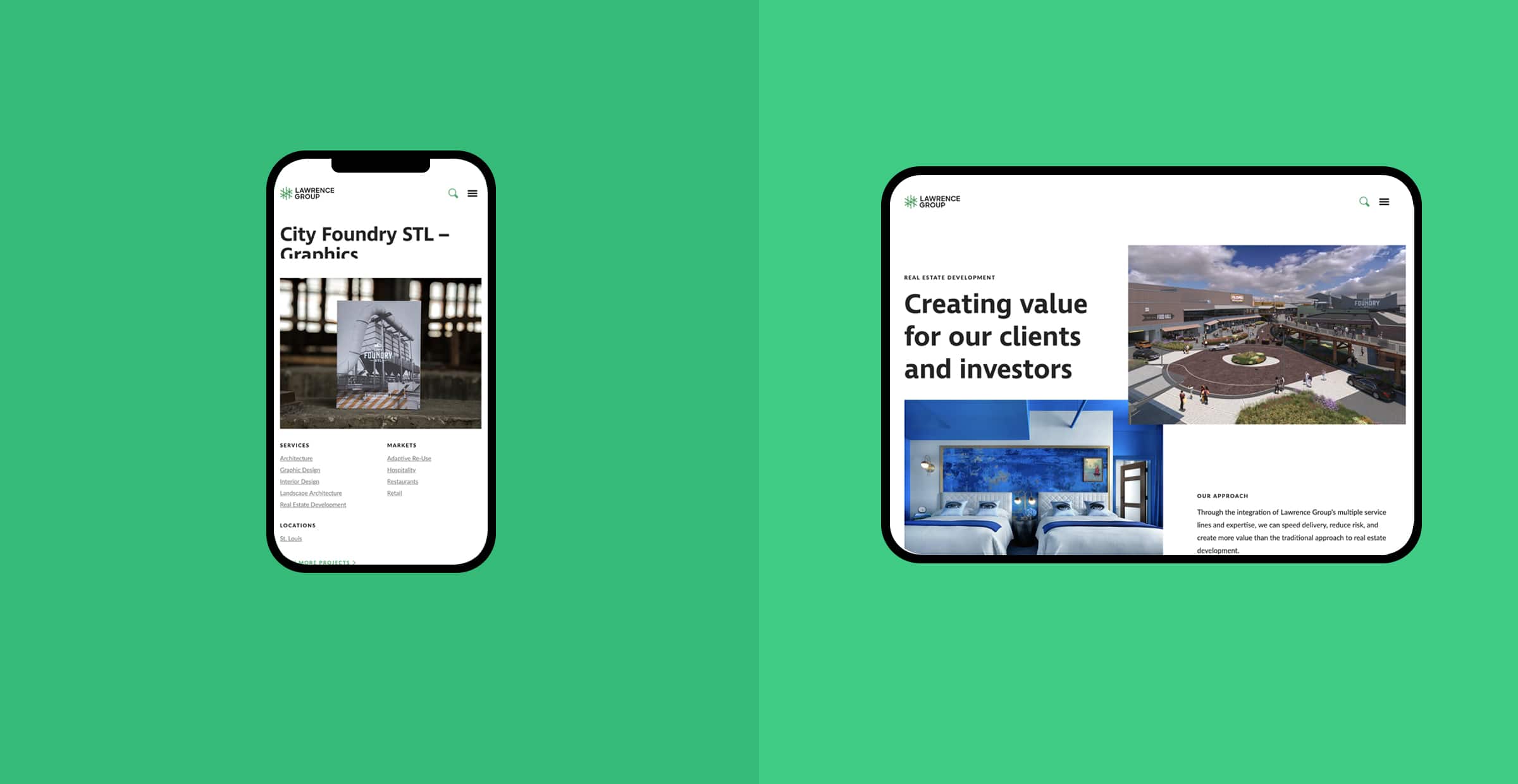
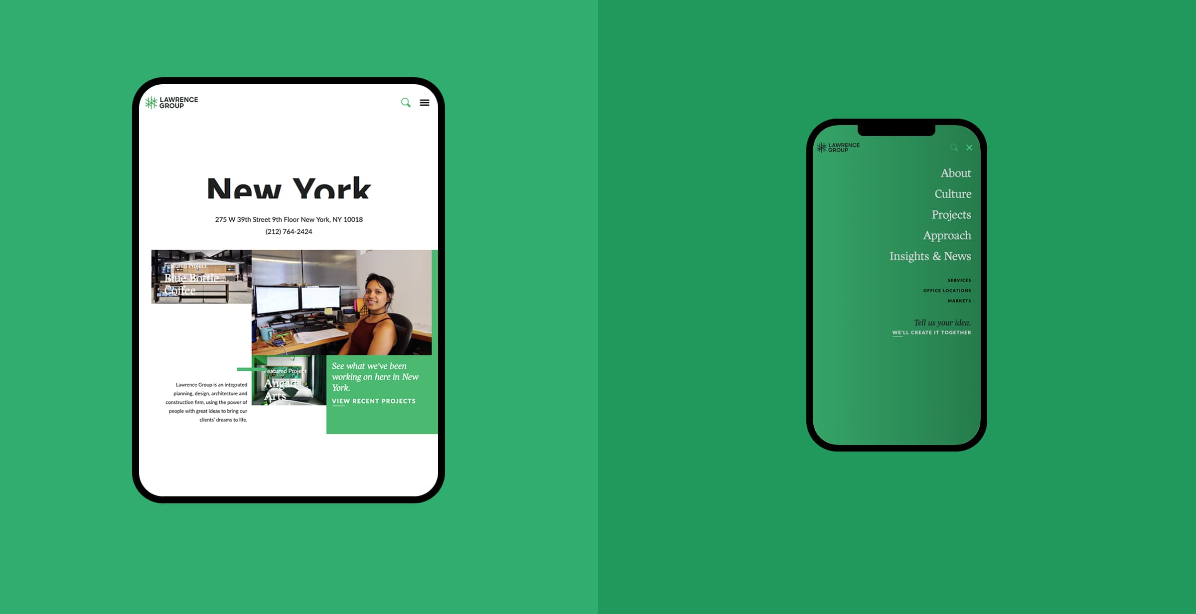
Lawrence Group Responsive