Making a Mark
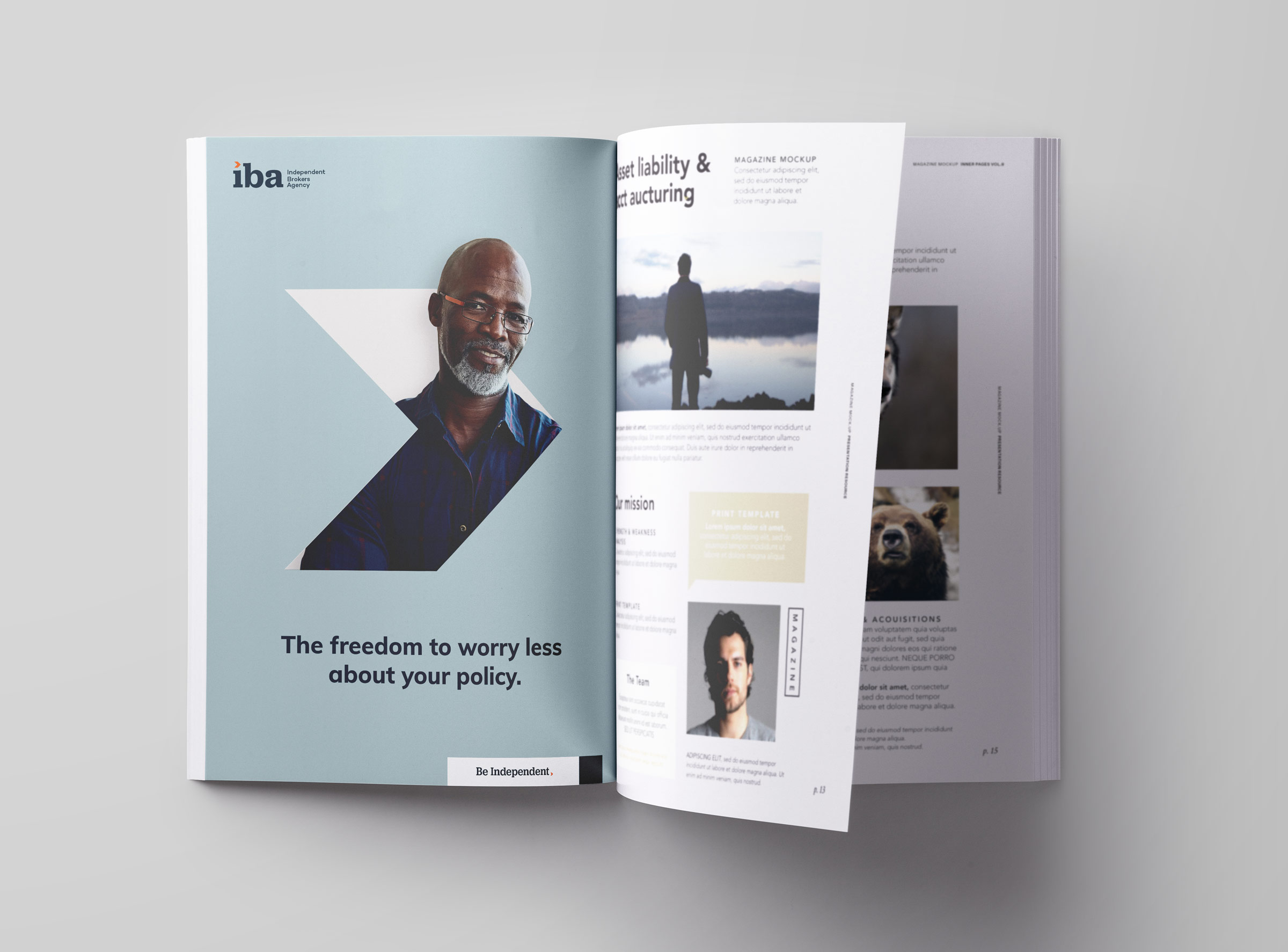
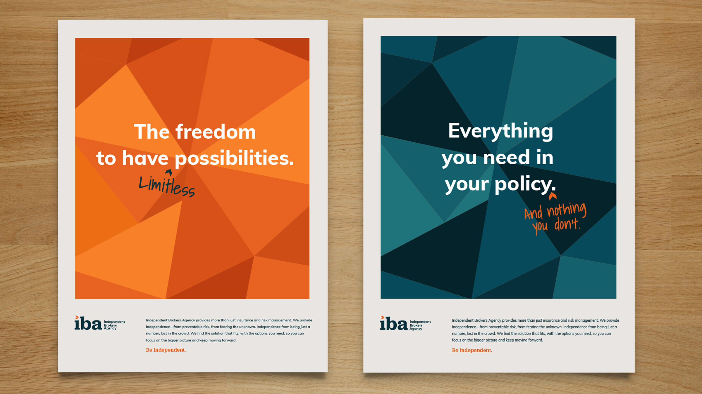
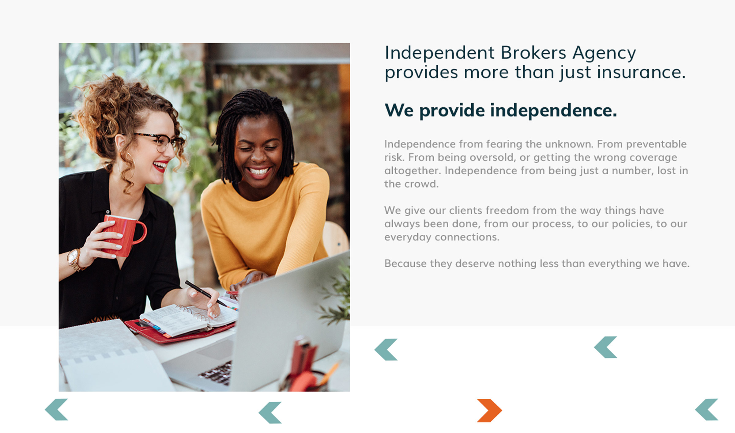
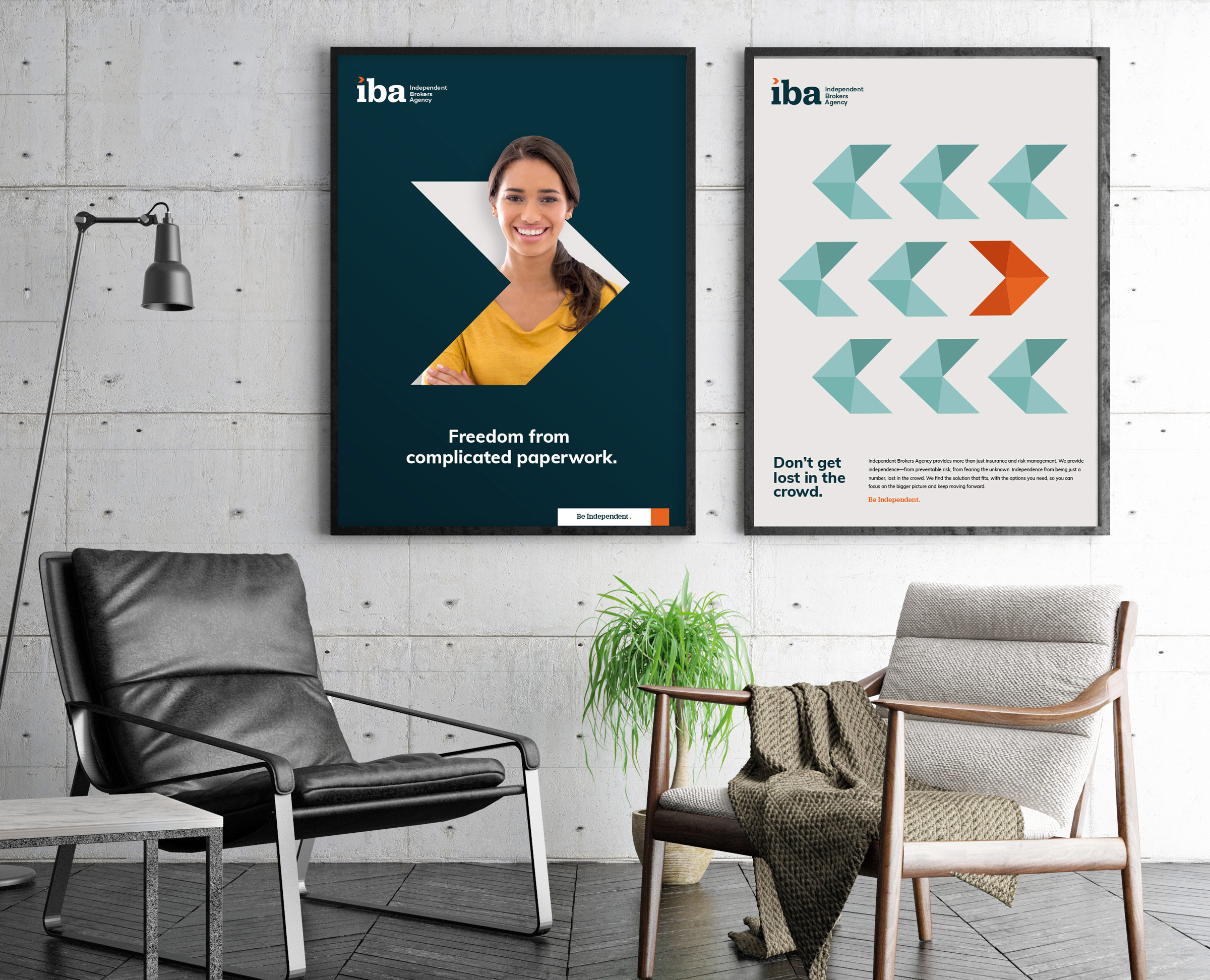
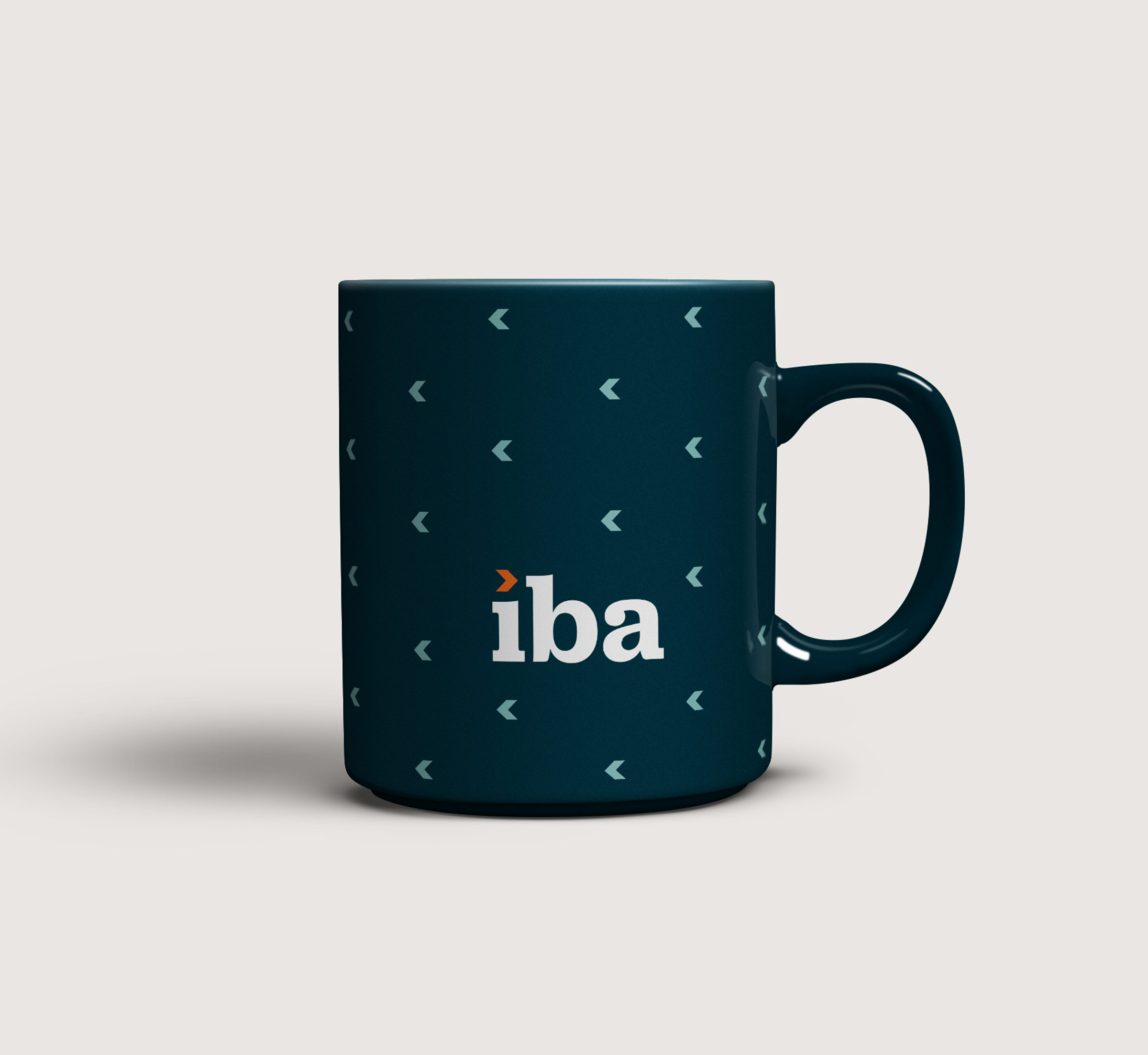
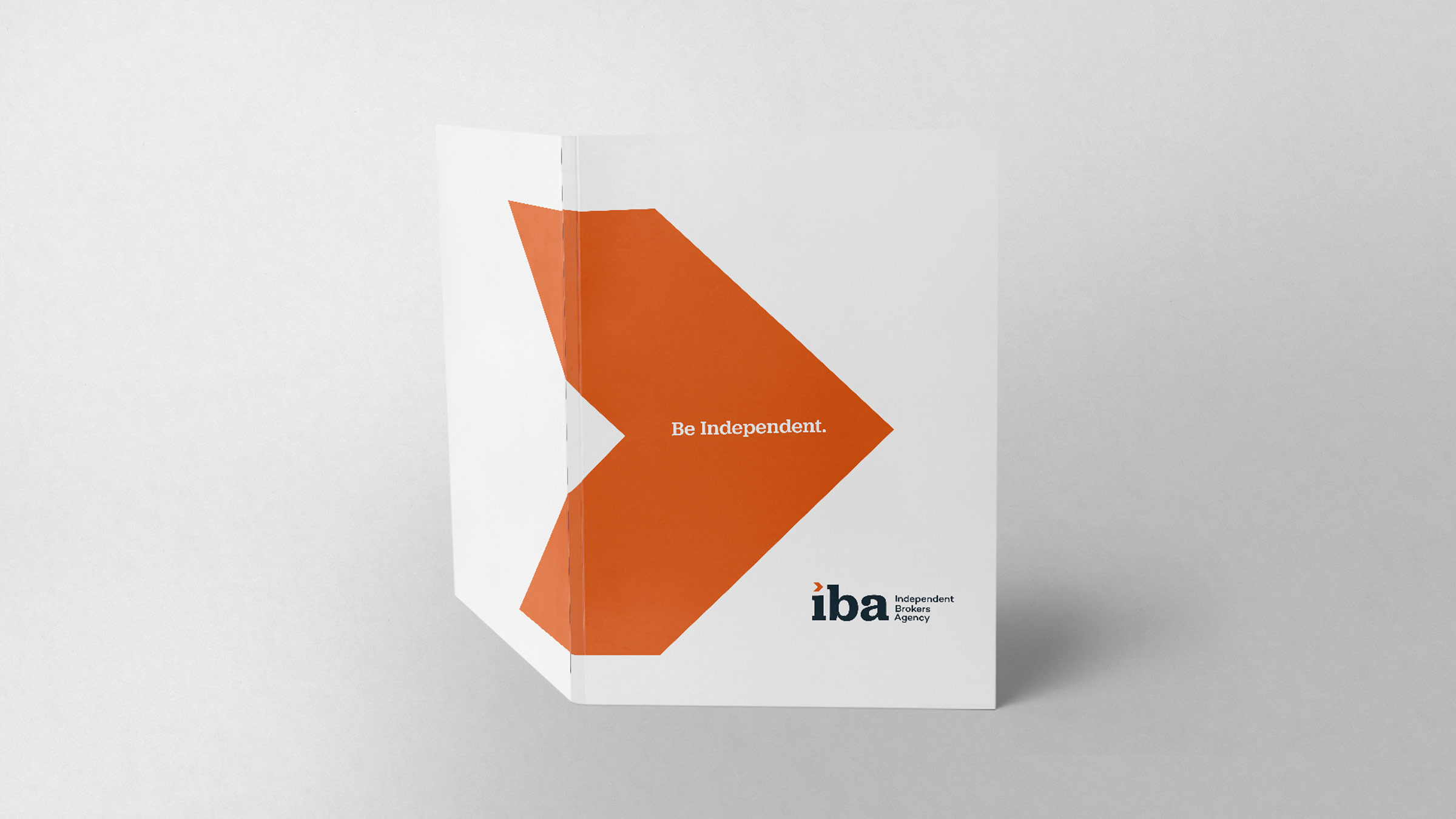
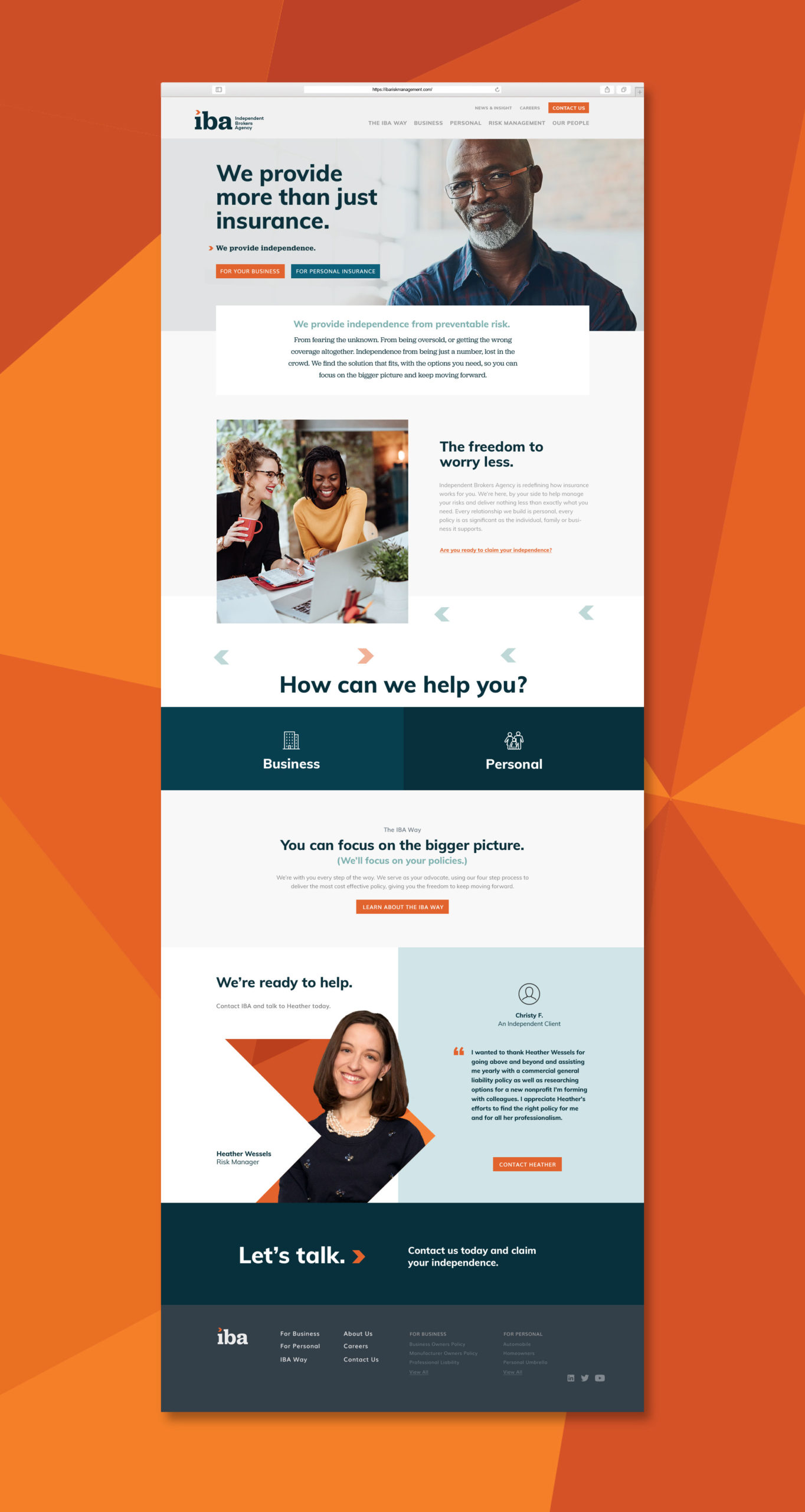
Independent Brokers Agency needed an identity and logo that were modern, recognizable and most importantly, relatable. We started with our treatment of their name, shortening it down to its initials for quick recognition and a compact design. We used a bright orange arrow as the dot over the “I” to symbolize the guidance IBA provides their clients throughout the process. This mark works both with the logo and independently, serving as an extension of the brand. We also put a strong focus on the human element of their business, putting the client front and center in our messages and approach to sales collateral, print ads and a new, easily navigable website.

