Branding / Website Design
Encore
Encore offers an elevated, lifestyle-focused living experience—we gave this unique residential property a brand identity to match.
Encore offers an elevated, lifestyle-focused living experience—we gave this unique residential property a brand identity to match.
Constructed by the same developers that brought the Cortona to St. Louis, the new Encore building needed an identity that would visually compliment its sister building’s, but also set itself apart with a focus on artistic expression and stylish details.

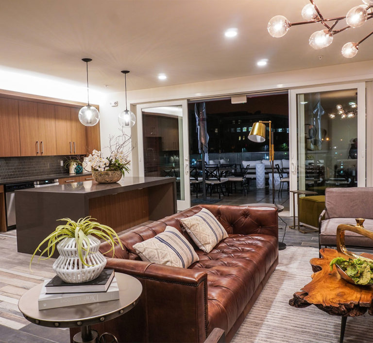
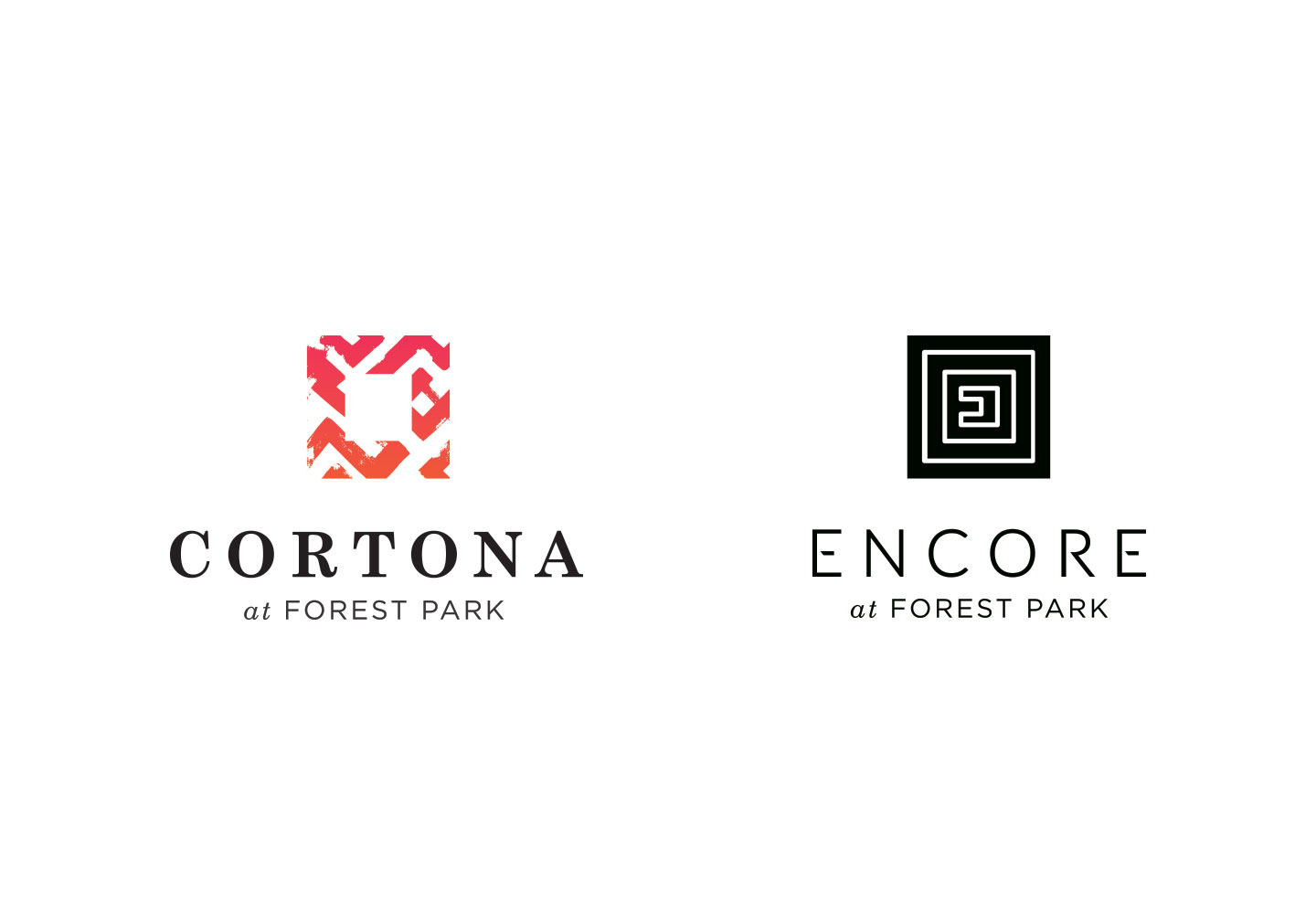
We created a unique letterform with the “E” in the name, and used that as the base of the logo. As we did with Cortona, we used the square shape, and incorporated the active, expressive nature at the core of the Encore experience in the center of the logo.
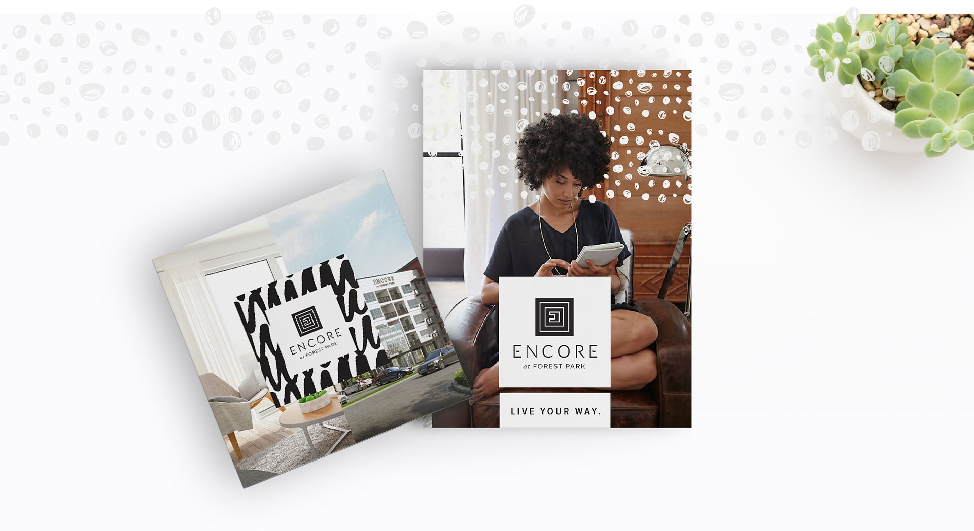
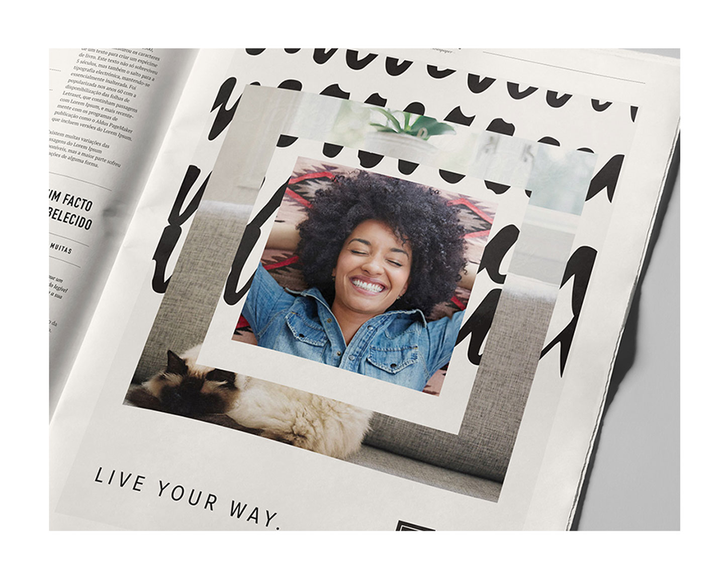
We focused on the ideal lifestyle of the tenant—what did Encore offer them that other apartments can’t? Encore offers a customized residential experience. Rich in amenities, with a range of ways to personalize one’s space, Encore’s focus is to help residents live the life they’ve always wanted. “Live Your Way” became our platform.
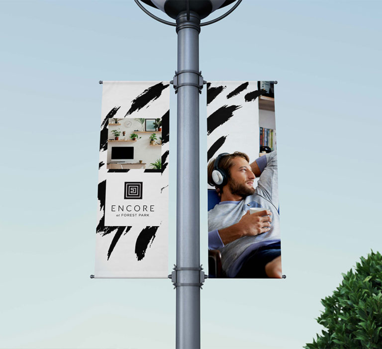
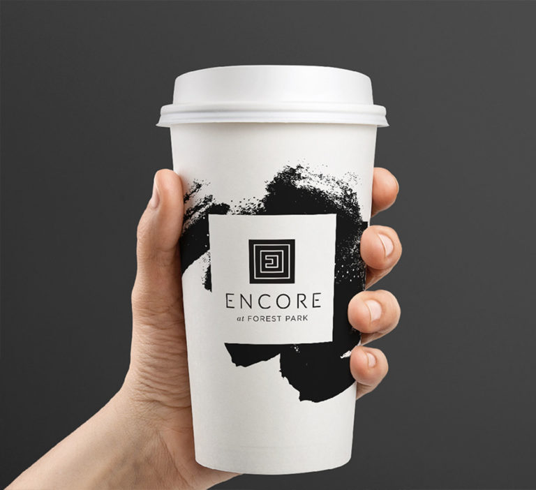
The idea of personal goals and satisfaction provided inspiration for key visual elements throughout the brand. Hand-painted brush strokes show that the experience at Encore is full of energy, art and personal touches. We paired them with imagery that depicted the life at the Encore – bright, carefree, and whatever you want it to be.
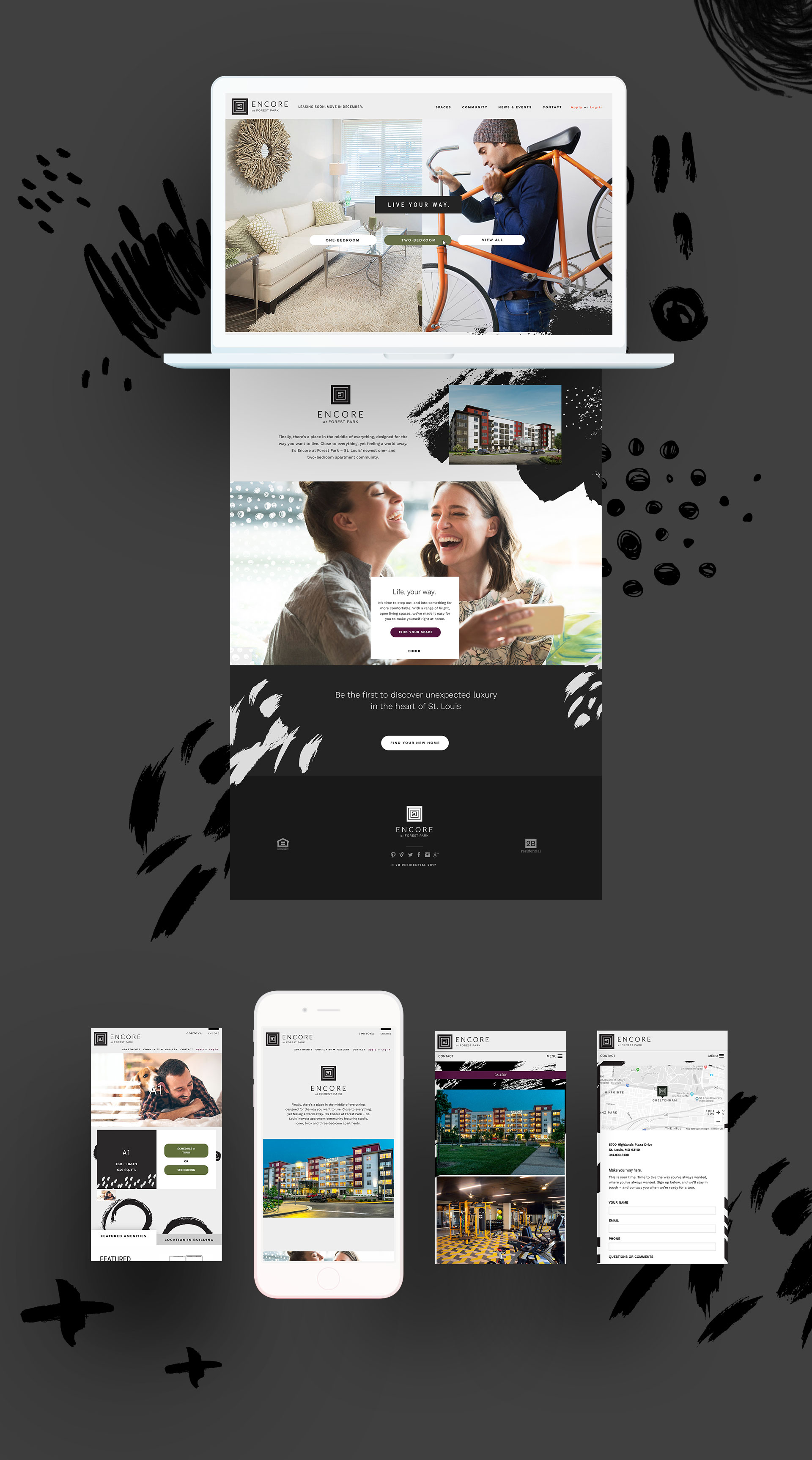
Encore’s mobile-friendly website takes all of these ideas and makes them actionable. The site is built for realistic exploration, with button-based calls to action that lead people to the information they need: finding the right size apartment, exploring the neighborhood, or, for current residents, paying the rent.