Finding the Story: Atomicdust Creates a New Website for United Way of Greater St. Louis
The challenge was clear when we started planning the United Way of Greater St. Louis’s new website: for an organization with enormous name recognition, United Way can be hard for the average person to describe.
In a nutshell, United Way of Greater St. Louis partners with nearly 200 local agencies to assist one in three people in the region. Simple? Sure. But that short, sweet description barely scratches the surface. To help people understand the United Way and inspire them to get involved, we needed to center the site on the organization’s real, human impact. We discovered that United Way’s work is best expressed through the incredible stories of people involved in or helped by its programs and partner agencies. And the first story we wanted to tell? Yours.

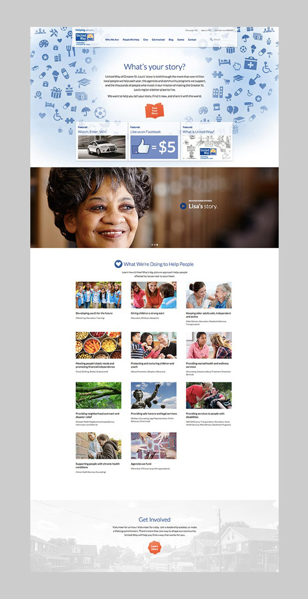
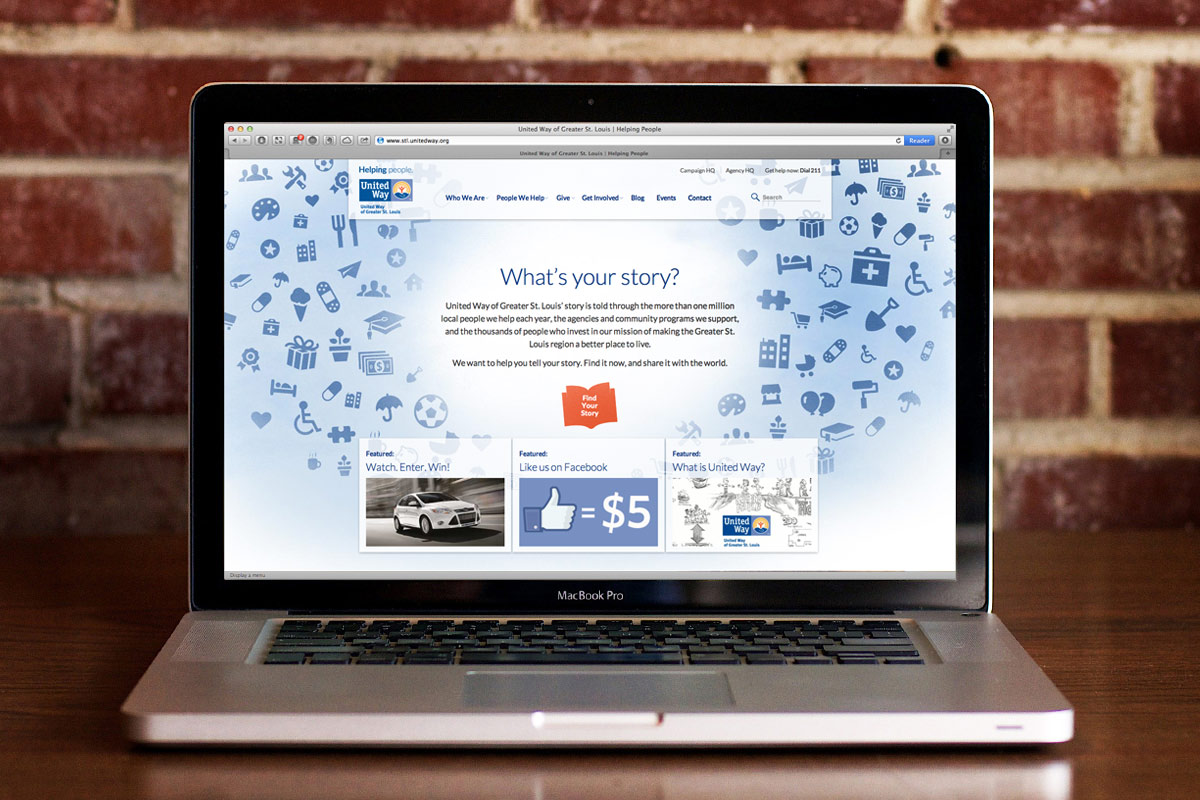
“What’s Your Story?” is a personalized interactive piece that asks visitors about themselves, their community and the causes they care about. It’s a fun, engaging activity that answers the big questions: “What is the United Way of Greater St. Louis, and how does it affect me?” Throughout the process, the piece weaves in facts about the organization’s efforts and its impact in the region.
When users choose issues they care about (poverty, heart disease, education, hunger, etc.), personalized links populate at the bottom of the page that connect them to more information about the selected causes, including relevant volunteer opportunities, blog posts, and events.

Once the “What’s Your Story?” activity has been completed, the site generates a personalized graphic that can be posted to Facebook. Visitors can also share a link to the activity through Twitter or email to encourage friends to find their own stories. Because the piece “talks back” to visitors, it makes them feel personally invested in the United Way’s mission and inspired to take action.
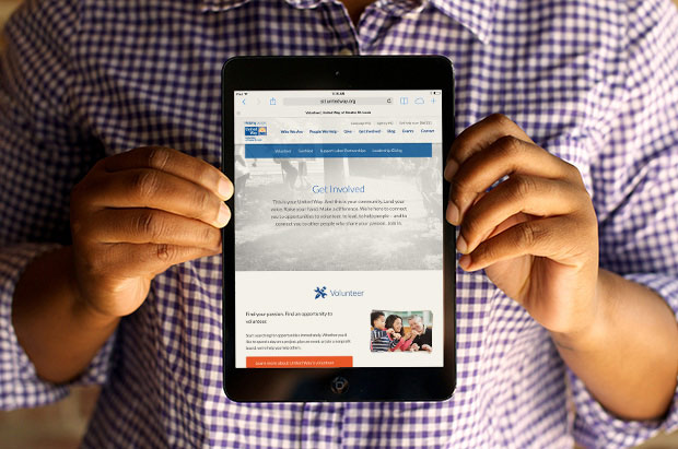
When it came to the site’s design, we weren’t humble in our ambitions: we wanted to give St. Louis the best United Way chapter site in the country. Our approach balances a cheerful visual tone with the site’s complex navigation structure and content. With so many audiences, programs and stories, the old site had a lot to say and a hard time keeping it organized. Open communication with the client helped us get the architecture right so that external visitors and internal staff members would never feel lost or overwhelmed.

Throughout it all, we were driven by our passion for the United Way’s mission. The more we learned, the harder we worked to get it right. And the rewards were always bigger than the challenges. One of our developers admitted that it was hard not to shed a tear or two during playback testing for the homepage’s “Featured Stories” videos, made by our friends at rukus. We learned that there’s not just “room for emotion” when it comes to the work we do – emotion can inspire us to push boundaries and solve problems more creatively.
Visit the new site to see how all the communication and emotion work together for the United Way of Greater St. Louis.

