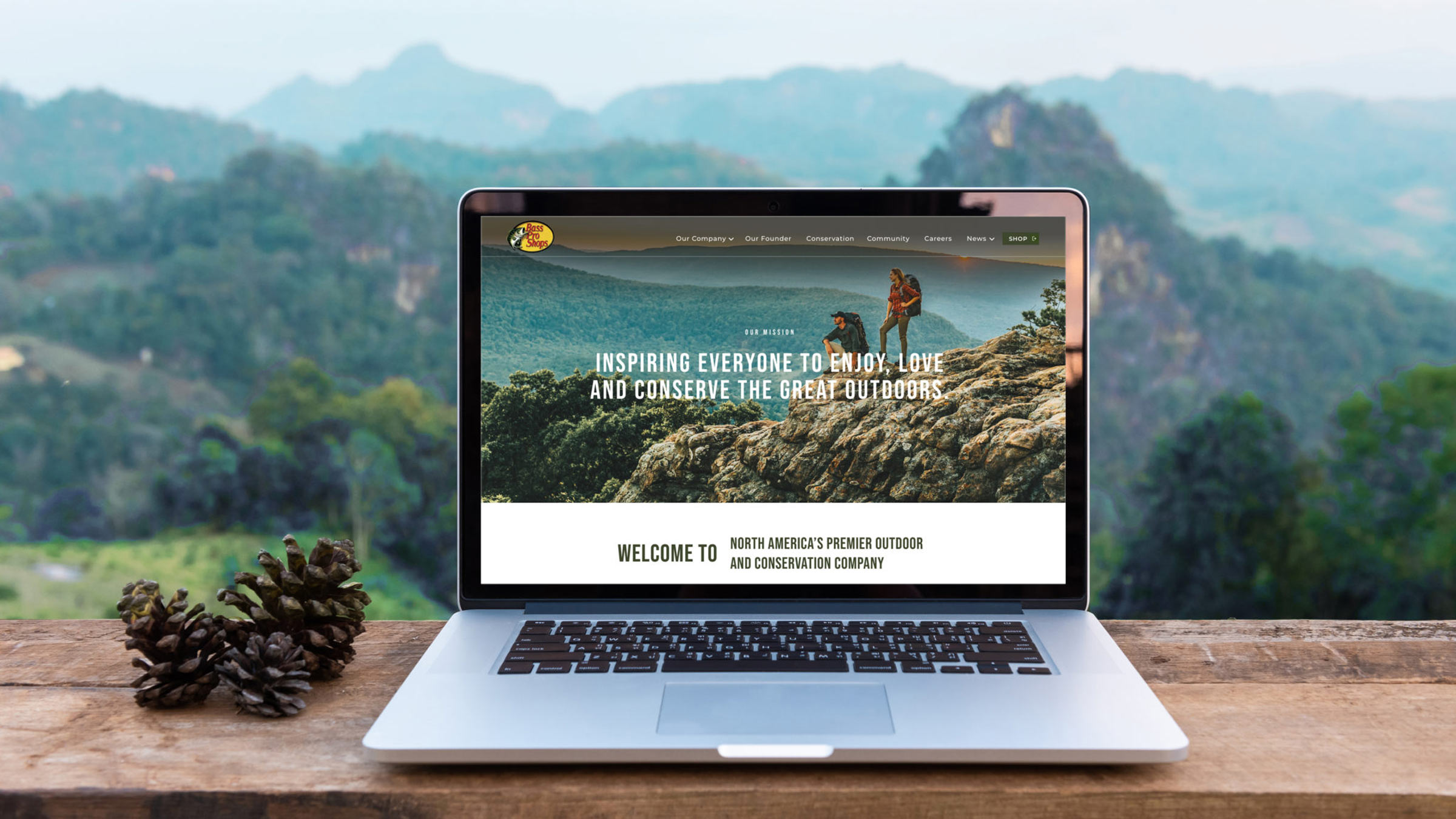
Call of the Wild: Website Design for Bass Pro Shops
Last year, we got a call from Bass Pro Shops.
As you probably know, Bass Pro Shops is an outdoor retail company with locations across the U.S. and Canada. Headquartered in Springfield, Missouri, Bass Pro and Cabela’s stores are mammoth in size, featuring immersive, interactive displays tailored to each location’s unique natural landscape.
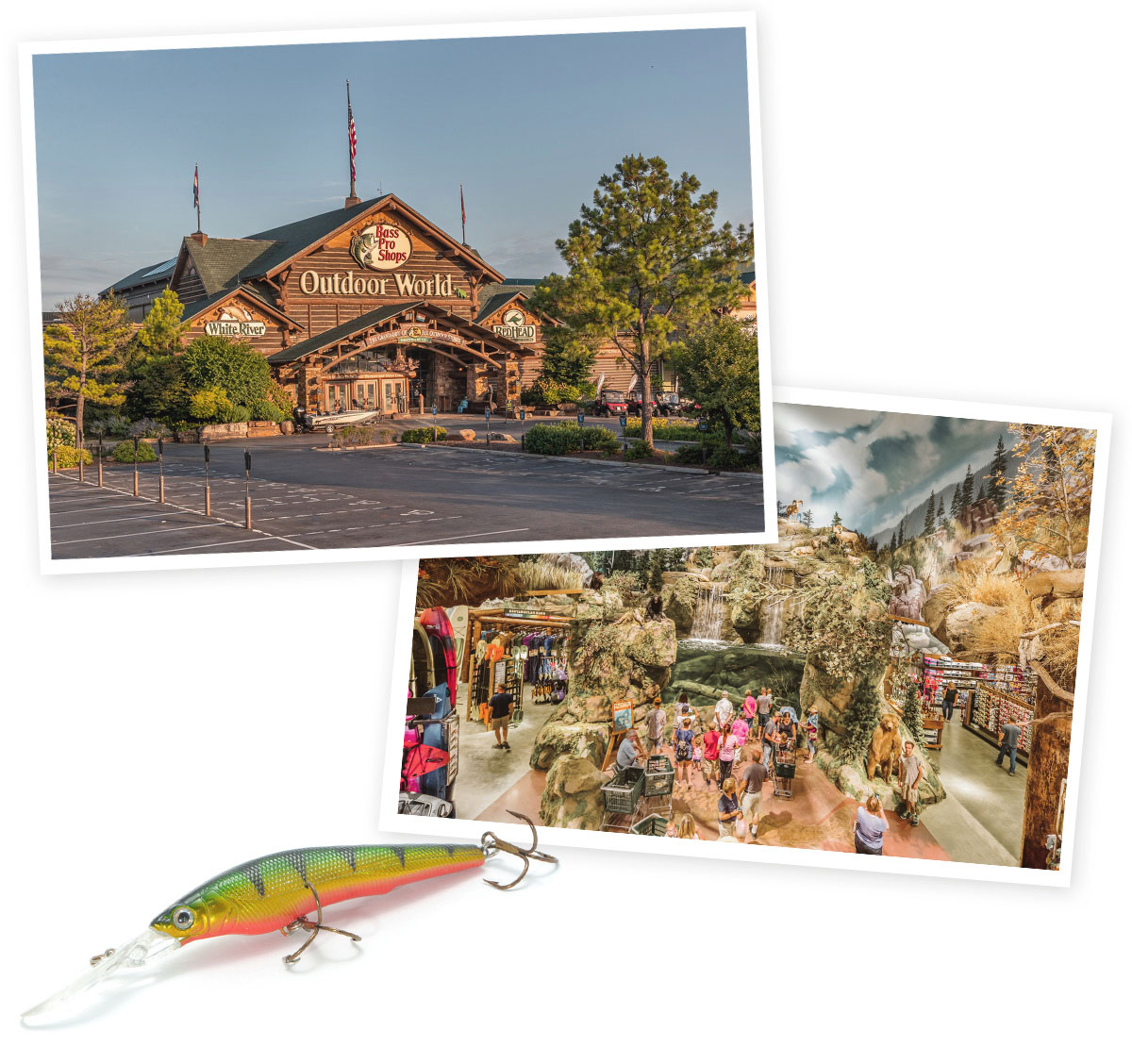
On top of being your go-to brand for outdoor gear and apparel, Bass Pro Shops and Cabela’s, led by founder Johnny Morris, are leading North America’s largest conservation movement and making a significant impact on the future of the outdoors—helping everyone from military veterans to families and kids in urban areas enjoy the great outdoors.
Online, however, messaging about Bass Pro Shops’ conservation and community programs was lost on the company’s website.
That’s where we came in.
Answering the call.
Bass Pro Shops reached out, asking if we could create brand pages for basspro.com that would encompass all of the site’s non-commerce-related content—including the company’s history and mission, press releases and blog posts, and even employee recruitment for its retail stores, resorts and Springfield headquarters.
Beyond just housing the content, the Bass Pro team told us they were looking to elevate the brand with this unified platform, telling the retailer’s story both from a mile-high overview and at a more granular level.
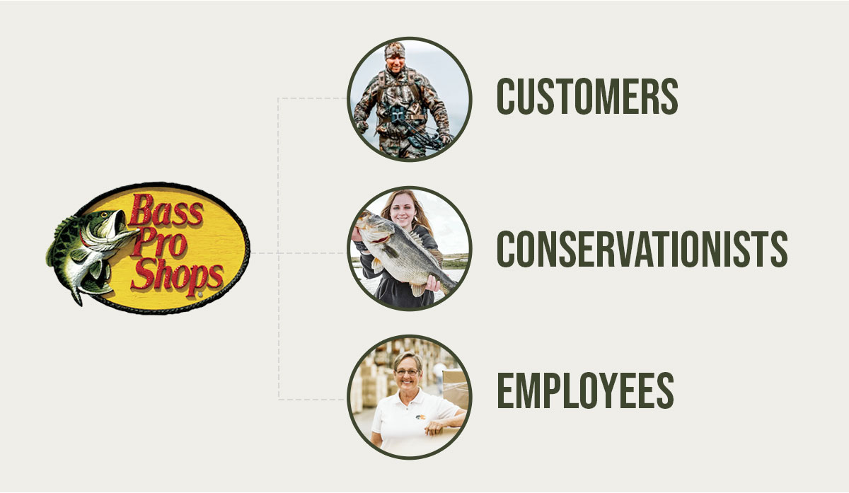
Oh, and the section needed to help audiences connect with the brand and see why Bass Pro Shops matters to conservationists, customers and employees.
We were thrilled to take on such a big website design project with household names like Bass Pro Shops and Cabela’s. But we needed to figure out how to make all the pieces come together—and fast.
Human-centered design.
I’m not a designer, but there’s a term I learned after joining Atomicdust that I love: human-centered design.
Basically, human-centered design means solving problems and designing products based on the needs of the people in your audience.
It’s not just about design that’s visually attractive or making something new for newness’ sake—but designing something that’s useful, intuitive and enjoyable to use. It starts by asking what the audience needs, what they care about, and what will help them, and ends with creating a product that makes their lives better.
With such a wide and diverse audience (loyal customers, new customers, conservation nonprofits applying for grants, reporters looking for information about Bass Pro Shops’ brands, prospective team members searching for jobs) designing the site using human-centered design would take some juggling.
Sign up for Atomicdust’s newsletter to get insights and projects delivered to your inbox.
But we also knew it could work.
Getting organized.
Often, especially with complex websites, the success of a website relies on something most visitors will never even think about: the sitemap.
Sitemaps set the foundation for the entire user experience—whether it’s intuitive and easy to navigate or makes visitors go in circles trying to find what they’re looking for.
The same thing was true for this project. We needed to take a ton of scattered content—tucked here and linked there on the existing Bass Pro Shops site—and organize it in a way that streamlines the user journey.
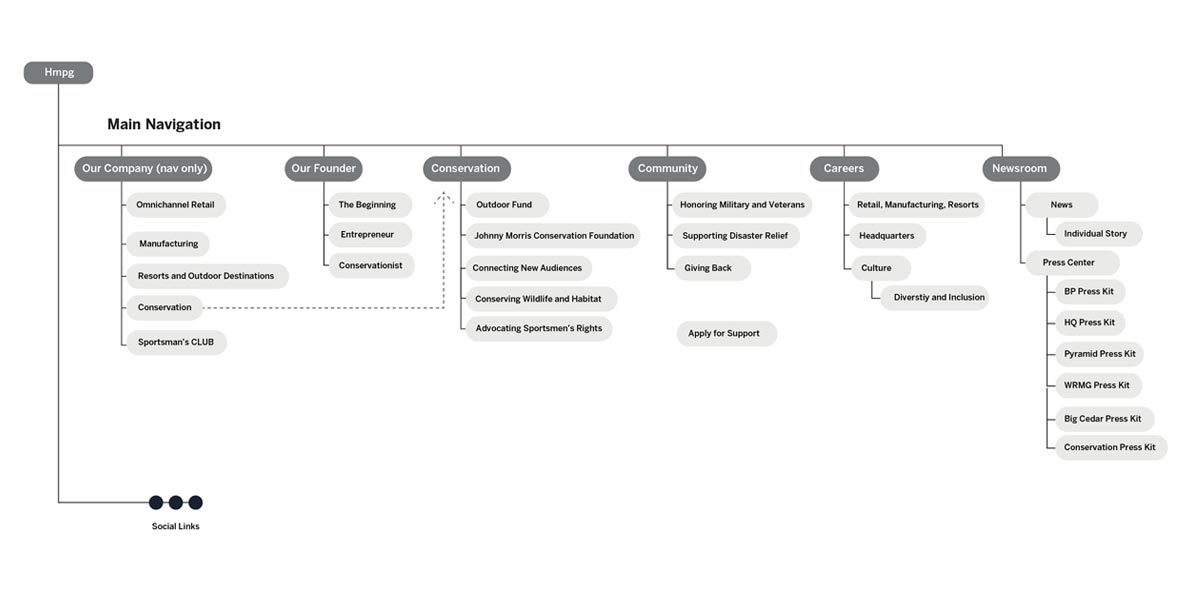
We locked ourselves in a room for a few hours (the world was still pre-pandemic at that point) to hammer out what the site map and brand pages would look like.
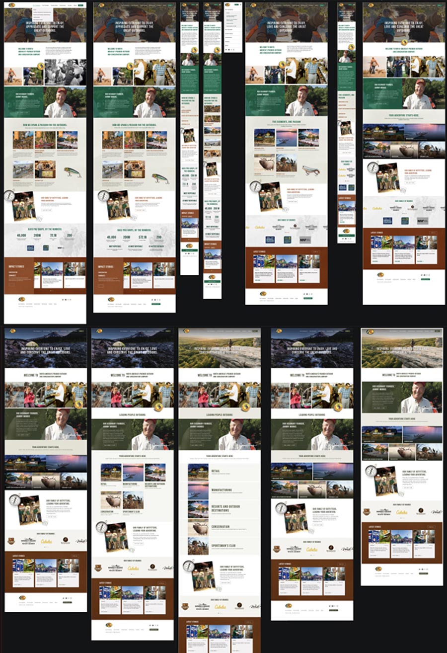
The menu breaks down the content into prominent sections, based on who’s visiting the site and what information they’re looking for. Main pages give a birds-eye view of the company, and subpages offer up more details as visitors travel through.
See more of Atomicdust’s website design projects.

More than meets the eye.
With the sitemap in place, we started laying out pages. That presented another challenge.
We were dealing with a lot of copy and content, which can overwhelm visitors and sometimes do more harm than good.
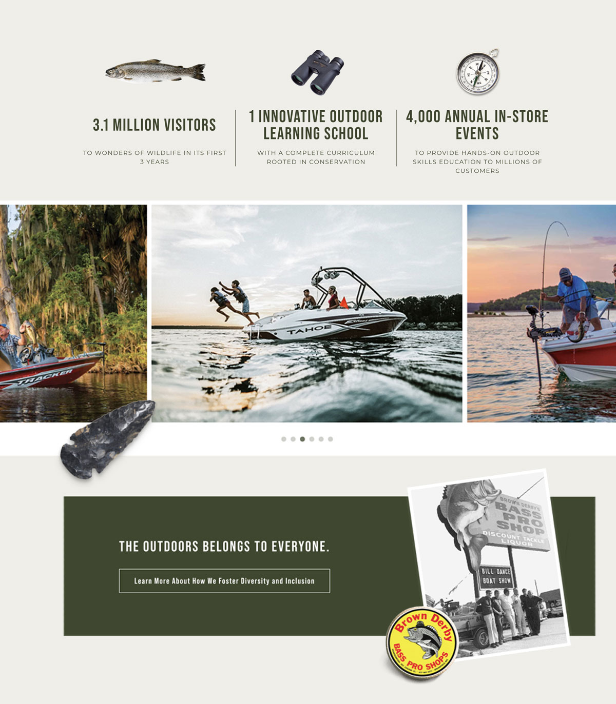
With carefully placed carousels, grids and tabs used in thoughtful layouts, we were able to break up the copy and keep pages feeling light and digestible.
A photo finish.
There’s a rule of thumb in marketing that’s rooted in psychology. Humans love seeing pictures of other humans (we’re social animals), and using photos of people in marketing can increase clicks and conversion rates.
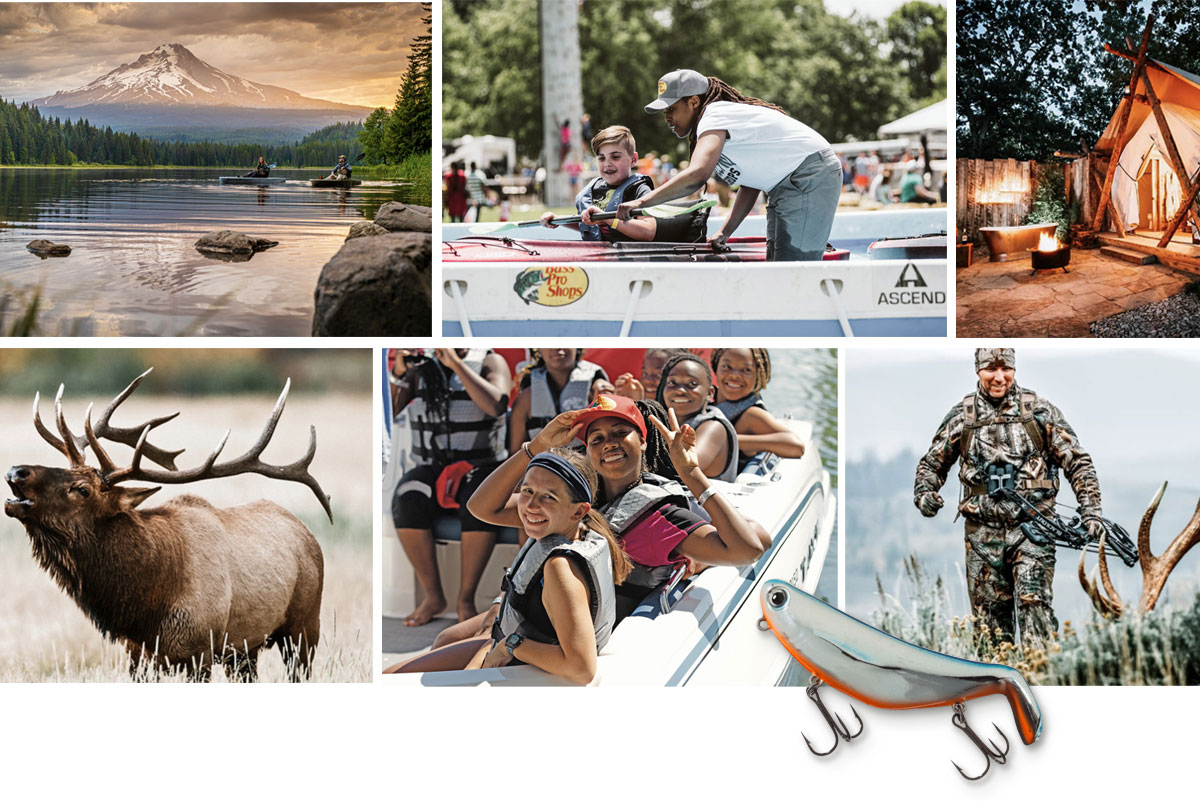
We knew we wanted to use photos to help visitors feel connected to the Bass Pro Shops brand as they navigated the site. Luckily, the company has a giant library of images—from historical photos of Bass Pro Shops’ early days to impressive nature photography and high-energy shots of people enjoying the outdoors.

To make them cohesive, we edited all of the photos with the same color processing technique, strategically placing them on pages to add color and illustrate the brand story that’s told through the copy. Bass Pro Shops’ sub-brand logos and the logos of organizations they partner with indicate trustworthiness, while small details like fishing lures, golf balls and arrowheads make the pages feel almost tangible and 3-D.
The call of the wild.
In the end, we were able to create Bass Pro Shops brand pages that simultaneously enhance the existing brand and fit in seamlessly with the rest of the site.
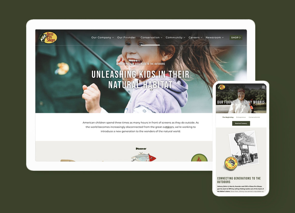
We were honored to work with North America’s premier outdoor and conservation company, helping further their mission to help more people enjoy the great outdoors.
And now that the project is all wrapped up, we think it might be time for a company camping trip.
