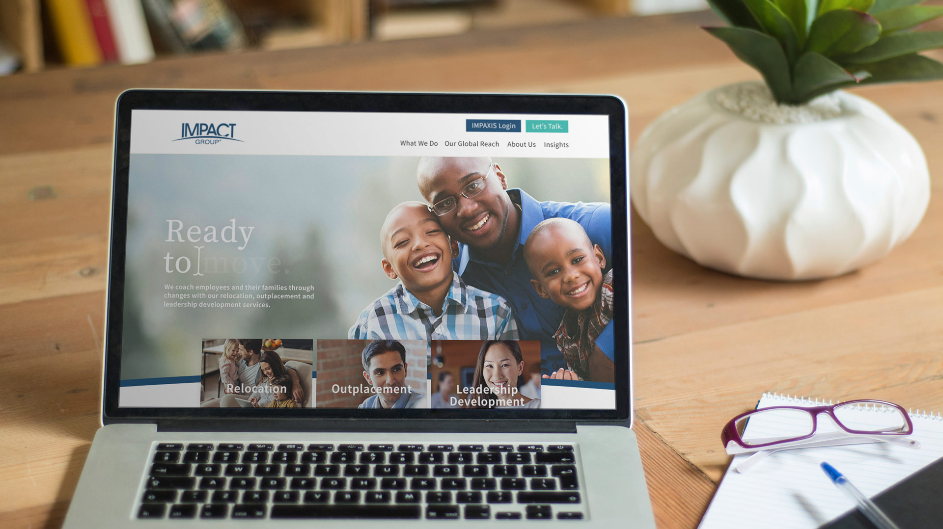
Making an Impact: A New Website Design for IMPACT Group
Can website design help put visitors at ease, even when faced with intimidating or complex subjects? That was our challenge when designing a new website for IMPACT Group.
IMPACT Group works behind the scenes to guide employees through relocations, layoffs and leadership training at some of the largest companies in the world.
The transitions their customers are faced with can be overwhelming – both professionally and personally. But IMPACT Group approaches every transition with a positive, friendly outlook, something that wasn’t coming across on their existing website.

The existing IMPACT Group homepage
It soon became clear to us what really set IMPACT Group apart: They focus on the people. Historically, relocation and outplacement had been a colder industry – treating the employees more like human capital than, well, humans. But when IMPACT Group came around in 1988, they took a new, personal approach.
Coaches around the world help employees (and their families!) through professional transitions, whatever they may be. If you’re moving, they help you find a home, a school for your children, a job for your spouse or even the best local yoga studio to visit. If you’ve been laid off, you have an expert coach in your corner to help refine your resumé and find networking groups in your area. And if you’re trying to take the next step forward in your career, they have a leadership program tailored to your goals.
It’s a one-on-one process that was not only a differentiator in their market, but inspiring to see in action.
Start with a Plan
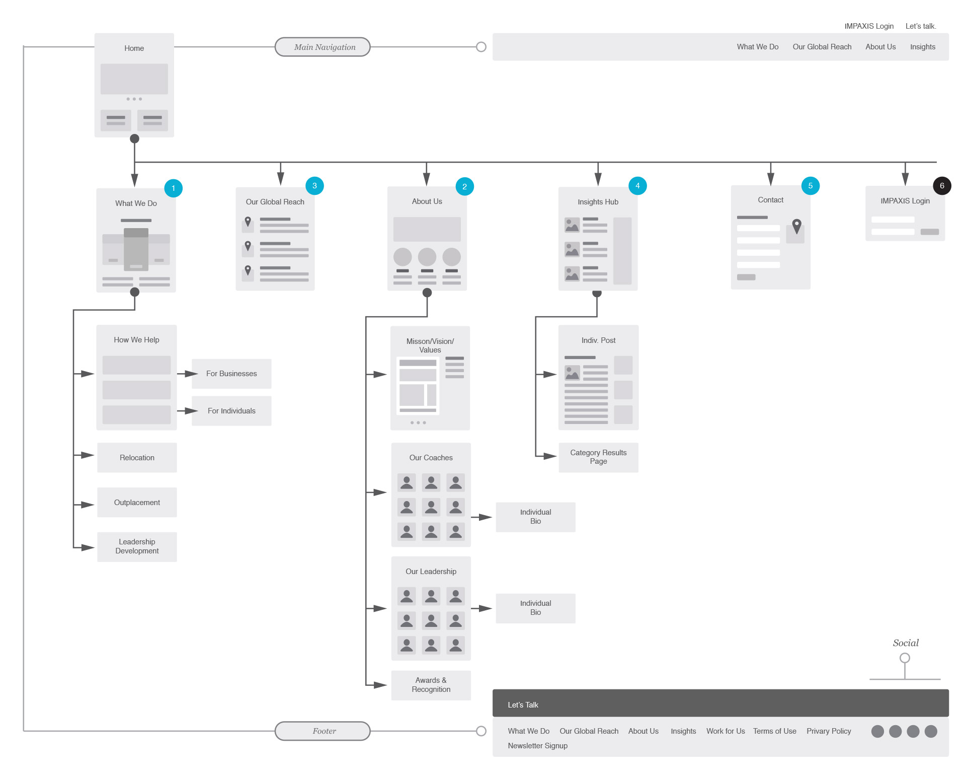
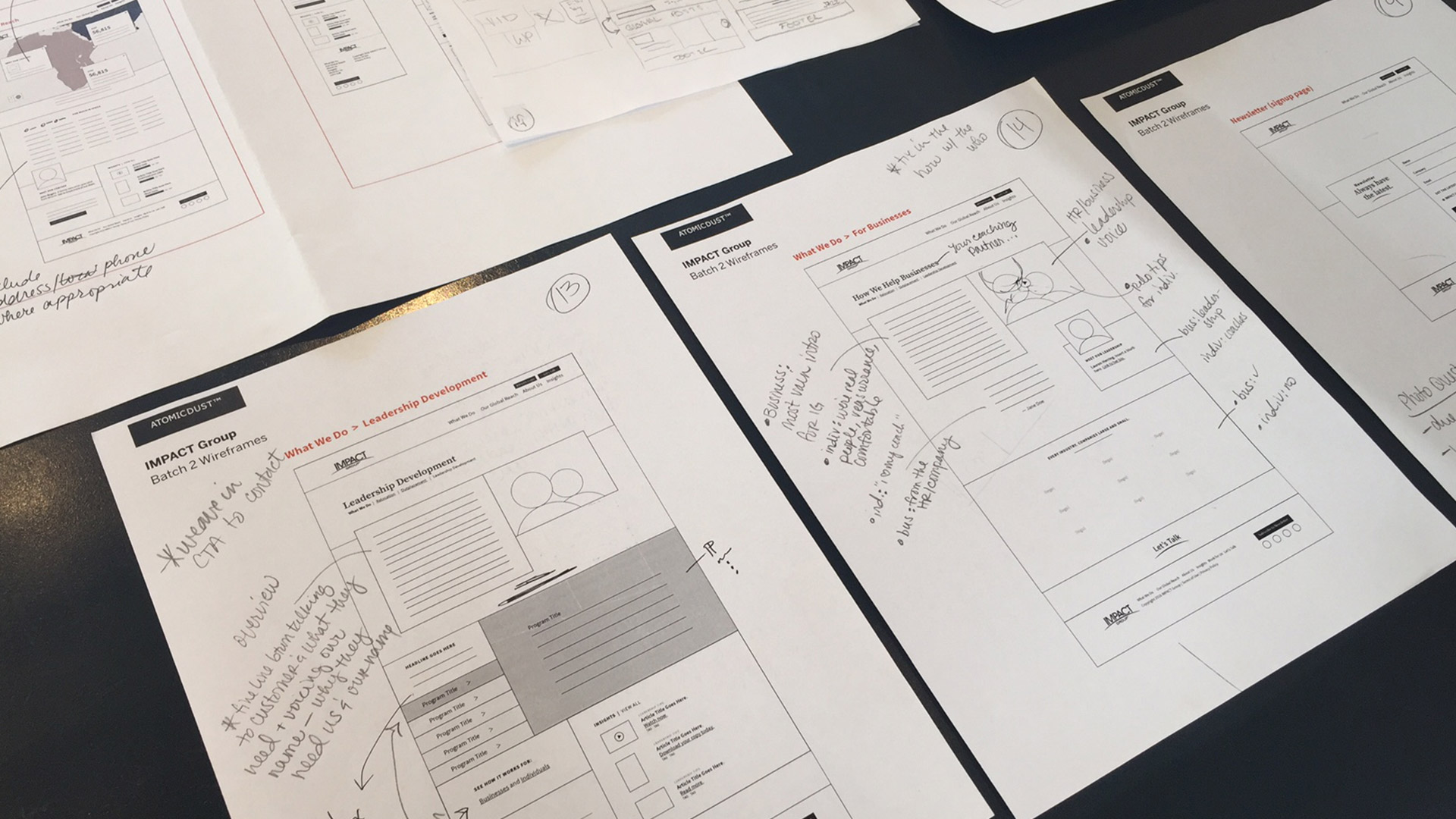
As we typically do with website design projects, we started our planning with sitemaps, content maps and wireframes, always thinking about the goals along the way:
- Communicate the passion and drive IMPACT Group has to empower clients and change lives, emphasizing their personal approach to coaching.
- Find a balance between speaking to businesses and to individuals. Be “people-to-people,” not B2B or B2C.
- Establish IMPACT Group as a global company.
- Leverage their expertise and content of their blog.
- And of course, generate new leads and subscriptions to the IMPACT Group newsletter.
We landed on a visual tone that felt fresh amongst the corporate grays and beiges of the industry. Bright colors and smiling faces create a real sense of friendliness. And showcasing life in and out of the office reinforced the idea that it’s about more than just the job.

Bringing it to Life
Designing a website isn’t always smooth sailing. When it came to our initial homepage design, we hit a snag. At first, we built a Swiss Army knife of a homepage, an end-all, be-all solution to tell IMPACT Group’s story. But it just wasn’t sitting quite right with any of us.
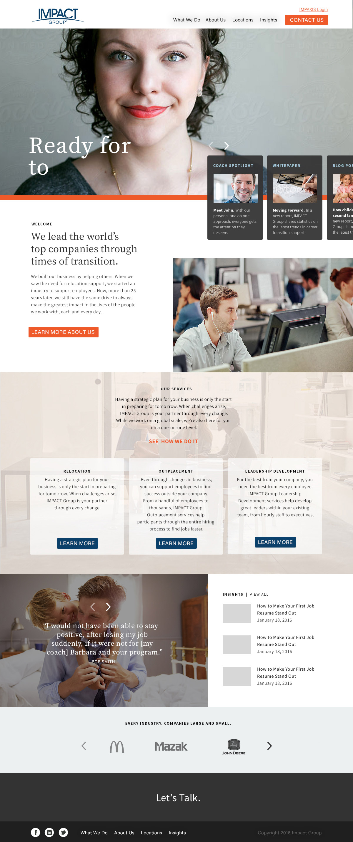
Our initial homepage design
We realized that we were trying to do too much, a common trap in web design. As UX Designer Tom Greever puts it, we were suffering from “Homepage Syndrome,” when the homepage becomes a catch-all for everything, creating a garage sale of links.
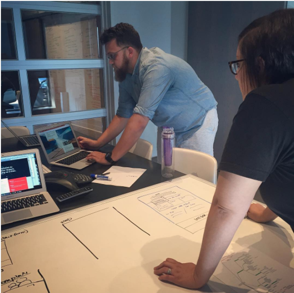
So we went back to the drawing board, literally. We all grabbed pencils and got sketching. It helped us prioritize the action we wanted visitors to take and imagine their paths through the website. For visitors who know which service they’re looking for, we created clearly defined doors to help them find it faster. For those less familiar, we focused on introducing the IMPACT Group’s personal approach, knowledge and expertise.
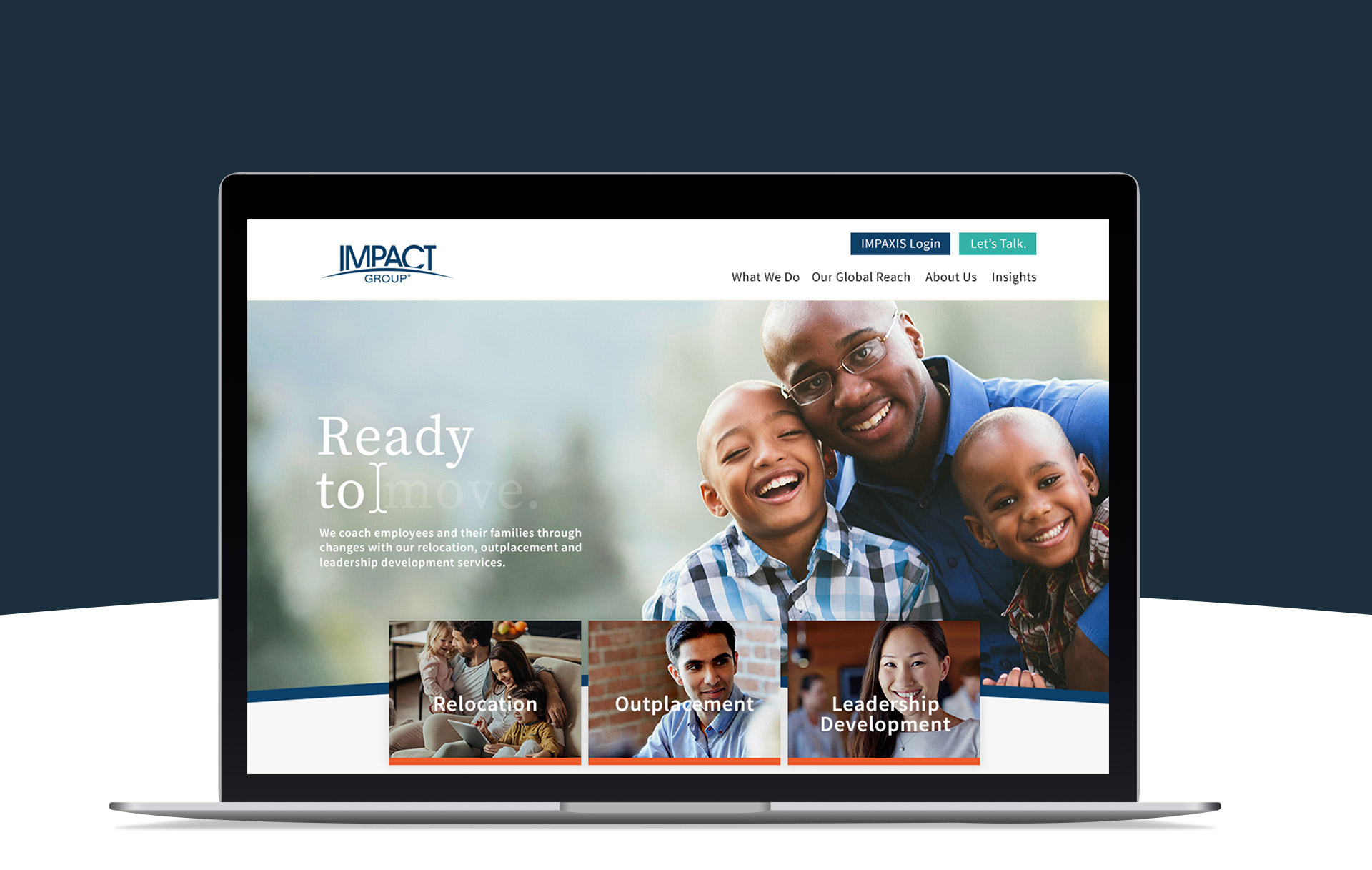

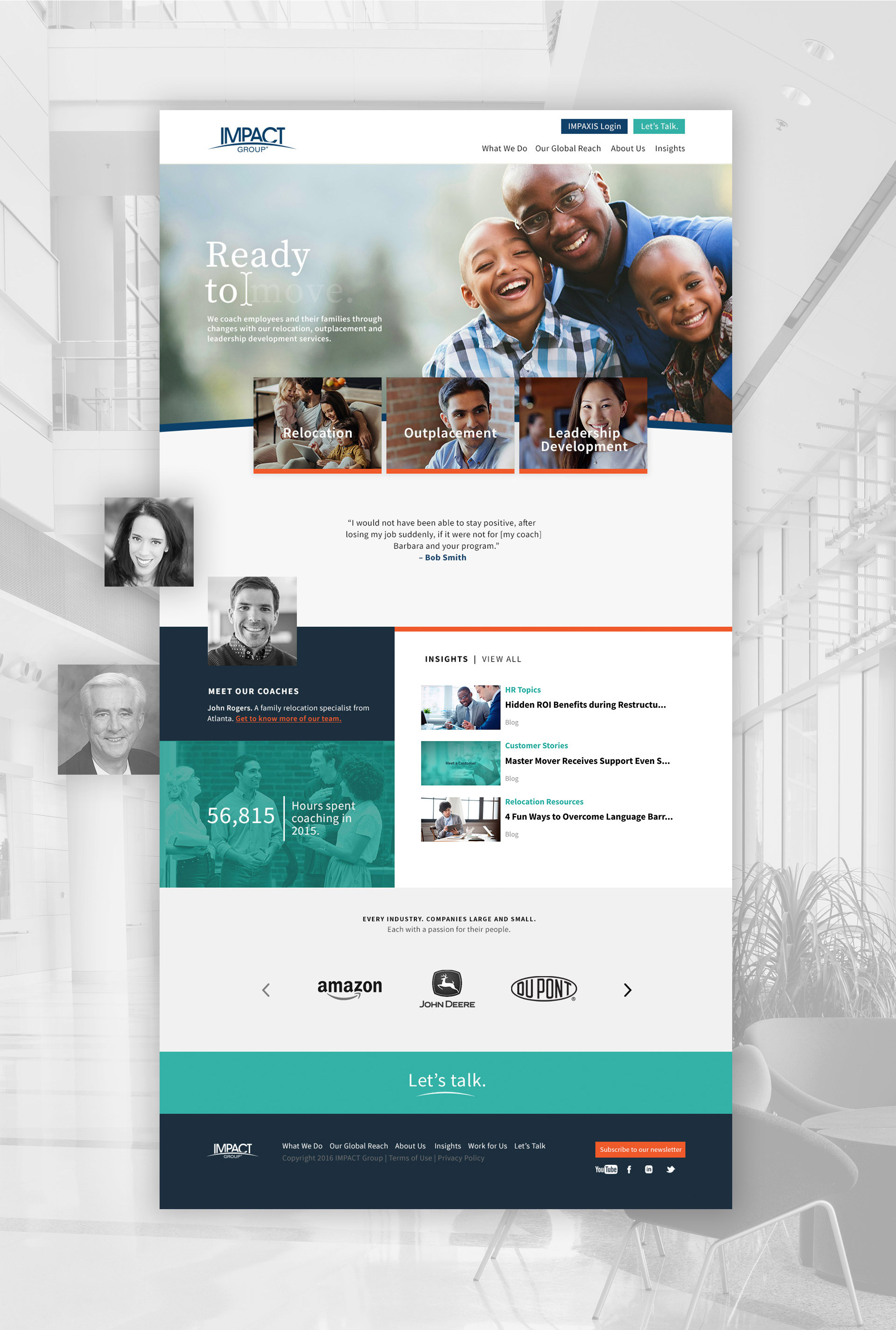
Using a shorter homepage was a risk. It meant that interior pages needed to do more of the heavy lifting – informing visitors and helping generate leads. And after all, thanks to search engines, any page of a website can be a visitor’s first impression.
To showcase their personal approach, we created a home for nearly 100 coaches and sprinkled real customer stories throughout the site. IMPACT Group’s core differentiator was no longer just a bullet point or written claim – there was visual proof.
In all of the copy and forms, we made sure the tone was friendly and approachable in order to appeal to both the HR buyer and the end customer. We added sections specifically for each audience, with content that matters to them.
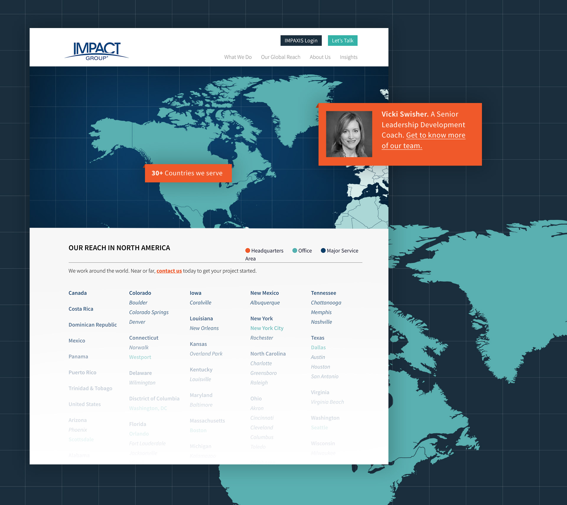
One of the most ambitious challenges came when designing the Global Reach page. On their old site, they merely listed addresses of other offices around the world – but we (and they) knew that wasn’t enough. How do you illustrate a global presence without showing points on a map?
We opted for an interactive map, broken up into the main regions they serve. As the visitor explores each region, stats and content specific to the area populate the map and the cities IMPACT Group serves are listed.
We further leveraged their expertise with a robust Insights section, pulling in blog posts, white papers, videos and more into a fluid and inviting reading experience worth exploring (and sharing). And of course, friendly and frequent calls to action are present throughout the site to encourage visitors to act.
Tying it All Together
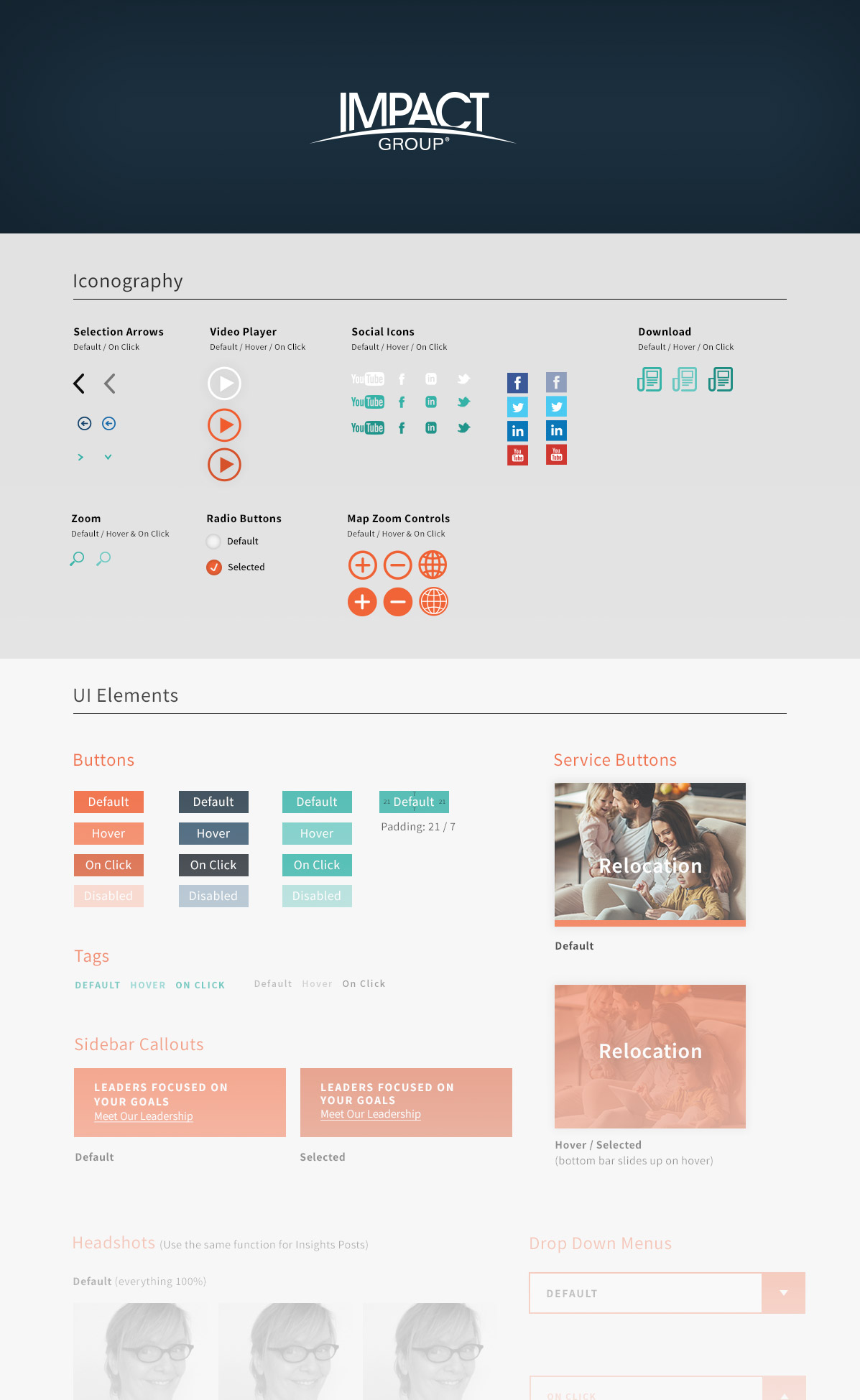
As we wrapped up the website design, we knew we were pushing the boundaries for their industry – and their development team. To help bring the site to life, we provided wireframe mockups, style guides and of course, our phone number to help them along the way.
When the site launched early this fall, IMPACT Group invited us to celebrate along with their staff at a pancake breakfast. Because that’s just the kind of people they are – friendly, approachable, fun.
And now, finally, that comes through both in person and on the web.

Want to keep up with the latest work from Atomicdust?
Subscribe to our newsletter for all the latest news, events and weekly marketing tips from our team.
