Grids Bring Structure and Strategy to the Benson Hill Website
There’s nothing more intimidating for designers, writers and even developers than a blank slate. But that’s exactly what we faced as we started work on a new website for Benson Hill Biosystems.

Not quite a startup, yet definitely a young company looking to raise its profile in the industry, Benson Hill is pioneering an industry they call cloud biology. Long story short: Benson Hill uses the latest cloud technology to collect and analyze data, then share that analysis with other biotech companies to improve the performance of crops around the globe. That’s a gross simplification, of course, but it sets the stage for this conversation.

Benson Hill’s old website wasn’t doing a good job of telling this story or capturing their passion, so they came to us for help. They knew they needed a stronger external voice. They needed to have a flexible site that could be easily updated. And, of course, they needed a blog to showcase the ever-changing nature of their business and how they’re always one step ahead.
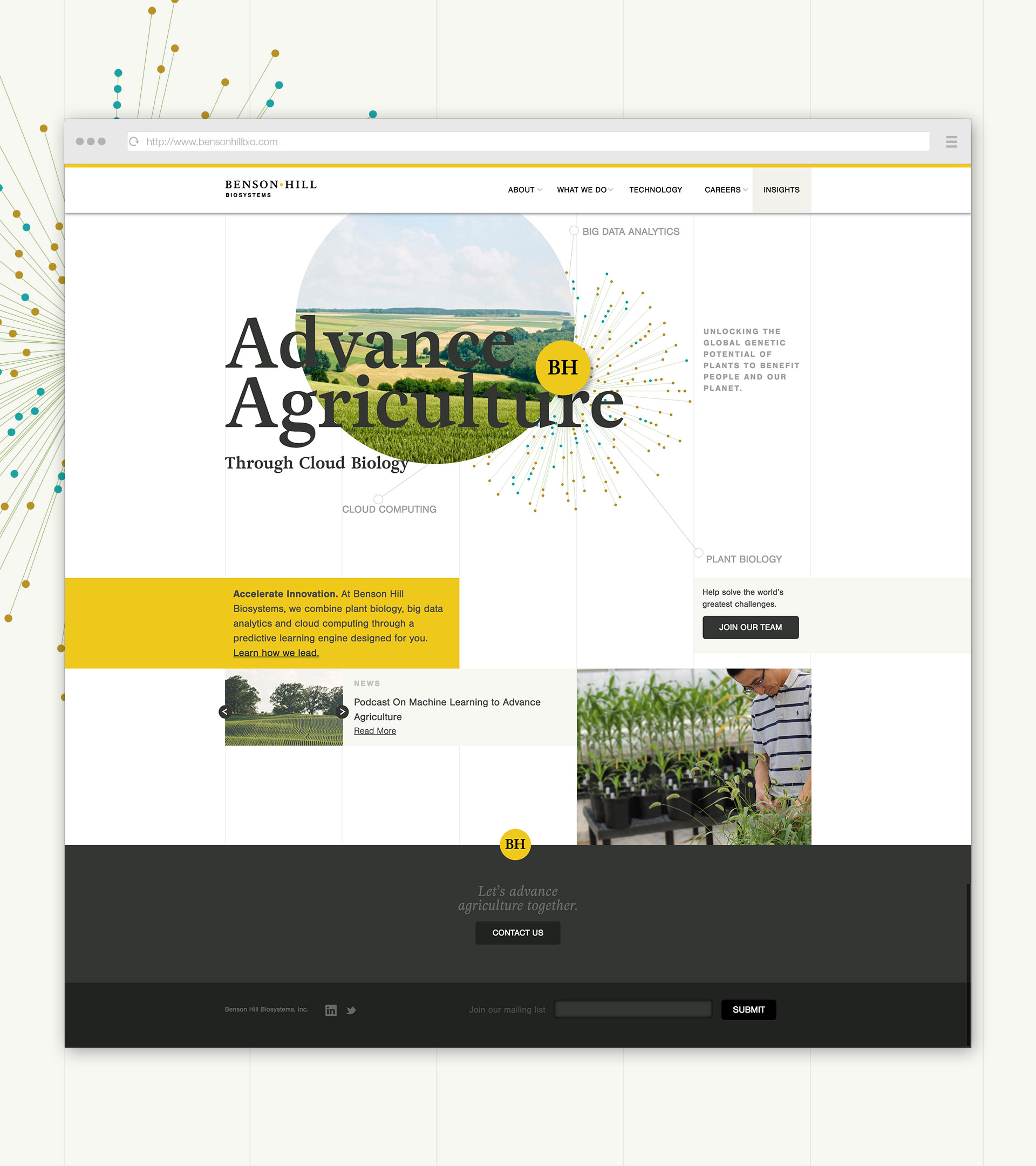
Nothing was off the table. We were free to create a new logo. We could bring in an entirely new look and feel. There were no standards to follow. No established voice to emulate. Only a still-evolving story to tell.
And what does a creative team do when presented with a project without boundaries? And with a client who has openly said they’re open to pushing things a bit?
The answer might surprise you. We set our own boundaries.
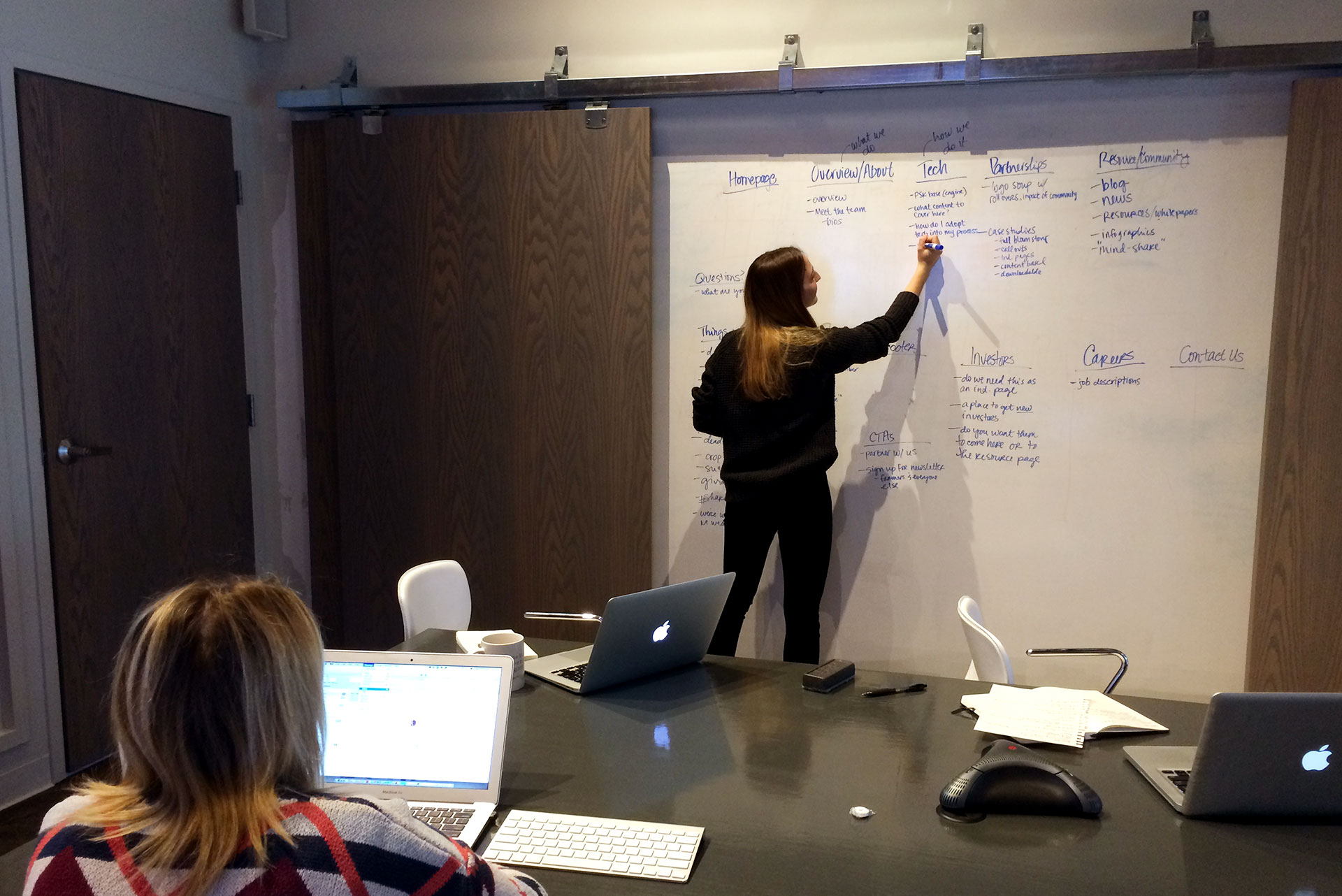
Working closely with our client (who was relatively new to the process of creating a website), we built wireframes and content maps. And then we sketched designs based on our old friend the grid. With no other structure to lean on, this would give us something literal, almost physical, on which to hang what we knew would be a lot of complex content.
 The wireframes and grids served us well as the client started gathering and drafting the initial sections of the site. Simply put, they wrote. A lot. Which makes sense, of course. They’re scientists. Scientists who want to reach other scientists. And that demands a certain level of sophistication and detail.
Even so, we needed to make it digestible. So we started breaking things up.
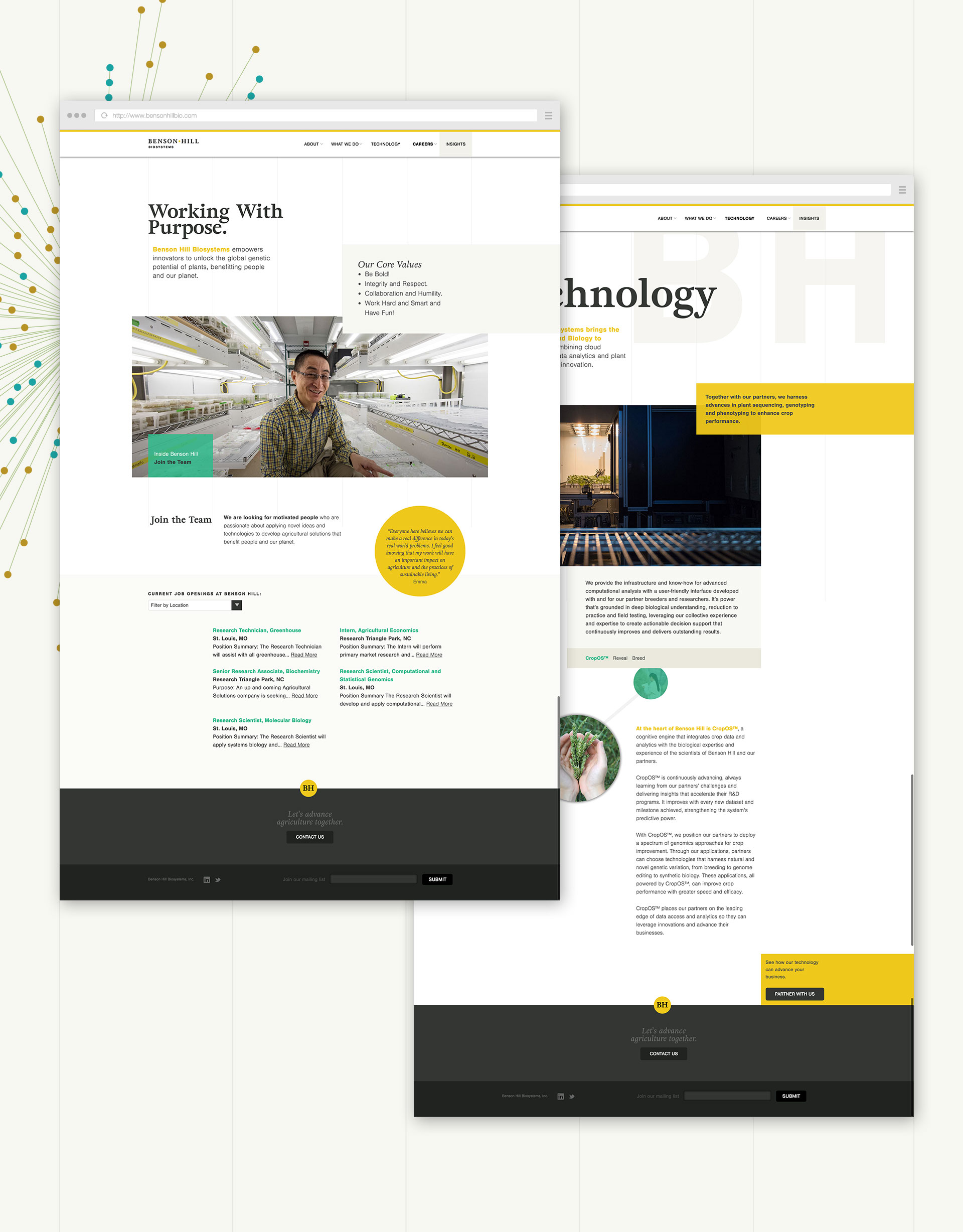
Our early adherence to structure helped us frame each conversation with the client. We were able to show the team how we wanted people to move through the site, and how design and copy could make it happen.
For inspiration, we looked to other formats that handle complex, long-form copy with ease. And who does this better than anyone? Publications like National Geographic. Scientific journals. And yes, even the old Time-Life nature books from our front shelves.
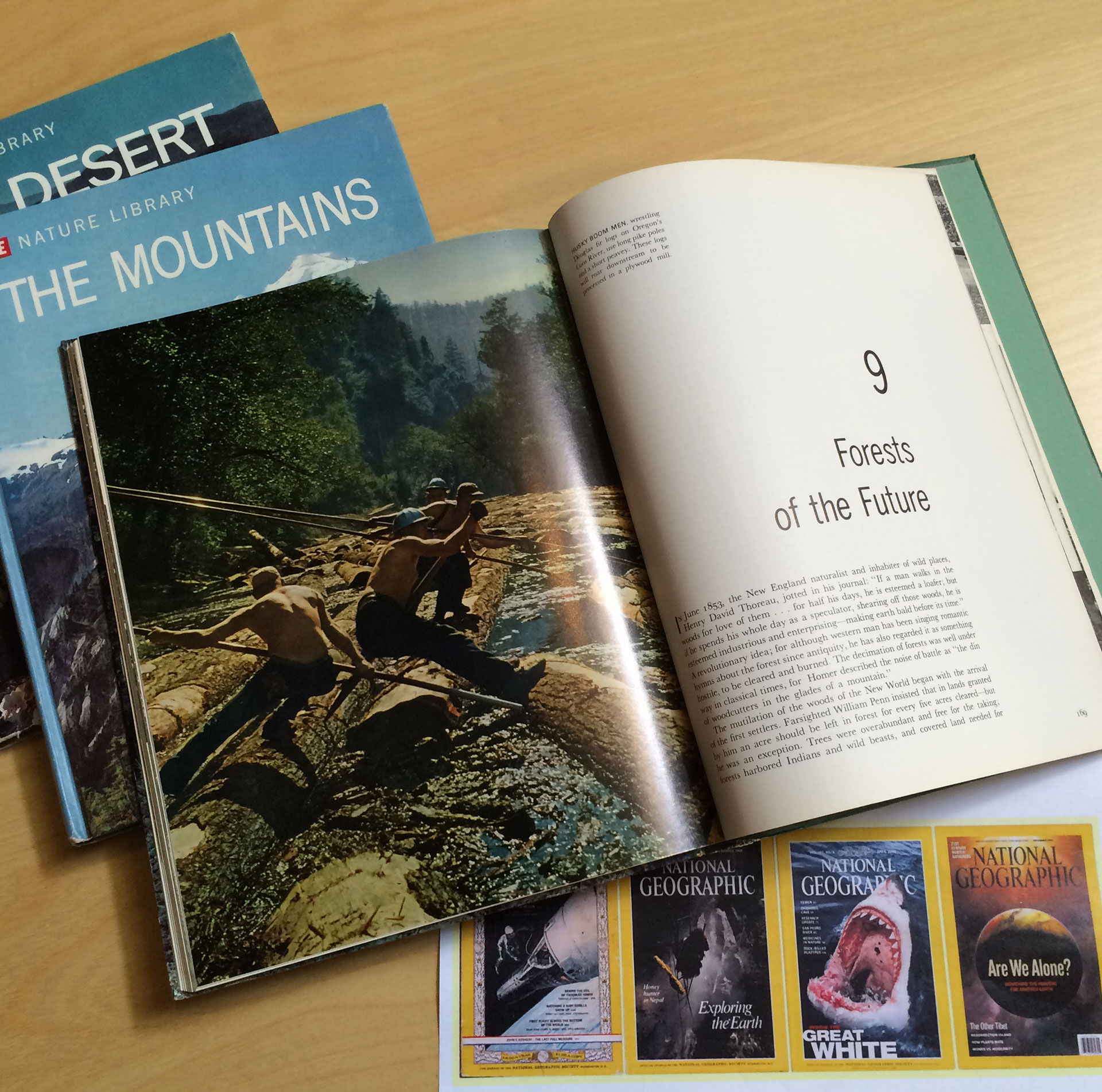
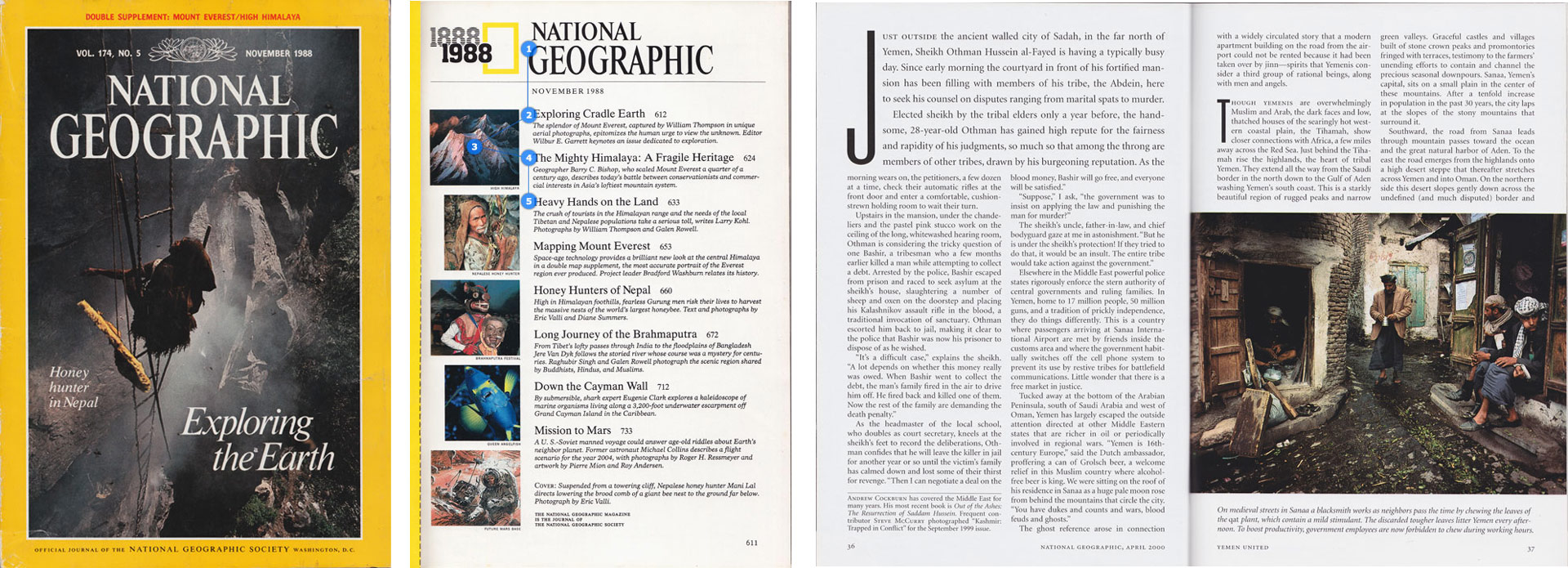
It’s about sidebars, subheads and paragraph breaks. It’s about infographics and interactions to bring concepts to life. And, yes, it’s about keeping everything on a grid – giving every piece of information, every photo, every headline its place in the hierarchy.
This almost journalistic approach seemed a natural fit for our very wordy client. It was also a way to make Benson Hill seem instantly trustworthy and cutting edge: exactly what they wanted.
Of course, the best thing about making rules is being able to break them. So on every page, we set out to throw something off a bit. Breaking words through photos. Bringing in subtle animations. And adding pieces of interest that lead users down the page.
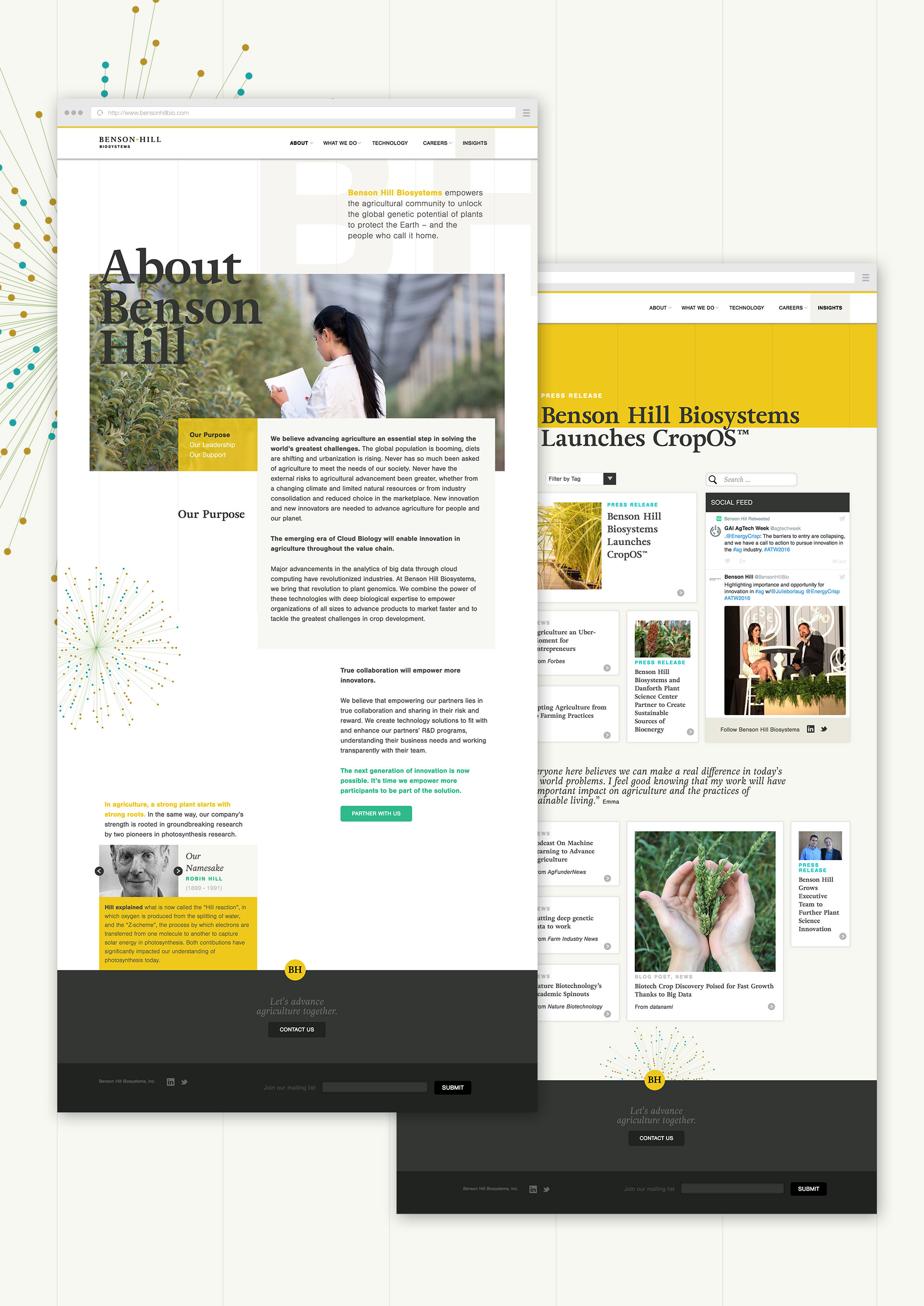
Speaking of throwing things off a bit: as a young company in an ever-evolving industry, Benson Hill was prone to change. Sometimes fundamental change. As we’d try to nail down direction or message, or even simple callout messages to clarify what they do and for whom, the direction would change.
Guess what kept us moving forward? Boundaries. Wireframes. And yes, even the grid. Here’s why: as the elements around us shifted, we knew we had this to fall back on.
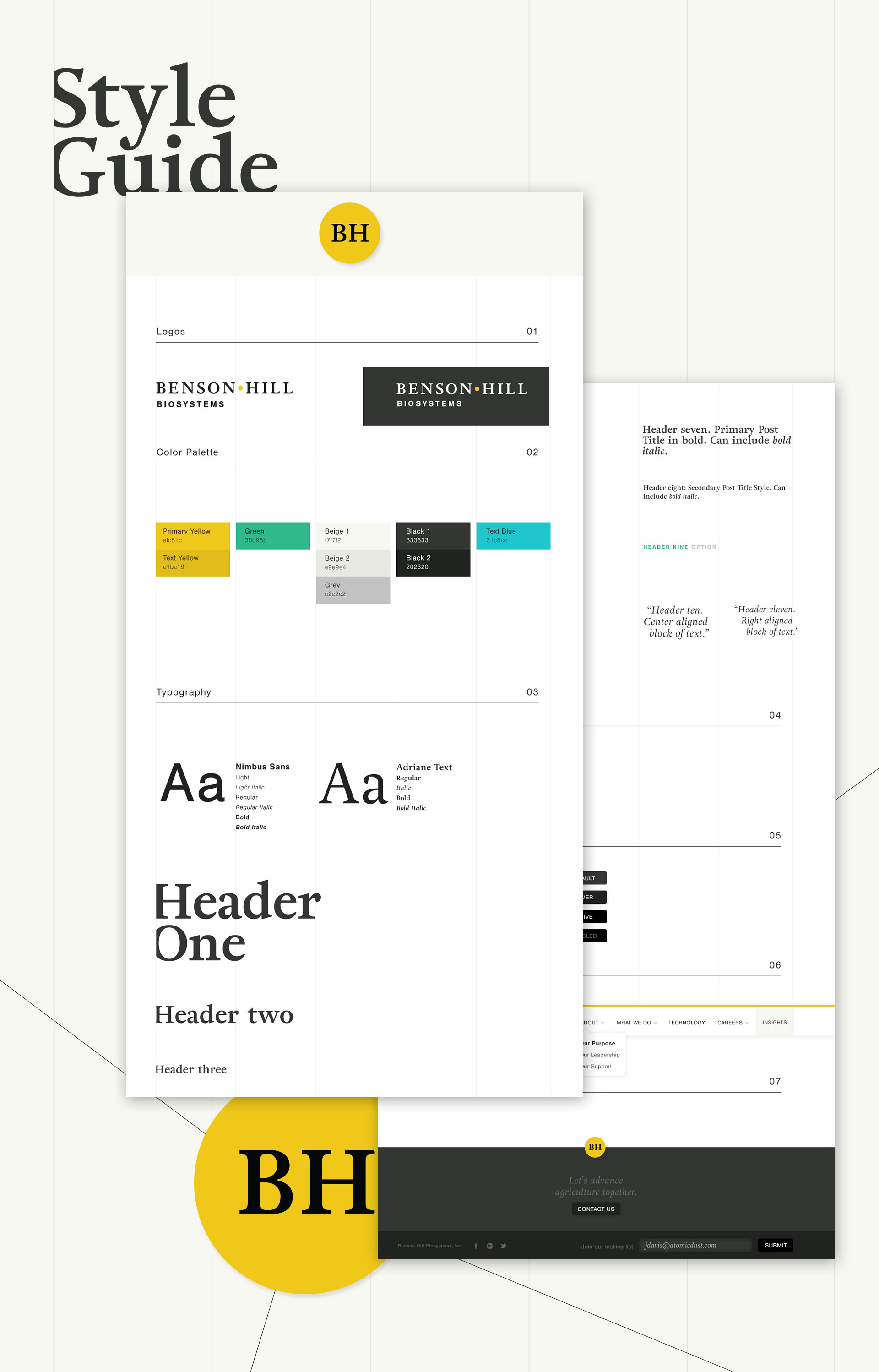
In science and technology, there’s no such thing as “static” or “standing still.” So it was critical to make the Benson Hill website easy to update – and not just the blog. Now, as the company continues to evolve, their website can evolve with it.
At the outset of this project, faced with no boundaries and little solid direction, our designer Jessica Davis said, with not an ounce of sarcasm, “The internet is hard.” And while you’ll probably never get her (or anyone) to say it’s easy, boundaries do help.
See boundaries in action at the new Benson Hill website, bensonhillbio.com.
Want to keep up with the latest work from Atomicdust?
Subscribe to our newsletter for all the latest news, events and weekly marketing tips from our team.


