The New News Feed is Coming
Earlier this month, Facebook announced a big design change coming to the site – the new Facebook News Feed.
“Goodbye Clutter”
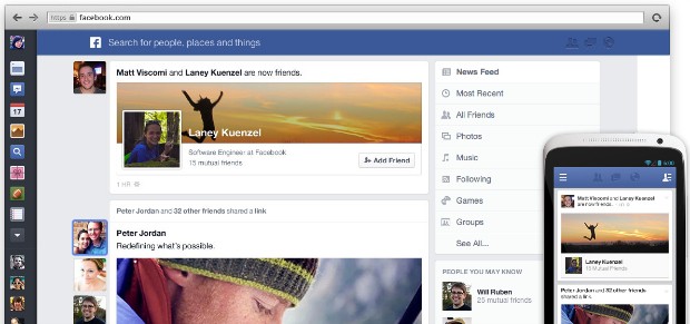
The biggest complaint Facebook gets (according to the video explaining the redesign) is that people want control over what they see. With the new design, users can now choose between different content feeds, including ‘Most Recent,’ ‘All Friends,’ ‘Photos’ and ‘Music.’ Facebook’s new News Feed design puts the user in control of what they see- and that can be scary for brands.
Facebook has allowed users to filter Pages they’ve liked or subscribed to in a separate ‘Pages Feed’ for some time now, but the new design gives users what they really want – a ‘Friends Only’ ‘All Friends’ feed.
Additionally, the old ‘Pages Feed’ option was hidden in the cluttered lefthand column of the News Feed. The new content feeds are hard to miss, appearing prominently on the top right of the page.
Users can still filter by Pages they’ve liked or subscribed to with the ‘Following’ feed, which appears on the list below ‘Photos’ and ‘Music.’ It is unknown whether users will have the option to reorder this list. Page updates will appear in both the ‘Following’ and ‘Most Recent’ feeds, and it’s assumed that we’ll have the same EdgeRank struggles there that we’ve been battling for the past few months.
What’s really puzzling is that in the video on the redesign, Facebook acknowledges that most of the time, people only have a few minutes to visit the site and they look to the News Feed to get “just the surface” of what’s happening. The new lists are intended for use when “you have a few extra minutes, and you’ve gone through your News Feed’. Is that meant to imply that only people with time to waste – er, spare – on Facebook are going to actually use those separate feeds?
“Bursting With Color”
During the announcement, Mark Zuckerburg stated that almost 50% of News Feed content is visual. No surprises there. Since the Timeline changes last year, there’s been a bigger emphasis on visual content. Add in the popularity of Instagram and Pinterest, and it is clear that brands need a visual content strategy – which is difficult if you’re a brand without a great in-house creative team or a strong partnership with a creative firm.
“Everywhere You Go”
In case you haven’t heard it enough, you had better make sure your content is optimized for mobile, as the new design is meant to work seamlessly across desktops, phones and tablets. Updates should be shorter (generally Facebook’s mobile versions add ellipses after 270 characters), and based on compelling visual content. It is important to note that descriptions with photos are now shown as an overlay on top of the photo – another sign to keep text to a minimum. You’ll also want to make sure that all custom landing pages are optimized for mobile.
But where are the ads?
One of the biggest unanswered questions – and of utmost importance to brands – is where the ads will appear on the new design. Will all ads be Sponsored Stories within the News Feed now?
Will only ads with great images be shown in the ‘Photos’ feed? Will only ads pertaining to music appear in the ‘Music’ feed? And will the ‘All Friends’ feed be the Holy Grail for users – an ads-free Facebook?
The new Facebook News Feed will begin rolling out to all users soon. You can learn more about the redesign on Facebook.
 Danielle Hohmeier is the Online Marketing Manager at Atomicdust. She writes about marketing and design in the digital world, with a focus on marketing convergence and social media.

