How Storytelling Brought Life to Ron Rubin Brands
Sometimes, especially in the context of branding and website design, the oh-so-trendy concept of “storytelling” goes a little too far – even more so in the wine and beverage business.
But when Ron Rubin sat down with us to talk about a new website for his California winery, we knew there was something to it. This was going to be about much more than clusters of grapes on a beautiful, foggy hillside.
Of course, especially at the outset, we didn’t realize quite how much more there really was.
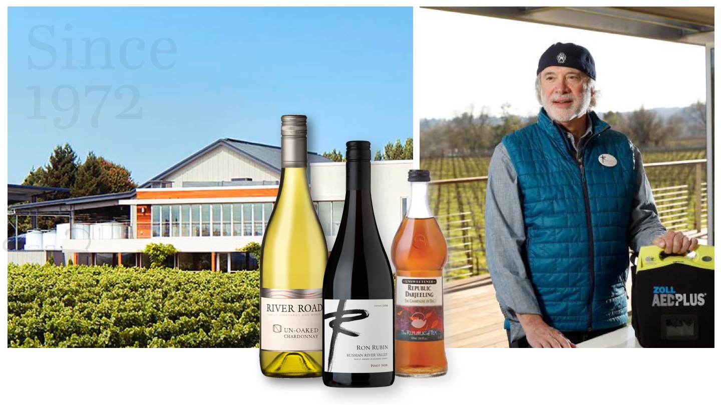
The Illinois native and self-proclaimed “beverage guy” started to talk about his history in the industry, and our imaginations were captured. He spoke of his 40-year dream to own a winery, and then took us through a wide-ranging tale that included Ron driving the success of Clearly Canadian—the La Croix of the 1990s.
And speaking of stories, he told us he was so inspired by the philosophy behind the founding of The Republic of Tea, that he bought the company—a company his son helms to this day.
You could see the gleam in Ron’s eye as he talked about his winery dream finally coming to fruition at the River Road Family Winery, in California’s Russian River Valley. He even shared the story of his own heart attack, and how that experience inspired him to bring defibrillators—the very device that saved his life—to wineries across California.

Ron’s vision was for a site that would talk about the winery and its two wine brands, of course, but also use the opportunity to show distributors how bottled teas from The Republic of Tea could help them round out their clients’ beverage programs.
He also wanted a platform to showcase his penchant for innovation—and his constantly-evolving product lines.
More than a winery website, indeed.
Setting things straight.
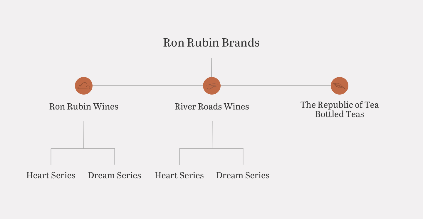
The website would be home to three different product lines: River Road, which is sold exclusively at Total Wine & More; Ron Rubin, also produced at his California winery but sold elsewhere; and The Republic of Tea Bottled Teas. Before a website could be made, each brand needed to be clearly positioned in the industry.
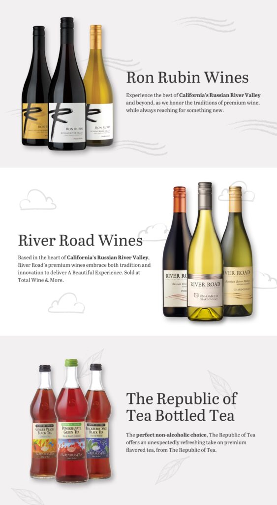
We established Ron Rubin Brands, an umbrella to house the separate entities and let them shine individually and as a family. The commonalities between the sister brands, namely a commitment to innovation and Zen practices, set the foundation.
Building the brand.
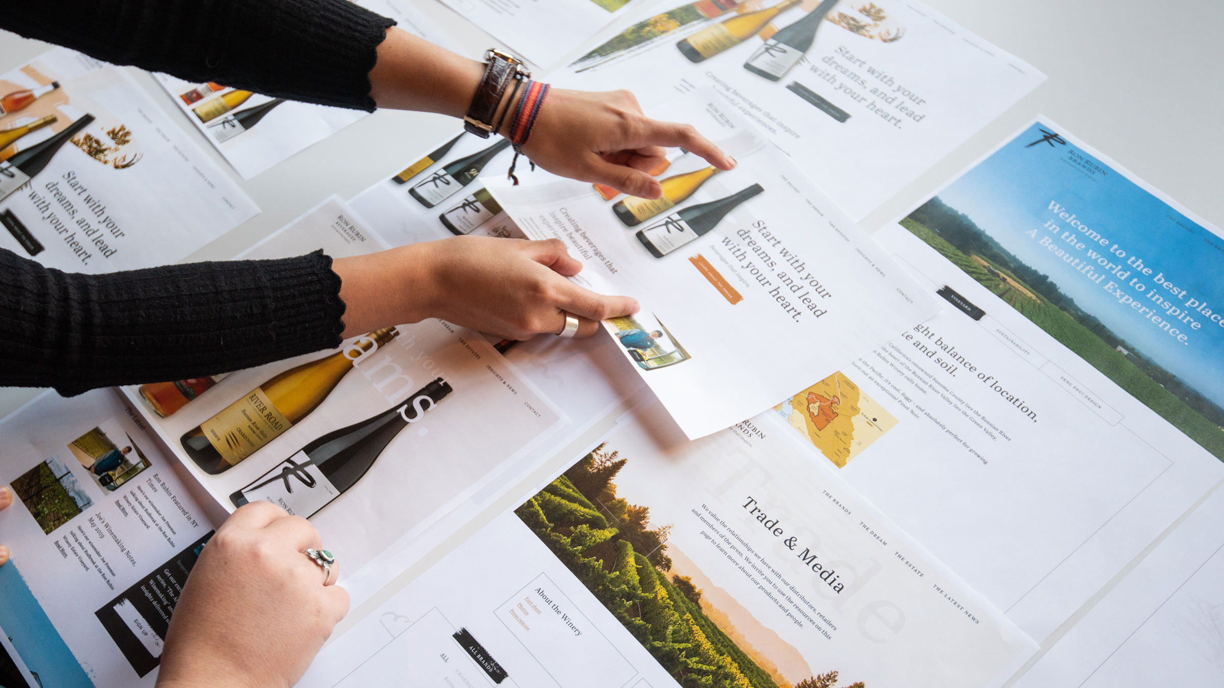
Inspired by Ron’s story, we looked for ways to turn his approach and experience into a website that would speak to both distributors and consumers. We looked to combine the appeal of premium wine and bottled tea with Ron’s unique story, and to convey the unique value of this unexpected (for the industry) pairing.
It all came together with a headline: “Start with your dreams, lead with your heart.”
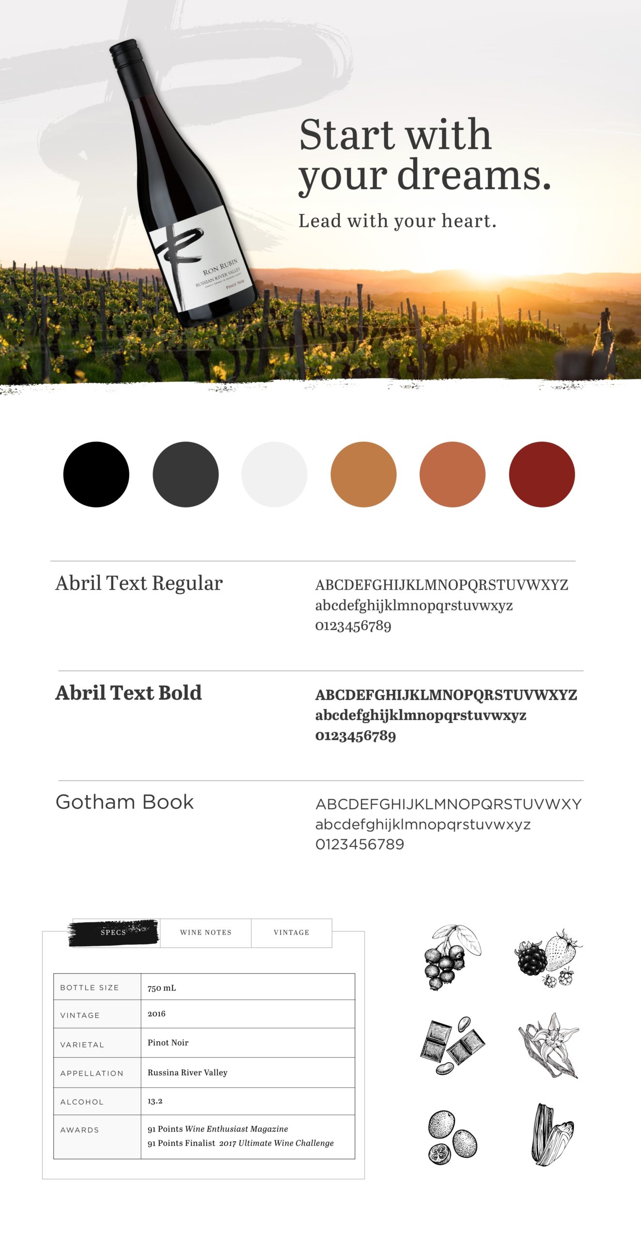
Those brand keywords – dream and heart – became central to the brand story. They’re also echoed in the two lines available from each wine brand. The Dream series, with its classic wines, conveys the culmination of Ron’s dream. And the Heart Series, with its focus on innovation, shows his willingness to step outside the norm and create something new.
Ron’s story is woven throughout the site, inspiring visitors with, you guessed it, Ron’s dream and his innovative approach to beverages. Warm, inviting language invites visitors to “Share our dream” and receive “Inspiration in your inbox,” pulling people into the brand and making it feel like an extension of their own dreams.
Zen and the Art of Website Maintenance
Ron’s love of Zen and Feng Shui inspired the website’s aesthetic. The homepage includes an abundance of white space. We took the existing Ron Rubin logo, a hand-painted brushstroke R, and created a mask with a photo of the winery for a pop of color. The few additional details—textured drawings to complement each brand—are unobtrusive.
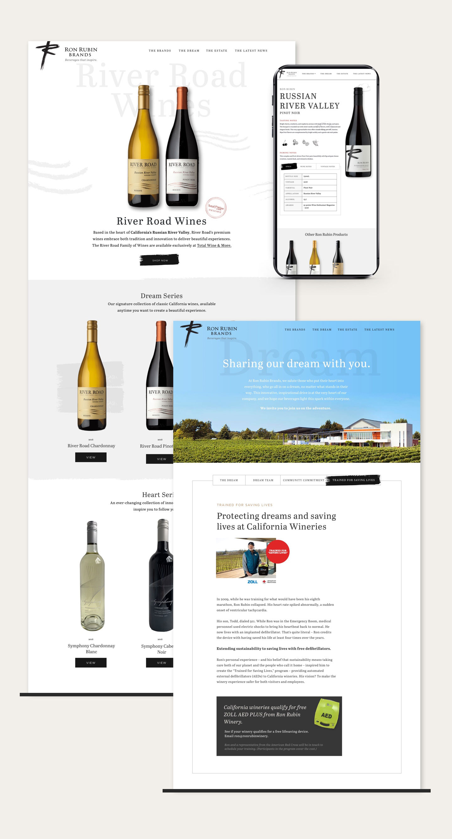
Deeper into the site, we balanced the thoughtful nature of the brands with the business-oriented nature of the site’s visitors—mostly wine distributors and wholesale buyers. Product pages for each variety include descriptions and links to buy. And of course, there’s a page dedicated to sharing Ron’s mission to put defibrillators in California wineries.
As we raced to develop the website to launch on Ron’s birthday, we made sure to build in time for some impactful details. Things like hover and fade-in animations and a completely different navigation interface for mobile make the site shine. Functionality was also important: the Ron Rubin team will be able to easily update the site with the latest products and news.
The story continues…
So while storytelling sometimes goes too far in marketing, other times—times when it stems from an authentic person with a heartfelt desire to innovate and help people—it’s just the trick. The Ron Rubin website is proof.
