Revolutionizing a Legacy: Preparing DIDION’s Brand and Website for the Future
In the world of family businesses, there’s a myth known as the “three-generation rule.” This idea suggests that many family-owned companies fail by the time the third generation takes the reins.
Personally, I’ve never been a big fan of rules.
Especially when the “rule” is more fiction than fact. The data tells a different story, showing family-owned companies often outlast their non-familial counterparts.
DIDION is proof.
As a proud third-generation company, DIDION knows that staying successful means always improving and adapting. That’s why they came to Atomicdust: to energize their brand and website, defying the myth and ensuring their impact on the industry continues for generations to come.
Let’s Roll
DIDION has manufactured metal-processing machinery for foundries since 1975. And more recently, they’ve introduced solutions made specifically for the recycling industry.
Both industries face a common challenge: efficiently and effectively cleaning metal. DIDION developed an innovative, patented solution that changed the game, and it all centers around one simple concept: revolutions.
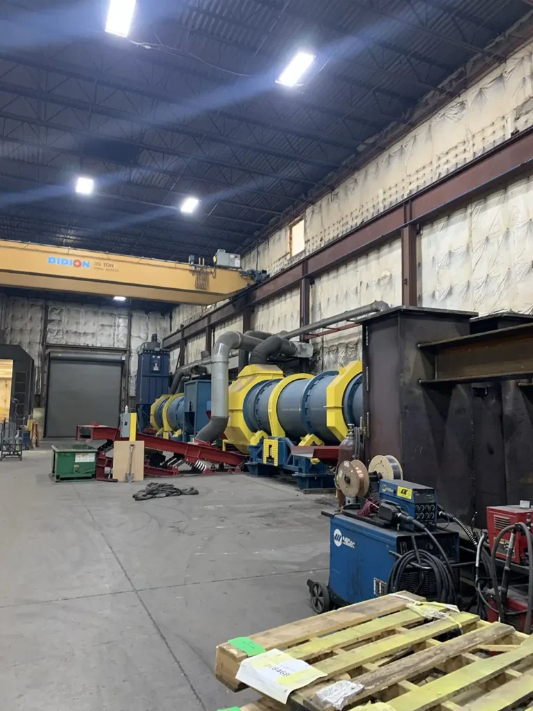
Traditionally, removing sand and contaminants from metal pieces has been a time-consuming, inefficient process. DIDION set out to create a more effective method: enter the industrial rotary drum. These massive, heavy-duty drums utilize rotational force to clean metal pieces more effectively than conventional methods.
DIDION’s revolutionary approach isn’t just cleaning metal—it’s transforming industrial waste into valuable resources, driving profitability for their clients while promoting sustainable practices in an increasingly circular economy.
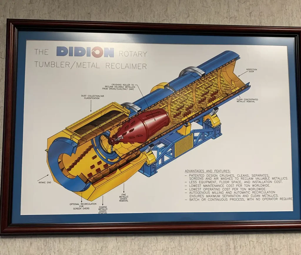
Though their equipment has powered global industrial manufacturers for decades and developed a strong reputation for saving time, money and energy, a critical element wasn’t working.
DIDION’s brand and website failed to showcase the company’s innovation and impact.
We put on our hard hats and got to work.
Heavy-Duty Discovery
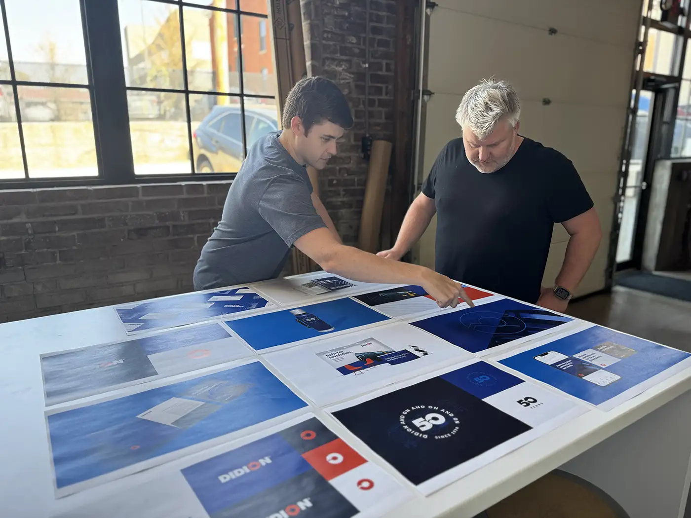
As we toured the warehouse (yes, in the appropriate safety attire) and interviewed DIDION’s team and their customers, we began to find out what really makes DIDION’s world turn. We gained a clearer understanding of their history, their durable patented equipment, and most importantly, their three biggest challenges.

Pages from DIDION’s previous website
First, brand misalignment.
DIDION’s brand hadn’t been updated in a couple decades. The outdated visuals and messaging created a gap between how customers perceived DIDION and the company’s key benefits and capabilities.
The second issue? Divergent audiences.
Though metal casting foundries and recycling plants have similar metal-processing needs, each audience has their own unique set of motivations, industry-specific language and distinct operational challenges.
And finally, changing workforce demographics.
As seasoned industry veterans retire, a new generation of professionals is stepping into key roles. Younger decision-makers, while tech-savvy and innovation-driven, lack the familiarity that their predecessors had with DIDION.
To move forward, we needed to create a narrative and identity that would modernize DIDION’s brand image, address the needs of foundries and recycling plants, and resonate with the next generation of decision-makers—all while bridging the gap between the company’s rich legacy and current technological relevance.
A challenge? For sure. But much like DIDION, we’re not afraid of hard work.
Now… where did I put those safety goggles…
A Fresh Spin
The DIDION equipment portfolio is full of diverse functions, features and benefits. But it wasn’t the cost-savings or the clean results that we kept circling back to.
It was the relentless rotation of DIDION’s drum technology that inspired our approach. We envisioned a brand embodying continuous motion, transformation and progress. This powerful mechanism became both our creative spark and a metaphor for DIDION’s role in revolutionizing industries.
With this powerful concept as our foundation, we crafted a brand narrative that bridges DIDION’s rich legacy with their innovative vision for the future:
It takes hard work to make the world turn.
But in 1975, Didion made hard work easier with a revolutionary innovation
that recirculates natural resources and spins waste into wealth.
Today, we continue to deliver the durable machinery that rugged industries require to power progress, drive business and keep your hard work moving on and on and on.
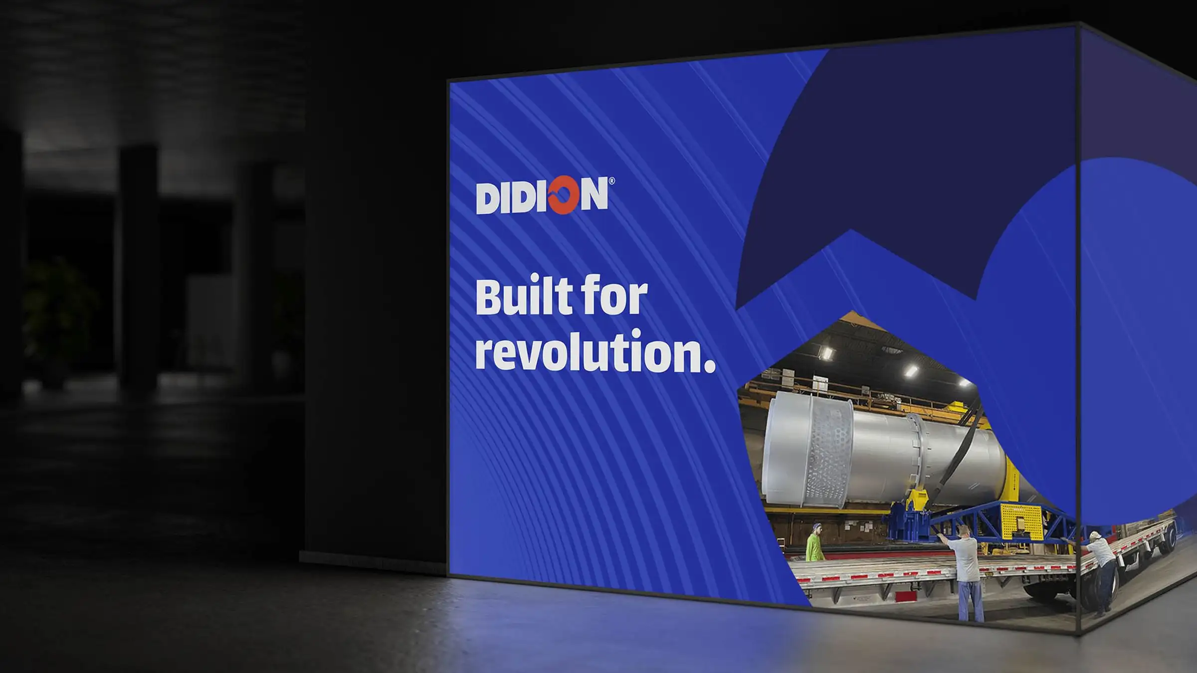
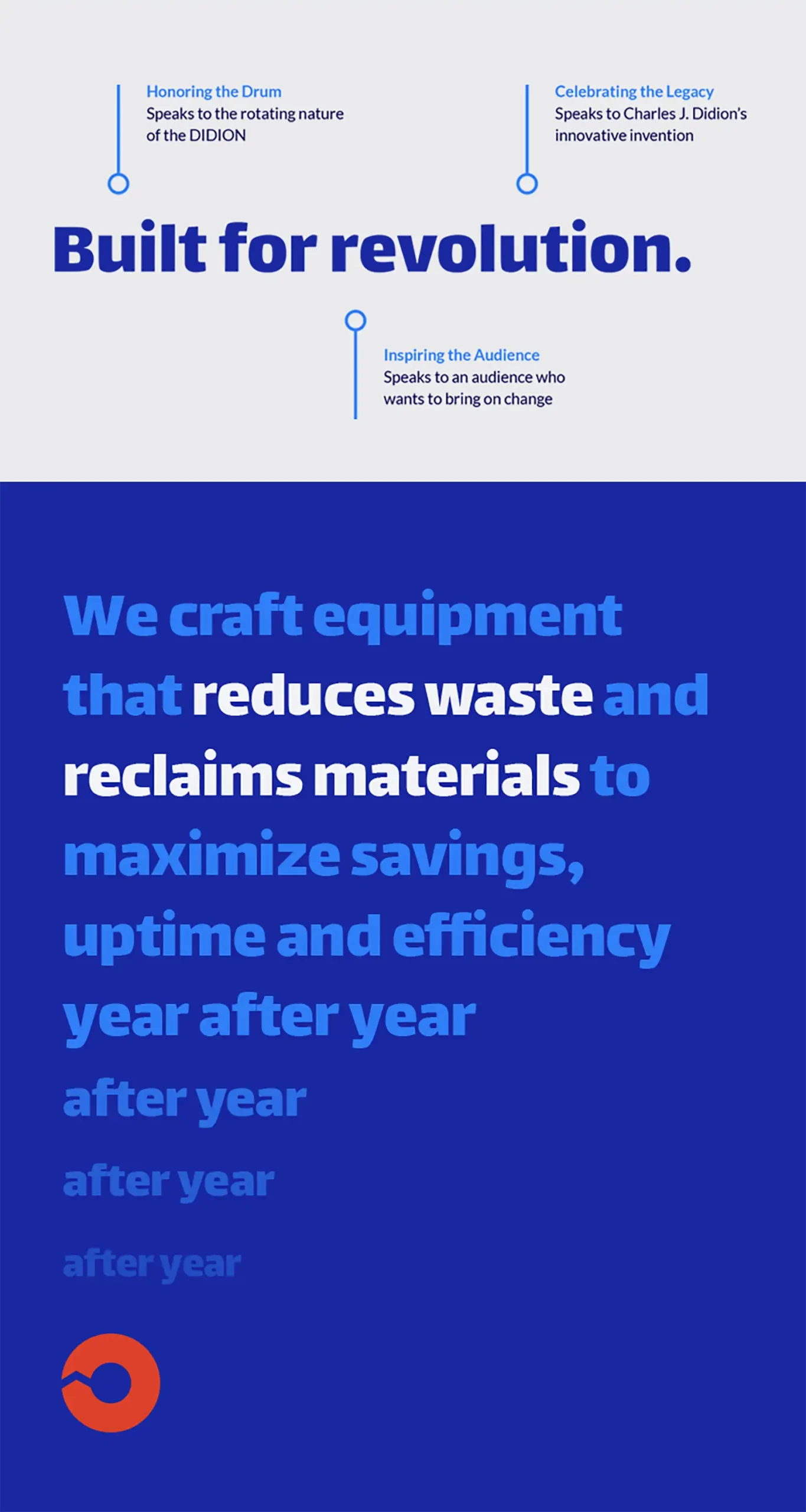
The tagline, “Built for revolution.” succinctly sums up the narrative of DIDION’s pioneering technology, enduring legacy and continuous drive to revolutionize industries through innovative, robust machinery.
With foundational language in place, we turned our attention to creating a visual identity that would bring this revolutionary concept to life.
Drumming Up Visual Interest
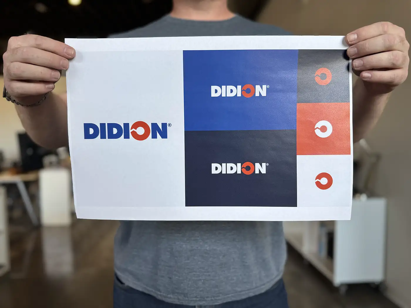
Our challenge was to create a design language that honored DIDION’s history while modernizing its image for the future. We began by retaining the company’s iconic, bold logo as the foundation of our design refresh.
Drawing inspiration from the logo’s “O” graphic—a rotating arrow—we expanded this element into a dynamic symbol of the continuous motion, progress and revolution the narrative described.
This element serves as a framing device for images, guides viewers’ attention across layouts, infuses designs with a sense of energy and momentum, and acts as a recognizable brand element across different touchpoints.
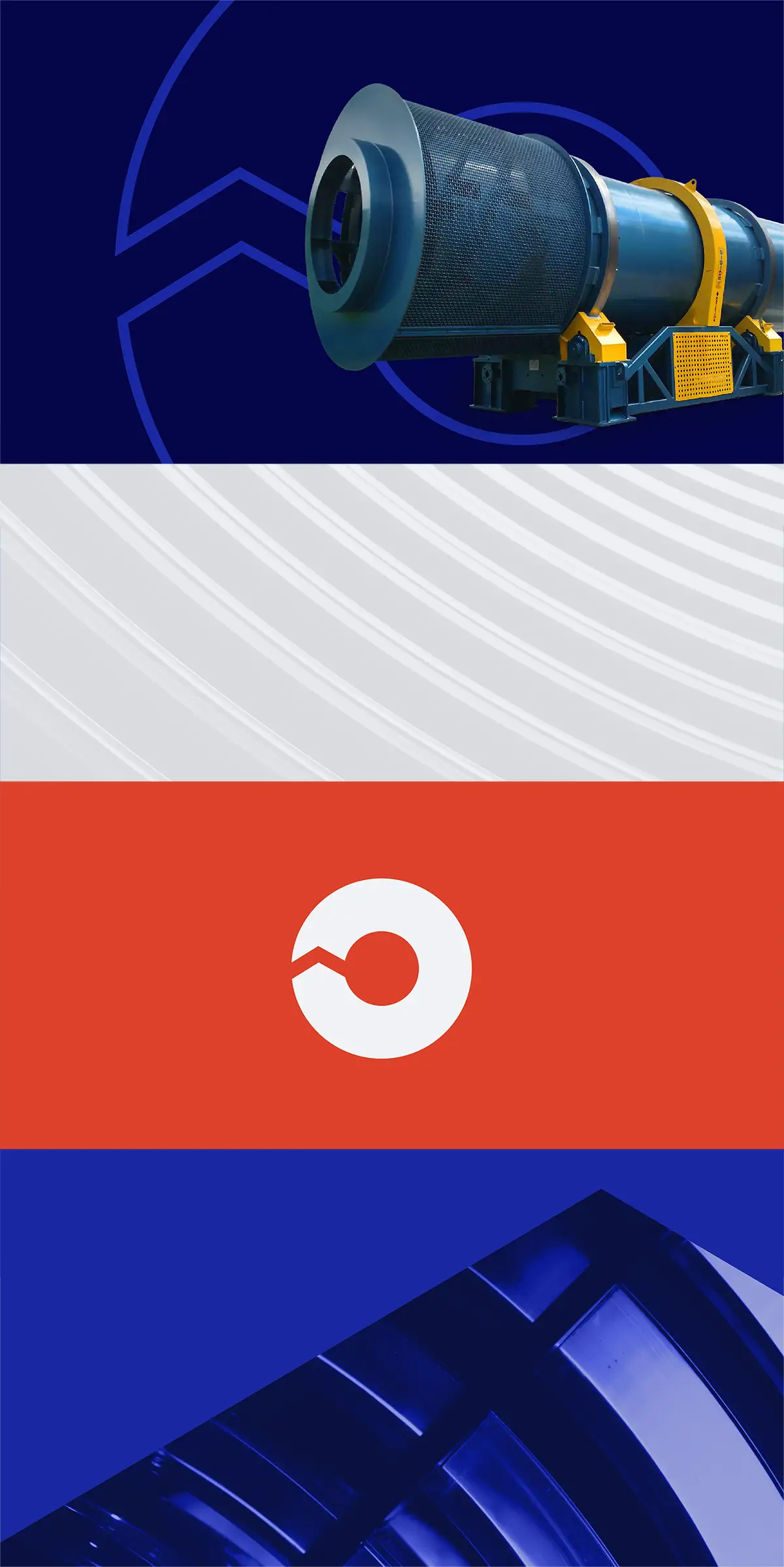
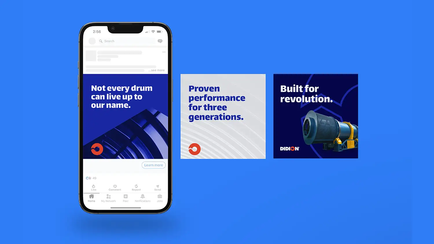
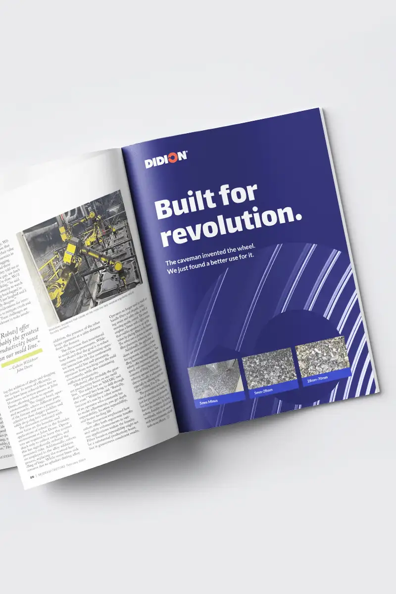
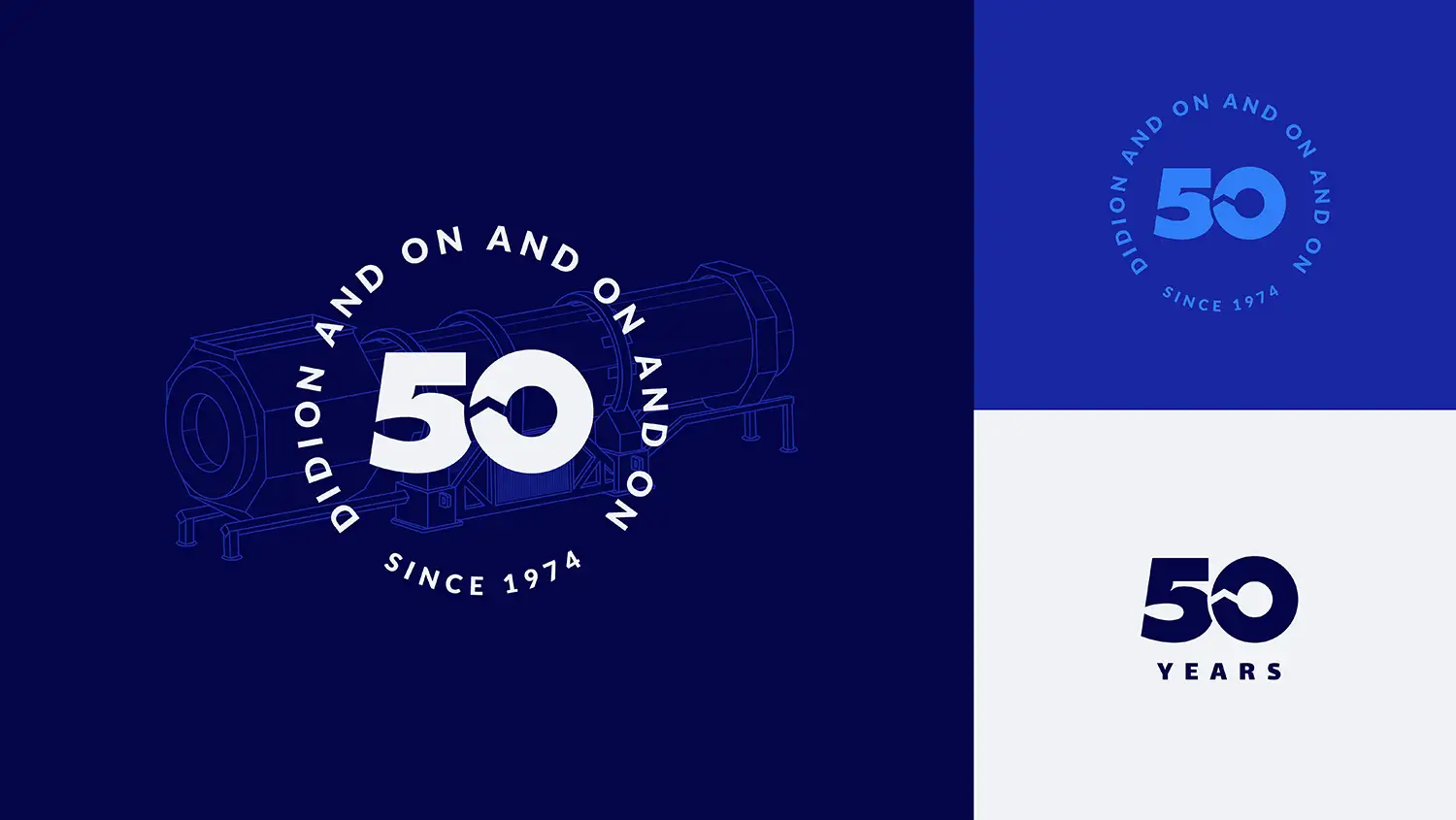
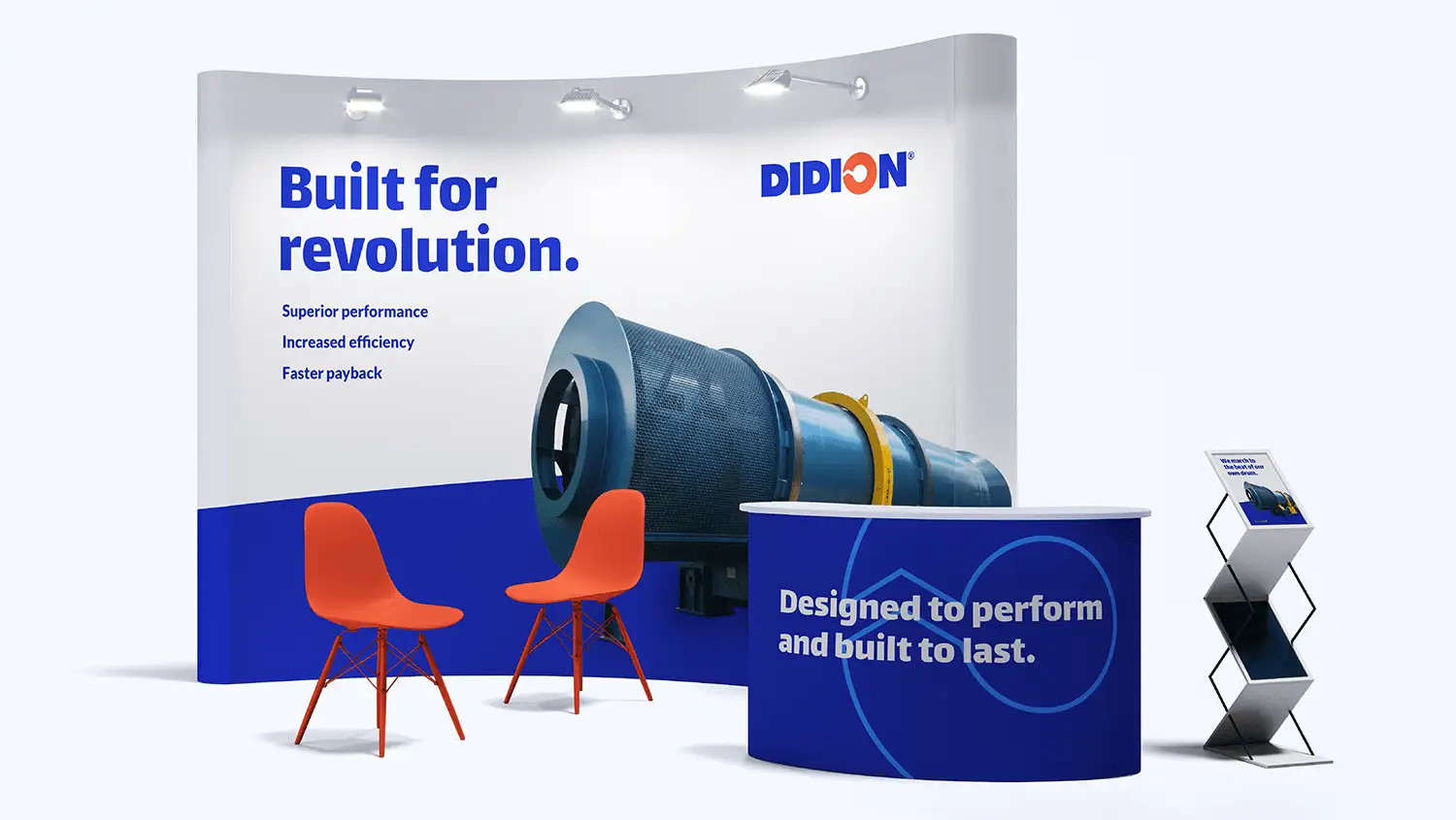
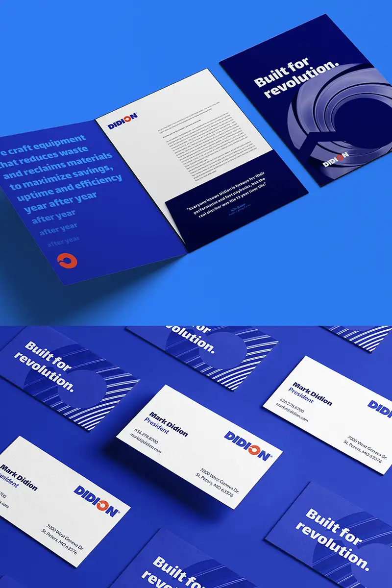
Combining this symbol with textured imagery, a vibrant blue color palette and a strong typeface, we brought new life into the legacy brand, introducing a system that could translate effectively across both print and digital platforms.
Speaking of digital platforms…
Rolling Out an Evolved Identity
The centerpiece of DIDION’s brand rollout was the new website. We created a modern, sleek design with clear navigation and audience-focused pathways for both foundry and recycling customers. The site features engaging animations and benefit-focused messaging that brings the DIDION brand to life.
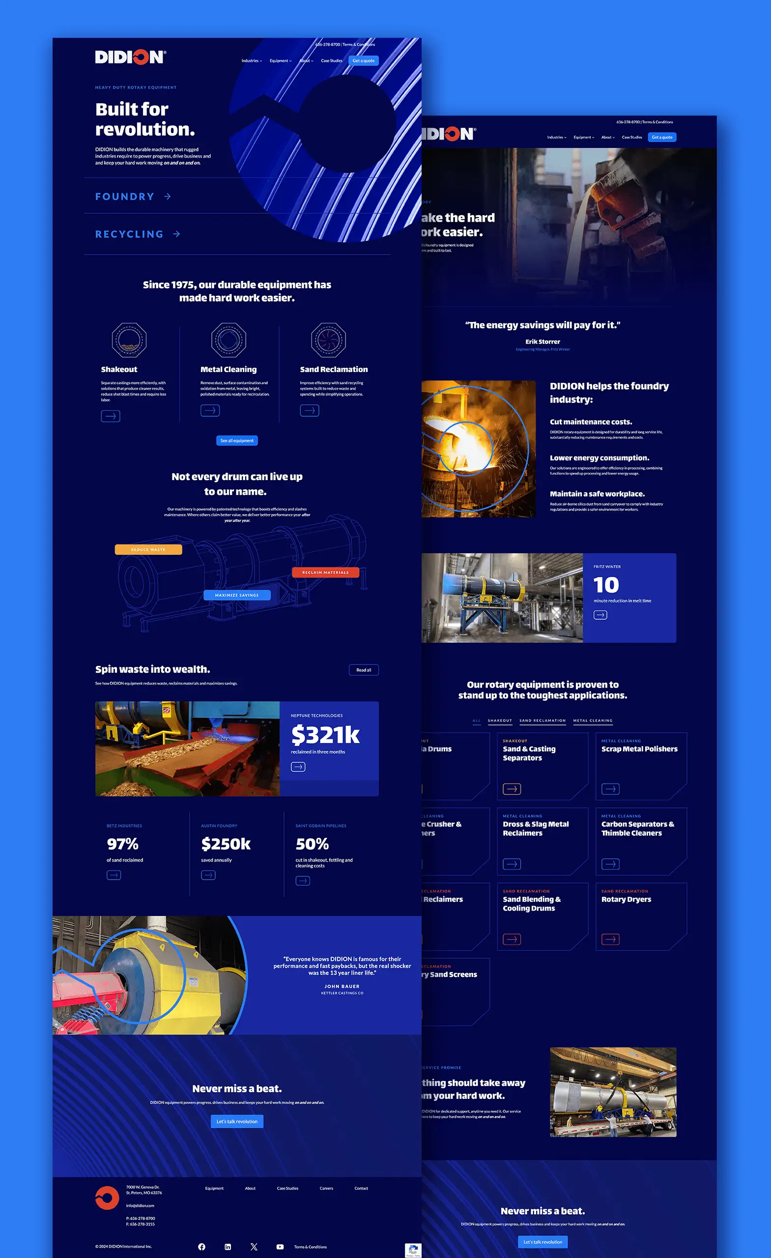

The responsive design ensures seamless viewing across devices, while categorized equipment sections allow for intuitive browsing. We also incorporated prominent case studies highlighting concrete benefits and savings, and integrated customer testimonials to build credibility.
By emphasizing DIDION’s core benefits—waste reduction, material reclamation and cost savings—alongside their innovative products, the company is now able to quickly communicate the brand’s value to foundry and recycling audiences.
The website’s scalable design allows for easy addition of new case studies and product information as the company grows. This flexibility ensures that DIDION’s digital presence will evolve alongside the company, supporting their marketing efforts for the long run.
Coming Full Circle
By revitalizing DIDION’s brand and creating a powerful digital presence, we’ve helped prepare this legacy manufacturer for the next generation of customers, telling their story through engaging visuals and compelling case studies.

The new brand identity and website honor DIDION’s rich history, while positioning the brand as the forward-thinking leader it’s always been—ready to continue driving progress for generations and generations and generations to come.
