Reinventing the Work Shoe: Reebok Branding and Web Design
Everyone loves a fresh pair of athletic shoes, but bulky, workplace-standard footwear doesn’t typically inspire much excitement. When Warson Brands and Reebok hired us to develop branding and an e-commerce site for their new line of work shoes, we saw an opportunity to re-imagine work footwear branding entirely.
Reebok is a household name, known for innovative athletic wear and technology. That places it at odds with the visual identity of your everyday work shoe, which tends to rely on a familiar, rugged, handmade look. Instead of working against the Reebok brand, we decided to work with it, blurring the lines between athletic and work shoes to create something completely new. Warson and Reebok made it easy to accomplish, with great-looking shoes that anyone would want to wear.
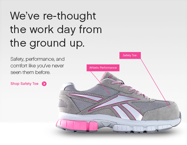
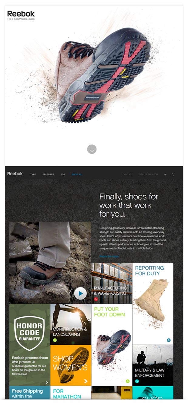
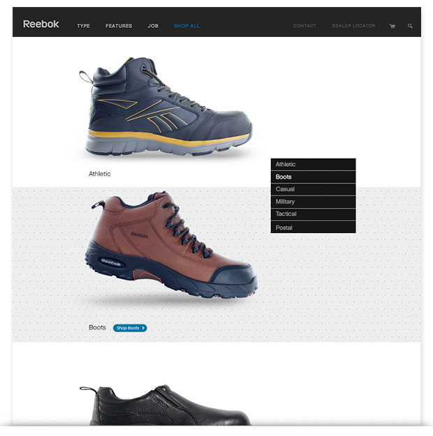
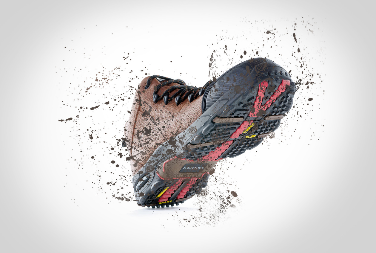
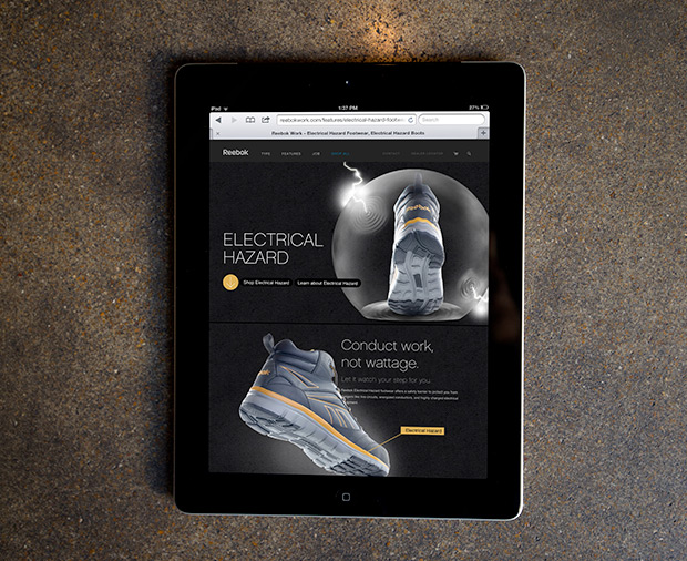
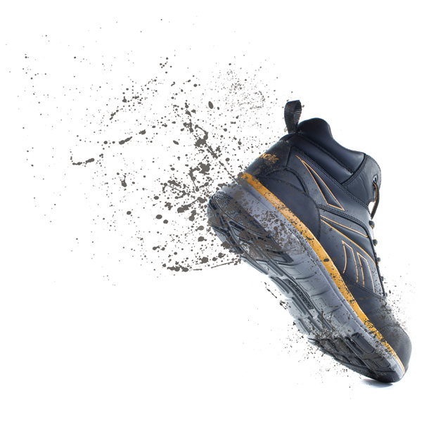
The brand’s new website encourages exploration. It’s simple and elegant to match existing Reebok visuals, and makes each shoe a hero with bold, colorful photography taken by Atomicdust in our own studio space. Visitors can easily browse by type of shoe, occupation, or feature, like slip resistance, static dissipation and electrical hazard protection. The site uses custom animations to show each shoe moving and reacting to its environment. For example, as you scroll down the homepage, a large cement block falls toward a sneaker that – luckily – features a built-in safety toe. No harm done!
After designing and coding the website, we handed it over to the team at Unidev, who were able to tie it into the client’s accounting software. We also designed a mobile site (coming soon) for shoppers on-the-go, and filmed and edited website and trade show videos to show the shoes looking stylish, strong and safe at various jobs and worksites.
This brand is truly the future of work shoes, and we enjoyed telling its story. Take a look behind the scenes of the project in our portfolio, and visit reebokwork.com to see the results.
