A Rebrand for Premium Retail Services Brings New Energy to Retail
For more than 30 years, Premium Retail Services has helped major manufacturers and retailers connect with customers, build brand awareness and drive sales. But retail is changing quickly, and Premium asked Atomicdust to help them show prospective clients that they’re a force moving the industry forward.
While Premium has an excellent reputation and an enviable client list, they were no longer satisfied being lumped into a “third-party labor” category with their competitors. Premium is known for its stellar field merchandising teams, but that reputation was overshadowing services that are increasingly relevant to the evolving retail industry, including data analytics, consumer insights, retail program design and video production.
We took Premium through our Branding Program – but added a twist. After conducting interviews with employees and clients, exploring competitors and sharpening our understanding of the changing retail space, the Atomicdust team gathered for a two-day off-site brand workshop.
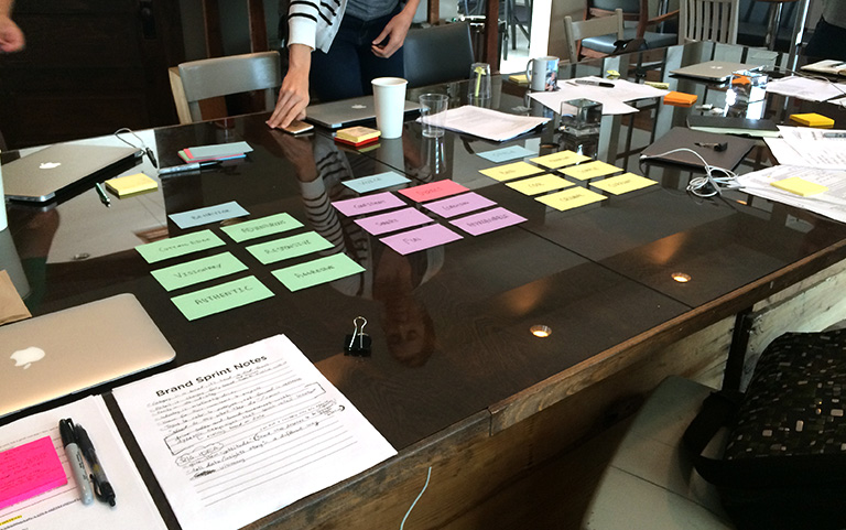
The workshop was highly structured, alternating large group discussions with small group activities and exercises designed to shake up our brainstorming process. The goals were to review and discuss research as a group, identify new opportunities for the brand, and develop a “big idea” to express through positioning language.
By the end of the second day, in the aftermath of a thousand Post-It notes, scattered card decks and permanent marker stains, we had our approach.
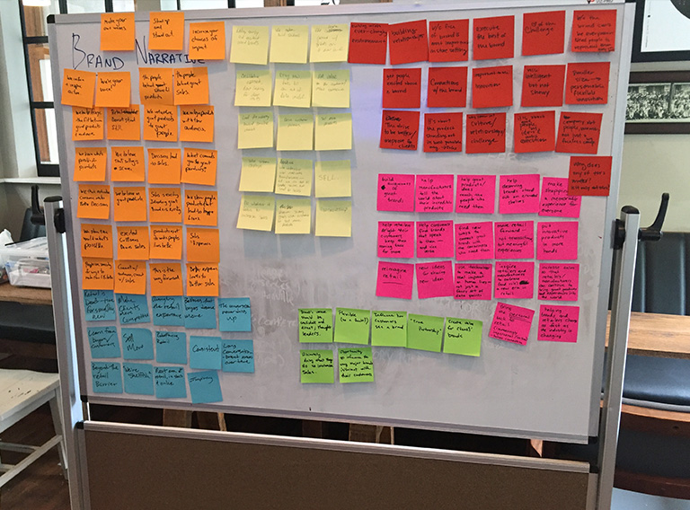
Because the retail industry has become more omnichannel – less about products on shelves, more about online shopping, personalization, automation and wearables – we wanted to help Premium speak to something larger than merchandising.
We positioned the company as a visionary retail services company with the power to shape every decision. The new Premium story leads with consulting and data, a more flexible position that allows them to communicate their value in any setting.
Premium Retail Services brings new energy to retail.
We create inspired strategies that help retailers and manufacturers surprise consumers, drive brand awareness, and spark sales.
As we translated the position into a visual identity, we envisioned Premium as a modern brand on par with many of the consumer electronics clients it serves. After all, shouldn’t a company that works with brands like Oculus look just as sleek and forward thinking?
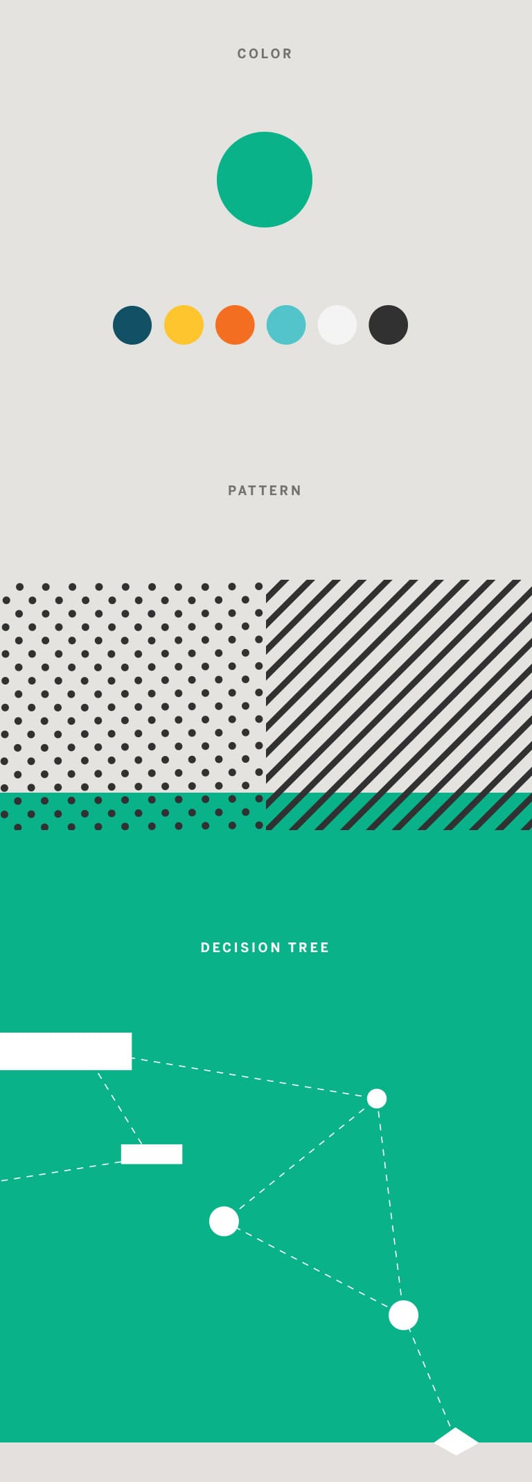
We started simply: with the color palette. In a sea of red and blue competitors, we gave Premium an unexpected green.
We then explored graphic elements to communicate the idea that Premium is “behind every decision,” eventually landing on a flexible and colorful decision tree. The decision tree represents a customer’s mental and physical journey toward a purchase; it’s a mental map and a literal path through the store. By including patterns in our decision tree-focused expressions, we added depth – and another ownable brand element.

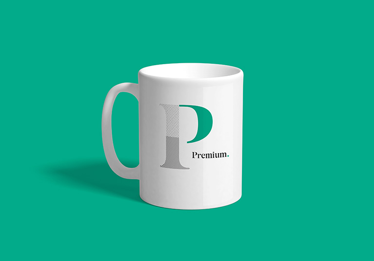
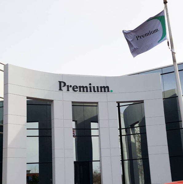
From these explorations came the deceptively simple Premium logo. Decision tree dots are “hidden” in the type. Individually, they represent data, steps in a buying process or other individual pieces of a decision. Connected by the logo or by lines, they reveal Premium’s differentiator. The third dot is also a period, making the name – and the statement it makes about quality – more emphatic. Premium. Period.
It’s iconic, instantly recognizable and unlike anything in their space.
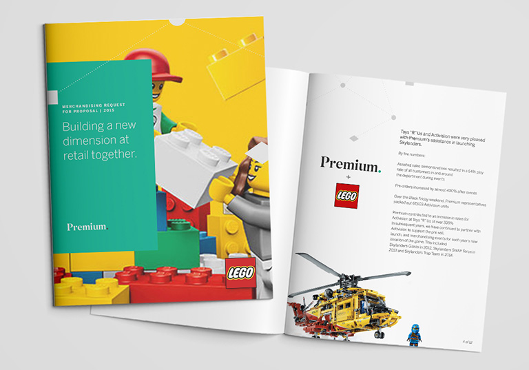
We ensured the entire brand was simple and flexible enough to work as a “container” for prospective client brands. Both the logo and the sleek new brand mark can incorporate client imagery and colors to illustrate the close partnership between Premium and the brands it works with.
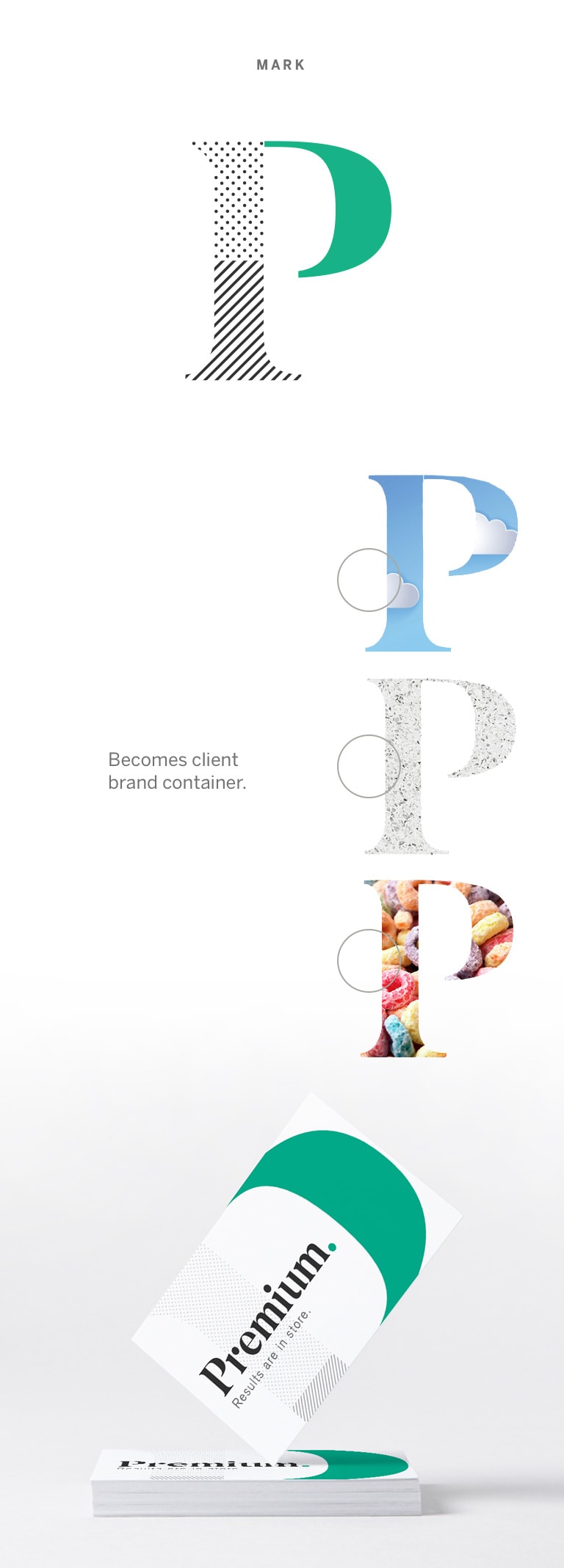
We also recommended a new approach to photography, prioritizing natural poses and lighting over the stock images of fluorescent-lit shopping carts that have become so prevalent in the industry.
And finally, to reinforce Premium’s new focus, we reworked their solution categories and simplified the terminology. Premium now promotes four clear categories, including brand advocacy and strategy.

When it came to the new website, we wanted to reassure prospective clients of Premium’s capabilities as a strategic partner.
We wanted to keep Premium top-of-mind for prospects who may not be ready to switch partners, attract exceptional prospective employees, and engage existing team members.
Of course, the site also needed to reflect the new brand, instantly communicating energy and a unique vision. Because Premium is straightforward and transparent, we ensured the website’s structure and content followed the same model.


We also chose to weave case studies, blog content, video and testimonials throughout, enabling Premium to “walk the walk.” At every turn, the site reinforces the idea that strategy, technology, data and analytics support all Premium solutions.
Premium officially debuted the brand in December, and the response has been remarkable.
The team has truly embraced the brand, and we couldn’t be happier. With their new look and messaging platform, Premium is poised to take full control of their reputation. Visit their site now to learn more.
Want to keep up with the latest work from Atomicdust?
Subscribe to our newsletter for all the latest news, events and weekly ma tips from our team.

