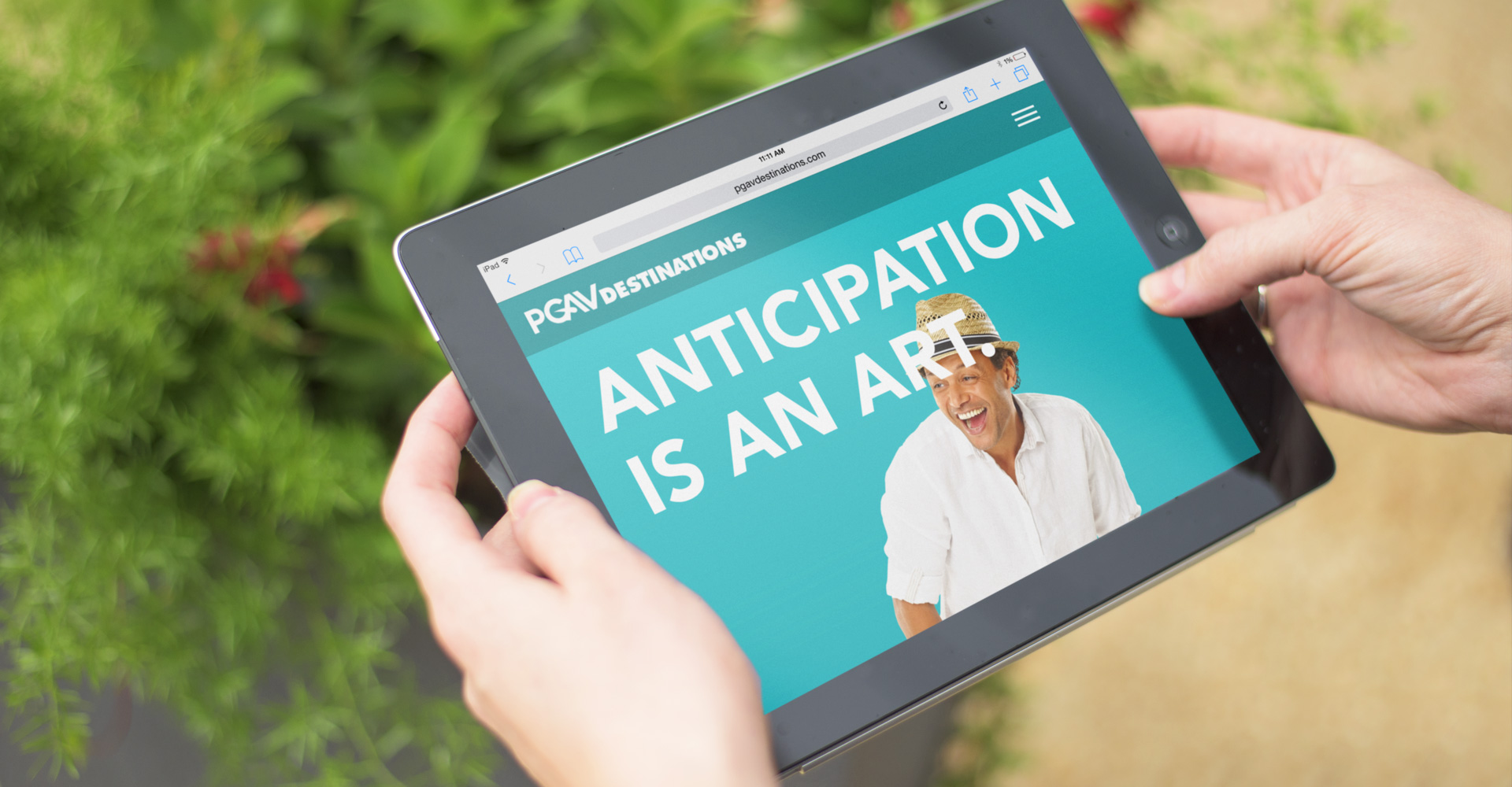
The Journey and the Destination: A New Site for PGAV Destinations
“In the first sentence of the first paragraph of the first book I ever read about running a design studio, it said, ‘Never work with architects.’” – Mike, to the client
In the fall of 2014, John Kasman and Ben Cober offered Atomicdust the opportunity to help global design and planning firm PGAV Destinations tell a more focused story on the web.
We weren’t sure it was the right fit.
PGAV Destinations provides groundbreaking ride design, exhibit design, master planning services and much (much) more for clients across the world, including the Biltmore Companies and National Geographic. Over five decades, as their service capabilities grew across five destination industries – theme parks, resorts, zoos and aquariums, museums, and brand destinations – their positioning had become jumbled, and their website no longer captured the extent or the magic of their work.
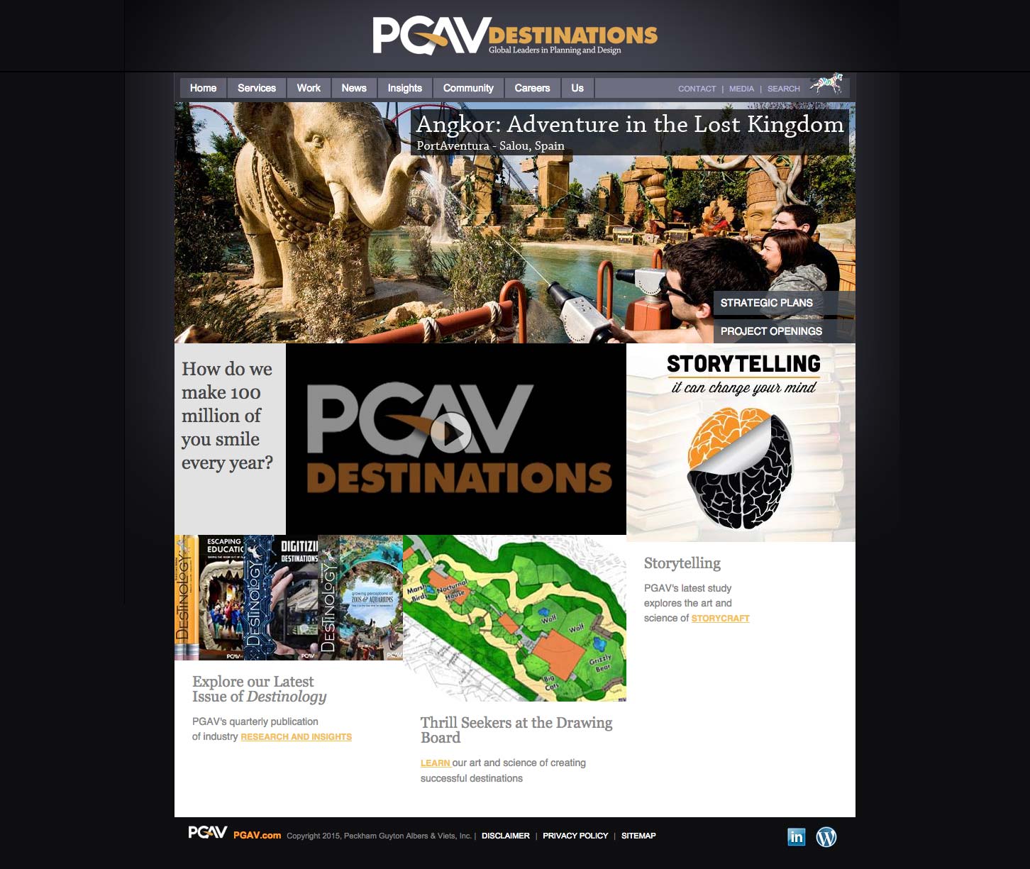
The previous PGAV Destinations website:
“We want to inspire people to want to work with us as individuals – to want to work with our culture. We have a lot of soul, and our website should reflect that.” – John Kasman, PGAV Destinations
Rollercoasters and water rides. Gigantic aquariums. Space shuttle exhibits. And two really smart, nice guys at the helm. The project’s allure was obvious, but our hesitation was real. After building a reputation for our work in the healthcare and financial services realms, where marketers tend to be less familiar with the language of design, we weren’t sure how a design firm/design client collaboration would pan out.
Doubt piled on. In an industry that relies on flashy aerial imagery and 3-D renderings, how could PGAV stand out? How could anyone translate onto the web what PGAV does in three dimensions without falling back on the same clichés?
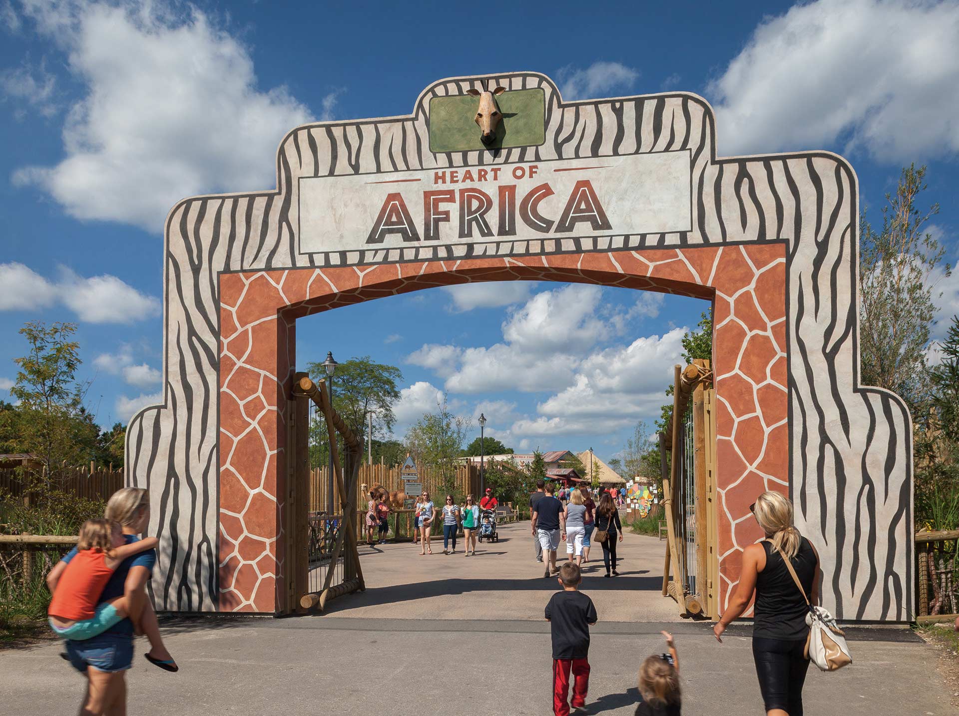

While touring PGAV headquarters in downtown St. Louis, we discovered enormous hand-crafted models, gorgeous destination photographs and a hard-working team of designers, architects, sculptors and urban planners. After settling down in the conference room to talk logistics, John spoke up. “Something’s bothering me,” he said. “We’ve talked a lot about what we do, but I don’t know if we’ve said enough about why we do it.”
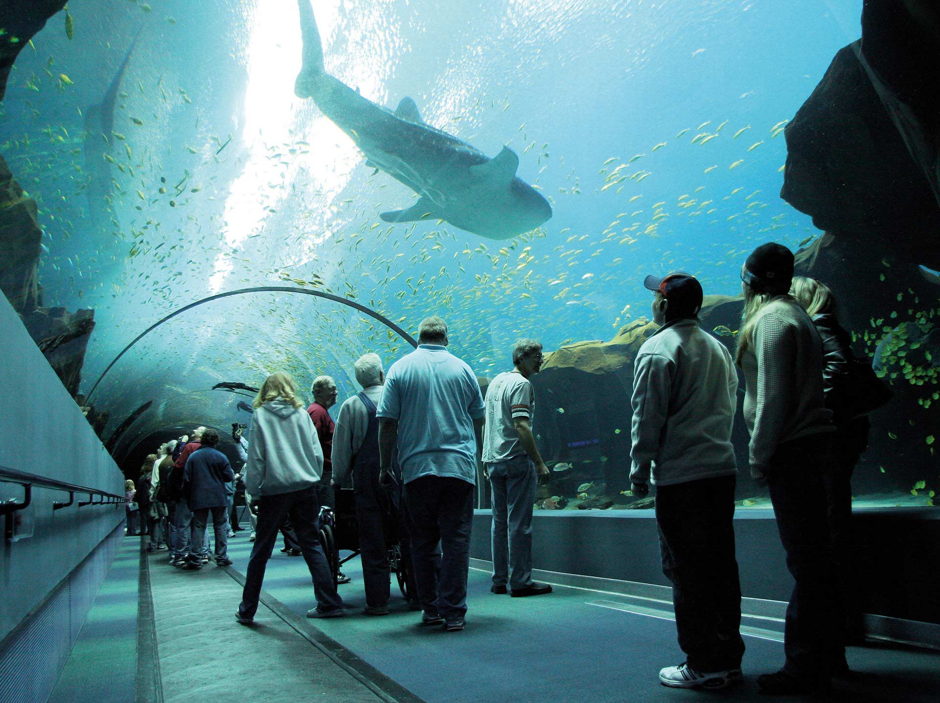
John told us about a visit he’d taken several years back to one of the firm’s newly opened aquariums. As he stood with his family observing sea lions at play, he noticed a young girl in a wheelchair staring intently at the tank. He watched as her parents lifted her out of the chair and helped her stand with the use of crutches. She made her way closer to the tank, and stood there, smiling and laughing as the sea lions swam past her. He was grateful to have witnessed it.
John’s words brought into sharp focus something that we all already knew, but had yet to communicate to each other. The project was about more than blueprints and models and structures. Of course it was. PGAV turns ideas into experiences that shape people in the most meaningful ways. They do it every day, and they live for it. Whatever the challenges, whatever the hesitations, we were in.
As we worked on strategy, content structure and an initial homepage concept throughout November, our first major challenge made itself apparent:
This wasn’t “our” brand.
Our bread and butter is getting to work with a brand at the very beginning through our branding program, when we help them figure out what they should say about themselves and what they should look like. By prioritizing the brand program, we’re able to create messaging and visual foundations that already incorporate thinking about the web (and other marketing channels), and that can be naturally expressed through those mediums.
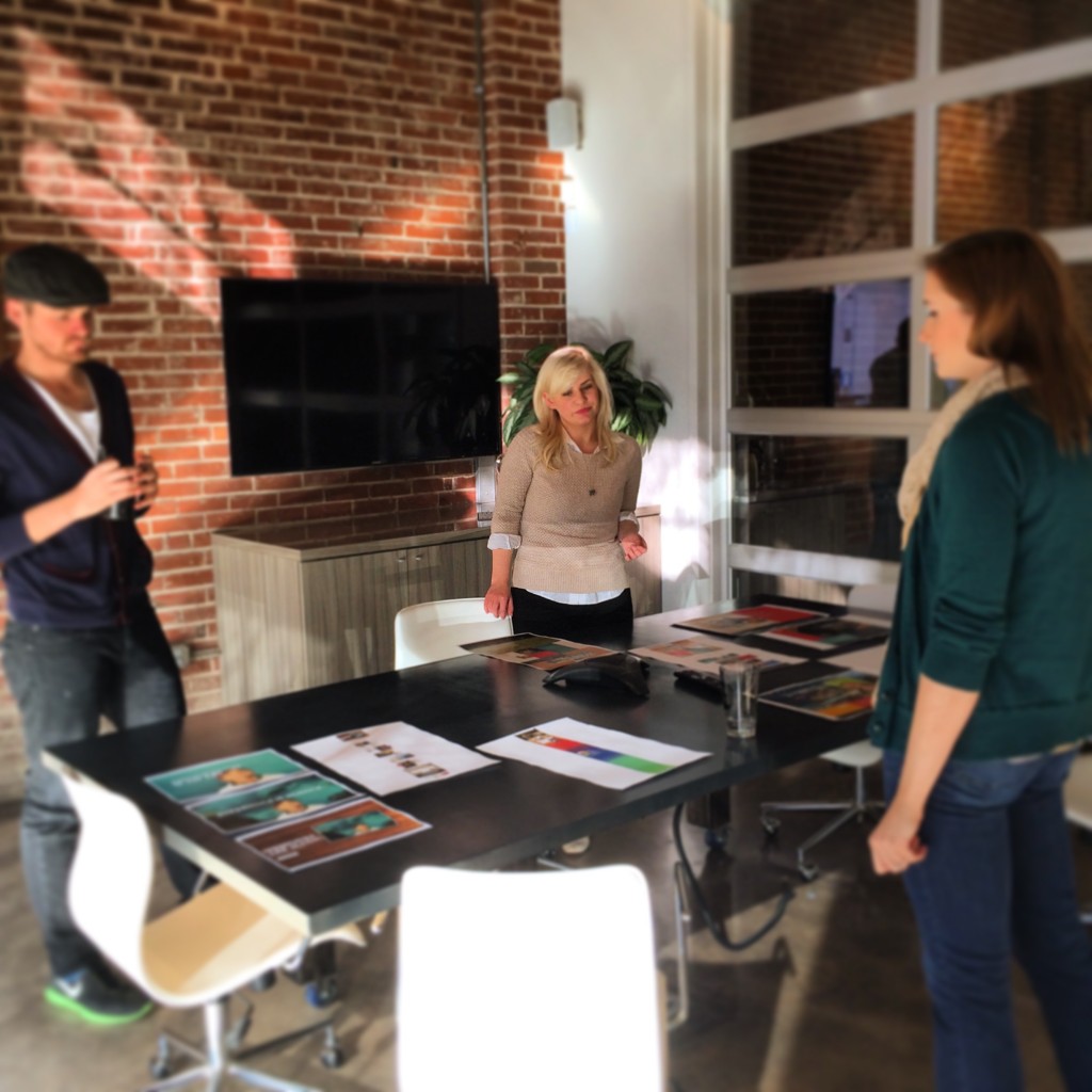
PGAV Destinations, however, had an existing brand. This would result in the infamous Thanksgiving break argument, where Mike and I butted heads as we tried to prioritize messaging for the web – a task that’s usually accomplished during the brand program – while standing at Beth’s desk, looking at a Photoshop file.
We needed a real foundation. We started simply: by translating the existing brand into clear clarifying and reassurance statements.
A defined site strategy and expanded sitemap came next:
“Everything clicked when we saw your creative team members at work, designing, drawing and building models by hand. At PGAV, experiences begin and end with people. People at PGAV imagine and build the experiences that they want to see in the world – the dreams they want to share with the world. This is something that PGAV’s clients see in themselves, too.” – excerpt from the strategy doc
PGAV Destinations is a B2B brand, but businesses don’t buy products or services. People do. Their story had to be bigger than attendance statistics. Through the web, we planned to show PGAV’s prospective clients the passionate people behind the firm’s unforgettable experiences, as well as their devotion to the tourists and guests who will one day be changed by those experiences. To achieve this, we proposed:
- Focusing on the visitors’ perspectives instead of the aerial shots and renderings competitors rely on.

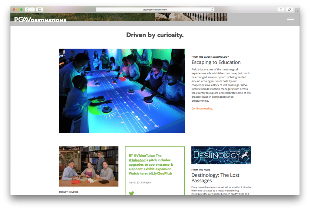
- Celebrating PGAV’s impressive research process and thought leadership.
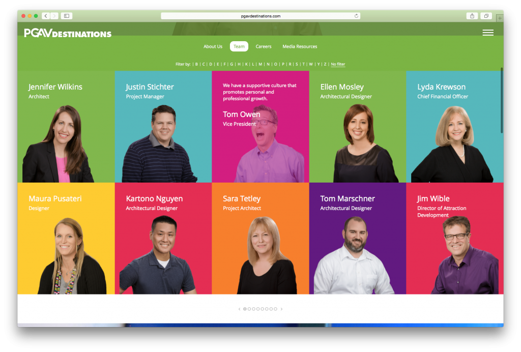
- Adding all 100+ team members to the site to demonstrate the company’s collaborative culture.
- Surprising site visitors at every turn to reflect the experience they would have at one of PGAV’s attractions.

PGAV enthusiastically agreed to our approach. As we worked with their team over the next month, we gained even more respect for their design instincts. Unfortunately, we also began to lose sight of who was leading whom. At moments throughout the project, we looked at what we had created, knew that it offered the “wow” factor we had sold the client on, and knew that it was appropriate for their brand. Still, as we moved further down the pipeline, we wondered if the approach was working in a larger sense.
When we incorporated new, eye-catching surprises into the designs, the site became more muddled. When we pulled back, the story fell flat. Heading into the holiday break, we were spinning our wheels.
Structure, Sketch and Sass Save the Day
The New Year offered a fresh start. During the first week of January, the entire Atomicdust team attended a weekend retreat to identify new tools and processes for working collaboratively in the face of exciting new possibilities in web design (and beyond). After two days of discussions, white boards, bonfires, bonding and beer, we were re-energized and ready to push forward.
It was an illuminating first week back as we jumped into PGAV again. First, we decided that our “surprise at every turn” approach would only work if we could introduce order into the chaos. We began to offset the bright colors, animations and bold text with grids, white space and constant elements across pages. The balance and breathing room worked wonders.
Enter Sketch, a vector graphics app that supports more meticulous, consistent designs. Beth used Sketch formally for the first time during the PGAV project, and it was a perfect fit. Among other features, Sketch has the ability to automatically duplicate core design elements. The app even supported our developers by allowing Beth to export CSS properties of individual objects. The use of Sass also sped up front-end development and added flexibility through reusable variables and mixins.
The site began to take shape. Beautiful video headers demonstrated PGAV’s work in motion. Hand-drawn sketches and candid photographs of families gave their process more humanity. Fun, unexpected tourism statistics (“80% of travelers say splurge purchases are motivated by the desire to create memories”) highlighted the firm’s commitment to research.
As we ran QA on the test site, old fears came back. Had we introduced enough order into the design chaos? Had we not done enough? Had we truly captured the spirit of the brand and the company’s culture? We needed to take a step back and look at the site outside of the context of our challenges. Once we did, we were pretty proud of it.
That final bout of questioning was only natural. We were working out of our comfort zone. In the end, “working with architects” had been an immensely positive experience. The questions were different, the perspectives were different and the pushback was different – and it all made the work wonderfully different.
We fought, we coded, we conquered. With persistence and newfound passion, we were able to give our friends at PGAV a dynamic, inspiring site that captures their approach and impact. The site went live, and the tweeting began:
Our website just leveled up: httpw://t.co/DTeLEKUREF
— Amanda Yates (@yatesamanda) July 9, 2015
Check out PGAV’s cool new website! See if you can find my cat lady easter egg… https://t.co/7ReJwgxVQF #lookunderL — Stacey Ludlum (@designingzoos) July 14, 2015
Thrilled to reveal the new https://t.co/oRHdwHjTfJ! Thanks @Atomicdust for a year of incredible work! #SharetheSite #PGAV #PGAVDestinations
— Ben Cober (@BenCober) July 14, 2015
Big thanks to the talented folks at @Atomicdust for their work on the new website. PGAV loves it! #happyfaces pic.twitter.com/zHbnojZs2l — Spot the Zebra (@spot_the_zebra) July 9, 2015
The new #PGAVDestinations website is live, feat. our beautiful projects & our beautiful faces. http://t.co/erdH99fZss pic.twitter.com/nnT4eJ85bQ
— Spot the Zebra (@spot_the_zebra) July 9, 2015
Cherry on top – the process reinforced some important truths for us:
If your internal culture is built on transparency, your client relationships should be, too.
At Atomicdust, a lot of what we call “collaboration” and “transparency” is really just a kind of telepathy. Because we’re a small agency, we’re abnormally attuned to each other’s creative styles, habits, likes and dislikes, and we often make creative decisions with our teammates’ imaginary voices in our heads.
It’s too easy to take this for granted when it comes to communication with the client, and to forget that, in most relationships, transparency is a by-product of frequent conversations. Because of the complexity of this project, we met face-to-face with PGAV almost every time we presented a new idea or design. In this setting, it was easier and more natural to share the thinking – and the challenges – behind every recommendation. This prevented misinterpretations on both sides, drastically improving the feedback and revision process.
“John and Ben are coming in to review the design concepts tomorrow at 1:00, so just a heads up. #clientpants” – an email from Dani
Creativity relies on chaos, but it needs structure, too.
This goes beyond grid systems. A dash of structure (and some new software) gave us the permission we needed to take successful risks, whether it was at the computer or in conversation.
We were proud to help PGAV Destinations translate their story to the web, and we’ve had a great time playing around on the live site. See it for yourself.
