How Microcopy Can Make a Major Impact
Microcopy.
It’s not the headline, or the body copy or even the subheads. And no, I’m not talking about the mouse-type disclaimers at the bottom of every car ad, insurance come-on and sweepstakes entry.
It’s such a new term that autocorrect wants me to say, “microscopy.”
But I’m here to tell you that microcopy, despite its name, is no small matter.
It’s not something you notice every day – that is, until you do. You always notice it when it’s not quite right, when something just feels “off.”
Microcopy is, ironically, a rather broad term for the bits of copy in a website or app that shapes the user experience: providing guidance, reassurance or other important information.
It might be a tooltip, a call to action or an error message. But no matter what you call it, it’s becoming an increasingly pivotal part of online and digital experiences.
Why microcopy is important.
Even as people get more and more familiar with how apps and websites work, they still need guidance on what to do next. They need reassurance, for example, that their information will be safe or that they won’t be charged. They need to know why they’re being asked to take certain actions or provide certain information. And yeah, they might even want to have a little fun.
And if you’re looking for conversions (and I know you are), microcopy is yet another opportunity for you to express your brand, prove to people how you’re different, and get people to trust you when it comes time to buy.
Ask yourself: Are you a “Contact us” sort of brand? Or does your culture lean more toward, “Let’s talk.” or “Let’s chat.”? The differences are subtle, but can speak volumes about what it will be like to work with your company.
I’ll show more examples, but here’s one tremendous example of a company knowing itself, knowing its audience and being able to deliver microcopy that leverages both:
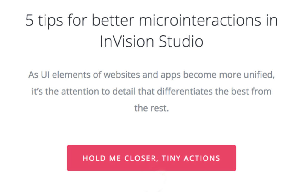
The best microcopy is compelling in every meaning of the word. It induces action, but also engages emotionally. It guides users to the next step, so they can enter information or move forward without a second thought and without second-guessing your motives (or their own).
Let’s take a look at some examples of effective microcopy from a bunch of websites you’ve probably visited before, and even from Atomicdust’s own website.
This example from online file sharing service WeTransfer is a great example of the power of being simple. If you’ve listened to any podcasts over the past year or so, you’ve probably heard of WeTransfer, so you know that one of their core brand promises is ease of use.
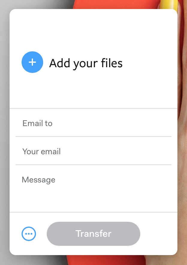
This screenshot of their core functionality bears this out. Note the call to action is Transfer. Not Submit or even Go. It’s a great way to reinforce the brand and reinforce expectations.
Popular project management tool Basecamp generally plays the right note with microcopy, too – especially in the help section of their site. They’ve made their help section casual, conversational and genuinely helpful.
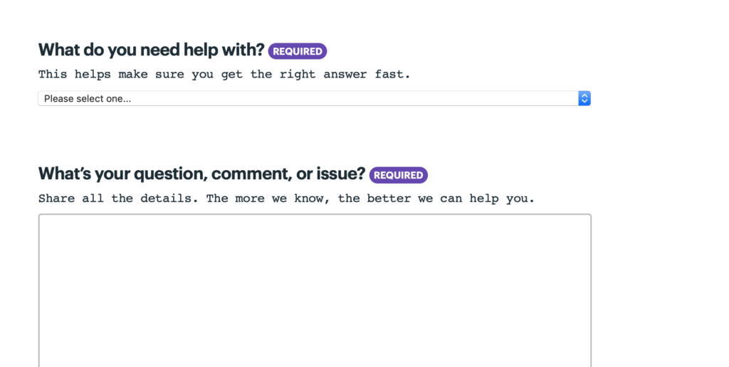
Online review hub Yelp plays it straight, yet knows just the right time to allay fears of undue influence on its site content.

Free trials are a huge part of the Internet experience today. For users, there’s always a lingering question about when credit cards might be charged or full memberships will begin. While the full details are explained on the site, Blinkist puts the important information right in the call to action button.

A search box is a search box, right? Not so on AirBnB, a brand that turned the travel industry on its head. The search box on their site could’ve easily said, “Where do you want to go?” but they took it step further – and their site experience is better for it.
This kind of call to action is a measured risk, because it’s putting the personality of the brand ahead of clear and open communication. But, to their credit, AirBnB knows their primary audience, and it works well here.

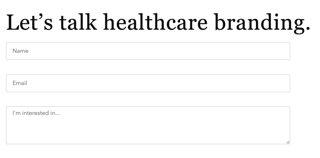
Drawing from the Atomicdust toolbox, here’s a conversational form we’ve placed on our healthcare landing page. It’s clear, professional and conversational – just as we have built the Atomicdust brand to be. It’s also contextual: it could easily just say, “branding,” and free us to put this call to action on every page. But we’ve made it more meaningful for our audience.
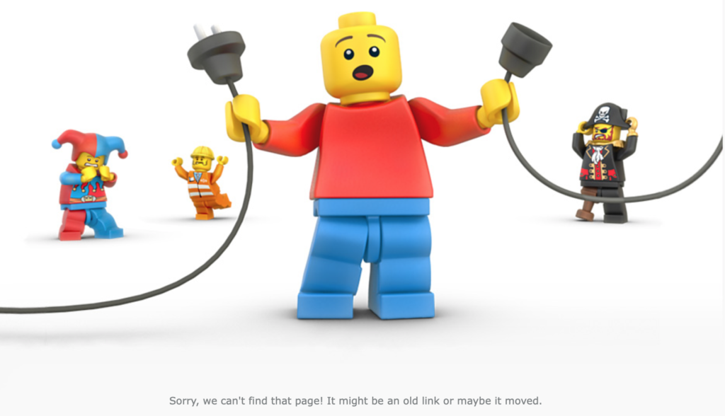
What about when things go wrong? Even error messages are a chance to both show your brand personality and improve the experience for people when they land there. Here are a couple examples of brands that got this part of microcopy right (AirBnB, Lego and Pixar). Note, of course, that some of these rely on clever designs to pull off the clever messaging: yes, just like everything else we do in this business, effective microcopy often goes hand-in-hand with good design.


And now a few pointers.
Ready to clean up your site’s microcopy? Or are you in the early planning stages and trying to figure out the best way to approach all of the copy on your site? Either way, the lesson is the same. The most effective trick is to think like your user.
At every step of your users’ interactions with your site or app, ask yourself:
- What should someone do next?
- What concerns do they have?
- What objections do they have?
- How do we show them how we’re different?
…And then set out to make sure your microcopy answers these questions.
And some additional rules?
- Be clear.
- Be helpful, not salesy (even when you’re selling).
- Be active.
- And be real. That is, be true to your brand.
And the best part? This kind of microcopy is the easiest to test. You can set up formal, measured A/B testing on your site to see what calls to action convert, and then apply that approach to the rest of your site.
That’s a lot of think about for just a handful of (hopefully) little words, but it can make all the difference in the experience people have on your site, and therefore, with your brand.
Speaking of microcopy, here’s some in its natural habitat:
Let’s stay in touch! Keep up with the latest from Atomicdust.
Subscribe to our email list for all the latest news, events and monthly marketing tips from our team.


