LinkedIn’s Redesigned Company Pages: What You Need to Know
Yesterday, LinkedIn announced they will soon be rolling out a new design to Company Pages.
In an email to page owners, LinkedIn laid out what to expect with the change and invited admins to get a preview of they page in the new design. Here’s what you need to know:
A New Page Design
LinkedIn will automatically migrate your existing content over to the new pages – but that doesn’t mean it’s really optimized for the new experience.
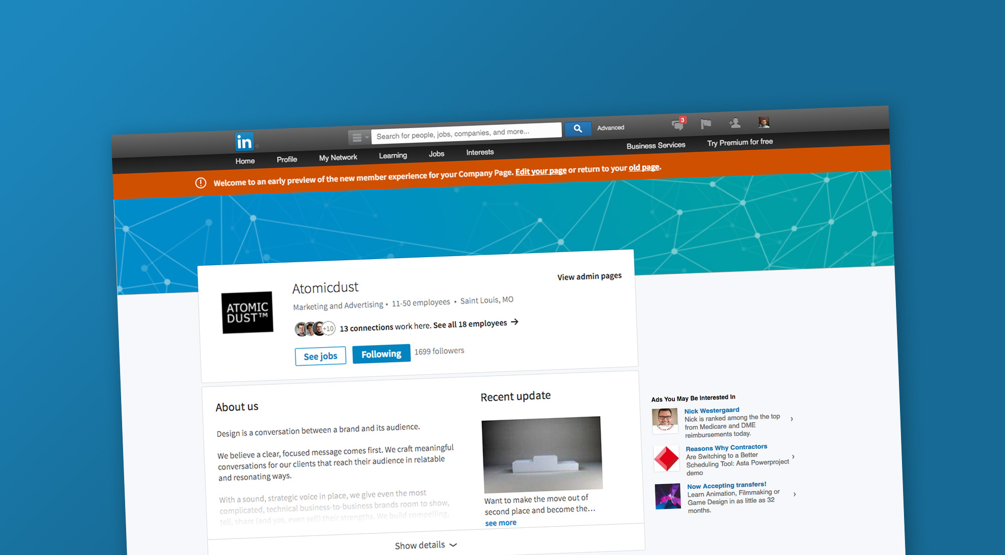
At first glance, a big change is the new cover photo, which acts more as a background header image than a banner. (For the record, LinkedIn suggests sizing the cover photo at 1536 x 768 and company logo at 300×300.)
The email also mentions adding a company tagline, but we did not yet see a dedicated field for this in the preview. Based on the new page design, we assume this will appear at the top of the page underneath the company name.
Moving down the page, you’ll see a short ‘About us’ section, collapsed by default. Though you have a generous 2,000-character limit, it appears that, depending on screen size, only 300-500 characters will be visible before prompting the visitor to “Show details.”
Pro tip: Page managers will want to make sure the copy in the About section is either succinct enough to stand on its own or captivating enough to earn that click to expand.
Other “details” that are hidden below that line? Information like your list of specialties, company address, and the link to your website.
A New Look for Company Updates
Company Updates are now at the very bottom of the page (a disservice in our opinion, especially if LinkedIn is trying to encourage companies to share and ultimately put ad dollars behind content).
However, your most recent update is now pulled up to the top of the page, next to the About section. Only a small snippet of the update is shown here – approximately only the first 40-60 characters, and no link title or description. The company updates at the bottom of the page show the full update, but only pull in the link title, cutting the longer descriptions we used to see.
Pro tip: It may be time to start approaching LinkedIn updates more like Twitter – short and to-the-point, despite longer character allotments.
What About Showcase Pages?
The email from LinkedIn stated that Showcase Pages “will also benefit from the redesign,” but we’re yet to see any previews of those pages specifically. Our best guess is that they will follow a similar structure to the new Company Pages.
In a win for oft-neglected Showcase Pages, they’ve moving to the center of the Company Page rather than getting lost in the sidebar. However, the center placement only shows two pages and then another prompt to “See all.”
Changes Behind the Scenes
Behind the scenes, a redesigned admin experience brings in streamlined sharing, editing and analytics. It’s easy to quickly share an update or view week-at-a-glance analytics. The ability to edit your page, however, is difficult to find – it’s under to poorly-named Overview tab.
The email promised expanded analytics, but aside from a week-at-a-glance sidebar, it doesn’t appear that the full analytics dashboard offers anything new. It continues to break down reach and engagement on each recent update, charts growth and shares demographics – but we had access to all of that already.
LinkedIn has already started debuting the new design out to a small group of users, and we expect it to roll out to all users soon. If you haven’t already, log in and check out the preview of your redesigned Company Page.
Stay up to date on the latest marketing insights from Atomicdust.
Sign up for our newsletter and we’ll send you weekly marketing tips from our team, as well as the latest news and events from Atomicdust.

