Bringing the International Photography Hall of Fame and Museum into Focus
Even if you’re from St. Louis, you might not know about some of our city’s hidden gems. One of those lucky finds is just a few blocks from our office, right in the heart of the Grand Center arts district – The International Photography Hall of Fame and Museum.
The museum (IPHF, for short) is a 6,000-square-foot art gallery and exhibition space celebrating some of the world’s greatest artists and innovators in the field of photography. They proudly display pieces from their renowned collection of prints, cameras and more – all behind unassuming glass doors off Olive Street.
Right from the start, we knew we wanted to elevate the brand to reflect the history and significance of the organization. But as we learned more about them, we also discovered that beyond restoring and protecting historic photos, IPHF also works to foster a love of photography with younger generations. With that in mind, we built our design around the message: “Preserving the past. Fostering the future.”
We blended old and new with our selection of typography (pairing a heavy serif with modern, clean san-serifs) and color palette (rich earth tones, countered by crisp pops of blue and red). Together, these elements blend both past and future, creating a look that’s fresh, modern and perfect for IPHF.

Before starting our design for the new IPHF website, we researched other museums across the country and looked for industry best practices and patterns. Sure, we knew we needed the basics – hours, location and admission prices, of course – but what experience could the website offer digital visitors besides that?
Naturally, we decided we ought to focus on photography.
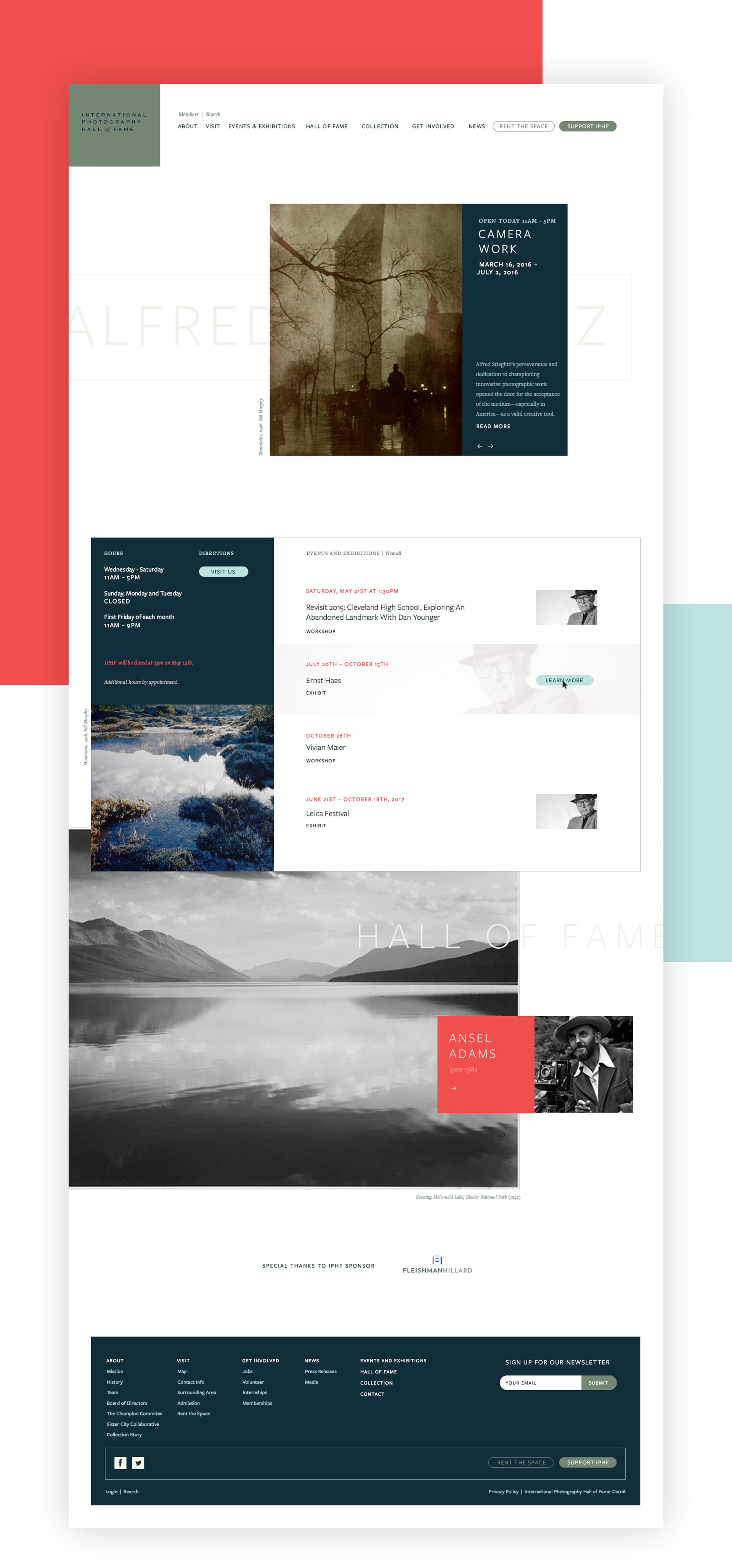
Sounds obvious, but the old IPHF website suprisingly lacked much photography. It’s common for museums to be protective over the art they display, but these days, many of these photos are just a Google search away. We knew nothing could compare with seeing these photos in person, and that giving digital visitors a glimpse at the collections would entice them to visit in person.
We added some movement and elegence to the homepage with an animation showing off the new visual brand. As visitors scroll, the animation is replaced with the key information they need, incuding hours, the address and featured events and exhibitions. The homepage does exactly what we intended – it provides a quick snapshot of who IPHF is and what they bring to visitors.

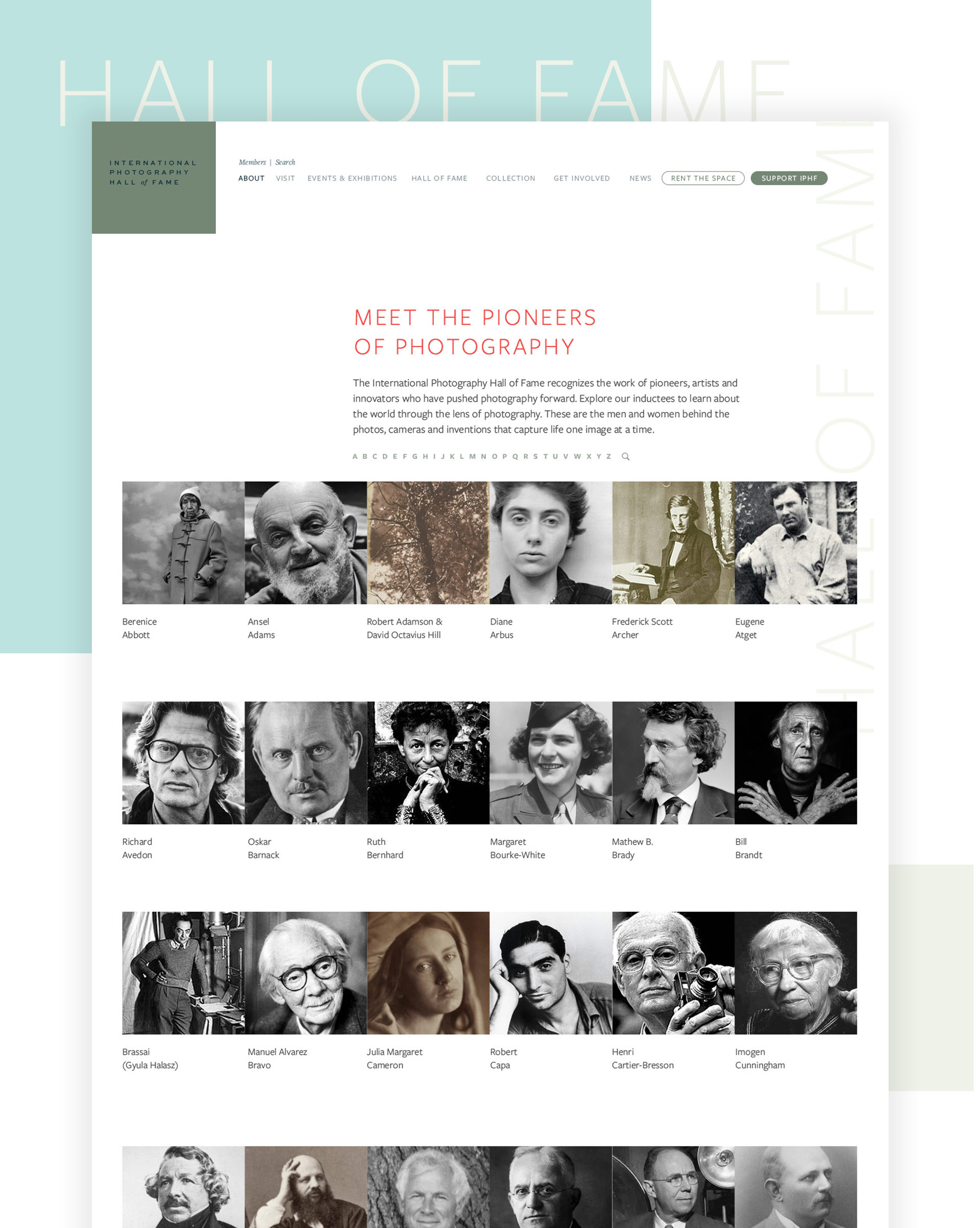
As we moved through other key sections of the website, we worked closely with the IPHF team to identify opportunities to add value for visitors. Reviewing the anlaytics on their existing website, we found that beyond looking for hours, the address and admission prices, there was a lot of interest around the Hall of Fame inductees.
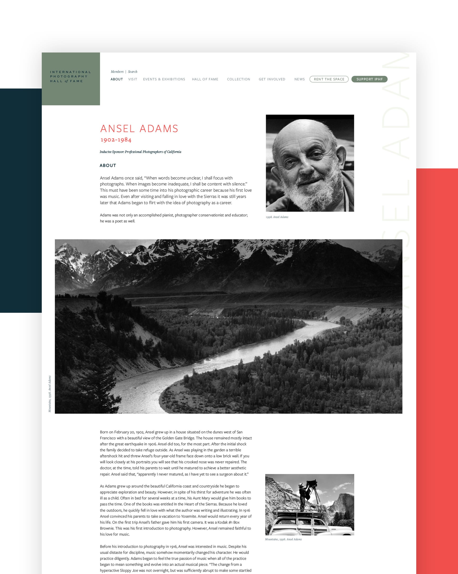
From Ansel Adams to Yasuzo Nojima, IPHF had biographies on each Hall of Fame inductee, a diverse mix of photographers, inventors and innovators in the industry. We turned our attention to improving the reading experience on each bio and added large feature photos, creating an encyclopedia-like feel.


Since 1965, IPHF has been on a mission to educate, exhbibit and honor contributions to photography, and now its digital presences helps foster that goal. Whether looking to visit, writing a research paper or just seeking to learn more about the founders of modern photography, the new IPHF website design provides a refined, modern experience.
The new website launched just before the announcement of their 50th Anniversary celebration, including the induction of one of our shared design idols, Steve Jobs, into their Hall of Fame. (You can experience the exhibit for yourself, open until February 4, 2017.) We look forward to adding more valuable content to the IPHF website over the coming year, so keep an eye out.
Visit the IPHF website, and start planning your next visit to this local gem.
Want to keep up with the latest work from Atomicdust?
Subscribe to our newsletter for all the latest news, events and weekly marketing tips from our team.

