Interaction is Branding
When someone mentions “branding,” my guess is “interaction design” isn’t the first thought that comes to mind.
In the increasingly always-connected mobile world we live in, it should be.
The way a user interacts with an app, website, or device has a profound impact on the emotional connection users form with their favorite brands. People love to be surprised and delighted – and paying careful attention to interaction decisions is a fantastic way to reinforce a brand experience.
Path
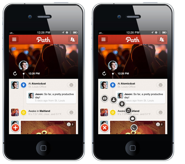
Path is a social app available on iOS and Android phones, with similar functionality to Facebook. The company recently relaunched their primary app – and immediately thereafter, Twitter seemingly exploded with praise (and some disdain, naturally) for the app’s design and usability flourishes. The most obvious example is the share menu – it’s a large plus-button in the lower left corner of the screen, and when pressed, six smaller icons spin out to form a radial arrangement of icons. The plus sign tilts 45 degrees to become an X – and if you press it again, the smaller icons spin back into the main button. It’s very slick, and a definite “Oh, neat!” moment.
These design details, small and large, are apparent throughout the app. They create a feeling of delight that’s unique to Path – there’s simply nothing that works quite like it. Facebook, by comparison, feels old and boring.
2011 saw the launch of tons of reading aggregators – apps and websites that import your social network information and serve up articles from various sources that you should like (based on what you and your friends link to.) The first – and most popular by far – is Flipboard for iPad.
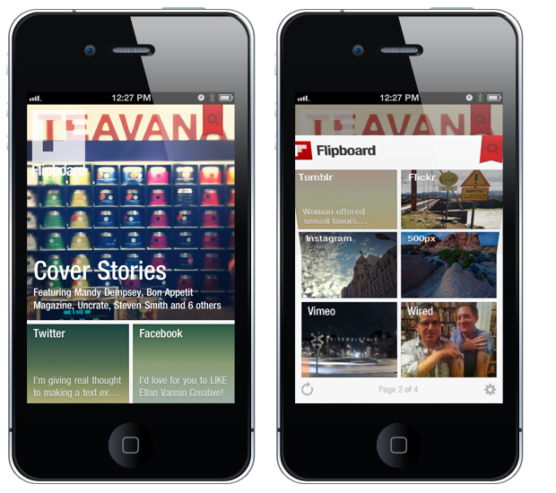
Once you’ve used Flipboard’s page-folding mechanic (or watched one of their demo videos), you just get it. They’ve got a touch interface mechanic wholly different from Apple or Google’s default page-turn styles, and it belongs entirely to Flipboard. They’ve made a screen transition distinctive, fun, and obvious.
Moreover, the Flipboard team is obviously aware that this interaction is at the core of their brand. The recently released iPhone version doesn’t flip side-to-side in the same way as its larger iPad sibling, instead using the same mechanic to flip up and down. It’s a natural gesture that only requires one thumb to activate, and it’s still instantly recognizable.
Windows Phone
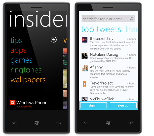
Branded interaction models aren’t limited to apps or websites – Microsoft’s Windows Phone operating system puts a lot of emphasis on horizontal swipes, revealing additional content in parallax panes. Most apps on the platform make use of this style of navigation. It’s not entirely unique to Windows Phone – the iOS version of Tweetdeck used something similar – but they use it so often and so well, they effectively own the interaction.
And that’s really the point – that’s what effective branding is. It’s about possessing something unique; it’s differentiating from the competition. It’s about creating something desirable, not something that’s good enough.
In the grand scheme of things, interaction design is only one way to contribute to a brand’s overall experience. Still, it’s something that should be carefully considered in a time where we regularly carry tiny supercomputers in our pockets.
![]() Jason Stoff is a fancy-pants designer, photographer, and handsome rogue in St. Louis, MO. And also holds the title ‘Senior Designer’ at Atomicdust.
Jason Stoff is a fancy-pants designer, photographer, and handsome rogue in St. Louis, MO. And also holds the title ‘Senior Designer’ at Atomicdust.
