Hardworking Catalogs for Rockport Works
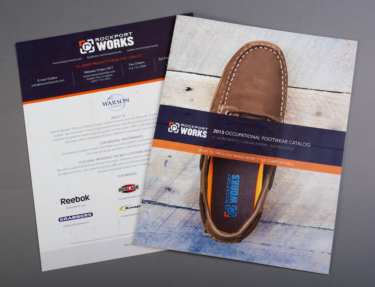
We’ve worked on a few projects for Warson Brands, most recently a pair of product catalogues for their Rockport Works brand. Warson Brands creates hard-working footwear for multiple national brands, including Reebok Work, Florsheim Work and in this case, Rockport Works.
We were tasked with creating catalogues that work just as hard as the Duty Uniform and Occupational Footwear lines from Rockport Works. These lines of footwear are purpose-built for work. Regardless of the occupation, Rockport Works softens the blow of the workday. We built a pair of catalogues to highlight each of the lines without losing technical specifications or sacrificing quality design work.

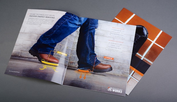
We started with photography. We took the shoes away from the white backdrops, put them into their natural habitats and photographed them. The shoes shined on grass, docks, cobblestone and kitchen floors – we wanted to communicate that in the catalogues. Afterwards, we looked at how we could make all of the technical specifications more digestible with clean and consistent design.
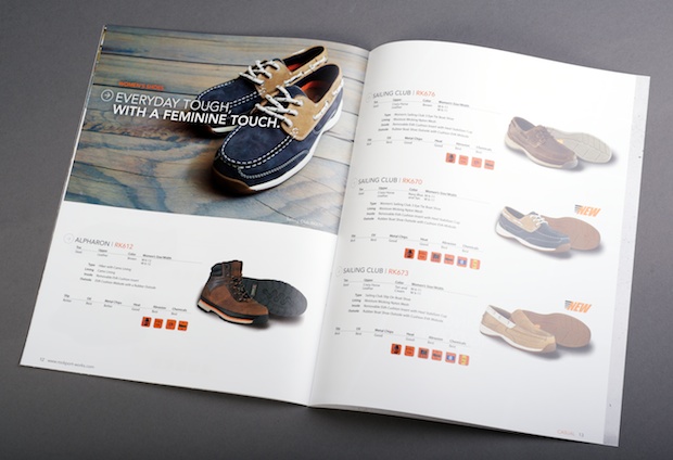
At the end of the day, these are informational catalogues – their primary function is to inform. That in mind, we organized the information and used the Rockport Works icons to highlight the special features of each shoe. As retailers look through the catalogues, they can easily get a grasp of the characteristics of every model. And that’s what we wanted.

It’d be easy to stuff all of this information on one sheet – model numbers, characteristics and maybe a thumbnail. But we wanted something that would work for retailers, something they can use again and again. There’s a lot of information packed into each of these catalogues, but thoughtful design makes it all much more manageable.

