Taking a Little off the Top for Hair Saloon Website
There’s so much parity out there in the world. When a brand comes along that has something unique to sell, it’s a revelation. That’s exactly how Hair Saloon entered the market in 1999.
Amidst the salon revival, men were being left out. Our client wanted to change that, and he started what he called an honorable rebellion.
They created a place that’s part saloon, part salon. The kind of place “where everyone knows your name” – but you’re not there to hang out and drink. You’re there for a new kind of haircut experience that feels as comfortable as the old days. Like the barbershops of old, with a modern twist.
While the founding messages of a place specifically for men were still relevant to their business, the company recognized the need to express them in bold new ways: toning down the exclusivity in some ways, but going bolder in ways more relevant to today’s audiences.
It was also a key turning point for Hair Saloon as a whole: they were embarking on a redesign of their stores, and making a new push to prospective franchise owners to support growth. A new website design would be the cornerstone of this effort.
Living the Brand
As we started to work through creative solutions, we (well, the guys among us, anyway) got haircuts. We explored the competition and experienced for ourselves how Hair Saloon was different. And with shorter hair and a sense of where we needed to go, we set to work.
As we explored websites in the industry – even those companies that aren’t direct competitors –we found a wide gap between form and function. Some sites were heavy on lifestyle and story, but difficult to navigate. Others were highly functional, and frankly boring, at the expense of story.
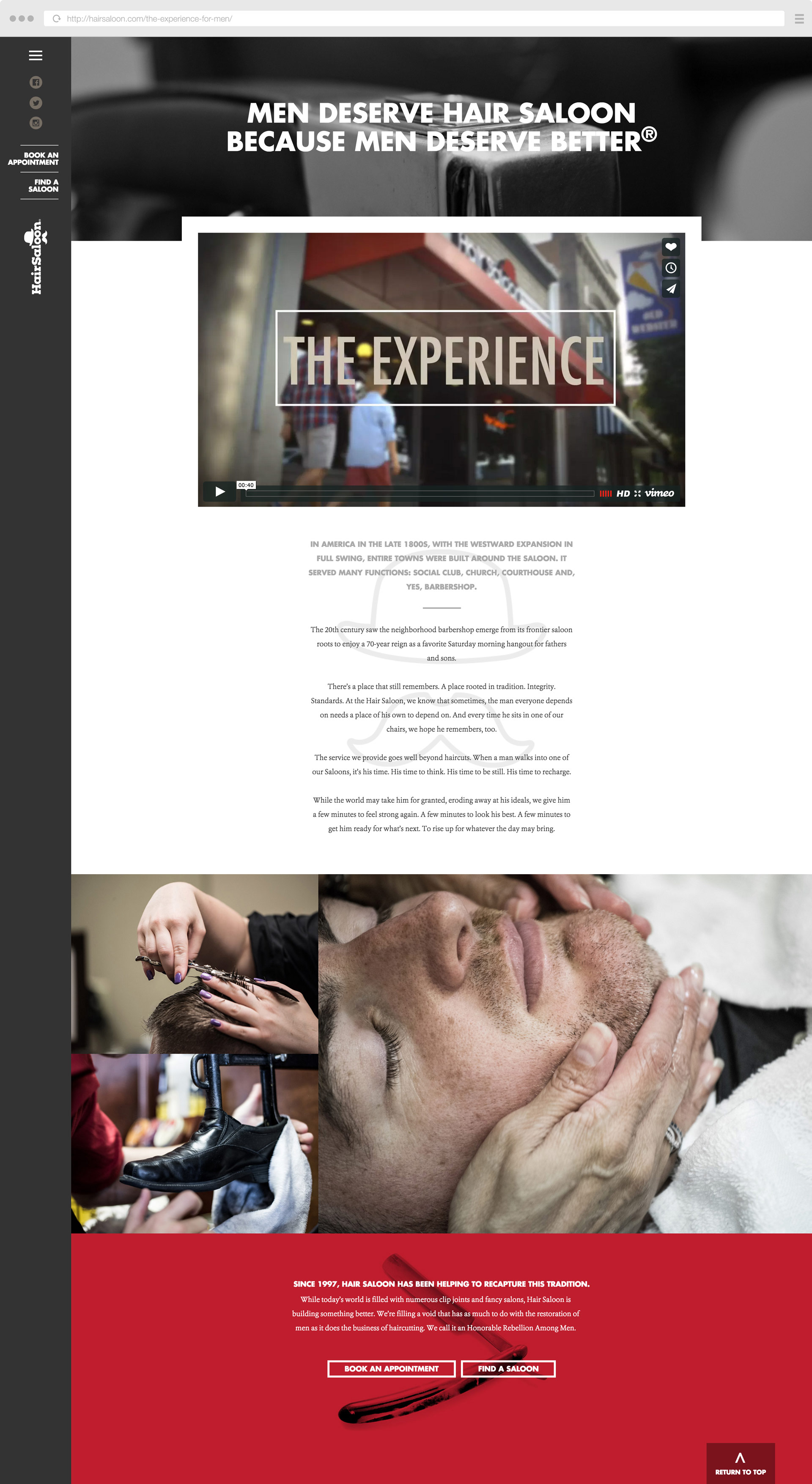
For the Hair Saloon website, we eschewed traditional navigation, instead using the space to take direct action on the site – from finding a location, to booking an appointment or buying one of their products.
Together, the bold, bright graphics and headlines tell the Hair Saloon story better than the lengthy copy we found on similar sites in other markets. We knew, from our own experience and research, that most visitors would initially skip over these messages and jump right into action.
As we draw users deeper into the site, we did take time to immerse them in the Hair Saloon experience, leaning heavily on video for the experience and copy for the philosophy and founding story.

Growing It Out
As Hair Saloon prepares for its next stage of growth and prepares to move beyond its 16 St. Louis locations, they wanted to reach out to potential owners who would embrace the Hair Saloon story and bring the rebellion to more people.
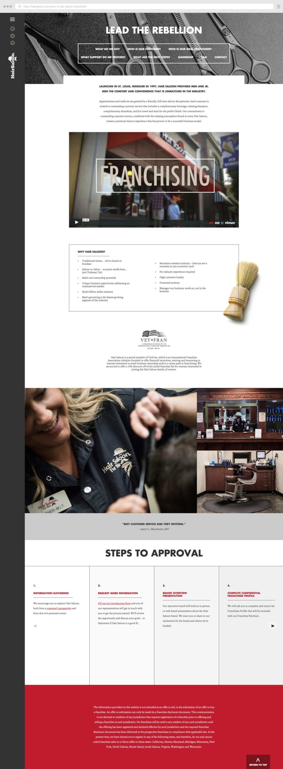
While well within the Hair Saloon aesthetic, the franchisee section has different goals. It starts with an introduction to the brand with a video and key selling points – and then logically leads prospects through the decision process.

It’s a logical, almost step-by-step way to answer the primary questions people may have about opening their own franchise – ending with a step-by-step guide to what comes next.
The goal? To ensure that franchisee leads coming to the company are informed, qualified and excited about the brand.
Never Fade
Of course, launching a site is never a one-and-done deal. Since Hair Saloon’s site went live, they’ve routinely published content, highlighting promotions and new developments that support the brand. From military appreciation to Fathers’ day promotions and golf tournaments, the Hair Saloon marketing team has been on it.
They have also fully embraced social media, posting just the right balance of directly branded content and promotions and relevant lifestyle content to keep fans engaged on Facebook, Twitter and Instagram.
It has been rewarding to see the company embrace the web as a publishing platform – and we can’t wait to see where they take it next.
Want to keep up with the latest work from Atomicdust?
Subscribe to our newsletter for all the latest news, events and weekly marketing tips from our team.


