The Great Frame Up and Deck the Walls Websites Launch
Our work for Franchise Concepts’ Deck the Walls and The Great Frame Up recently launched. While most any craft or hobby store has a framing sections, these guys set themselves apart as the framing experts.
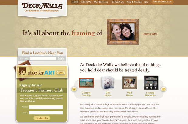
Each brand wanted help showcasing the variety of framing options and the expertise of the employees in the stores. So we put the framed items right where they should be- the center of attention.
The result was a pair of sites that showed people all of the memories they could capture- whether it be their child’s first art class project or that game-winning hockey puck. They got the message: if there’s something to be framed, I need to take it here.
In addition to rebranding the corporate sites, we also provided a solution to help franchise owners keep their sites consistent with the corporate brand. Each franchisee had created a website for their own store, and each site had a completely different look and feel form the next. This created a major disconnect from the main brand.
To alleviate this problem, we provided a variety of templates for individual franchise owners to choose from. As a result, they could personalize their specific store with special offers and photos, while still keeping the consistent look and feel of the corporate brand.
After developing the strategy and producing the initial creative, we gave the files to their internal team to code up. You can check out the sites here:


