Making Franklin Madison’s B2B Web Design Consumer-Friendly
The term “B2B” is misleading.
Despite the name, B2B companies aren’t actually selling to other businesses. They’re selling to the people at those businesses.

That case of mistaken audiences leads to old-school B2B website designs that are drowning in copy and brochure-like static designs.
Modern B2B brands, however, know that’s not good enough.
Franklin Madison is one of those brands. The average consumer might never even hear the company’s name. Still, the team knew their website needed to connect not just with executives and managers, but with people.

So they hired us.
The World of Consumer Insurance
Have you ever gotten an ad for insurance from your bank? Offering those programs is what Franklin Madison is all about. The company partners with banks and credit unions to provide consumer insurance—life insurance, hospital insurance, even pet insurance—to their customers and members. Why? Providing additional services like insurance allows financial institutions to strengthen customer engagement and build alternate revenue streams.
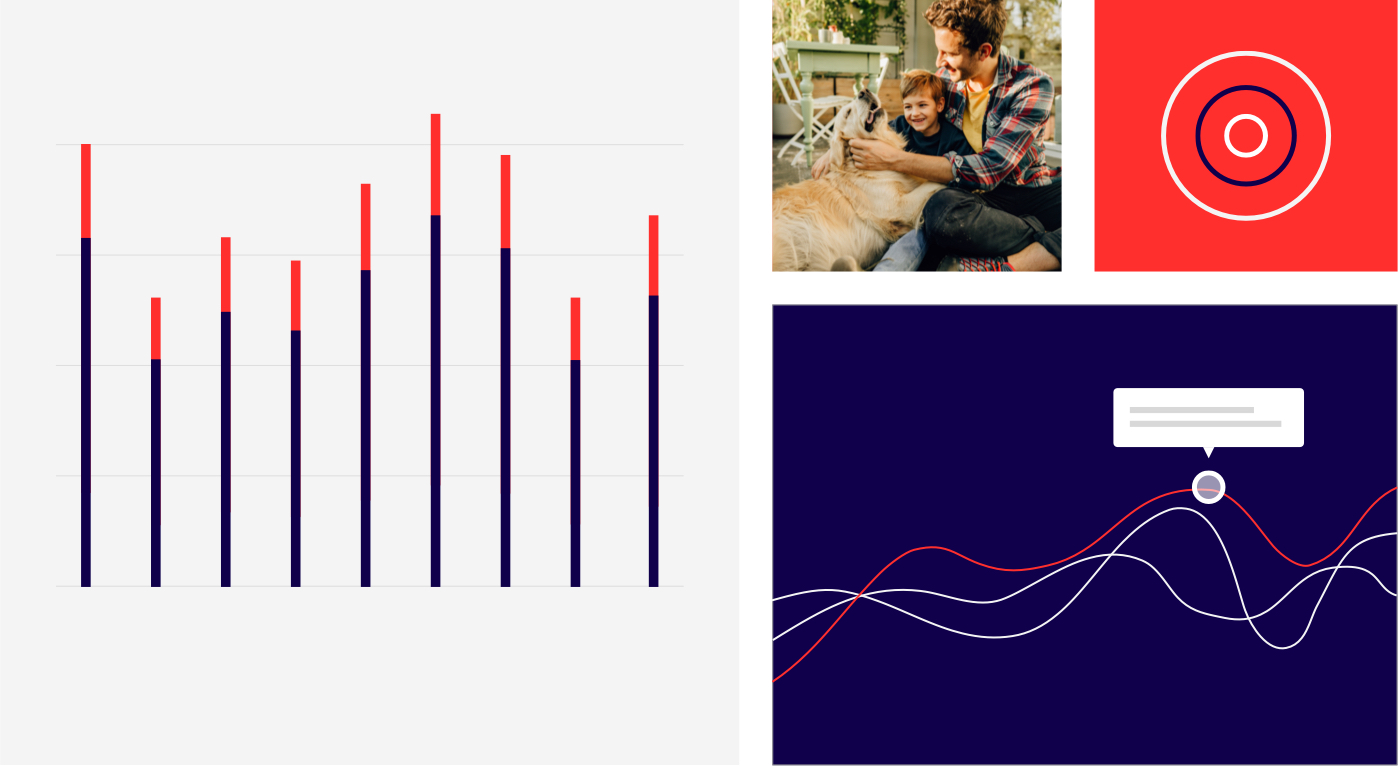
That’s not all. Franklin Madison uses insightful data analytics and a talented team of creatives to help its clients deploy targeted and effective marketing campaigns promoting the insurance products.
But with a complicated product, they needed help telling their story online.
Getting to Know You
Franklin Madison had completed a rebrand a couple of years before approaching us. The brand was still working and representing the company well—it just needed a few updates to stay modern and come to life online.

Our team met to discuss the project, asking ourselves: how do you educate audiences about a behind-the-scenes company with an intricate menu of products and services? And then how do you make that company feel modern and cool?
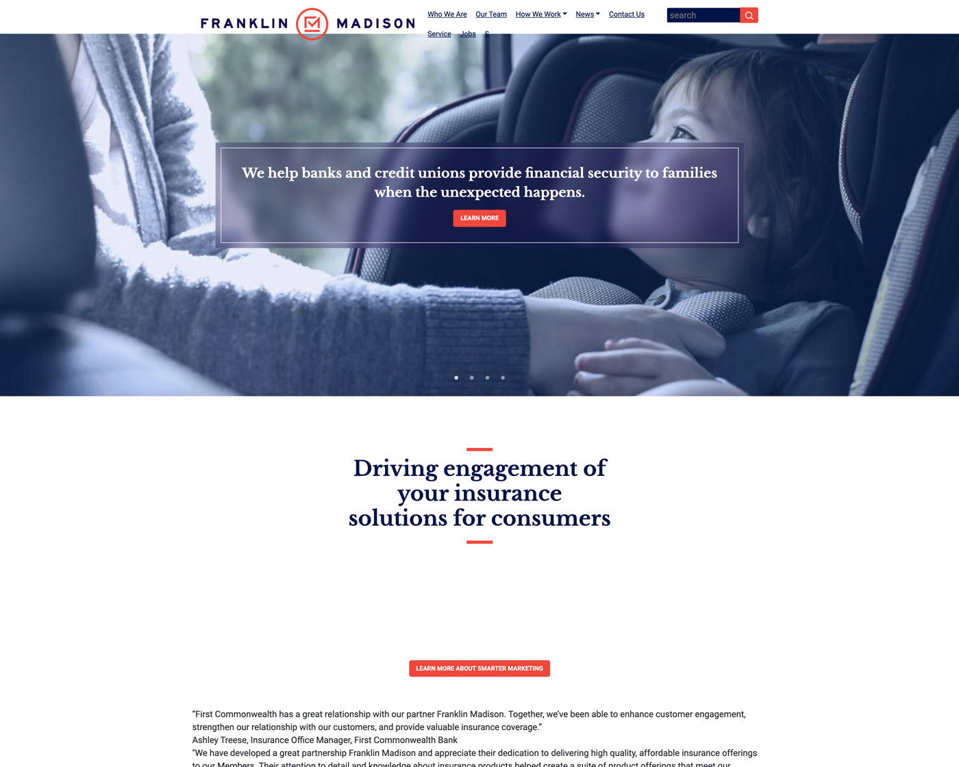
A screenshot of Franklin Madison’s old website
Atomicdust has worked with B2B companies in complex industries and markets for decades, so we knew it was possible.
We just needed to figure out the right solution for Franklin Madison.
Franklin Madison Explained
We started, like always, with a sitemap, designed based on what information users would be looking for and in what order.
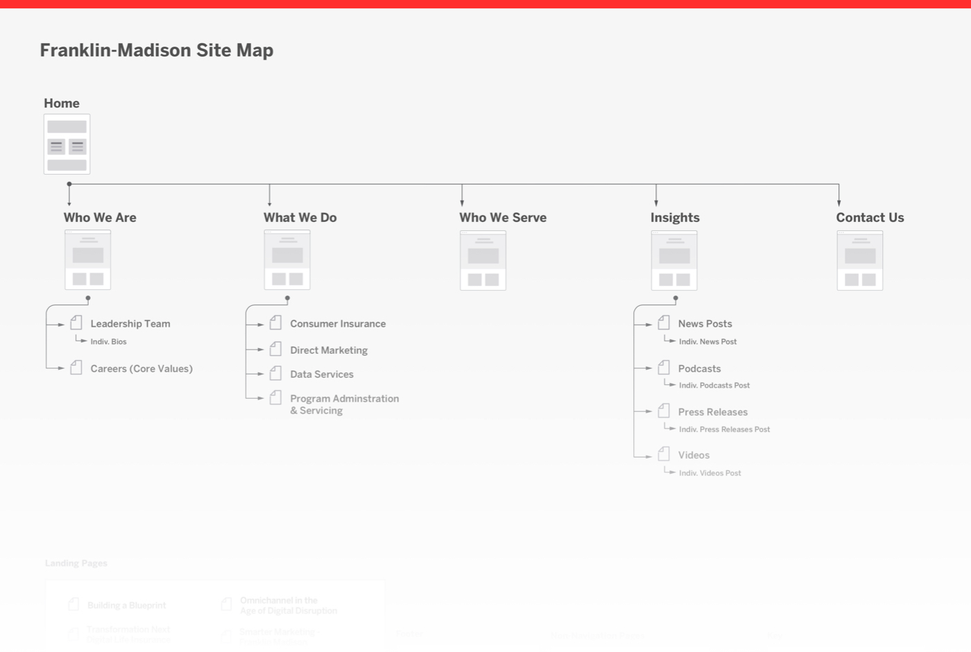
Visitors might or might not be familiar with Franklin Madison, so the site’s main navigation spells it out: Who We Are and What We Do.
From there, they can easily find digestible explanations of Franklin Madison’s services. Calls to action at the bottom of each page give users an easy way to connect with the team and learn more.
But we wanted the design to complement the straightforward copy, while also keeping the user engaged.
The brand identity had already been defined. We just had to find new ways to give it life.
A Brand Goes Digital
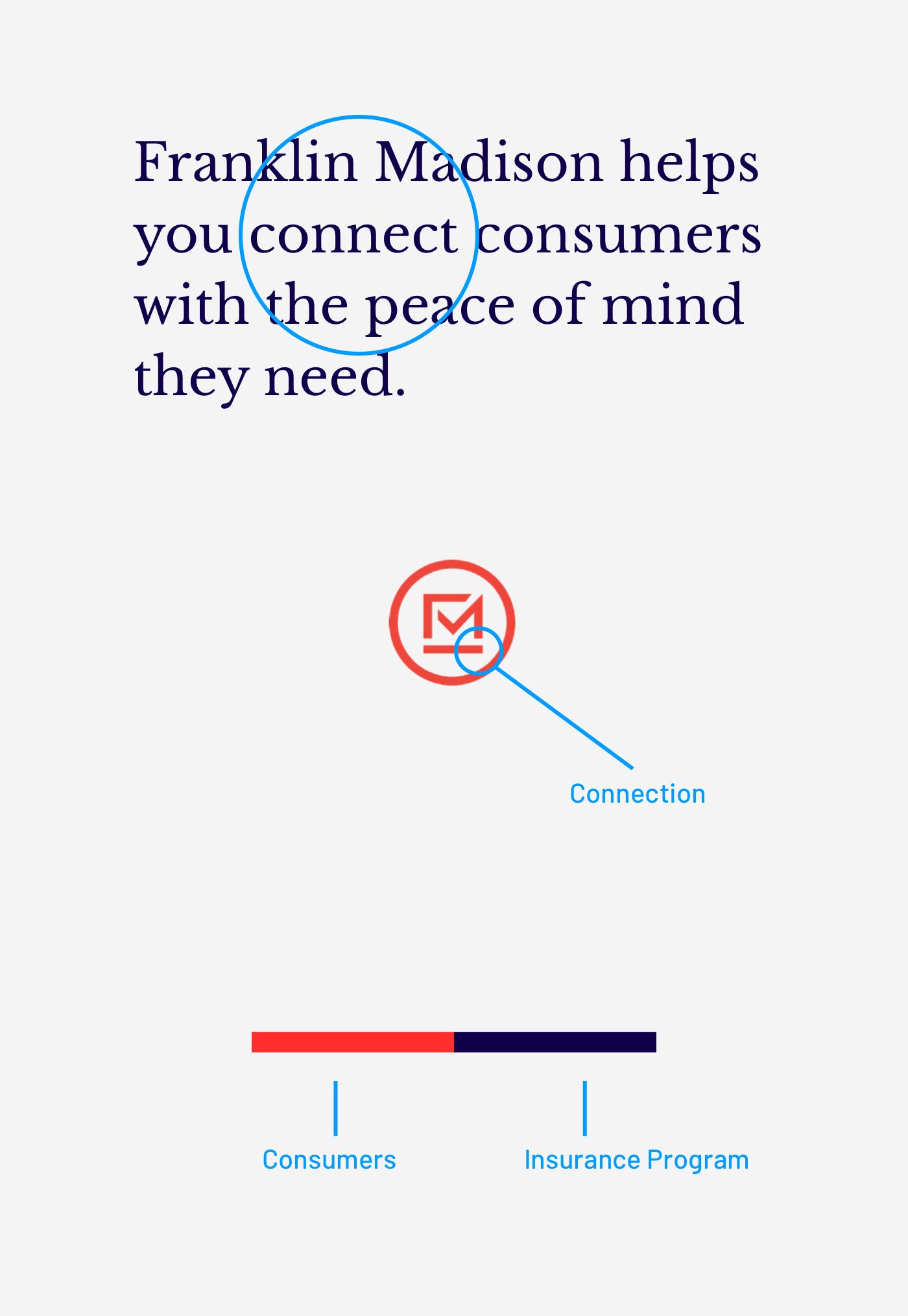
Taking an element from the existing brand, we began using (and animating) the line from Franklin Madison’s logo to give movement and direction to the site. In background animations, hover animations and as small touches throughout, the line instantly makes the brand feel ultra-modern and consumer-friendly.
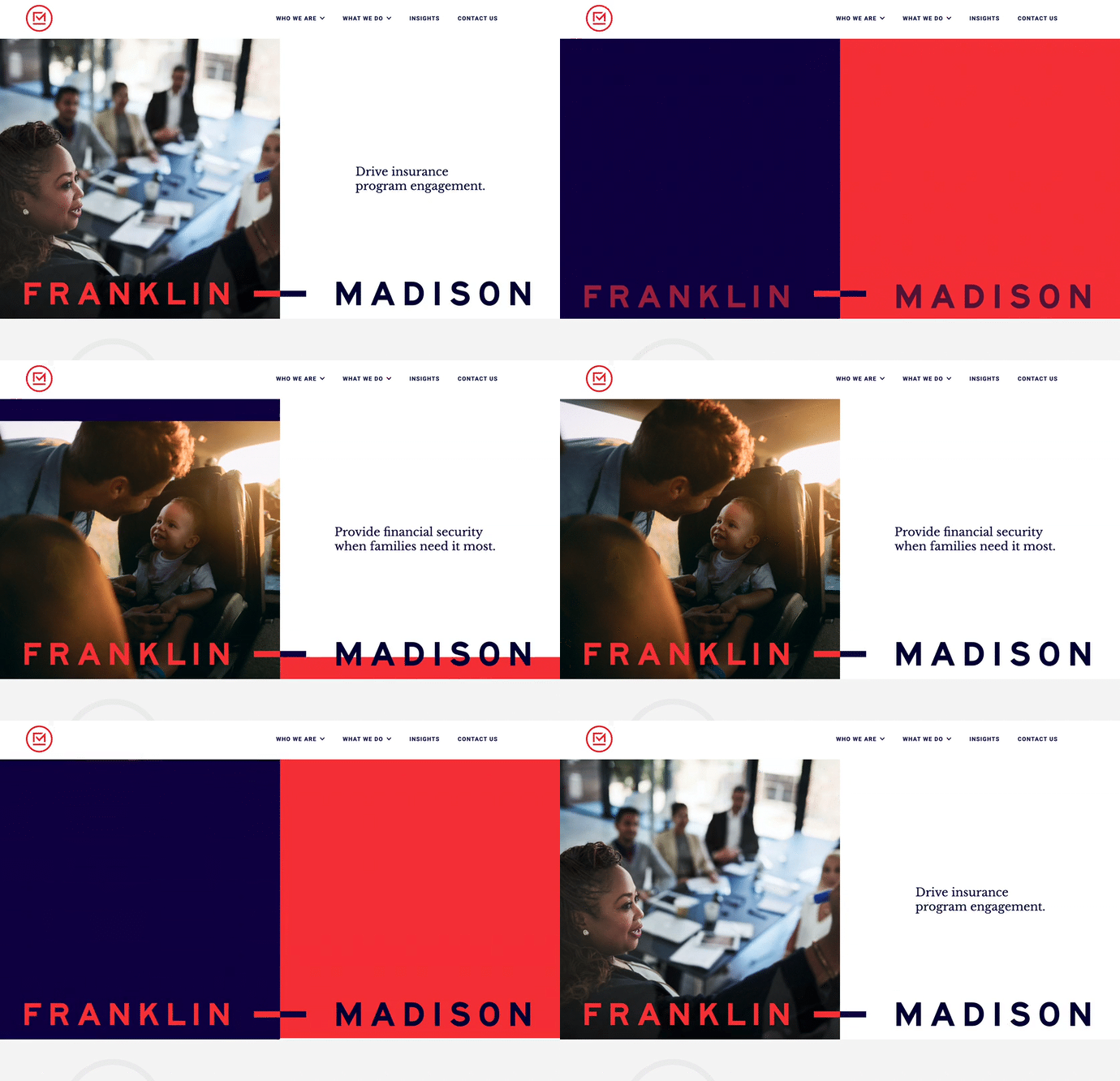
Compelling photography, icons and graphs (all dotted with clear, easy-to-understand copy) keep visitors’ attention as they learn more about Franklin Madison and its services.
![]()
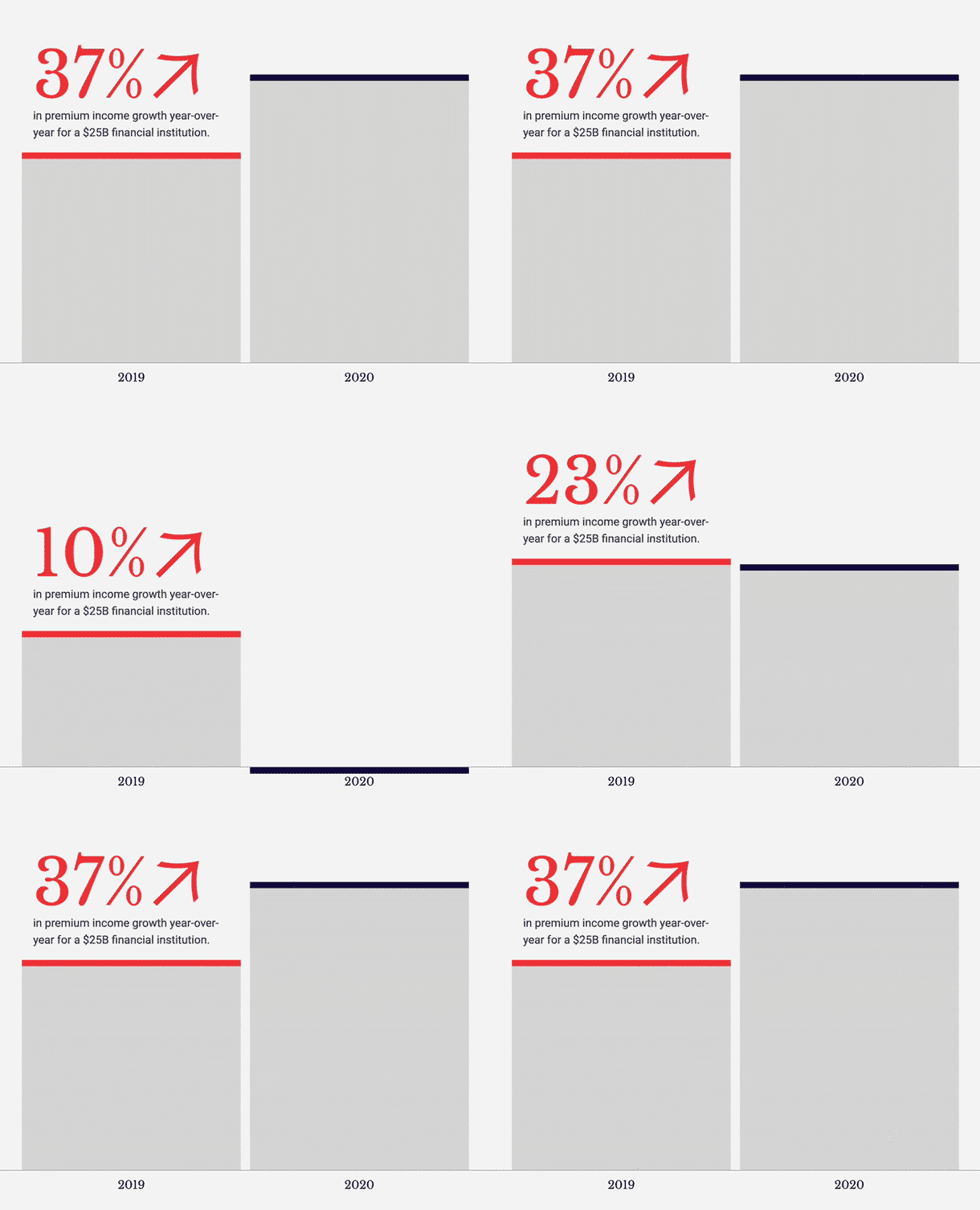
Of course, Franklin Madison is a B2B company, so we made sure everything on the site looks and sounds professional—while still approachable and human.

Next Up in B2B Web Design
Over and over again, even with markets most people never think about, we never get tired of using strategic design and copy to help brands—no matter the complexity (or visibility) of their industries.

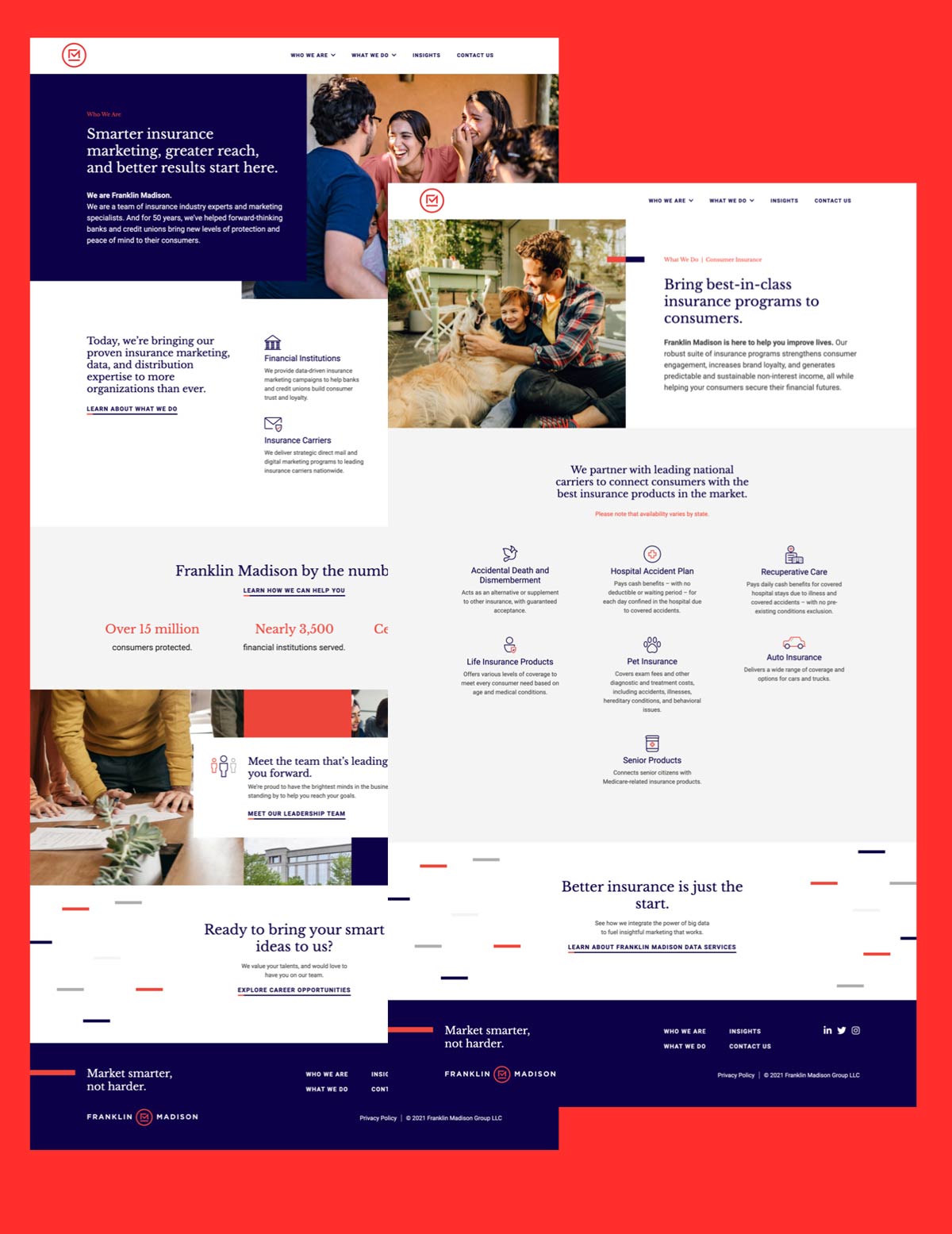

And for Franklin Madison, the launch of the website was just the beginning.
While starting another project with the company (being hired by a client a second time is always a great compliment) we heard an anecdote from their team: instead of a pitch deck or brochure, a member of Franklin Madison’s leadership team was pulling up the website to talk about the company in meetings with prospective clients.
And it doesn’t get much better than that.

