ExitCare’s New Website Makes a Case for Patient Education
When Atomicdust was hired to build a new website for Elsevier’s ExitCare, a patient education and engagement solutions company, we knew the project would be about more than features and bullet points. We needed to help ExitCare show their customers – hospital systems and electronic health record companies – that putting the right tools, technology and information in patients’ hands can make healthcare more efficient and affordable.
Still, healthcare organization budgets can be tight, especially as new regulations require rapid and expensive changes. The clinical benefits of investing in patient education are well known. But we needed to help ExitCare make a compelling business case for the investment, and explain why they’re the partner to choose.
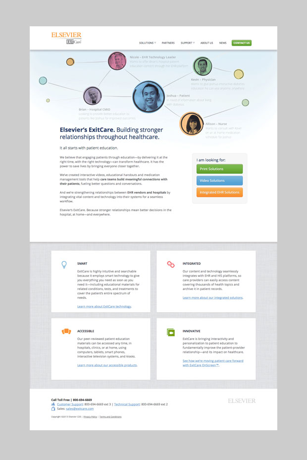
The brand story we developed got right to the heart of the company’s mission: “Building stronger relationships throughout healthcare.” ExitCare isn’t just a collection of educational products. By centering care and collaboration around patients, ExitCare creates clearer channels of communication between those patients, families, physicians, nurses, hospital leadership and EHR technology vendors. It also keeps care teams and families informed and makes care more efficient.
Healthcare technology has an unfortunate reputation for hard-to-use, counterintuitive interfaces – we wanted ExitCare’s website to be as friendly and usable as their products. Because the company had no existing visual language, we designed a fresh look that was consistent with the overarching Elsevier brand. With simple, colorful circles and sketched lines, the website now illustrates the natural human connections that form between people when ExitCare is involved.
Our creative team brought out their best problem-solving skills to ensure the site was easy to navigate on both desktops and mobile devices. The desktop site relies heavily on submenus that share everything ExitCare has to offer, but this would have looked cluttered on a mobile screen. Taking a cue from CoDrops, one of our favorite web design and development blogs, our developers created an animation that allows the submenus to slide in and out from the side of the screen.
ExitCare now presents itself as a friendly and powerful partner in the evolving patient education landscape. We can’t wait to see what happens next.


