Designing a Second Restaurant Location for Revel Kitchen
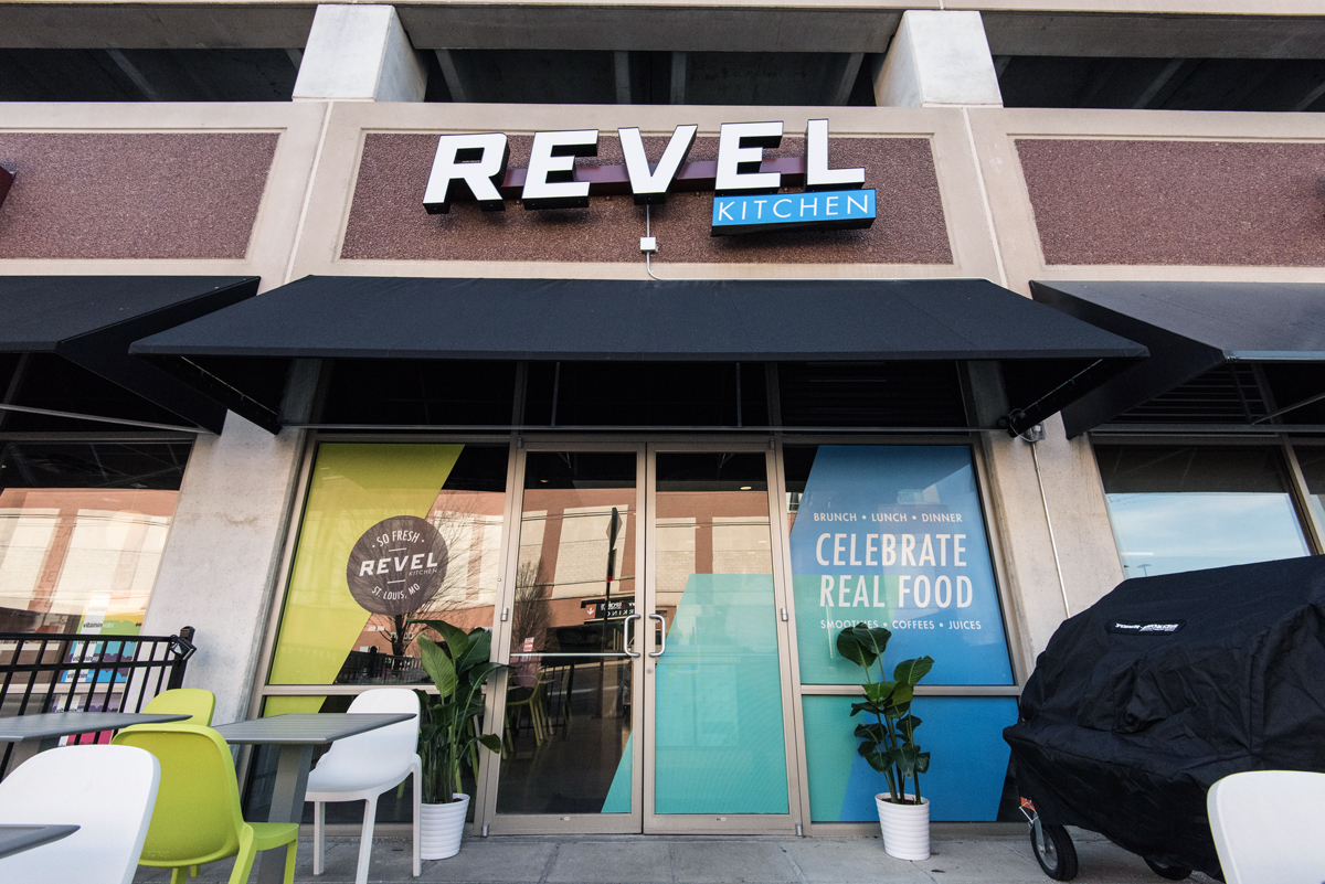
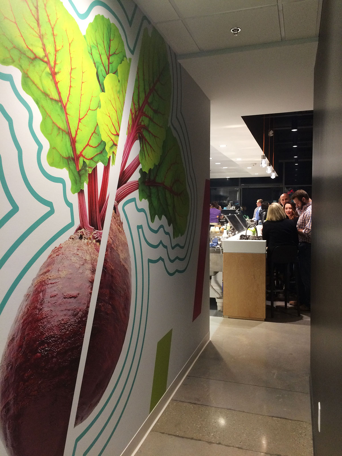
I’m still relatively new to Atomicdust, but one of the first teams I joined when I got here was the Revel Kitchen crew. Talk about an exciting brand. When I hopped on, the new branding and food truck were well underway, and the team was preparing to launch the restaurant’s new website. Throughout it all, we knew a second location was on the horizon. While the opening date was hard to pin down – not unusual for restaurant openings – we prepared to create interior and exterior graphics that would celebrate the Revel brand (and real food, too).
Getting the Green Light
Our team was on standby while the Revel team – and Nehring Design, who took on the space’s interior design – worked hard behind the scenes to prepare the second location. Suddenly, we got the news that the restaurant would have a soft opening in two weeks. (This was when we began to panic a little on the inside.)
Did I mention that we had just helped another client open their restaurant the week prior? Thankfully, we were still in restaurant mode.
“Design is like a doctor.” – Paula Scher
I’m a nerd at heart, so I can’t help but think about things from all perspectives. I believe that’s how design should be. Anyone can make something look pretty, but making it work is another thing. A personal favorite designer of mine, Paula Scher, once said, “Design is like a doctor.”
“They come into a situation and they listen to a patient’s complaints and take their book of knowledge against what else is existing in the world and they make some diagnosis in which their client participates.”
Scher was referring to creating brands for clients and thinking holistically, but this has always stuck with me. You have to view a problem from multiple angles. Then and only then can you really make a diagnosis and finally, a recommendation.
Designing for Revel Kitchen worked the same way. We had at least three things to consider: how to infuse and then push the brand, how to keep in mind the client and how they would use the space, and, finally (and probably most importantly), how to enhance the customer experience.
Finding the Right Balance
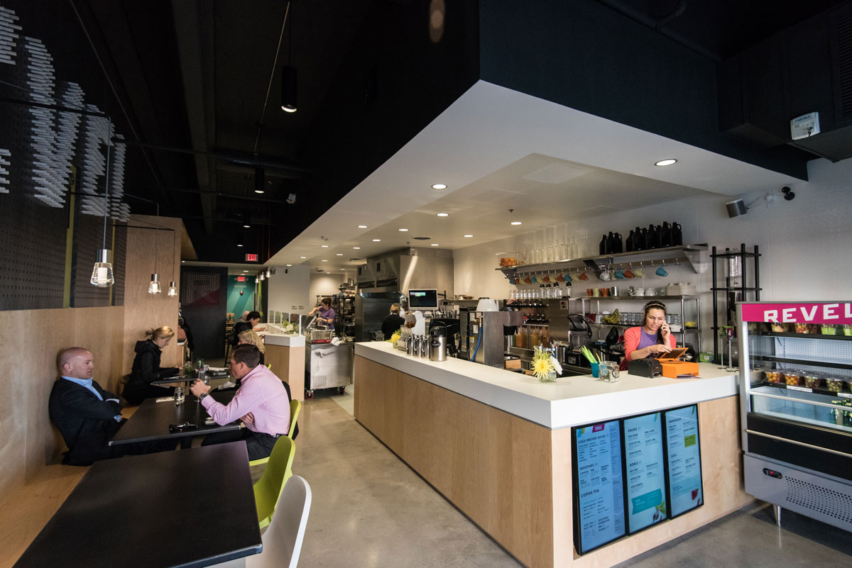
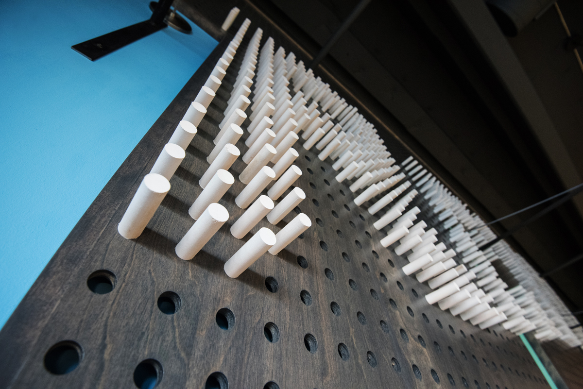
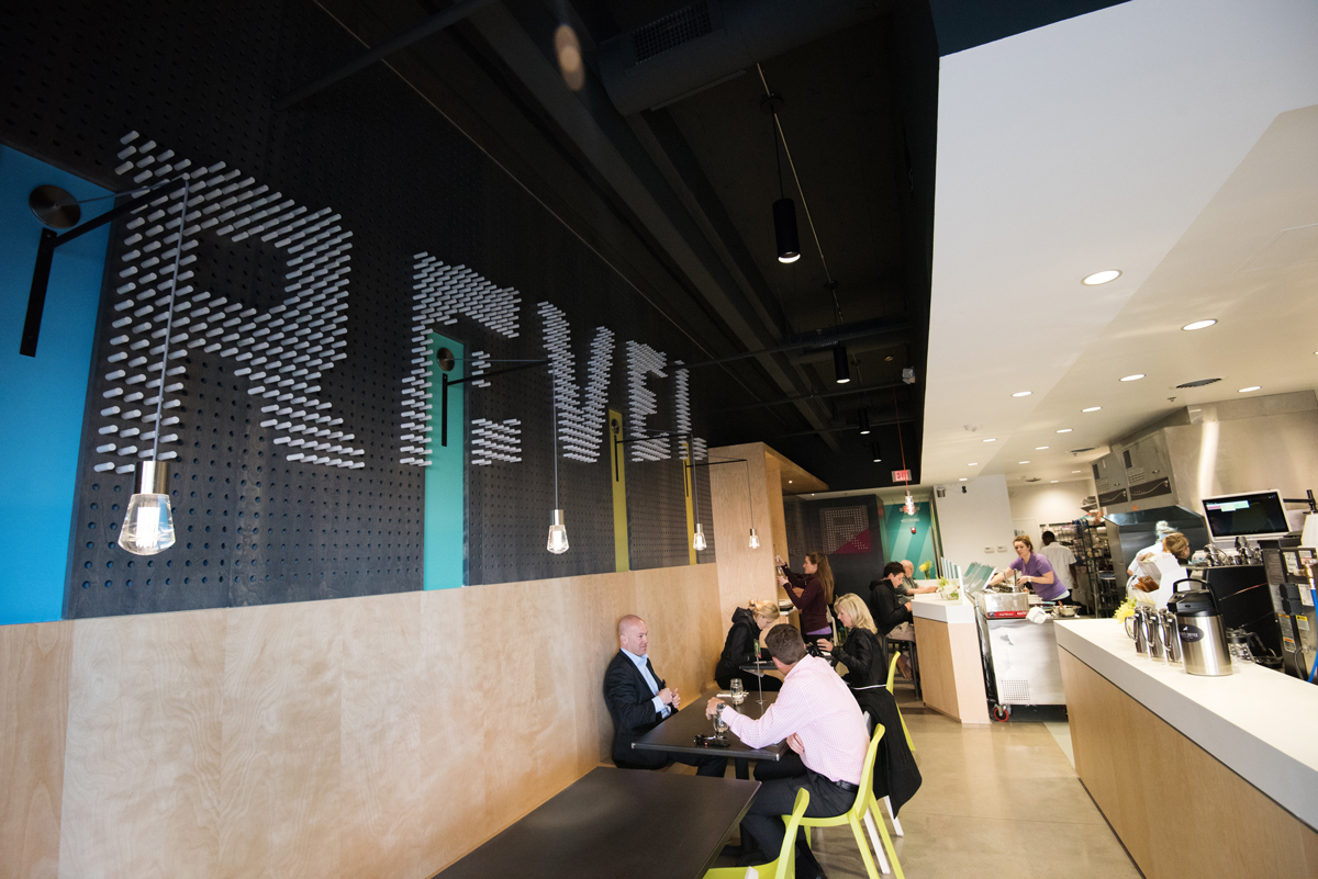
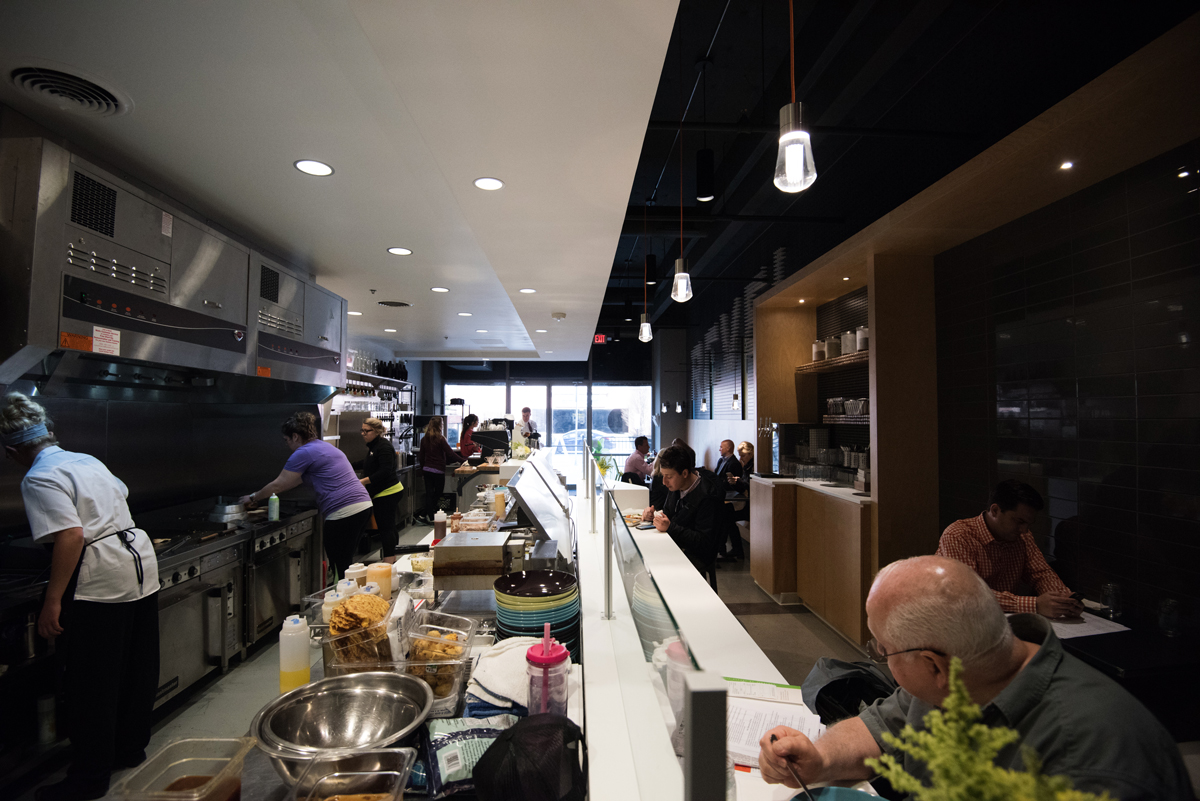
The moment we walked into the space, we were greeted with our first design challenge – textures. The space had everything from a giant peg wall, to white tile, to brushed metal to birchwood. Our blank canvas didn’t feel so blank. It was so drastically different from Revel’s Cherokee Street location that I became a little worried. But the more we visited, took measurements (measure twice, Jessica, measure twice), and brought ideas back to the office, the more we realized the space was perfect.
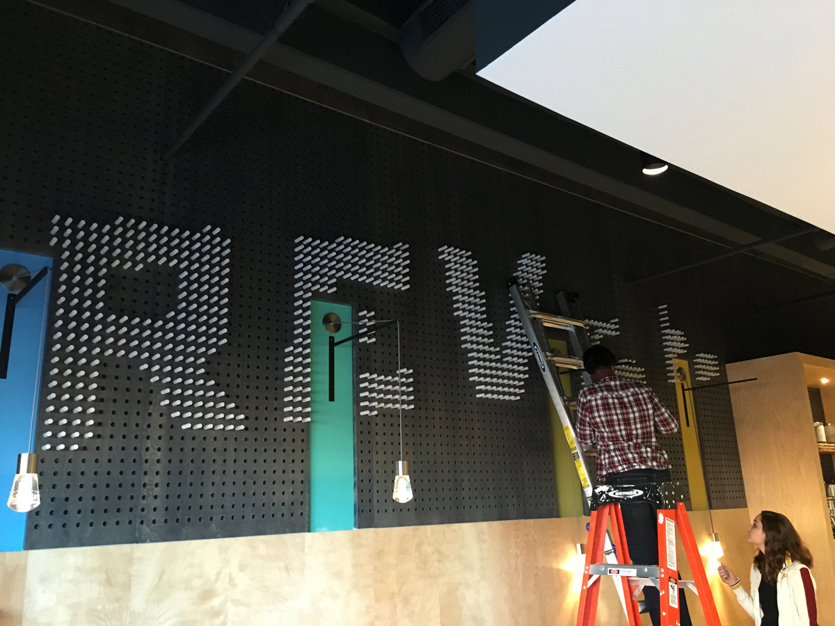
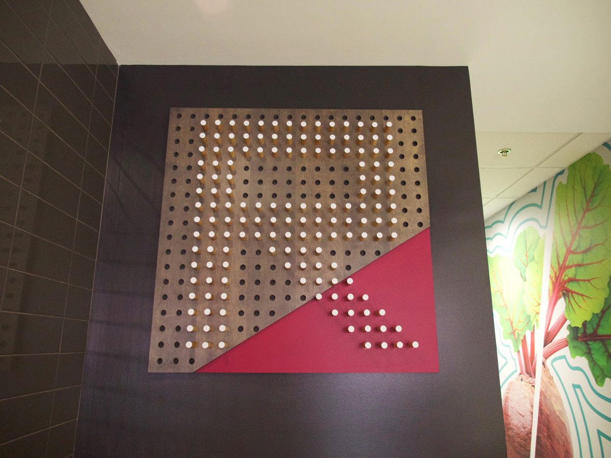
We embraced the peg wall. Our team recreated each individual peg hole on screen and played around with various ways of spelling out Revel. It didn’t take long before we realized making this wall come to life would actually be tricker than we thought. Perfecting letterforms, searching for just the perfect peg size, all while not trying to bust the budget – it was overwhelming. Finally, we decided it would be best to bring this thing to life ourselves. With all hands on deck, we found a way to build a statement wall that was exactly what we envisioned.
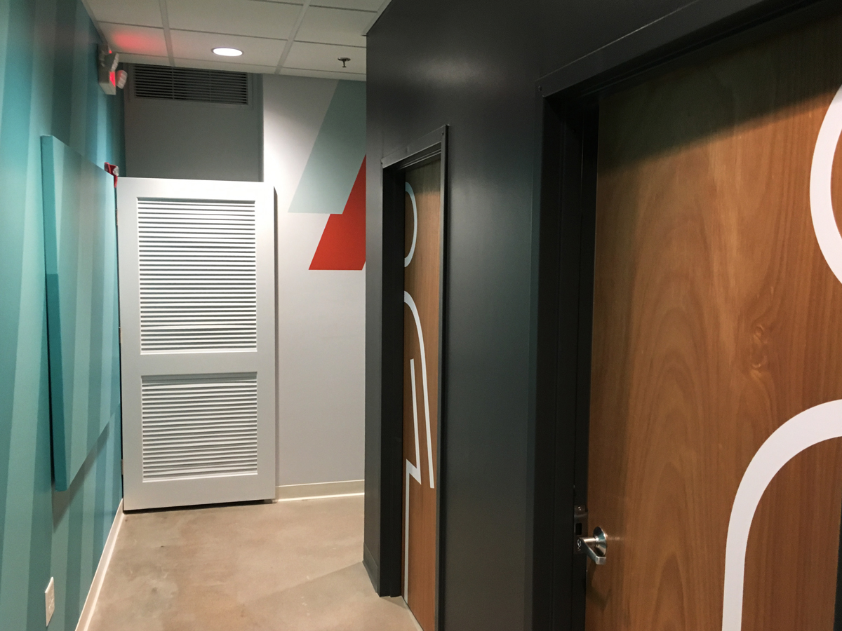
When it came to other graphics and items, it was all about finding the right balance. How do you infuse the vibrant, energetic vibe of Revel’s brand using the existing textures and shotgun-style floorpan?
Our answer was to create “pockets of surprises.”
Thinking About the Client and the Customer
While we were figuring out the peg wall puzzle, we also needed to think about the menu. One of the great things about Revel is their passion to celebrate real food and show that there’s a wide variety of options when it comes to healthy eating. Great food comes from fresh ingredients. And of course, fresh ingredients mean the menu needs to change seasonally. We created a menu that Revel could edit as needed and that customers could easily understand.
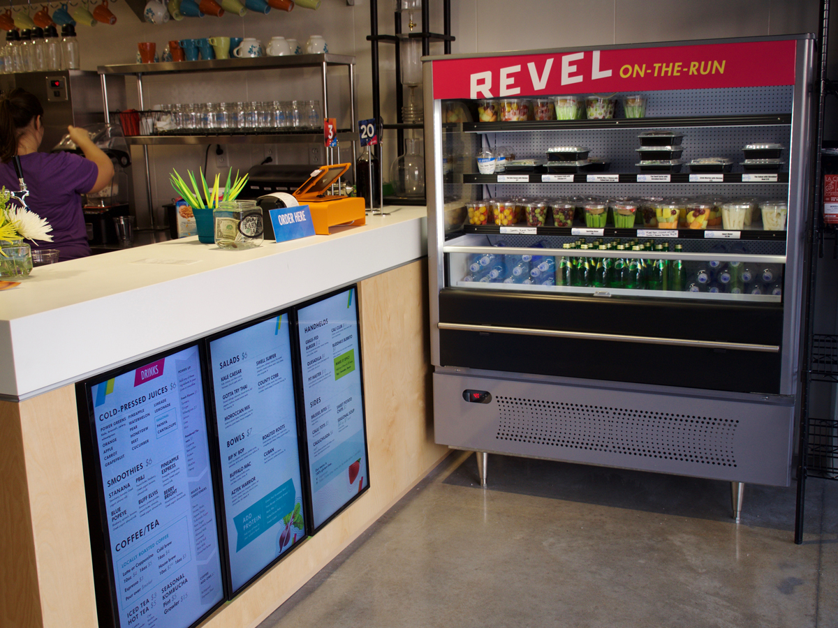
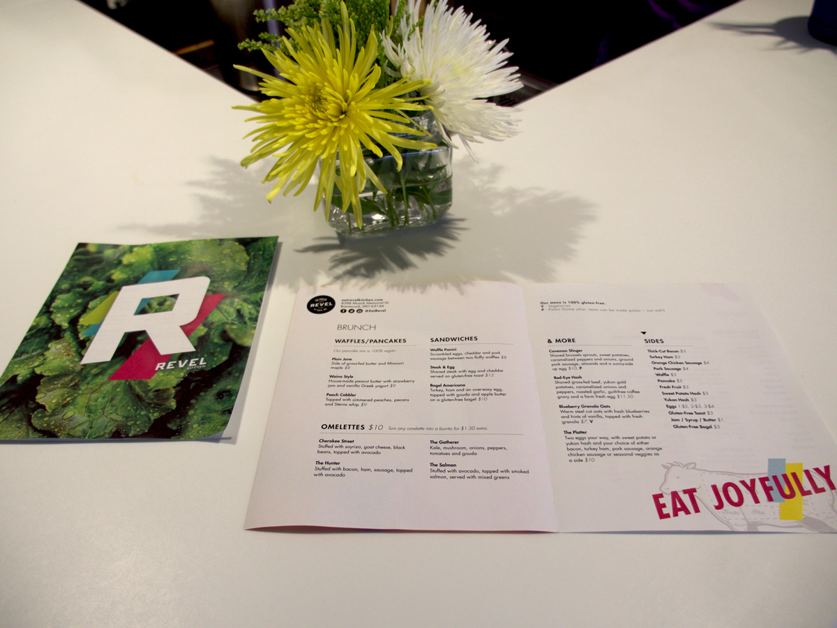
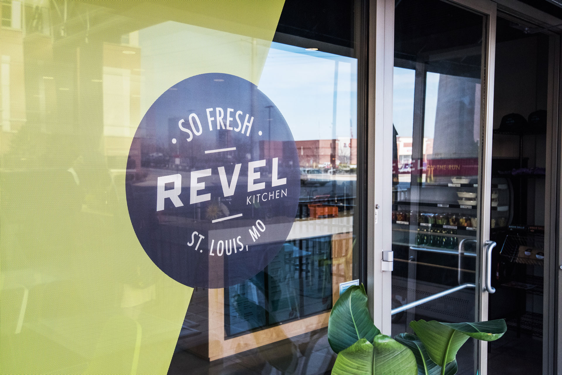
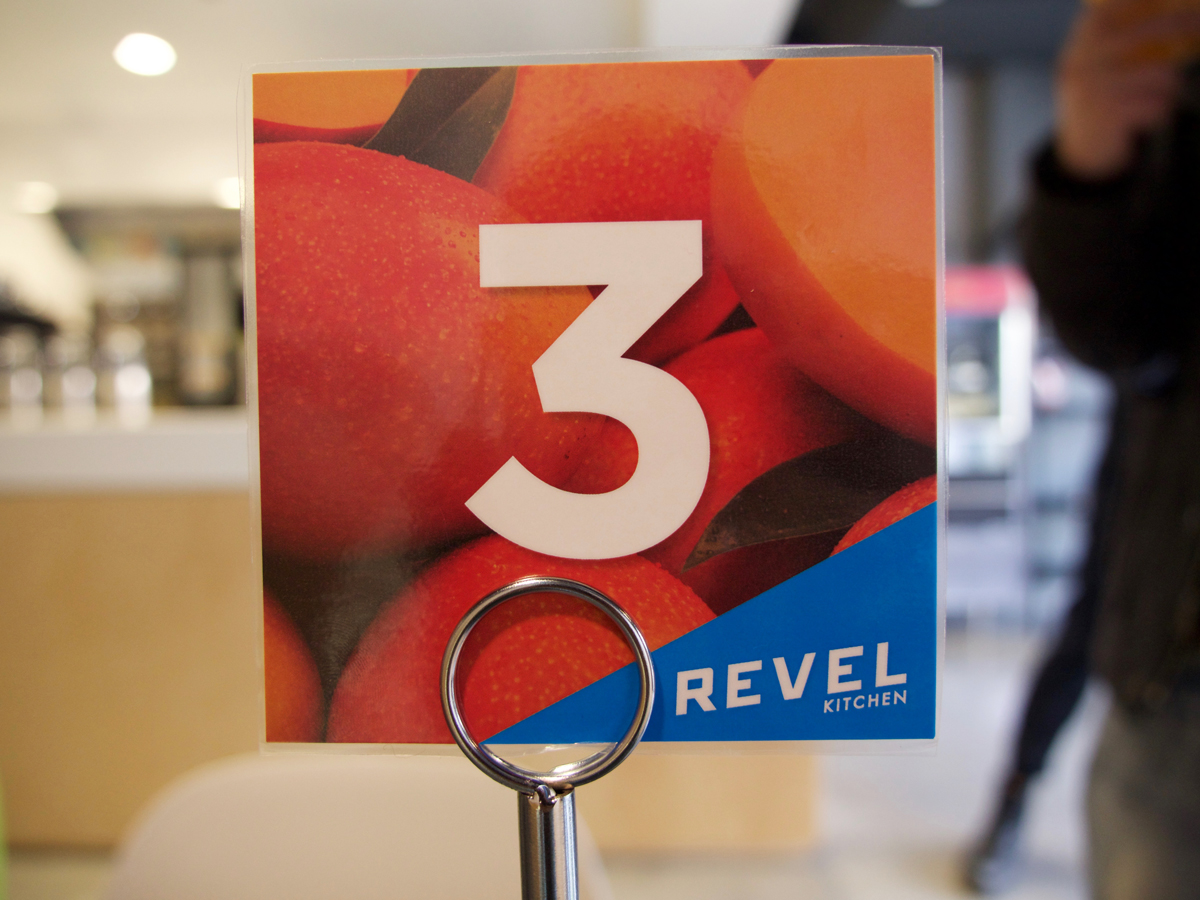
From there, we created table numbers, to-go stickers, and vibrant exterior windows – all of which look effortless, but were built on endless discussions that ensured each piece would work for the client and the customer.
After all the work, I have to admit, it’s pretty incredible to walk into a space you helped create. That feeling never gets old for me.
And now you can experience it for yourself – Revel Kitchen’s Brentwood location is now open. If you haven’t made plans yet, make sure you stop by!
