A Designer’s Loosely Organized Thoughts on Adobe Photoshop Touch
As a Professional Designer Person, I’m contractually obliged to get excited when Adobe releases a new version of Photoshop. Early last week, the newest product to bear the Photoshop name was released to iPad 2’s everywhere. After some fiddling, I’ve come away with a few initial impressions.

The Positives
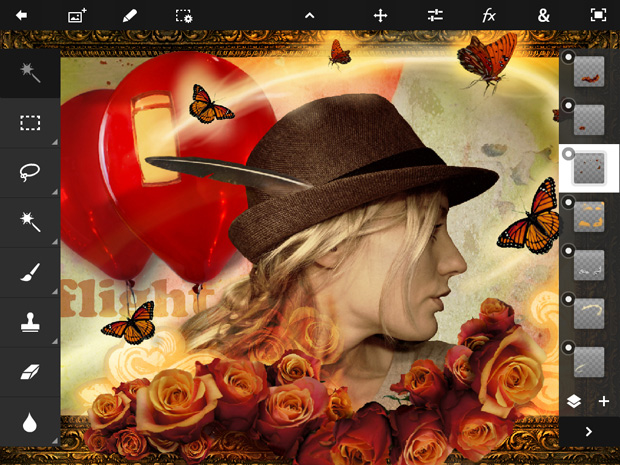
- The core concepts of Photoshop are here, and that’s impressive. Layers, blending modes, filters, type, and more are present and accounted for.
- The Facebook/Google Images integration is nicely done, and well thought out. I could’ve sworn that Flickr was shown as an option in earlier screenshots, and it’d be a great source too.
- Adobe Creative Cloud integration. The Touch App suite should play really nicely with CS6, whenever that comes out.
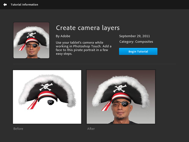
- Upon first launch, users are presented with a number of tutorials, intended to introduce the features of the app. This is a great idea, because…

The Negatives
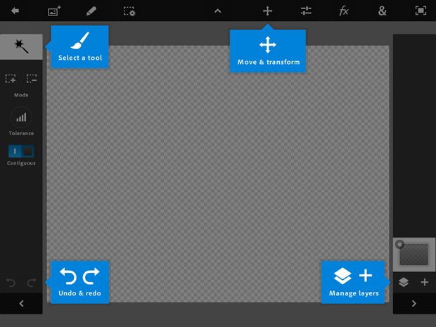
- …The UI is not as simple as it looks. It’s not bad, and I don’t mind that it’s non-standard compared to Apple’s normal UI, but it’s a lot to take in at once.
- Performance isn’t great. It’s passable at best, and the canvas is currently limited to 1600 x 1600 pixels. I fear for what this means for the future of the app.
- As I understand it, the app is built using Adobe AIR, a cross platform environment that can target Android as well as iOS. This is not inherently a bad thing, but it creates a different “feel” when compared to fully native iOS apps. This is important because, as we’ve blogged about before, interaction is branding. The app feels just a little off, and users who are accustomed to native iOS apps are going to be suspicious of apps that don’t feel correct. An early example is the aforementioned tutorial page – scrolling in the interface is slow, and the rubber band physics at the end of a list is a pale imitation of native scroll physics.

The Mysteries
- I wonder why more of the successful elements of the existing Adobe Ideas app weren’t carried over to this new suite of Touch apps. The brush size slider, for instance, is far easier to understand in Adobe Ideas.
- I still have no idea why most of the Touch apps – Photoshop, Kuler, Proto, Debut, and Collage – debuted on Android. I’d bet that Adobe makes more cash in a few days on the App Store than they have in the past few months on the Android Marketplace – was the Android launch essentially an extended beta period? I doubt we’ll ever know for sure.
In Conclusion…
As is stands today, Photoshop Touch is a fun, flawed product. That’s great for a 1.0 – it clearly shows promise. But as I mentioned earlier, I’m still hesitant – a non-native platform seems like a shaky foundation to build a future upon, and it’d surely be a significant investment to completely re-write the app using completely native iOS code. At Atomicdust, we will be keeping an eye on the product, of course — the feature set of Photoshop Touch will grow, and I’m sure performance will be optimized – but will it ever feel like it really belongs on iOS?
There are already people saying Photoshop Touch is really not for getting client work done, and at the moment, they’re right. But it wasn’t so long ago that it was a given that designers needed a powerful desktop computer to do “real work” – work that’s now comfortably done on a MacBook. Tablets will grow to be a viable option, too, that much is clear. What’s less clear is if Adobe will be the software vendor creatives turn to for professional-level software.
![]() Jason Stoff is a fancy-pants designer, photographer, and handsome rogue in St. Louis, MO. And also holds the title ‘Senior Designer’ at Atomicdust.
Jason Stoff is a fancy-pants designer, photographer, and handsome rogue in St. Louis, MO. And also holds the title ‘Senior Designer’ at Atomicdust.

