Design Adds Meaning: Building Great Things for Boss Gloves
In late 2013, Atomicdust was asked to breathe new life into an old brand. Boss Gloves was founded in 1890s Kewanee, Illinois, when a farmer, frustrated by the challenges of husking corn, combined a leather strap and a metal hook to create the Perkins Boss Husker. Boss built its reputation responding to the needs of local farmers, and 124 years later, people around the globe trust the company to provide gloves, boots and safety gear for the agriculture, automotive, energy, lumber and construction industries.
Boss has a great story, but workwear is an industry with a frustrating amount of parity. Work gloves are everywhere, and they’re interchangeable. Stop by Lowe’s or Home Depot, and you’ll see that glove displays, tags and marketing materials are almost universally black and yellow, with a focus on function over lifestyle.
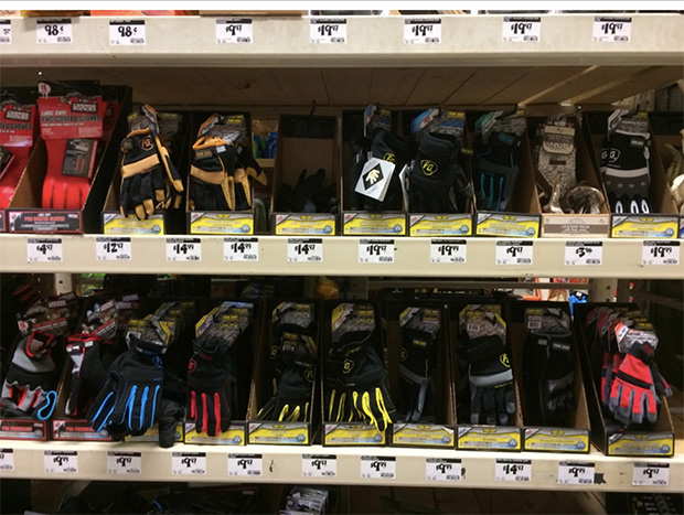
Because the category has one look, consumers make their product selections based on price alone. A company like Boss can only win by undercutting the competition.
This is where design becomes crucial.
When one brand in a highly competitive category starts a visual trend, the rest tend to follow. On occasion, a brave company will take a risk and break out of the category’s expectations.
Consider Walmart and Target. The products they sell are (arguably) indistinguishable. But one company built its brand on value, while the other — Target — built it on the concept of life made better through design. Target’s commitment to design, from its advertising, to its displays, to the look of the stores, gives customers something to believe in. There’s a reason to buy beyond price.
Simply put, design adds meaning. When we began working with Boss, we wanted to prove that by making something that looked like nothing else in the category. We wanted to create a brand that could break through the price story by speaking to something bigger than the gloves themselves.
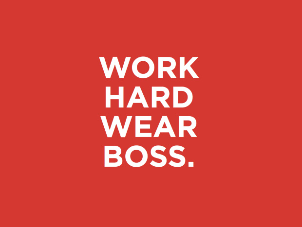
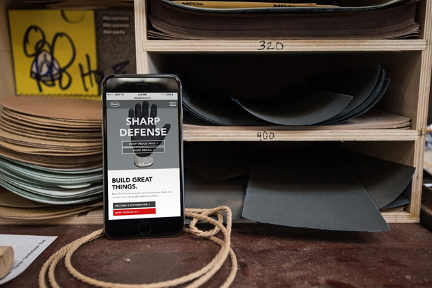
We started with messaging, including a new tagline: Build Great Things. It’s simply stated — true to the new, straightforward Boss voice — with a message that resonates with the people who will use Boss workwear, as well as the distributors and retailers who are building their businesses by selling Boss products.
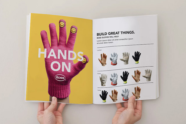
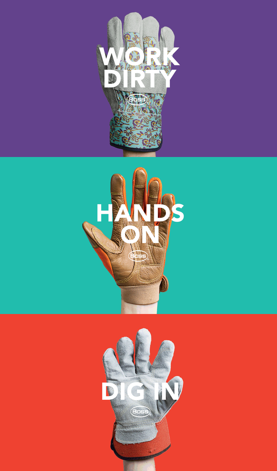
The visuals, in line with the new voice, keep things big, bright, straightforward and unlike anything else in the category. Short, action-oriented headlines are a little “bossy,” but they’re balanced by friendly, vivid colors and bold images. Oversized product photography wordlessly emphasizes the quality of the products, showing off every stitch.
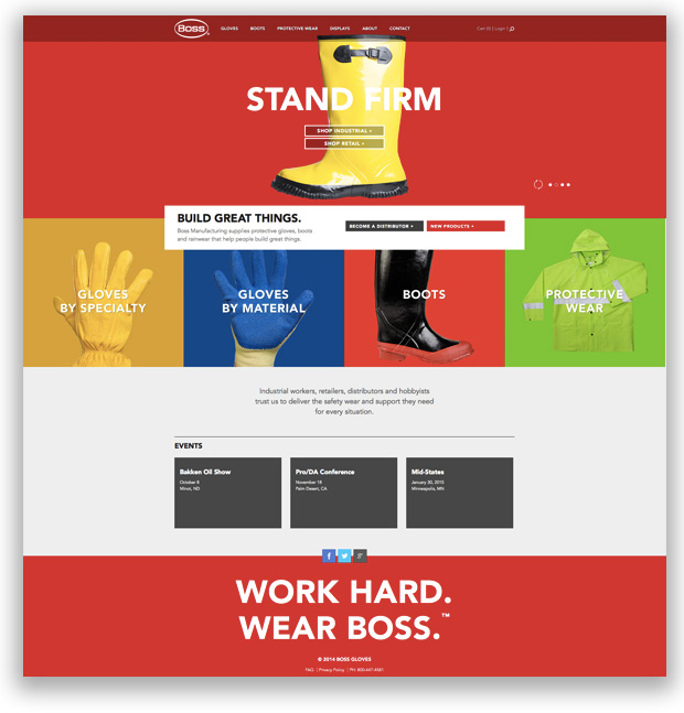
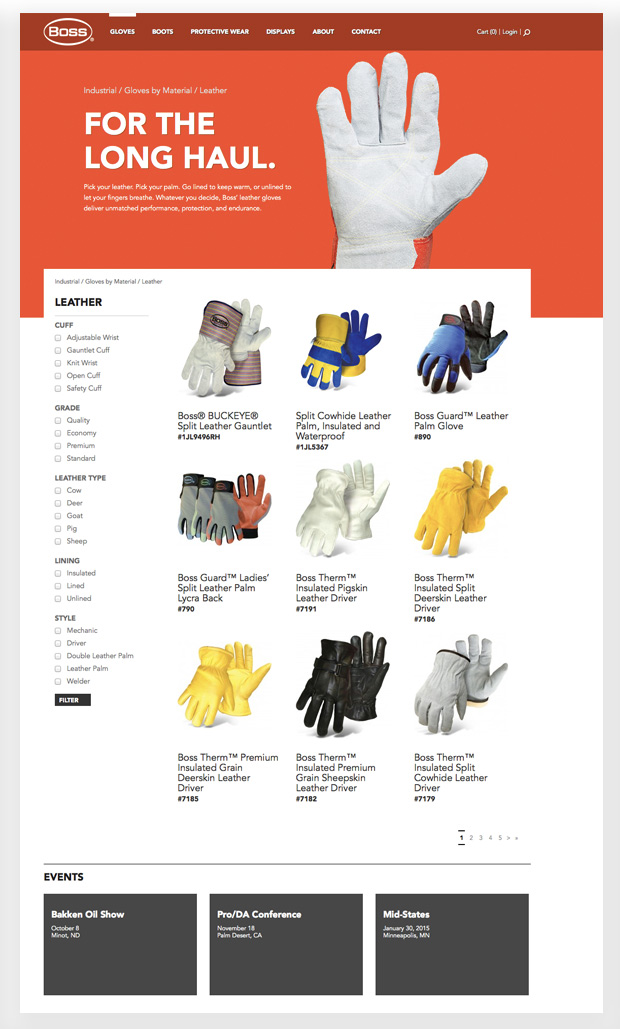
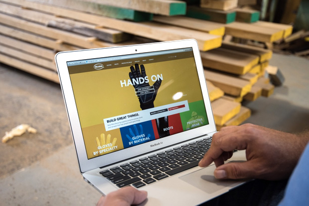
The new mobile-friendly website, designed for consumers, distributors and retailers, delivers on Boss’s longtime promise of better service and selection. An improved e-commerce experience and a secure space for distributors and retailers provides easy access to billing details and sales supplies.
We also designed concepts for new tags, point-of-sale pieces and more to help Boss stand out on the shelf.
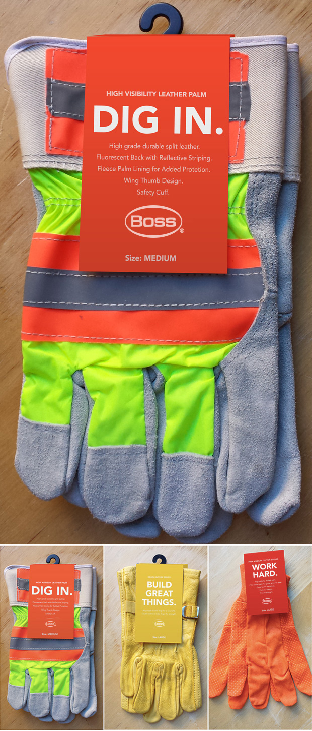
The brand is now not just about workwear, but about what great workwear can help people build. Boss is telling a new story; design is helping them share it. Visit our work section to see how it all came together.
