Recharging the Cor Jesu Academy Athletics Brand
For many of our clients, branding is personal.
We often meet with clients who have worked at the company for decades or had ties to the organization since childhood.
This sort of personal investment leads to emotional attachment—and for better or worse, the organization’s brand becomes their world.
Our team is brought in when for some reason, that brand just isn’t working any more. Maybe it’s just been a while since the brand has evolved, or perhaps the company has evolved but the brand hasn’t kept up. It’s our job to shape the brand into something that feels right again.
That’s exactly what happened earlier this spring when our friends at Cor Jesu Academy reached out.
Back to school.
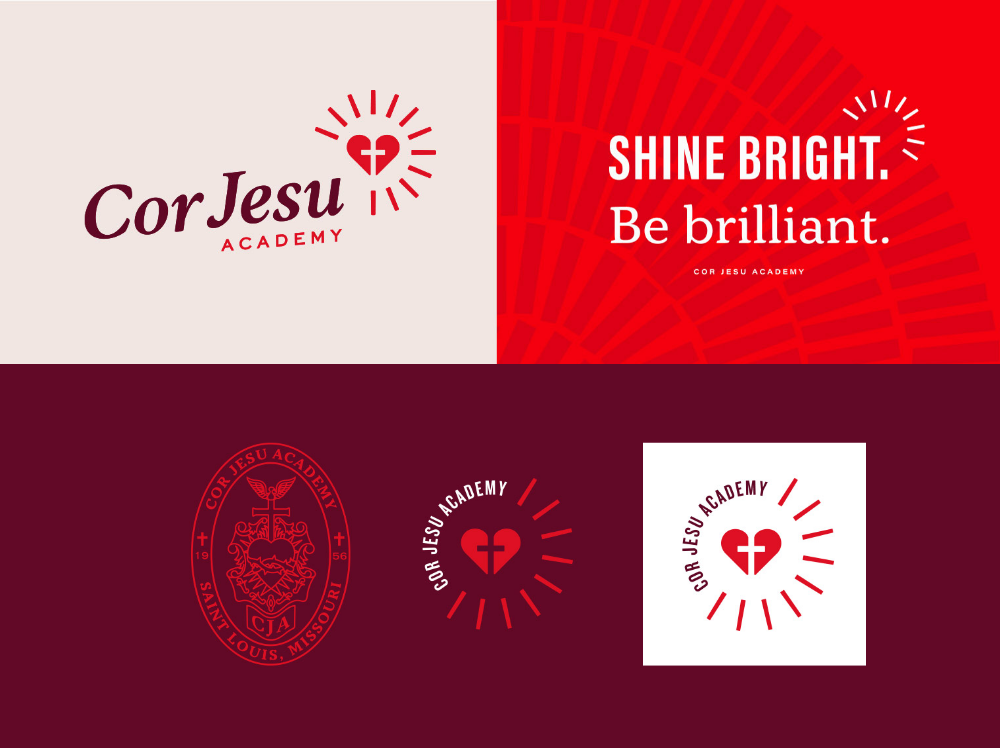
Our branding team had worked with Cor Jesu the year before, developing an updated brand for the private, all-girls, college preparatory school. Building on their reputation for superior academics, we’d collaborated with Cor Jesu to create brand language and visuals that communicate its commitment to developing well-rounded students through extracurriculars, athletics, career readiness, spirituality and, yes, superior academics.
The Cor Jesu community—students, staff, families and alumnae—was loving the school’s new brand: the bold colors, focus on being brilliant and bright, and dynamic visuals that pulled it all together.
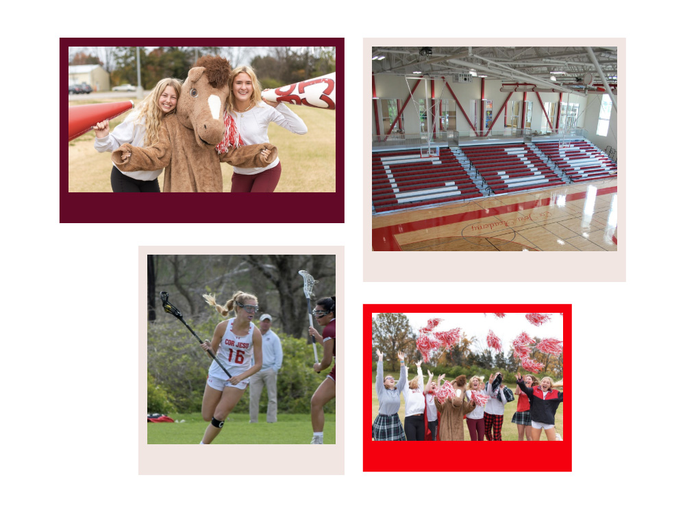
Now it was the athletics department that wanted a brand refresh. Formal branding for the various teams and clubs had never been established, and there was little consistency in the design of things like game promotions, posters and uniforms. Cor Jesu’s teams had achieved big things and the community wanted to rally around them. They just didn’t have much to align behind.
But there was a name—and a horse.
Making a mascot.
As we interviewed students, alumnae, coaches and faculty, we heard one thing over and over again: “Please don’t take away the Charger.”
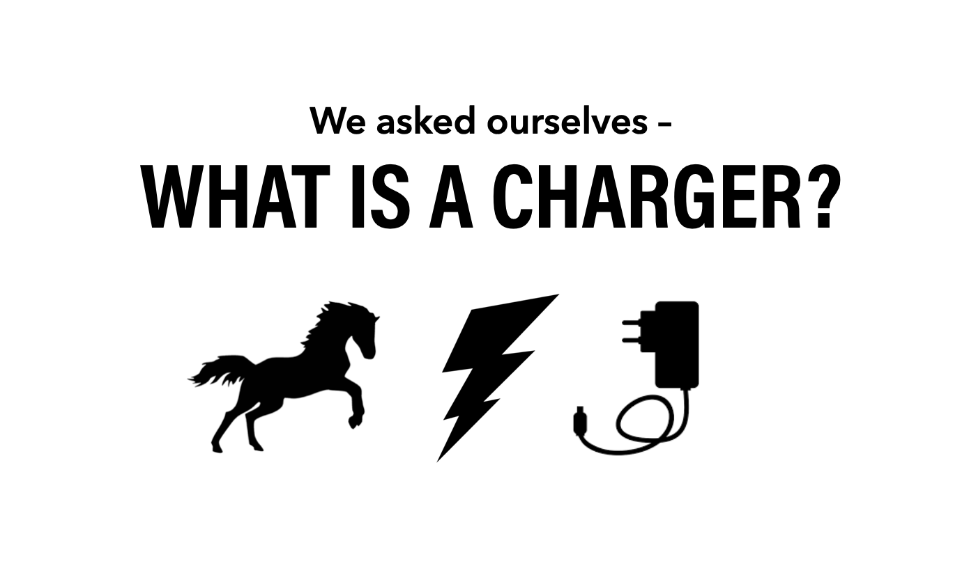
What’s a Charger? Many didn’t know. It was a bolt of lightning—kind of. It was a horse—kind of. Over the years, the meaning behind the Charger name had faded. But the horse remained.
The school’s mascot was a large goofy horse, rumored to have been inspired by the Clydesdales at Grant’s Farm, which neighbors the school’s campus. A staple at pep rallies and games, the horse was beloved by everyone. The horse had no name, and while it had come to be synonymous with a Charger, the people we spoke to said they wanted imagery besides the horse to represent the school’s teams.
They had another request, too. They didn’t want the athletics brand to be overly feminine (no “Lady Chargers”) or too masculine (no intimidating looking medieval horses with a spear).
Above all, they wanted a brand—and various expressions—that would unite the Cor Jesu community. After many of the school’s traditions had been halted or altered by the pandemic, students needed new ways to show school spirit. But with decades of alumnae and families who had emotional ties to Cor Jesu’s existing athletics brand, whatever we created needed to maintain its legacy.
We needed to push the brand forward, while being careful not to push it too much.
Lightning strikes.
Our team didn’t have to look far for inspiration.
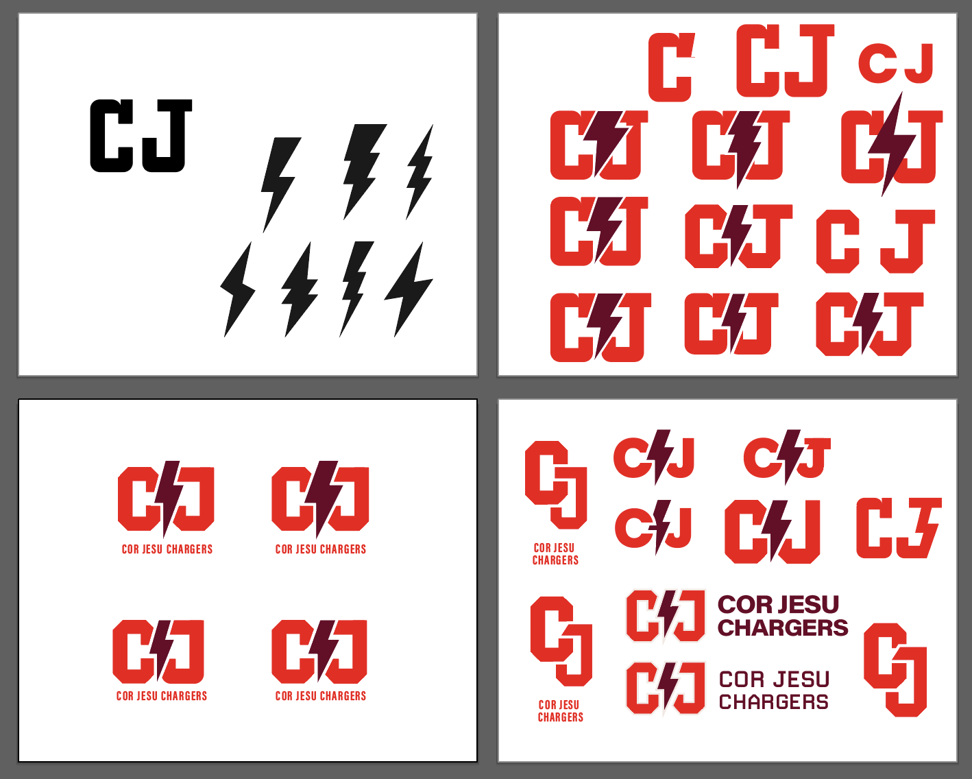
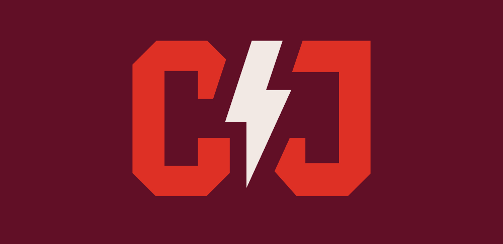
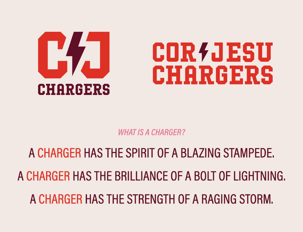
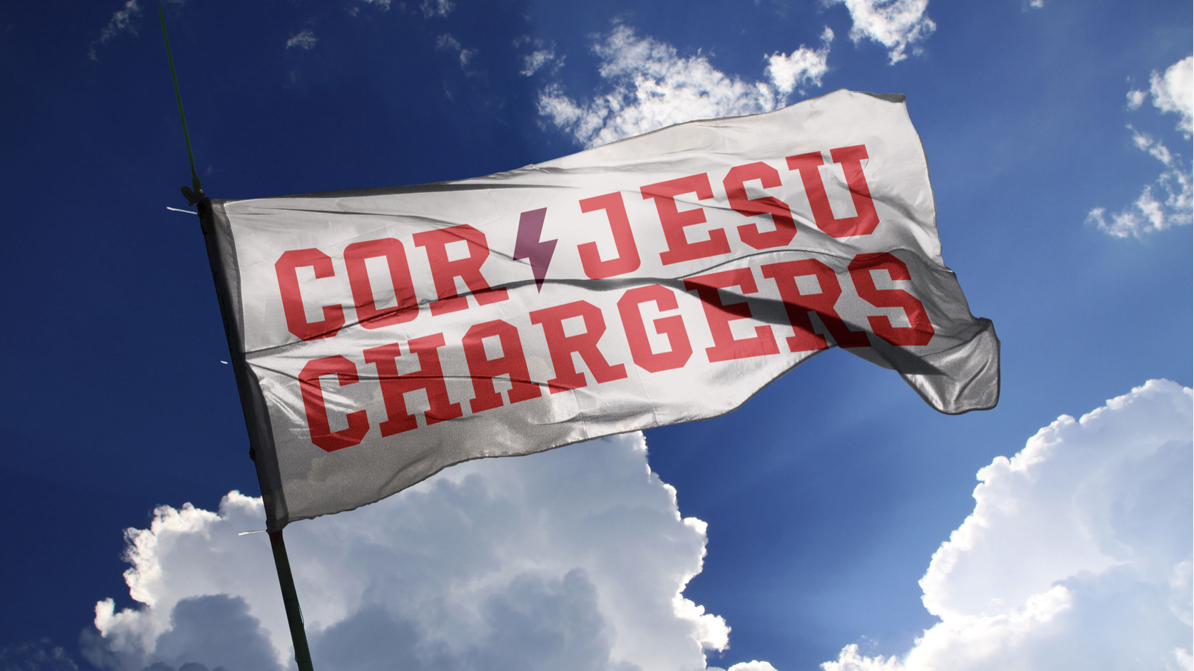
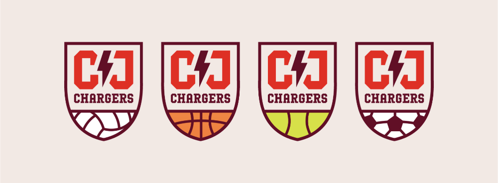
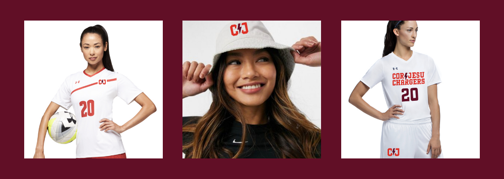
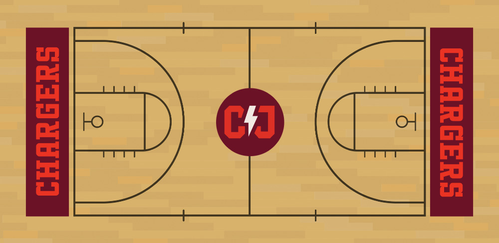
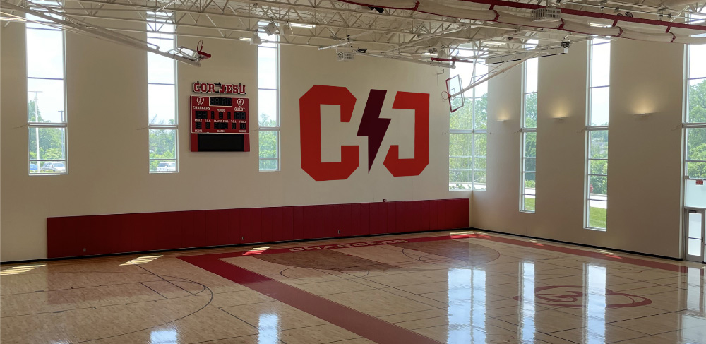
The school’s new tagline, “Shine bright. Be brilliant.” had the energy and excitement we were looking for. We created a lightning bolt to represent the teams’ electric energy. Combining the bold graphic with collegiate-inspired type for a school monogram, the design is fit for a modern teenager and easily carried across the athletic world, from a sea of rally towels to jerseys, swim caps and team patches.
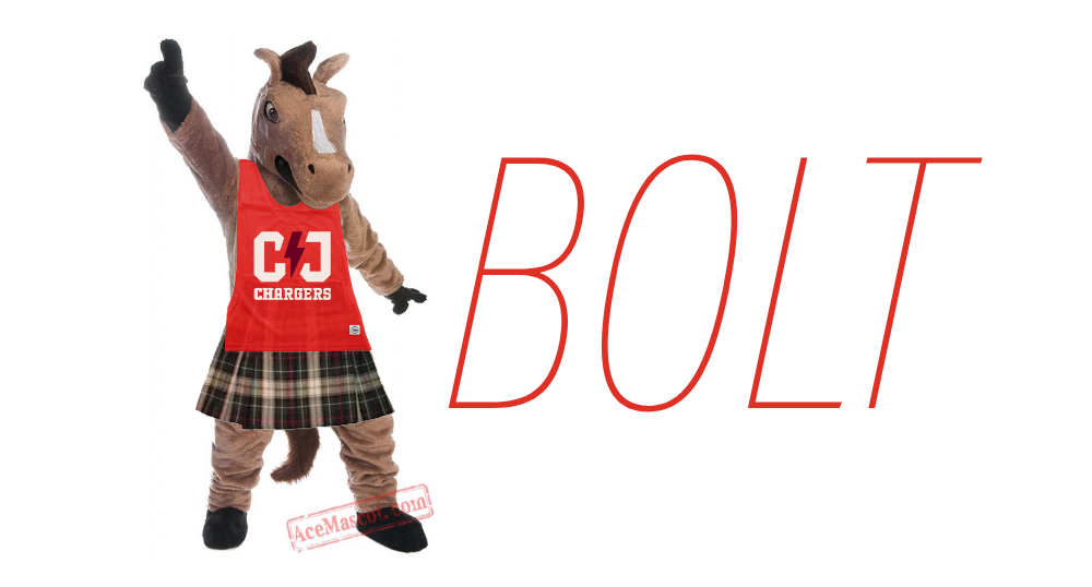
Creative expressions include language to ignite fans and athletes alike, strengthen the meaning behind the Charger name and renew its connection to the mascot, because we wanted the horse to still play a lead role in the brand. And we gave the mascot a fitting name: Bolt.
Atomicdust’s branding program typically includes a brand narrative. But for this project, we had something else in mind: a cheer.
Bolt’s the horse that cheers us through,
raises our spirits and energy, too.
Fast as lightning, strong as rain,
Bolt’s here to help us win again.
Our team designed patches representing each sport, examples of how the brand can live on uniforms, and even some fun merch. We even created a shirt for the mascot to wear, tying the two concepts (a horse and lightning bolt) together even more.

Ready. Set. Charge!
The school year started, and at the first pep rally of the semester, the athletics department unveiled the new brand.
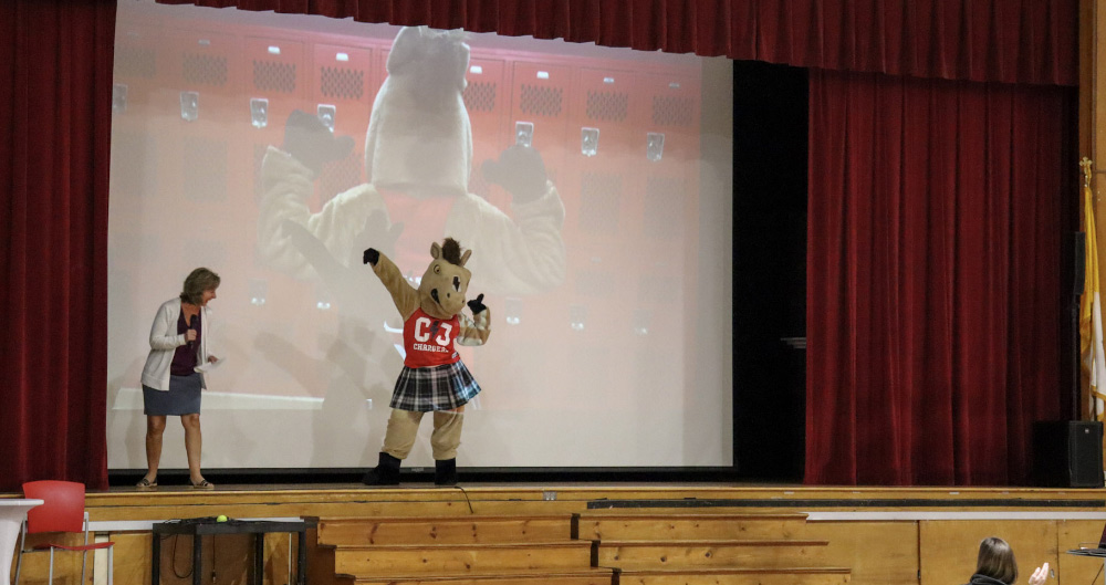
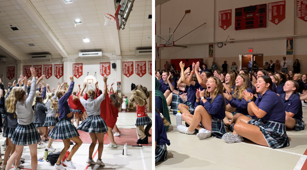
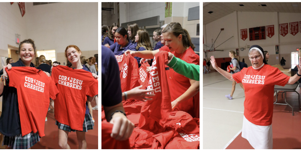
The new athletics brand bridges the school’s strong legacy with its promising future, polishing existing components with new visuals and language that the entire community can rally behind.
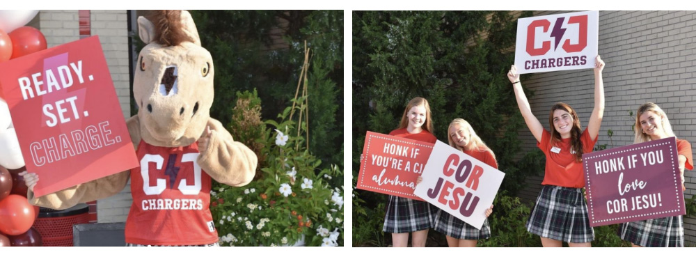
For the Cor Jesu Chargers—the athletes, coaches, families and fans—the new brand is personal. And it should be; it represents the community’s strength, spirit and long list of achievements. We were honored to create a brand that they’ll wear and support proudly for years (and potentially decades) to come.
