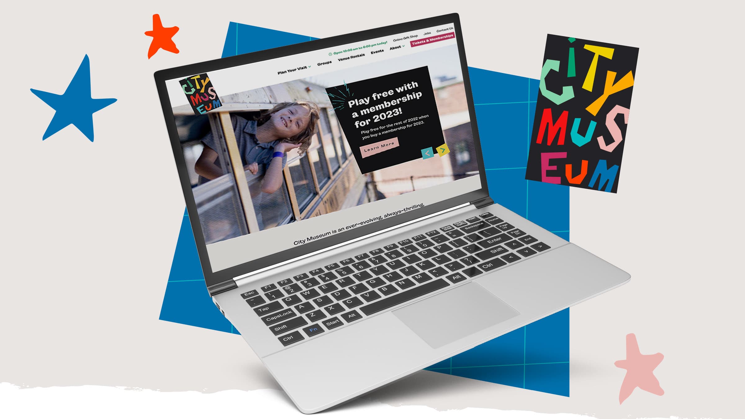
Weirdly Wonderful Web Design for City Museum
There’s a mystery hiding inside City Museum.
There’s actually quite a lot that’s unknown—just waiting to be found in the deep caves, curious collections, strange passageways and other weirdly wonderful spaces throughout. It’s part playground, part art exhibit, part daring adventure. And it’s always a little bit different, each time you go.
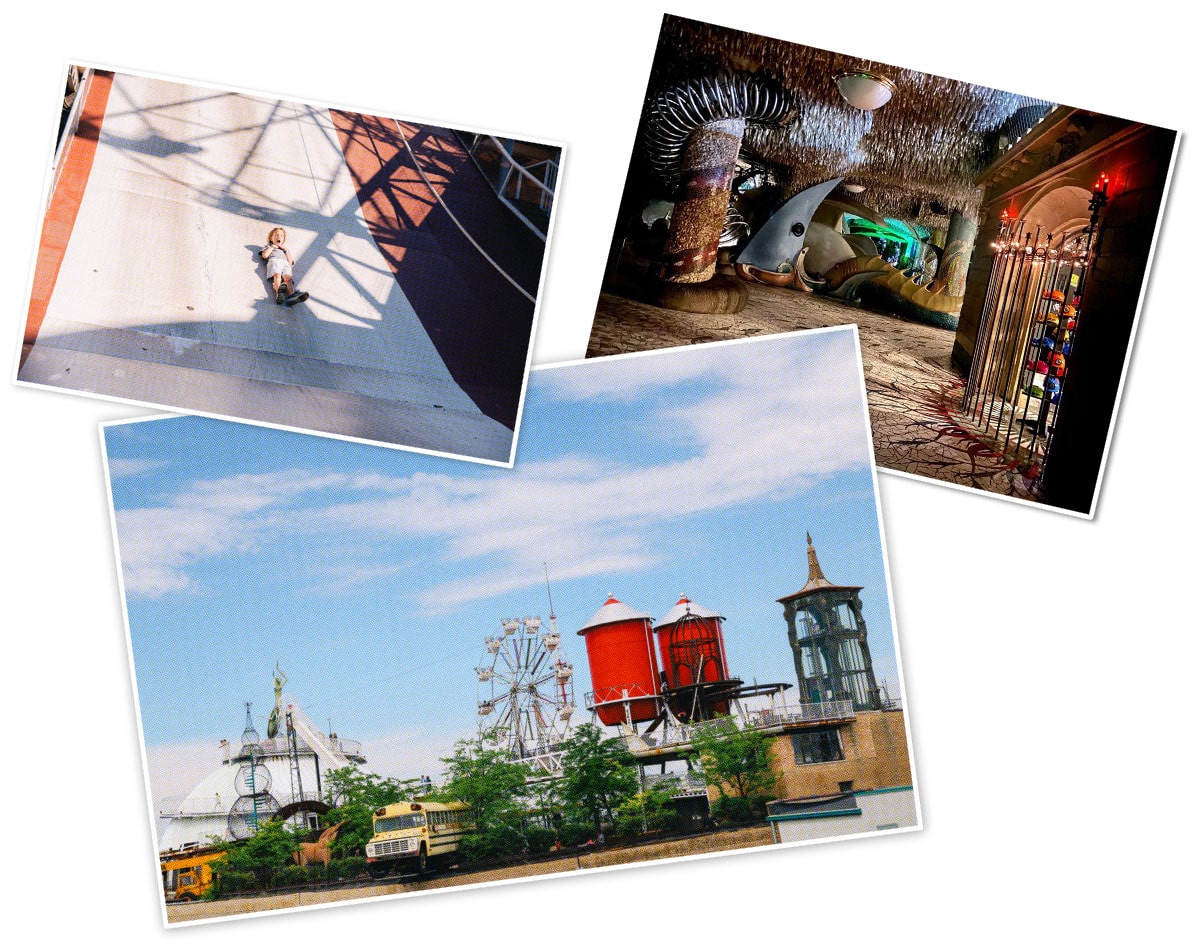
That sense of discovery is part of what makes City Museum a globally celebrated attraction. But while a bit of uncertainty is important for the customer experience, it’s not exactly what most people (especially parents) want when looking at a website.
And when it came time to bring the City Museum’s new weirdly wonderful branding to life on the web—that was the problem we were trying to solve.
First comes brand, then comes web…
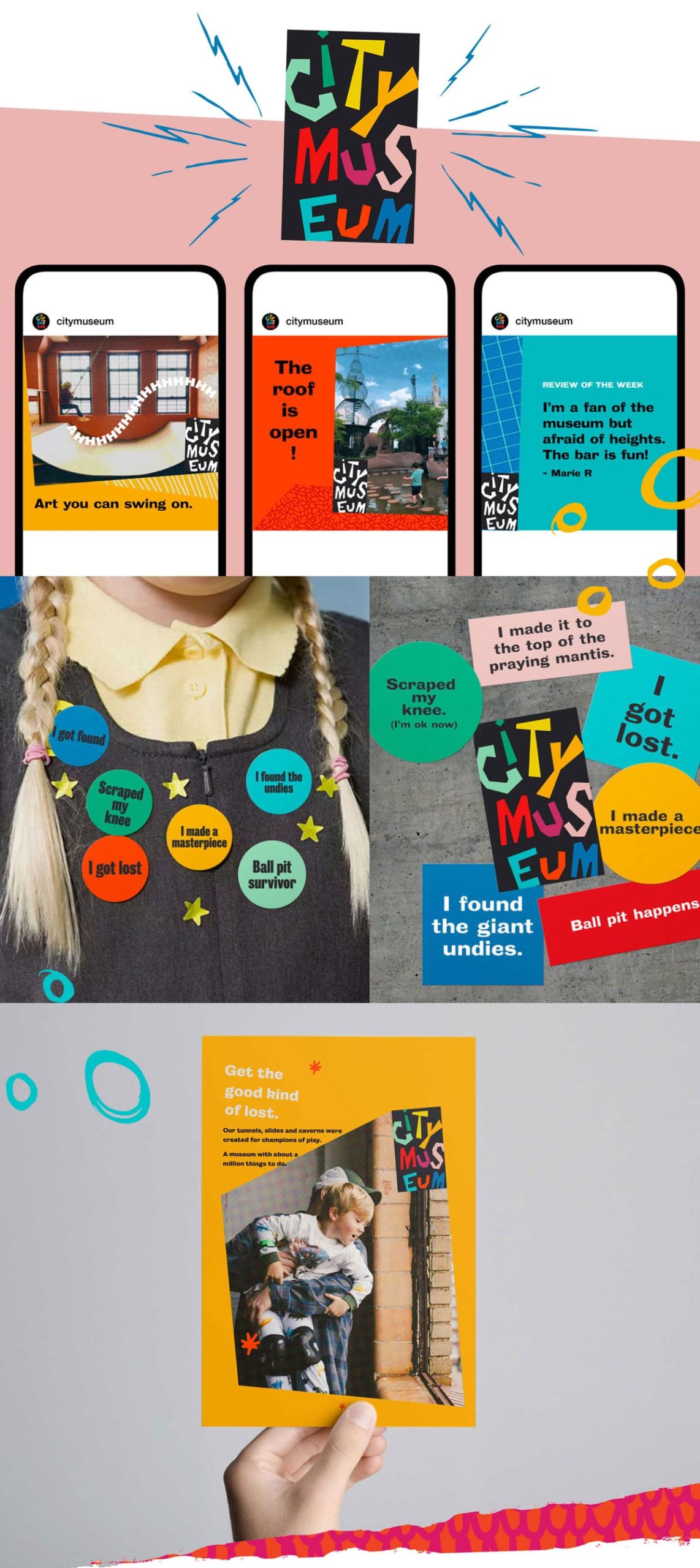
Late last year, City Museum unveiled a rebrand we’d been working on since before the pandemic. Celebrating the organization’s artistic origins and rebellious spirit, the new brand is colorful, playful and a bit unusual.
As the team at City Museum began rolling out the new colors, patterns and rhymes at various customer touchpoints (like on social media, signage and merch) their attention turned to the website.
Under new ownership from Premier Parks, City Museum had started offering membership options and events. But the website still had outdated information and needed to be better organized to allow visitors to find what they were looking for.
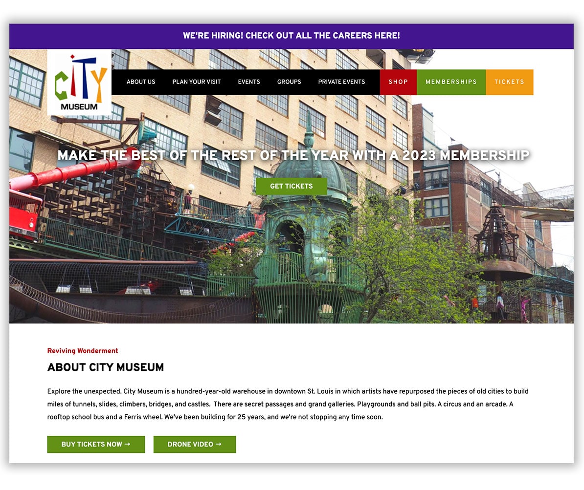
The old City Museum website design
The website they asked us to create had to easily allow visitors to get important details like cost and hours of operation, as well as a taste of what to expect—without spoiling any of the unexpected twists and turns that make City Museum so fun.
Excited by the success of the rebrand, we were ready to take on the challenge.
Designing the unexpected.
We’ve written before about The Swiss Grid, or The Grid System—a design aesthetic in which designers use a grid to organize information in the composition. It combines typography, compositional grids and simplicity, and much of Atomicdust’s website design work over the years has used The Swiss Grid as inspiration.
The City Museum website is The Swiss Grid antithesis.
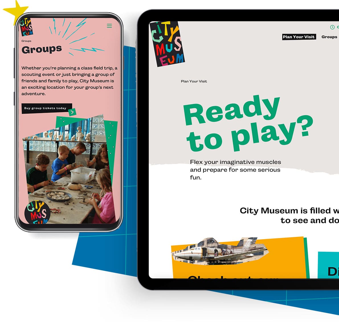
With seemingly haphazard diagonal lines, ripped textures, spinning logos, collage-like images and slanting text, the elements give a sense of motion and playfulness. We pulled colors and patterns from the new visual branding to make each page bright and playful. And bumper sticker graphics with phrases like “Ball pit happens.” and “I found the giant undies.” hook visitors’ curiosity.
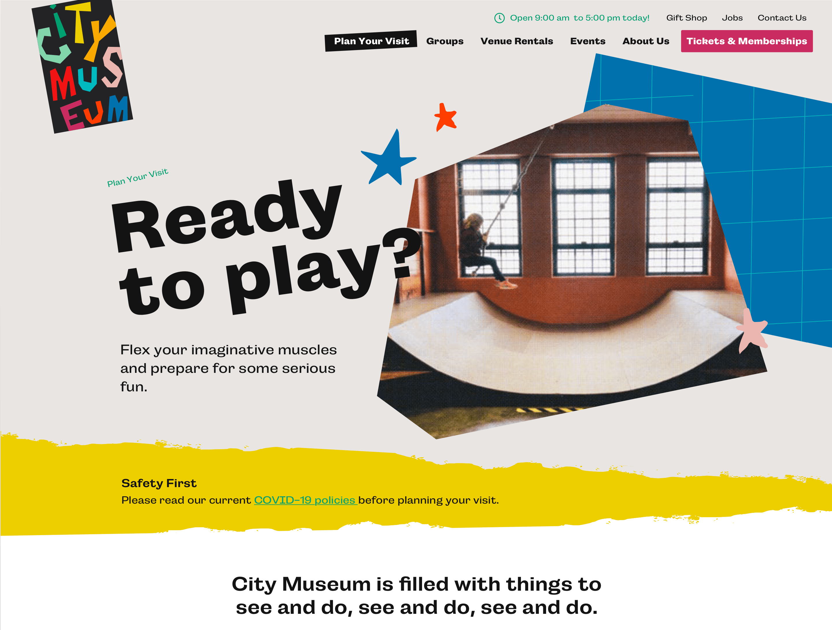
As we continued writing and designing, the client’s team asked us: could the site be live by City Museum’s 25th anniversary at the end of October?
The right info in the right spots.
Our team started outlining the sitemap and page content, paying close attention to the types of information visitors might be hunting for when they arrive at the site.
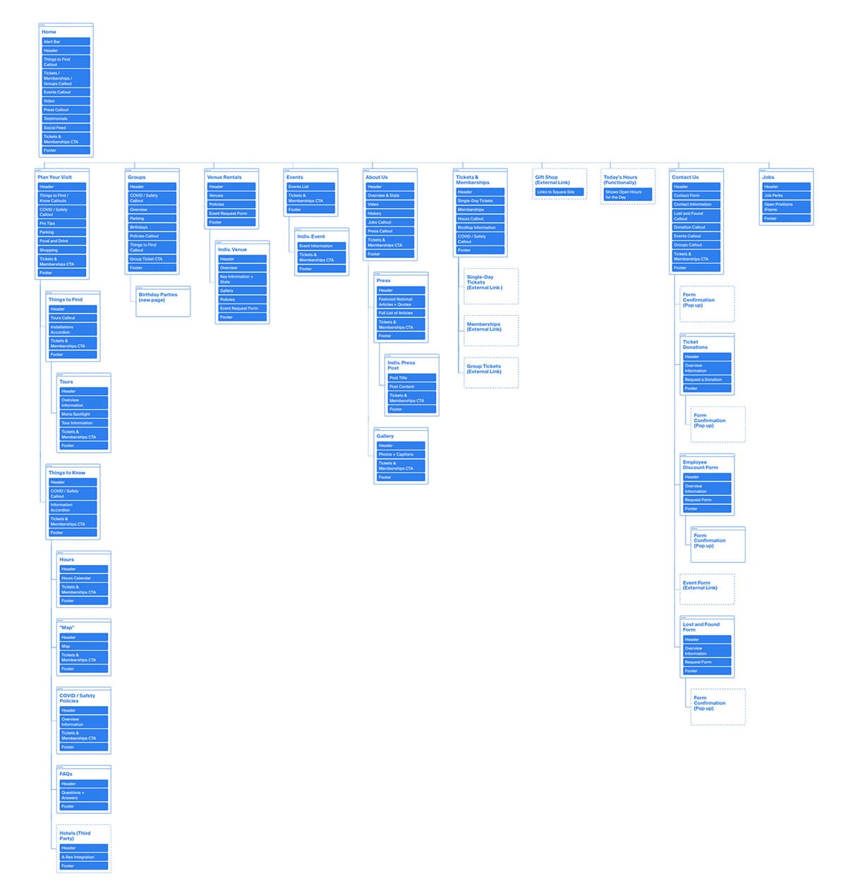
We started with the obvious. Today’s hours (updated automatically with dynamic code) are big and bold in footer and main navigation, along with links to tickets and memberships.
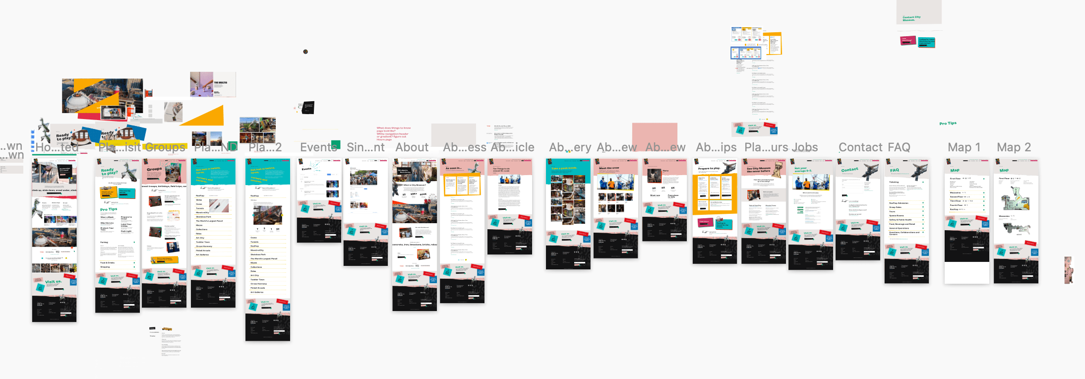
City Museum had never had a map, and we wanted to stay true to that. Instead, we created a page highlighting a few key things found on each floor, like restrooms, the gift shop, Artquarium and Rooftop Café.
A Things to Know page gives parents, adults and kids tips on how to prepare for a successful visit, like wearing climb-friendly clothing and writing your phone number on your child’s wristband in case they get lost.
Our strategy? Give people the info they need and tease the fun waiting inside—and no more. Quippy, conversational copy ties it all together, with lines like, “Label your littles,” and “And if you’re more of a hands-off parent? The bar is on the first floor.”
A collaborative, imaginative build.
We figured (and hoped!) we could meet the deadline—but one developer wouldn’t be enough. So, we created a new method for developing websites, one we started calling “block and tackle.” Our team of developers divvied up the site, each building their own section. Working together as sections were finalized, they merged the pieces into one cohesive website.
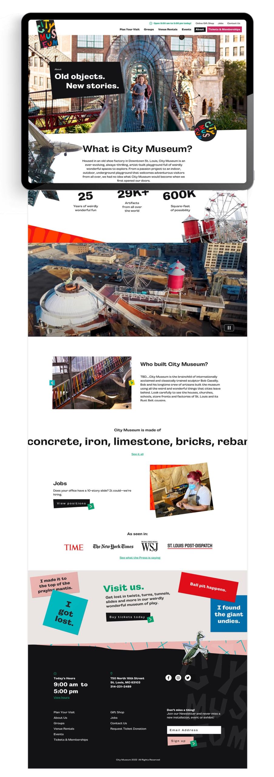
Here, the details really shine. On the homepage, copy glides across the page like a news ticker, and a photo of the giant praying mantis on the roof rocks back and forth next to twirling stars. Text links are surrounded by scribbled circles when a mouse hovers over them, and buttons pop up like they’re 3D before a user clicks. On the Things to Find page, a photo of the attraction appears when the user hovers over the name.


Just like the real thing, visitors stumble upon surprises as they journey deeper into the site.
Best of all, the site is mobile-friendly, built with accessibility in mind and easy for the City Museum team to update as needed. So even years down the road, the site can still contain all the necessary information visitors need as the ever-changing playground continues to evolve.
Continuous inspiration.
Working with the City Museum (one of our team’s favorite places and an attraction that inspires so many across the globe) was among the most exciting projects we’ve ever taken on. We were thrilled to help refine its brand and loved bringing it to life with a new website—launched a week before City Museum’s 25th anniversary celebration.
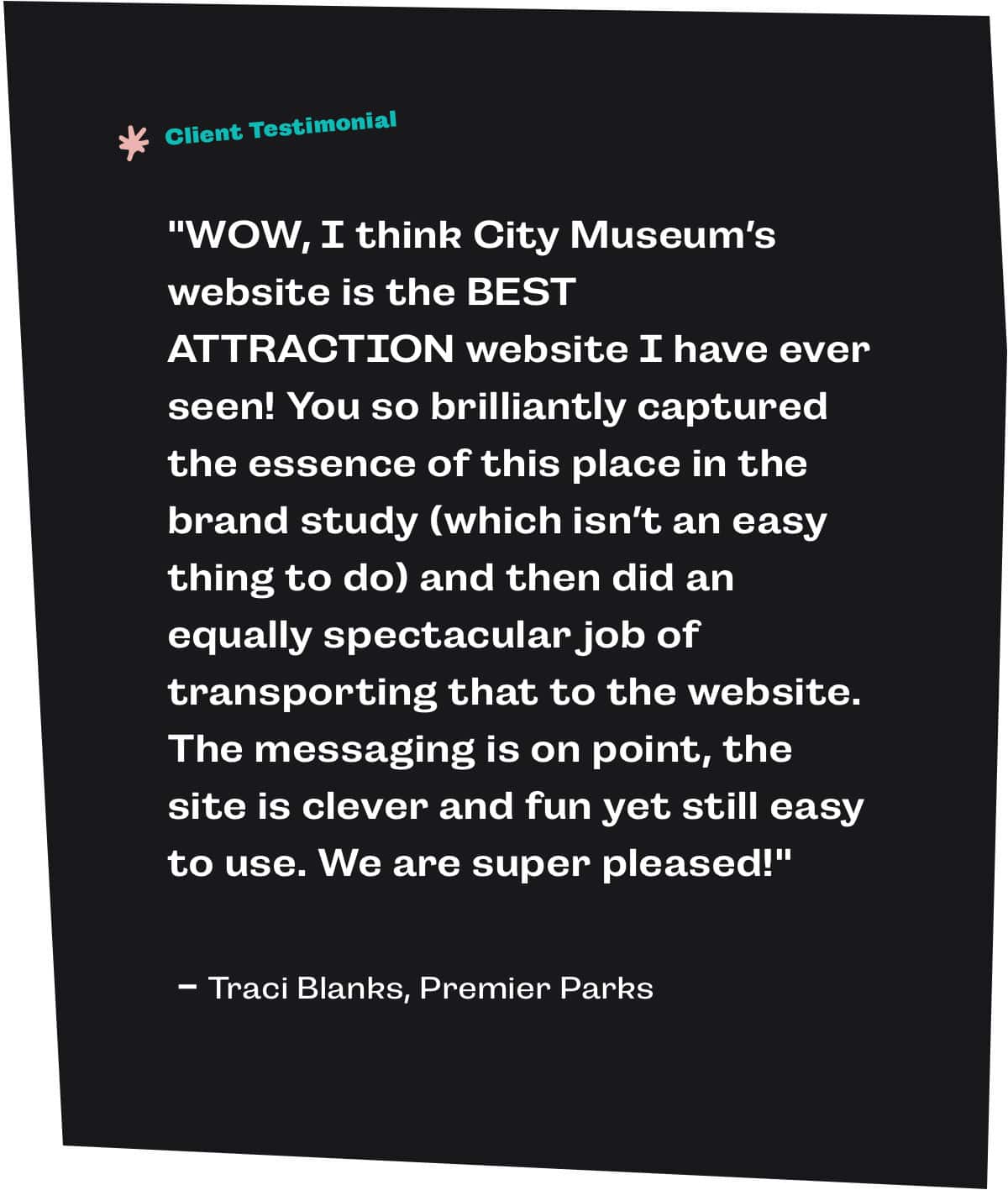
After the site went live, we got some of the best client feedback we could ask for:
There’s no doubt City Museum will continue to reign as one of the most creative and iconic places in the world, and we loved getting to tag along for part of the ride. We can’t wait to see—and climb up, slide down or crawl under—what they build next.
