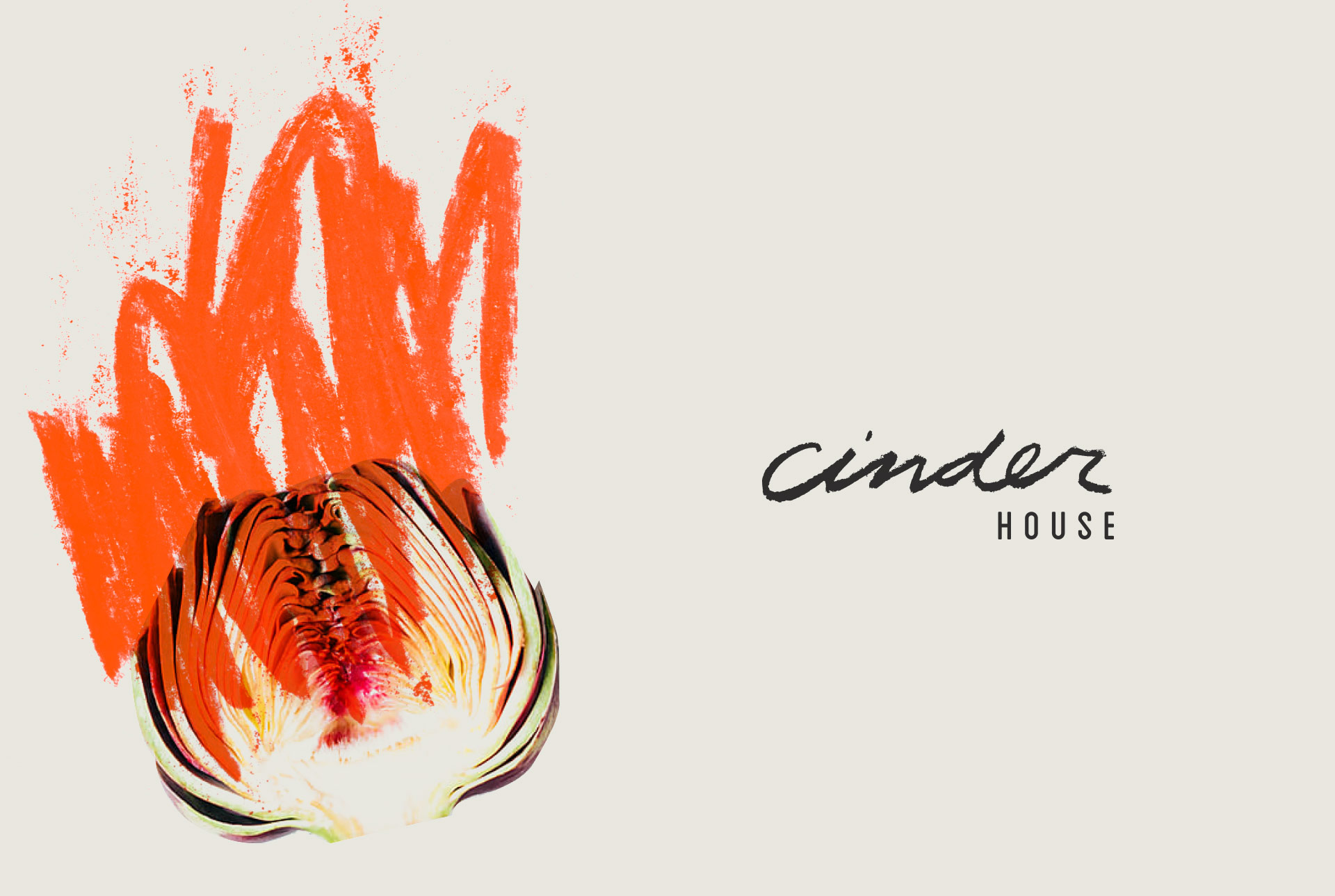
Igniting a New Restaurant Brand for Cinder House
It was late in the afternoon, and Katie Werges and I were laying out design expressions in rows on the conference table. I had just started to brew a fresh pot of four o’clock coffee. Do you know how nerve-wracking it is to serve James Beard Winning Chef Gerard Craft coffee? Sometimes, I think I get more nervous about serving the coffee than the fresh design concepts for his latest restaurant concept.
We were working on the branding identity for the sixth restaurant that Atomicdust has done for Gerard. You’d think by now I’d be used to the fact that Gerard is never disappointed (and probably doesn’t care that much) by the coffee (it also happens to be great – it’s Goshen, another brand we worked on years ago).
Over the last few weeks, just about our entire team had been helping solidify a name for this new restaurant. We were working through a couple of Gerard’s original ideas, trying to riff off them, create something new, tweak, justify, wonder, and look up about a million words in online thesauruses.
They all had to do with fire. Well, most of them did anyway.
The concept was inspired by the Brazilian style cooking Gerard grew up with, and what was unique about it from our previous experiences branding Craft Restaurants was that this one was in partnership with the Four Seasons St. Louis.
So it was super secret – and secrets are exciting.
There were dozens of names. Most of them were about fire. Then there were 10. Then, just 2. And then, one last log on the fire: Cinder House was born.
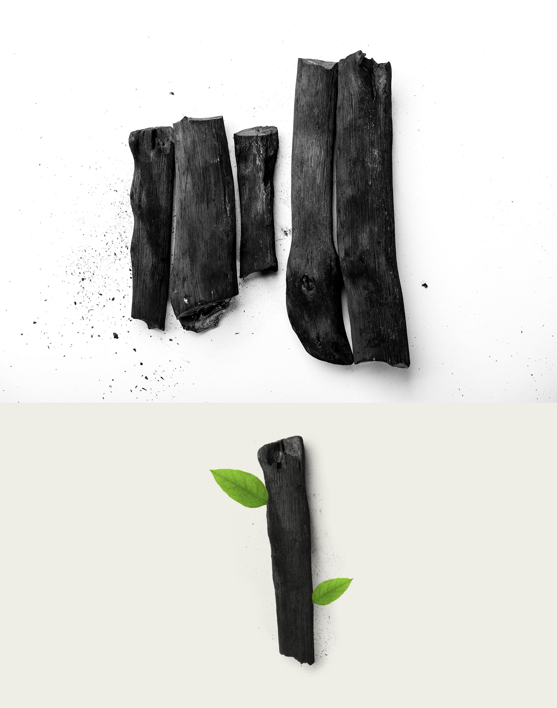
Gerard had this idea of new life being born from ashes. He sent over some sketched ideas of green leaves sprouting from natural wooden charcoal.
We were inspired, and ran with it. We ordered cool-looking charcoal from a couple of websites. We shot some photos of it, adding the green leaves in Photoshop.
And since our office doesn’t have an official place to store pieces of charcoal, I left them laying around on our back meeting table.
One afternoon, Katie took some of the pieces of the charcoal and started to draw “cinder” with them on paper. It was like charcoal drawing from an art class. She also sketched out flames, grills, and other fire and cooking-related elements.
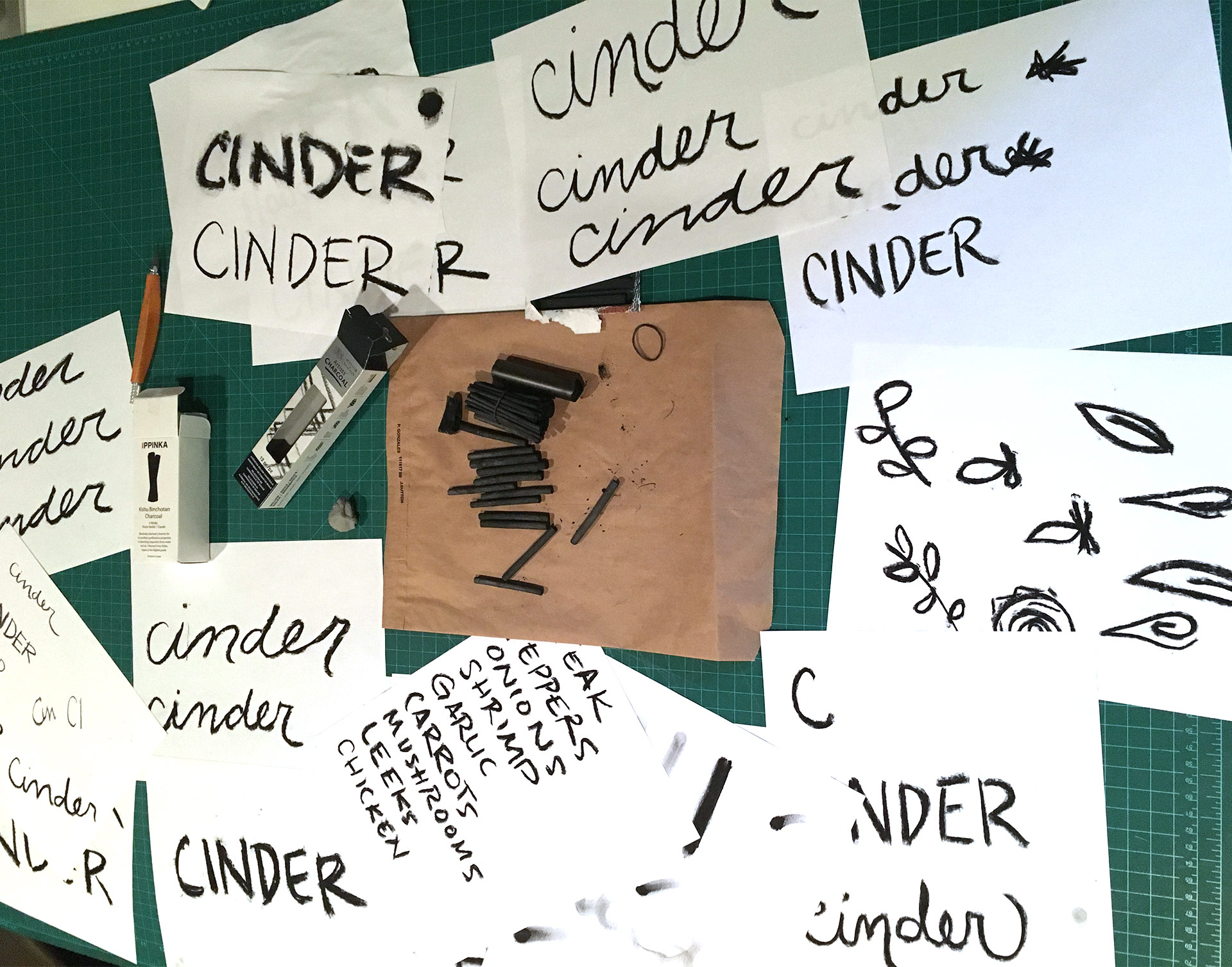
There was something about them that felt successful. They were organic, simple, and didn’t look like anything we’d seen before for a restaurant brand identity. It wasn’t as structured as what we thought a “hotel restaurant” would be. It was simple and our whole team was excited to share.
But this was our opinion. This was internal only. What would our client think?
Gerard and the coffee entered the conference room just about at the same time.
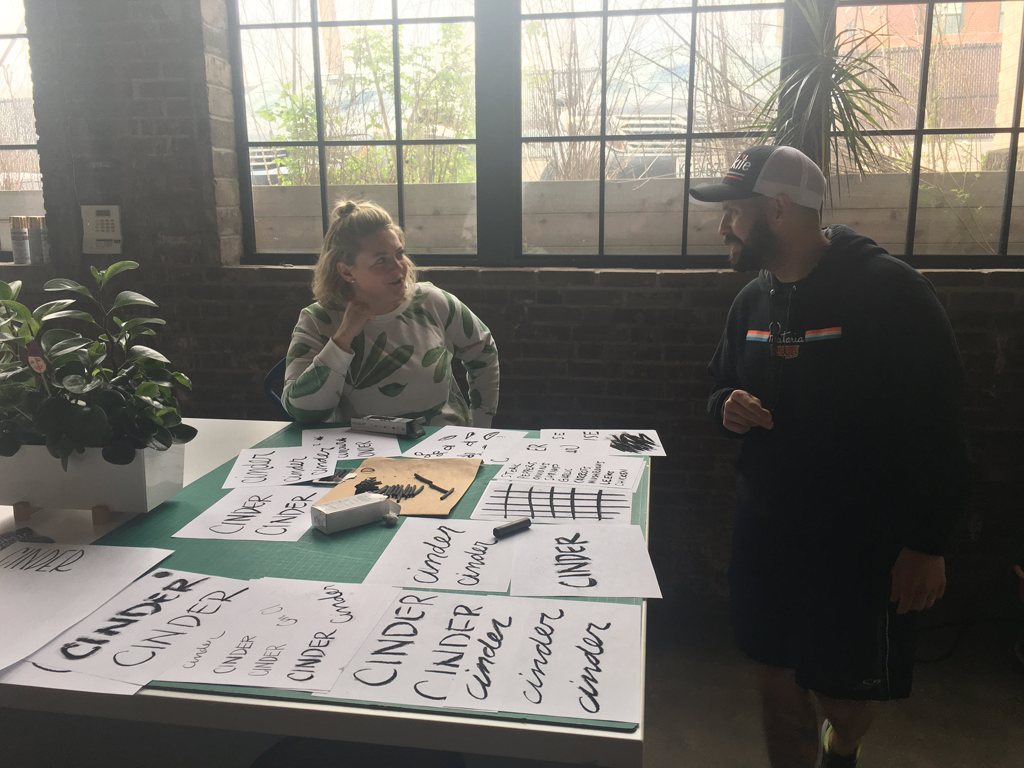
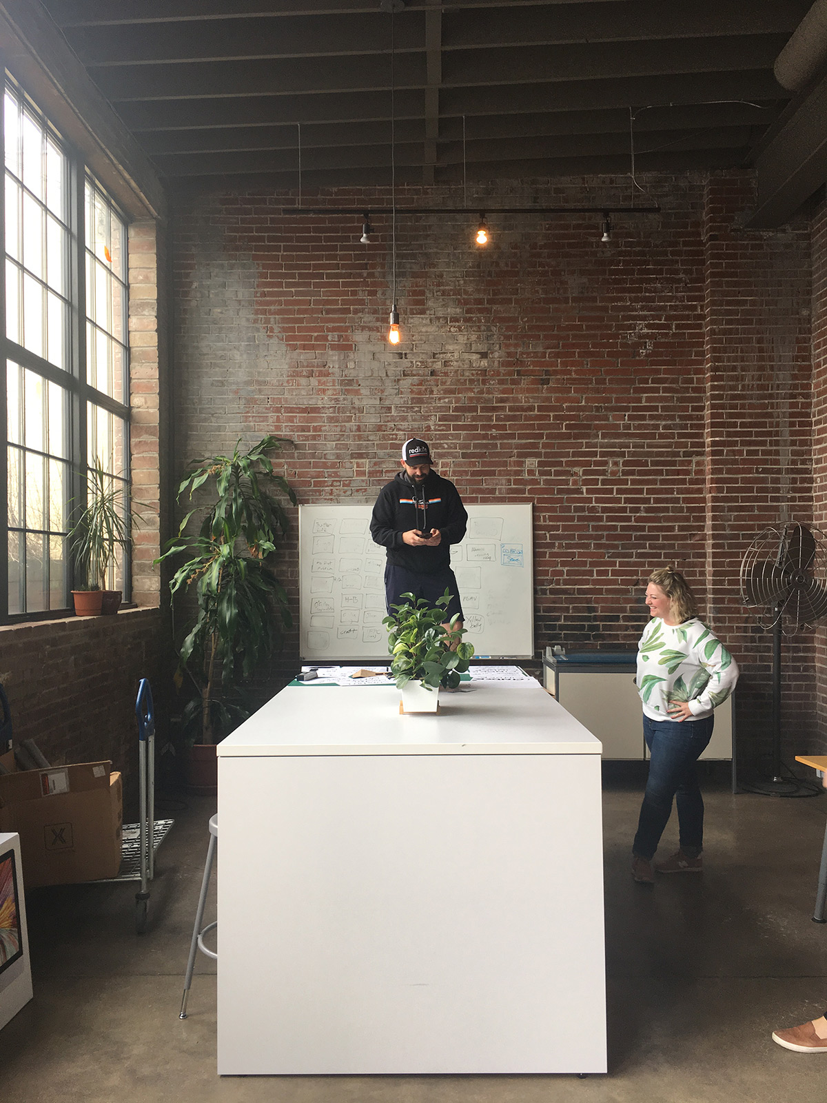
Scanning all the different identity designs spread out on the conference table, he smiled, pulled out his phone, and started taking photos – all the while talking to us about what he liked, what designs he felt were successful and what elements that he was excited about. Just talking and taking photos on his phone.
“When are you going to announce Cinder House to the public?” I asked.
“I just did,” was the reply.
With one Instagram story he had created without any of us even realizing, the Cinder House brand identity was born. We just assumed he was talking photos of the work to show friends, family, and to ponder over.
“People are already excited.”
So, we grabbed the design spreads we had on the table, and moved to the back of the office – where the light is a lot better.
Brand Narrative & Clarifying Statement
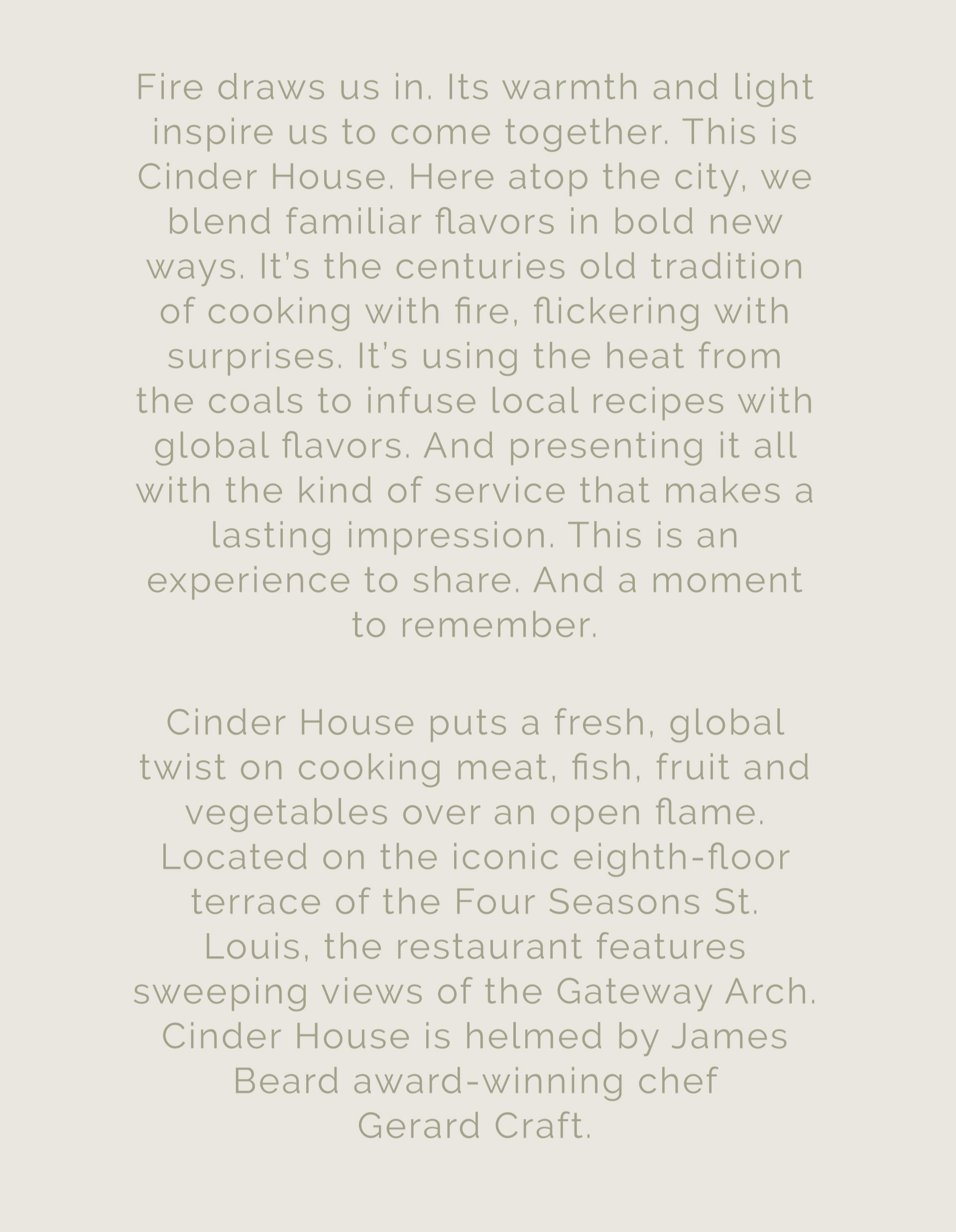
With any branding project, from large corporations to brand new restaurants, we believe language is foundational for good work. Like the chicken and the egg, language doesn’t always lead the spark of the concept – but for Cinder House, language helped solidify the initial sketches and bring it all to life.
Brand Design Process
Some of the early, hand-drawn, charcoal design elements for Cinder House ultimately led the brand’s visual direction. The scribbles started looking like the tops of flames with embers when blown up and turned orange. Using charcoal as a medium to create the logo fit perfectly for the concept.
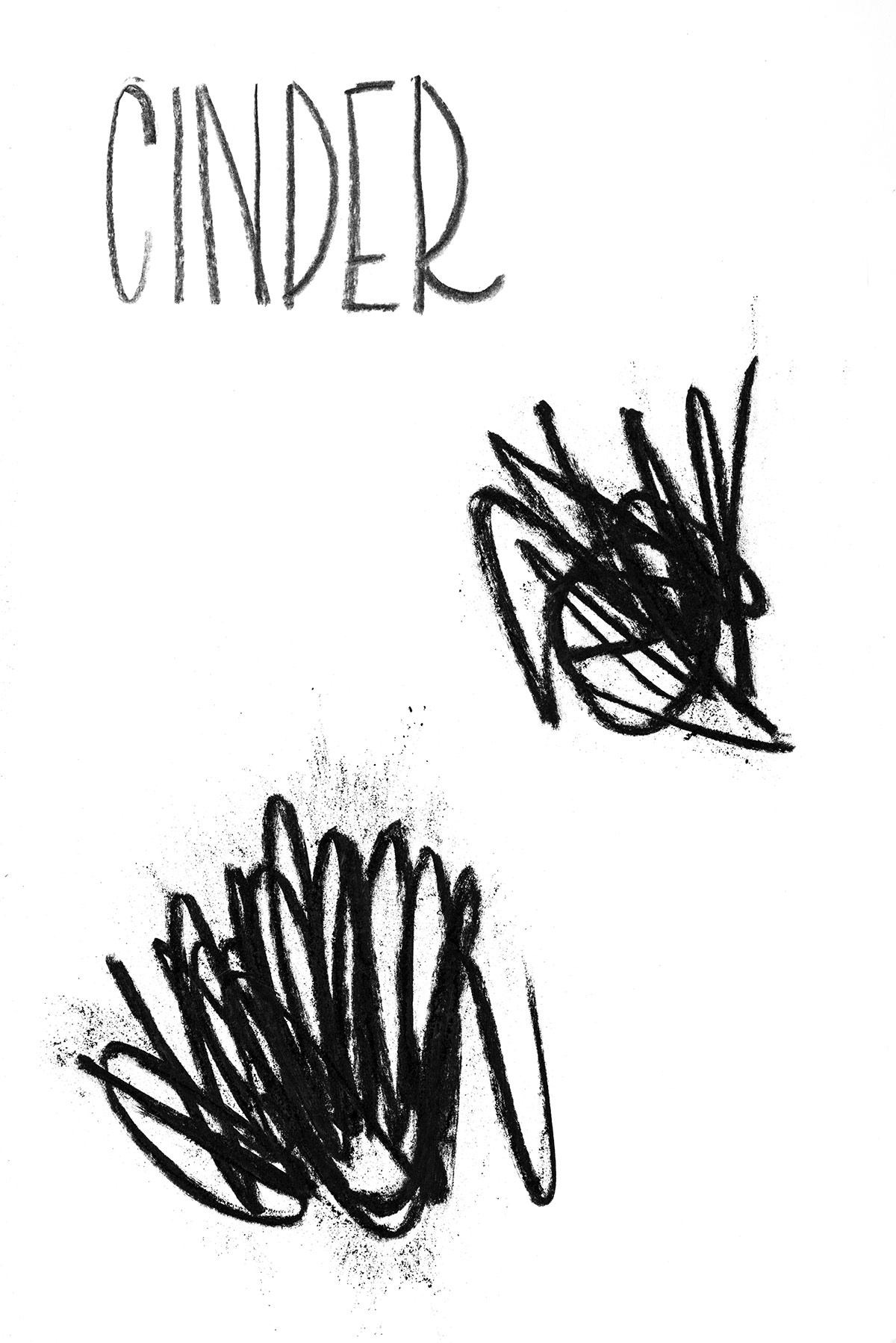
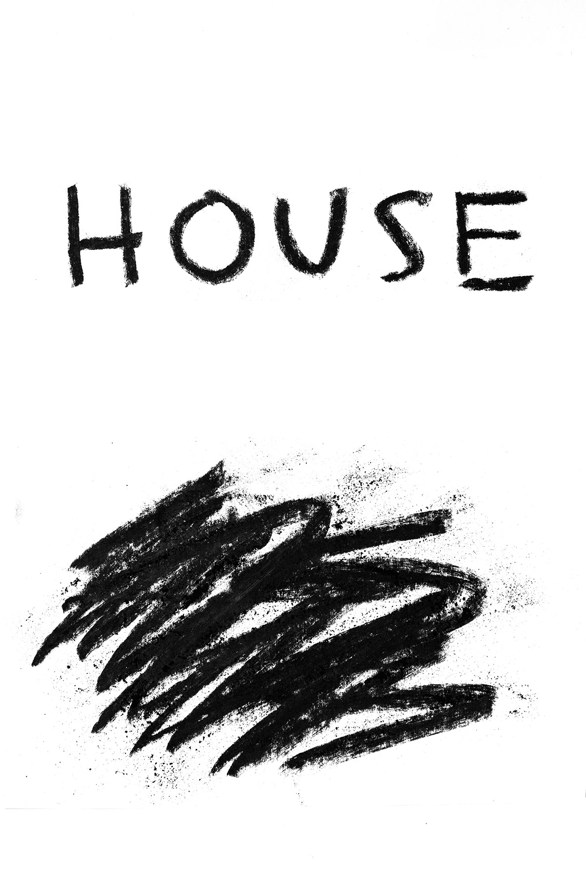
We made sketches around cooking with fire using simple ingredients, and used these as textures and elements in the Cinder House brand. The organic nature felt unexpected for a restaurant brand identity.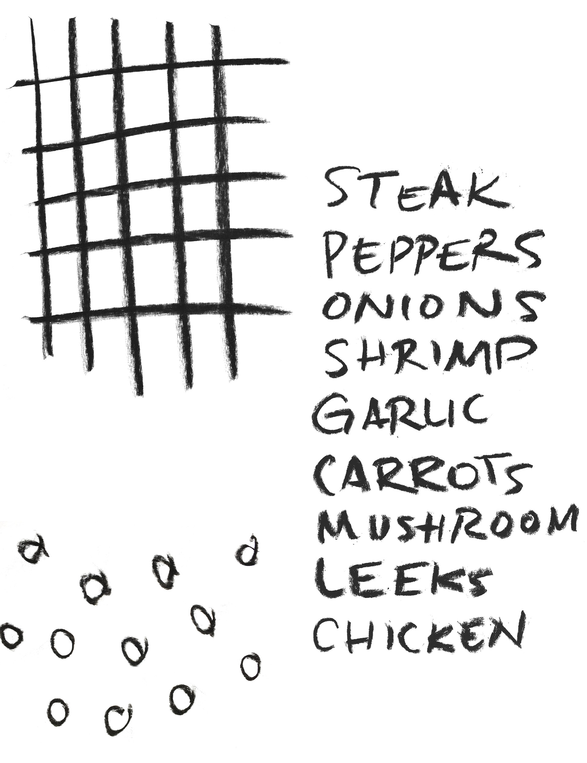
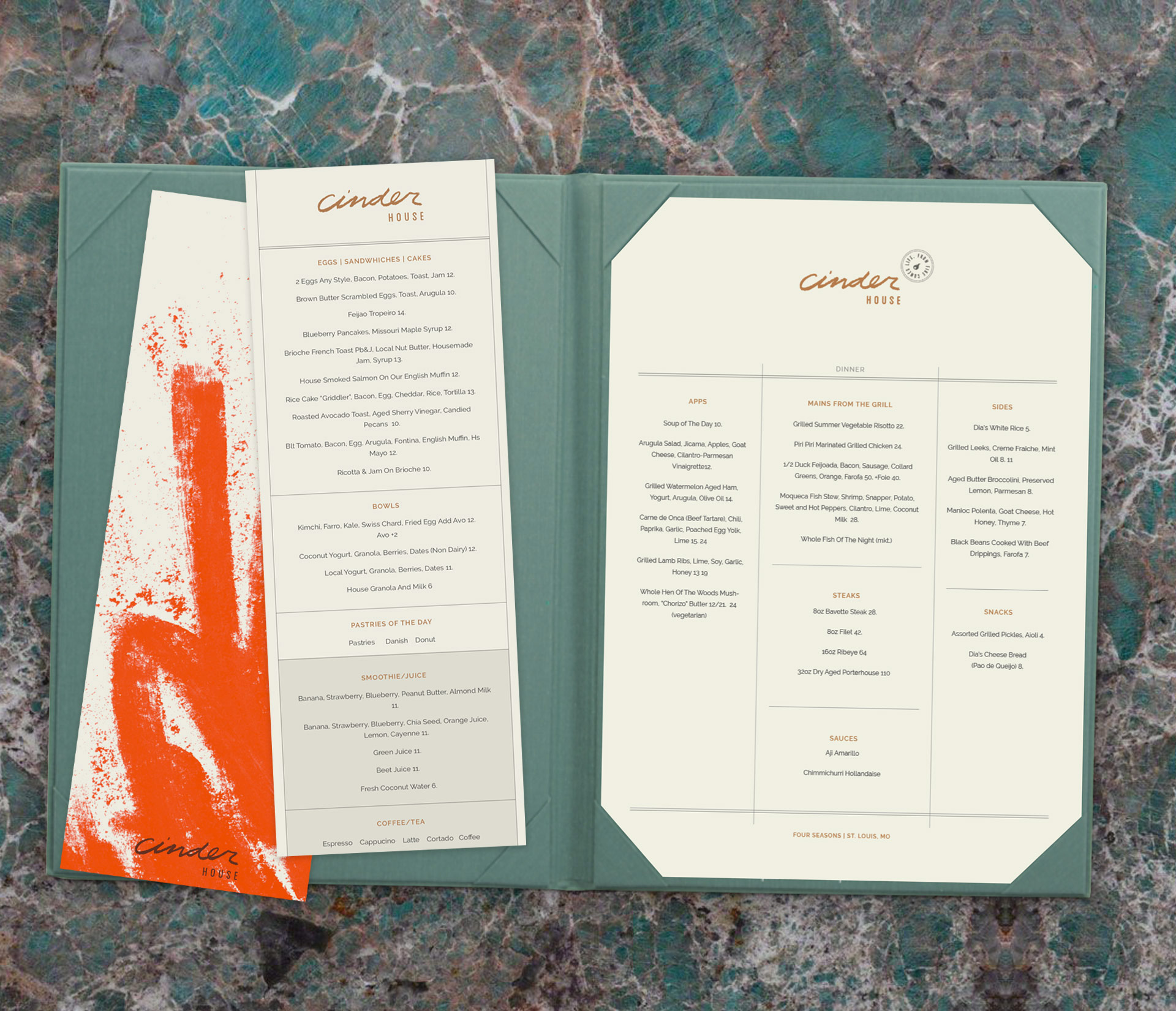
The brand started to take shape as we used the hand-drawn elements in the context of more functional pieces, like ads and menus. The bright orange reflected the fire, heat and passion of South America.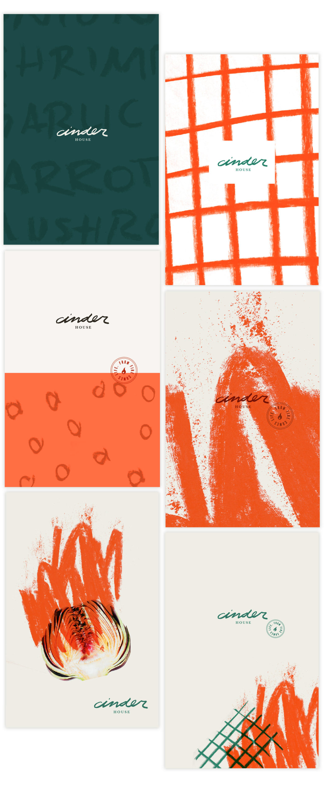
The Brand Rollout
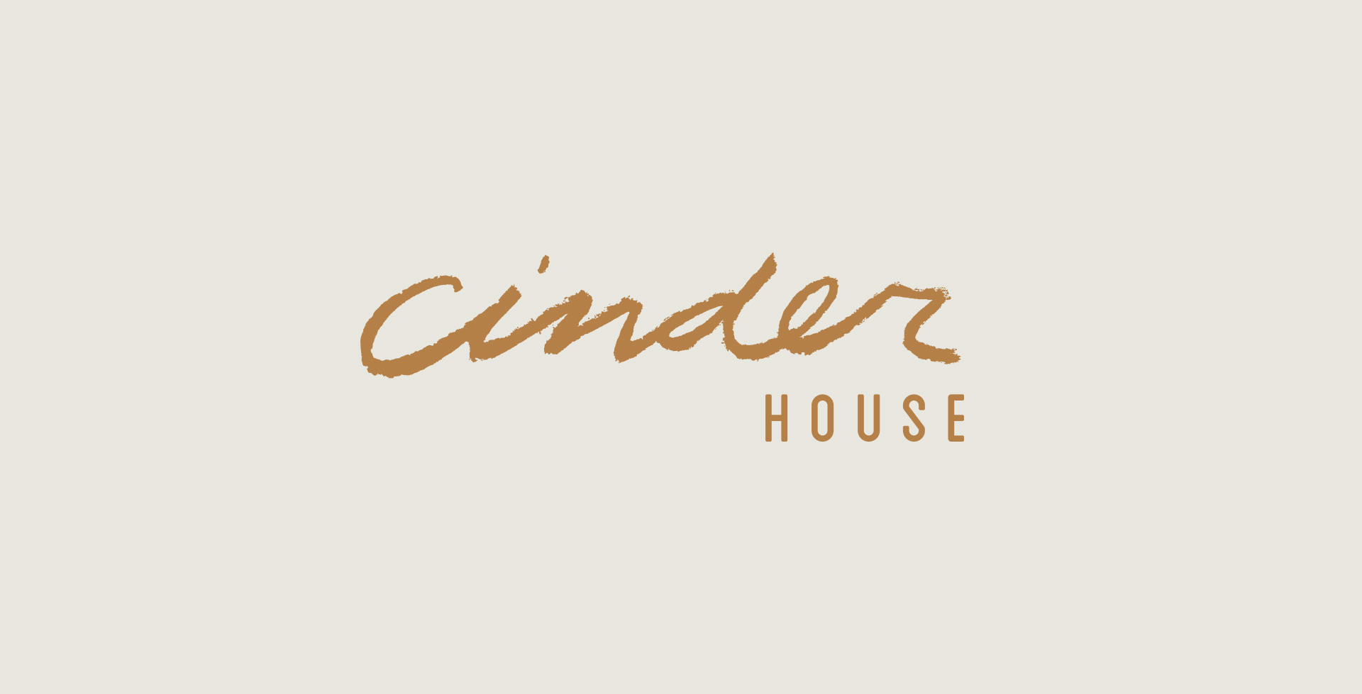
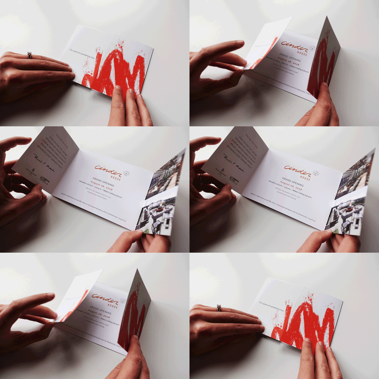
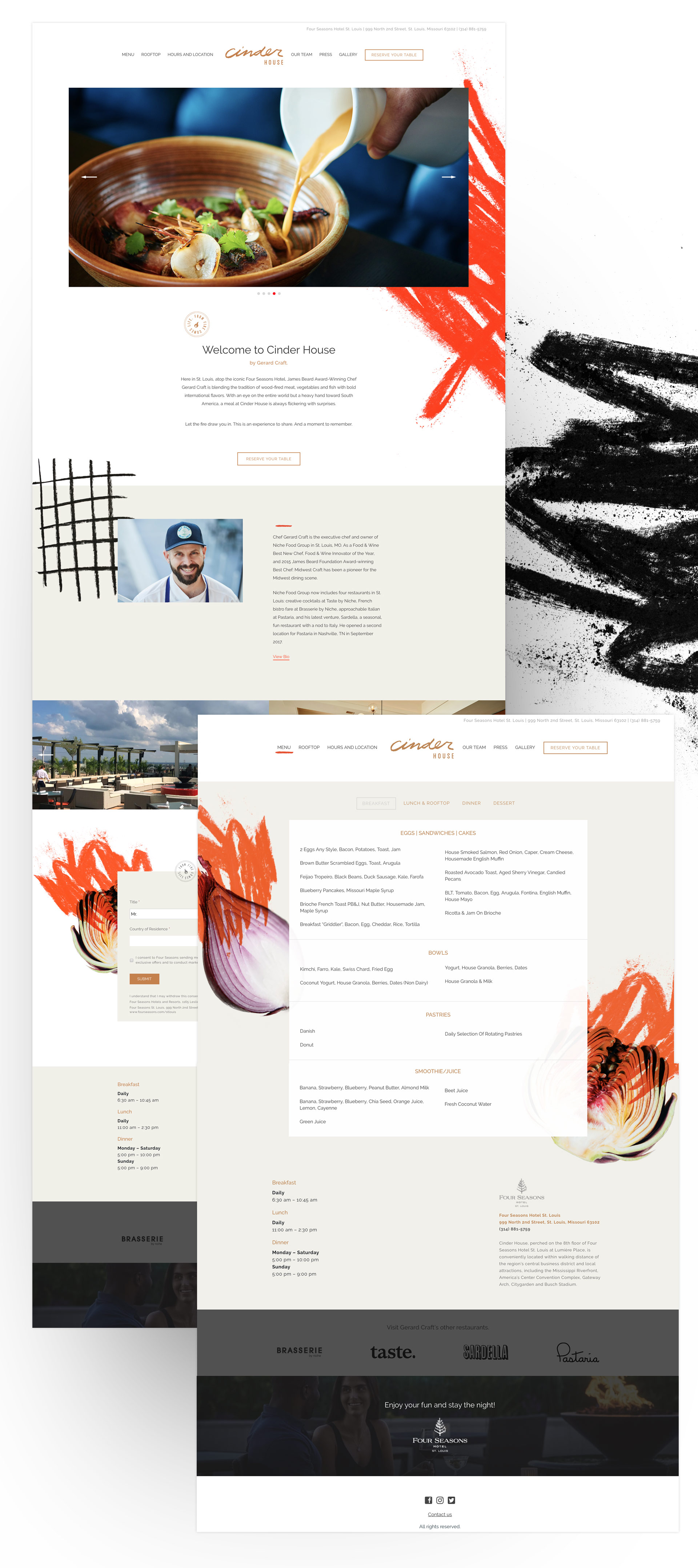
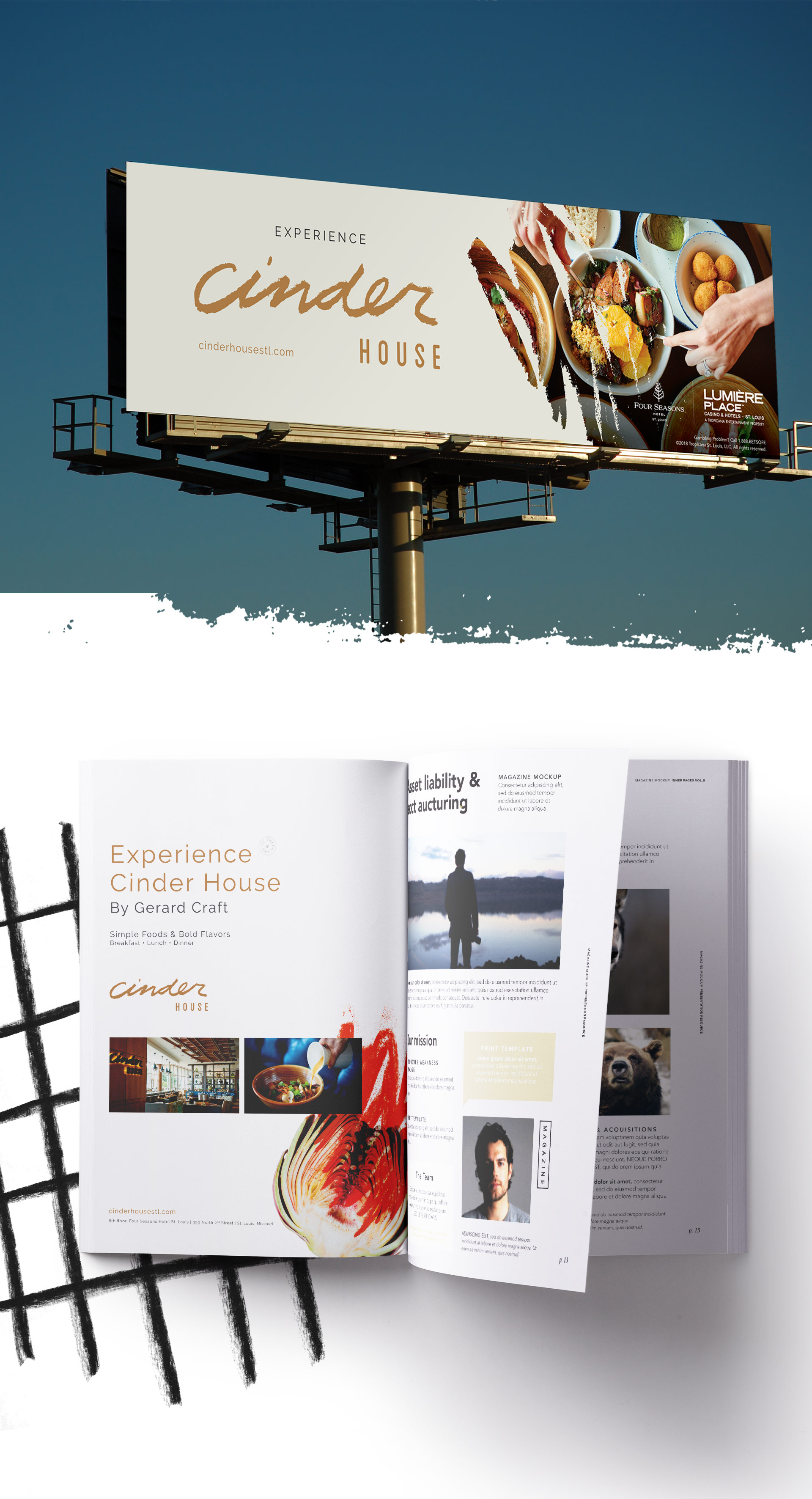
Finally, all the pieces came together. We refined the logo and elements of the identity and started to plan and execute the Cinder House brand rollout, from construction teasers, to websites, billboards, ads and, of course, menus.
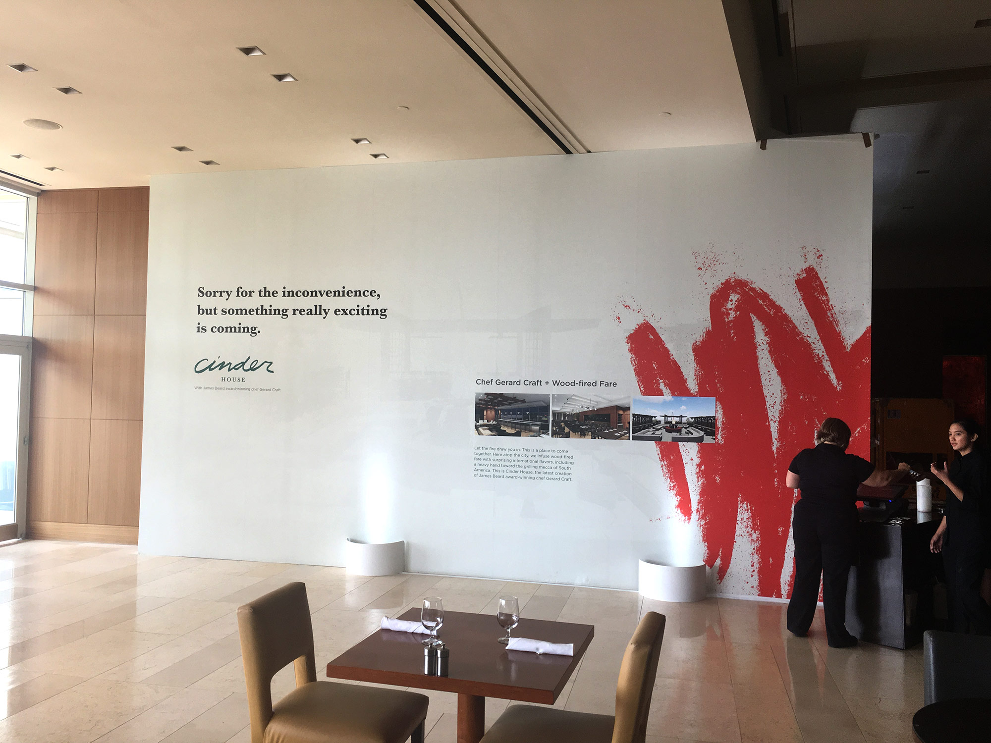
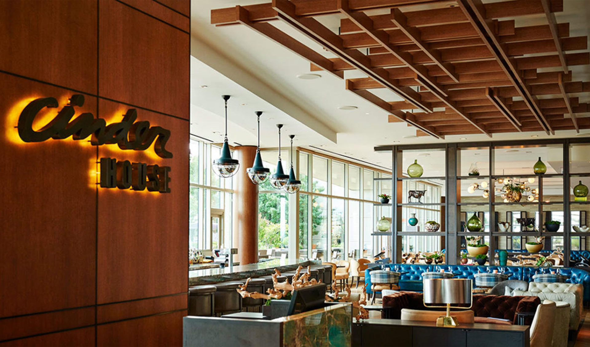
Interior of Cinder House was designed by the awesome Sasha Aleksandr Malinich of R/5 design agency.
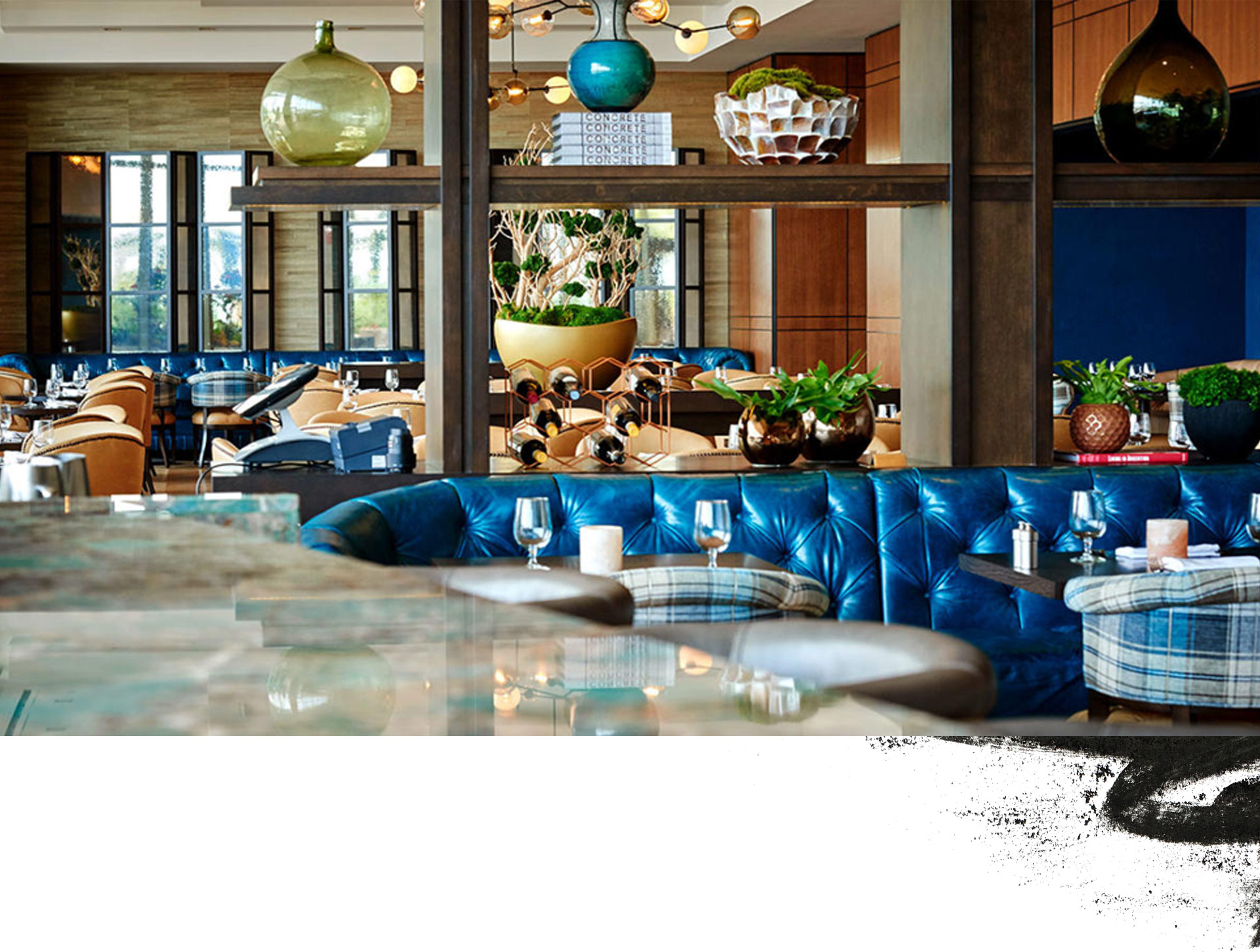
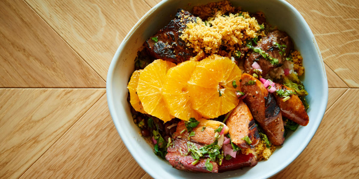
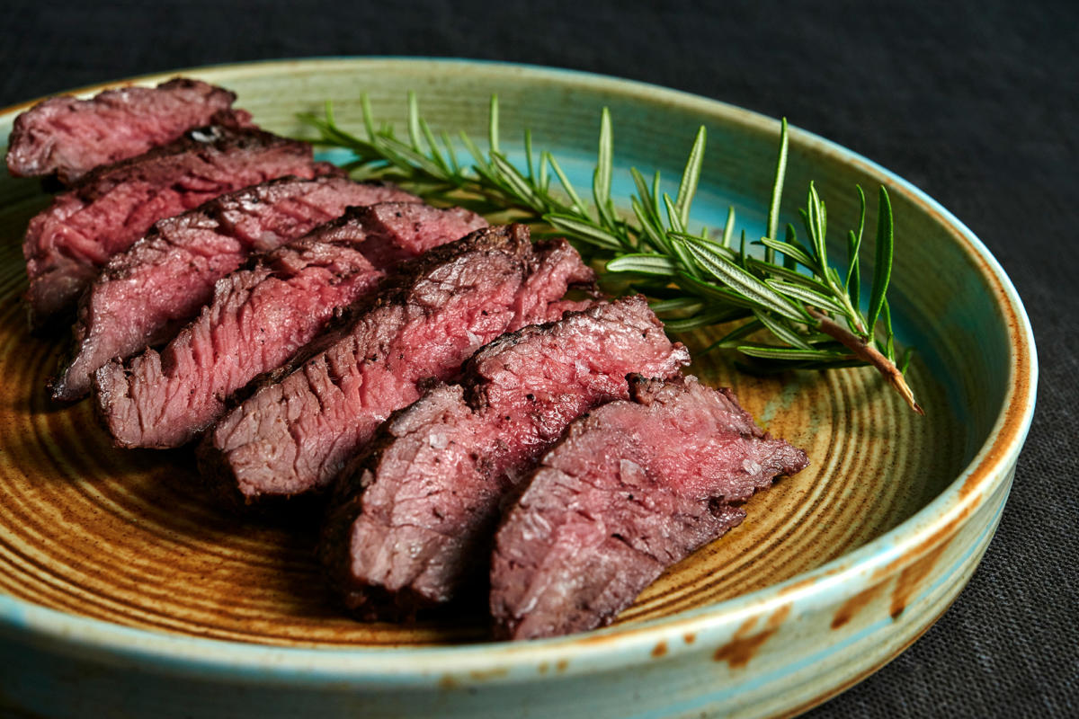
Photos by the amazing Greg Rannells. https://gregrannells.com
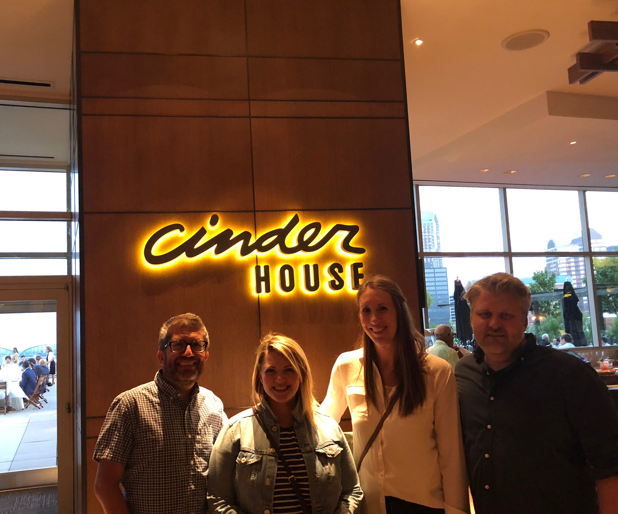
The (very full and happy) Atomicdust Cinder House team.
Virtually unheard of in the restaurant industry, Cinder House opened early, and we are thrilled to have been on hand to try several of their signature meals. Each one was, of course, nothing short of amazing.
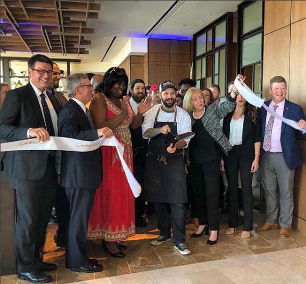
Congratulations to Gerard and the Four Seasons St. Louis team on the opening of Cinder House. We’re proud to have been a part of launching the new restaurant, and look forward to our next adventure (and to sharing more coffee) with Gerard Craft.
Stay up to date on the latest branding work from Atomicdust.
Sign up for our newsletter and we’ll send you monthly marketing tips, branding insights from our team, and the latest news and work from Atomicdust.
