A Modern Rebrand You Can Bank On
When Central Federal, a full-service community bank, needed to change perceptions and increase their customer base, they turned to Atomicdust for a modern rebrand.
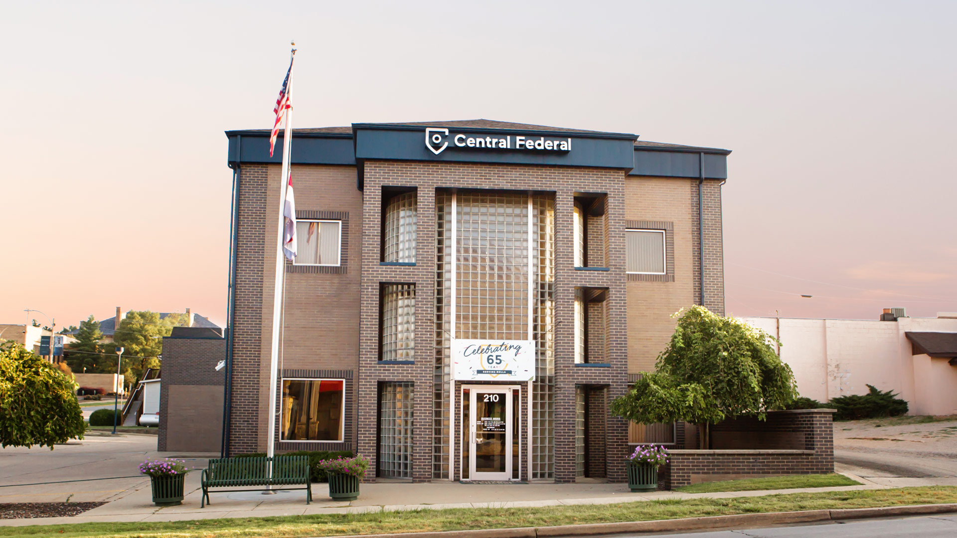
Located in downtown Rolla, right across the street from the Missouri S&T campus, you’d think that Central Federal was in a prime position to be serving the influx of students, young professionals and new families in the community.
But with dated signage and an intimidating brick facade, people just weren’t stopping in. And despite being a staple in the community for more than 50 years, they still had people ask where they were located. Even their name — Central Federal Savings & Loan — didn’t resonate with customers or even speak to the full scope of their services.
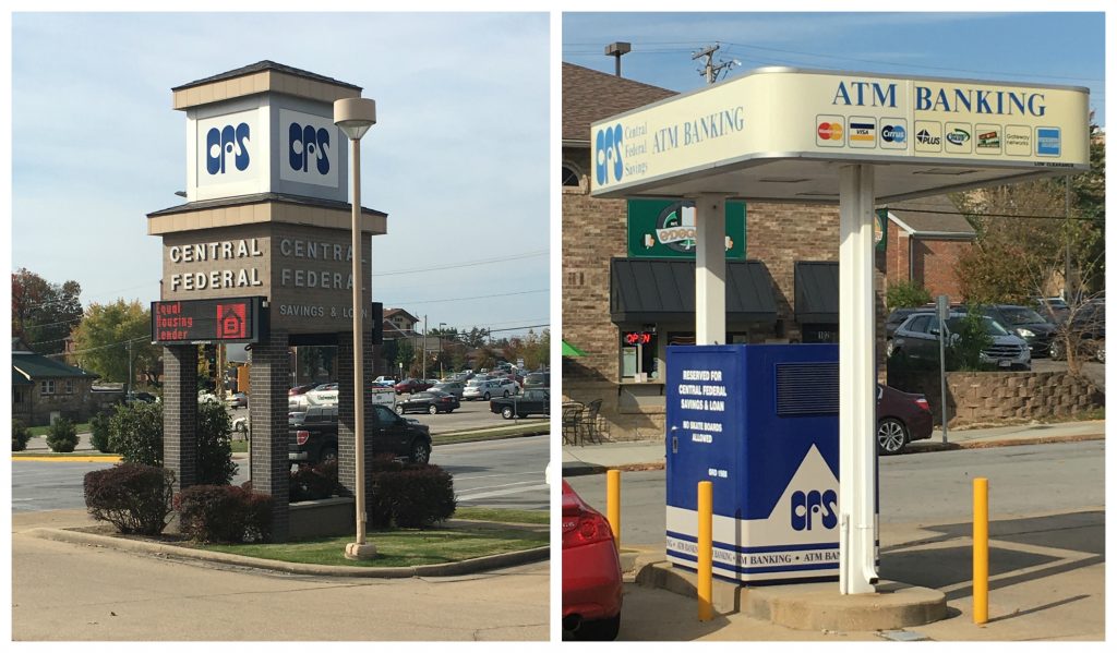
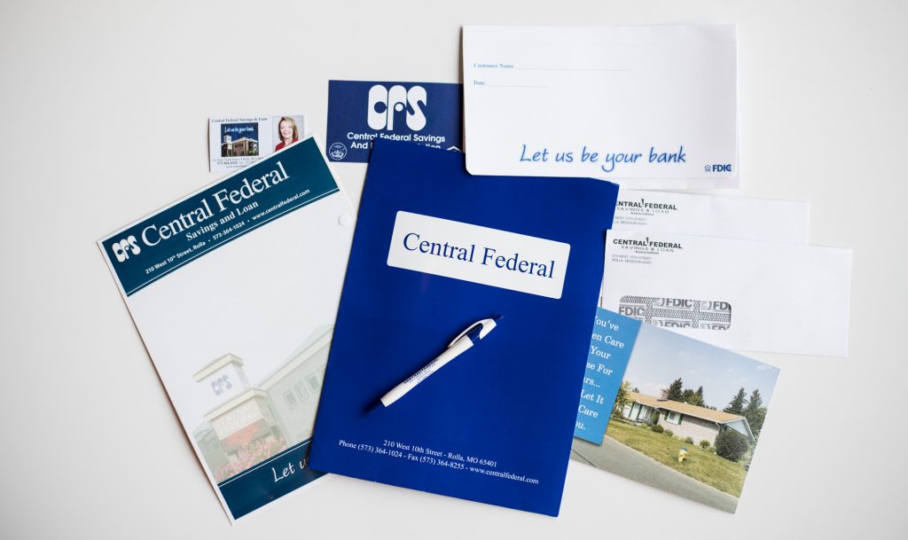
It was time to make a change. To challenge existing perceptions. To get people to stop and look. And ultimately, grow their customer base in the community.
As we embarked on rebranding Central Federal — yes, changing the name was one of the first (and easiest) decisions we made — we talked to both employees and customers about their experiences with the bank.
It was through those conversations that we learned about their commitment to service. In fact, when asked to describe Central Federal, the most commonly used words were local, honest and service-oriented. And when asked what they would not want to change about the bank, that family-first approach was the unanimous answer.
This desire to offer genuine, quality service to everyone who walks through their doors lead us to our tagline — Bank on Rolla.
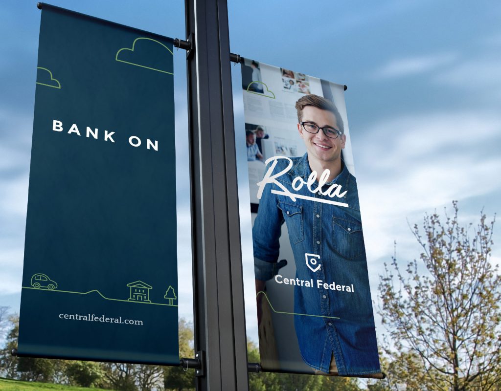
The tagline communicates trust, reliability and commitment to the local community. Not to mention, Central Federal is located on Rolla Street. (A clever nod to those “where are you located?” questions.)
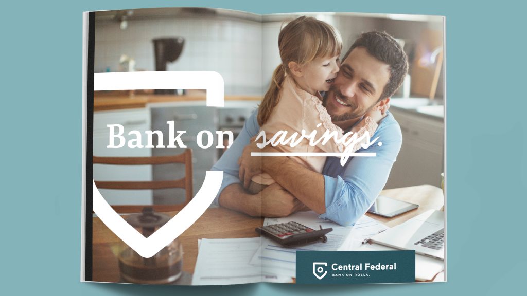
After settling on the “Bank on Rolla” tagline, the creative just started to click. We imagined using “Bank on _____” as a device to communicate Central Federal’s core values and speak directly to customer needs.
![]() The bank being “on Rolla” inspired the new logo, which combines modern iconography of a location pin, a classic shield and the letter “C”.
The bank being “on Rolla” inspired the new logo, which combines modern iconography of a location pin, a classic shield and the letter “C”.
The mark itself is friendly and contemporary, and can easily scale across different sizes – from debit cards to billboards.
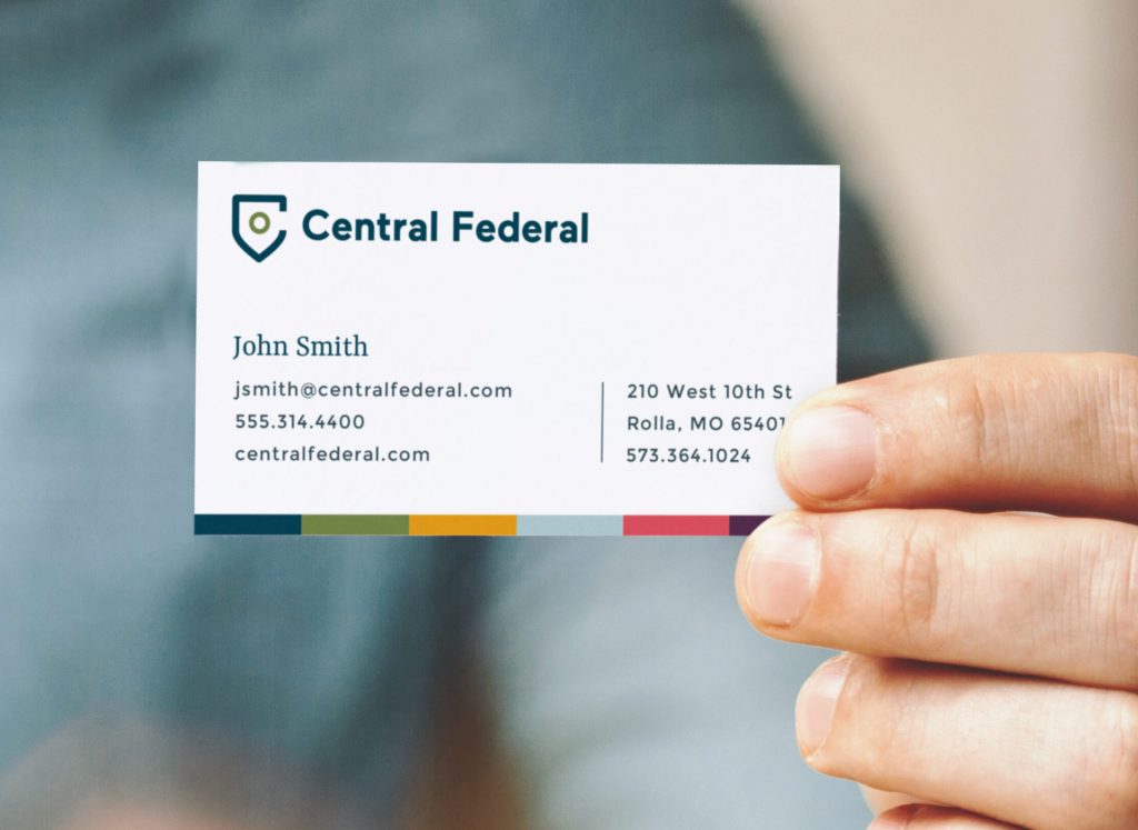

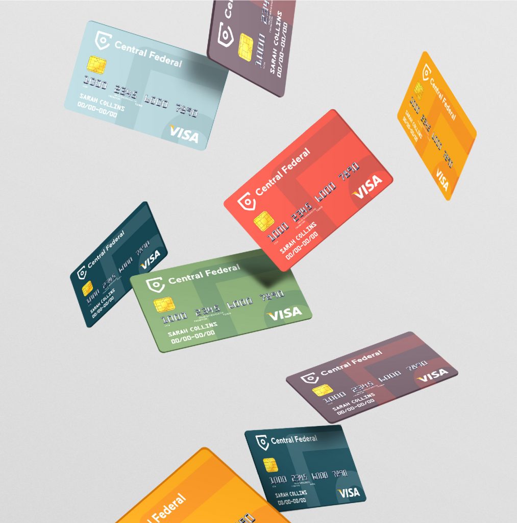
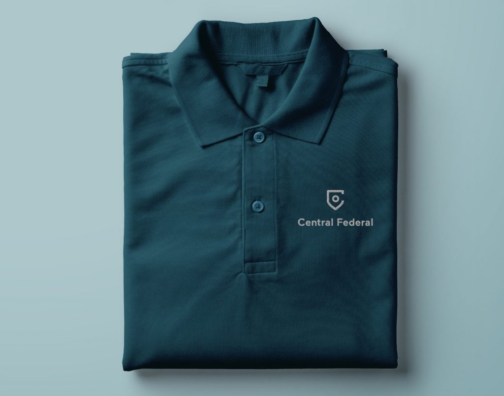
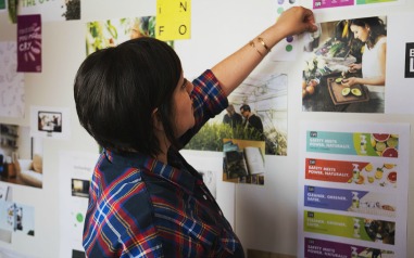
The rest of the brand identity is all about balance. A fresh, playful color palette modernizes the brand, and yet, is still refined enough for a reliable banking institution. Traditional serifs and modern san serifs provide a sense of sophistication, while the “Bank on ____” is grounded with handwritten script. Adding authentic stock photography and illustration create an approachable and modern brand to communicate Central Federal’s community-forward approach.

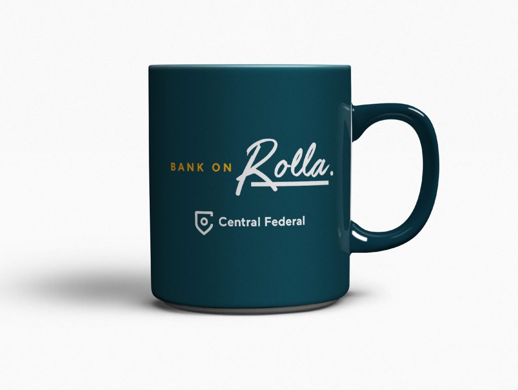
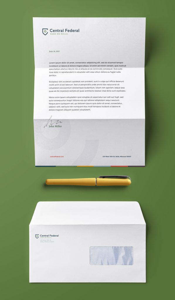
As we launched the new brand, we focused first on ways to improve the interior and exterior of the bank itself. How would we approach this if we were marketing a retail store? Or branding a restaurant?
While branding for a bank and a restaurant might seem far off, the same goal applied — Let’s get people to stop and think. And ideally, come inside.
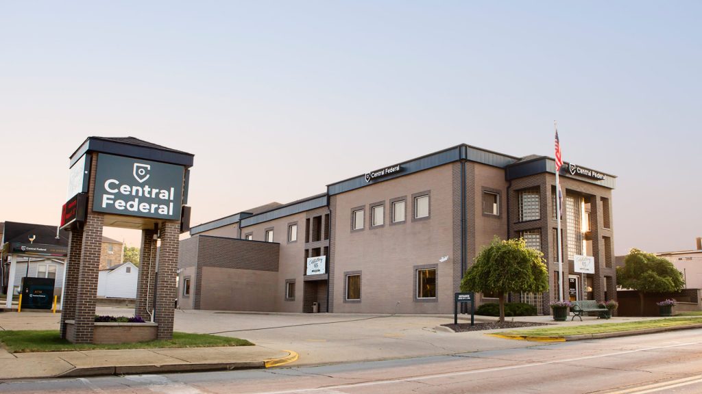
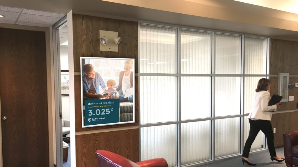
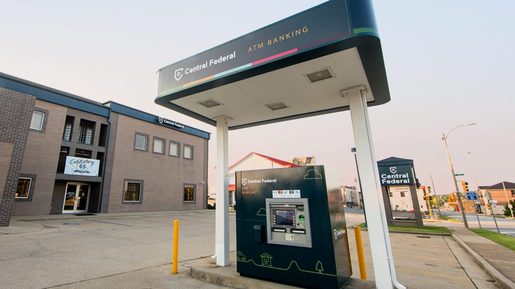
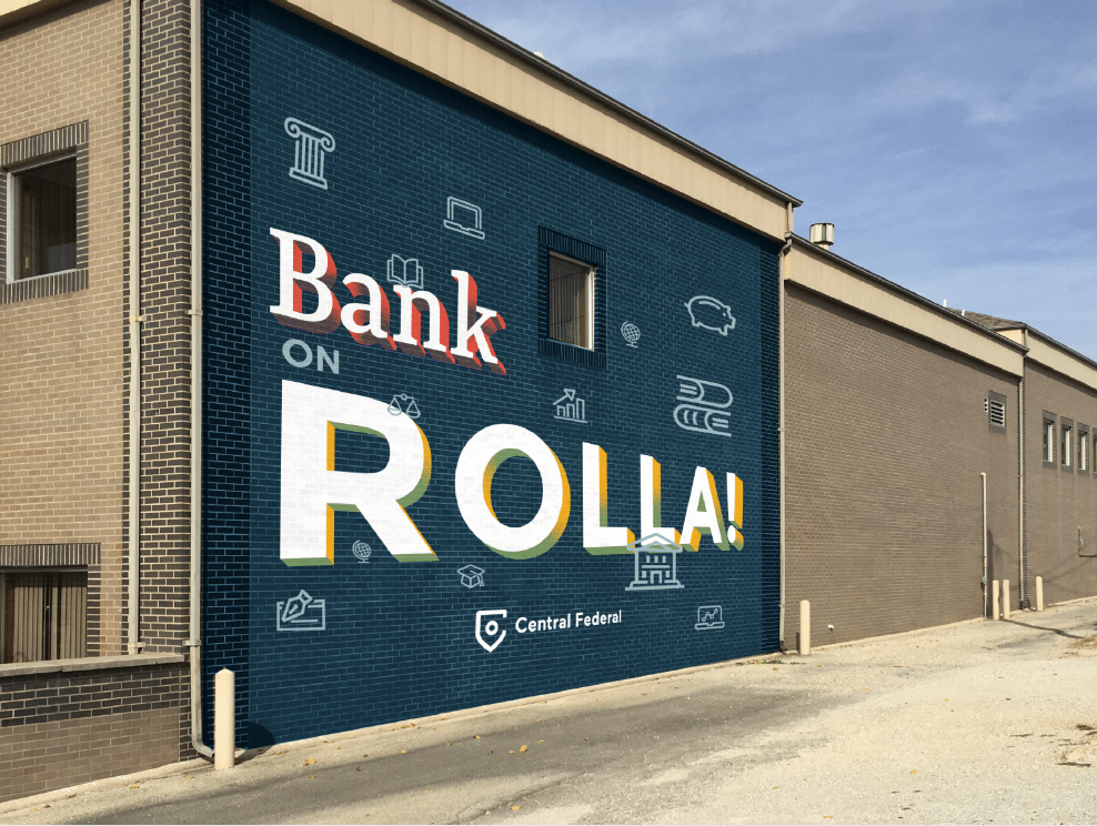
We replaced their hard-to-read, outdated signage with brand new banners. We completely redesigned and wrapped their ATM (a design first for us!). We’ve even got a building mural in the works.


Over the last few months, we’ve helped the Central Federal team adopt the new brand in local print ads, social media headers and more. Thanks to robust brand standards (not to mention, free Google fonts), it’s easy for their team to create additional marketing pieces using their new brand identity.
We can’t wait to see (and share!) more from Central Federal in the coming months.
Want to keep up with the latest work from Atomicdust?
Subscribe to our newsletter for all the latest news, events and weekly marketing tips from our team.
