A Practice Made Perfect: Building Husch Blackwell’s Website
We always ask a lot of questions when we start branding and website projects. So it wasn’t unusual when we started our partnership with growing law firm Husch Blackwell this way.
What surprised us, however, was that they asked questions right back. They even challenged how we thought a law firm might work. Every person we talked to openly shared their opinions about how we should proceed with the project.
It was a great example of the most important thing in building websites: Think like your client.
They offered input about aspects large and small. They asked about big things like functionality and SEO and small details like fonts, photo styles and ideal word counts – even before we had determined any of these specifics.
At first, the questions and the level of detail they were looking for so early in the project caught us off guard. The further we pressed, however, we started to understand their motivation.
Our main contacts – the Husch Blackwell marketing team – were working day and night to satisfy a lot of internal people who would be living and executing the brand every day. They had never tackled a project of this magnitude and were taking questions from attorneys and team members across the country who were anxious to see what was coming.
As we started to understand our client – and as we helped them understand our processes and approaches – things started to flow more smoothly.
It was an educational process for all involved. More on that in a bit.
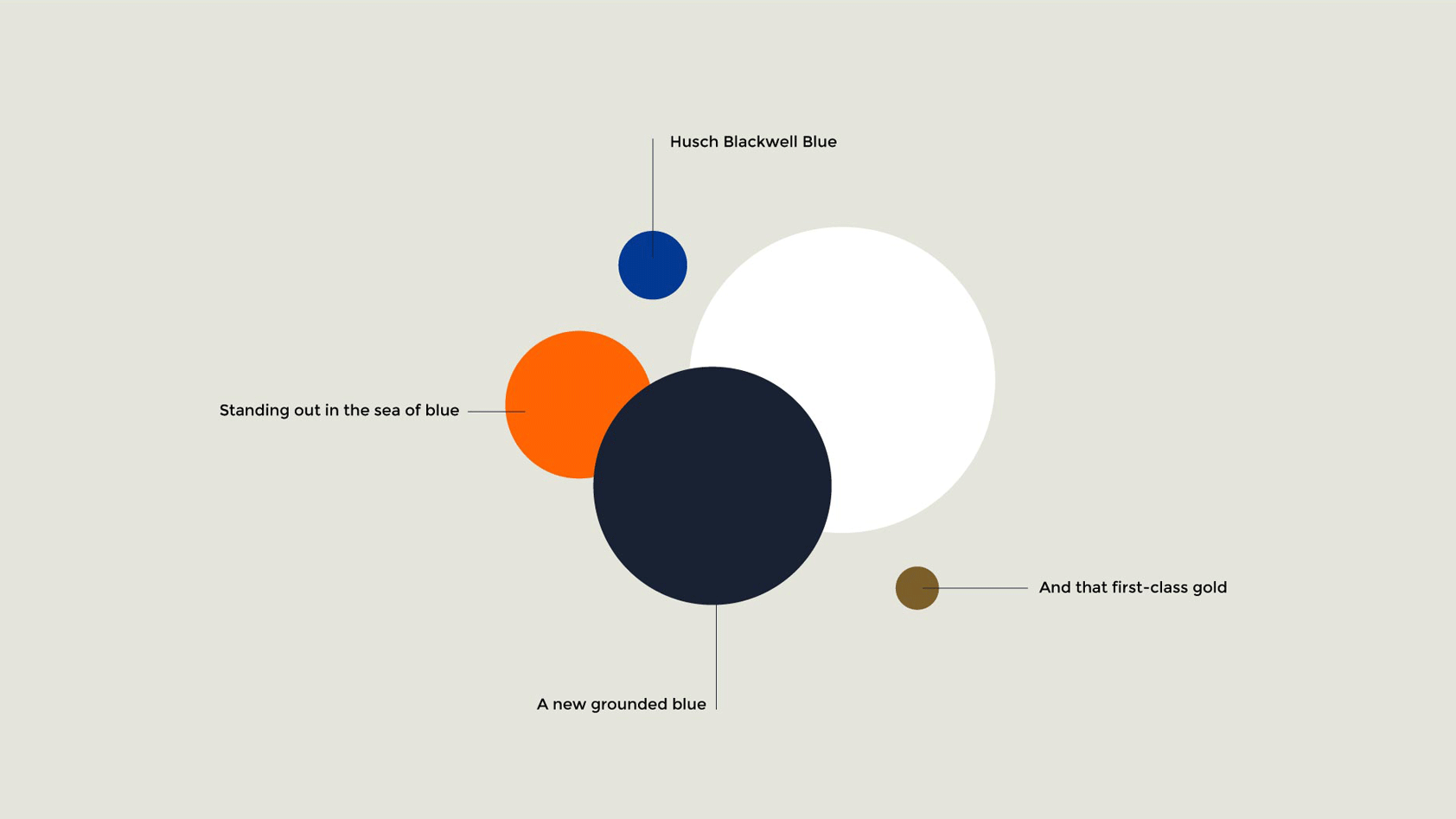
- Brand colors
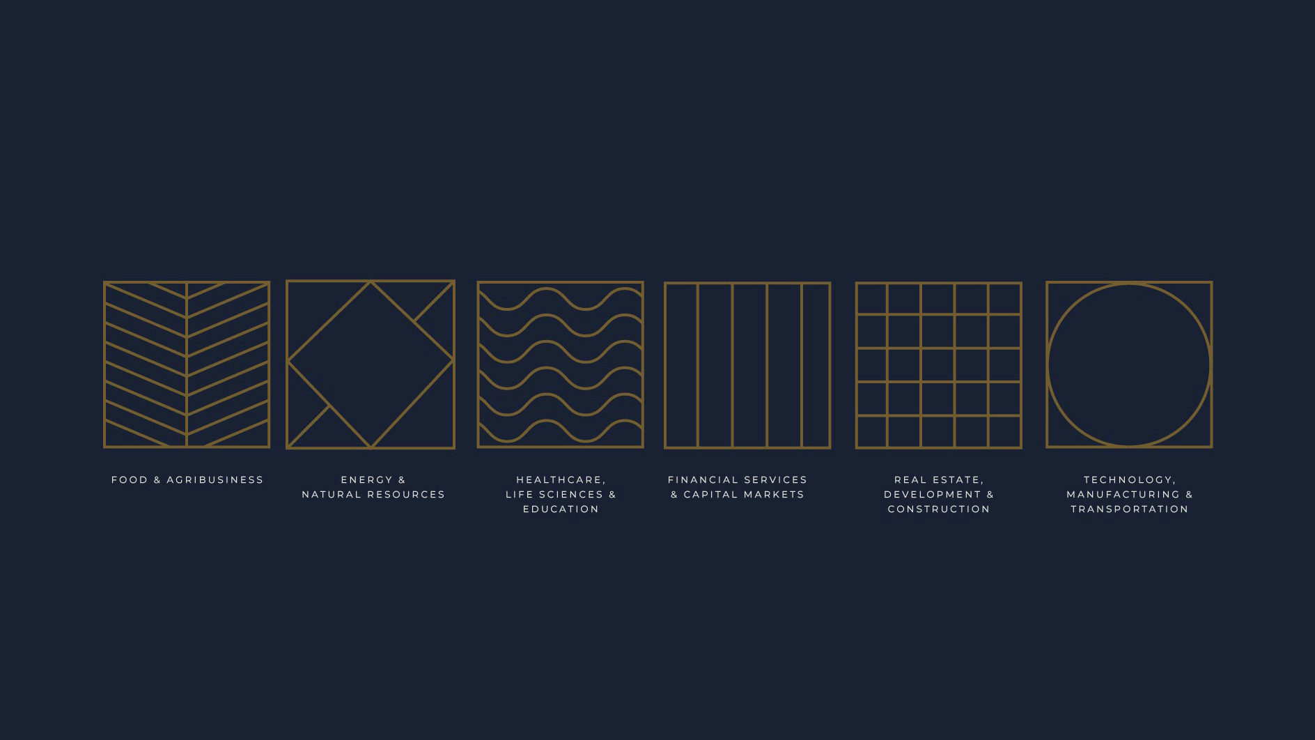
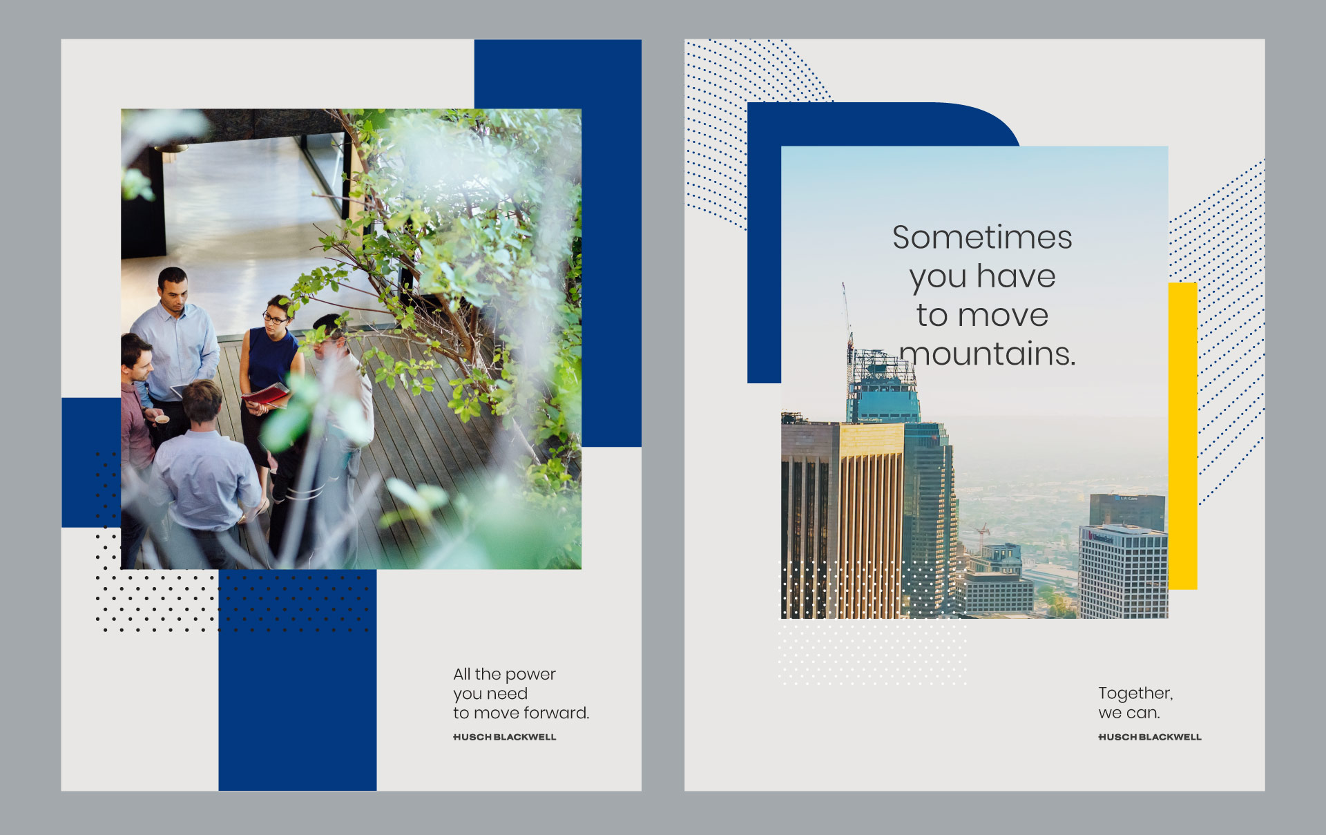
- Early brand explorations included using patterns to represent client industries
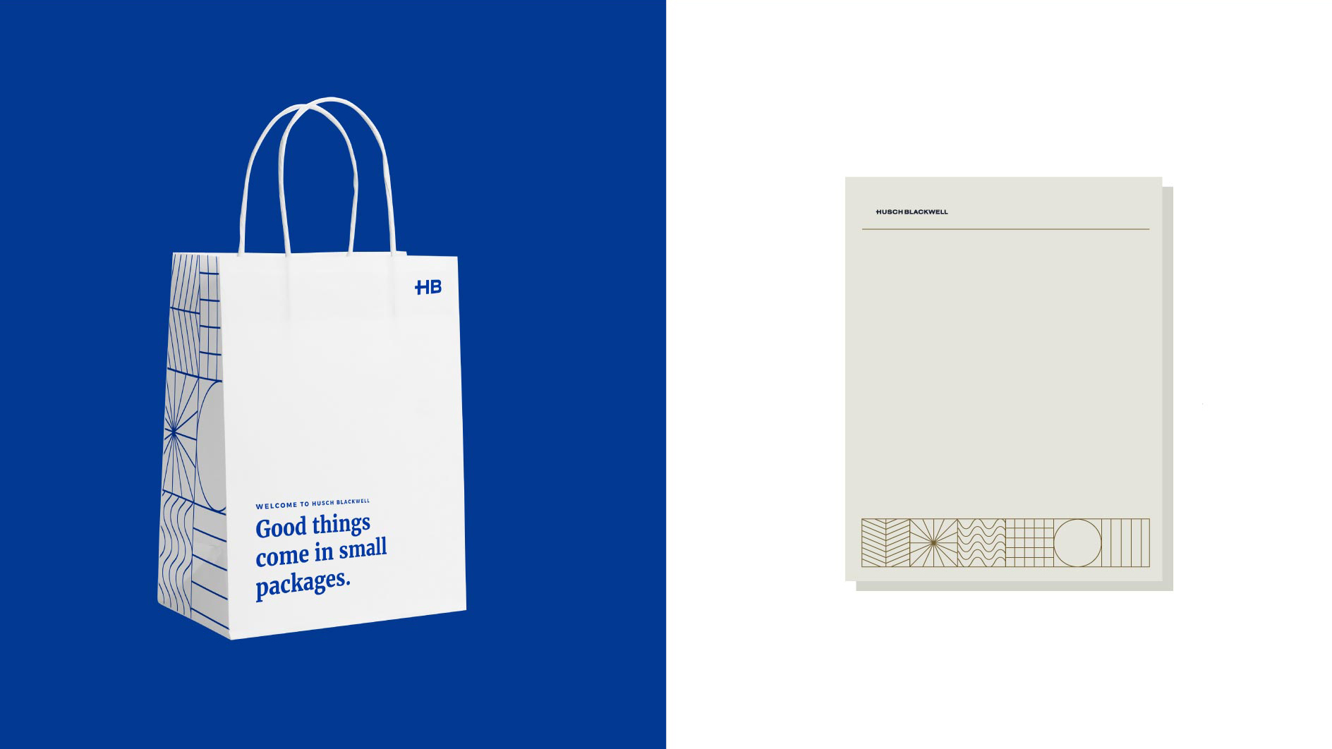
- Mockups of early brand explorations
But first, let’s talk about the brand.
One of the first questions we asked as part of our branding program was, “What makes you different?” They had an answer that told us a lot about their firm, but also set the stage for yet another set of questions.
While law firms are traditionally structured around legal practice areas like intellectual property or litigation, Husch Blackwell takes it a step further. They’ve taken these traditional practice areas and placed them into groups focused on their clients’ industries.
Several years ago, they had branded the approach, “Industry First,” but the marketing team was having trouble making the unique structure meaningful for prospects, clients and prospective associates.
Even internal teams were having trouble articulating exactly how “Industry First” made them different. Some even questioned (to us) if it was different at all.
This challenge forced us to explore the concept further. What does “Industry First” really mean? How does it impact the day-to-day practice of law? And what benefit does it bring to Husch Blackwell clients?
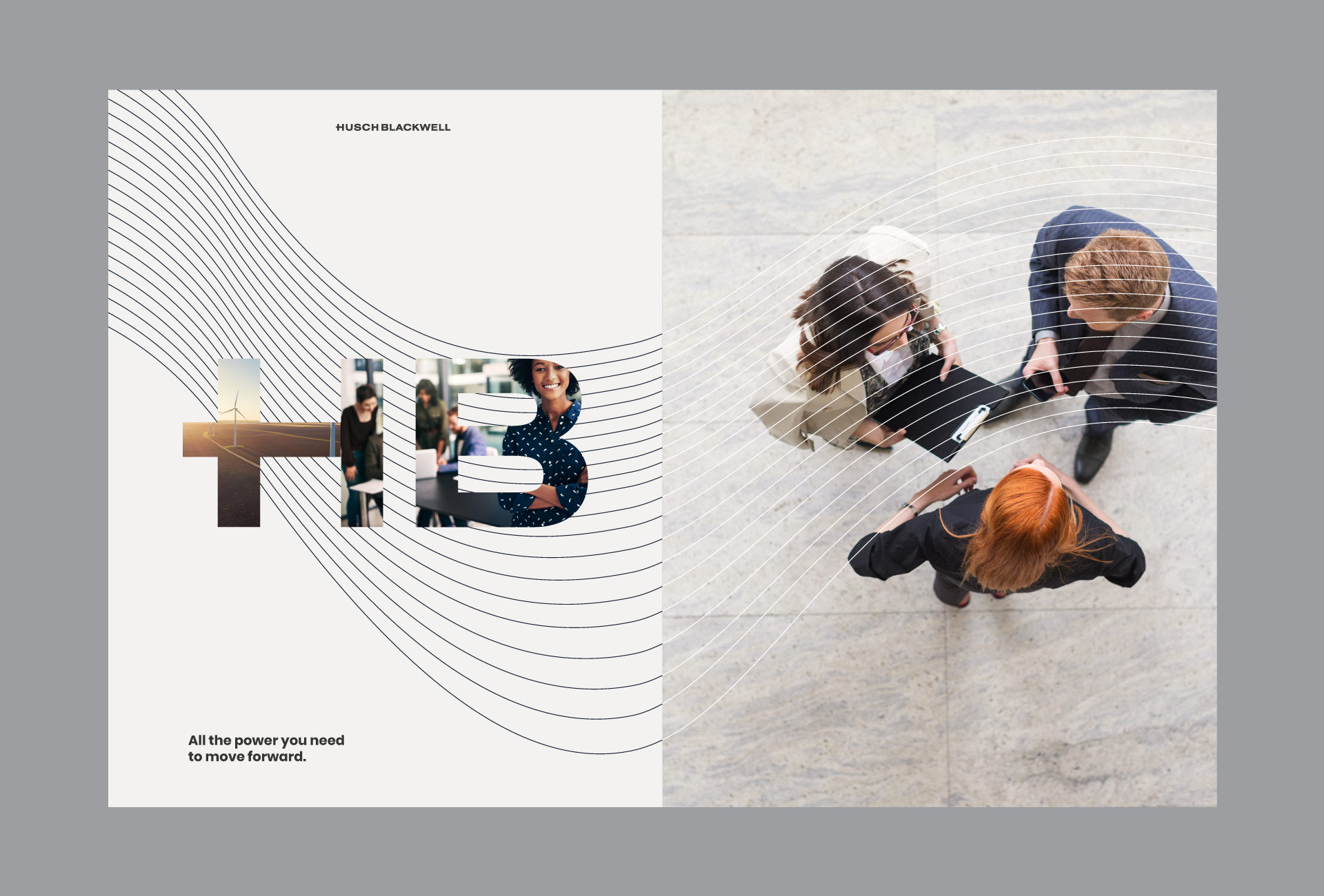
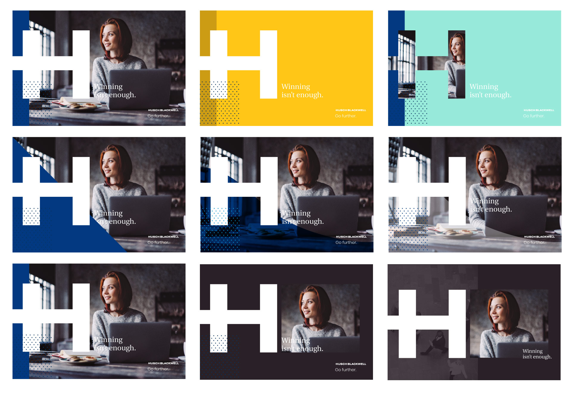
- Early brand expressions
- Early brand expressions
- Early brand expressions
- Early brand expressions
- Early brand expressions
Our first (and admittedly obvious) answer was that it means they put their clients first. Right. Just like every law firm says they do. So we kept digging.
And the more we dug, the more we uncovered about the untold secrets of Industry First. For clients, there’s a sense of security that comes from knowing your attorneys know your business as well as you do. And in that security, you know they’ll be there to lead to you the right decisions. They’ll be there to lead you toward better.
Eureka – we had our first breakthrough.
High fives all around. Everything Husch Blackwell does as a firm – from how it’s structured around industries to its inclusion of expert non-lawyers on teams – is measured against how it leads clients forward.
This set the stage for an especially client-centric brand narrative.
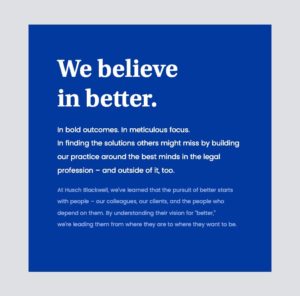
Bringing client focus into focus.
Then it was time for the age-old question: what does a brand that’s all about leading clients toward better look like? How could we evolve their logo and core designs to meaningfully reflect this client-centric approach?
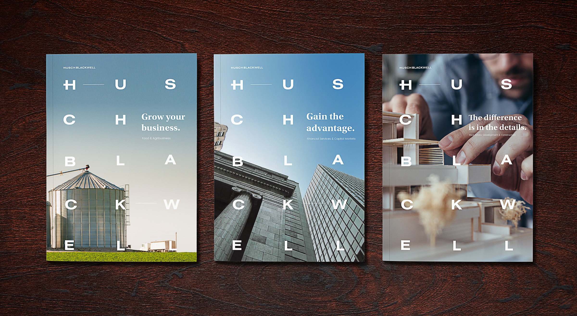
Marketing for large-scale law firms like Husch Blackwell is often handled at the local level, executed by multiple people for a wide variety of purposes. Proposals and other materials are highly personalized. That’s why, rather than focusing on making specific “things,” we created a series of brand elements the firm could use to express itself.


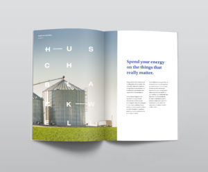
These brand expressions – the updated logo, typefaces, photo styles and even the “word search” design – set the tone for everything we created. Our goal was to make the brand feel open, modern and, yes, client-focused.
Even better, this was an evolution of their existing brand, with similar colors and logos, so they could continue to use existing materials alongside the refreshed identity.
Let’s take it to the web.
With the key brand elements in place, we turned our sights toward designing the firm’s new website. We wanted to avoid the common trap that law firms often fall into – multiple layers of navigation, with little to guide users to their desired destination.
Of course, law firms have complex websites because they’re complex organizations. They have many layers of navigation because there are many layers of content to unpack.
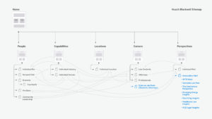
We solved the crush-of-content problem with a bright, clean design. We hid the navigation in a now-familiar hamburger menu. Most of all, we gave every element, every call to action room to breathe.
And then we put a search bar in the middle of all of it. While search is not an uncommon feature, placing it prominently on the homepage is a standout feature in the legal arena.
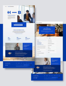

In the search bar we put some straightforward copy that, you might say, leads visitors from where they are (They have a question.) to where they want to be (Husch Blackwell has the answers.): “What can we help you find? Find people, capabilities and thought leadership.”
This experience sets the tone for the rest of the site – friendly, helpful and straightforward, but most of all client-centric – and in turn sets Husch Blackwell apart.
Getting to know you.
Ahh, attorney bios. This is one of those areas that our client started asking about right away. Even before we had a finalized brand or fleshed out website concept, bios were a topic of conversation.
Bio pages are hugely important for law firms. To borrow a phrase from another industry, they’re “how business gets done.” This is where credibility is won, client respect is earned and referral deals are initiated.
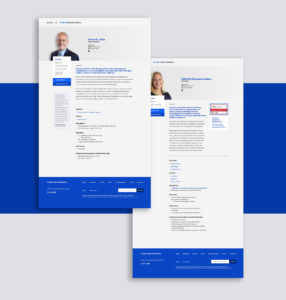
They challenged us to create information-packed bios that would maintain the clean, friendly design we were establishing. There were multiple discussions about how much each professional’s bio should embody brand. Do we list industries first? Practice areas? What’s practical? What’s important?
The entire process challenged us to look at the structure of a bio page, and how bios are accessed throughout the site, in a whole new way. We worked with the client on every detail, from what information is presented and what we show first, to small details like ideal word counts for every section. After all, once the framework was approved, they were assigning a team of internal writers to profile their professionals, and they wanted as much guidance as possible to keep everything aligned. Fair enough.
The result is an attractive and different bio, with a lot of white space, which makes the large volume of information easier to digest. But the most important aspect? It works for our client, and for their attorneys and clients.
Making content meaningful.
Here on the industry- and practice-area pages, we put the information clients need right up front. Bios are prominent, of course. And we focused copy development on helping prospects instantly see themselves on the page by demonstrating the types of problems the firm has solved. The pages are further populated with relevant content pulled from the firm’s vast content library.
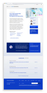
It’s an approach we took throughout the site – putting content in places people will most likely be looking. Content – blog posts, news alerts, case studies and press releases – is a critical ingredient in any website, particularly in the professional services arena. It acts as proof of any marketing claims made, and as reassurance for people about to make a very important decision.
Husch Blackwell had an amazing library of content spread across multiple industry-specific blogs. From the beginning, we saw tremendous value to bringing all of this high-value content onto their main website.
The sheer amount of content the firm publishes gives their site a lot of credibility from an SEO perspective, particularly since all of it is timely, keyword-rich and relevant to the other content on the site.
One struggle: How do we make it all usable? With multiple posts a day from every industry group, we needed an obvious way for visitors to find relevant content. We solved this in two ways. First, we designed easy-to-use dropdown menus that filter the blog content on the main blog page.
The second way was a recognition that most users’ journey through the site probably will not focus on the blog page. They’ll likely look at other pages, for example an industry page, where they can immediately find relevant content. So we wanted to make sure they never got lost when they did so.
No dead ends.
So many law firm websites stand alone as brochureware, only as reinforcement for in-person marketing efforts and not as business-generating engines on their own. This means, across the industry, law firm sites are typically short on calls to action. With good reason: openly soliciting leads is generally frowned upon and does feel wrong in the legal arena.
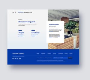
Our answer to this was to make sure that no page on the site led to a dead end. Every page leads visitors to more content, more reassurance, more opportunities to get the know the firm and its individual attorneys.
Contextual calls to action – some of them subtle, some overt – pull people deeper into the site. For example, on the career-oriented page, “10 reasons to join us,” we invite people to get to know the Husch Blackwell team.
Ready for the real world.
The entire experience working with Husch Blackwell was an eye opener for us. They challenged us and asked us more questions than most clients. They forced us to be open to new ways of thinking about things we thought we understood (like attorney bios).
Most important, their questions made us take another look at what a law firm’s clients look for in a website. It’s yet another example that the most important ingredient in any project is to think like your clients and to see the world from their perspective, so you can better answer their questions and calm their fears.
It’s not always easy, and it always requires a lot of unexpected questions, challenges and back-and-forth. But it does lead to better, more effective work that actually gets the job done.
Let’s stay in touch! Keep up with the latest from Atomicdust.
Subscribe to our email list for all the latest news, events and monthly marketing tips from our team.
