Building an Iconic Brand for ClaimChoice
“I love that chair—I’ve always wanted one,” the voice said from the other end of the speaker phone in our conference room.
“I just love modern design. It’s timeless—and that’s exactly the thing I want for our brand.”
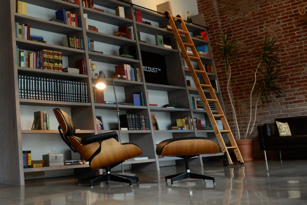
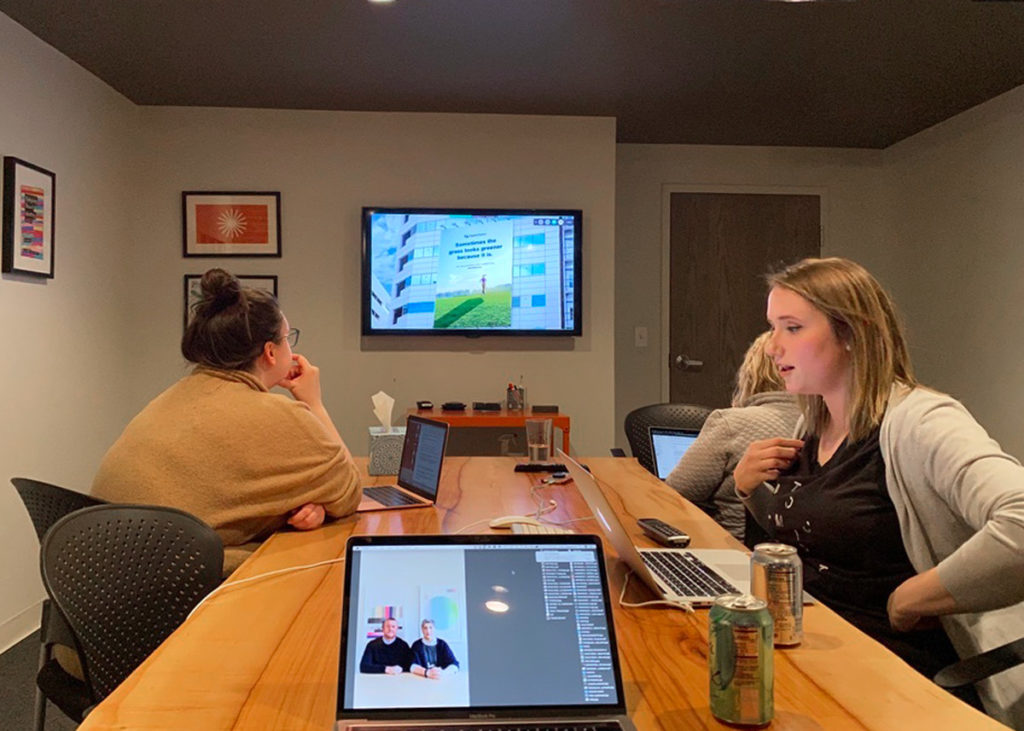
The chair our new client Phil was talking about was the Eames Lounge Chair that sits in the front of the Atomicdust office. He was referring to a photo of our lobby on the cover slide of our agency overview presentation.
We continued through our overview of Atomicdust’s approach to branding and website design, and along the way, had a great conversation about design. How design can help a company position and shape its brand, explain its products, stand out from competitors, and gain market share.
In short, how design could help a Michigan-based insurance company like ClaimChoice become more like an Eames Lounge Chair—simple, iconic and welcoming.
Getting Started
In the beginning, one of the most difficult parts of this project was learning about ClaimChoice’s corner of the insurance market.
ClaimChoice helps employers navigate self-funded healthcare options, a heavy and difficult decision for business operations and HR teams.

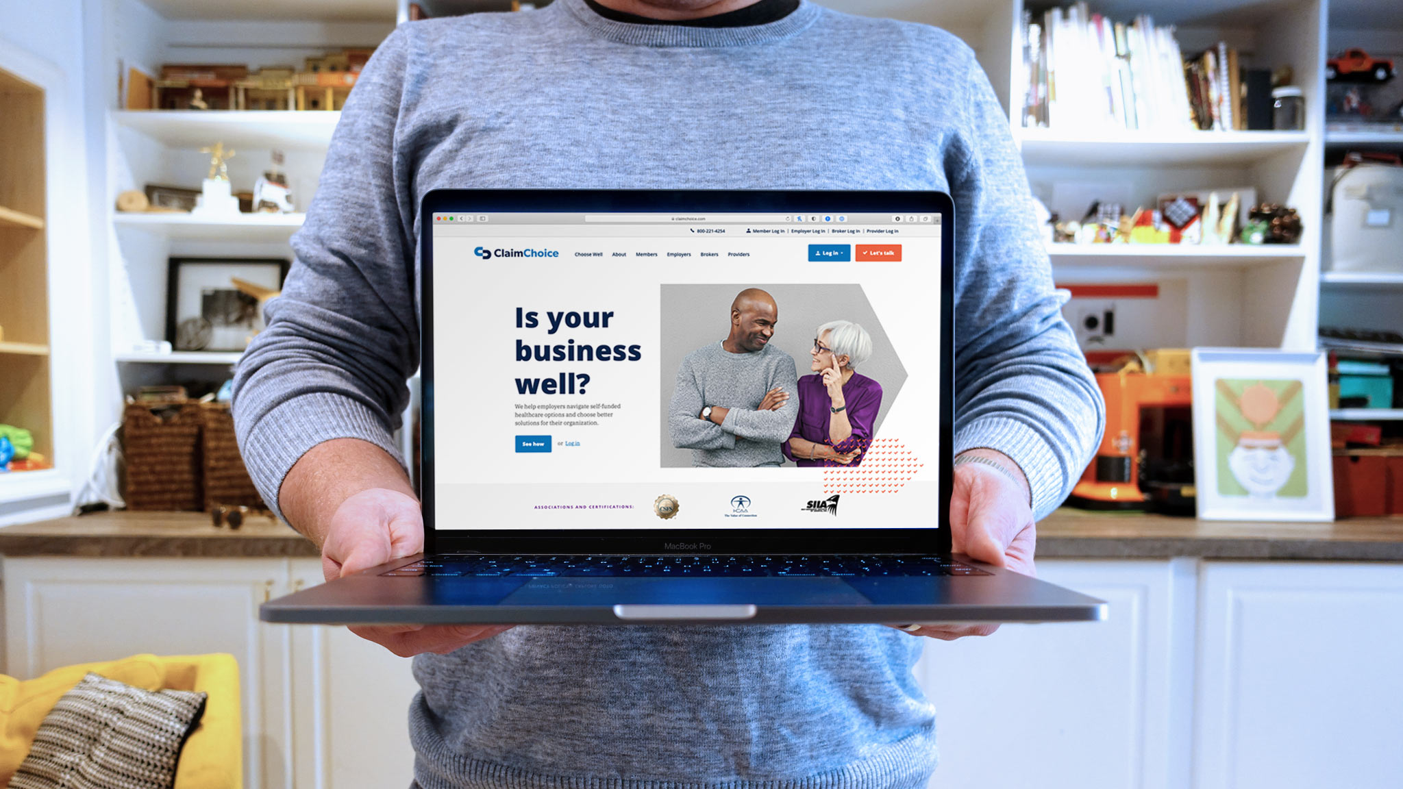
ClaimChoice’s old website didn’t do a good job of communicating the company’s services or engaging audiences.
Even after (almost) 20 years of working with clients in both healthcare and professional services, this was our first time delving into the world of TPA self-funded medical plans. (If you don’t know what that means, that’s ok. I didn’t either.)
A TPA is a third-party administrator that provides large businesses with ongoing support and advice on their health insurance plans. TPAs offer companies significant cost savings compared to traditional health insurance plans, while providing great care for employees and their families.
I’ll admit—it may not sound exciting at first. Categorically, healthcare and insurance are not known for amazing branding and design. But for us, that’s where design can have the biggest impact.
Keeping it Simple
It’s easy to think about the power of design for brands like The Eames, but we needed to use design to help ClaimChoice grow its brand.

Our strategy was simple. No—I mean “Simple.” If we felt the industry was complicated and difficult to understand, we needed to simplify it. If we could make the language and tone of the brand customer-focused, and not industry-focused, ClaimChoice would be fresh air for the industry.
When Steve Jobs and Apple released the iPod, it wasn’t the first MP3 player—far from it.
When they launched, they didn’t compare themselves head-to-head and feature-to-feature with competitors. They knew that their audience didn’t want to get bogged down in the technical details of a new media format—they just wanted the benefits of the iPod.
The result: Apple iPod – “1000 songs in your pocket”
We used this approach of simplification for the world of TPA self-funded medical plans as best we could. And we did it with the line:
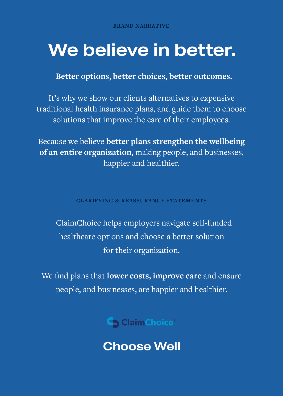
ClaimChoice helps employers navigate self-funded healthcare options and choose a better solution for their organization.
Okay, so not exactly as short as “1000 songs in your pocket”, but hopefully you see our approach. (Although we could have gone with “1000 claims in your office,” but that might have been depressing. 😂)
Building the Visual Brand Identity
Along with creating more audience-centric brand language, we wanted to bring the same friendly, simple approach to the brand’s identity.
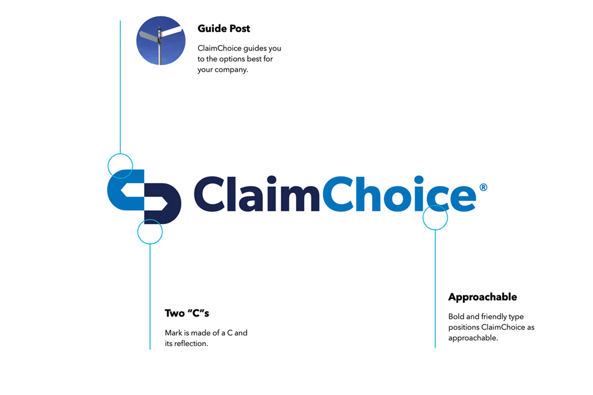
Our job was to redesign the ClaimChoice logo to be approachable and easy-to-understand, while still appropriate for the category.
Here’s ClaimChoice’s original logo:

Some early logo options, which used arrows and checkmarks to represent ClaimChoice’s role in leading clients:

New Branding & Web Design for ClaimChoice
“A logo is an empty vessel until you fill it with experience.” – Michael Bierut.
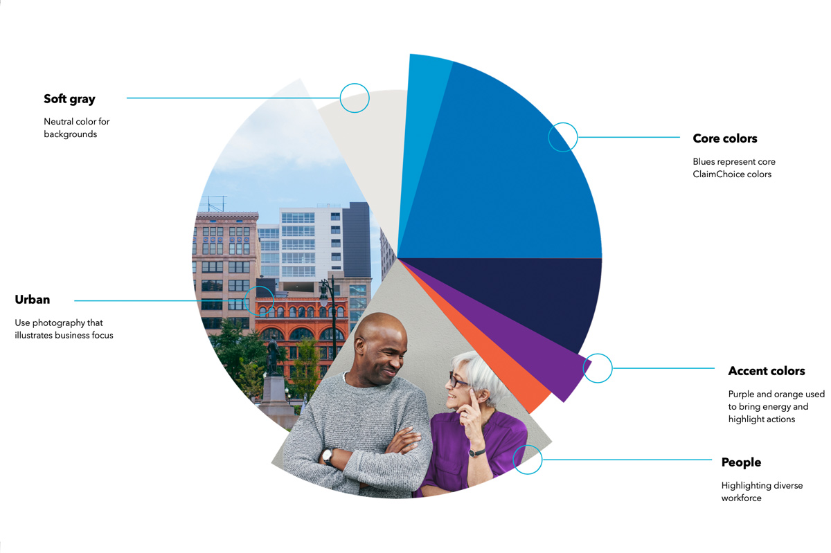
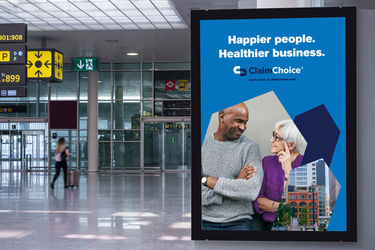
When we presented our recommendation for the new, simplified ClaimChoice logo we also wanted to show it in action—or, taking a cue from famed graphic designer Michael Bierut, we needed to fill it with experience.
Using the knowledge we gained during the research portion of our Branding Program, we designed a system of new customer-facing sales and marketing materials we call Brand Expressions.


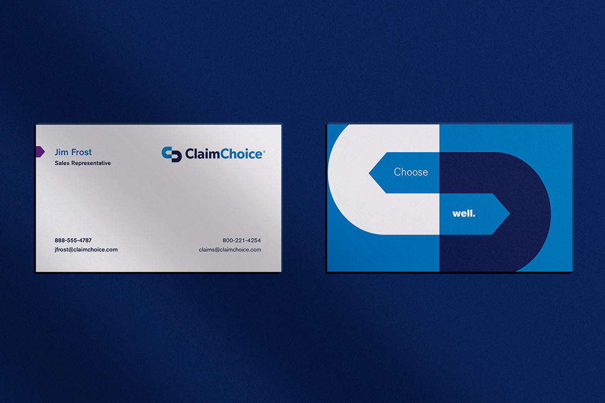
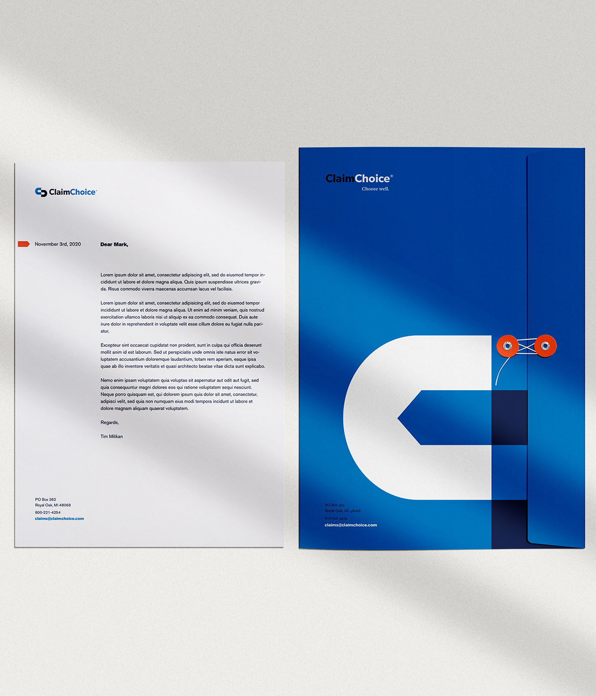

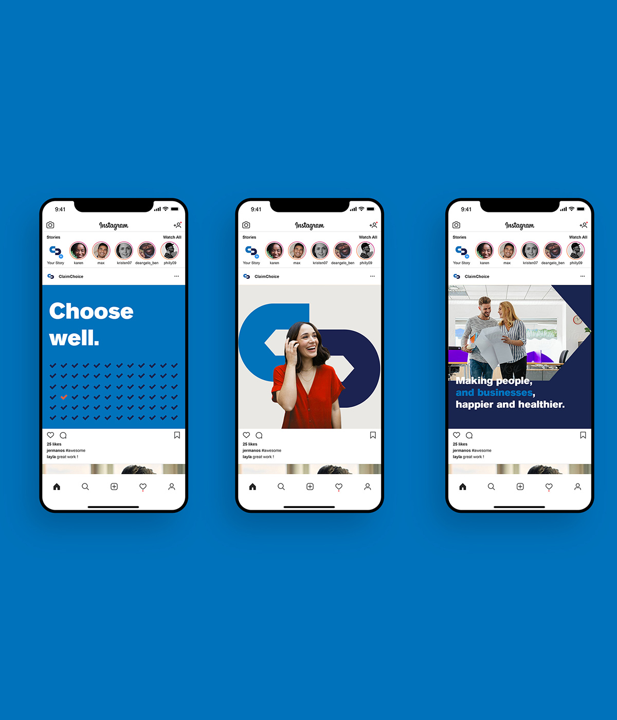
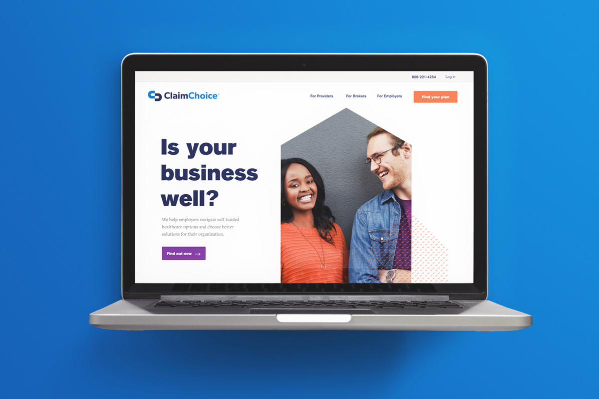
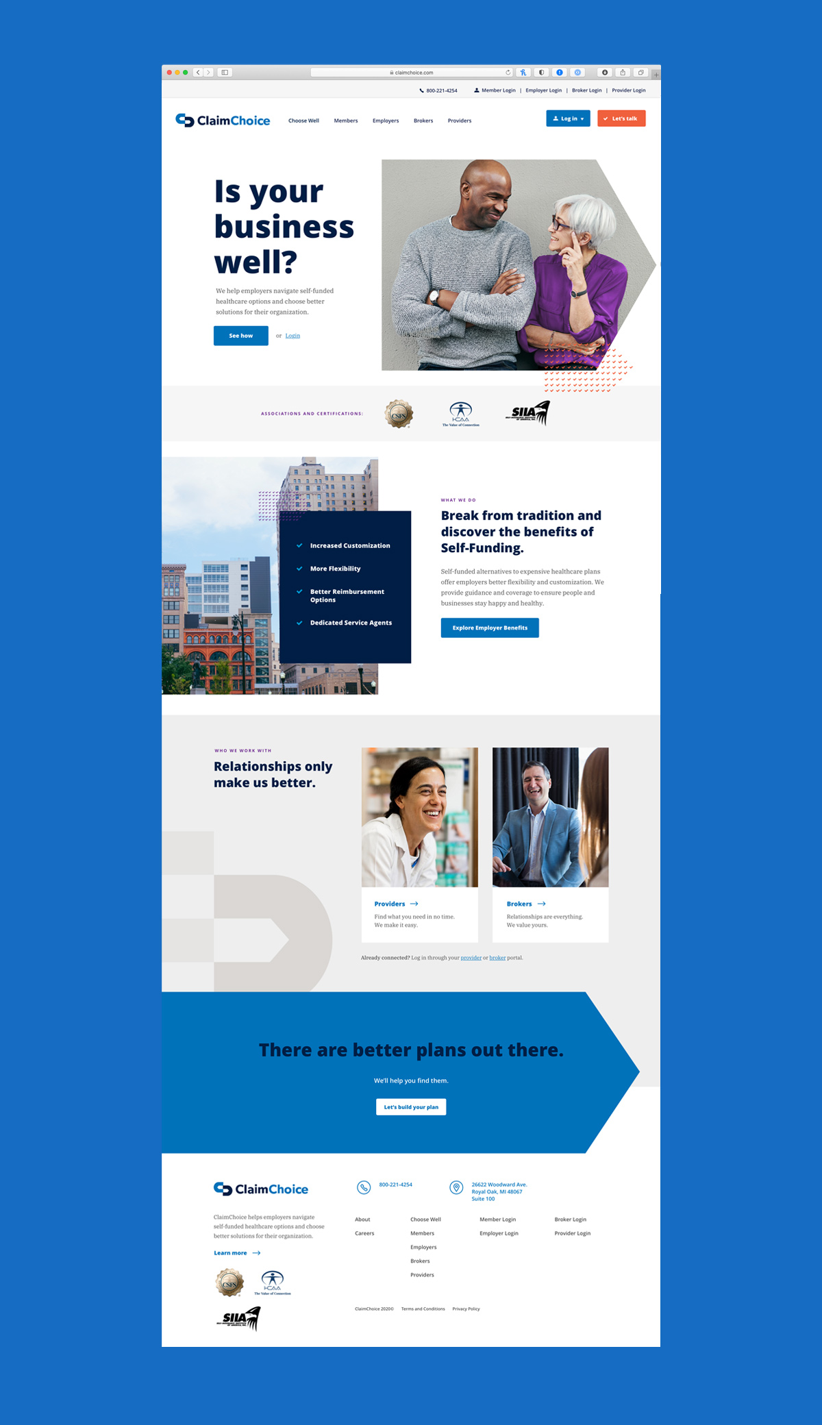
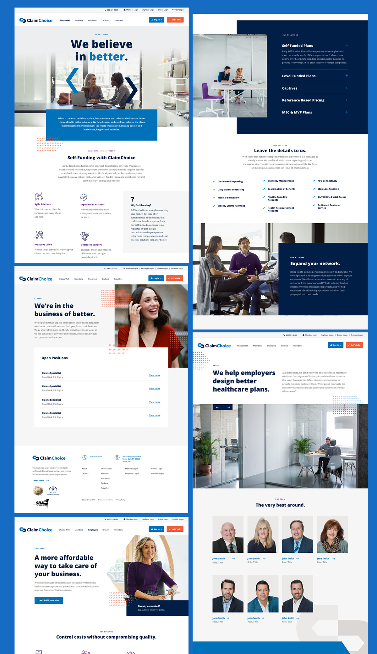
We brought the brand to life online with a new website, with the same audience-focused, friendly and simple strategy we used when creating the brand.
To make the website work as a sales tool for ClaimChoice, we implemented lead generation tactics to encourage visitors to sign up to learn more. Calls to action encourage visitors to keep exploring the site before leaving their information in the contact form.
And ensuring it would be easy to use both for visitors and ClaimChoice’s internal marketing team, we made the site mobile-responsive and simple to update on WordPress.

Remembering Design’s Purpose
When people ask me what I do for a living, an easy reply is “branding and design.”
The more abstract version might be this: We take a business, learn as much as we can about it and its customers, then go away for a month and reimagine it. Then we come back, present it to our client and explain how we envision it working, and show them how it can live in the world — in their world.
We get to open up doors that have long been closed and forgotten about. For ClaimChoice, it meant asking, “How can we breath fresh new life into an old, dense market?”
How could we make an insurance brand modern, timeless, and relevant?
The answer, of course, was reimagining the company in a way that was different from competitors and more meaningful to its audience.
But a simple way to say all that is through design.
Here’s to brave clients and good taste in furniture.
