Now Open: Atomicdust Goes Beyond Branding for Start Bar
If you follow us online, chances are you’ve already seen bits and pieces of Start Bar. Or maybe you’ve even visited the arcade bar since it opened in downtown St. Louis earlier this summer.
Start Bar is a tribute to what made arcades great, mixing past and present to create something different in St. Louis.
That underlying theme informed everything we did as we worked with Consips to elevate the arcade bar concept. Our work on the project took us above and beyond our typical branding or website design project, venturing into environmental design to set the tone for the full experience.
“First things first…” – Wu-Tang Clan
Back in February, the team from Consips came to us with their plan for an arcade bar in downtown St. Louis. The team had already been wildly successful with Wheelhouse locations in Clayton and downtown, and for their newest concept, they wanted a bar with activities beyond drinking and eating (or watching a sporting event). They wanted a place were adults could go and hang out with friends and play games like they did when they were kids.
Given our love for arcades and video games, we were intrigued.
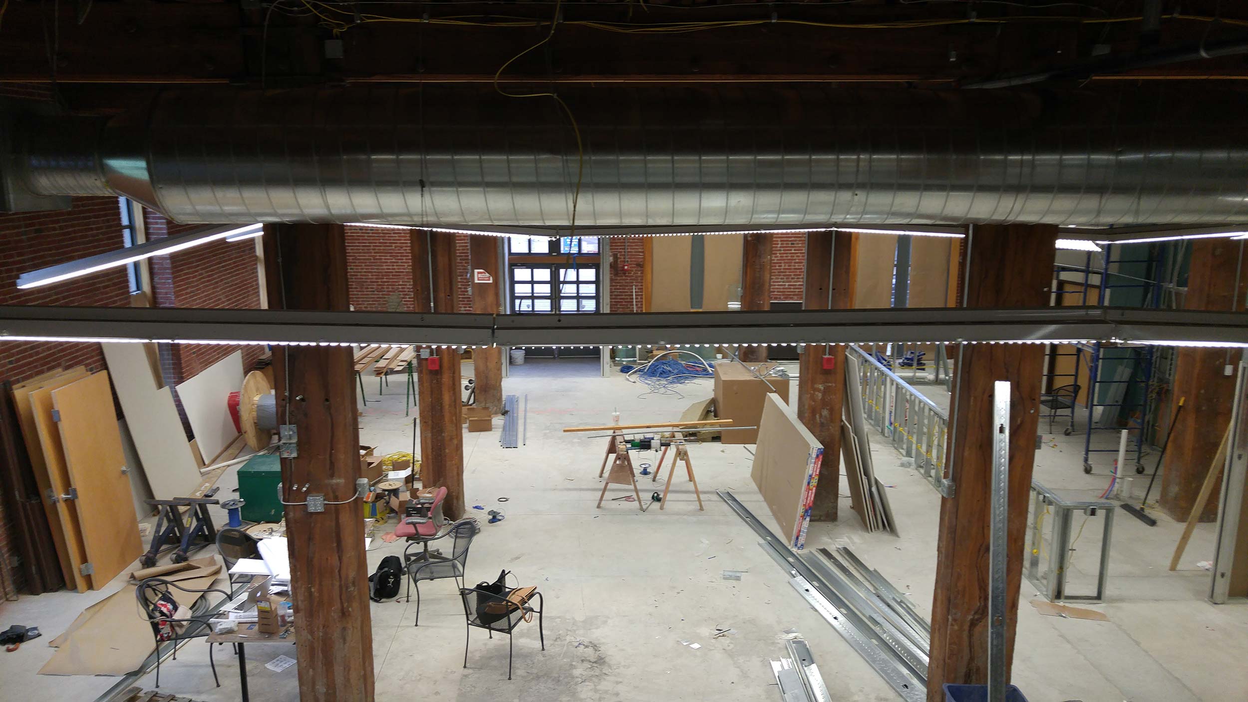
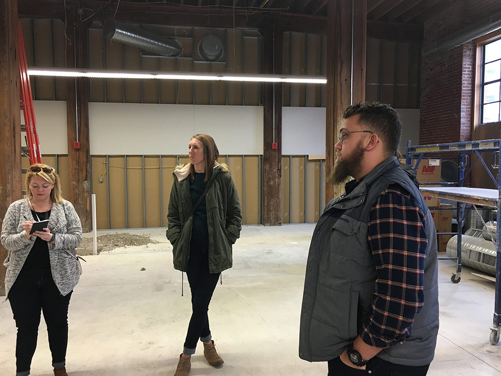
We had our project kickoff meeting at the future site of Start Bar, which was then an empty brick building on Spruce Street. Afterward, we were left with a laundry list of items to design and a bigger question – what should Start Bar be?
We spent the next few months refining our answer.
“… like we bringing ’88 back” – Nas
Rather than simply “Chuck E. Cheese with beer,” we wanted Start Bar to be a reflection of how we remembered our own adolescence.
We thought about everything we loved about arcades in the ’80s and ’90s. The dimly lit rooms. The glowing arcade cabinets. The timeless soundtrack. The mystery that awaited you around every corner and the rush of exploring (and winning) new games. The feeling of independence and youthful rebellion.
We weren’t building a time capsule to go back to our younger days. We were bringing the best of that arcade culture into the present to create something completely different – a place to drink, eat and discover the joy of video games with the people around you. That’s the idea behind it all. That’s Start Bar.
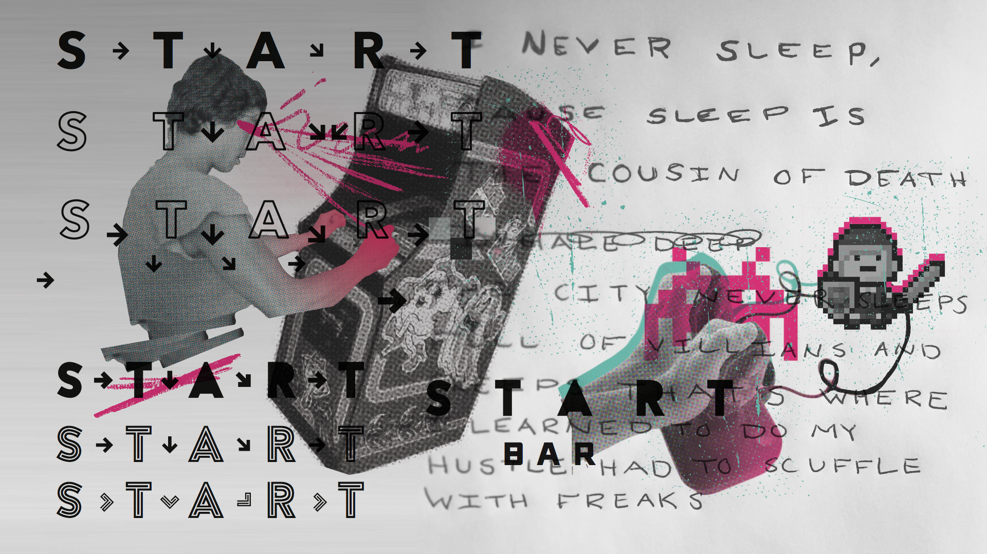
Establishing that tone visually was easier said than done, though. We each had a different opinion of what visually represented adolescence – from Atari-inspired typefaces to arrows configured in the Dragon Punch pattern from Street Fighter – and we knew there was a fine line where blending past and present could become a gimmick.
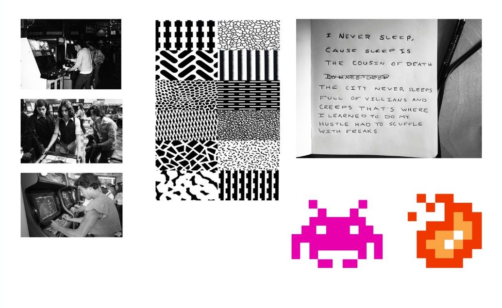
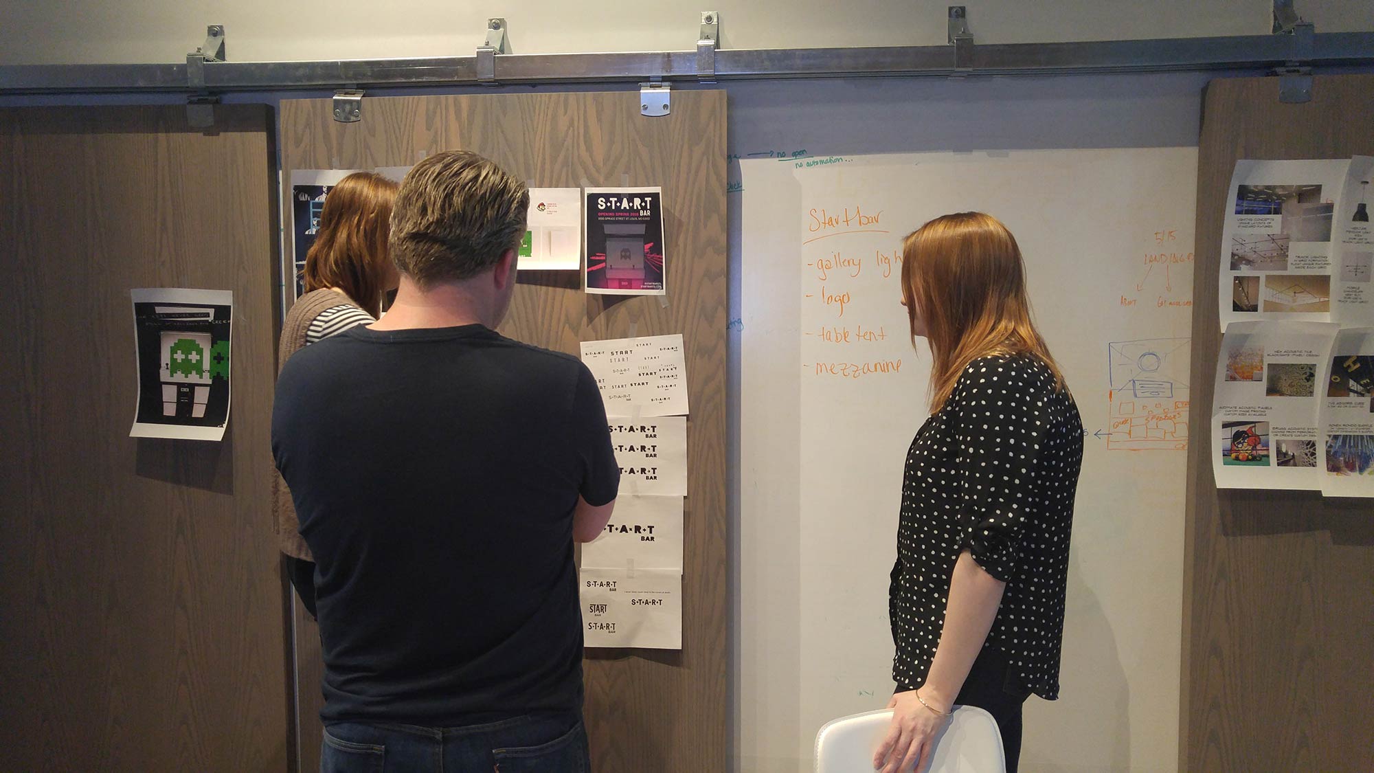
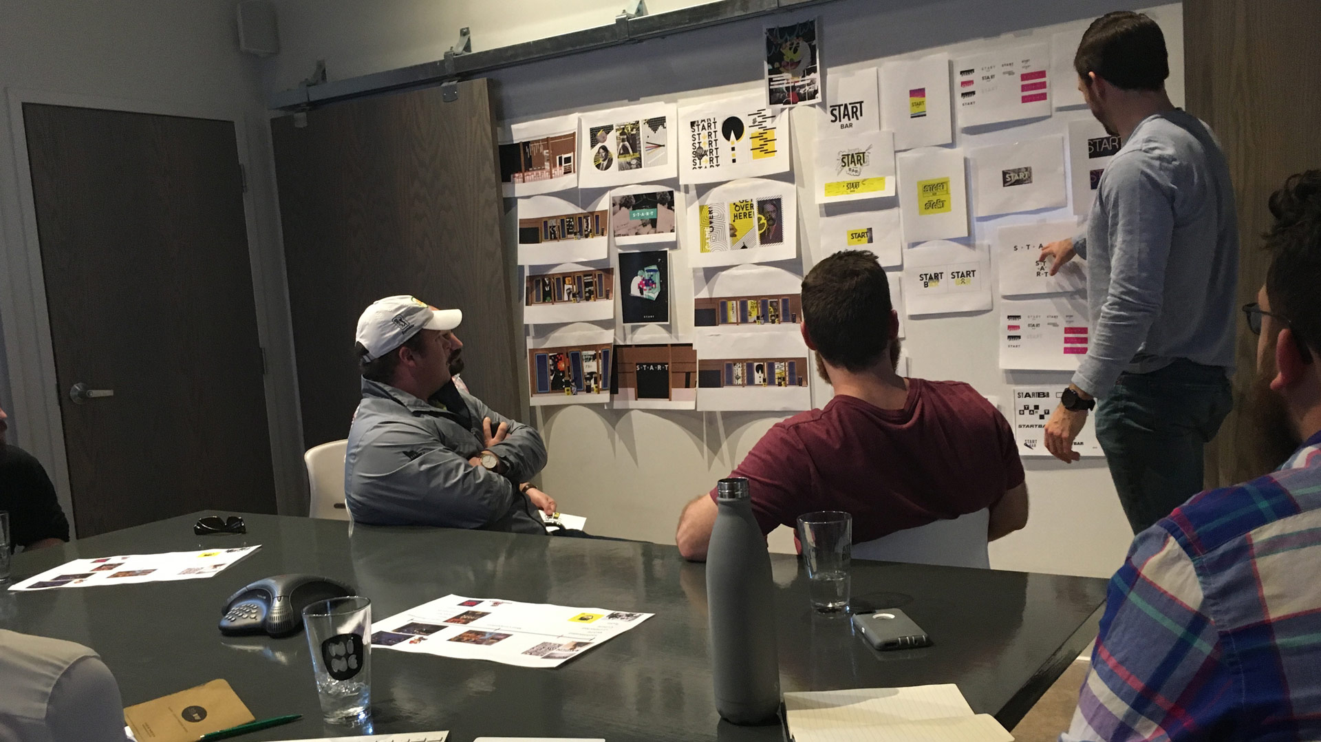
During the project, Mike kept reminding us of the 1999 movie Ghost Dog: The Way of the Samurai, about an unlikely hitman in modern Brooklyn that lives by the ancient Samurai code. The movie is delightfully strange, sad, and is a melting pot of cultures, beliefs, awkwardness and tension. We found ourselves rewatching clips when we were stuck, and admired the way it recklessly mixed all these styles and perspectives together.
That was the tone we wanted for Start Bar. We imagined the space as a video-game-themed art gallery, paired with ’90s grunge, against bright pink neon. Sounds like a clash of concepts, but so does Ghost Dog.
“So push it, along, trails, we blaze…” – A Tribe Called Quest
With the brand established, it was time to start planning and designing the interior of the bar. Sure, we’ve been involved in the environmental design for Pastaria, Revel Kitchen and Porano, but starting from scratch was an entirely new (5,000-square-foot) challenge for us.
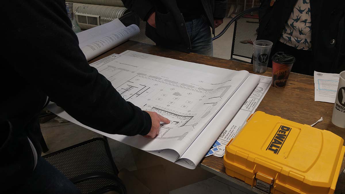
We’re admittedly not architects or professional interior designers, but armed with a roll of blueprints and a dream to do something new, we got to work with Start Bar’s team of general contractors, electricians and plumbers to build out 1000 Spruce Street.
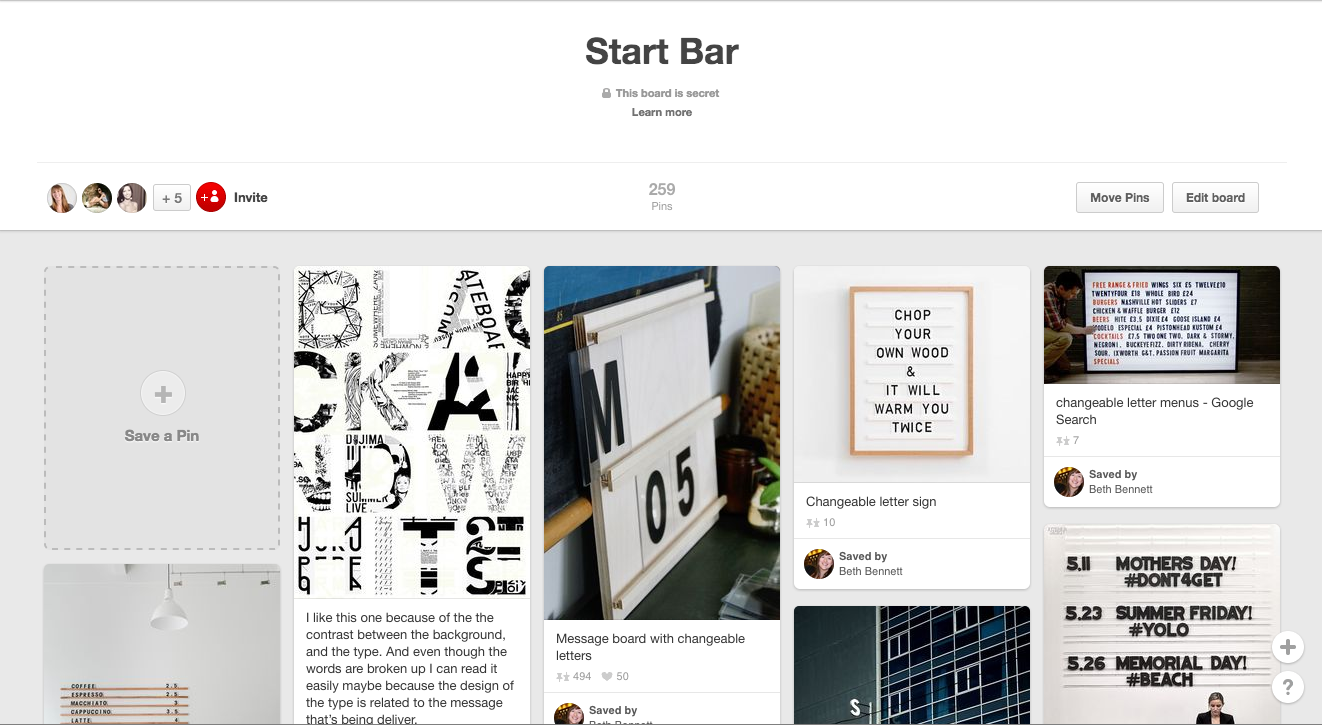
And where do all the best amateur interior design projects start? Pinterest, naturally. We pinned hundreds of photos of everything from lighting, to faucets, to stairs and railings. What does a copywriter know about lighting fixtures? In my case, not much. But the whole team collaborated and contributed to the boards.
Then we turned to another new tool, SketchUp, to give our designs dimension. Think of it as a mix of Photoshop and The Sims – which seemed fitting for this particular project. SketchUp allowed us to go further than whiteboard sketches and hand drawn mockups could, but now, not only were we designing an entire building, we were learning a new program along the way.
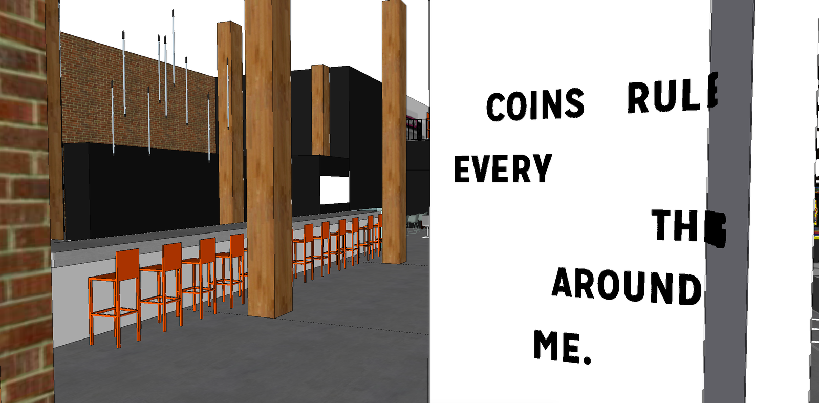
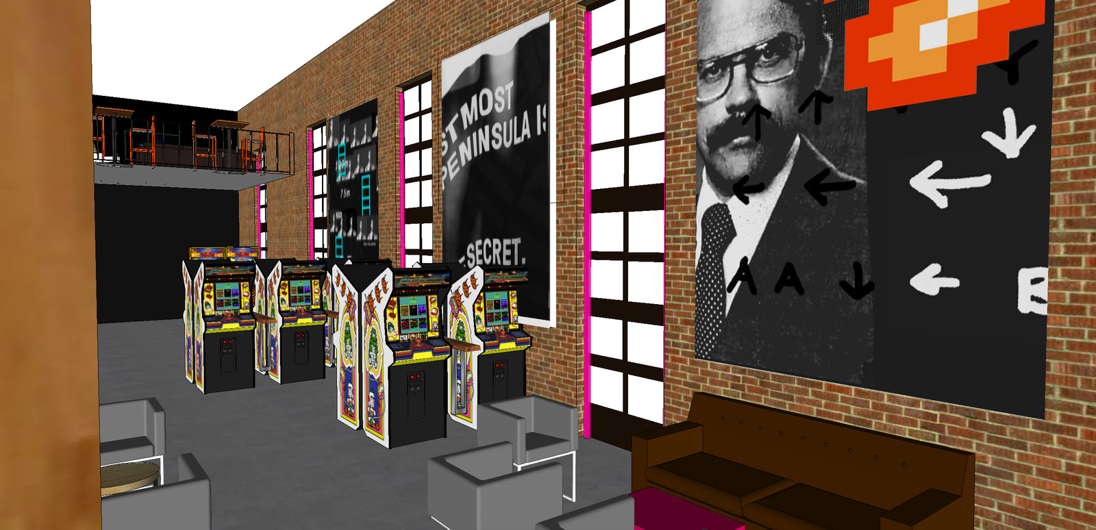
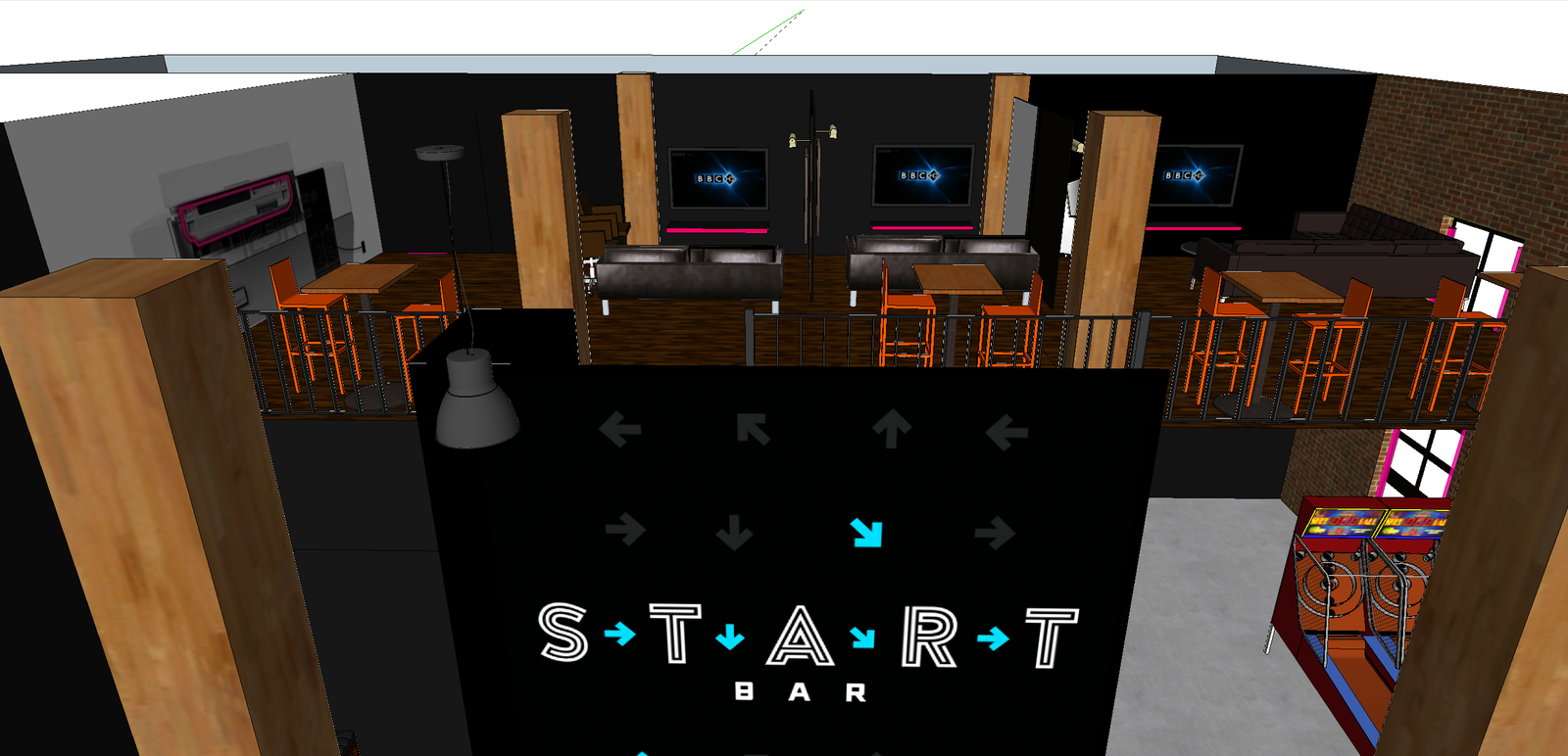
It paid off. With the 3D renderings, we could move games, tables and couches around freely to figure out the overall look and flow through the space.
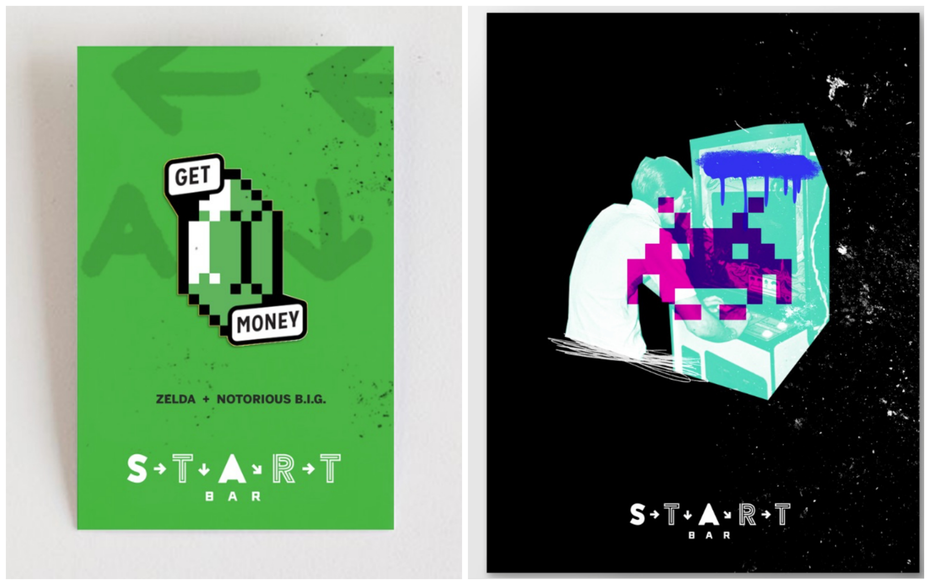
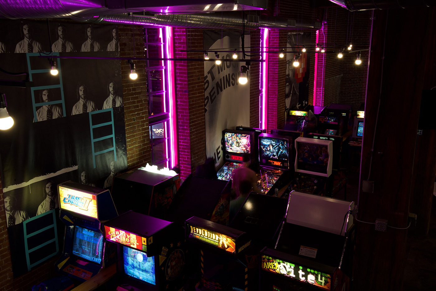
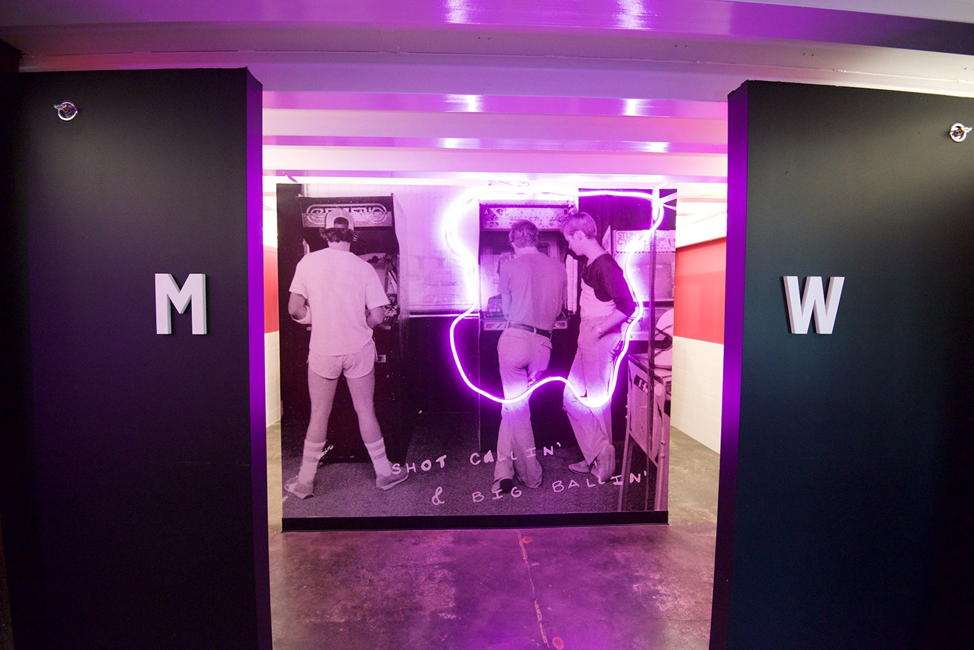
For the decor, we went back to our Ghost Dog inspiration and created tension by mixing cultures. We combined old photos of video game personalities from the ’70s and ’80s with hip-hop lyrics and pixel art. Most importantly, we wanted to create standout moments everywhere you look.
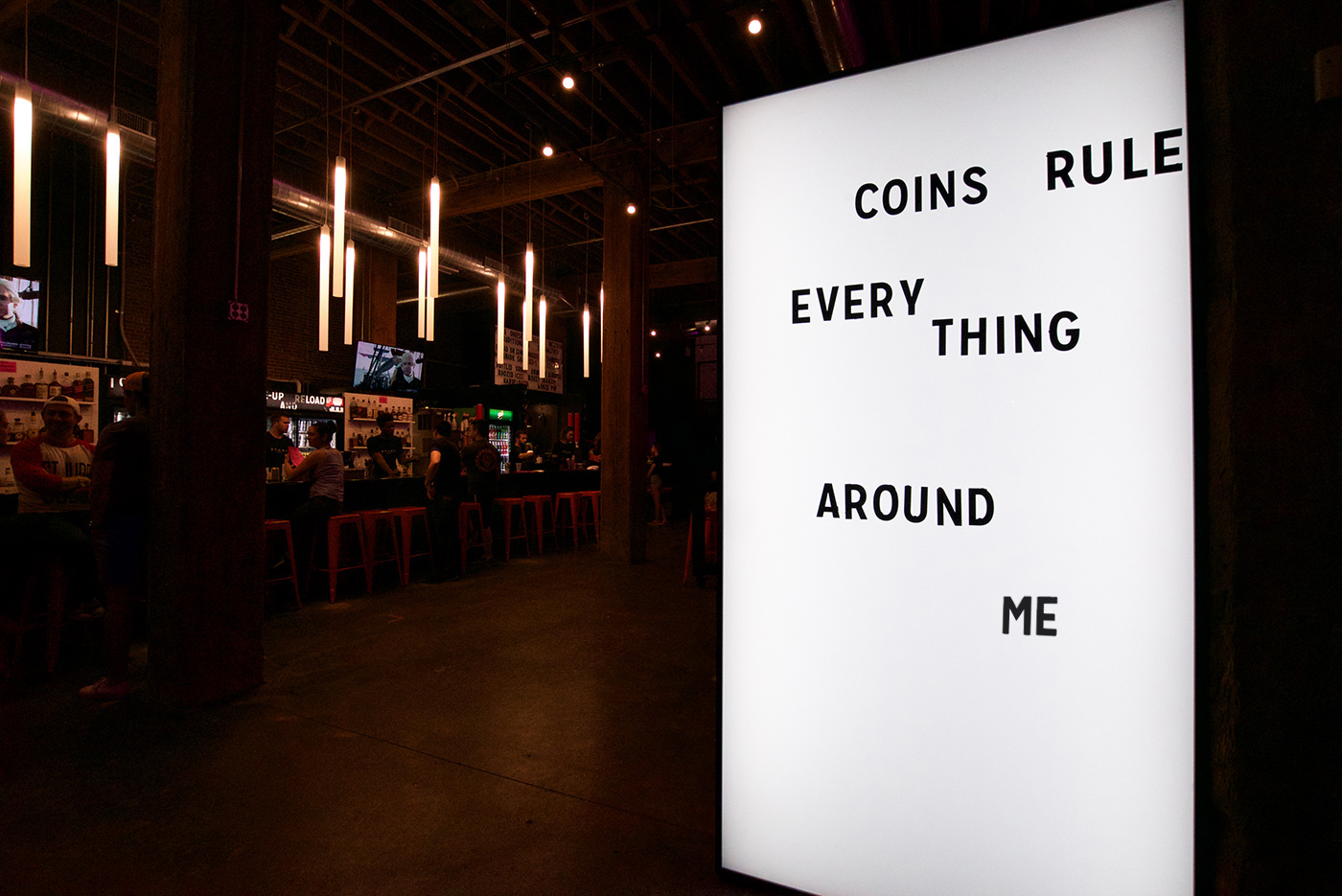
At the entrance, you’re appropriately greeted with a tweaked version of the Wu-Tang lyric, “Coins rule everything around me.” On the main walls, we created 10-foot art mural tapestries featuring the world’s greatest Donkey Kong player, one of the first game developers and wisdom from The Legend of Zelda. On your way up the lighted stairs, you can’t miss the Start Bar logo wall with flashing arrows.
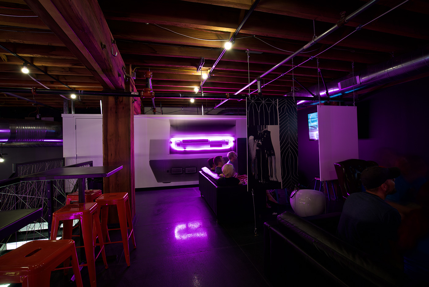
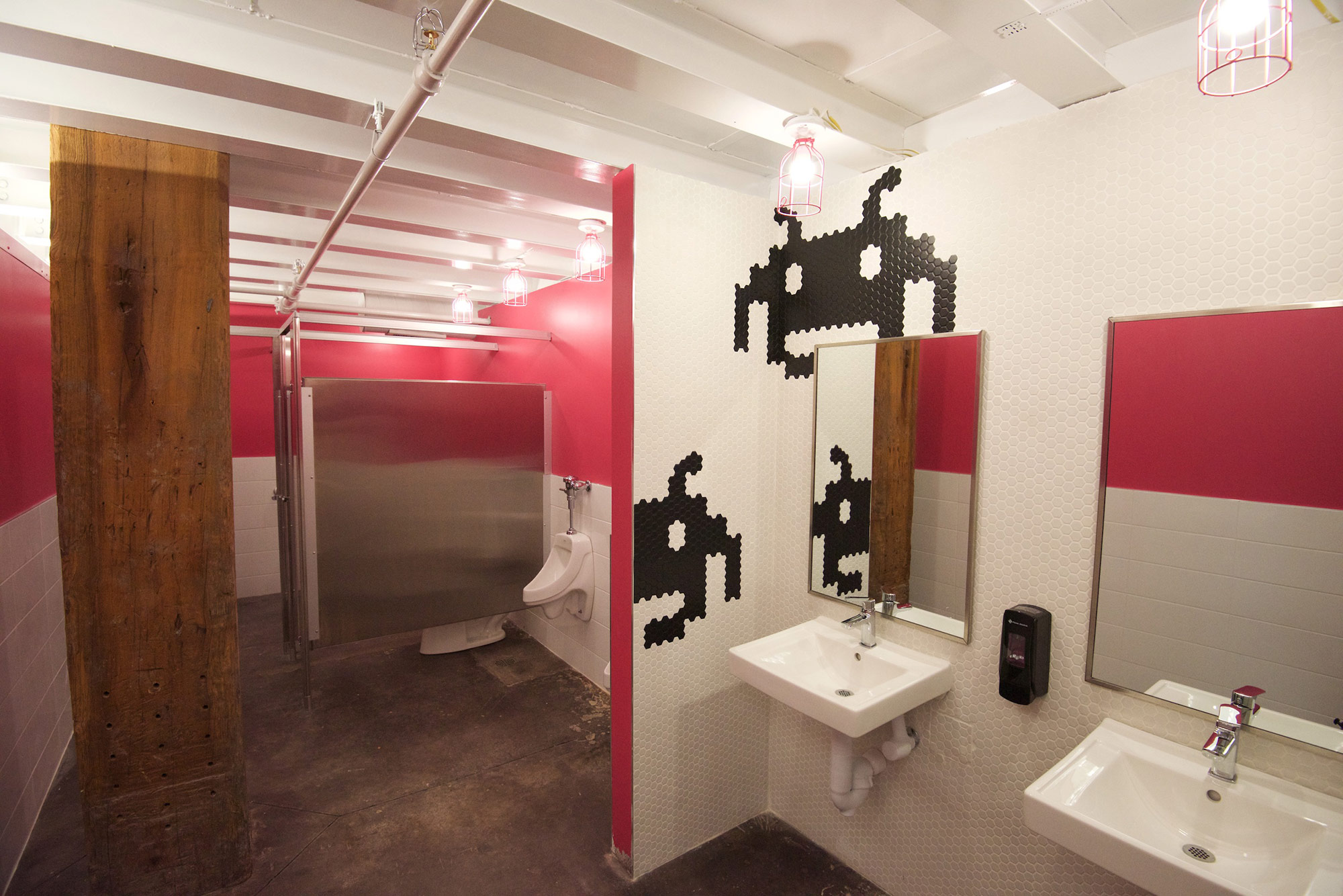
Murals upstairs and at the bathroom entrances highlight classic video game culture in pink neon lights. And speaking of the bathrooms, we opted for hot pink (“Razzle Dazzle” to be exact) for both men’s and women’s walls – an unconventional touch, and one of our favorites.
We even created a “secret room” behind a defunct cabinet game, decorated in a classic hunting lodge-style with the greatest video game villains displayed on the walls.
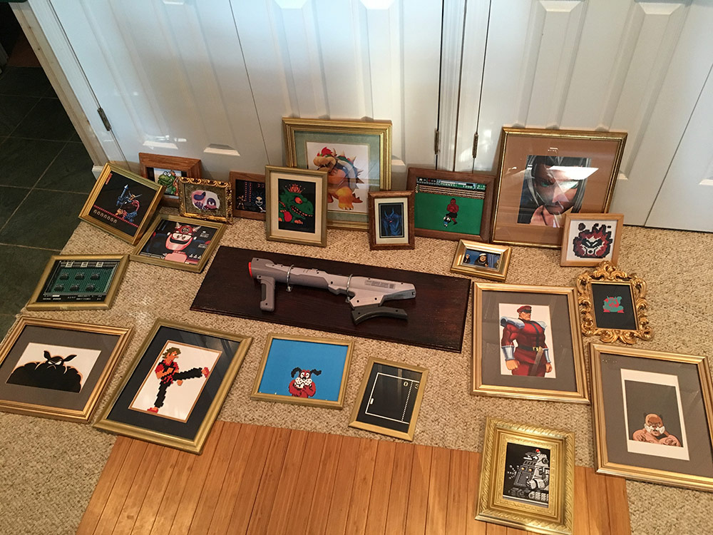
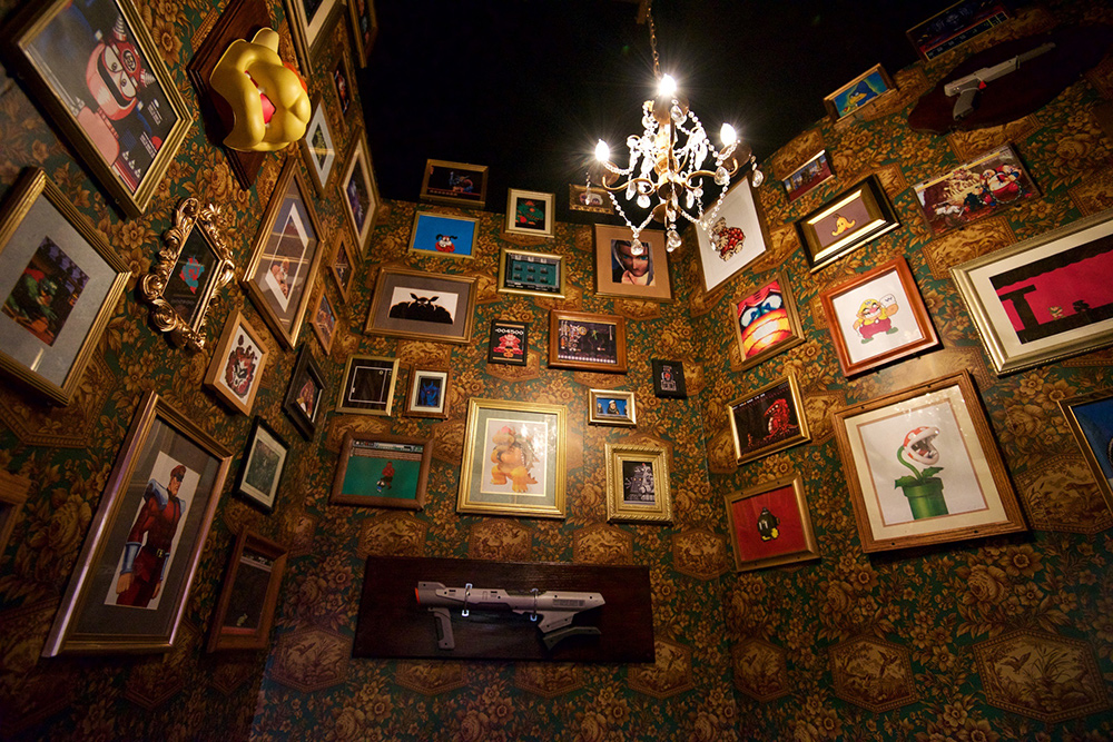
With the help of the construction team, Engraphix, and Swift Print Communications, we were able to create Instagram-worthy moments everywhere you look.
“Music blasting, but I just can’t quit…” – Notorious B.I.G
As we got closer to the opening, the list of materials we needed to create was about as long as Start Bar’s 25-foot ceilings are high.
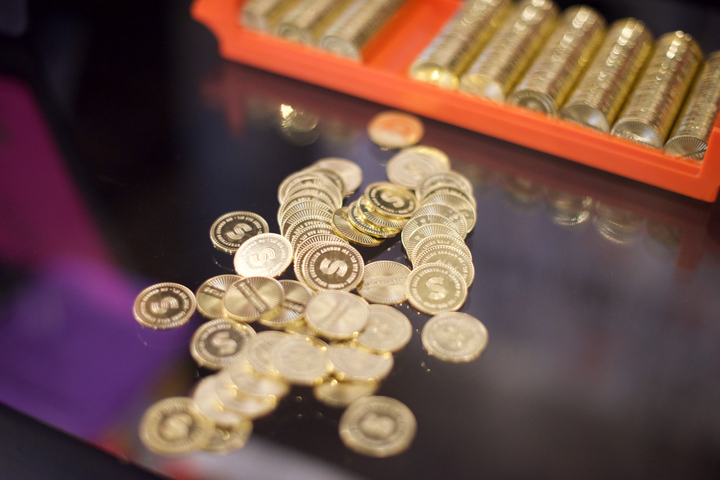
There were staff t-shirts, can koozies, graphics for the beer cooler and Start Bar rocks glasses. We built a marquee menu board to list Start Bar’s from-scratch pizzas and snacks. Even seemingly small details like game tokens were custom designed.
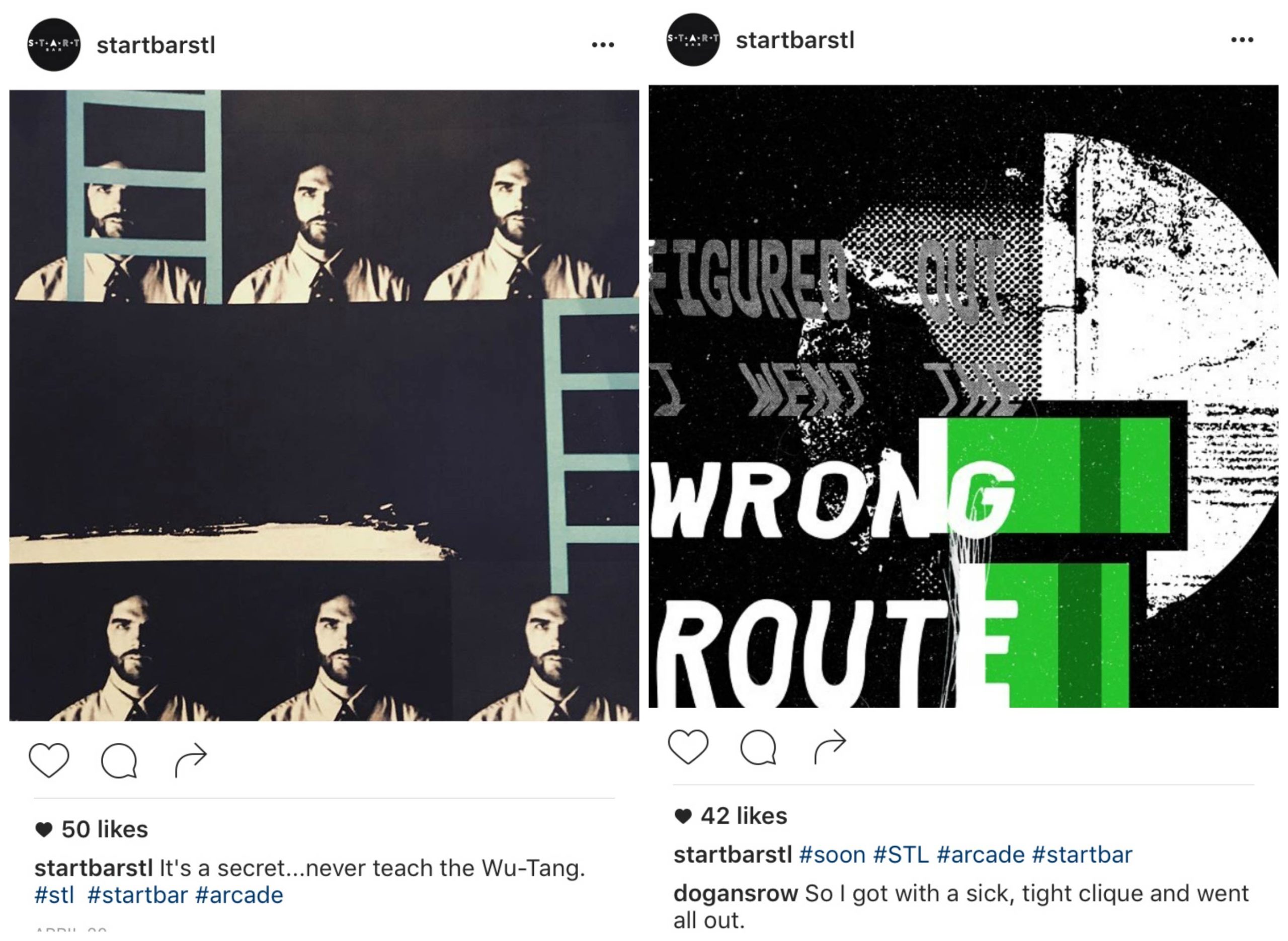
Piece by piece, Start Bar was coming together and we couldn’t contain our excitement. With the help of the Start Bar team, we launched their social media accounts to build hype for an arcade bar that we hoped St. Louis would be as excited about as we were. Almost every day, weird photos and cryptic videos, often inspired by a Nas or Biggie lyric, made their way online.
And when it came time to design the website, we wanted the online experience to be just like Start Bar itself – unlike anything we had ever seen.
We’ve designed restaurant websites before, and knew we needed the basics: hours, location, contact info and the menu. From there, we got weird(er). We used VHS-inspired photo glitches and set music to play over hotspots around the site. It’s weird, it’s not from any UX-design book, but it’s perfect for Start Bar.
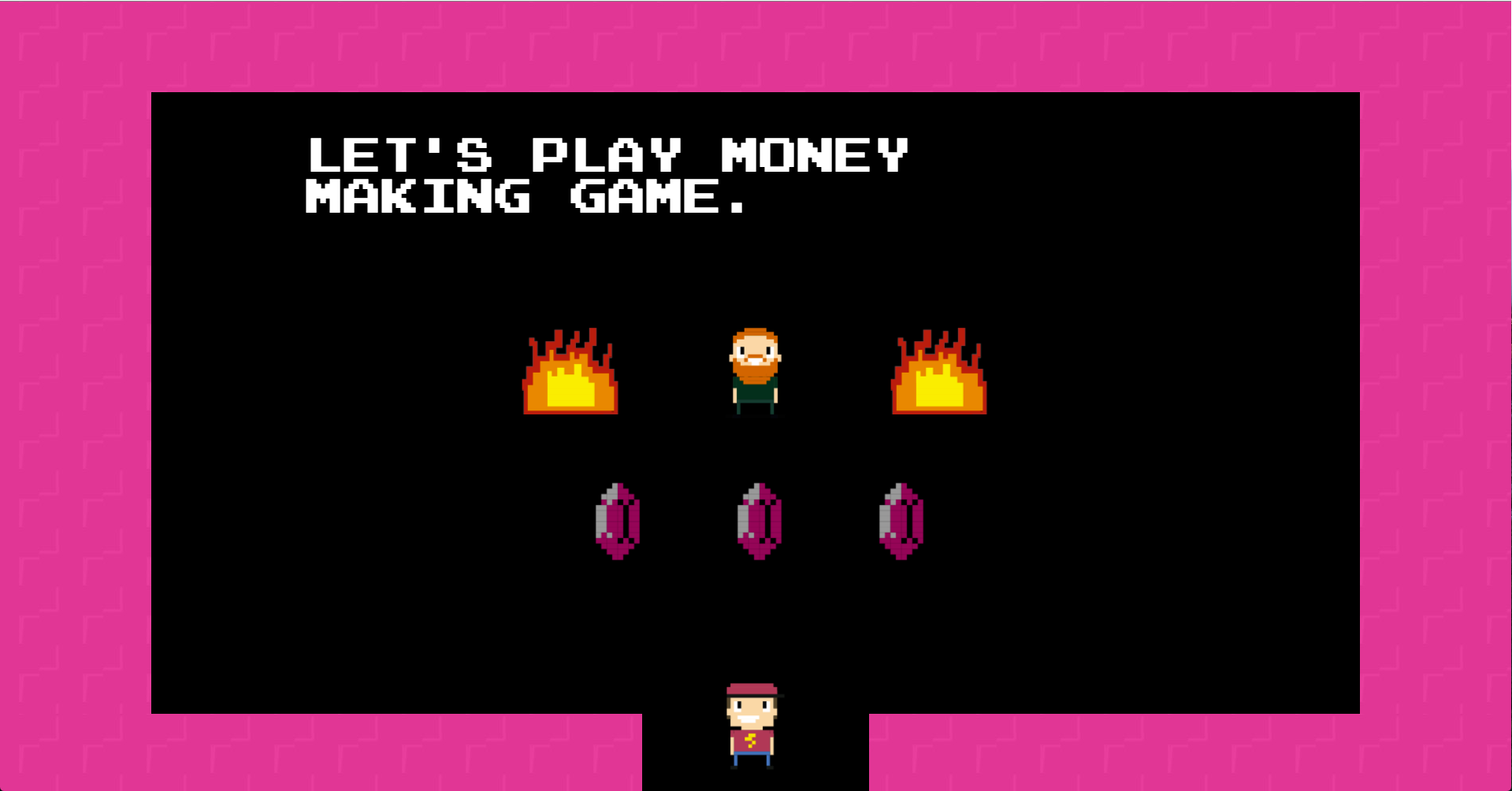
We took it a step further to reward our fellow gamers, including a secret game unlocked with the Konami Code. We had never built a functional game on any of our websites, but after venturing into the world of environmental design and a little architecture, we figured, why not?
After entering the secret code, you meet an 8-bit version of Consips Owner Stephen Savage, who offers you three rupees – one’s a loser, one’s a free beer and a third rewards you with free Start Bar tokens. After the site launched, we checked in daily (sometimes hourly) to see if anyone had found and won the secret game. It was probably as fun for us as it was for site visitors.
“… swinging through your town like your neighborhood Spider-Man” – Wu-Tang Clan
Start Bar started as a branding project. But where does branding end? For this project, it didn’t end until you’re able to play NFL Blitz next to custom art murals, while listening to an Atomicdust-curated playlist of ’90s rap.
Throughout the entire process, we challenged ourselves to make something new and different. It meant venturing outside of traditional graphic design, but we couldn’t be more excited about the end result. Go check out the Start Bar website or more pictures of the interior – and get to the bar as soon as you can.
Stay up to date on the latest marketing insights from Atomicdust.
Sign up for our newsletter and we’ll send you weekly marketing tips from our team, as well as the latest news and events from Atomicdust.
