Making a Statement: Branding and Web Design for RedCard, a Healthcare Pioneer
Explosive growth can be like a double-edge sword for companies. Success is nice, of course, but hyper-fast expansion can push things like strategic positioning and marketing to the back burner.
That’s where RedCard stood when they came to us. The company’s founders – industry veterans who pioneered their segment of the industry –built a foundation of loyal clients based on their past relationships. But their marketing lacked a sense of focus.
As they turned their long-term vision toward attracting larger, more sophisticated clients, they knew they needed to clarify their brand. And although we didn’t know it at the time, they had a couple of surprises up their sleeves, too.
Starting with a Foundation
In the simplest terms, RedCard builds communications solutions for health insurance companies. They help manage all aspects of ID cards, claims statements and can even coordinate payments to providers.
But what does that mean to their clients? What’s the benefit? That’s what we wanted to find out – because we knew that’s what ultimately matters to their prospects.
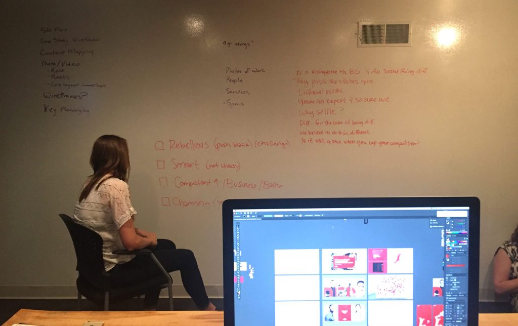
Our branding program held the answer. We talked to RedCard’s founders – a group of four who have worked together, in some capacity, practically since college. We talked to their employees. And we studied their competition.
Most competitors focus either on statistics without real meaning or context – like the number of ID cards they’ve delivered. But RedCard’s approach is to make the pieces more meaningful – for insurance companies, members and providers.
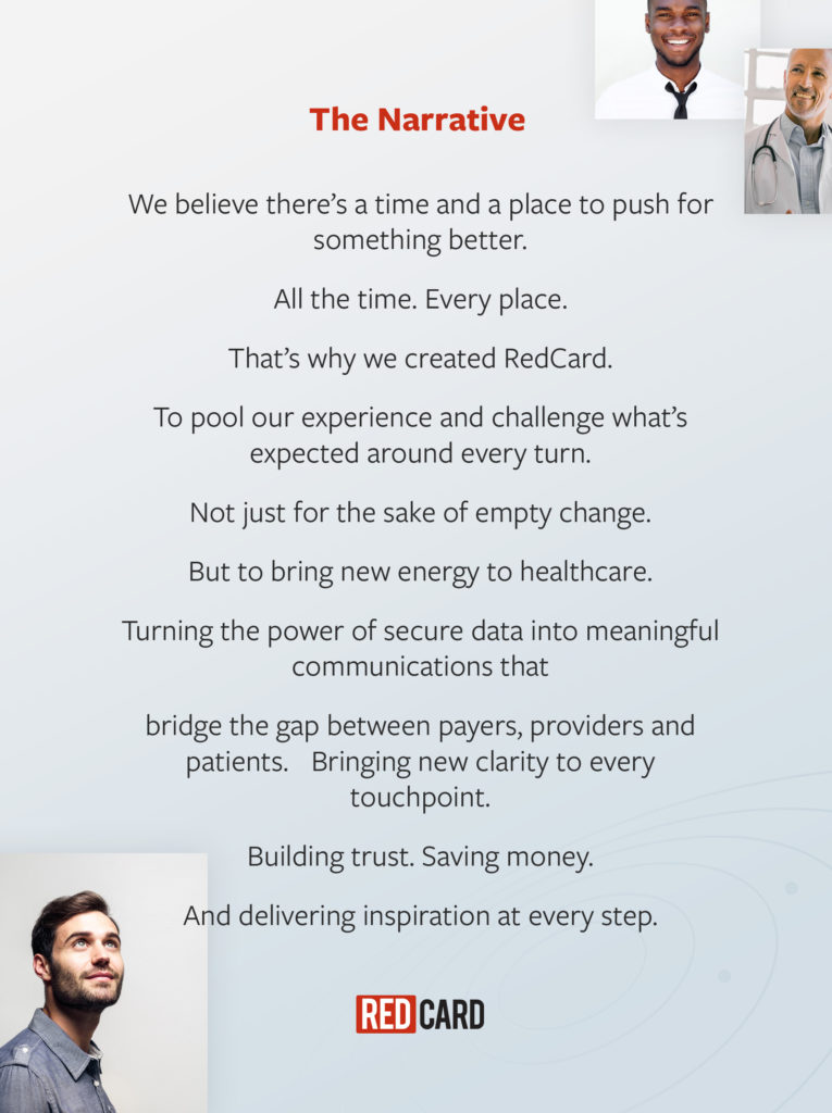
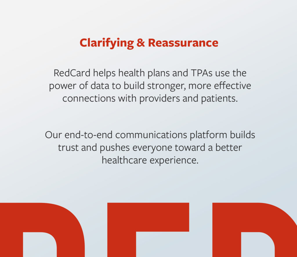
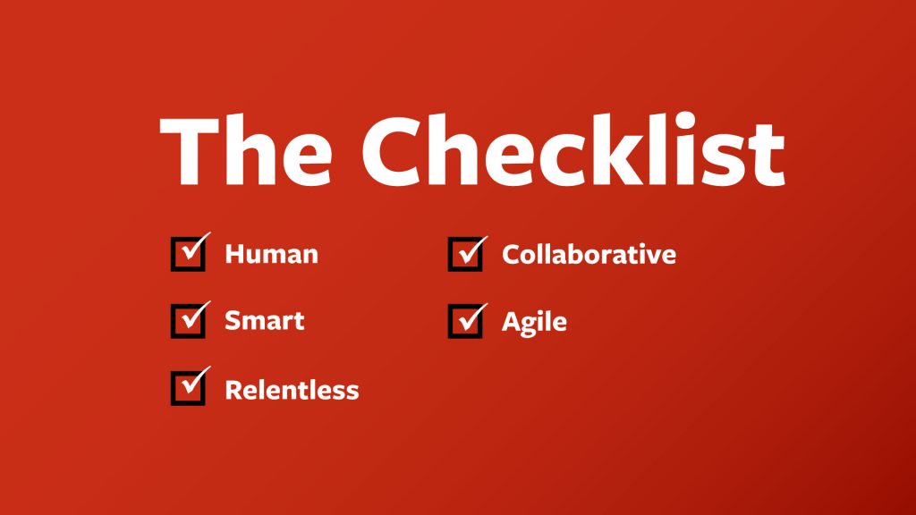
Clarity was important here – so we crafted two simple statements to solidify what RedCard does for its clients and the benefits the company delivers.

Evolving the Brand
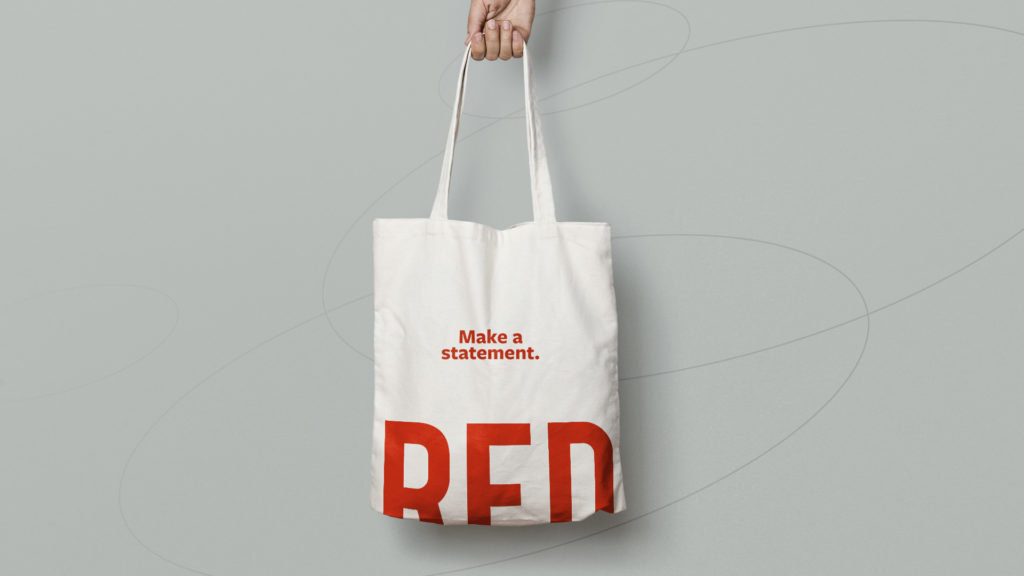
Our first look at the brand started, of course, with the logo. Red is an unusual enough color in the healthcare industry – and it’s equally standout for the financial side of the house. We tweaked the color slightly to make it feel friendlier, but left much of their original logo intact. There was simply no reason to make a major change to the logo.
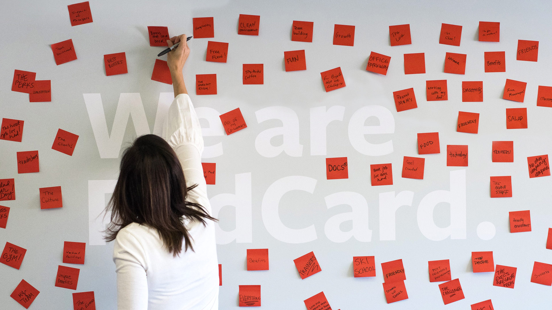
For the last couple of years, RedCard had been running a people-centric campaign, “I am RedCard.” This was a reflection of their personal, collaborative, culture – but it felt slightly off. How could we infuse the idea of connections – even community – into the brand.
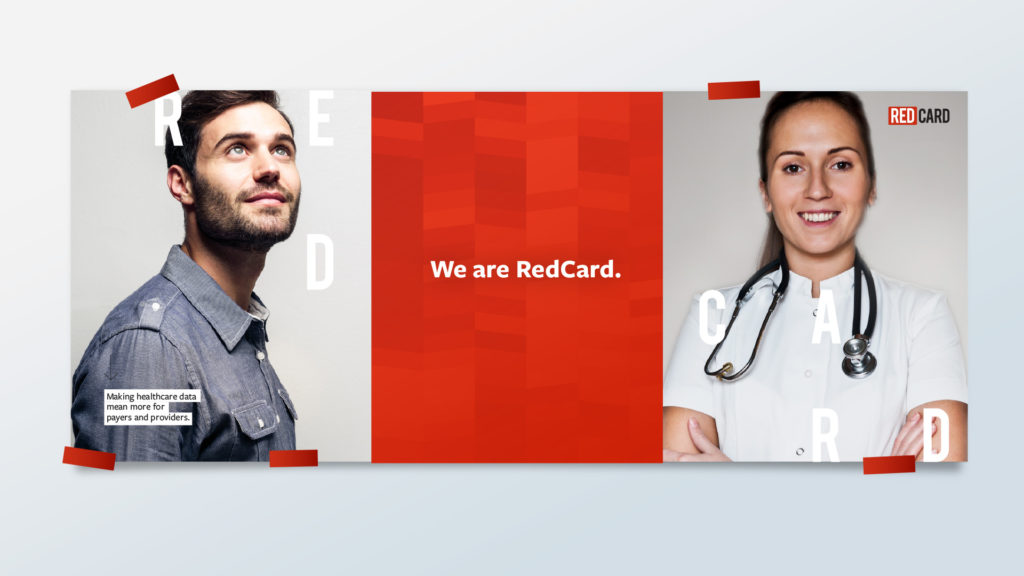
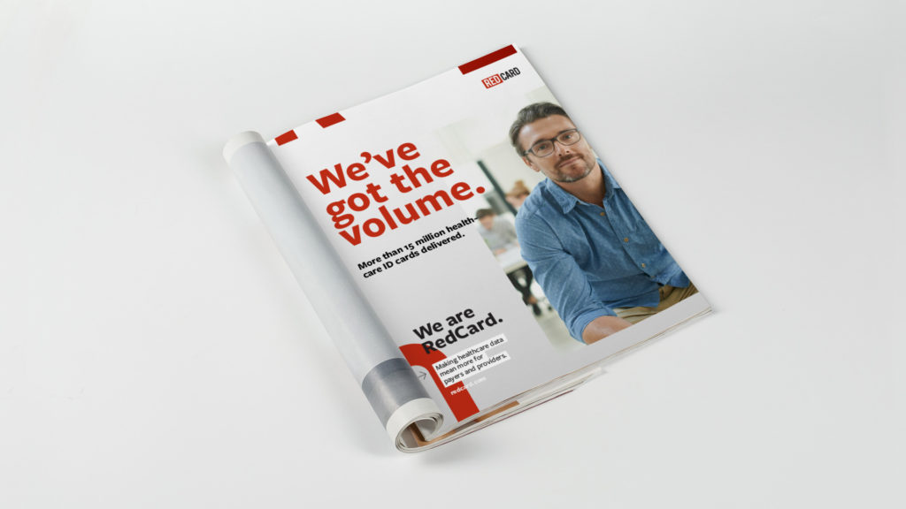
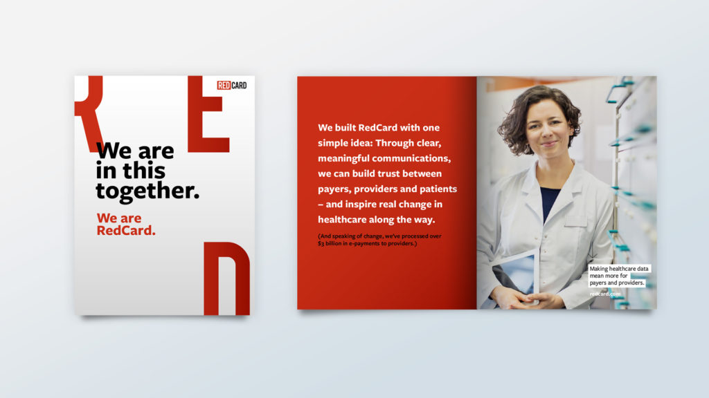
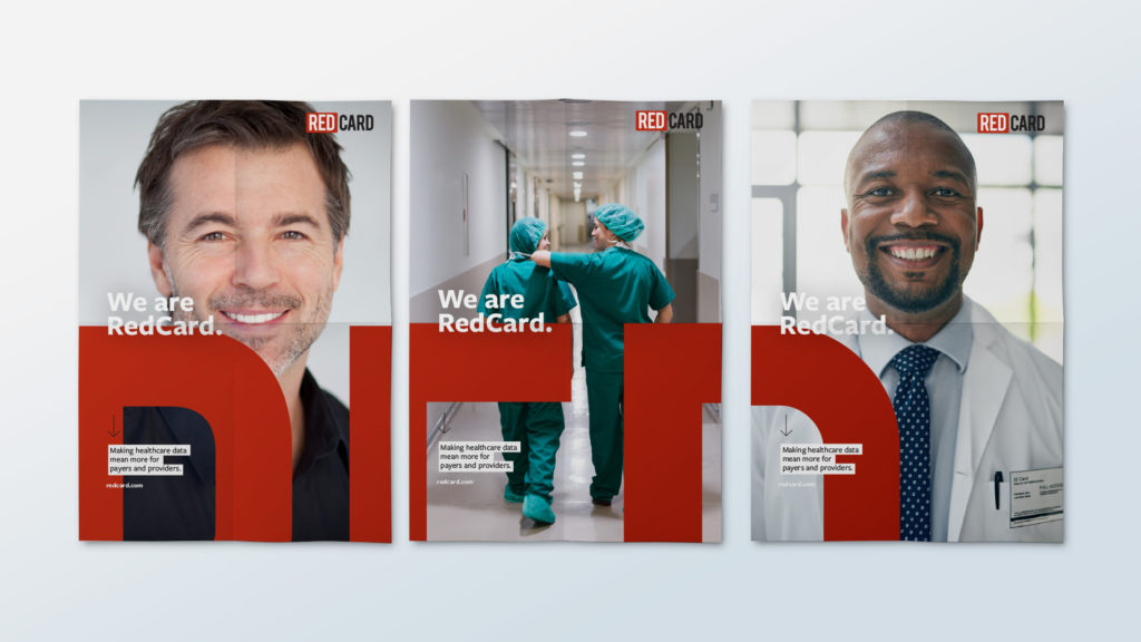
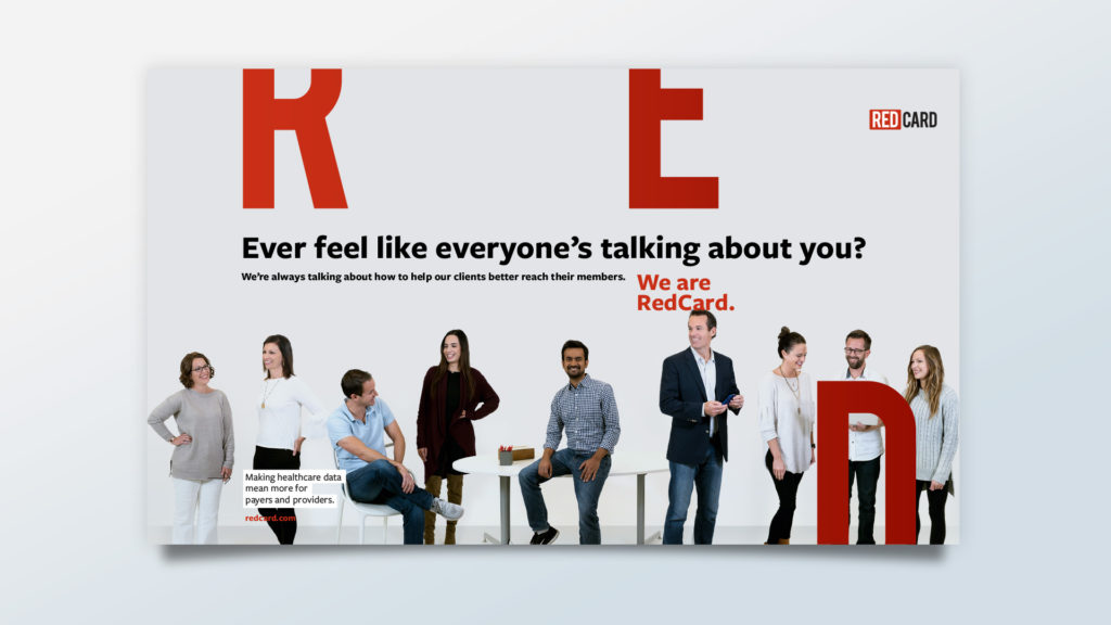
Instead of reinventing a beloved tagline, we evolved it, moving to, “We are RedCard.”
In use, this becomes a tagline or mantra – but also an invitation. “We are RedCard, and we’d love for you to be, too.”
Getting Practical
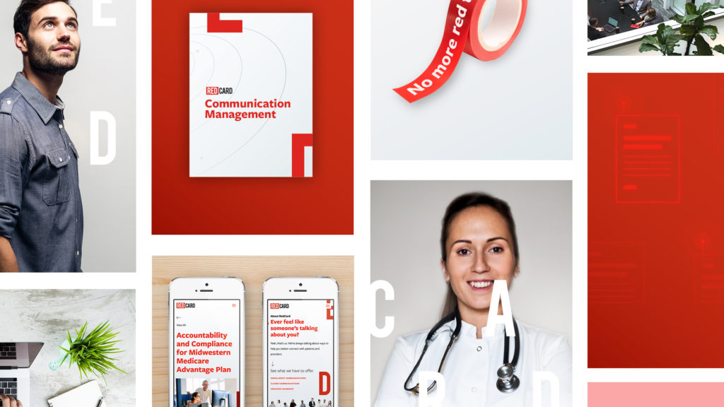
While we were gentle in evolving their existing logo and tagline, we took the opposite approach as we approached adding new visual elements to the brand. Where appropriate, we blew apart their logo, scattering the letters to add interest to standard pieces like business cards.
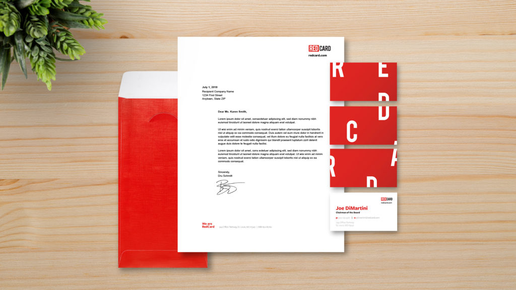
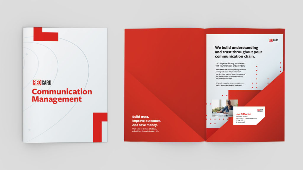
The deconstructed logo literally disrupts the otherwise straightforward design of the identity – mirroring RedCard’s intention to disrupt their own industry. More on that, as we explore their website.

Building Trust and Pushing Further
RedCard’s old website had very little information about what they did for clients. Some of the information was even scattered across multiple websites. Much of this was by design, but moving forward, they knew they needed clarity, while still walking that fine line of giving too much away in a highly competitive environment.
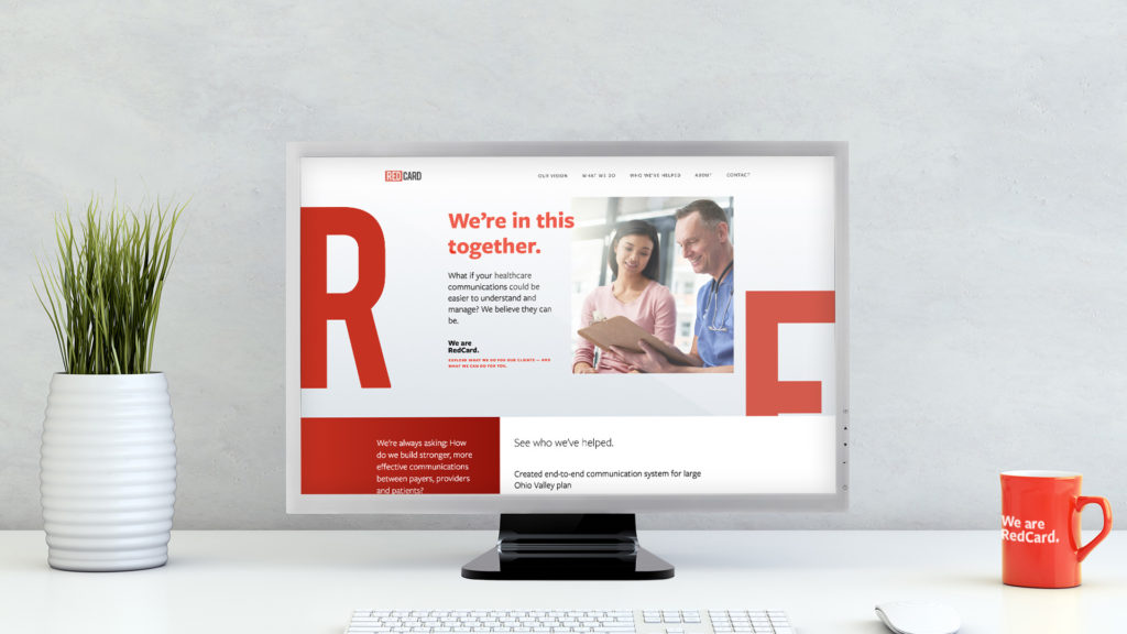
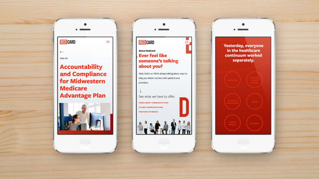
As we built out pages for their three key areas of focus – enrollment communications, claims communications and provider payments – we worked hard to make each page feel part of a larger story. Headlines, supporting case studies and even calls to action all work together to make RedCard mean more to its prospective clients than a collection of printed ID cards and statements.
To pull it all together, we used our newly established brand elements, like the bumped-up red and deconstructed letters from the logo, throughout the site.
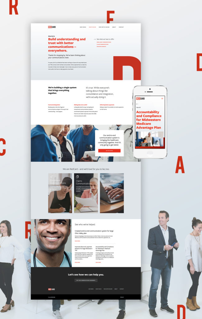
There’s also a combination of stock and original photography. We spent a day in their office capturing both their founders and members of the team. It’s an experience that allowed us to capture cool (albeit pieced-together) shots like the one below. More than that, however, we were able to experience their culture and gain an even deeper appreciation for what makes RedCard, RedCard.



This level of understanding lead to a great working partnership with RedCard, as they challenged and pushed us throughout the creation of the site. In fact, one of their late suggestions – the “Vision” page – quickly became our favorite section of the site.
Joe DiMartini, one of RedCard’s founders, took us through a head-spinning introduction to their vision for the company and for the healthcare industry overall. He explained how the technologies RedCard has pioneered are leading insurance companies and others toward more affordable, meaningful, transparent communications around benefits and costs.
It’s about filtering and securing data. It’s about timing communications. It’s about building connections where trust has broken down the most, between providers and payers. It’s about giving everyone the tools and the knowledge they need to make better decisions.
And then, Joe turned us loose, trusting us to craft the story of RedCard’s vision in visuals and simple language.
We intentionally made this section of the website look and feel different – as the visitor scrolls, a single, animated experience tells the story of RedCard’s vision. We built the page using parallax sections with accompanying CSS animations. What starts out as separate circles animate as you scroll, weaving in and out, visually connecting. We broke the complex story into digestible pieces, and used a contrasting bright white background at the end to signal the new day that’s coming to healthcare.
The Vision section leads people from the chaos of yesterday’s scattered approach to the carefully aligned, harmonious promise of tomorrow. It’s built on the idea of creating a healthcare communications community – and the final call to action invites the visitor to join RedCard on a journey toward a brighter tomorrow.
We’re Just Getting Started
We’ve done quite a bit for RedCard over the past few months – and we’re just getting started. Watch this space for more as we create internal communications, tradeshow materials and other key items to keep the company keep growing.
Want to keep up with the latest work from Atomicdust?
Subscribe to our newsletter for all the latest news, events and weekly marketing tips from our team.
