Addition by Subtraction for Brand Addition
When I was a kid, my favorite toy was the packaging from a Disney Pocahontas toy. Not the toy—the packaging.
I was a weird kid.
To this day, I find myself hanging onto mementos. The pen from a restaurant I loved. The mug with my favorite hardware store’s logo. The pin from my neighborhood custard spot.
They all represent meaningful moments between myself and the brands I love.
And Brand Addition understands that.
Less Junk, More Joy
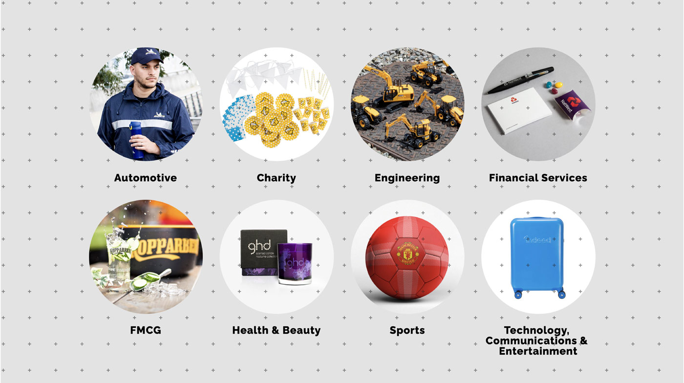
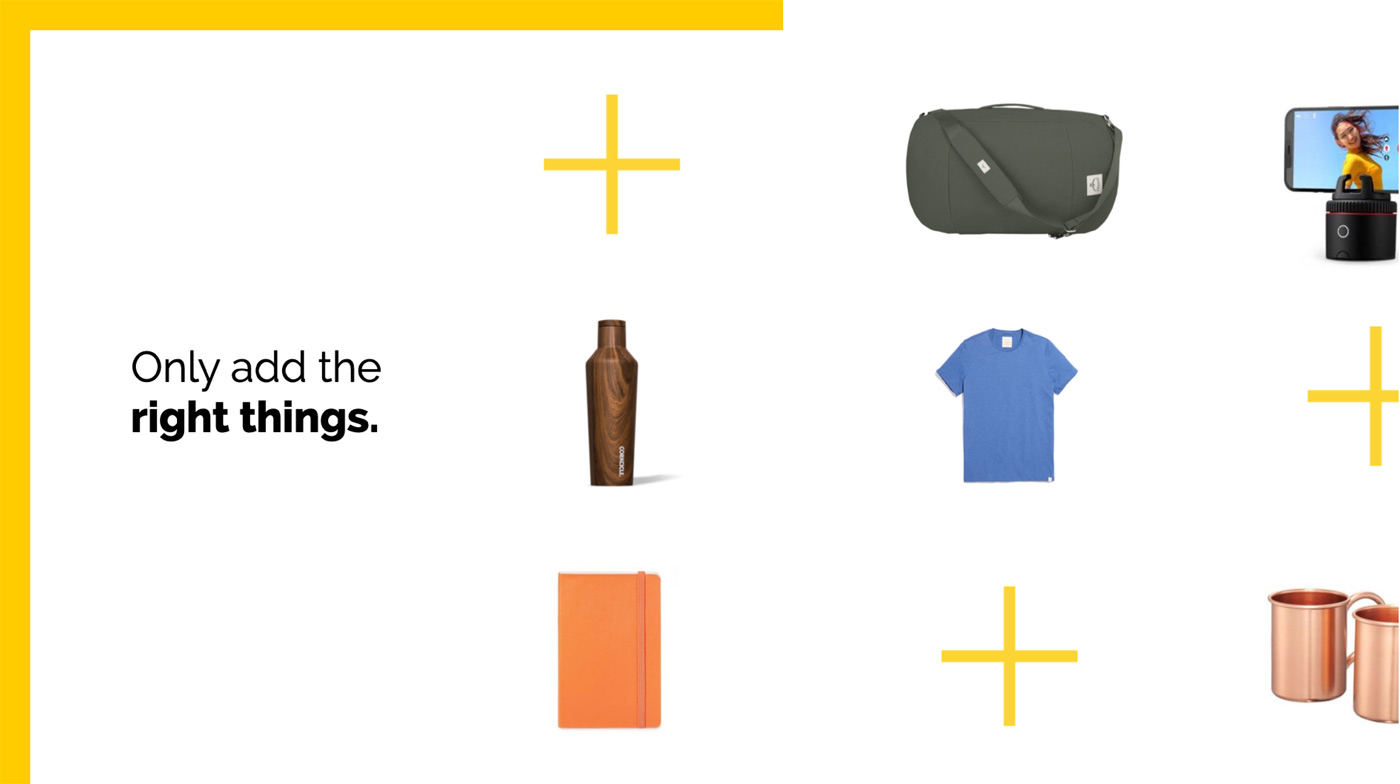
Much like my mementos, Brand Addition creates branded goods and gifts on behalf of some of the largest companies in the world—ever heard of Michelin or Cadillac? They design, create and ship promotional products that, unlike my torn Pocahontas packaging, are useful, intentional and meaningful. They spark joy in customers and employees and build connections with audience.
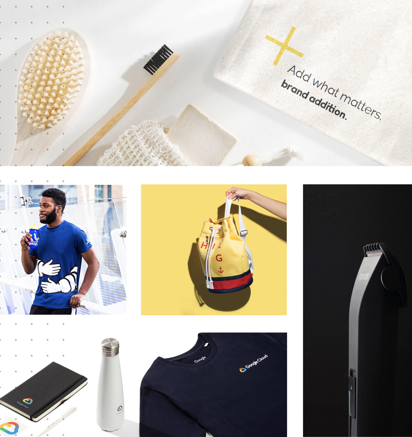
Not only does Brand Addition make high quality promotional products, but they also have an amazing internal culture (we’ve never heard so many rave reviews), a worldwide presence and a dedication to delivering ethical, sustainable goods.
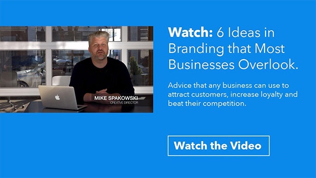
What they were missing were the tools to explain what all those great things mean for their customers.
So they called Atomicdust.
A Blank Canvas
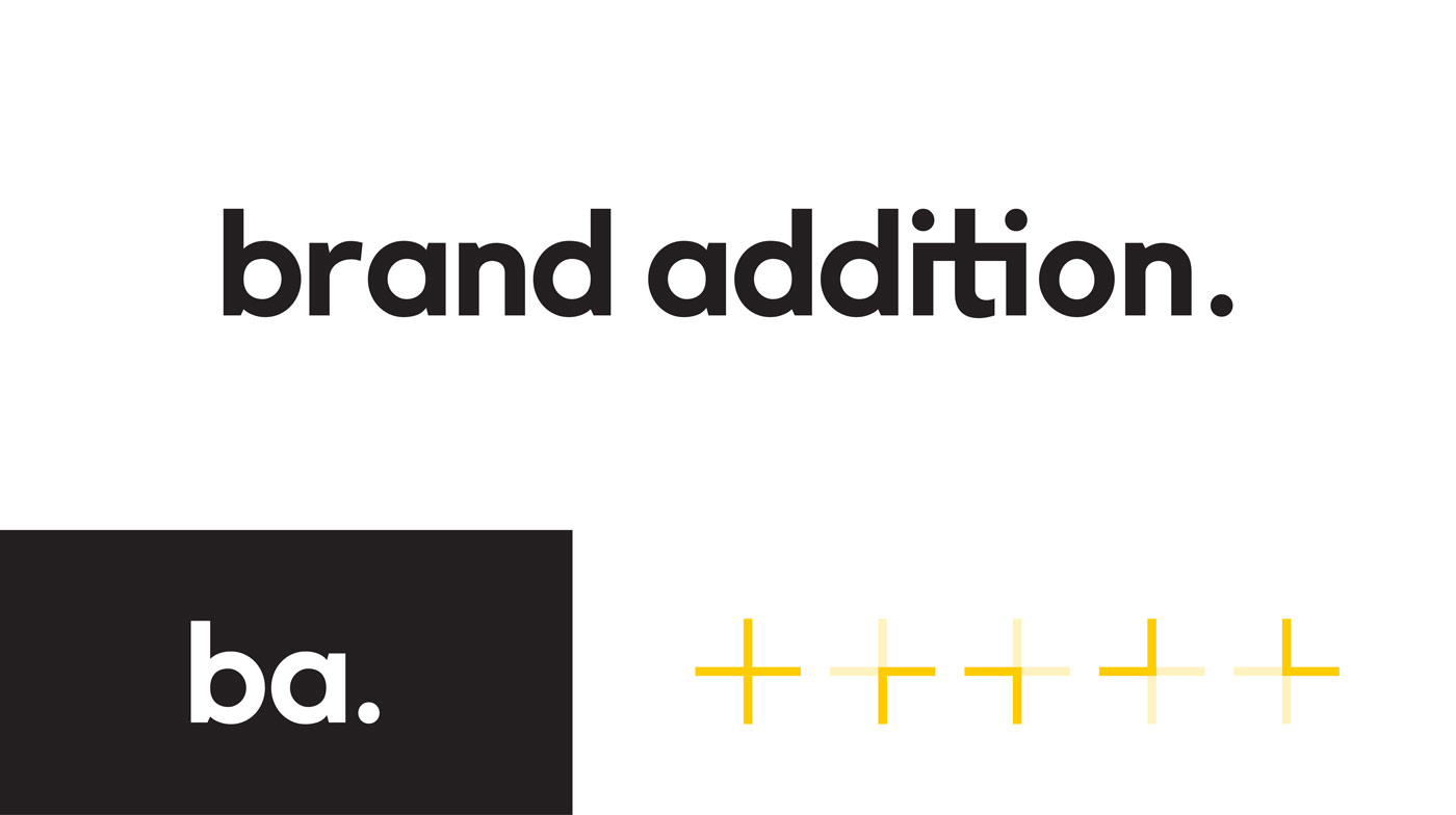
When you’re a brand that creates products for other brands, you don’t want a visual identity that clashes with your clients’ logos. That’s why Brand Addition’s existing brand elements were minimal, clean and mostly black and white, with an occasional pop of yellow for emphasis.
And their language? It was sparse. Scrolling through their website and sales decks, we had a hard time finding ownable messaging, or language that is true to Brand Addition and couldn’t be said by competitors.
During interviews we conducted with Brand Addition team members in the U.S., U.K. and Germany, we heard:
“It would be nice to not always mirror what customers say. Have our own voice and tone. We’re different than them, that’s why they pick us.”
“We can remain professional and continue to communicate clearly without too many buzzwords.”
“Sometimes I think we don’t know ourselves. We help others brand. We haven’t figured it out for ourselves.”
It’s tough to meet so many people who are so excited about what they do, but can’t describe just how great and different the company they work for is.
We needed to give Brand Addition’s teams—people all over the world—a visual identity that matched their attitudes and passion. We needed a message that would unite diverse internal audiences and excite potential clients.
We needed some serious inspiration.
Working Together from Home
Much like Brand Addition’s international teams, we’ve found ourselves working together from a distance over the last year and a half. Conference room gatherings have turned into Slack channels. Brainstorms over coffee are, well, still brainstorms over coffee, but I’m drinking Folgers at home instead of the good stuff at the office.
For weeks, we talked, debated and tried to find the Brand Addition big idea.
The challenge wasn’t necessarily telling their story—our interviews gave us great insight into the company’s values and how it works. The challenge was differentiating Brand Addition from tons of other companies doing the same thing.
As much time as we spent talking through ideas together, we also spent a lot of time individually researching the competition, the industry and its trends to try and figure out how it would all come together.
Keep It Simple
I’m a bit of an over-thinker. When we weren’t talking about Brand Addition as a team, I was alone, drafting many, many drafts of Brand Addition language that never even made it to an internal review.
But we’ve found more and more that the simpler the solution is, the more effective and accepted it will be. As Einstein said, “Everything should be made as simple as possible, but no simpler.”
We realized that the answer—the inspiration—was in front of us the whole time.
Right in the name of our client.
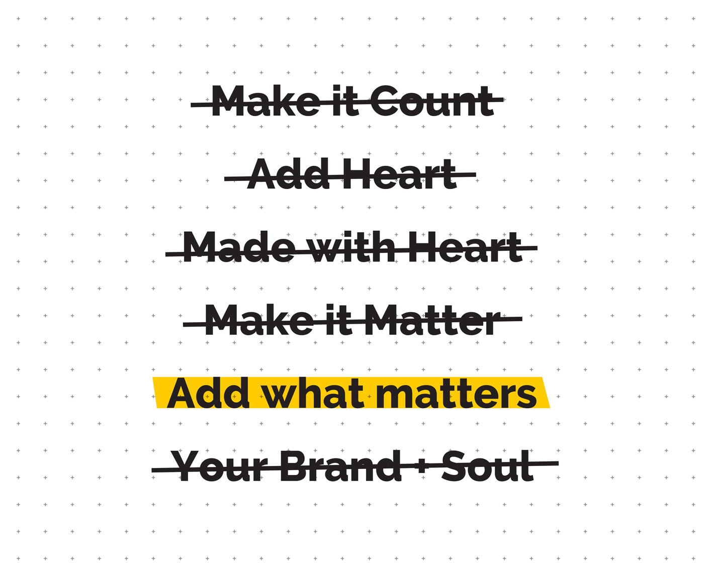
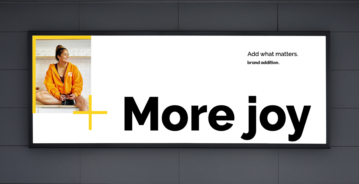
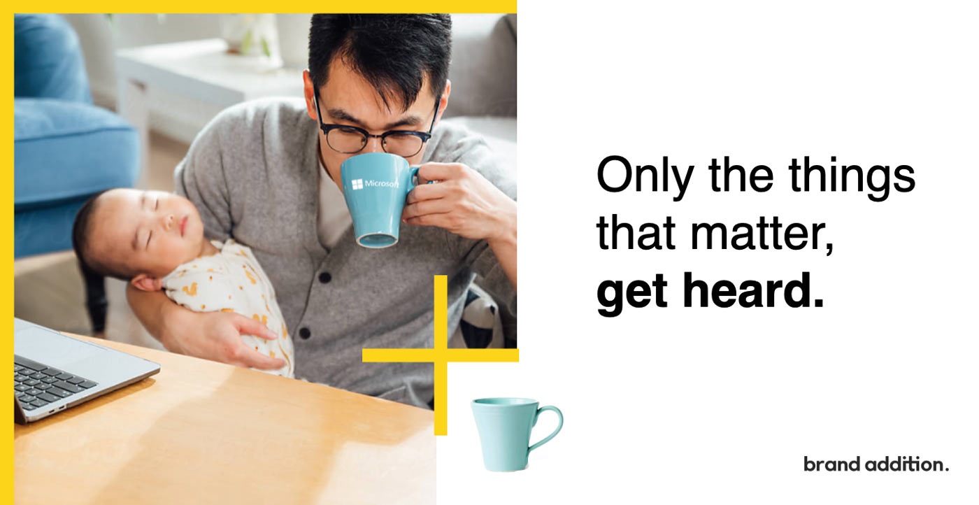
In a world, and industry, of excess, everyone else makes junk.
Brand Addition adds joy to everyday items that drive meaningful connections.
Addition Attracts Attention
The more we leaned into the idea of addition, the more the brand came together. We created instantly recognizable, bright yellow addition signs that connected branded products with meaningful moments. They also instantly brightened sales decks and foundational language to help the teams communicate why the company is so great. We were excited to see so many of the little ideas we’d had over the past weeks add up to one great brand.
![]()
Added Pressure
When we presented our concepts, we were thrilled to hear positive feedback from the Brand Addition team. So positive, in fact, that they asked us to present it to the rest of the company.
We’ve gotten used to virtual conference with big groups. But presenting to hundreds of people all over the world was a first.

Luckily, that meeting went well, too.
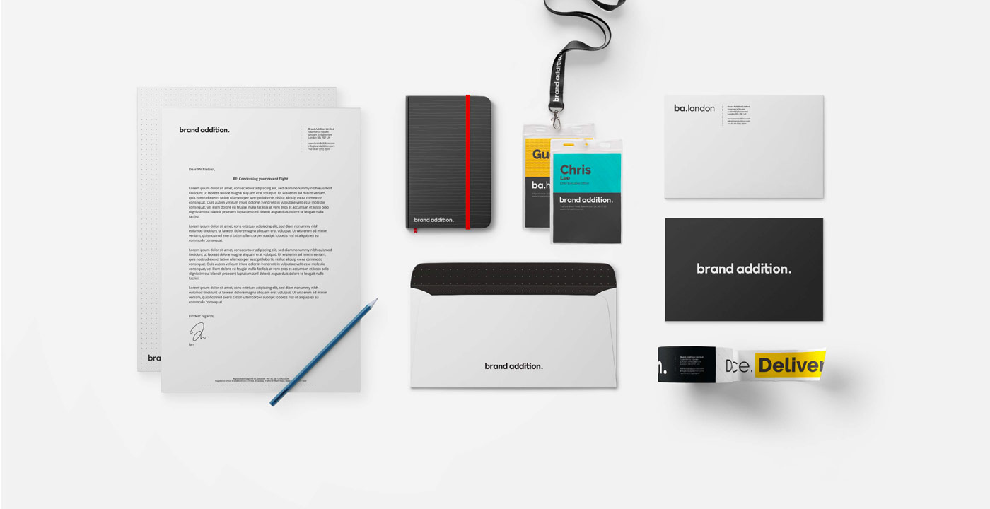
We’re already seeing Brand Addition incorporate their new brand elements and tagline into their website and social channels—showcasing their new brand and mission–to add what matters to make branded moments count.