Connecting Those in Need for the Behavioral Health Response Website
This might not be surprising, but at Atomicdust, we’re not doctors.
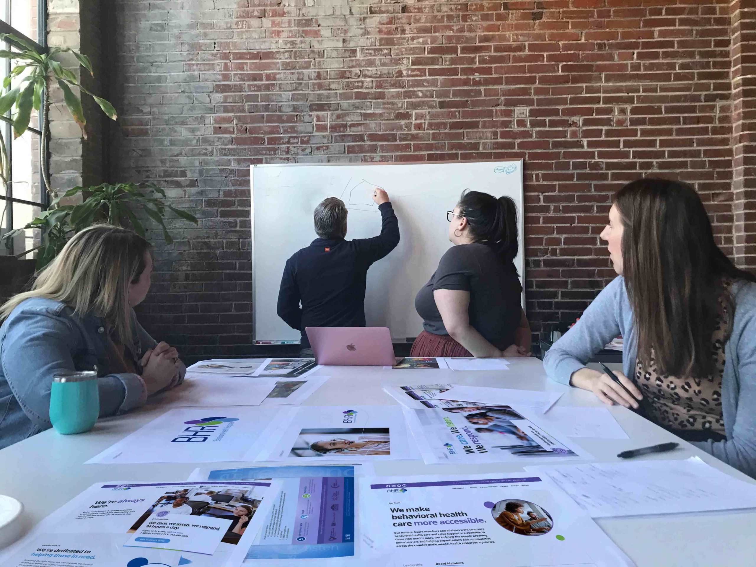
The closest thing we have to an operating table. (Photo taken pre-pandemic.)
We’re web designers, copywriters, digital marketers and developers. A stressful day for us might have something to do with a tight timeline or rush project.
While none of us have gone to medical school, we’re so lucky to be able to work closely with organizations that deliver life-saving services every day–like hospitals, healthcare providers and now, a valuable resource for those struggling with mental health challenges.

Behavioral Health Response, or BHR, provides crisis support, telephone counseling, employee assistance programs and access to other mental health resources. Although mostly catered to people in eastern Missouri, the organization’s crisis hotline fields calls from around the country—and will support anyone who reaches out. BHR also partners with local hospitals, companies and schools to lead mental health trainings and educate communities about stress, crisis warning signs and mental health resources.
It was an important mission when BHR reached started looking for a web design agency in early 2020. It got even more vital when the pandemic hit and the need for more mental health resources grew.
Two audiences, one web design.
We started outlining the strategy for the site while transitioning to working from home.
With two unique audiences—individuals seeking crisis support and organizations looking to partner with BHR—the website’s navigation and user experience needed to cater to both (not to mention smaller audiences like donors and prospective employees). BHR’s current site was outdated and not very welcoming, with no information about its educational trainings.
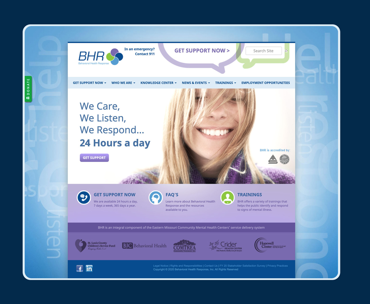
Behavioral Health Response’s old website.
Even finding the crisis hotline phone number took several clicks—far from ideal for a crisis situation.
Focusing on what matters.
There’s a phenomenon that happens with old websites. As more and more things get added, content gets updated and shifted around. After years of these changes, the websites end up with lots of valuable information, and a major problem: you can’t find any of it.
Herbert A. Simon, a social scientist who studied organizational systems and decision-making behavior, had a well-known quote that we reference sometimes on website design projects:
“A wealth of information creates a poverty of attention.”
Basically, too much content backfires. People have limitations on what they’ll read, how much information they can take in at once or how much time they’ll spend looking for something.
So reorganizing the user experience on the site was priority number one.
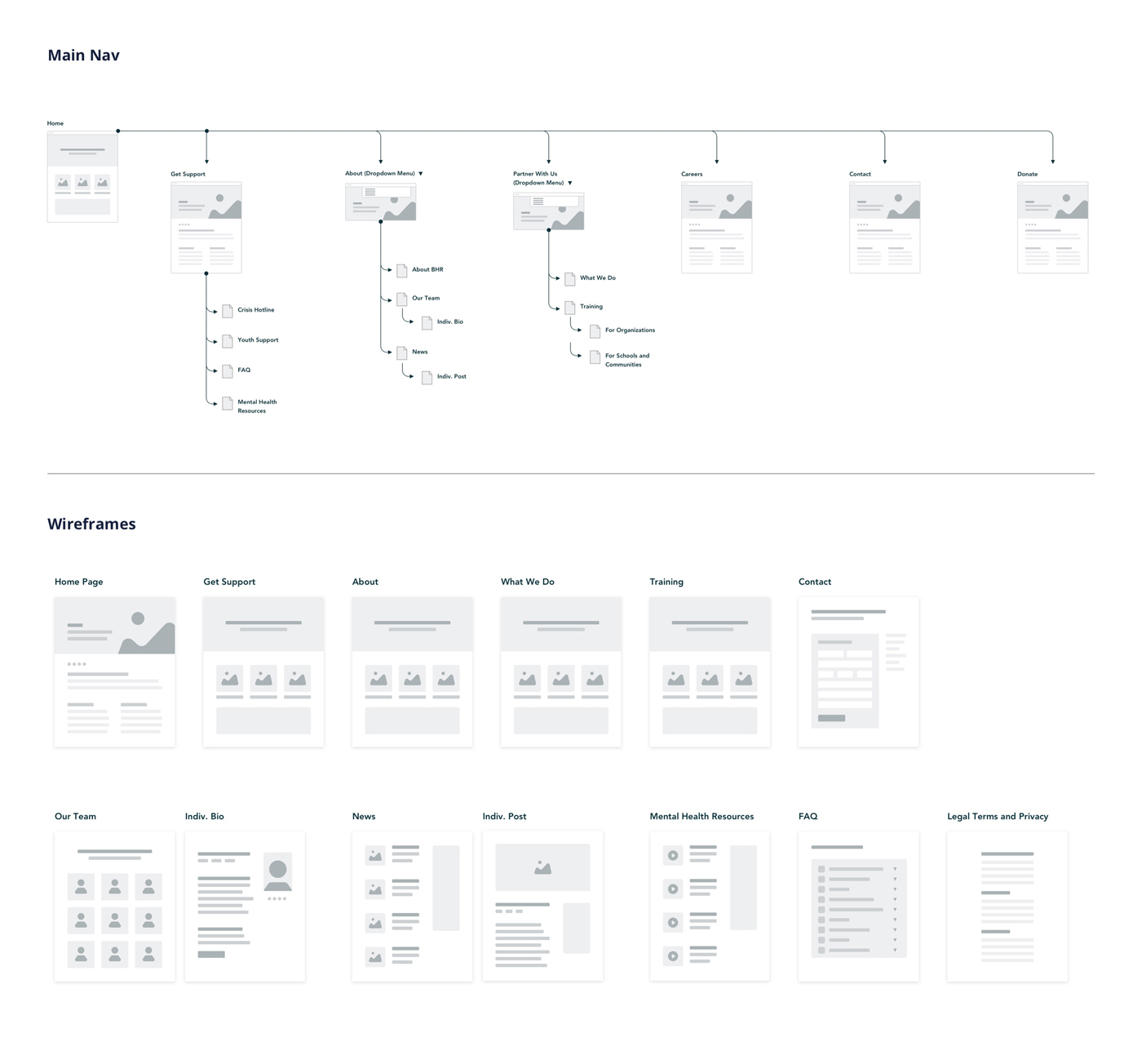
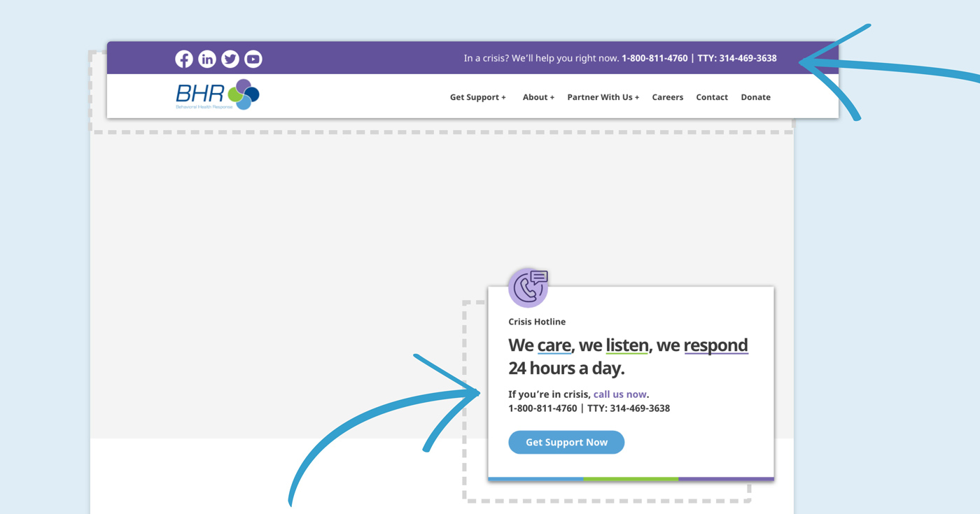
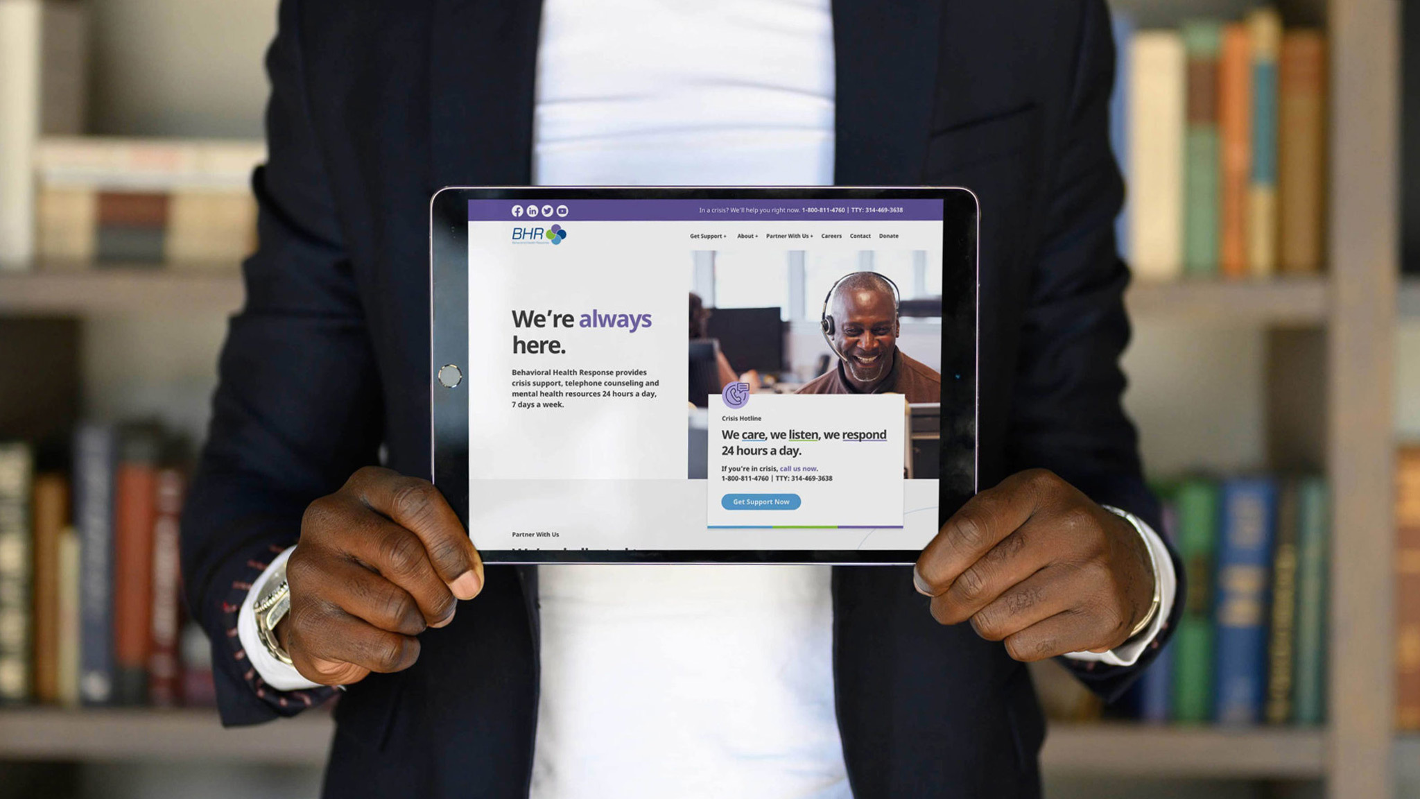
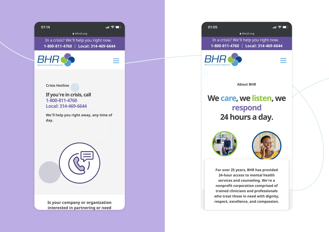
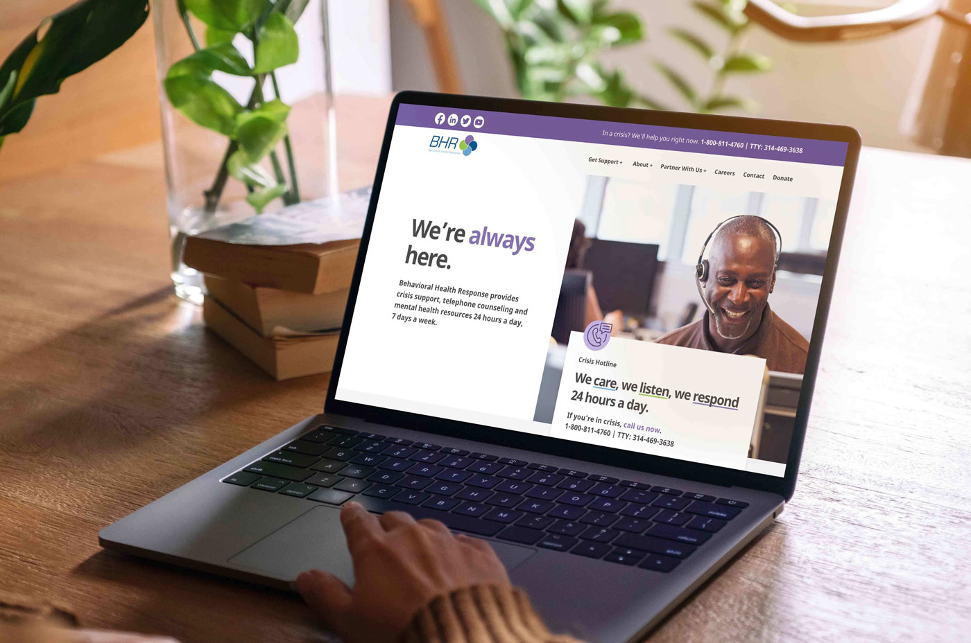
The new homepage spotlights the hotline number to make sure people in crisis can find what they need right away. (It’s also at the top of every page so it’s always accessible no matter how someone enters the site.) We structured the main navigation and service pages to help different audiences flow through the site and easily find the information on BHR’s services. The blog would also be segmented to share insights with the audience they’re most relevant to.
The sitemap and wireframes were done. Now we just had to tackle the visual design.
Approachable, but realistic.
Beyond a logo, BHR didn’t have much of a brand identity. We used the green, blue and purple used in the existing logo to create icons and aesthetic accents that would bring consistency and motion to the site.
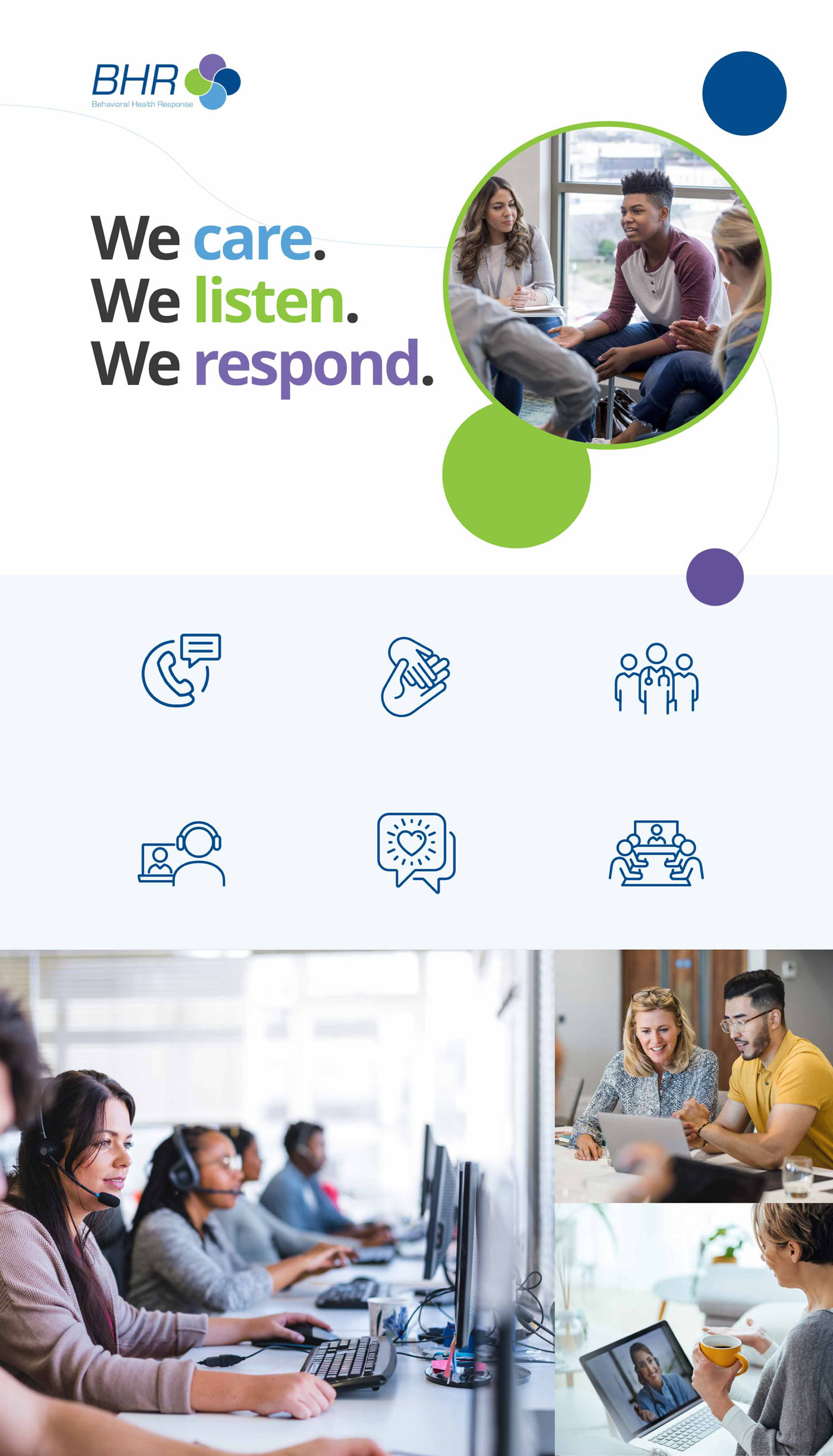
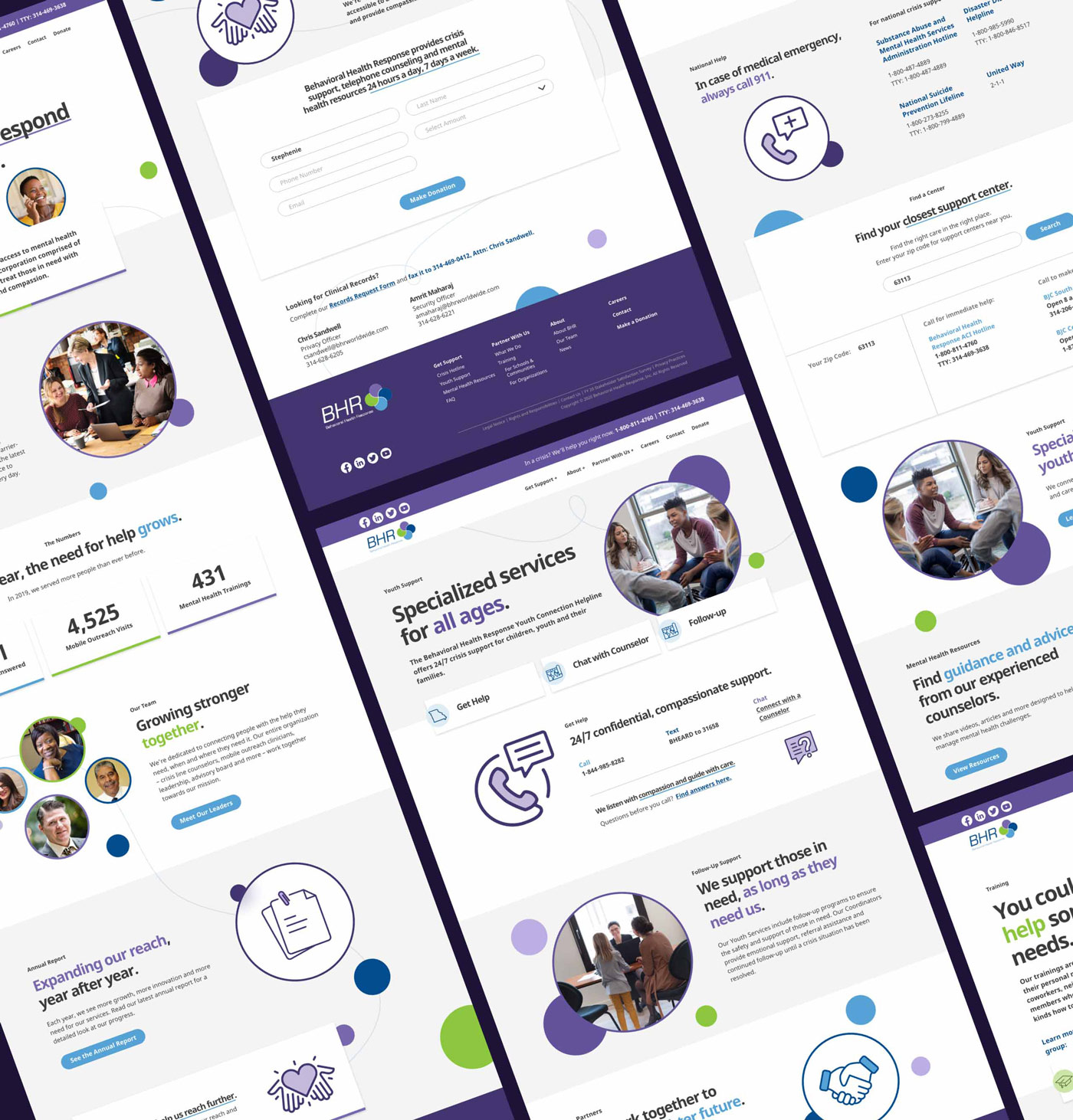
But setting the right visual tone was tough. Mental health, mental illness and crisis support are heavy topics, so using overly cheery imagery wouldn’t be appropriate. However, we still wanted the site to be positive, and clearly convey that the team at BHR would be welcoming and supportive to those reaching out for help. Photos show hotline staff listening intently while on the phone, and groups of people seated in a circle and sharing to illustrate BHR’s supportive team and resources.
Making the connection.
The website launched at the end of the year, and just a few weeks later, BHR made the news with an important announcement. The organization would begin partnering with the City of St. Louis to divert mental health-related 911 phone calls to BHR’s hotline. BHR clinicians would also begin riding along with St. Louis police officers to help deescalate potentially deadly situations.
It was incredibly rewarding to get to work with an organization that has such a profound and immediate impact on people in our community. Every day (and night), BHR works to connect people in crisis with resources that can help.
We’re so proud to have designed a website that makes that connection even easier.
