Modernizing a Construction Brand for Alberici
Alberici has built some of the most complex and important structures in North America.
We’re talking critical infrastructure like water treatment plants and heavy industrial production lines, and highly technical projects like hospitals and cutting-edge office buildings.
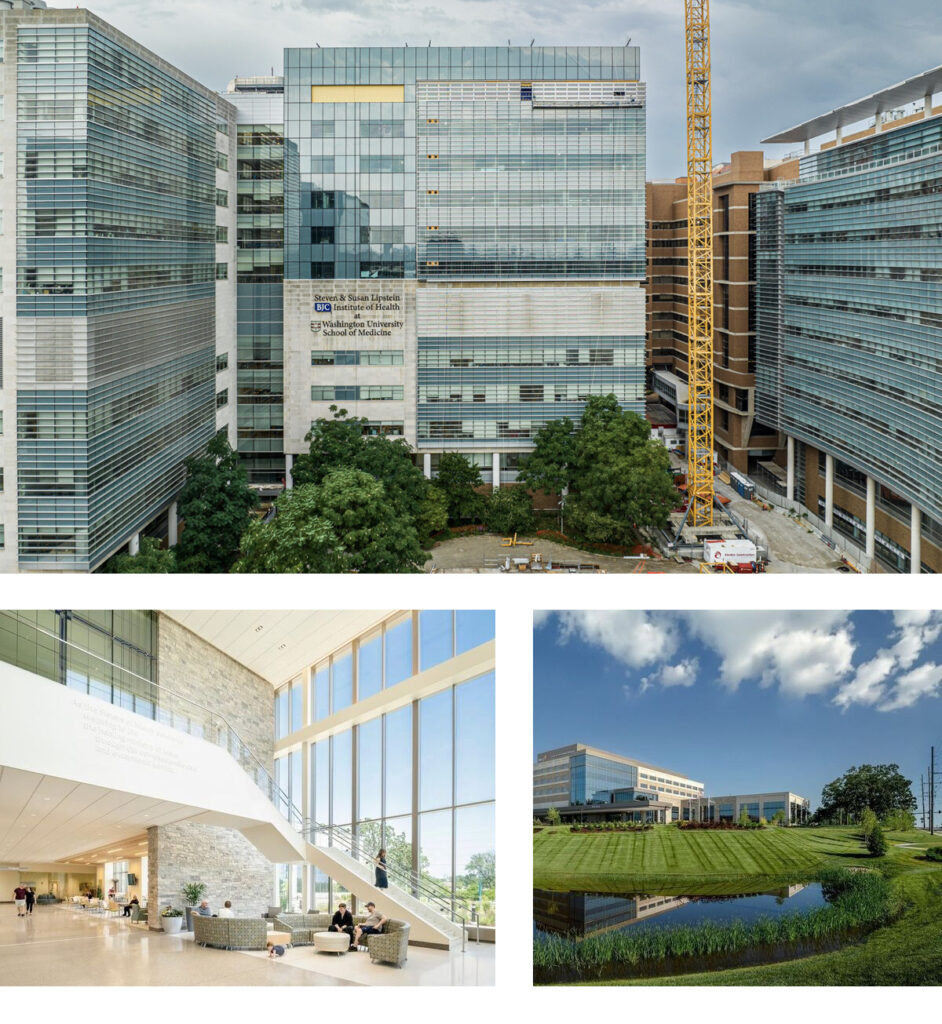
On the firm’s home turf of St. Louis, they’ve led major stadium and hospital projects and gained visibility for their Platinum LEED-certified headquarters (one of the first such buildings in the world when it was built 20 years ago). The building is something of a local landmark, with surrounding natural grasses and a large wind turbine.
However, even though their projects have had (and continue to have) a huge impact on communities in St. Louis and around the country, their corporate culture is exceedingly humble. They’ve been focused on quality, safety and project delivery, but less so on branding, messaging and promoting their amazing work.
As a result, their brand story, marketing collateral, proposals and website didn’t reflect the true nature of the company’s work or culture.
And that’s why they came to Atomicdust: for our Branding Program.
Starting with a foundation.
The essence of effective branding is authenticity.
Anything a brand publishes needs to accurately reflect the company’s values, promises and differentiators. To get a sense of what makes the company tick—and what sets them apart—we had a conversation (actually, a lot of them). We talked to people throughout the organization and uncovered a remarkably consistent story.
We discovered there was significant value in and affinity for their existing brand elements—so we knew their core colors and logo were not going to change. But across the company, their teams knew they needed a brand story that would resonate with both internal and external audiences.
This refined brand story could help them stand out in an increasingly competitive market, both for new projects and employment candidates.
Alberici is a culture-driven organization. People are incredibly important to their success. They rely on process, collaboration and initiative to get things done—and always need more people who are ready to embrace these ideals.
We learned they’re working on some of the biggest, coolest, most complex projects in North America. These are the kinds of projects that often present big timing, logistical or location-driven challenges that other construction companies just aren’t equipped to handle.
They’ll build where others can’t. They take on the kinds of projects that would even scare away other contractors. This made us wonder: should we say, to borrow a phrase, that they’ll boldly go where no one has gone before?
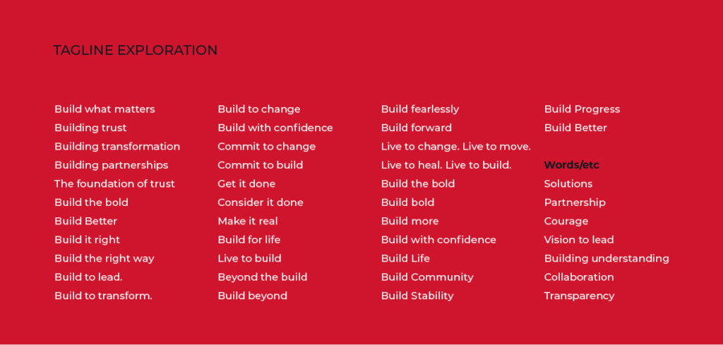
Our clients’ core audiences are always a major part of any brand strategy. And while the challenges are bold, Alberici’s solutions are proven. They’re driven by process, by experience, by expertise. “Bold” isn’t right for their clients. Their clients are looking for certainty.
That’s a fine line to walk, and we walked it for a while. We wrote version after version of the brand narrative. We argued over words and phrases and tone, exploring one extreme and then the other.
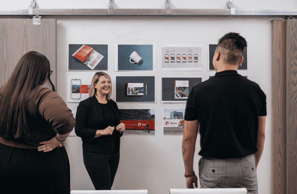
It’s all part of the process for us, though. And once the language was fine-tuned with input from the client, we knew we had captured their true essence in the brand narrative:
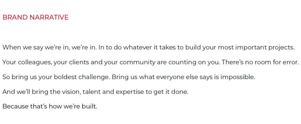
With these words, Alberici makes a bold promise. But it’s one that even their most risk-averse clients can appreciate. Alberici is uniquely qualified to complete some of the most complex and critical projects on the continent.
Sparking a revolutionary evolution.
Going in, we knew we wouldn’t be changing key parts of Alberici’s visual brand. Their iconic red was staying, as was their well-known logo.
But we did have an opportunity to modernize key pieces. To give them new, ownable elements that could bring consistency and sophistication to their communications.
As with the language, we asked ourselves, “How far do we push?” We wanted to ensure the visual brand captured their culture just as well as the language. They’re humble, even understated—and yet incredibly meticulous and sophisticated.
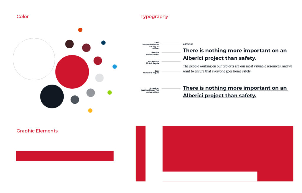
We started our designs with something invisible.
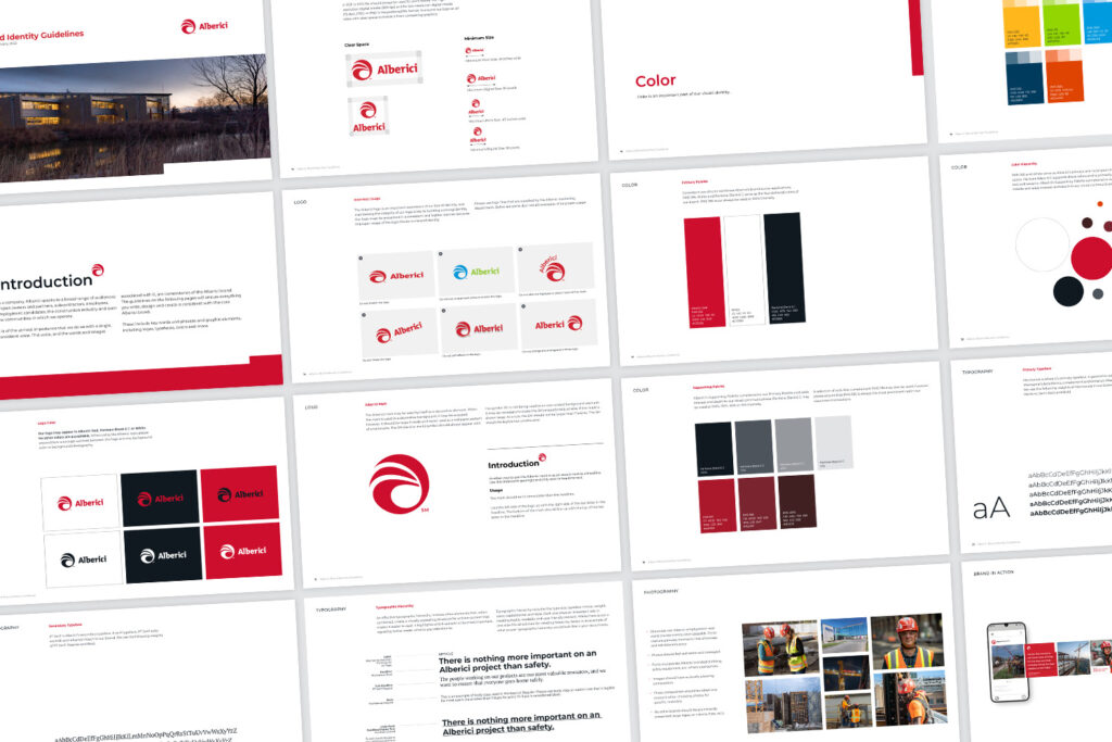
Every design for Alberici is built on a grid. The grid brings immediate structure. Like their own process-driven culture, it shows their precision and attention to detail. It’s subtle, but you’d know if it wasn’t there. You’d miss it.
We did the same with our designs.
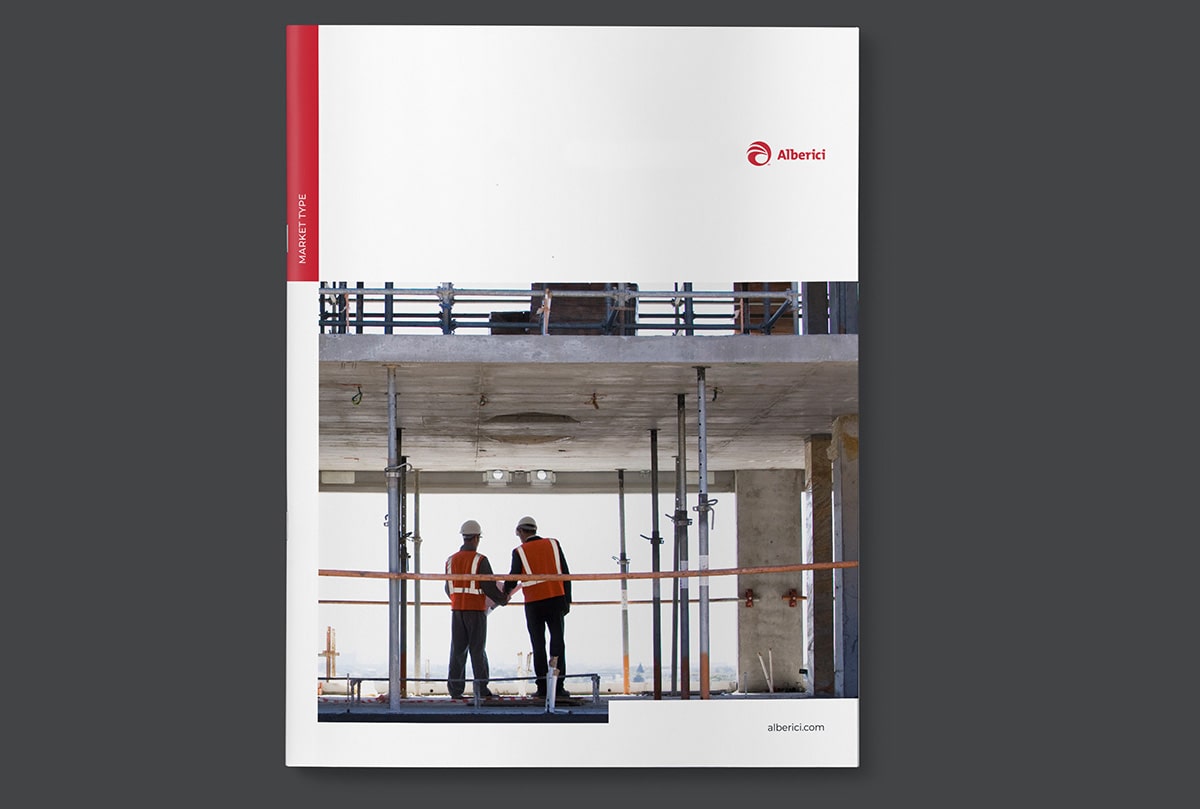
The red bar and unexpected photo cuts are not arbitrary design elements. Like the other pieces of the brand, these are all based on the grid, designed to lead readers through each piece to critical next steps or calls to action.
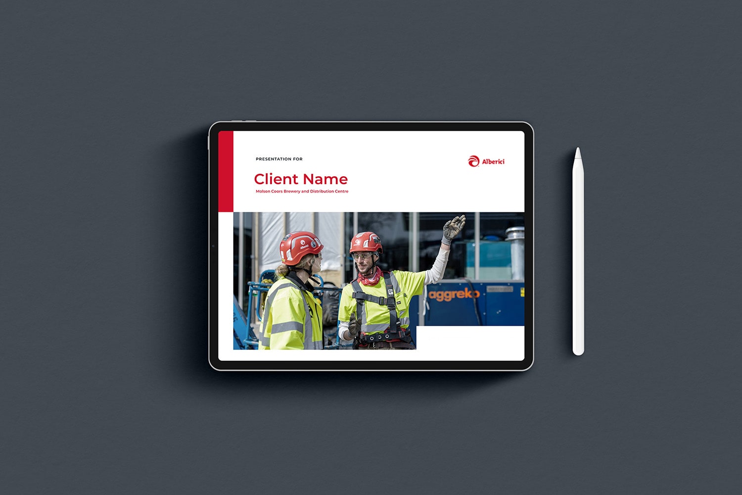
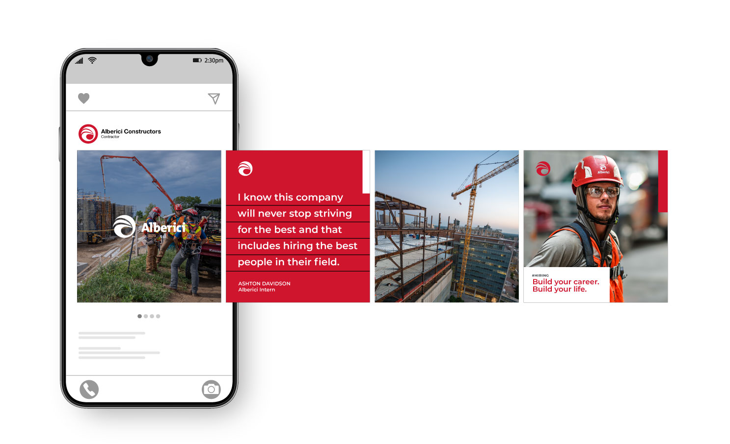
These elements work across print, the web, and even proposals and presentations.
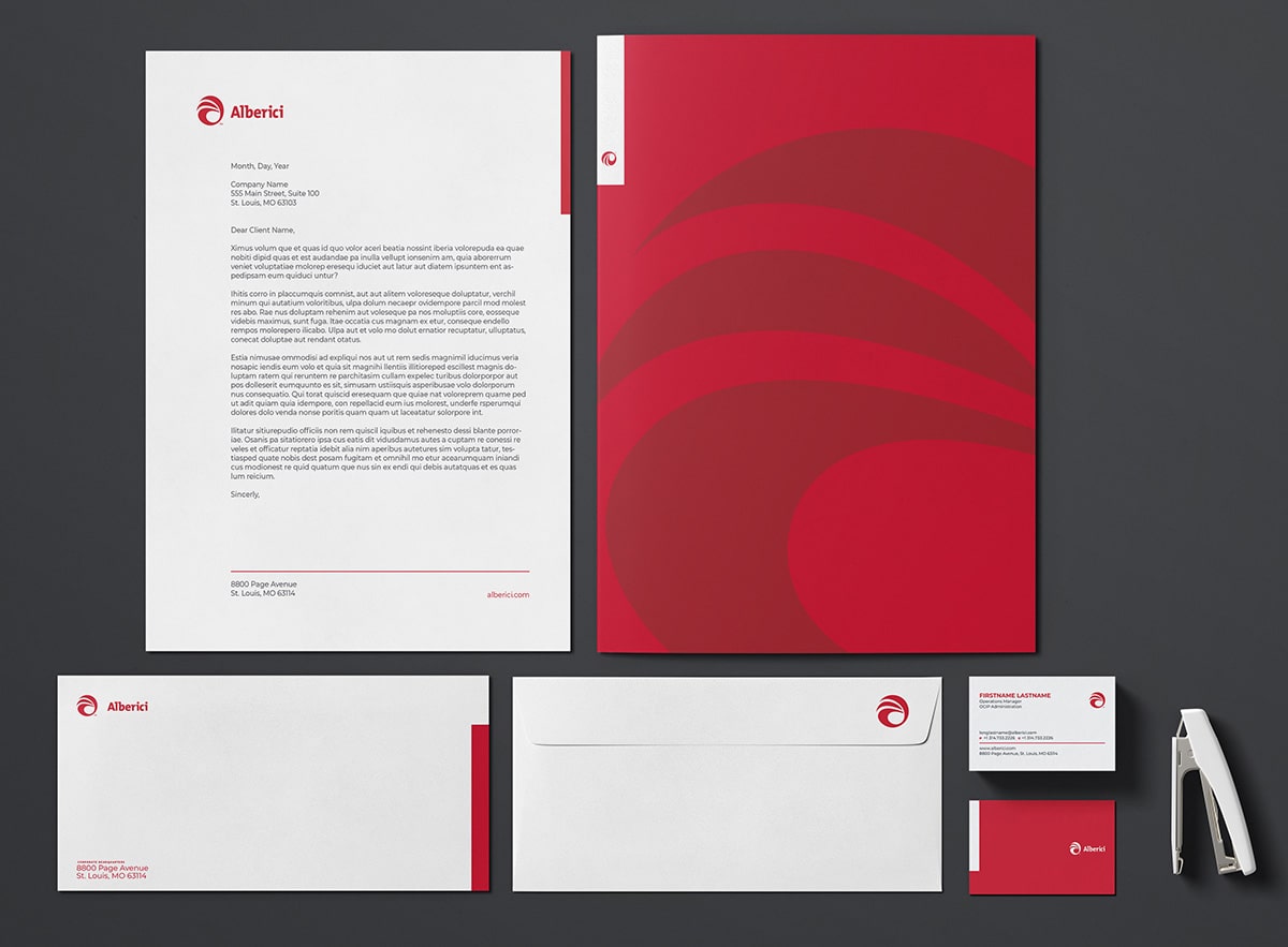
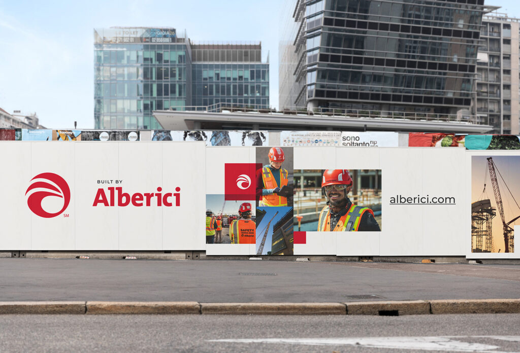
As you can see, we’re also stepping outside the standard construction and design tropes that show beautiful photos of buildings at sunset. Yes, of course, there’s always some of that—but we’re also bringing photos of people to the forefront. It’s all to underscore the very first line of the narrative, “When we say we’re in, we’re in.”
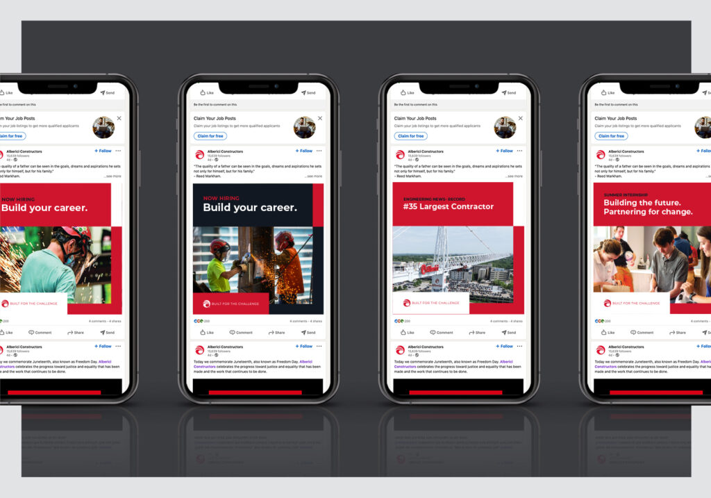
It’s a personal, people-centric promise only Alberici can make, and is a clear demonstration of their new, evolved brand.
Making Alberici’s website the cornerstone of the brand.
The grid played a strong role in the Alberici website, too. Every page is purposefully designed to draw visitors down the page and then lead them to the next section of the site.
Bright, clear photography and videos demonstrate the company’s expertise and the people behind the remarkable structures they build.
And while there’s a lot of content on the site, it never feels overwhelming: each page allows visitors to take in only as much as they need to make a decision—and quickly find a relevant call to action.
Every page calls back, where appropriate, to the core brand promise of being up for the challenge. Project pages follow a simple formula: The Challenge, and Challenge Met.
All in all, the website is a bold foundation for Alberici’s new brand—and it’s designed to be just that: a flexible, adaptable canvas they can use to share their latest projects and innovations.
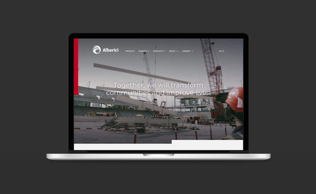
Mobile-friendly and easy to update, the site’s architecture will give Alberici’s team the freedom to continue to show the world that they have the experience and expertise to handle whatever clients bring to them—and the innovative spirit to adapt to the modern world.
All in on bringing Alberici’s brand to life.
Of course, Alberici doesn’t do anything halfway.
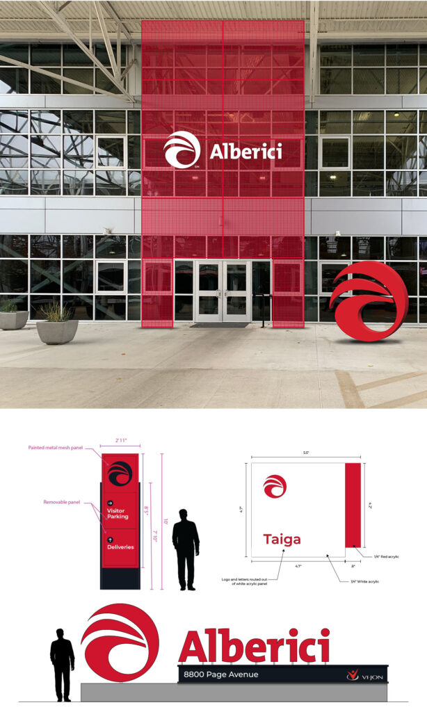
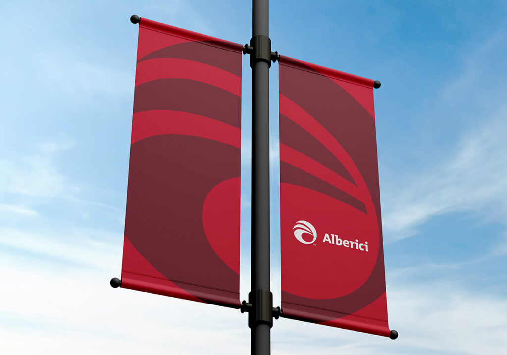
With the refresh complete and the website launched, we’re continuing to work with Alberici to find new ways to incorporate their evolved brand into their business. We’ve even partnered with their team to revamp their office interiors and visitor experiences. See some of our initial concepts.

We can’t wait to see what we can help them build next.
