Accessibility Design Advice from a Color Blind Copywriter
My co-workers and friends tease me all the time about being “color blind.” I make jokes, too. It’s all good-natured ribbing. And thankfully, it’s pretty rare that anyone holds a purple shirt in front of me and asks, “Oh, color blind man, what color is this?”
A former friend of mine did that once. Once.
What people do ask all the time, though, is what it’s like to be color blind. And since I work in the design industry, I thought it might be helpful to share a few insights on making design more accessible. After all, design is all about communication – and communication starts with understanding.
First up, let’s dispel the color blind myth.
Let’s get one thing out of the way right away: “color blindness” is really a misnomer. It sounds like political correctness run amok, but the more accurate term floating around these days is “color vision deficient.” There’s even a fun acronym – CVD.
I’m not going to get into the deep scientific discussion of rods and cones and the various types of color blindness. There’s enough there for an entirely different article, written by someone far smarter than me.
But just for the sake of discussion – I have the most common form of CVD. I’m a “strong Deutan,” which means that the color-sensing part of my eyes – the cones – see too much red, and not enough green. Lucky me.
Of course this form of “red-green” color blindness doesn’t mean only those two colors will cause problems for me. I’m always confusing green and brown, blue and purple, and green and gray.
So what’s it like to be color vision deficient?
Here’s how I’ve described it (and I haven’t seen this description anywhere else): Think about your color vision after twilight. After the “golden hour” when colors are at their best for photos, with the sun below the horizon, colors fade. They’re still there, but it’s harder to tell them apart. Reds, browns and grays seem to blend together even to well-sighted folks.
That’s how I see all of the time. Not the dim part, but the muted part. I still see colors, and based on context I can usually do pretty well with identification. But that’s an educated guess. And discerning hues that are close? Figuring out if those pants match that shirt? Forget it.
What does this have to do with design? Everything.
Think about it this way: the whole point of graphic design is to communicate a message. When you forget how other people might see color (or might not see certain colors), you immediately make it harder for people to see and understand your message. When you use similar tones and color values to deliver a message, rather than just for aesthetic impact, you could be confusing – or losing – a pretty good chunk of your audience.
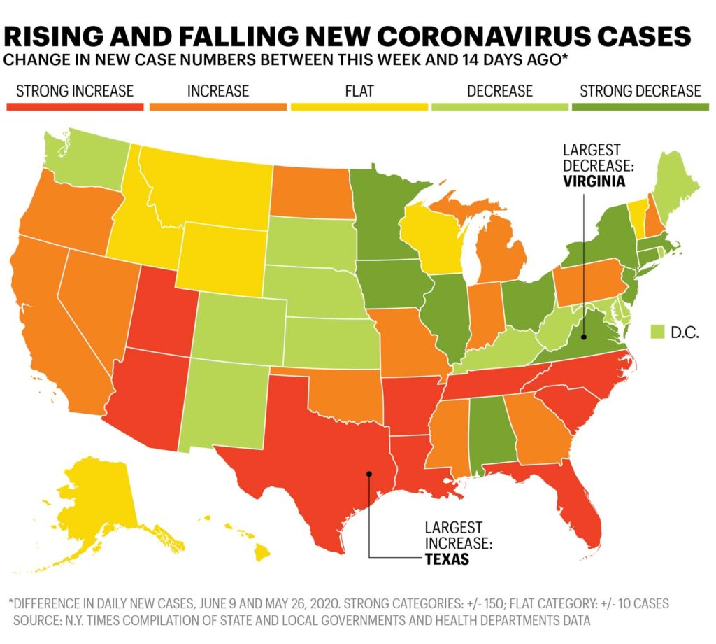
Think about a color map, like the one below, with large swatches of color to show specific data points. These are nearly impossible for folks like me to decipher.

So what are some things you can do to make sure your visual design is accessible as possible – even to people with CVD?
Here are a few places to start.
Think beyond colors.
If you’re using colors to show the difference between data points or to build a hierarchy of information, try not to rely on color alone to tell the story. Give a hint – with size, boldness or brightness – as to what’s more important. Or throw symbols or icons on there to drive the point home. The map above tries – but the colors are too similar for anything to be truly meaningful beyond what’s labeled.
Vary your values.
When your message makes it critical for users to distinguish colors, move toward the brighter hues. And if you can, vary saturation and brightness when possible to separate the colors. Colors with similar values tend to blend.
Use patterns or symbols.
Remember the map example? Let’s think about another pain point for color blind readers. Weather maps. If you can find one, pick up a copy of your local newspaper. There’s a good chance the weather map is printed in black and white.
It’s actually readable!
But look at maps published by your local TV station. They’re probably in full-color. And they’re very hard to read.
Obviously, I understand that using dashes or dots as a distinguishing pattern probably isn’t going to fly in most modern design projects. But the idea here, again, is to think beyond just color to communicate. It doesn’t mean abandoning color altogether… it just means being smarter about how to use it to communicate.
Learn to love contrast.
As you select your color palette, choose hues and values with the most contrast. This is especially true for overlapping elements – such as text on a field of color. What pops right out to a color-sighted person might be a struggle for someone with CVD.
So where do we go from here?
Like any communication challenge, the real answer here is understanding. By simply knowing that other people might not perceive color the same way, and using this knowledge to influence your design process, you’ll already be two steps ahead.
Of course, there are ways to help you see things differently. Photoshop (under View > Proof Setup) has a built-in tool to simulate CVD. But the best way? Just ask someone. Chances are there’s someone in your office or your circle of design reviewers (you know you show your stuff to folks) who is color deficient.
In most cases, it might not be a big deal. But if you’re trying to communicate meaning or show important data, it’s incredibly important.
I’ll leave you with one last thought. Writers are charged with using the right words to talk to the right people, and to avoid phrases that might have different meanings for different audiences. What if we thought about colors in the same way?
What if how someone sees color could change the message they get from your design?
(Weather map makers, I’m looking at you. Don’t make me think it’s going to snow tonight.)


