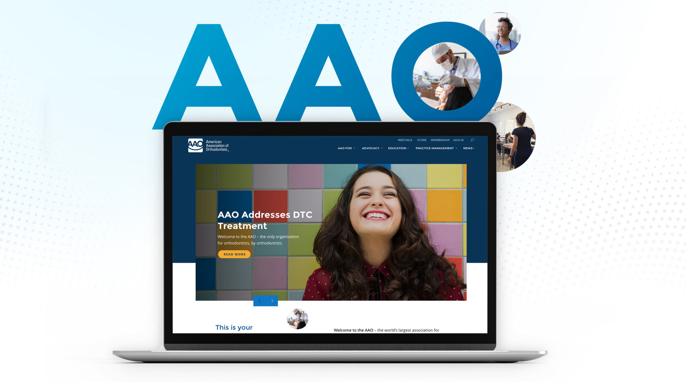
Adding Value to AAO with a Streamlined Website Redesign
It was a dark and stormy morning, just before the world shut down.
No, that’s not deep symbolism or foreshadowing—that’s really how our website redesign project for the American Association of Orthodontists (AAO) began.
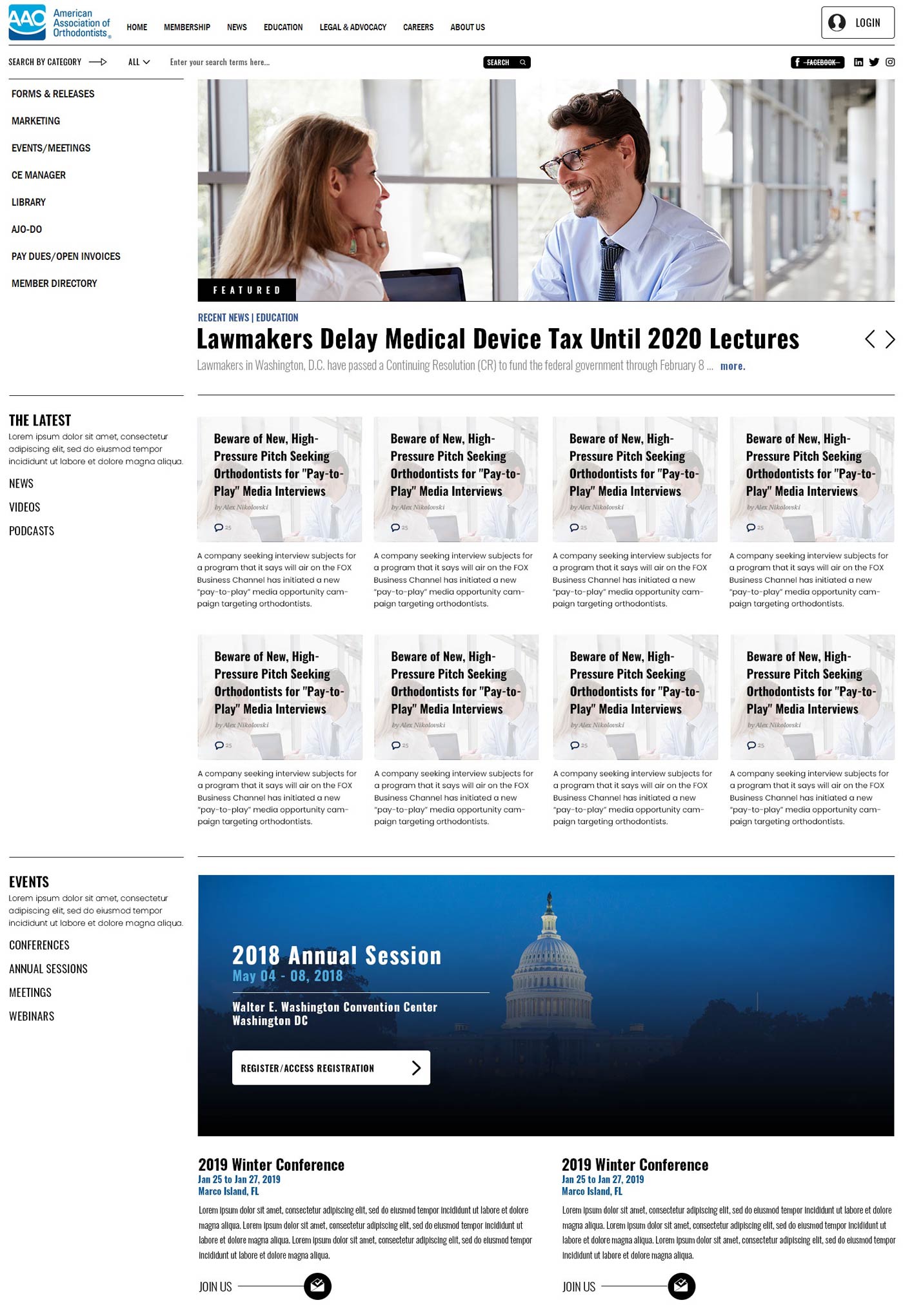
A screenshot of AAO’s old website
We gathered around a large table in their Creve Coeur headquarters to talk about their website, and how we could improve the member experience. It was a massive site that had grown over time, with different stakeholders putting their own stamp on each section.
The result was a site that puzzled its most important audience—AAO members. The site serves as AAO’s primary connection with members, helping them find continuing education, practice management, staff development and other resources.
Unfortunately, the site’s inconsistent structure had members clogging AAO’s phone and chat lines as they searched for information. As a result, the association was getting low member engagement on all but the highest-profile efforts. Meetings and events were doing great, but other valuable benefits—like education, leadership opportunities and more—were struggling.
The site’s structure was leading to real consequences: perception of the value of an AAO membership was slipping, particularly among younger members.
Their charge to us was to help reverse this trend with a website redesign. If we could make the site more useful and usable, if we could make its content more accessible, we could help members discover the true value of the AAO to their careers, their orthodontic practices, and their lives.
Challenge accepted.
Making the user experience personal—or not?
It would be a great story to say that, as we walked out of the meeting, the skies parted, the sun shone, and we knew had a clear path forward. Instead, we dodged raindrops, went to lunch, and talked about what lay ahead. This was going to be a doozy.
The week or so that followed brought huge changes to how we worked and lived, as the pandemic took over the world—but the site must go on! We held multiple virtual whiteboard sessions to get the ball rolling on the website redesign strategy.
Our initial idea was to structure the site’s redesign around users, rather than traditional buckets of information. What better way to make a site (and an association) feel “valuable” than to deliver customized experiences?
Gold! Cut and print! It can’t fail! Let’s start writing, designing and developing right now!
Well, not so fast. After some lengthy conversations with the client, we discovered this website redesign approach wasn’t going to work after all. There’s too much overlapping content. It would make for an even more confusing experience, say, for staff members (one persona) who might be looking for something on behalf of their employer (a practicing orthodontist, another persona).
We still believed in the idea of having role-specific pages or sections of the website—but knew we needed to build a traditional website content structure around things like education, practice management and advocacy.
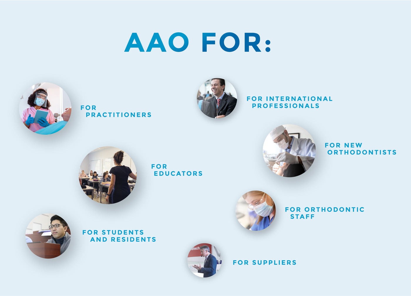
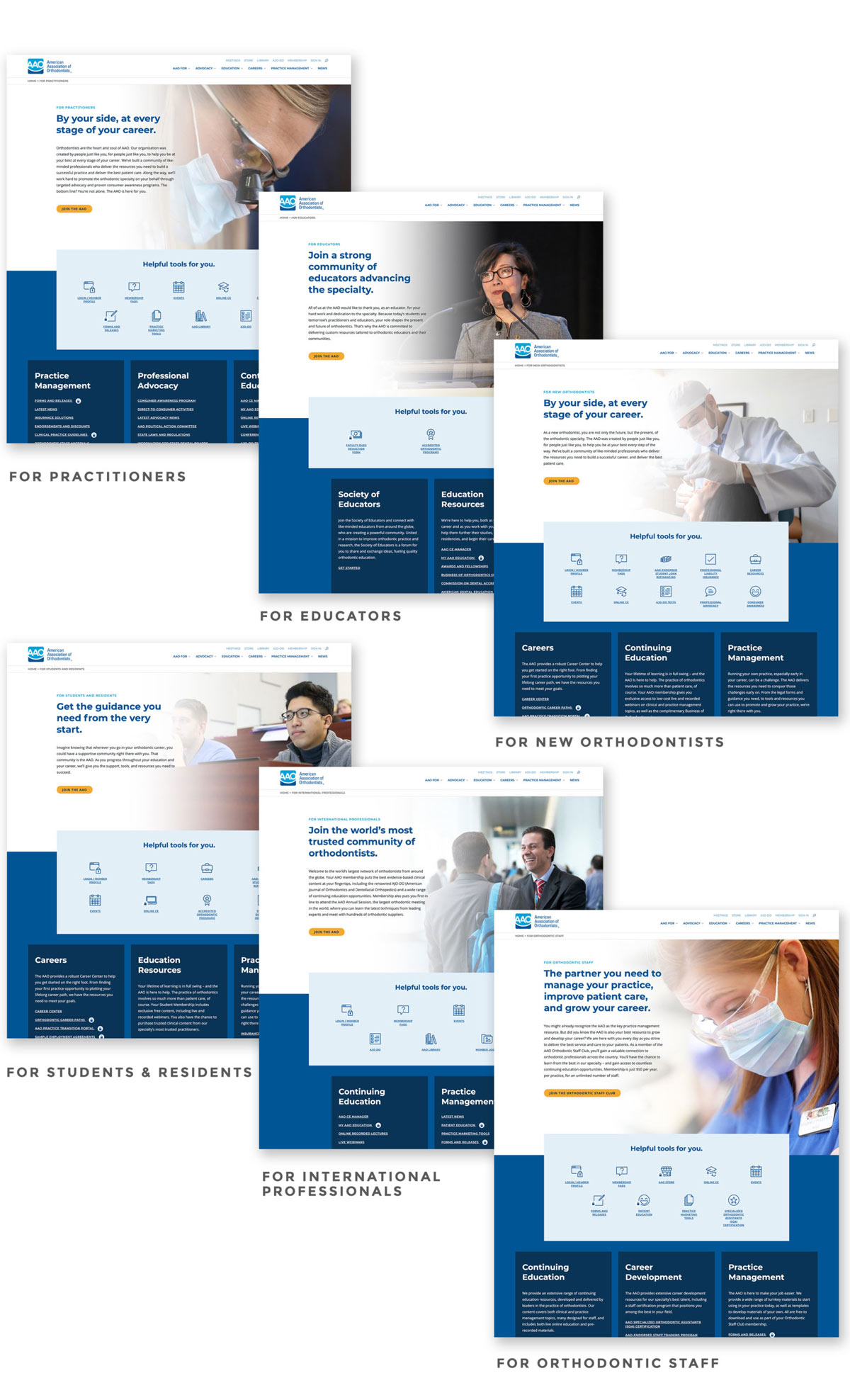
Our solution was to create persona-specific pages under the heading of “AAO FOR.” This lets us explicitly show the value AAO delivers for the wide range of people who work in orthodontics while still making it easy for anyone to find what they need in the main navigation.
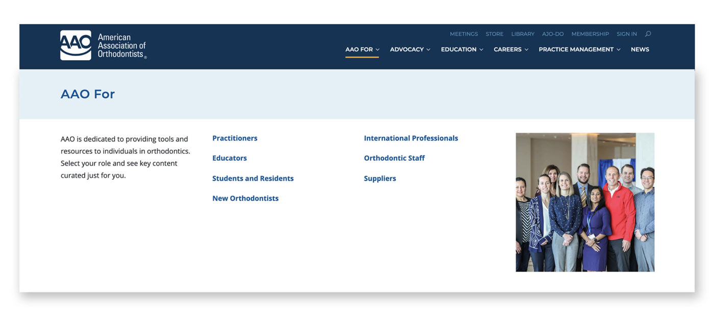
It’s also infinitely flexible: as the team at AAO looks to target different audiences, they can simply add a new page. And they did, with a page for new orthodontists, added midway through the design process. Our solution was working.
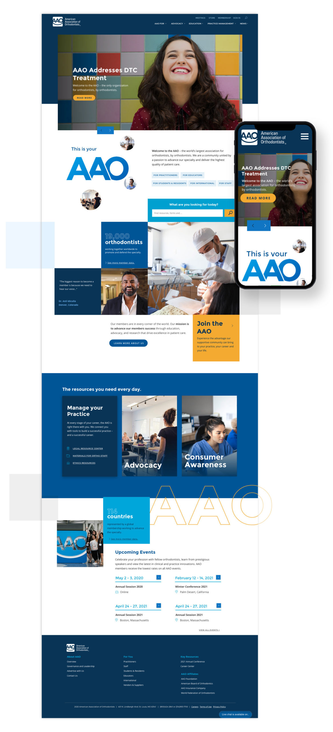
A website redesign strategy with maximum value.
Websites for medical and professional associations are notoriously complex. Designed to attract new members and provide value to existing members, they’re often a maze of login-protected information and demonstrations of benefits for non-members.
The AAO website redesign project was no exception. Our team worked closely with the client and brainstormed internally to uncover exactly what pieces of content needed to come to the new site and whether they needed to be restricted to members-only access.
We asked ourselves: how do we add value to members’ experience on the site? It’s all about improving the experience for users, and that means getting members the information they need quickly.
The entire site is built around this goal.
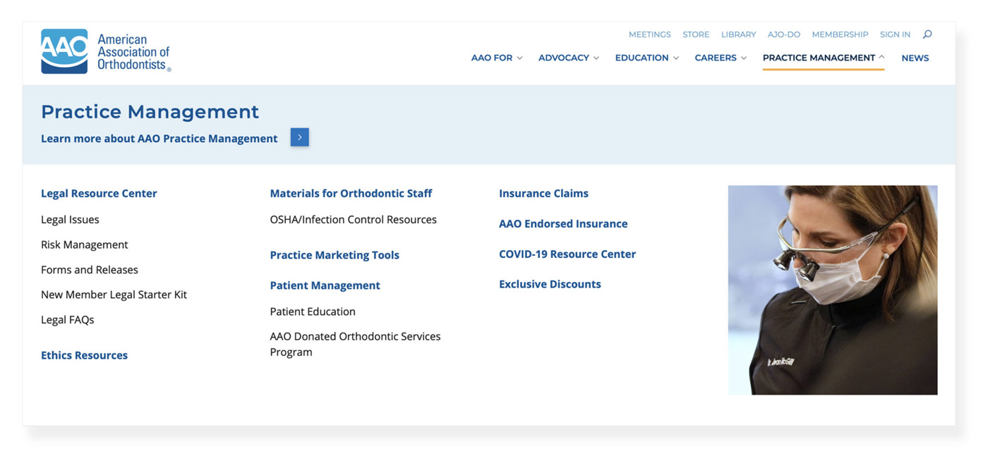
For example, we lead visitors to most-used links here in the dropdown, but also invite them to explore further for other information. It’s a natural, intuitive way to design a website.
Under “Helpful tools for you,” we’ve prioritized the most-used or most-requested content, and identified them with a padlock for those member-exclusive features.
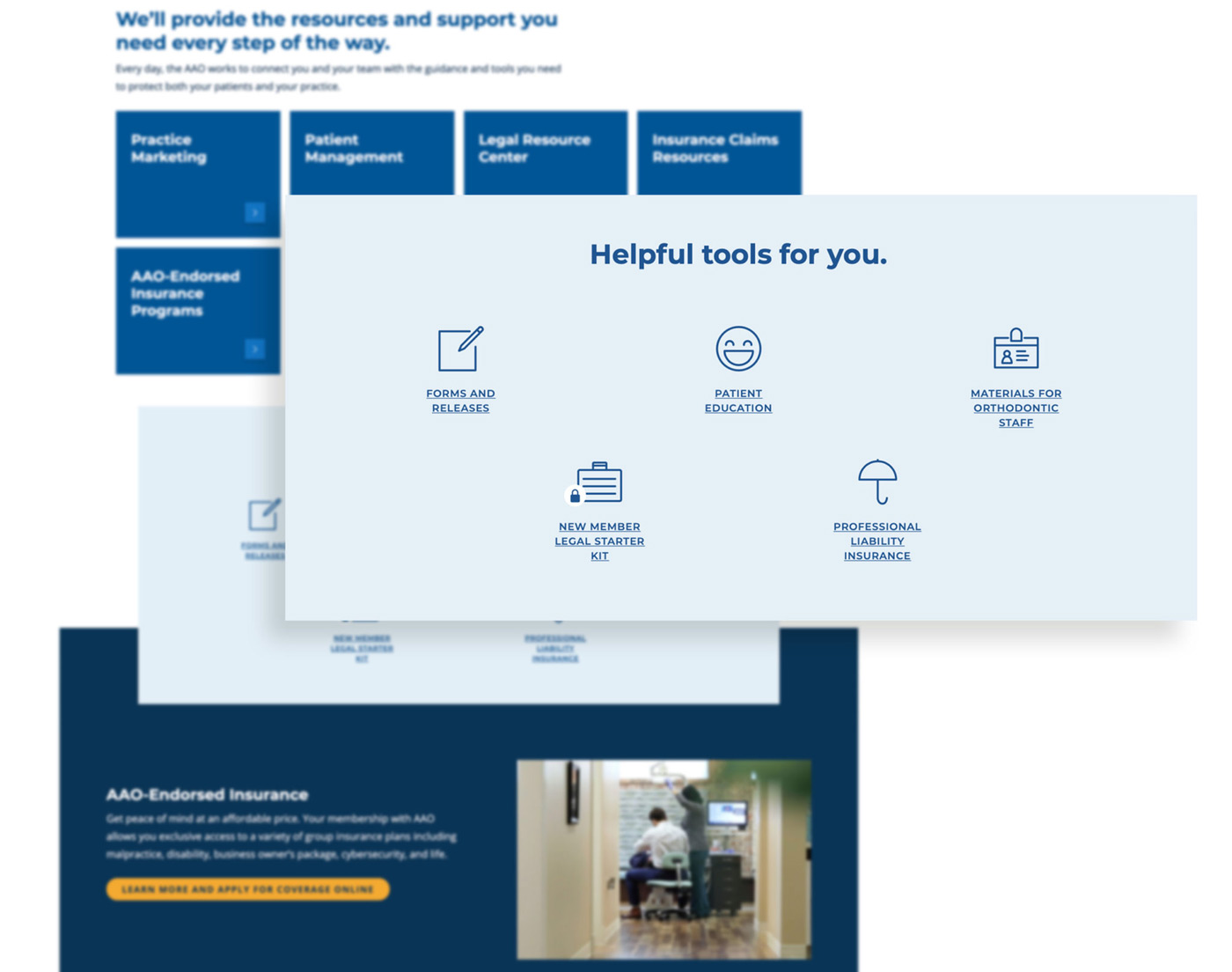
There’s real value in repeatability and consistency—so even as users get deep into the site (and the site does go pretty deep), they’ll know what to expect. Familiar messaging and design elements guide the experience, making content- and download-heavy pages feel more substantial and valuable to the target audience than just a list of links.
Full disclosure: with so much content, and so many paths throughout the site, it’s inevitable that someone’s going to get lost at some point (maybe even us, and we built it). We solved this issue—and aimed to reduce AAO’s call volume—with a robust search functionality.
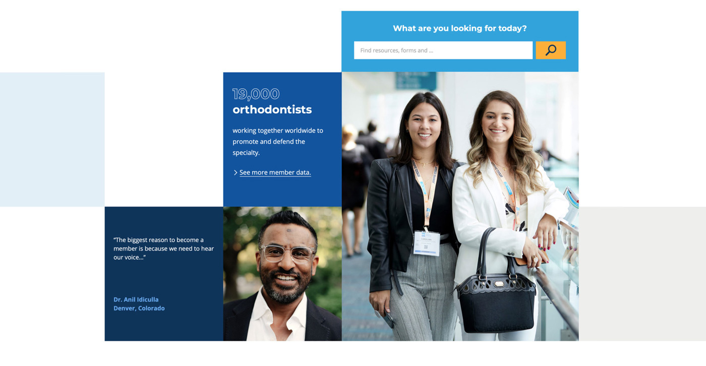
Developing value on the site, block by block.
The modular nature of the site’s design streamlined the development process, even with the 100+ essentially custom pages and page templates.
This block-based approach adds value to the client experience, too. Their team is well-versed in WordPress, so they’re able to build out new custom pages and content with little or no code.
But the question was always in the back of our minds: with so much information and so many audiences, how do we make sure people are only seeing the content that’s right for them?
The answer: a custom login for AAO’s new single sign-on functionality.
In essence, the site allows AAO to display different content to members and non-members. We can hide or control access to pages, blocks, even individual links within pages. Calls to action change depending on whether or not users are logged in.

It wasn’t the personalized experience we had initially envisioned for the redesign—it was better.
Taking care of business.
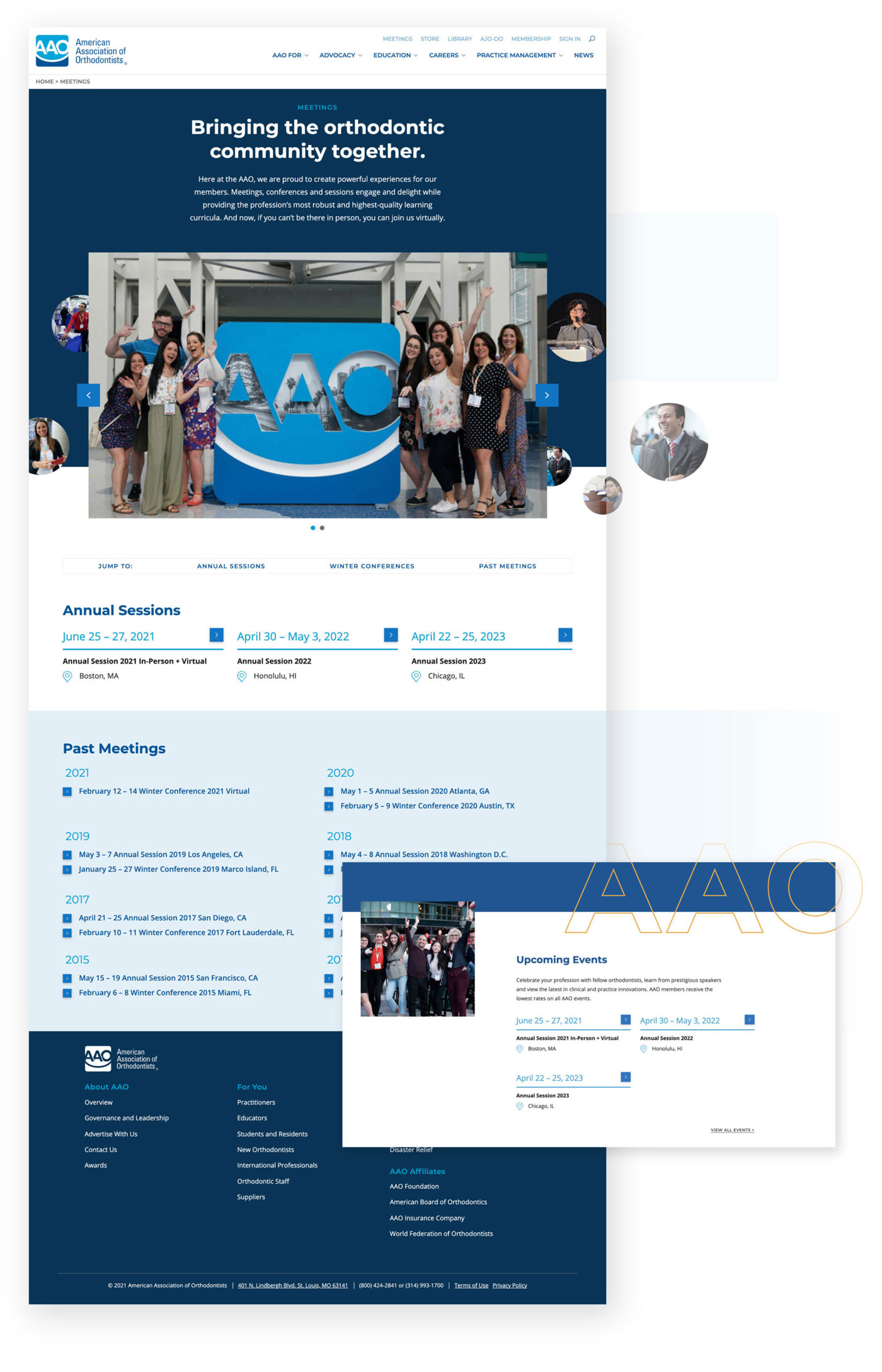
Even amidst the pandemic—perhaps even more so because of it—meetings and events are a huge part of the AAO experience. They are often the “entry point” for new members to join the association. While most of the events have separate microsites, these sites are packed with content about presentations, awards and more—so they had to be accessible.
We baked in a lot of functionality to make managing these events easier than ever for the AAO team. Links to upcoming and past events have prominent locations throughout the site. Once events are over, they automatically move to the “Past events,” sections. The folks from AAO don’t have to lift a finger.
Delivering content is one thing, but making it easier for users to interact with that content (and even submit their own information and requests) was quite another. Their site has a wide variety of forms—from requesting materials from their extensive library to award submissions and more.
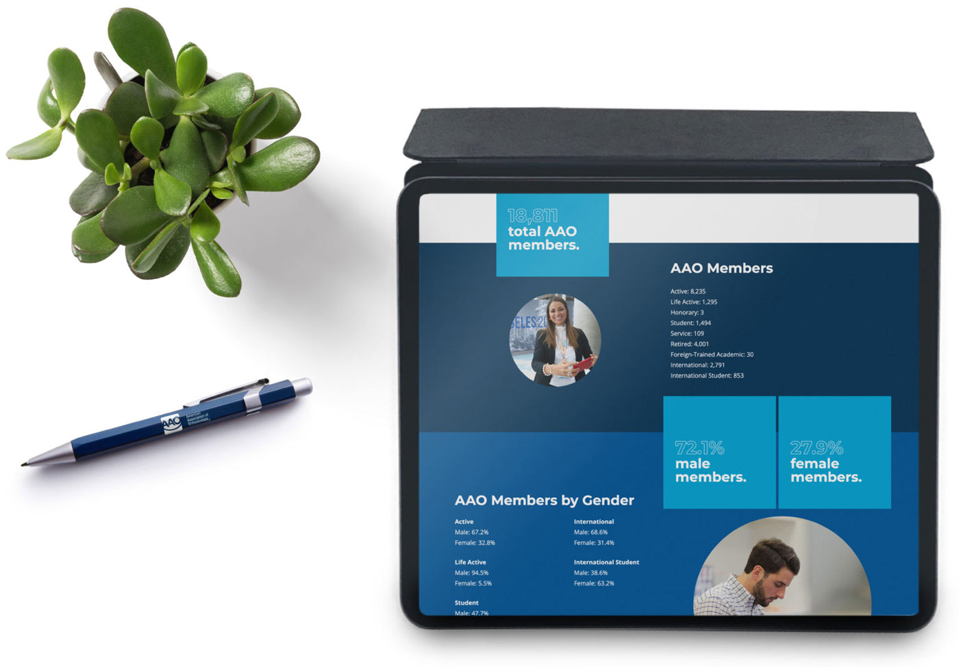
Most of the forms are long and involve multiple steps, or require document attachments. From strategy to design to microcopy to coding, our goal was to make the visitor experience (and the back-end management) as seamless as possible.

Delivering the value story.
On every page, with every link, the AAO’s website redesign now delivers a clean, cohesive experience—and clearly communicates the value AAO membership brings to orthodontists and their staff. We’ve had great feedback from their team so far, and are working on another website project to promote some of their newest initiatives. To us, that’s the biggest compliment we can receive.
To see the AAO value story in action, visit their new website.
