Relaunching a Local Favorite: Gerard Craft’s Porano
They say “All good things must come to an end.”
And maybe that’s true.
But I’d argue “All great things must come back.”
At least that’s the case for Porano, one of our team’s all-time favorite projects. Almost a decade ago, Atomicdust helped James Beard Award-winning chef Gerard Craft bring his talent for Italian to the fast casual restaurant realm, designing the brand identity and environmental branding for Porano in downtown St. Louis.
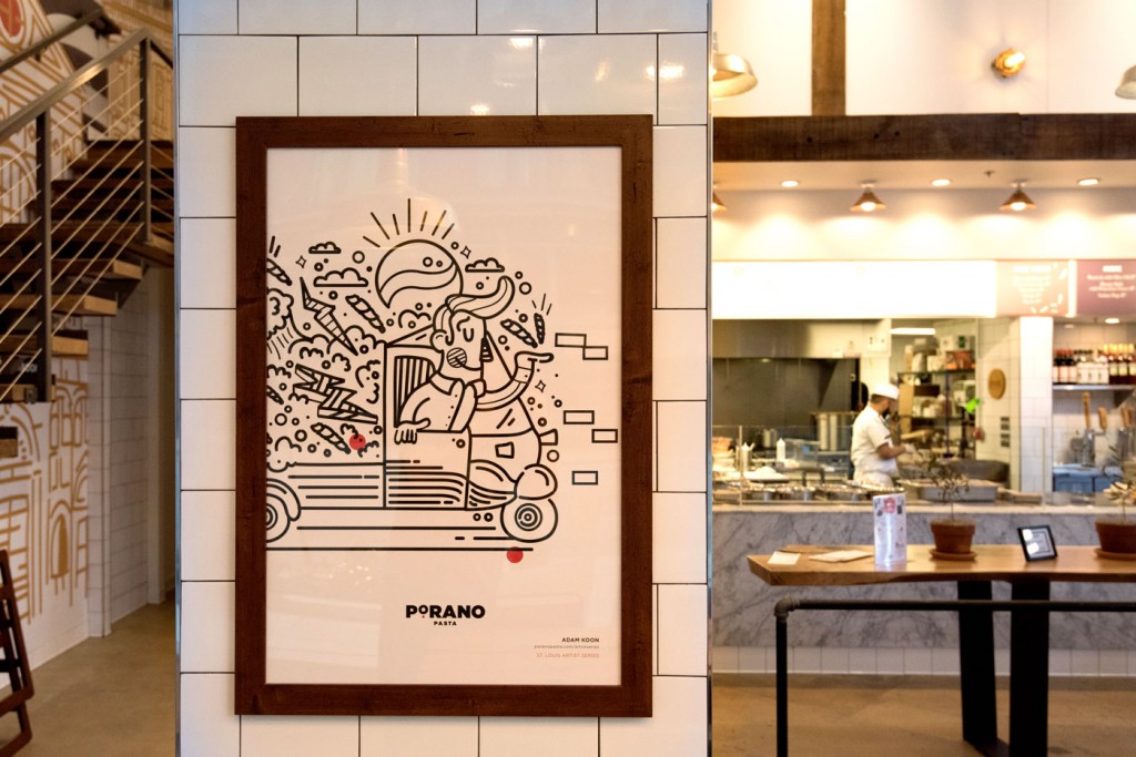

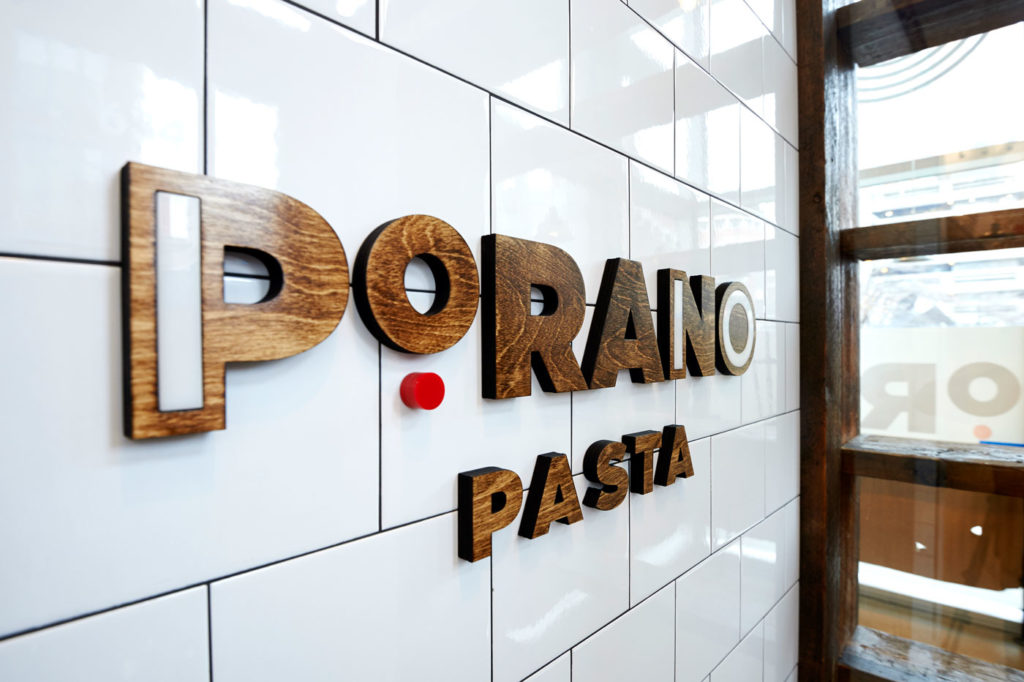
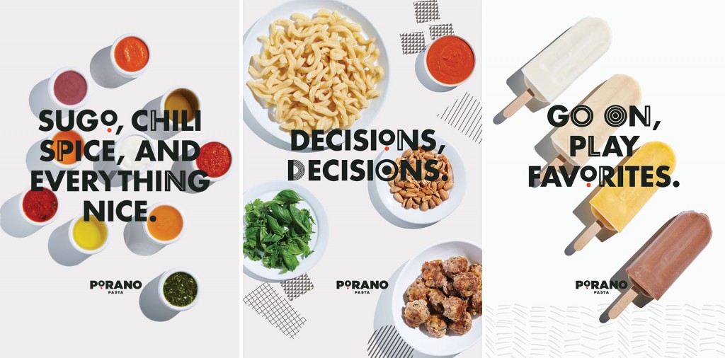
Above, brand elements inside the original Porano location
Porano earned rave reviews, and diners loved the format: customizable pastas and pizzas prepared via assembly line, using fresh ingredients and Gerard’s delicious recipes.
Then, after two and a half years, Porano closed, citing a lack of parking and irregular foot traffic around the location.
We were sad, of course, and not only because we’d lost a great place to grab lunch. Luckily, Gerard quickly enlisted us to develop the brand for his next acclaimed concept. After a while, Porano became a great memory and a really cool brand we were proud to have made.
Fast forward to late last year.
Same concept, new location
We’d always known Gerard had wanted to bring back Porano, which made perfect sense. The idea behind Porano was great; the original location just wasn’t right.
So when we heard they’d found a new home for Porano, news traveled fast through the team. I think some of us started planning our first order that same day.
But a few things had to happen first.
Even after nine years, the original restaurant brand identity we’d created still felt fresh. So the team took the already established brand and found ways to remix it for Porano’s new home.

Just like in the original, we wanted the brand to come alive in the physical space. The Porano name celebrates a city in Italy that inspired Gerard to shape his signature culinary approach. Blending illustrations inspired by children’s books overlaid with iconic images of St. Louis and an abstracted map of Porano, Italy, we brought that same whimsical feel to the interiors.
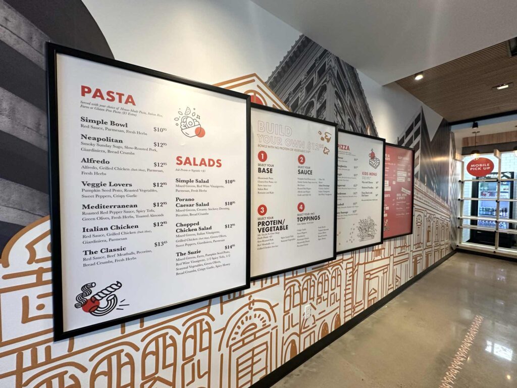
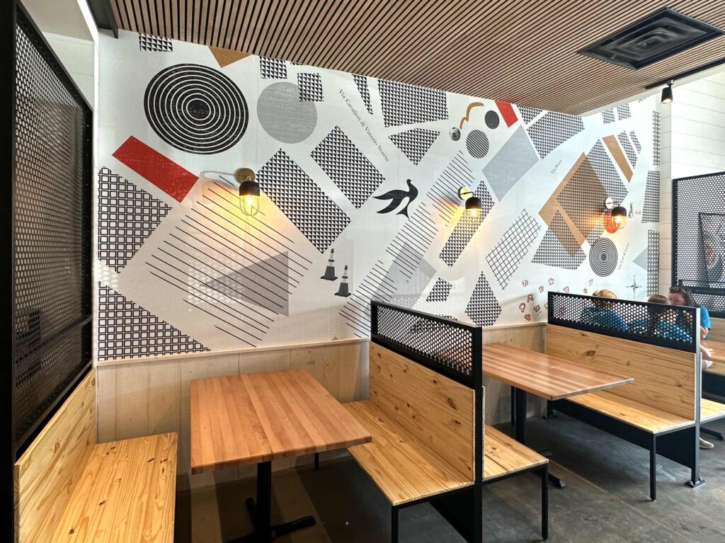
Bold, mostly black-and-white patterns span the walls, with pops of the brand’s trademark red and pasta-like gold. Even the windows are branded, with a visual system that can be updated as the seasons or promotions change.
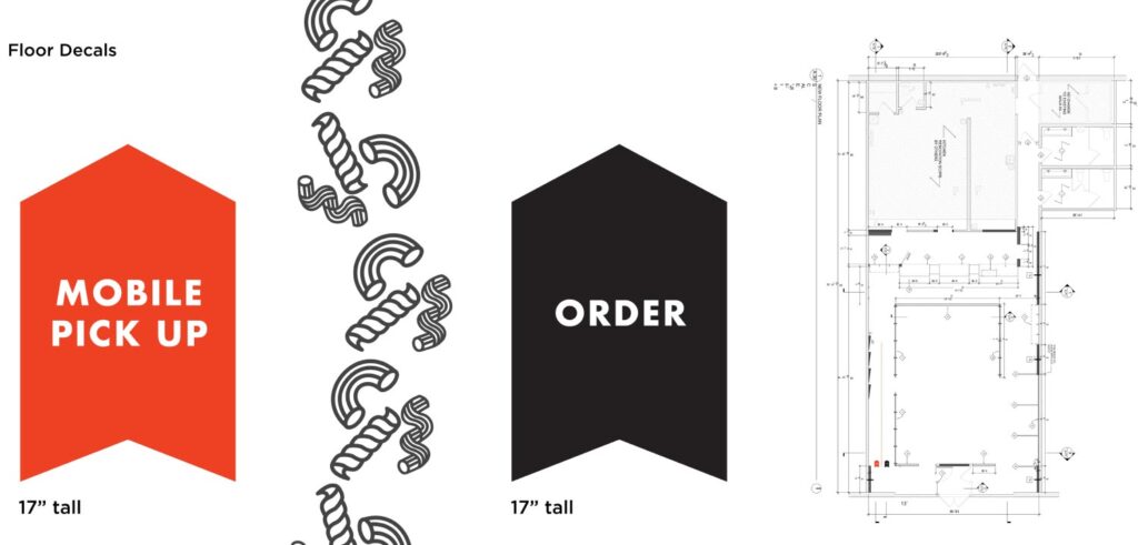
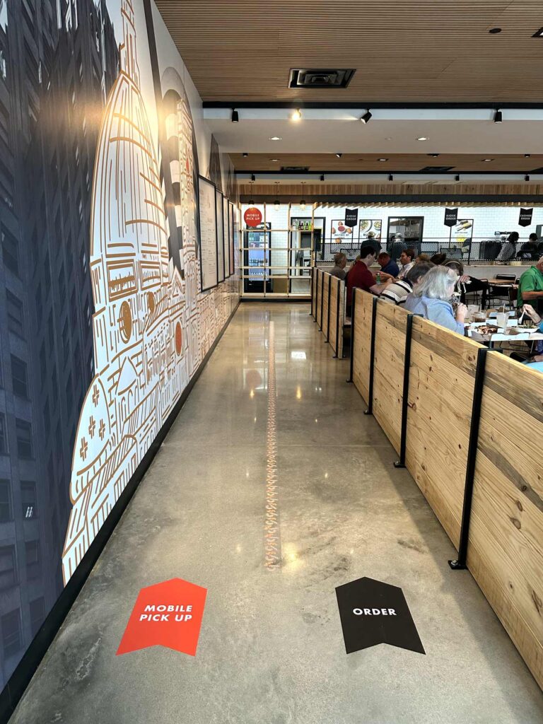
Less visually obvious, but just as important, was our focus on the flow of the restaurant, which can make or break the dining experience. We collaborated with the Porano team to establish wayfinding, designing signage that clearly conveys ordering instructions and guides diners to kiosk ordering and mobile pickup stations. Meanwhile, noodle-themed floor decals direct traffic.
A new trio of icons quickly explain the menu’s main options: pizza, pasta and salad.
![]()
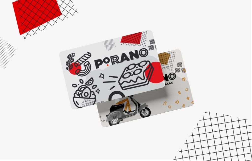
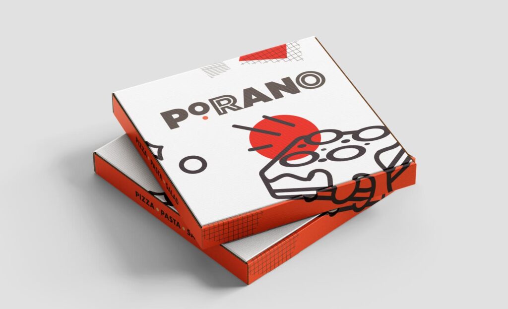
And gift cards and pizza boxes also got a new look.
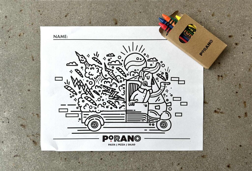
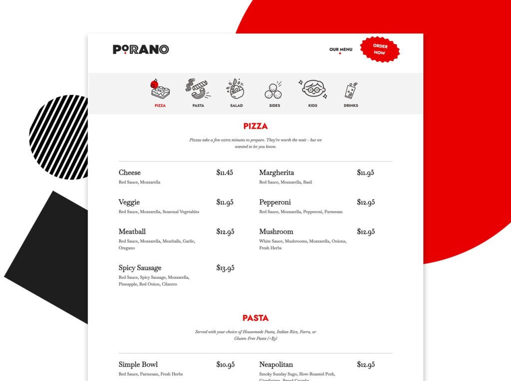
Of course, a restaurant experience often starts long before someone steps inside (anyone else dissect a restaurant’s menu online to plan what they’re going to order days before hitting up a new spot??) So we built a simple new website that serves up all the important info while incorporating a few fun elements of surprise and delight.
After months of buzz and a few pop-ups around town, Porano re-opened to well-deserved acclaim—with several of our team members there to celebrate.
To quote Atomicdust Partner and Creative Director Mike Spakowski, the first few bites were “like tasting a really great memory.”

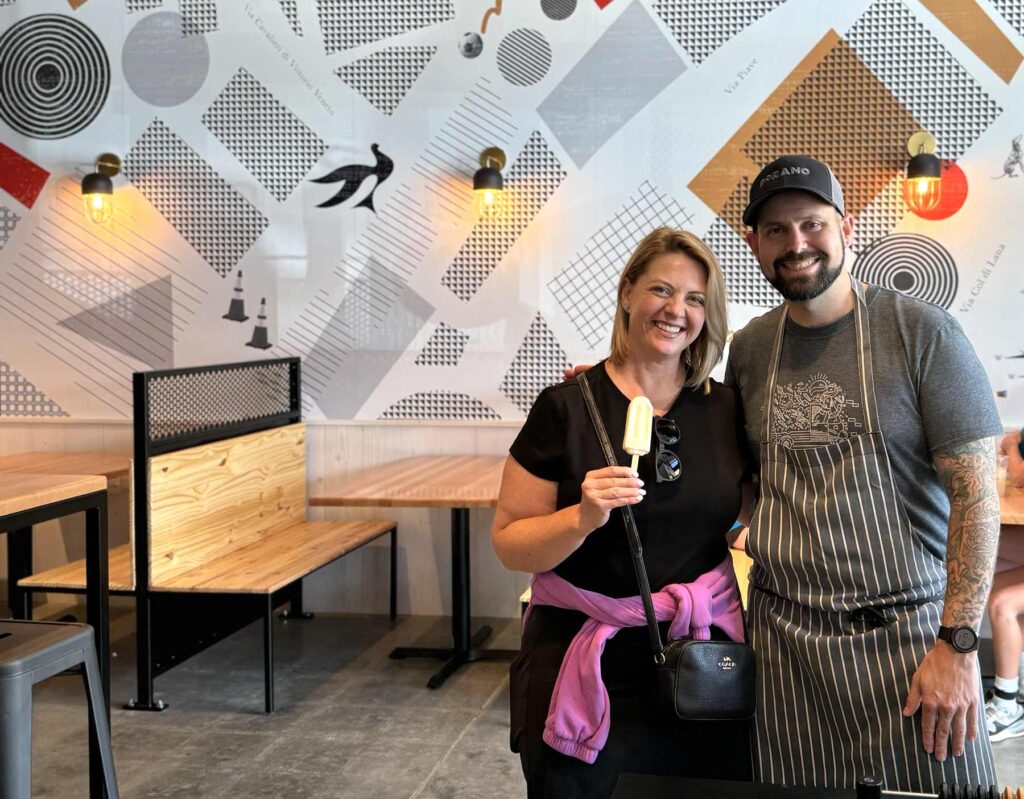
Above, Director of Brand Strategy Erika Cruse with Gerard Craft, owner of Porano and Niche Food Group
We’re always grateful to work with Gerard and his talented team, and loved getting to revisit an old project. Congrats to the folks behind Porano, and make sure to stop by the new location soon for a bite.

