Website Design
Connectria
A global technology solutions provider, Connectria helps businesses manage and modernize their tech. The company offers a wide range of services—from cloud migration and IBM power systems to 24/7 security operations.
A global technology solutions provider, Connectria helps businesses manage and modernize their tech. The company offers a wide range of services—from cloud migration and IBM power systems to 24/7 security operations.
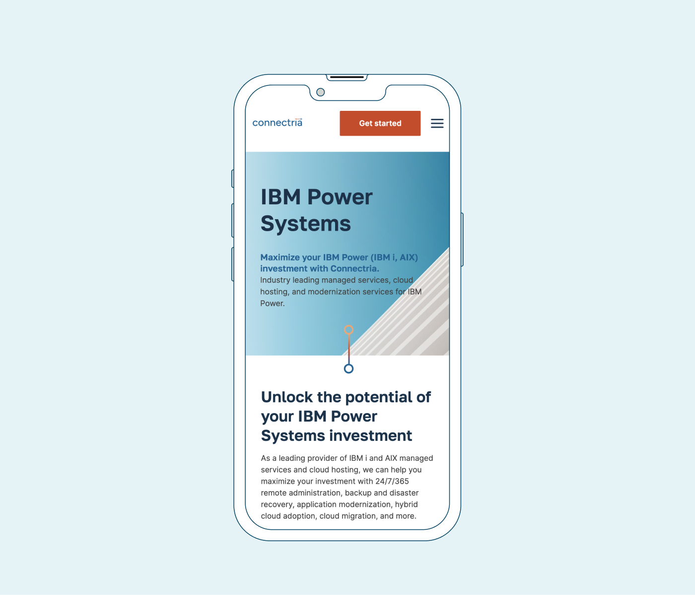
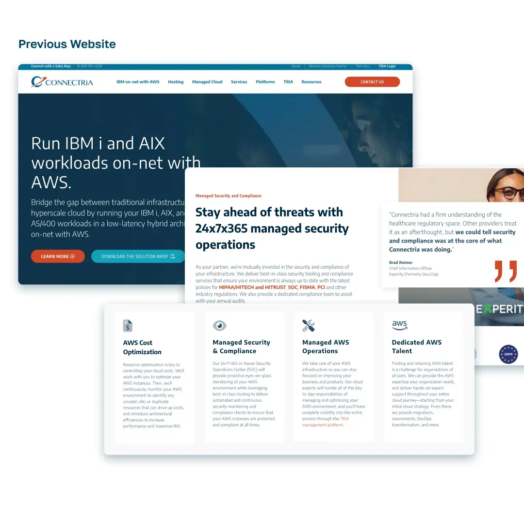
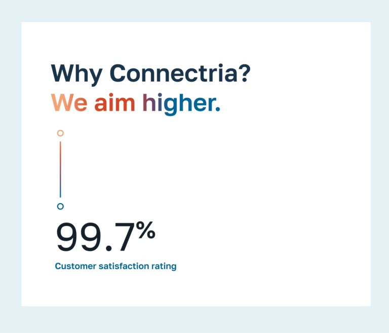
Connectria helps clients streamline their data and optimize tech stacks, but the company’s website was cluttered and needed a refresh. With a robust service offering, Connectria’s site was overloaded with pages of pertinent, yet text-heavy paragraphs—lacking the visual variety needed to be digestible and compelling.
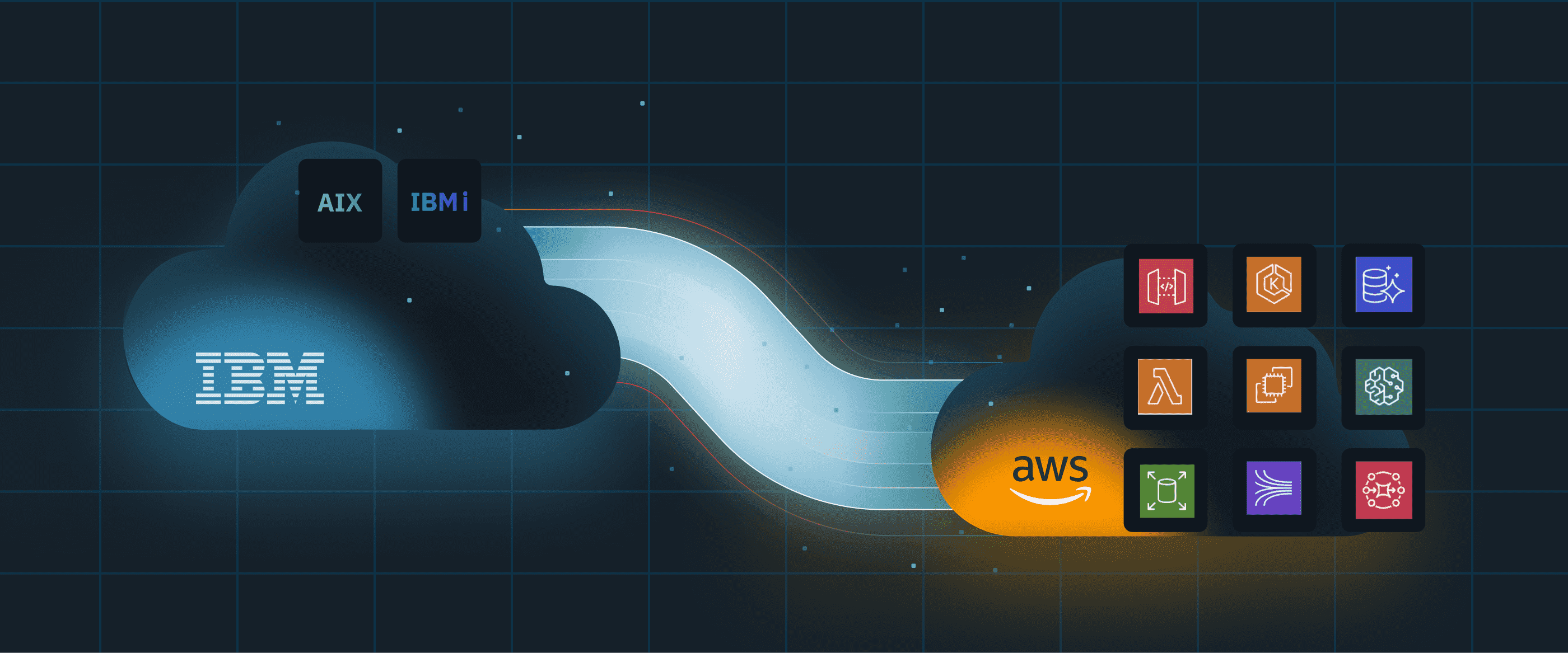
The theme throughout the site was connection—bridging the past and future of data and tech management. A series of animated graphics uses lines and dots to represent each of Connectria’s services, while also symbolizing how the company strengthens the connection between its clients, their data and reaching their goals.

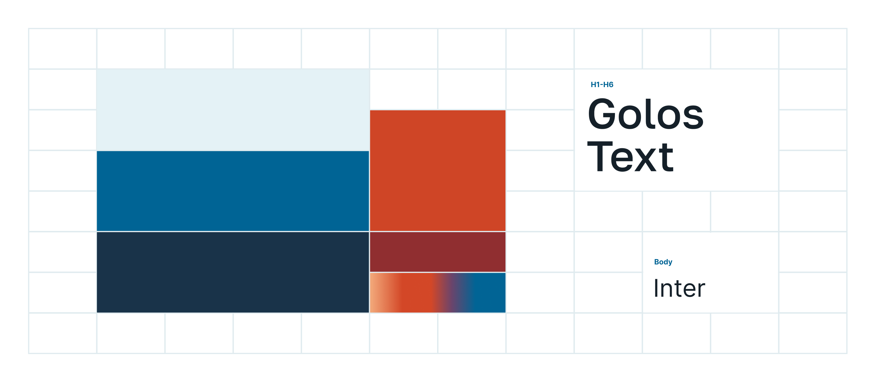

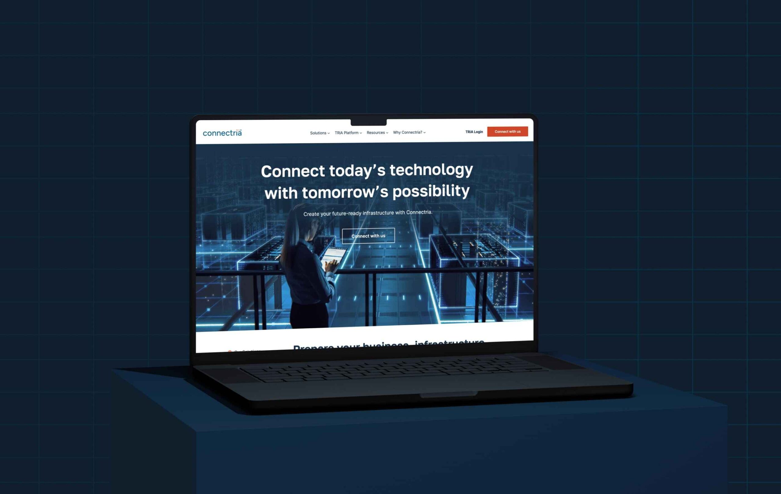
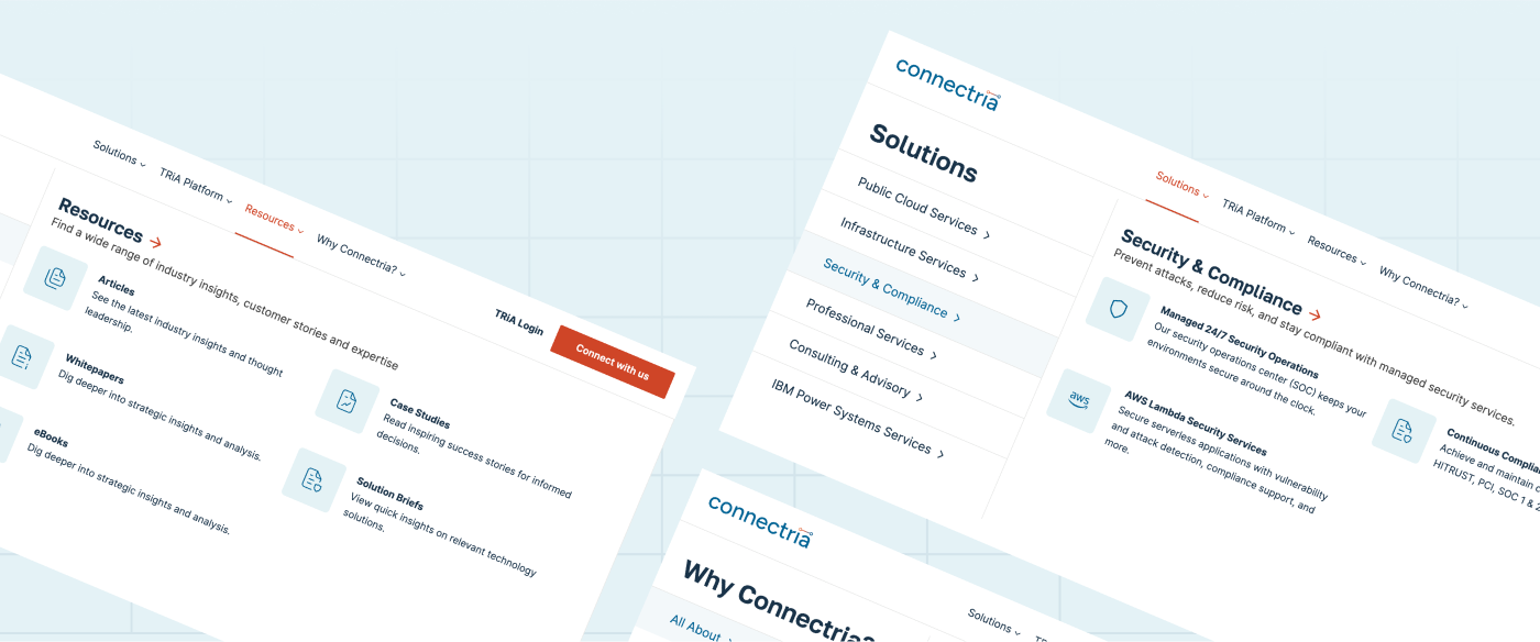
The new website needed to be easy to navigate and effectively convey how partnering with Connectria helps companies leverage technology to both better serve their clients and dominate their competition. We considered how users would interact with the new site, and categorized services in the mega menu to make sections easier to find.
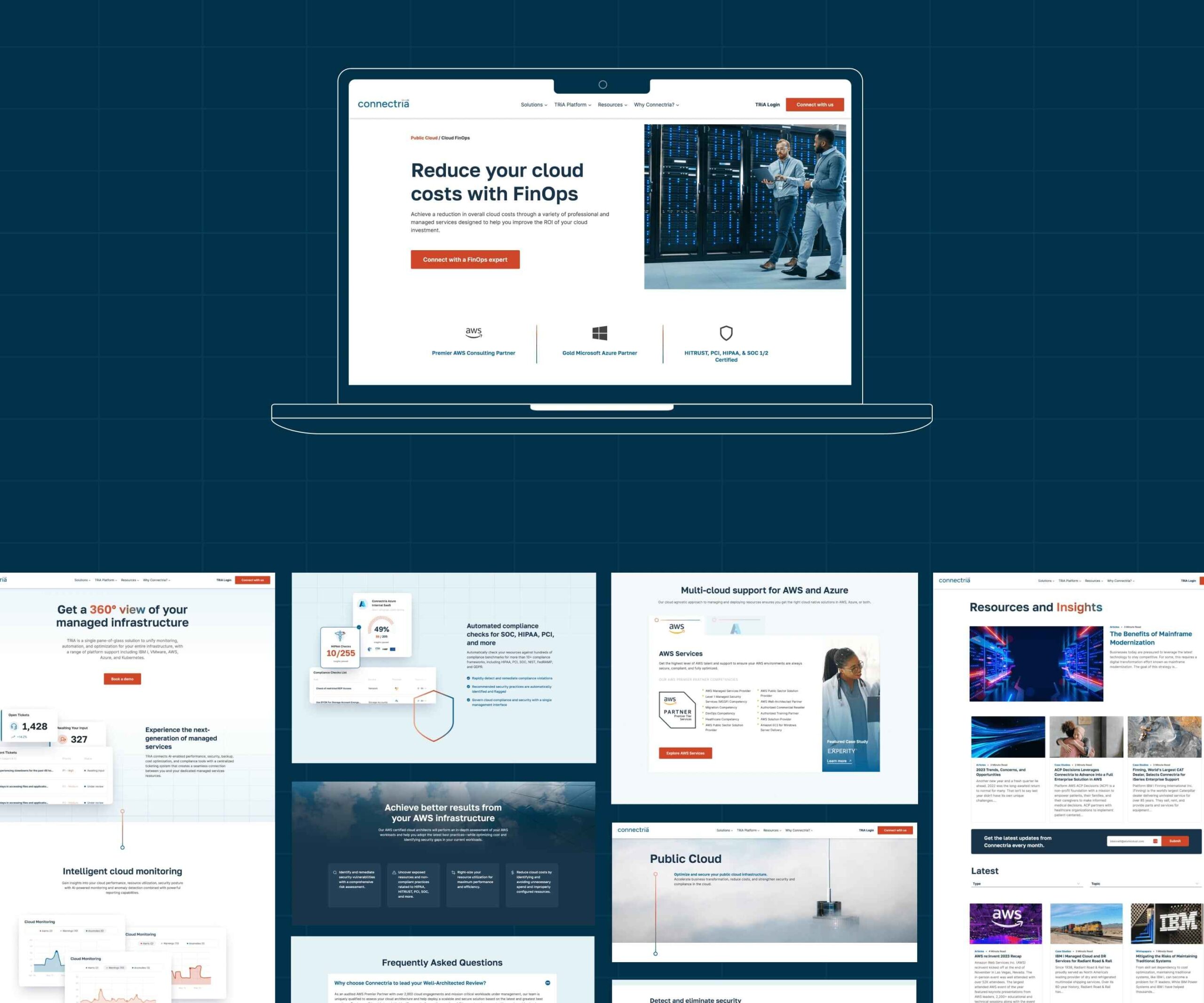
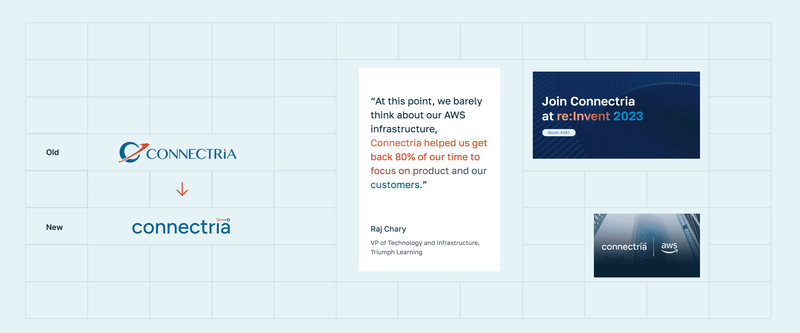
Connectria’s new site is future-ready, much like their service offerings. Our goal of making a site Connectria could easily expand upon was achieved faster than we imagined: before the site had even launched, their team was already building out new pages and components. The website’s restructure and redesign had a ripple effect: their internal design team updated the logo to match the site’s new, modernized look.
