Hi Neo


Hi Neo’s platform puts healthcare procedure prices at users’ fingertips—and makes it easy to compare hospitals and providers in a single, simple dashboard. They asked Atomicdust to help create an engaging website that would show how their revolutionary tool helps people spend better and feel better, too.
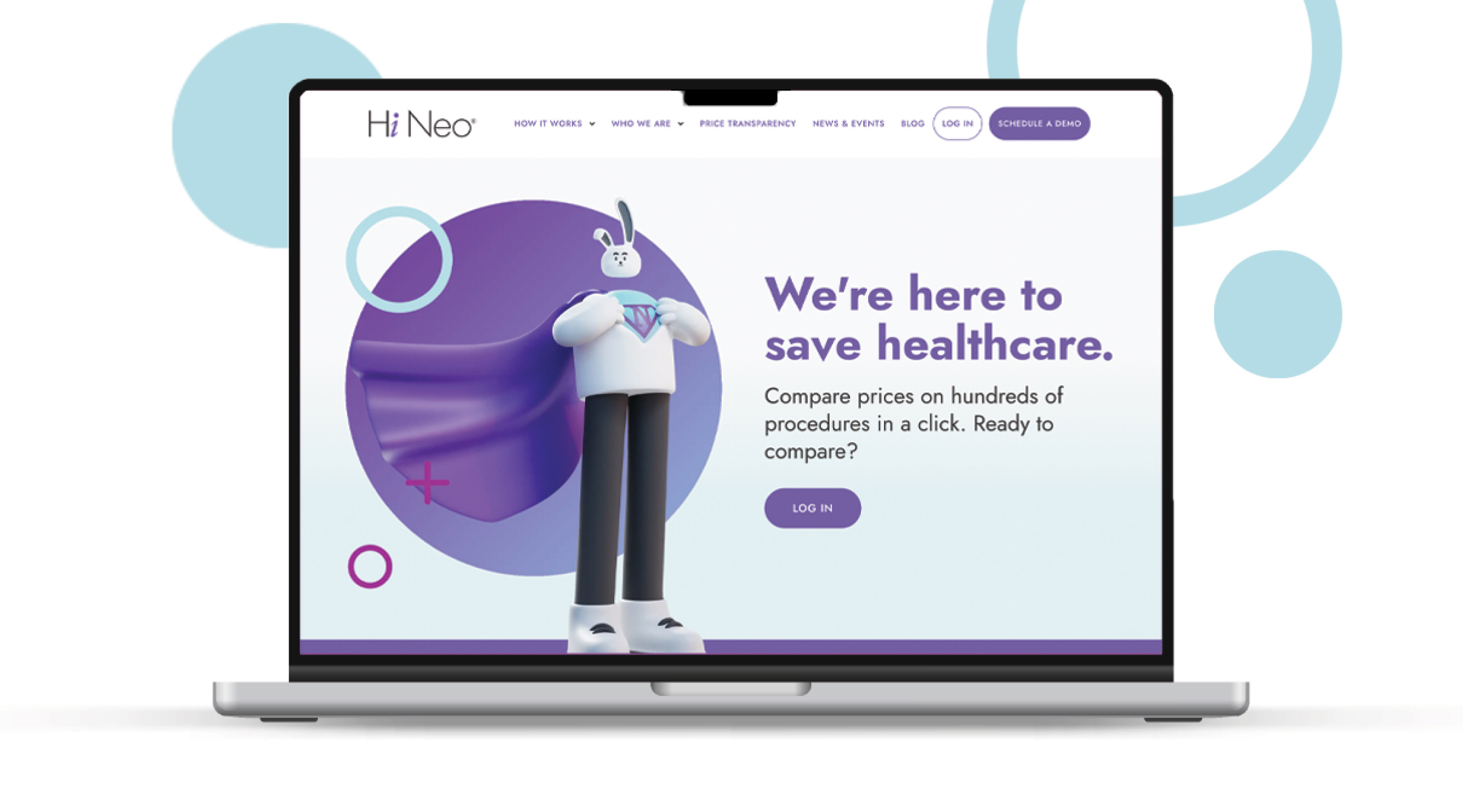
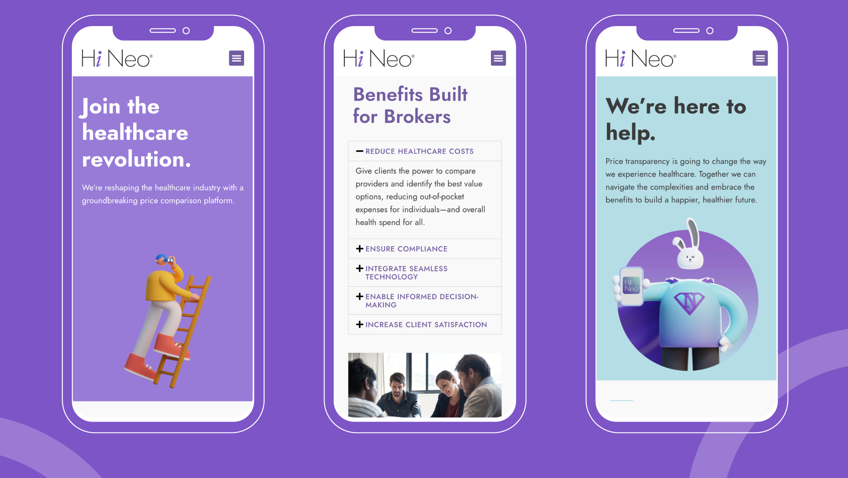
Image of Hi Neo website homepage

Demystifying healthcare.

Playful isn’t a common descriptor for a healthcare company, but Hi Neo is doing things differently. Their mission is to make healthcare more accessible and less confusing, so playing off the brand visuals they had already developed, we established a brand voice to match. We steered clear of jargon and leaned into direct, transparent and user-friendly language with a healthy dose of optimism.

Hi Neo's website design mobile mockups
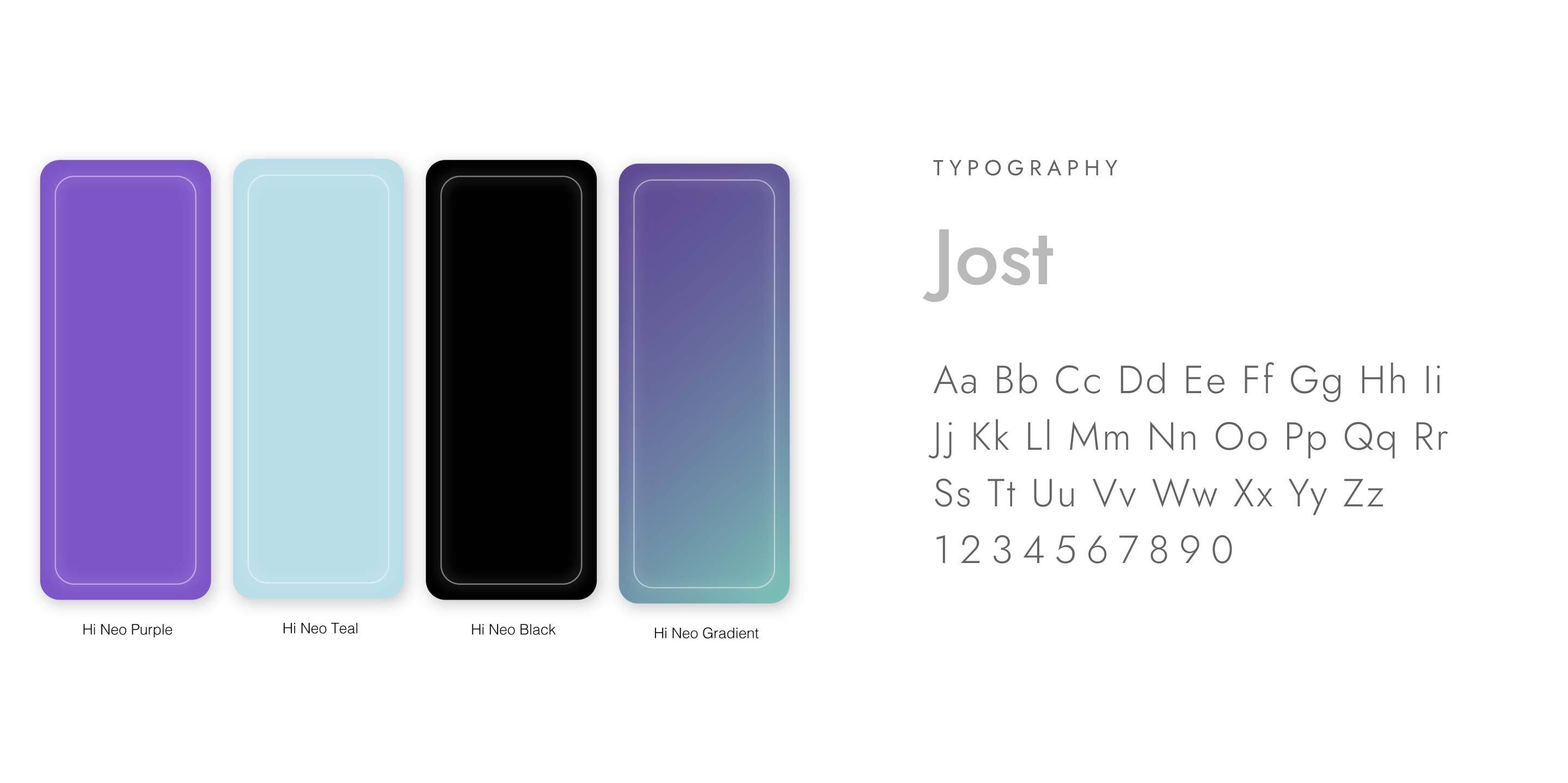
Hi Neo's brand colors and typography
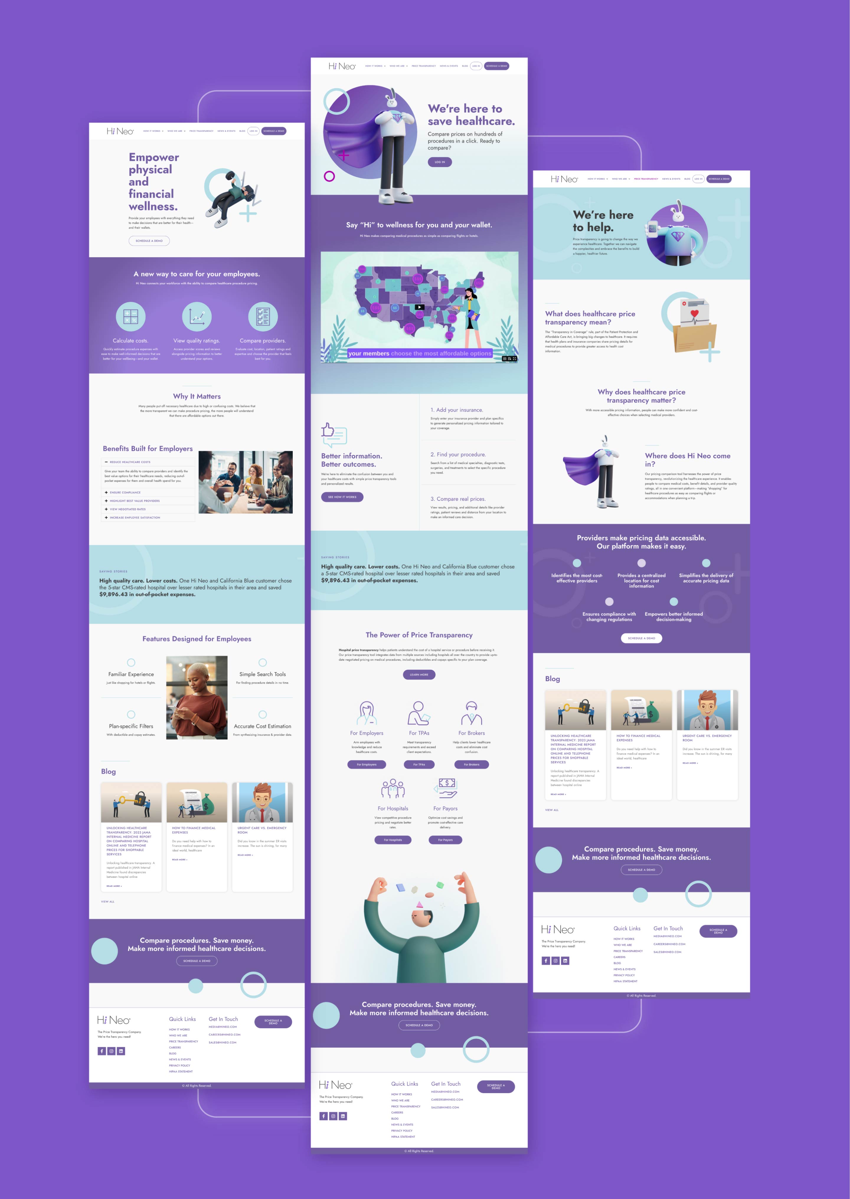
Pages from the Hi Neo website design

A website with character.

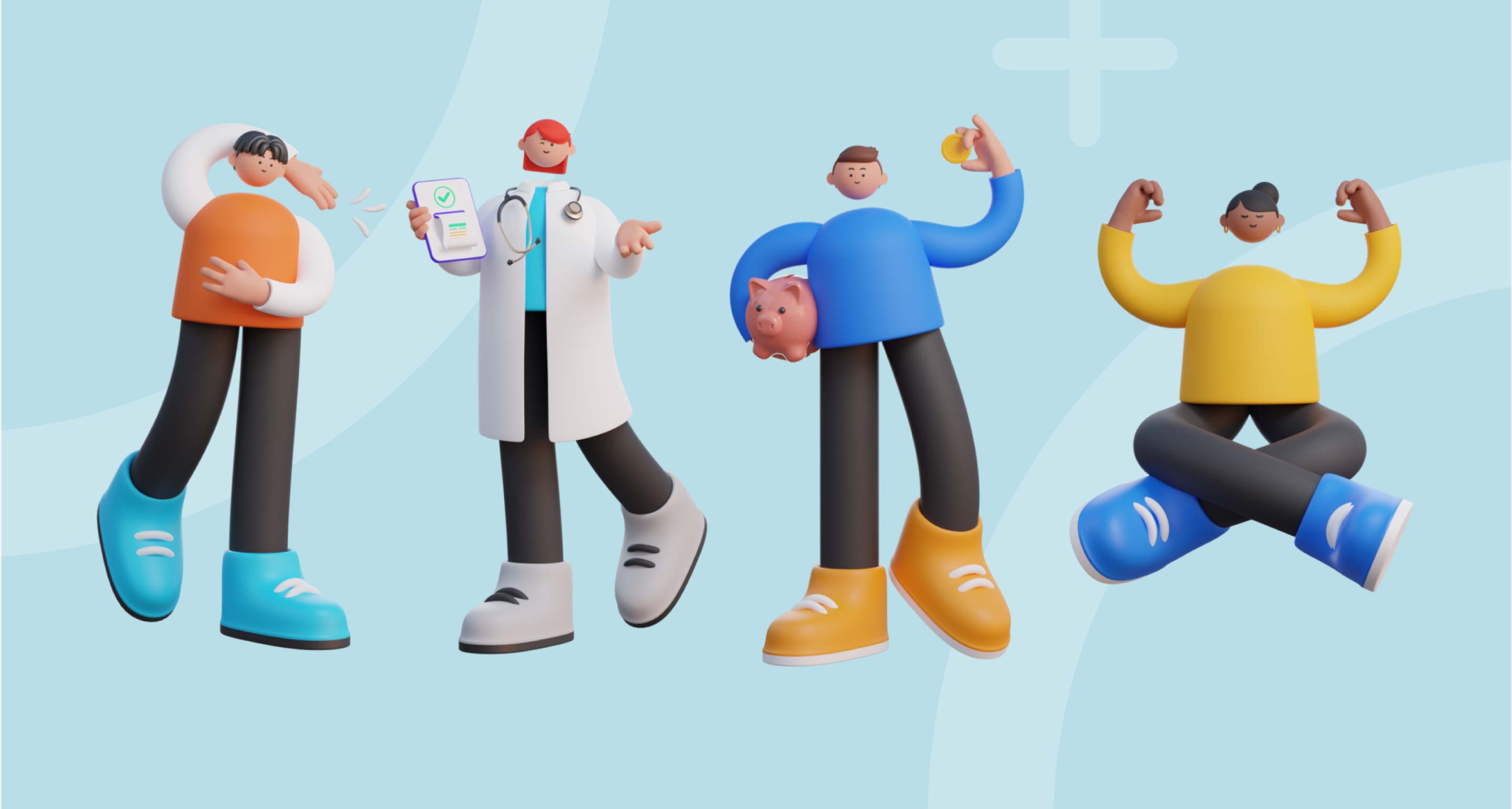
Hi Neo had an existing cast of characters used throughout their platform, but they were missing from the company’s website. We brought the illustrations—ranging from doctors and families to caped white rabbits and rainbows full of possibility—front and center. Not only do the characters give the brand a warm and friendly feel, but they also provide Hi Neo with ownable imagery that stands out in the traditional healthcare space.

Saving the future of healthcare.

Too often, people put off necessary healthcare procedures due to high or confusing costs. Hi Neo is helping users understand that there are affordable options out there with a platform that makes comparing procedures as easy as shopping for flights and hotels.

Hi Neo website design
Hi Neo's cast of illustrated characters