B2B Landing Page Best Practices: A Complete Guide
No matter the industry, from financial to legal to tech, effective landing pages can play a huge role in the success of a professional services company’s digital marketing efforts.
After all, more highly qualified traffic and compelling landing page design bring about more leads, more sales and more revenue. This post covers everything you need to optimize your company’s landing pages, from SEO and traffic to page design and content. We primarily focus on landing pages and conversion for professional services firms, but many of these recommendations apply to businesses across industries.
The Challenges of B2B Marketing
Professional services marketers face unique challenges.
On top of navigating typical marketing hurdles, marketers at B2B brands often have to overcome long sales cycles, differentiate their brand in crowded fields and keep up the pace of rapidly evolving marketing technology.
The biggest question for marketers is often, “How can we use technology to generate quality sales leads, and how can we do it as fast as possible?”
More than ever, marketers are tasked with supplying fresh, qualified leads and potential customers to their sales team on a regular basis. And the truth is, most marketers aren’t exactly sure where those new leads will come from.
And unfortunately, large brand websites—typically the main lead generation source—aren’t easy to update fast enough to promote new products or services or market to specific audiences.
With more digital tools for marketers to capture leads, and the world’s attention constantly online, marketers feel the pressure to use those tools to convert leads. But how do you get started—and where?
The answer is a great landing page. By building landing pages that are conversion-focused and audience-specific, companies can create a steady stream of qualified leads.
The Solution: A Lead Generation Landing Page
A landing page is a standalone web page with a single focus around a topic. Usually, landing pages are built around a specific service, product, audience segment or promotion, or a pain point its target audience is facing.
Landing pages are part of the brand’s website—but aren’t part of the main navigation. A visitor that enters your website through another page will likely never see them.

In addition to being optimized to perform well in search results and attract visitors, lead generation landing pages include forms to capture visitors’ information and turn them into potential customers.
Landing pages often don’t link to other pages on the website, preventing visitors from leaving the page without sharing their information. By being highly focused and designed to drive the visitor to take action, landing pages give visitors the exact information they’re looking for, especially for brands with a wide range of offerings.
The Benefits of a Landing Page Strategy
Landing pages are all about action.
Your firm’s website is great for increasing brand awareness and showcasing your products and services. Content pieces like blogs and white papers are great for generating traffic and educating users. But because landing pages can be created to attract a specific audience at a specific point in the buyer journey, they’re a crucial part of any online marketing campaign and are often what convince people to take action—converting visitors into leads and window shoppers into buyers.
Landing pages provide businesses with a way to talk about a product or service that their site isn’t optimized for. For example, a company whose site performs well in search results for keywords about their bread-and-butter service could create a landing page that focuses on their less-popular-in-searches, but still important, services.
Another benefit landing pages offer is the opportunity to create focused messaging for specific audiences. A law firm specializing primarily in construction and real estate might have landing pages showing what services they can offer clients in healthcare or agriculture.

Because they’re only one page, landing pages can be made much more quickly than re-doing an entire website. They also allow brands to try new strategies and test the effectiveness of different creative approaches and messaging with little time or money involved.
The Elements of an Effective Dedicated Landing Page
Depending on how a landing page is designed and used, it might be among the first or last touch points in a marketing campaign. A landing page optimized for SEO is often a brand’s first introduction to a user who found the page via organic search. Alternatively, a series of brand awareness and retargeting campaigns might prime an audience member to learn about the brand, before finally directing them to a landing page that addresses their unique pain points. No matter where the landing page falls in the customer journey, it can make or break your marketing campaigns.
But what landing page elements make it truly effective? Creating successful landing pages requires several important elements.
Goals and strategy
Before diving into copy and design, start by outlining the goals of the page and how it will be used in your marketing. Consider these questions:
- Who is the audience? What are their pain points? Where are they in the buyer journey, and what information are they looking for?
- What will compel them to take action—and what would lead them to go in a different direction than your solution?
- How will visitors find the landing page? Does it need to be optimized for SEO? If so, what keyword (or keywords) should the page target?
- What other brand messaging will users have received from your company before coming to the page? How familiar will they be with your company, and how much information do you need to provide?
- What action do you want visitors to take on the page? Potential conversions could include signing up to receive emails, scheduling a demo, downloading a piece of gated content or filling out a form.
Design your landing page around the answers to these questions to ensure that all elements support the goal of driving visitors to take action.
Compelling headlines, benefit-focused copy and clear call to action
Your landing page copy—the words and information on the entire landing page—is crucial to capturing the user’s attention and inspiring them to take action in a relatable and impactful way. It is the strongest influencer of your landing page conversion rate.
The three most important pieces of copy on your page: a compelling headline, benefits-focused copy and a clear call to action.
We’ll illustrate these three pieces with an example. Imagine you’re the chief financial officer for a mid-size manufacturing business and looking to hire a new outsourced accounting firm. You’ve eliminated all but two firms in your research. These are the unique value propositions you find on their landing pages:
40 Years of CPA Services
Our expert CPAs and financial advisors combine industry insights and personalized strategies to perform transparent and thorough external audits, plus reliable tax planning and consulting.
(Contact Us)
Or
Spend Less Time on Finances and More on What Matters
Our experienced team will help you navigate accounting complexities with ease, freeing up time to focus on your business. Ready to stop hassling with paperwork and worrying about your company’s finances?
(Yes, I’m ready)
Here’s the difference between the first landing page example, with a flat value proposition and features-focused copy, and the second example, which paints a picture of how life would be better for the audience if they engage the firm:
Your messaging shouldn’t be about you. It should be about them.
Scenario one represents an all-too-common mistake made by landing page creators (and marketers everywhere).
In an attempt to impress a prospective customer with professional jargon, it sounds stilted and vague—even to the CFO.
This example is about the company, not the relief it will bring to its specific target audience. And for landing pages to be effective, it has to be about them.
Scenario two speaks directly to the CFO. The pain point (freeing up time to focus on other aspects of their business) is essential to their experience, so the value seems monumentally higher than the first example.
In addition to being clear and relevant, scenario two provides tangible, mouth-watering benefits in the currency of time saved, which equals money saved for any business—and makes life better for the CFO.
Message match
The messaging and copy used on the landing page needs to align with the messaging the user has seen in the steps leading them there. If the visitor clicked on your Google Ad for accounting services for healthcare firms, the landing page shouldn’t be about accounting services for construction companies.
If the user experiences inconsistency or has to dig around to find what they’re looking for, or experiences an inconsistent journey, they’ll simply close the page and go elsewhere.
Compelling calls to action (CTAs)
Of course, landing pages need to ask the visitor to do something. Most of the time this is filling out a contact form or offering a phone number to call. For most professional services firms, a contact form gets the best results—and generally, the shorter the better.
Your CTA shouldn’t feel like a blunt disconnect from the rest of the copy. It should feel like a low level of commitment, a continuation of the conversation—the next step toward solving the visitor’s problem.
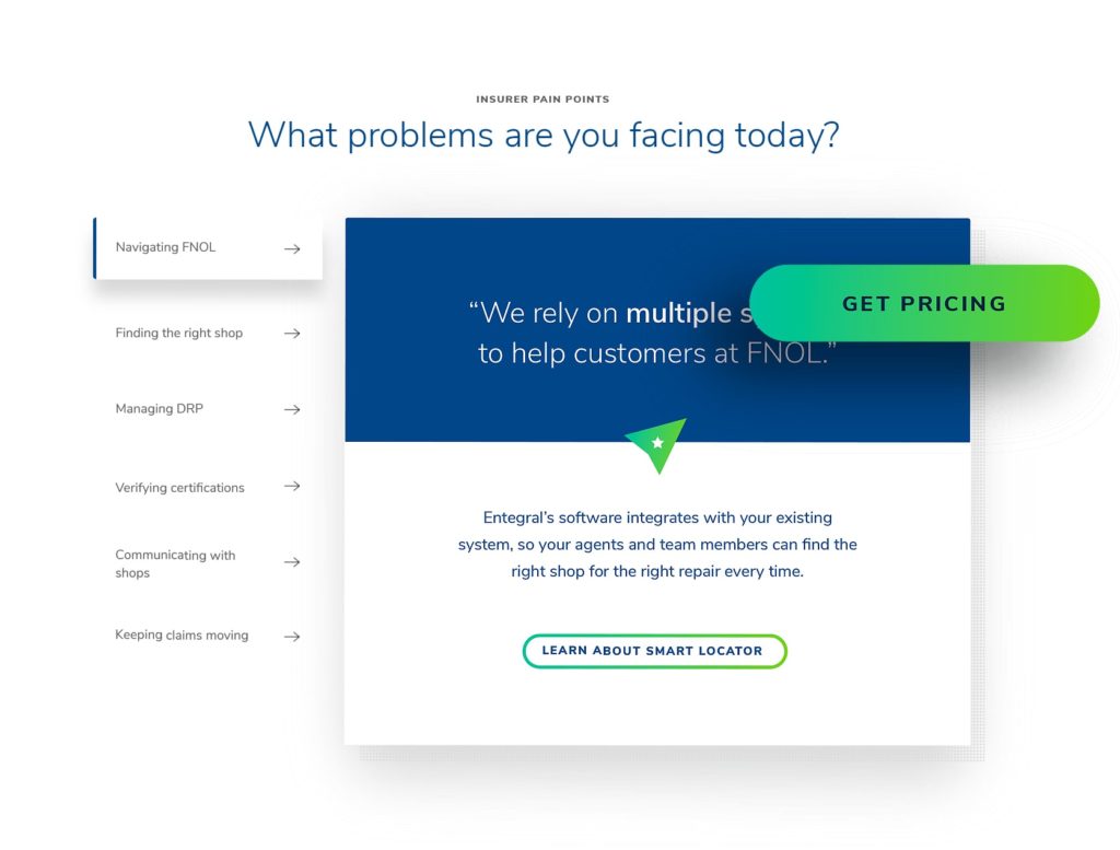
An example of benefit-focused language inspired by the audience’s specific pain points.
Depending on your brand’s voice and audience, you might want to use se benefit-driven language like “Yes, I’d love to save more time” or “Start saving today” vs. drier language like “Contact Us” or “Talk to our sales team.” Here’s a list of ideas to get you started:
- Schedule a free consultation today.
- Unlock your company’s potential. Get started now.
- Take the first step towards success. Request a quote.
- Get expert advice tailored to your needs. Contact us.
- Ready to achieve your goals? Book a strategy session!
- 3x your team efficiency. Request a demo now.
- Get ahead of the competition. Request a free competitive analysis.
- Maximize your ROI. Get in touch!
- Gain a competitive edge. Schedule a 30-minute strategy session!
- Ready to elevate your brand? Let’s discuss your goals.
- Find out how we can streamline your operations. Contact us.
A good test is to ask yourself, “Would I fill out this form?” If not, rethink your approach until you would.
One more thing—the copy on your landing page needs to be unique and not taken from elsewhere on your site. Duplicate content can negatively impact search engine rankings, so make sure the landing page copy is original.
Strong page design
Creating a high-converting landing page requires intentional design. Think of your landing page’s design as a translation of your written content. It presents the same exact meaning in a different language.
Your landing page design and visual elements should be simple and compelling. Even though these web pages typically live outside of the website’s main navigation, in most cases, they should still be on-brand for the business. In addition to being simple and benefit-focused, the design should leave the visitor wanting more.
The design should convey authority, relevance, value and have a clear CTA. Here are some different elements to make that happen.
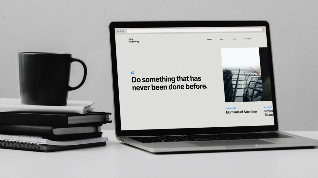
An example of minimalism in website design.
Minimalism
Good landing page design should be simple: brand colors, bold headlines and easy-to-skim copy (think bullet points, short paragraphs and clear columns.) CTA forms should be short—just the visitor’s name and email address, if possible—and attention-getting. Using a contrasting color on your CTA button will make it stand out. After all, it should be the most eye-catching element on the landing page itself.
Visual trust signals
Use visual trust signals to emphasize your trustworthiness and prove to the visitor that you’re a reputable source. Consider adding one or two trust signals like:
- Client logos
- Awards
- Badges for certifications or industry memberships
- “As featured in” carousels
Social proof
As humans, we’re designed to trust the opinions of other people who have been in our situation. That’s why social proof—things like testimonials and reviews from satisfied clients, or logos representing the companies you’ve worked with—is so important to convert visitors. Use quotes and video testimonials from clients to highlight the benefits your brand provides to its audiences. (Just make sure to get permission first before using anyone’s words or detailed information on your website.)
Images
Imagery can be incredibly powerful for conveying benefits. Remember: same meaning, different language. If you’re going for relevant, valuable, etc., then you need a hero image that communicates those values. An example from the earlier accounting firm scenario would be a picture of a CFO with nothing on their desk but a computer. This vividly supports the claims made by the written content (no more piles of paperwork to shuffle through).
Considerations around the fold
Originating from newspaper design, the term “fold” refers to the area visible before any scrolling occurs. While it’s tempting, don’t cram too much information or content above the fold out of fear that nobody will scroll down the landing page. Research confirms that people still scroll down. Afraid they’ll forget about the CTA button? Either add a second one at the bottom or make the button sticky so that it always stays in view. Problem solved.
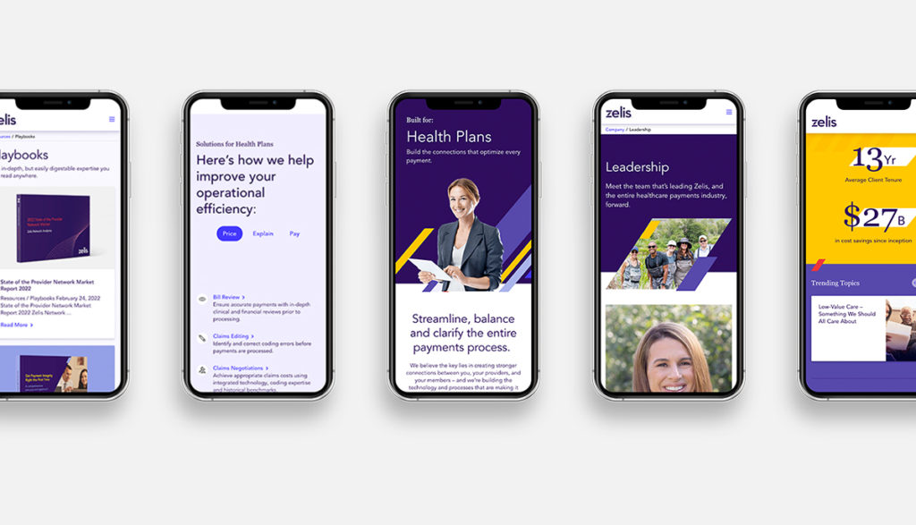
View your landing page in a variety of browsers and device types to ensure it will look good for all users.
User experience & page speed
If the page loads slowly, every other component matters less—because the likelihood of visitors bouncing increases. According to Think with Google, the difference between a 1-second and 3-second page load time increases the probability of a bounce by 32%.
And it’s not just desktop speed that matters. While many professional services and B2B websites are primarily visited by users on desktop and laptop computers, Google considers mobile page speed as an important search ranking factor. And for any users on mobile devices, the page should be responsive to ensure they have a positive experience as well.
How to Drive Traffic to Your Landing Pages
Increasing site traffic is something most marketers are constantly striving for. While there are many ways to go about it, here are some strategies for getting your landing pages in front of your target audience.
On-page SEO: Optimizing your landing page
Organic traffic visitors, or visitors who find your site through unpaid searches on sites like Google, are often the most highly qualified leads, so optimizing your landing page to perform well in search results is crucial.
Successful SEO requires ongoing maintenance. But setting up your landing page with the right fundamentals can get it off on the right foot. Here’s where to start:
Valuable keywords and strategic copy
Before you begin drafting copy, conduct keyword research using a tool like Ahrefs or Moz. Consider search intent, or the specific information or action users are looking for when they use that search term. The search intent of the keyword you target needs to align with the product or service the landing page is promoting.
Don’t restrict your landing pages to the most common search terms that are bringing visitors to your site.
Often, less-common long-tail keywords can attract more qualified leads and can even open up your brand to audiences it wasn’t previously serving. Dig into the searches that have led to conversions and build various landing pages around those to get even more conversions.
Ideally, landing page copy should be developed using a tool such as Surfer or Frase. A landing page designed to rank well in search results needs to strike the right balance between providing enough valuable information to rank, but not so much copy that it overwhelms visitors and ruins the user experience.
Links
While most landing pages exist outside of a website’s main navigation, adding a few links to a landing page from other pages on a website will help search engines find and index it.
Meta tags
The meta tags (several of which are listed below) help search engines crawl sites and understand the content. Meta tags should include target keywords while still being readable and appealing to searchers. It’s tempting, but avoid making every third word your keyword—that’s called keyword stuffing, and it will backfire.
Title tags
The title tag is the headline shown in search results and can be different than the on-page headline. This is often ignored, but title tags are the first thing visitors see in Google search results. Make the title tags of your pages keyword-rich and compelling to your audience.
Meta description
The meta description, also called the snippet, is the brief description that shows up underneath the headline in search results. Think of this as a mini elevator pitch about why people should click on your page in the search results.
Header tags
Helping to organize and break up content into digestible sections, header tags help crawlers understand the content and hierarchy of the page content and give visual clues to readers about how to read the page.
Alt text
Alt text can also include the page’s target keywords but should be thoughtfully written so they’re helpful for site visitors using screen readers.
Slug
The slug, or the part of the URL that identifies the specific page, should be descriptive enough to give readers an idea of the page content, yet succinct—typically omitting words like “the” and “of” unless they’re part of the target keyword.
Supplementing organic traffic: Paid search ads
A Google Ads or other paid search campaign can also be a great source of website traffic and leads. While this could be an entire blog in itself, here are a couple of important paid search practices as they relate to creating landing pages:
Be specific
Just like landing pages, your ad headline and copy should be as specific as possible about a single product or service. Don’t waste a ton of time crafting the perfect landing page about group insurance plans for a specific industry, and then have broad, non-specific ads point to that page. The more detailed and organized you can make your ads, the more qualified your leads will be.
Make sure your messages match
It’s worth noting again: the copy on your landing page should reflect the copy in your Google Ads. In addition to providing consistency for the visitor, it can also increase the performance of your advertising campaign.
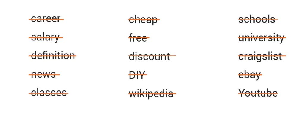
Example negative keywords to help filter out irrelevant traffic and prevent wasted ad spend.
Embrace the negative
Filter out unqualified leads by suppressing geographic regions that don’t apply to your audience and setting up negative keyword lists. These lists tell Google what searches your ads shouldn’t show up for. For example, an architecture firm that only designs large office spaces and company campuses might exclude the words “residential” and “house” to prevent individuals looking to build a home from seeing and clicking on the ads.
How much should you spend on Google Ads?
A recommended budget will depend on the keywords you’re targeting, conversion rate, your company’s sales close rate, and average lifetime value of a customer.
Here’s an example: say you’re targeting a keyword that’s $5 per click with 5,000 searches per month. At a 2% click-through-rate, you might expect to receive 100 clicks per month on the ads for $500. If your landing page has a 2% conversion rate, then two of those clicks would convert.
If you have a 50% sales close rate, then one of those conversions would turn into a customer for a cost of $500. For a company with an average customer lifetime value (CLV) of $1,000, that’s not a great return on investment; if the average CLV is $1 million, it definitely is.
Shareworthy: Paid and organic social media
Both paid and organic social media can drive qualified traffic to landing pages.
Organic social media relies on your brand’s reach, and if the people on your team are willing to share promotional content. Many B2B brands (and the teams that work there) underestimate the power of employee social sharing, but it can pay off. Content shared by an individual can get upwards of 8x the engagement of a brand channel sharing the same exact content. Encourage your employees to promote the landing page through a thought leadership post on LinkedIn.
Paid social media allows you to reach new audiences. Success starts with determining which social media platform is best suited for your brand.
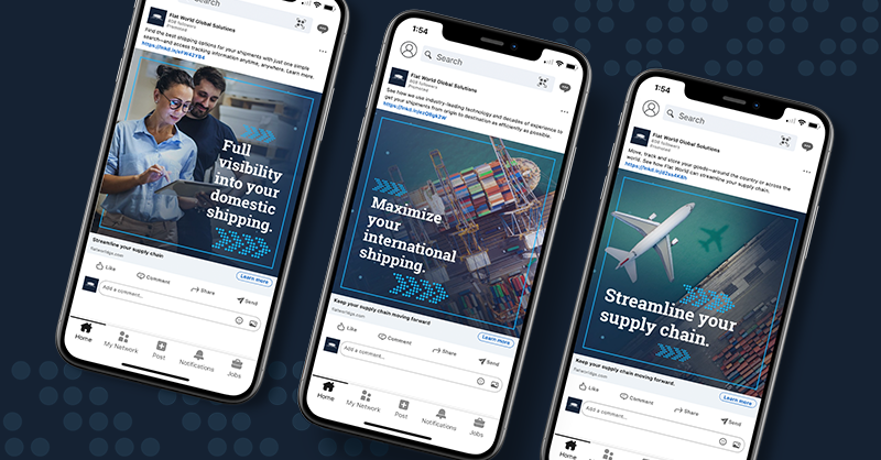
LinkedIn’s targeting capabilities makes it ideal for B2B brands, although it’s typically costlier than other social media platforms. Facebook and Instagram, which typically have lower price points, can be used to retarget audiences who have already indicated interest in your company’s product or service by retargeting visitors of certain pages on your website. A multi-layered ad campaign (across just one or multiple social media platforms) can nurture audience members so that users are already knowledgeable about your brand by the time they reach your landing page.
Make sure the landing page is appropriate for the specific audiences and their needs and aligns with the ad or post they clicked on to get there. A few things to consider:
- If they’re arriving at your landing page from an organic social media post, the visitors might already have a relationship with your brand. The content on your landing page should reflect that.
- If your social media ads or posts promise a special offer or download, make sure the landing page delivers.
- A strong strategy for the paid social/landing page approach is to create both the paid search ad and the landing page around a pain point your product or service solves.
How to Measure Landing Page Performance
Once your landing page is built and attracting traffic, it’s time to measure its performance.
Google Analytics is an important tool for measuring landing page analytics. Here’s what you should be tracking:
Page views – how many times has your landing page been viewed?
Conversions – how many times have visitors completed the intended goal, like filling out a form or signing up for a demo? Divide the number of conversions by the number of landing page views to determine the conversion rate. A typical landing page performs at around a 2-4% conversion rate.
Bounce rate – how many visitors leave the site after only seeing one page? If the answer is high, you may want to change the content, test different calls to action or look at whether the content of the landing page matches how the visitors got there.
Users by source – how many visitors arrive at your landing page from organic search, paid social and more?
Average time spent on page – how long do visitors usually spend on your page? This metric isn’t necessarily better if it’s lower or higher but can indicate that the content on your site needs to be adjusted.
User behavior – Using heatmaps, scroll depth tracking or user recordings, you can understand how visitors interact with your landing page. Reviewing user behavior helps marketers pinpoint what resonates with their audience and identify elements that need to be finessed.

Why track these metrics?
These KPIs help marketers understand how their landing pages are performing and what to do next. By knowing which calls to action, content and sources of traffic are successful and unsuccessful, marketers can fine-tune their tactics and determine future strategies. (But remember, marketing analytics and attribution can be tricky—check out this blog to make sure you’re navigating it successfully.)
How to Turn an Existing Page Into a High-Converting Landing Page
Once you establish baseline numbers, you can start testing different components. Use A/B testing to evaluate the effectiveness of CTAs, headlines, images, button colors, amount of content and other elements. Remember to only test one element at a time, or you won’t be able to correctly determine which variable led to a change in your landing page performance.

