B2B Website Design Best Practices to Scale Your Business
No matter your title, industry or location, most professional services teams would agree: the competition is fierce.
But there’s another truth that spans industries and sectors: the right website design can work wonders in helping you stand out from the the pack, engage visitors and generate leads.
A study by McKinsey found 70-80% of B2B decision makers prefer remote interactions or digital self-service—underlining the importance of a strong user experience and making sure your company’s website has all the information a visitor needs to move through the customer journey or make a buying decision.
Every B2B company is different, and every B2B website has its own unique features and needs. Anyone touting a one-size-fits-all (or even one-size-fits-many) strategy should be approached with caution.
That said, some tried-and-true concepts and website design best practices can set the foundation for a website that makes life easier for team members throughout your business.
Here’s a quick checklist of B2B website design best practices if that’s all you need—but make sure you keep reading for explanations, examples and even more advice.
- Keep your website’s main navigation clear and easy.
- Provide value for humans while keeping it easy for search engines.
- Don’t downplay design.
- Keep mobile-responsiveness in mind.
- Include the right calls to action at the right stage of the customer journey.
- Invest in fresh, quality content.
- Optimize for SEO and accessibility (including meta data, alt text, page speed and linking).
- Identify your target customers, their pain points, your company’s value prop and how you can solve their challenges.
The Importance of High-Quality Web Design for B2B Companies
When a company approaches Atomicdust for help with digital marketing, the first place we look is the website—even if the business isn’t engaging us for web design work.
Why?
24-hour salesperson
A company’s website is its only salesperson that works 24/7/365.
For both new and existing customers, B2B websites are usually the main source of information. Companies need to ensure they have a sales-ready website no matter where the visitor has come from or when. Other sources like online searches and social media will only lead visitors to your website, so if it’s not set up with a modern design, compelling copy or the information visitors need, the best digital ads and content marketing efforts in the world probably won’t be enough.
Longer sales cycles and more audiences
In some ways, B2B brands have to fight harder for sales. With fewer—but much larger—sales than most B2C brands, B2B companies typically see longer sales cycles and more scrutiny from various stakeholders. A single purchase will pass through a lengthy vetting process and approval by multiple stakeholders such as production, finance and operations. All these complexities add enormous pressure on B2B websites.
Knowing this, businesses have invested more in design. In fact, 73% of survey respondents said their companies are doing so to differentiate their businesses, according to a report from Adobe.
B2B website design has to do more than provide content buyers want to use. It should establish credibility by communicating how best to address the buyers’ challenges or risk getting ruled out.
Only a high-quality B2B website will keep your buyers engaged and drive your overall presence forward. Whether you’re working on a B2B website redesign or building a new site from scratch, on your own or with a web design company, you’ll want to use B2B website best practices for the best possible outcomes.
We’ll show you how.
Top features of a successful B2B website
B2B website design best practices include considerations around design, images, search optimization, navigation, content, copy and user experience.
Keep your website navigation clear and easy.
A strong B2B user experience (or UX) design allows users to find what they need quickly. Website visitors are quick to judge and usually won’t waste time digging around the website looking for information. For example, your main product or service website pages should appear within the main navigation and be accessible with a click. Burying them or not including easy-to-spot links will reduce the number of visitors who reach the pages and read the information.
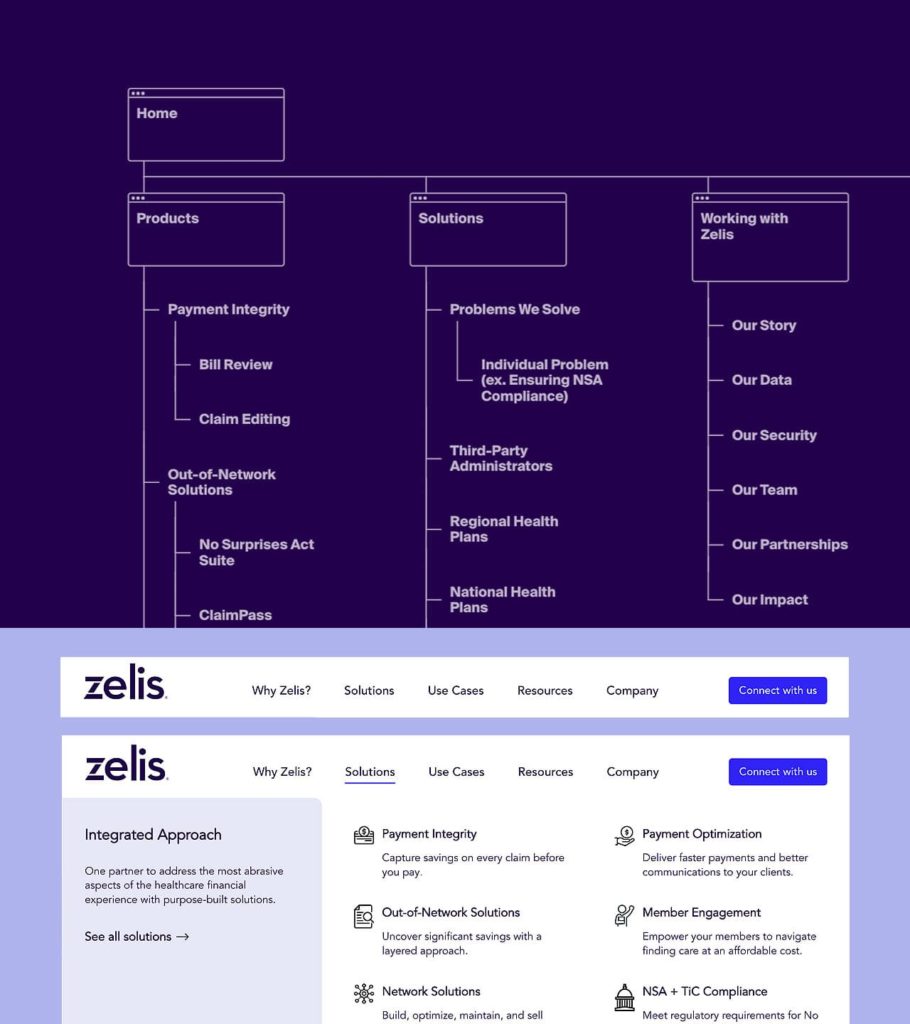
The Zelis website navigation allows visitors to travel through the site based on solution, audience, use case and more.
But many B2B companies have behemoth websites with several pages dedicated to each product or service. For a site structure with several layers of pages, breadcrumbs can help visitors easily grasp where they are on a site, and course correct as needed. A sticky navigation and search functions can also accomplish this.
A seamless navigation helps visitors enjoy a pleasant UX, leading to better retention and increased website traffic. Remember that an easy-to-navigate website is built for search engines and prospects alike, and will improve the ranking for credibility and value.
Provide value for humans and make it easy for search engines.
B2B buyers visit sites expecting to find information about the products and services they’re considering to help them make informed buying decisions. Creating benefit-focused copy gives your visitors the power to conduct research in their own time without speaking to a salesperson.
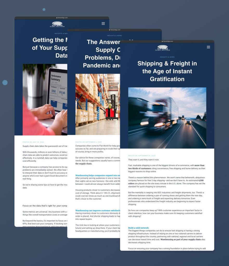
Publishing valuable content to target keywords—via landing pages, blogs, video and more—can both provide a positive user experience and attract qualified leads. But too many businesses focus on tricking search engines in order to rank first and lose sight of the most important piece: delivering a strong customer experience.
Get advice on how to improve your website design. Schedule a free session with our B2B web design team.
Don’t downplay design.
Fierce competition leaves no room for error. But often, B2B companies overlook the importance of design in standing out in their market.
Whether they’re arriving at the website from a Google search, promotional materials or a meeting with the sales team, users want a smooth and streamlined experience once they land on your site. While design is often personal and subjective, all B2B website design should be clean and clear, without sacrificing performance and quality.

Make your website inviting by including appealing and appropriate imagery, legible text and typeface, and consistency. Animations, interactive elements, gifs and video are okay to use, as long as they aren’t distracting, inaccessible or low-quality.
But that doesn’t mean B2B website design needs to be boring. Unexpected elements can keep users engaged and make a company more memorable long after the tab is closed. The trick is striking the right balance between trustworthy and distinctive.
A professional web designer with experience in your industry (or who has done extensive research into your competitors’ websites) can help you develop a website that both reflects the brand and appeals to prospects.
Keep mobile in mind.
Sometimes a website redesign project doesn’t have to mean starting over—instead just making sure the web design looks good on all device types.
More than half of web traffic originates from mobile devices—according to Statista, website visits from mobile devices account for about 52.2% of all traffic globally. Google also considers mobile page speed load as an important ranking factor in organic search.
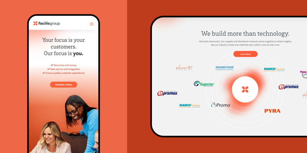
With this in mind, B2B companies prioritize mobile friendliness in their website’s design, even if most of their traffic will be coming from laptops and desktop computers.
Include the right calls to action.
Traditionally, B2B websites had one predominant call to action: “Contact Us.”
This CTA often led visitors to a form or phone number to talk to a salesperson.
The modern customer typically only wants to engage with salespeople later in the sales cycle—sometimes only when they are ready to buy. For much of the sales cycle, prospects prefer to take their time to research business offerings, read online reviews and explore content on the company’s website to asses if the business can solve their problems. Your calls to action should target them at whatever point they’re at in the buyer journey—not only when they’re ready to make a purchase.
For example, using a CTA like “Explore Our Services” or “Download the Case Study” will keep a user engaged and progressing through the sales cycle without having to commit to talking to anyone. They also cater to customer needs earlier in the sales cycle by educating them about your business products and services.
Don’t get us wrong—”Contact Us” is still a powerful CTA, but only when used properly.
Get more B2B website design tips delivered to your inbox. Sign up for the Atomicdust newsletter.
Invest in fresh, quality content.
If you went to a business’ physical location and saw that the lights were off, shades drawn and landscaping overgrown, you’d probably think twice about choosing them as a partner.
The same goes for B2B website design—except instead of lights, shades and landscaping, the content on a website indicates to visitors (and Google!) that the company is open for business and in good working condition.
Besides making your website easy to use and navigate, you should offer quality content updates on a frequent and ongoing basis.
Engaging in content marketing and publishing frequent, valuable content drives organic search traffic, supports lead generation and gives company representatives a way to immediately solve the challenges of the prospects they’re engaging with.
Optimize for SEO and accessibility.
For prospects to find you on search engines, you must optimize your site. You can improve your SEO ranking with original, quality blog content and frequently update portions of the websites to suit your customer needs. This will offer freshness and increase the page ranking.
With this in mind, pay attention to the keywords used in your content. Pick the most important ones and hashtags that best describe your offerings and sprinkle them throughout the content as they relate to them.
Your site should also prioritize accessibility so that visitors of all backgrounds and abilities can easily navigate, engage with and understand your website content. SEO and accessibility best practices often overlap, so prioritizing these details can help you achieve strong results in both.
Here are some SEO and accessibility best practices for B2B companies:
Optimize title tags and meta descriptions.
Ensure your pages have unique titles and meta descriptions to inform search engine algorithms about the page.
Use header tags.
Use header tags (like <h1> and <h2>) to organize the content of your website and make it easy for Google’s bots to index.
Use alt text.
Accessibility is important in ensuring all users can navigate and review your site. Prioritize accessibility by using the “image alt” HTML tag to offer context to your site images. This also lets Google understand the content of your photos.
Don’t keyword stuff.
Incorporate keywords naturally into your content and metadata—adding keywords where they don’t truly make sense, or start to sound inauthentic, will only backfire.
Prioritize page load speed.
Improve your page load speed by eliminating unnecessary code and pixels, and using images that are as small as possible while remaining clear.
Ensure your site is technically sound.
Monitor your site performance with Google Search Console, Ahrefs or similar tools to watch for issues.
Remember to link.
Include internal links between pages where appropriate, and external links to reputable sources with content that’s related to your business.
Reaching your target audience starts with strategy
Of course, all these best practices are followed with one goal in mind: improving website effectiveness.
Your website strategy should involve attracting potential customers, engaging them with the right message and content, and converting them into quality leads and buyers. Here are some tips for developing a successful website strategy:
Identify your target clients.
Sure, you could focus your efforts on driving more visitors to your website—but if they’re not likely to become quality leads, it won’t move the needle on your company’s most important metrics.
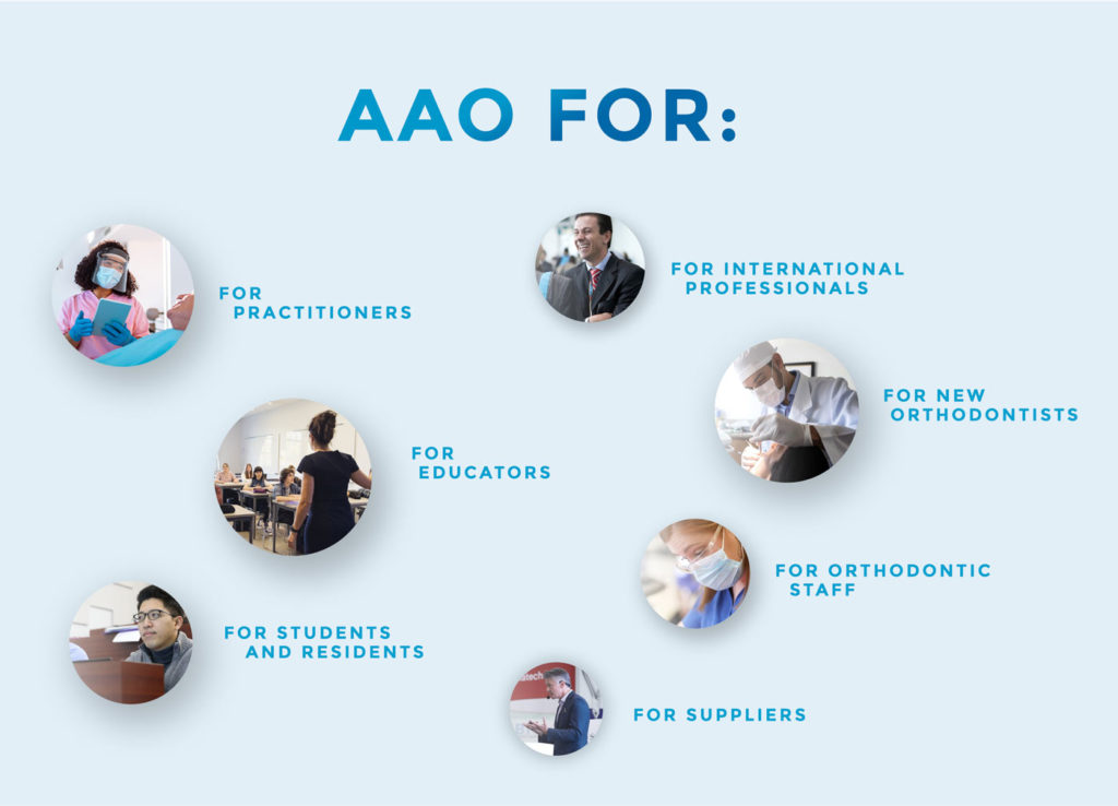
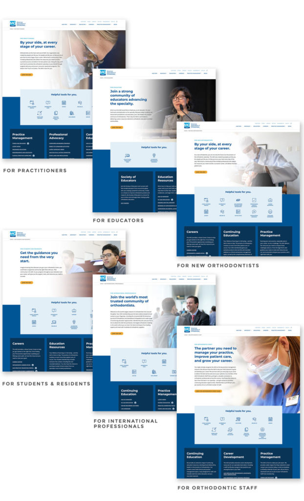
The American Association of Orthodontists website design organizes content around visitor personas and user intent.
The key to getting the right website visitors is understanding your buyer personas and their search intent. Evaluate your site through the eyes of a typical customer. From the moment buyers search for an answer to their problem and land on the page, what steps will they tackle to find what they need? How easily will they be able to find it—and will what they see and read be convincing?
One of the best ways to understand your audience is to research your site analytics and poll your existing customers. This helps to create, design and personalize content that solves your customers’ biggest pain points. Looking at behavioral metrics on Google Analytics can also show you how visitors move throughout your site. From there, you can optimize touchpoints to push them down the sales funnel.
Define your value proposition.
A value proposition shows the solutions your business offers its customers. It’s a statement you can use to gain a competitive edge and articulate why customers should choose you over other businesses. Customers are coming to your business for help, and a strong value proposition will boost the quality and quantity of website visitors.
Design for your customers.
A site that does not serve your customer doesn’t serve you either. Every B2B website should be client-focused, with content addressing their challenges, educating them and showcasing how your brand is the best option. Make it easy for customers to understand your products and services and whether they suit their needs.
Getting started with B2B website design
These B2B website best practices can help you build a better site, which in turn can help scale your business. The information listed above might seem like a lot to remember, but it all boils down to this: focus on giving your buyers an easy entry point, communicate solutions clearly and make it simple to take action.
If you’re curious how your website design could improve, schedule a free session with our B2B web design team.

