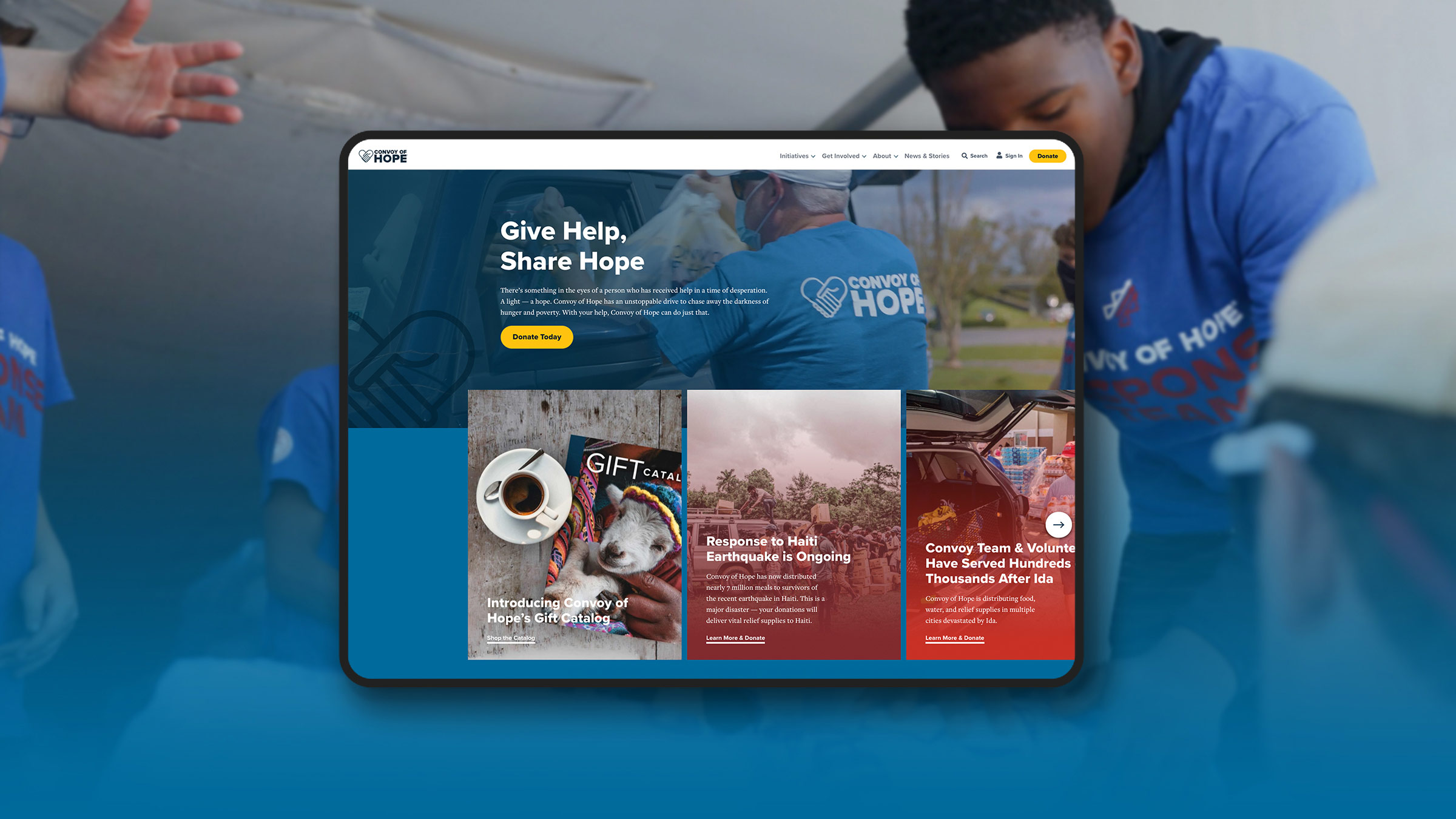
Creating a Mission-Driven Website Design for Convoy of Hope
Whether you’re familiar with Convoy of Hope or not, you’re definitely familiar with their work.
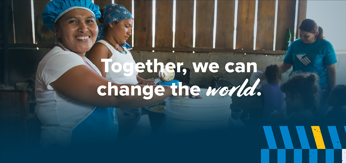
When disaster strikes—a tornado, drought, earthquake, fire or other crisis—Convoy of Hope is often among the first to arrive on location, providing aid to those in serious need. You’ve probably passed one of their trucks on the highway or seen their trailers in the background on the news.
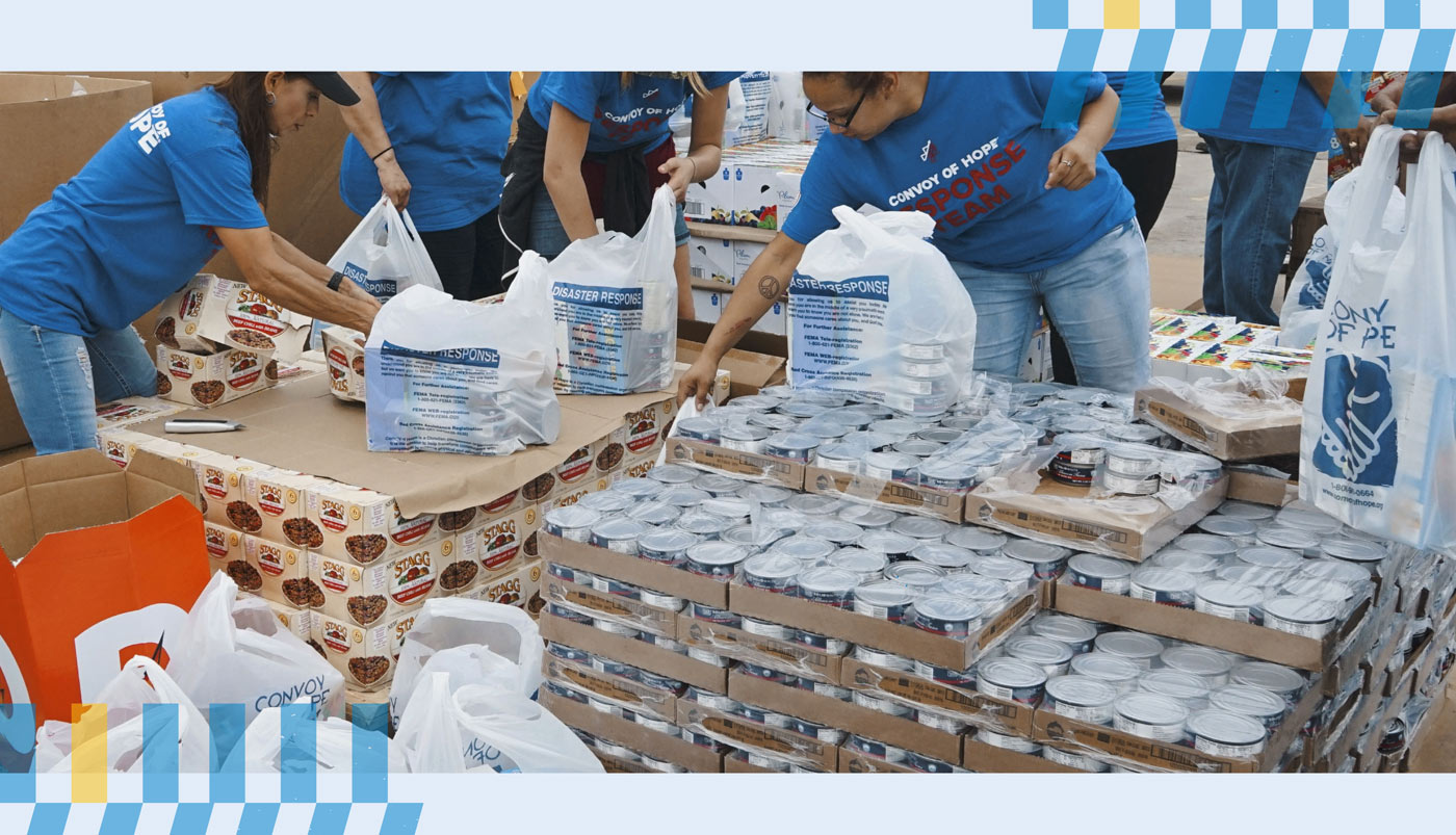
While disaster relief is a big part of Convoy of Hope’s mission, it’s just one of numerous initiatives helping communities near and far access the help and resources they need.
We were honored to help them increase the reach of their mission.
Initiatives with impact.
Convoy of Hope is based in Springfield, Missouri—but provides life-changing (and life-saving) support to people around the globe. The nonprofit partners with churches, businesses, organizations and governments to provide hunger relief, disaster response, empowerment programs and more to those in need.
It’s an important mission with powerful results: the organization has served 163 million people across 127 countries.
Convoy of Hope has thousands of employees, volunteers, donors and partners around the world, addressing some of humanity’s biggest issues.
But their website wasn’t keeping up.
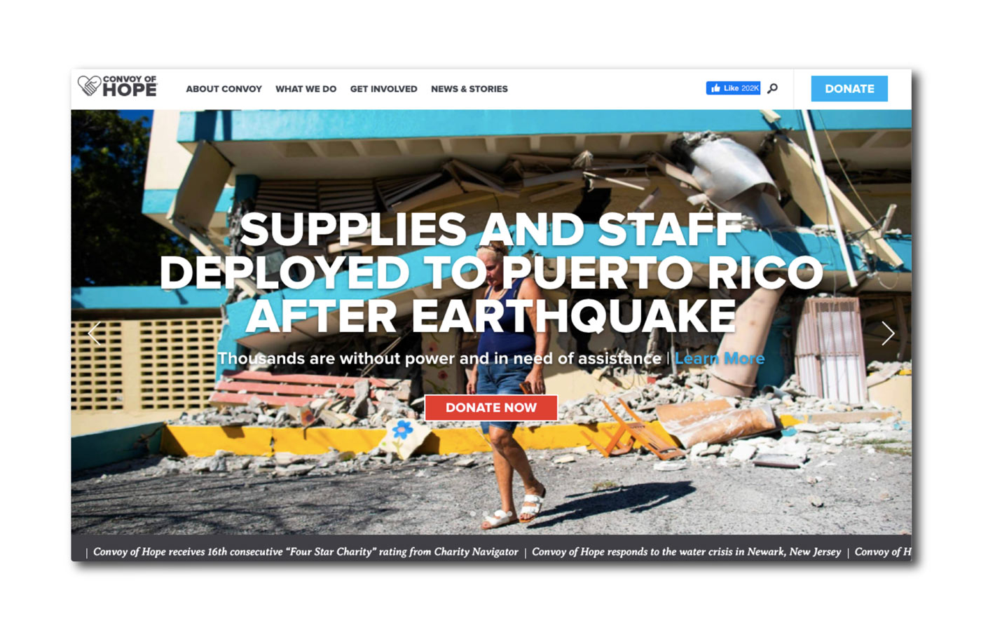
The homepage of Convoy of Hope’s old website
The challenges of service.
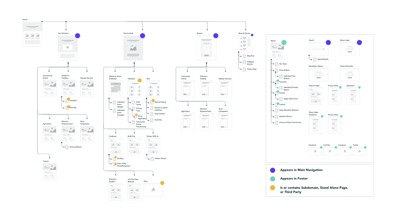
To no one’s surprise, Convoy of Hope had a big website. On top of the organization’s six pillar initiatives (Children’s Feeding, Women’s Empowerment, Disaster Services, Agriculture, Rural Initiatives and Community Events) and numerous pages supporting each one, Convoy deploys dozens of event- and issue-related campaigns every year.
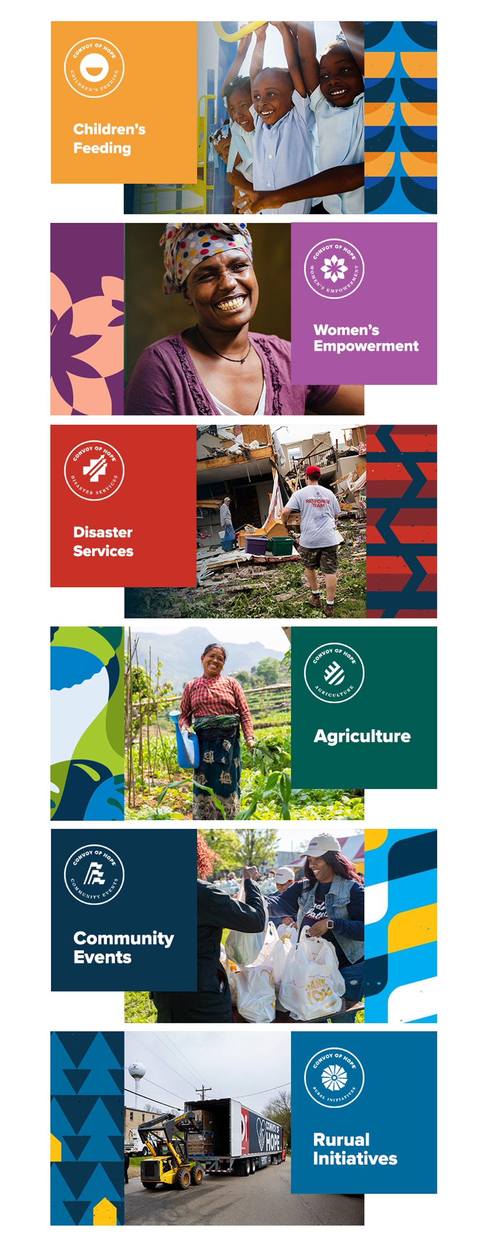
At the time of launch, the website design would need to have hundreds of pages, cater to local and international audiences, and form an emotional connection with individual donors and corporate funders alike.
Oh, and it needed to look great, too.
It was a mission anyone could get behind. We just needed to figure out how we would make it happen.
Powerful goals for a powerhouse organization.
Before anything else, we wanted to get a good handle on the various goals the new site needed to accomplish. So, our team drove down to Springfield to meet with the Convoy of Hope team and discuss functionality and strategy.
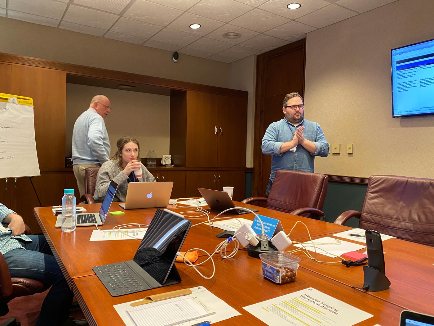
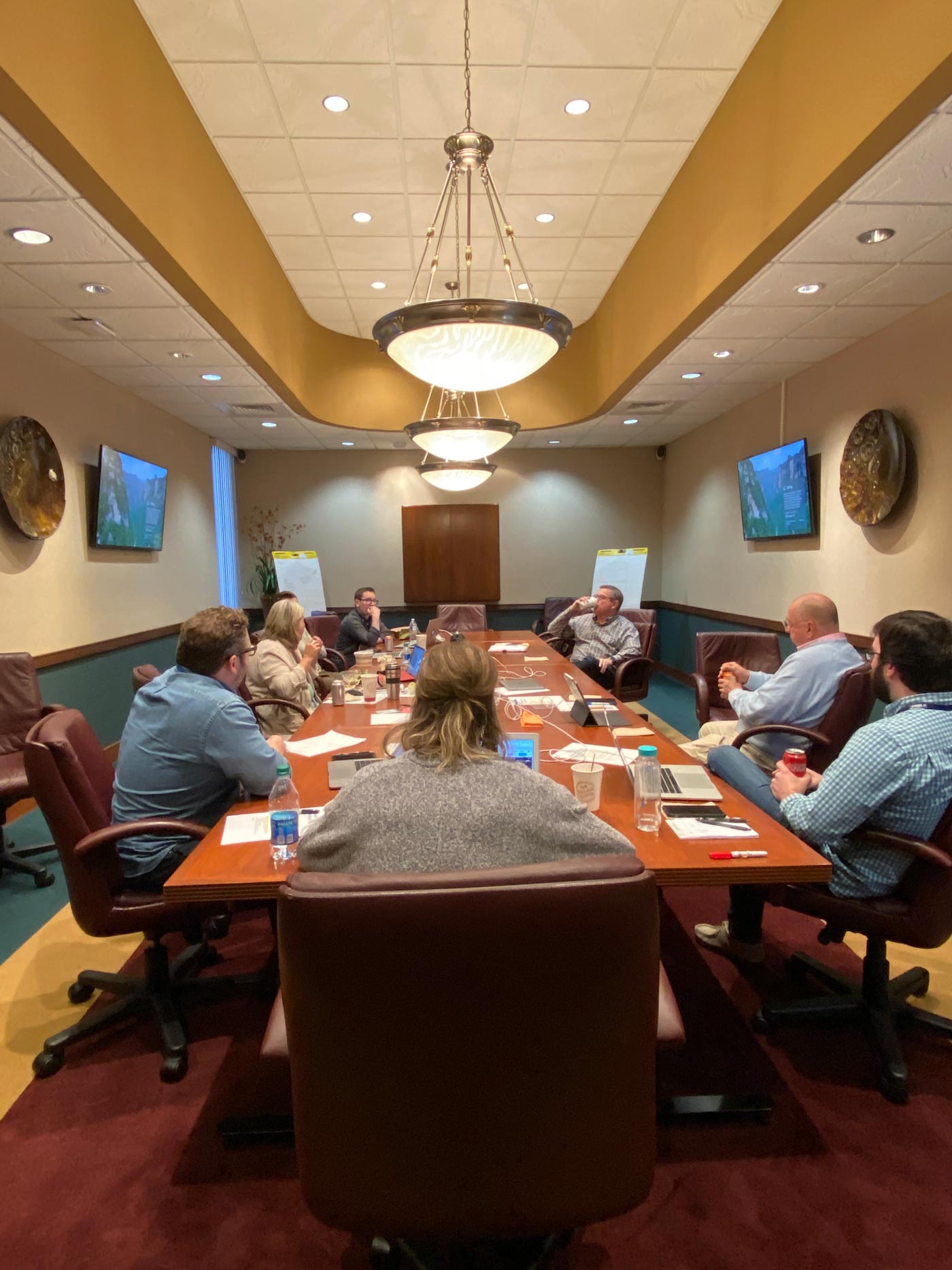
In addition to the main site, Convoy also needed a donor portal that would provide an uncomplicated and pleasant user experience for donors. On the back end, Convoy’s team needed to be able to easily manage donations and update the website as new campaigns launched.
Across it all, there needed to be a consistent, cohesive design and experience.
We drove back to St. Louis, thoughts racing.
A surplus of visuals.
Soon after we started designing the site’s main pages, we ran into a problem. Actually, a couple problems.
Convoy of Hope had a solid visual identity. Each of its pillar initiatives had its own badge and color palette, too. And the organization’s talented marketing team had produced a library of compelling imagery, designs and videos. But because the old website was so difficult to update, only a fraction of that media was being used online.
So we had to figure out how to make sure each of the initiatives upheld their distinct visual style without losing the overall brand, and determine the best way to use the existing imagery.
In the end, the challenges kind of solved each other.
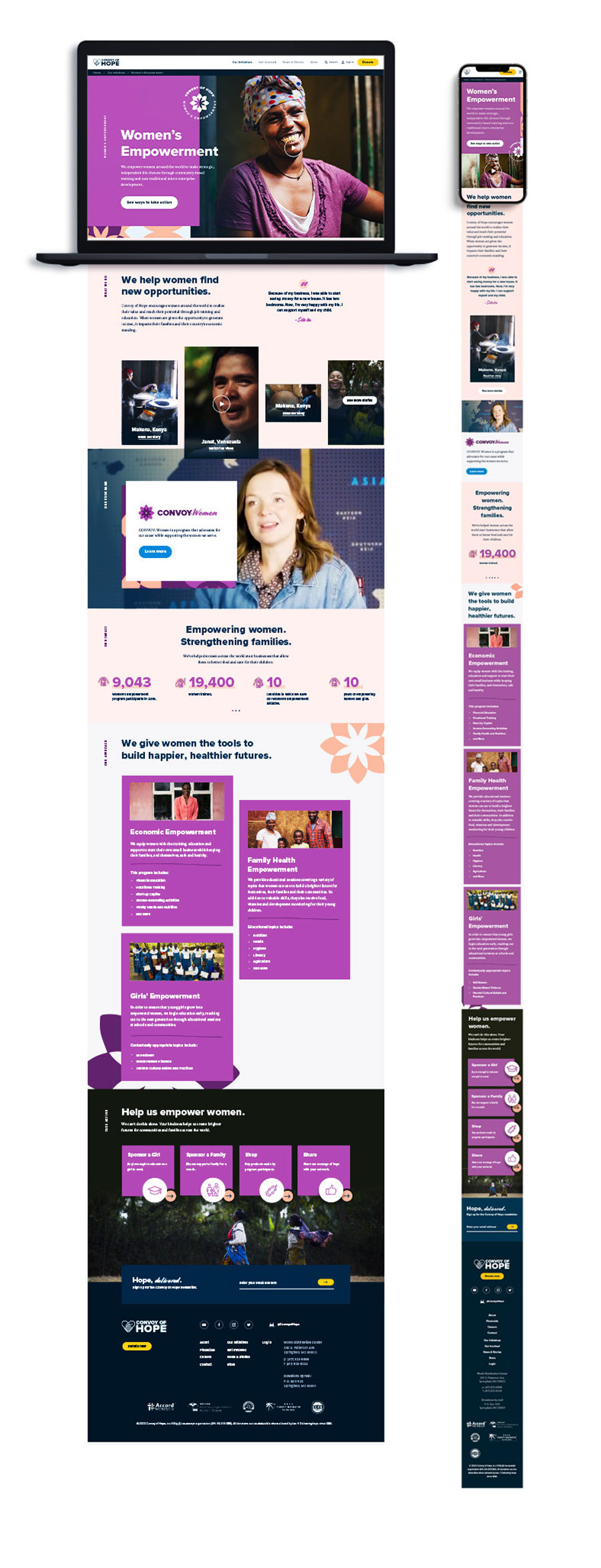
Pillar page by pillar page, we walked through the copy docs and combed through the stockpile of photos and designs, finding the right photography, illustrations and textures to pair with the messaging. Eventually, we created a system of blocks that could be repeated throughout the site for consistency but tweaked to reflect whatever section of the site they’re on.
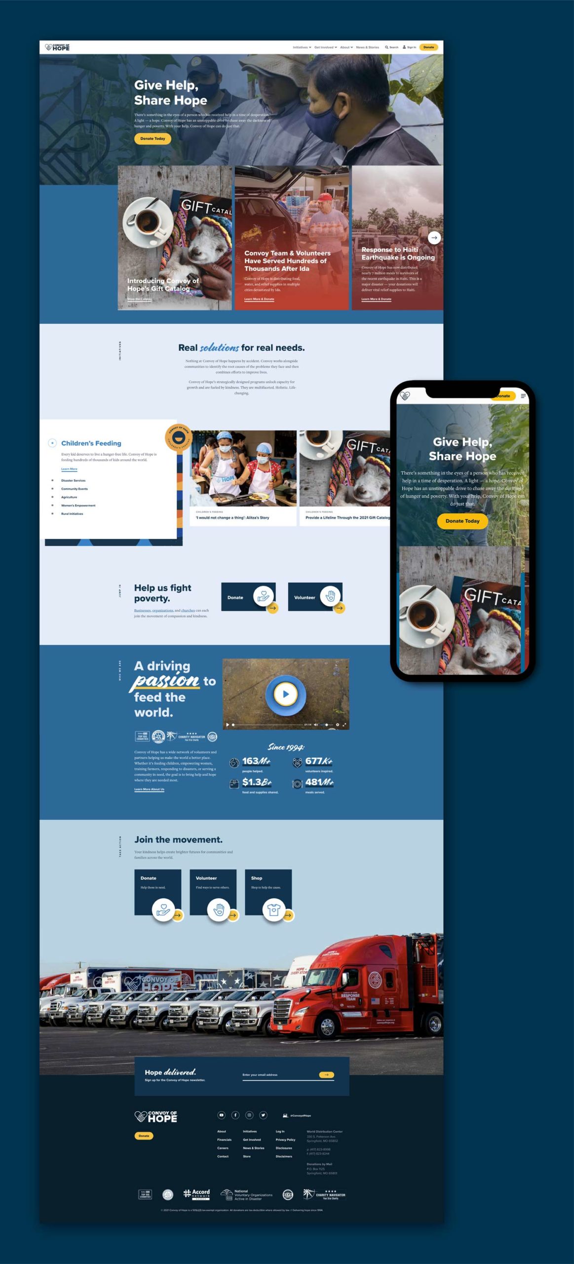
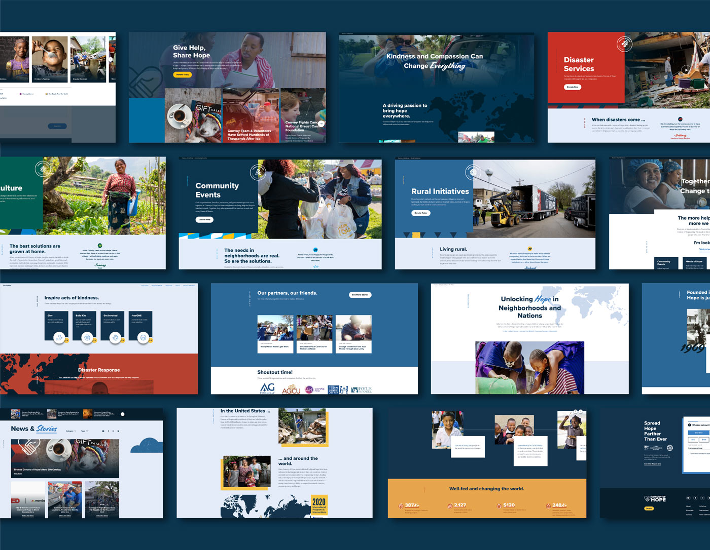
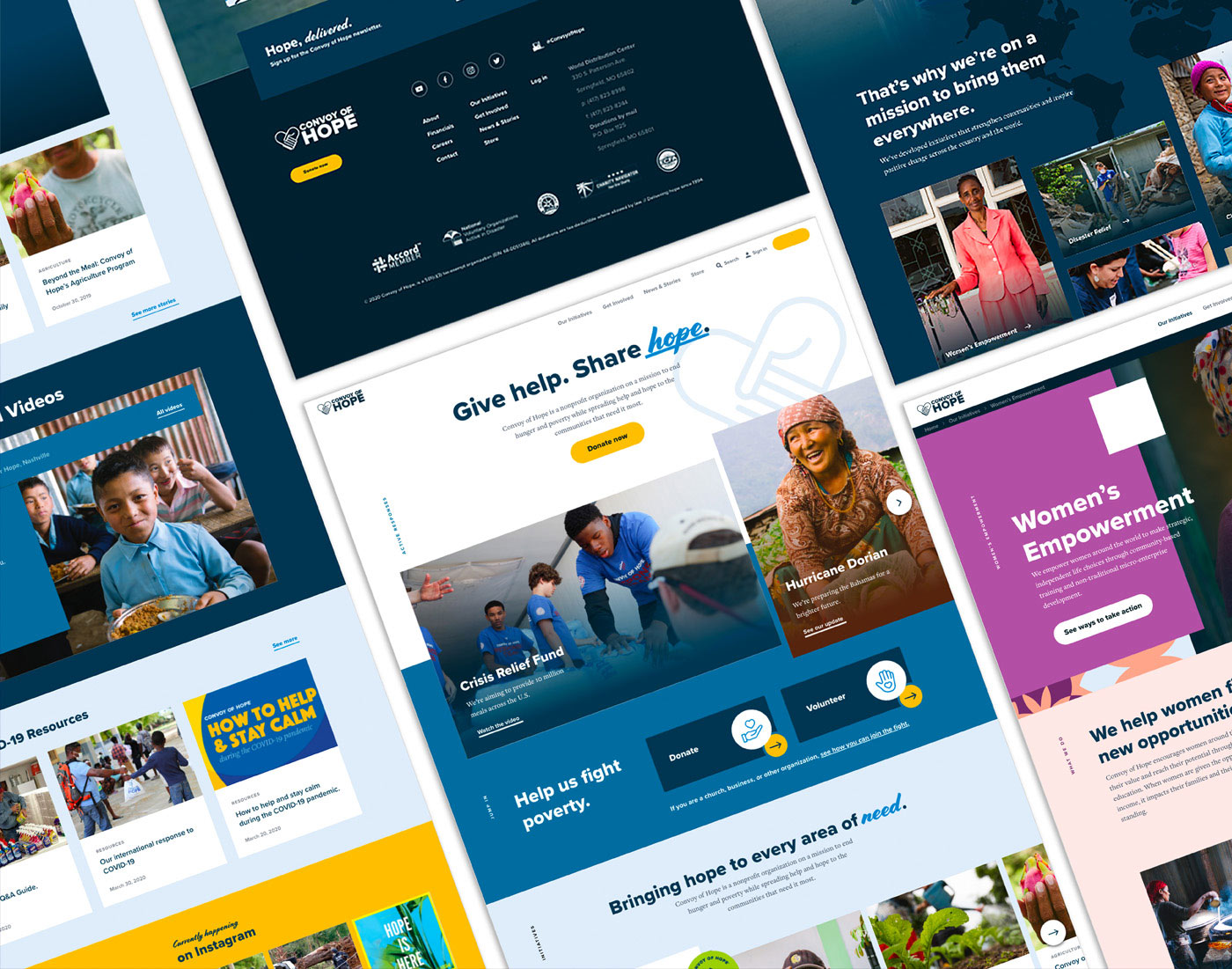
On each page, bold images, colorful textures, emotional copy, impressive statistics and textural illustrations weave together to form a compelling story.
We’d designed it. Now, could we build it?
Working for the greater good.
By now, we were several months into the project. There was still quite a bit of distance between us and the finish line. And yet, every internal regroup, every call with the Convoy team and every round of edits was invigorating.
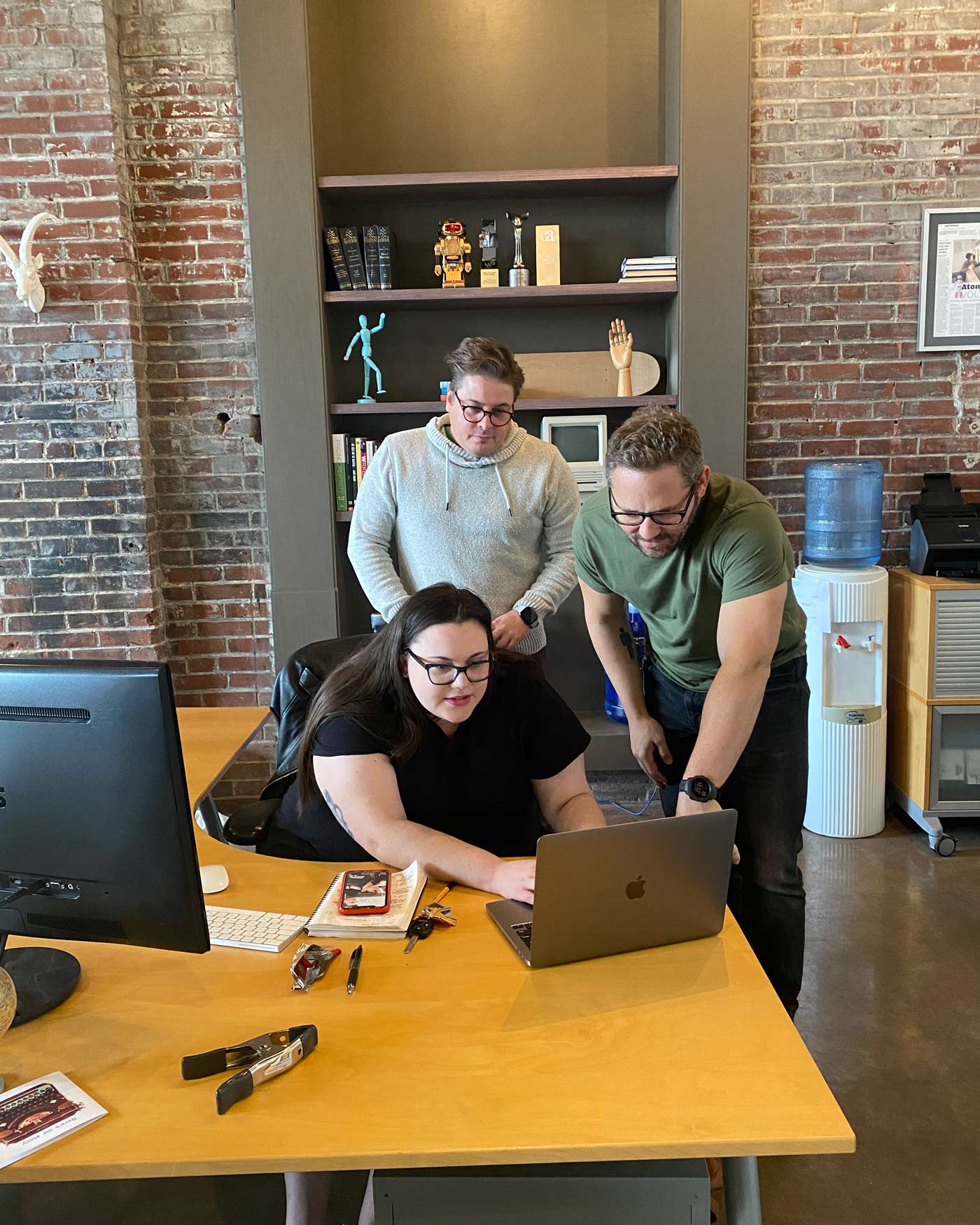
It might sound hokey, but Convoy’s mission—and the dedicated, talented team working to fulfill it—was more than enough inspiration to keep us going. We were all collaborating to create the best website we could, knowing that if we succeeded, it would result in a lot more than a website.
More mouths could be fed, more resources distributed, more people helped.
Our eyes were on the prize.
A few more helping hands.
When you’re building a site as big as Convoy’s one developer won’t cut it.
Several team members were brought onto the project and assigned a batch of pages to start building. Dividing and conquering worked out: because the site required so much flexibility, it required a lot of hands-on finessing of things like padding and margins.
After a few weeks, we’d built almost the entire site, ensuring seamless back-end functionality along the way.
A hopeful launch.
By the time it launched, Convoy of Hope’s new site was one of the most designed websites we’d ever created, with an abundance of visual elements on every page. Even with so much going on, the website is still incredibly organized and consistent.
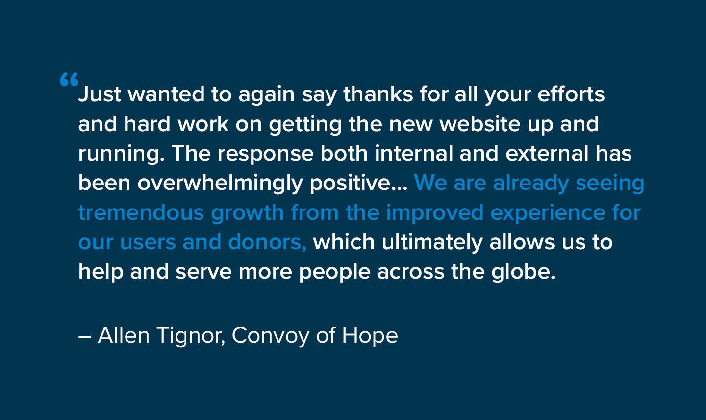
However, we knew the look of the site was only half the battle. It wasn’t until we got this feedback from our main contact at Convoy of Hope that we breathed a big sigh of relief:
Every day, in cities and villages near and far, Convoy of Hope makes big changes in peoples’ lives.
We were honored to play a small role in helping them do even more.
