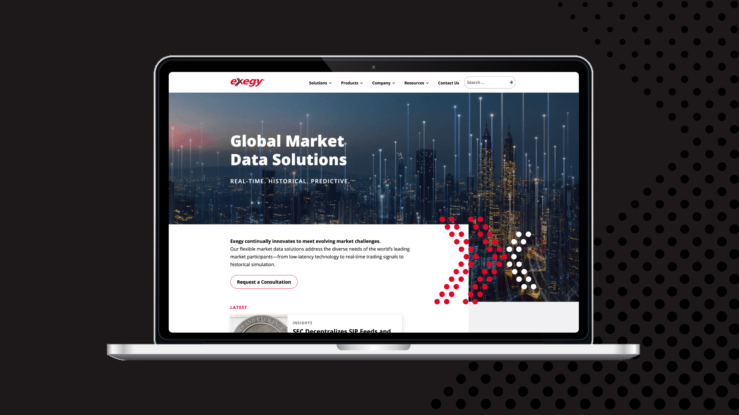
All Systems Go for Exegy’s FinTech Web Design
Last year, Atomicdust started working with Exegy, a financial tech (or fintech) company.
Exegy builds software and physical products that offer real-time, historic and predictive market data for brokers, traders, banks and financial companies around the globe. They make things like the Exegy Ticker Plant, an appliance that takes data feeds from multiple markets and streamlines the information to help both buyers and sellers make more informed decisions.
It’s high-tech, complex stuff used by forward-thinking economic pros.
And it was represented by a website that was copy-heavy and dated.
The Exegy team knew it—and was already well into creating a new site. With UI experts on staff, they’d already established the sitemap and wireframes.
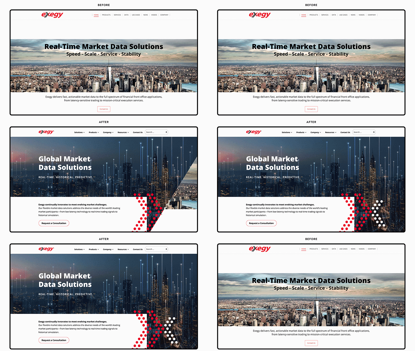
They asked us for help, not to create their site from start to finish, but to take their existing ideas and bring them to life online. The Exegy team would take care of the content and wanted us to code flexible templates that they could use to build out the site.
They’d already painted the picture. They were asking us to frame it.
Fintech web design, the modern way.
Atomicdust is a design agency. Copywriting, development and digital marketing are important parts of our company too, but no matter the project or client, we use design to solve business problems.
And Exegy had already taken care of a lot of the design for this site.
Still, we decided to take on the project because we knew we could help Exegy solve their business problems with a different web design resource. Gutenberg, the latest WordPress editor, had recently launched, and the tool would be perfect for Exegy’s goals.
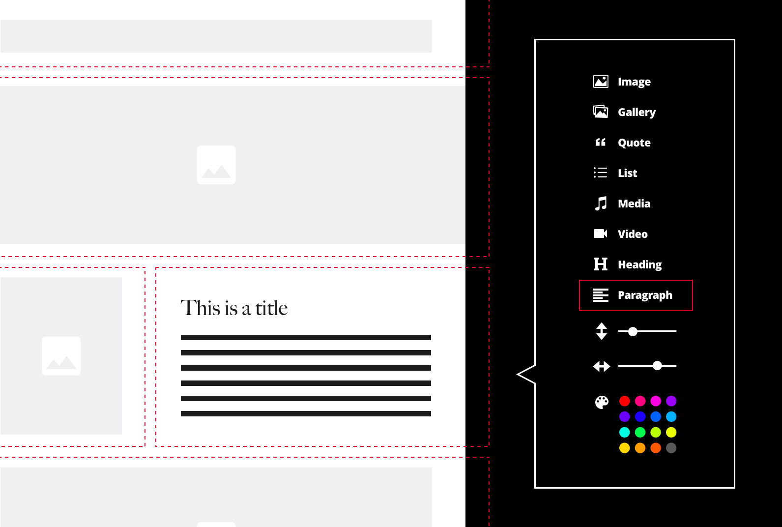
With Gutenberg, we could create individual blocks (sans content, which Exegy was still working on) and a set of pages, and then hand over everything to Exegy to use however they wanted.
We got started, knowing the process would look different than our usual web design projects.
More than meets the eye.
Exegy had the wireframes mapped out. We just needed to flesh out what those wireframes would look like.
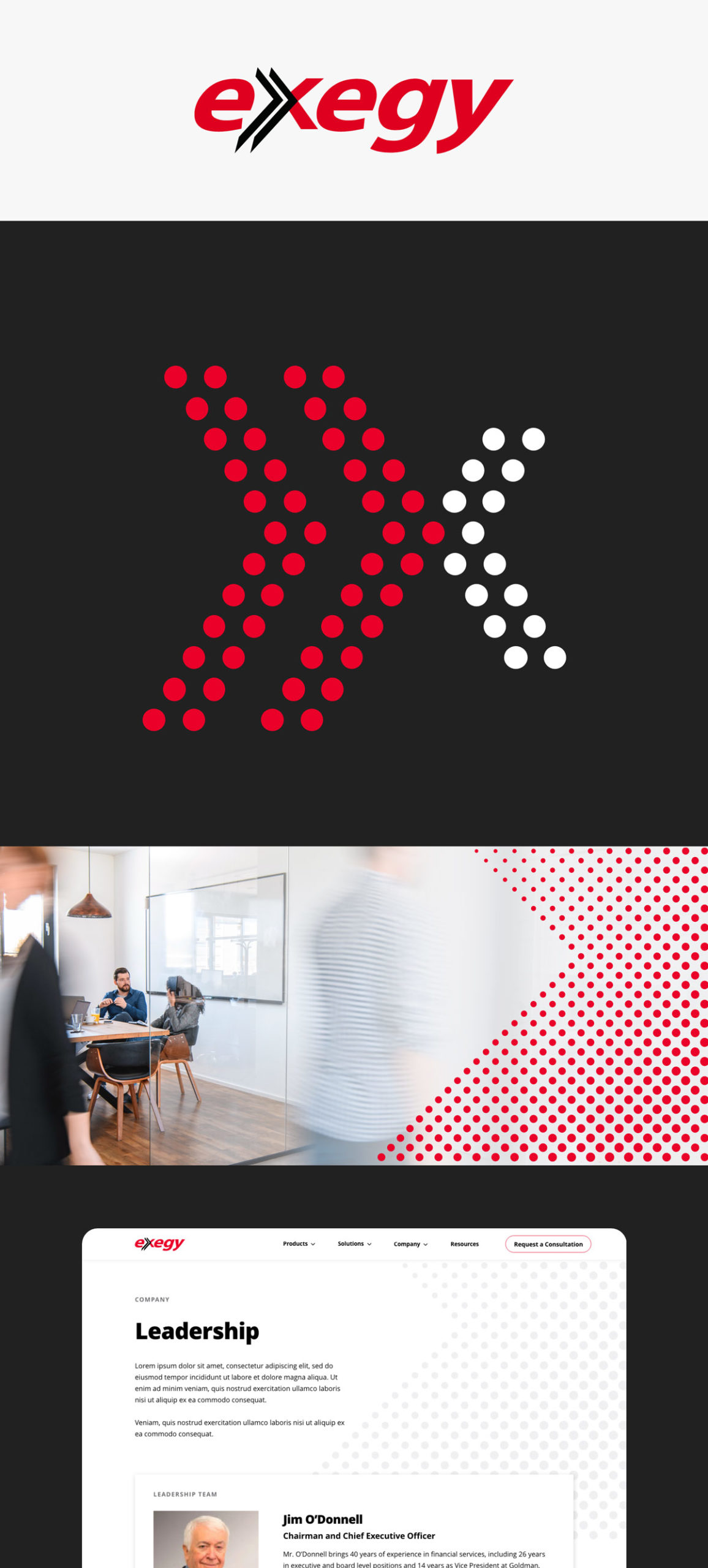
We based the visual designs on Exegy’s existing brand identity and took inspiration from one of its tickers to create a dotted X brand mark that brings texture and color to pages. To add another level of detail and differentiate between their numerous solutions, we created graphic illustrations of each product.
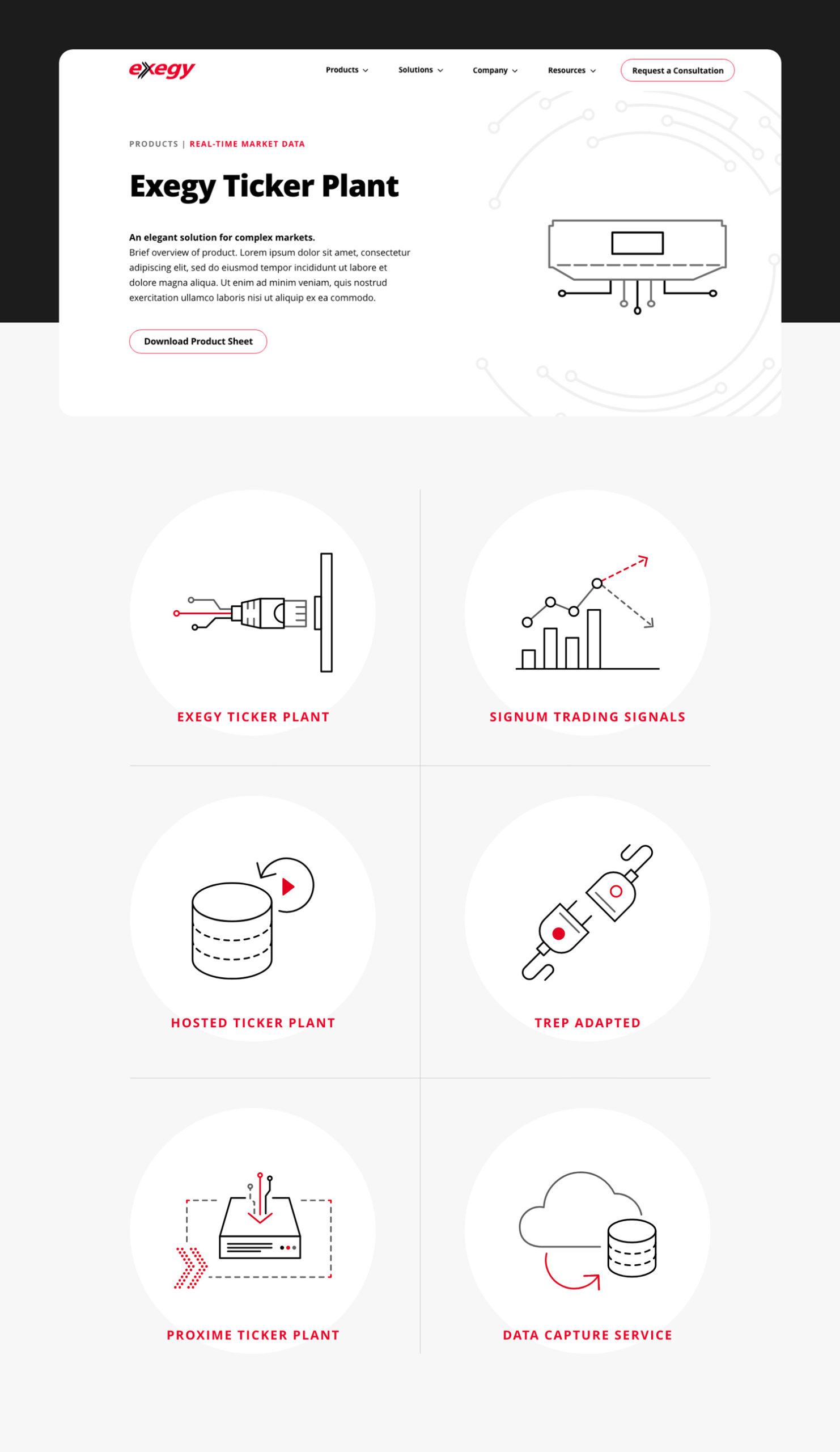
While Exegy’s team continued working on the copy, we took a hard look at the templates. They needed to be flexible enough to work with different types of content on the pages.
In the process, we realized something.
We had expected the project to be lighter on design than our normal projects. But we were designing a lot—we were designing a system.
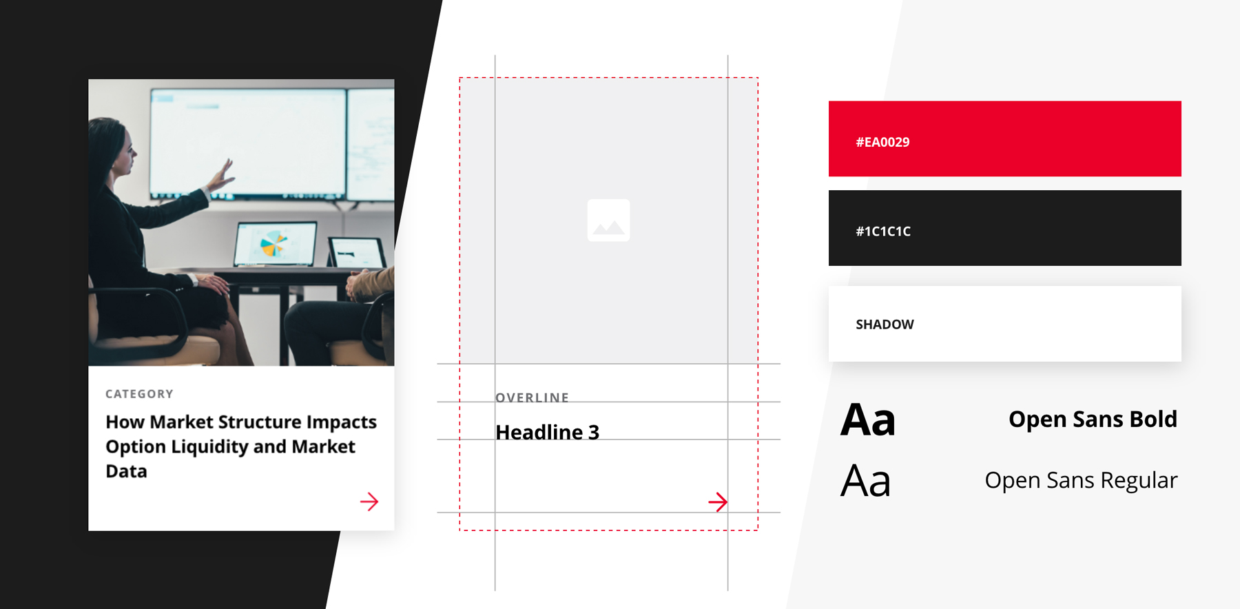
The system of page templates needed to work both individually and as a whole. And they needed to easily house different types of content based on Exegy’s ideas.
The system required some adjustments to get it exactly right, but most systems do. The elements weren’t function over form, either. The results feel appropriate for the industry, but still stand out among fintech websites.
System launch.
To make sure visitors don’t get stuck at dead-ends, we built CTAs to keep people moving throughout the site. Infographics, videos and product sheets help explain the products and benefits and round out the user experience.
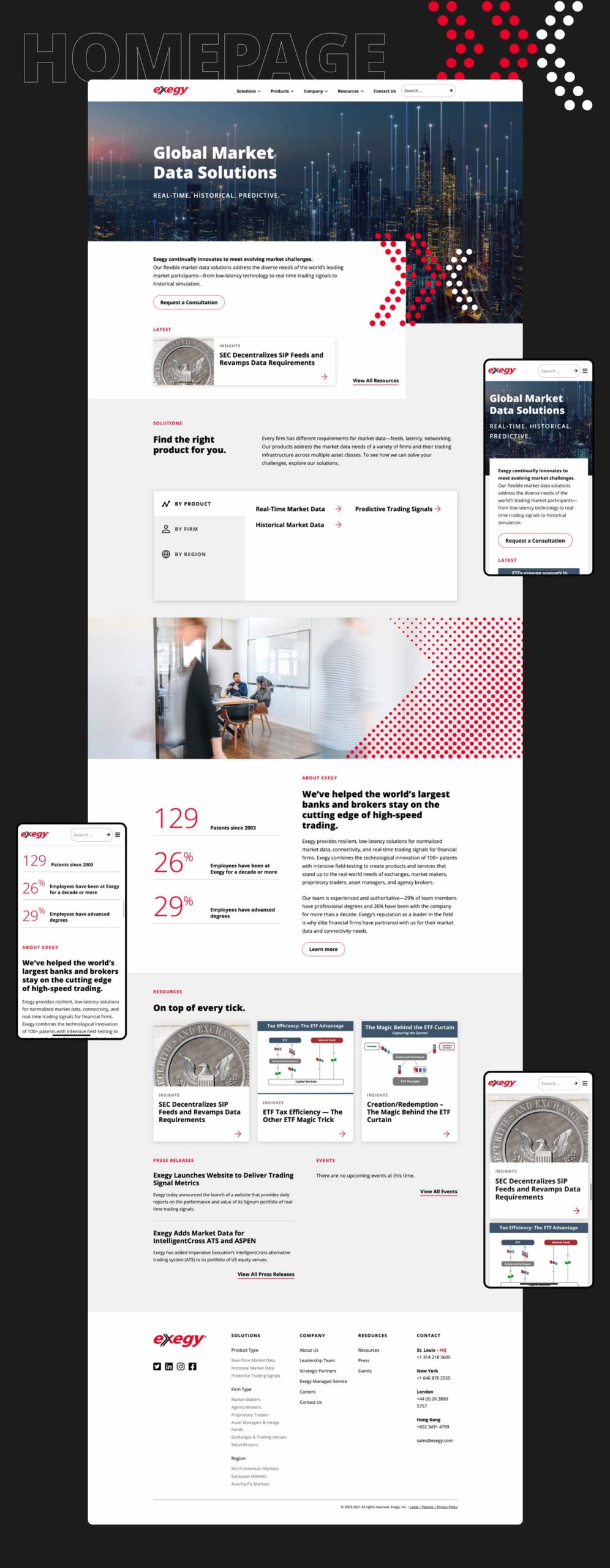
With the page designs finalized, our developer built a kitchen sink: every element we’d designed and coded in one place, so Exegy’s team could easily go in and build out all the pages. As they worked, they asked us to create a few remaining pieces. Fast forward a few months and the site launched.

Exegy’s new site gives the company a fresh look and clean user experience that’s expected of a fintech website. Balancing standard elements that establish credibility with unexpected components inspired by the products themselves, the site reinforces the brand across the customer journey.
And most importantly, it’s a system that works. It appeals to visitors and guides them to the information they need, just like Exegy’s high-tech products.
