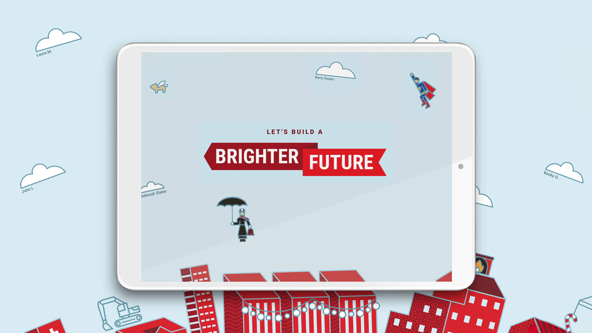
Sharing Good with McCarthy’s Holiday Website Design
We build websites that generate leads. We design brand identities that catch people’s attention. We implement marketing strategies that support sales.
And sometimes, our projects have a different goal entirely: to share gratitude, and make people feel happy.
In 2020, that’s a lofty goal. But we love a good challenge.
Building a brighter future.
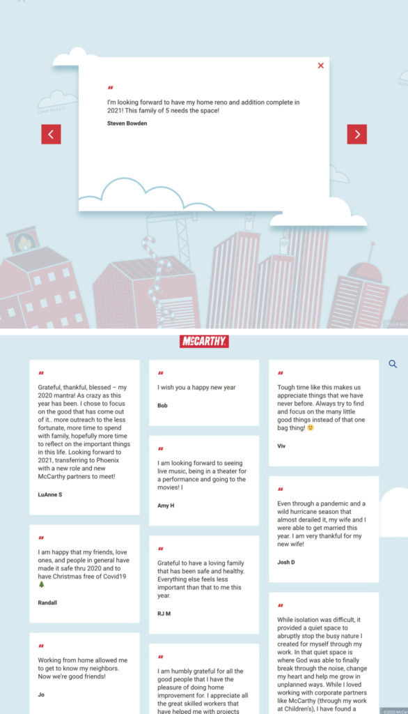
Every year, McCarthy Building Company, Inc. celebrates the holidays with a campaign, usually an interactive digital experience, to share with their clients and internal teams. For the 2020 holidays, the company’s marketing department wanted to do something bigger than usual, to bring happiness to a tumultuous year.
They’d seen a website we built a few years back for Mercy, where staff and patients could submit blessings. McCarthy loved the concept and wanted something similar, a place for people to add something of their own and share it with others. Ideally, the site could be used beyond the holidays, too, with some design changes and updates to keep visitors coming back.

We loved McCarthy’s commitment to bringing positivity to their community. But there was a lot that still needed to be nailed down.
And it was already late summer. We needed to design the site, write copy, build it, test it and launch in time for the holidays.
We needed to hurry.
The web design process.
In web design, sometimes you come up with the big idea first. You figure out how to make it possible (or even if it’s possible) second.
See more of Atomicdust’s website design projects
We presented a few concepts to McCarthy for how the site could work, not wanting them to feel confined to the original idea that had inspired them. But they liked the premise of people submitting things they were grateful for (studies show gratitude can improve physical and psychological health, and even help people sleep better) so we continued on.
The original designs focused on buildings (McCarthy is one of the largest construction companies in the country). Visitors would submit their gratitude through different buildings added to the skyline.
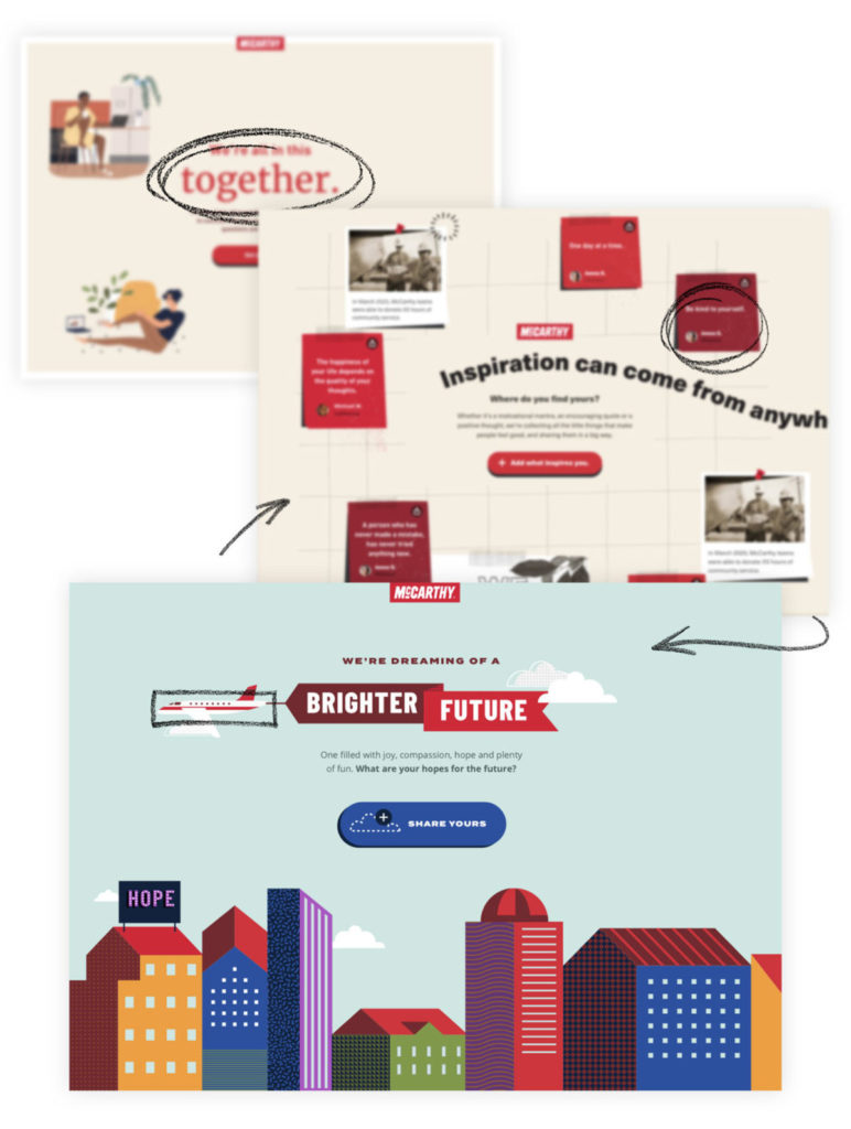
But the site isn’t about promoting McCarthy as much as gratitude and goodness. So we shifted the attention to the sky—each submission would add a new cloud to the horizon.
The scroll changed too. Instead of a vertical scroll going upward into the sky, we decided to make the site scroll left to right, just as the sun moves across the sky from day to night.
Sign up for Atomicdust’s monthly newsletter to get insights and projects delivered to your inbox
And wouldn’t it be awesome if everything was on an arc, so as the user scrolled, the cityscape rotated realistically like a spinning globe?
It would—but we weren’t sure how to make it happen.
Building the back end.
Here’s something I’m grateful for: developers.
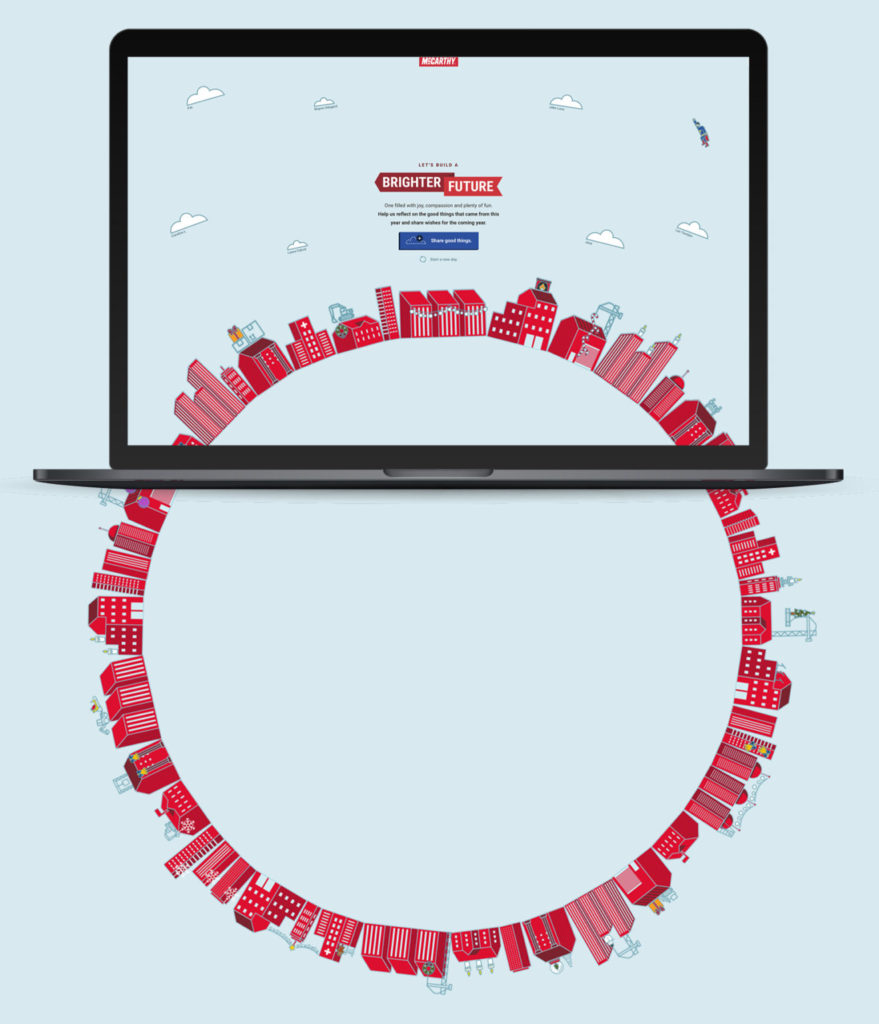
Eventually, they figured out that if we built the site like a bicycle tire, with clouds and the cityscape built like spokes on a giant bike wheel, it could rotate on an arc.
Engineering. They make it look so easy.
For fun, we added in a little Superman flying through the sky. And the client loved it—really loved it. So we incorporated more surprises: Mary Poppins, a satellite, a pig that flies.

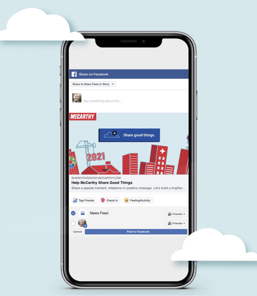
To get the site in front of as many people as possible, the developers built in social sharing functionality, so that after a visitor hits submit, they can share their entry on Facebook, Twitter or LinkedIn.
Sharing good.
We launched the site in time for the holidays, and McCarthy is busy sharing it with their teams, clients and communities around America. The sky gets cloudier every day—but with good clouds, representing gratitude and a brighter future.
After the holidays, the graphics can be swapped out, so the site can keep collecting entries year-round.
McCarthy is committed to doing good and having a social impact, and we’re grateful to have partnered with them to bring a little more joy to 2020.
